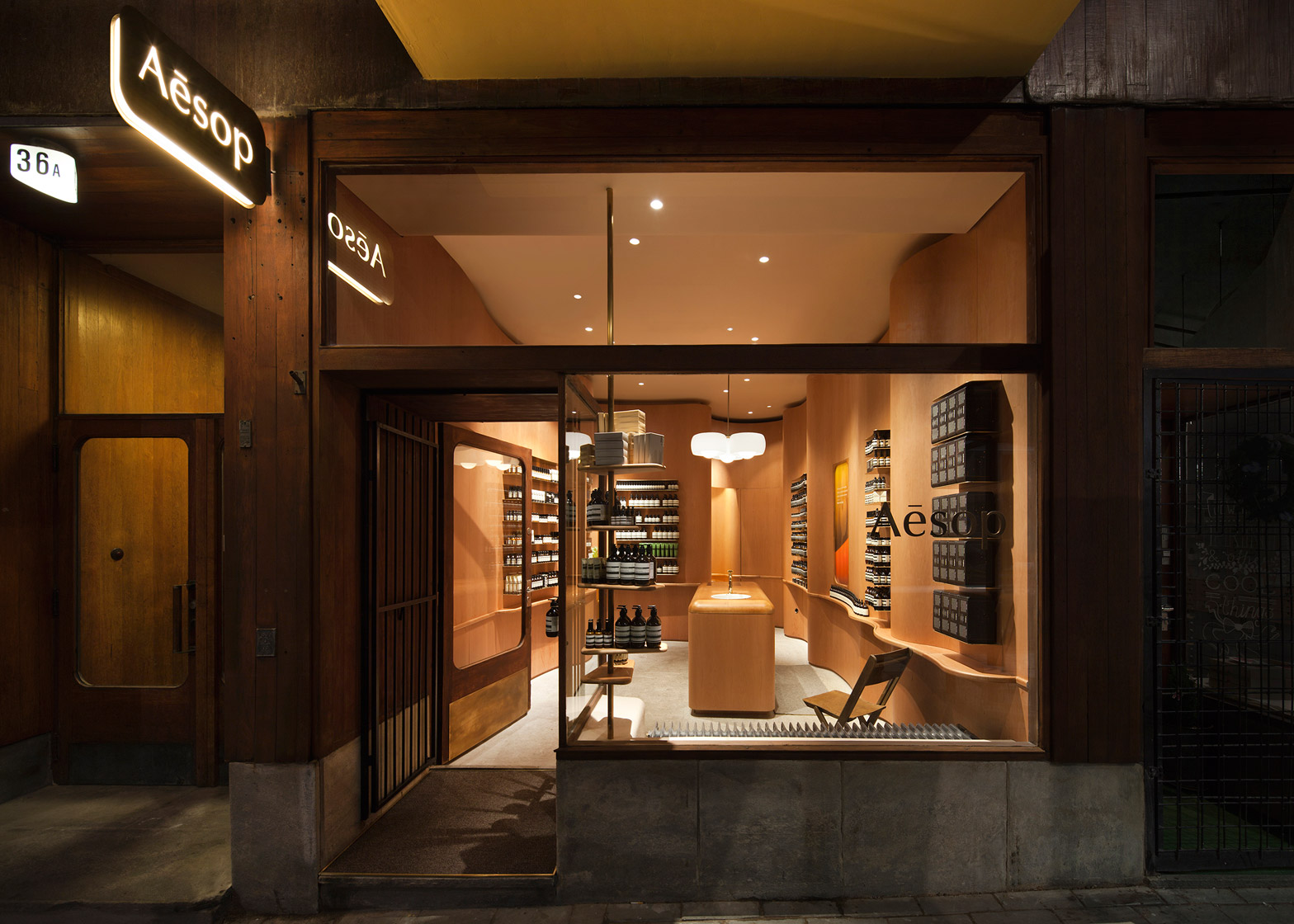
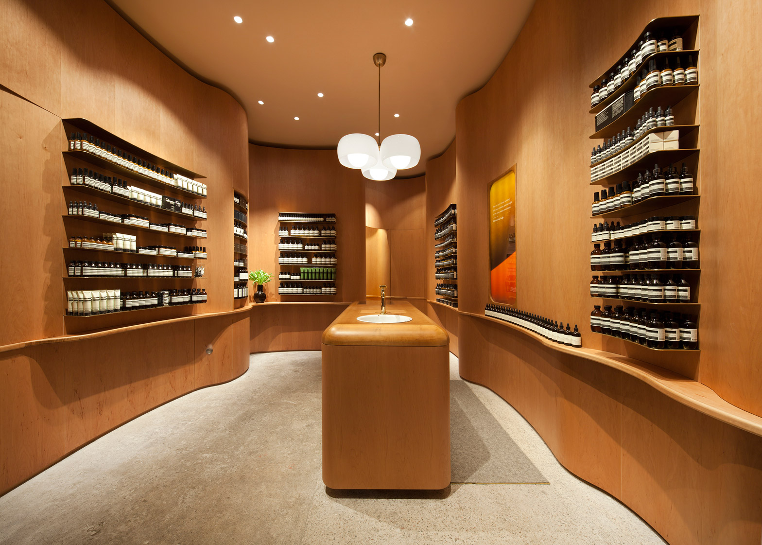
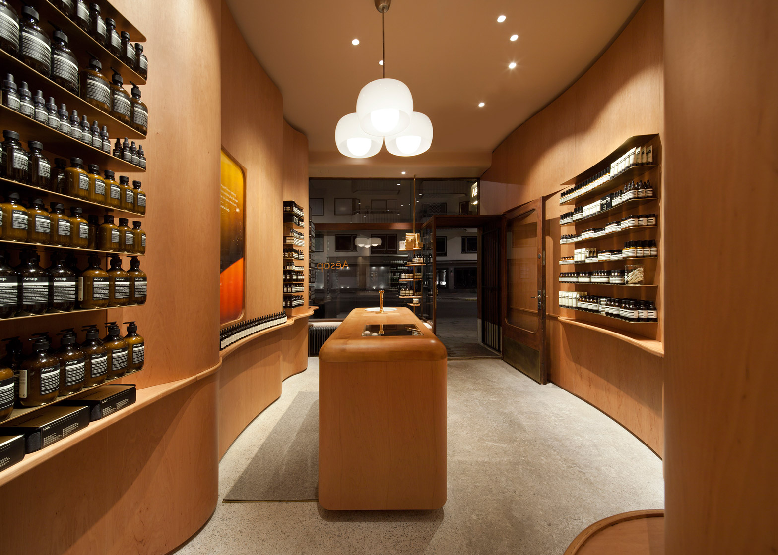
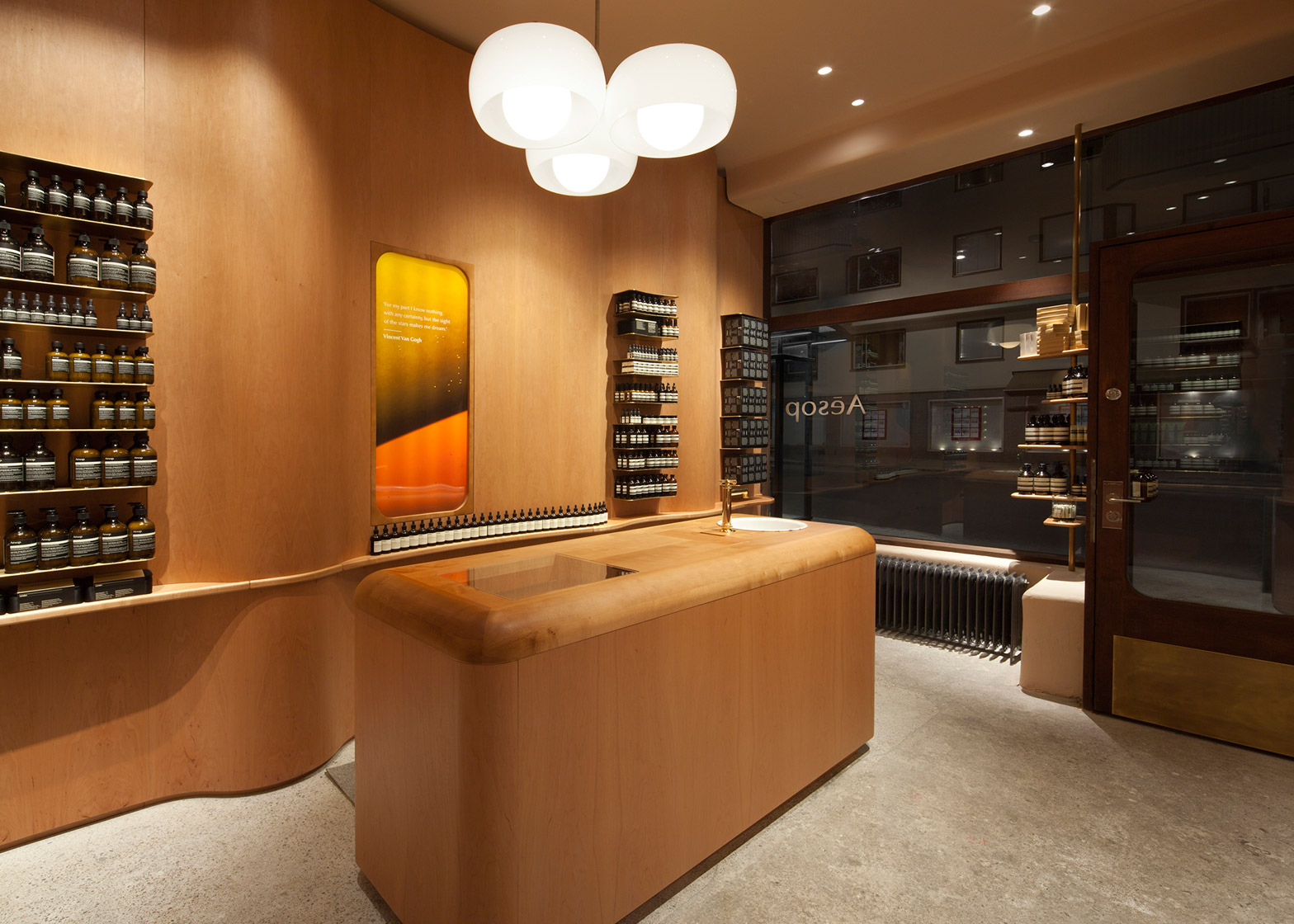
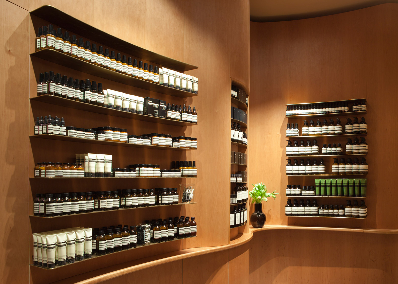
Skin and haircare products are displayed on brass shelves inside Aesop's second Stockholm store, which features curved wooden walls inspired by the designs of Swedish architect Erik Gunnar Asplund (+ slideshow).
The store is located in the SoFo district of Stockholm. It occupies an old 1930s house with a slatted-wooden facade, which provided the starting point for In Praise Of Shadows' design.
"The building was well sustained with most of the original details intact, and the building in itself became one strong source of inspiration for the design," said the architects.
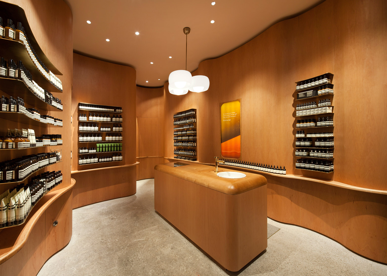
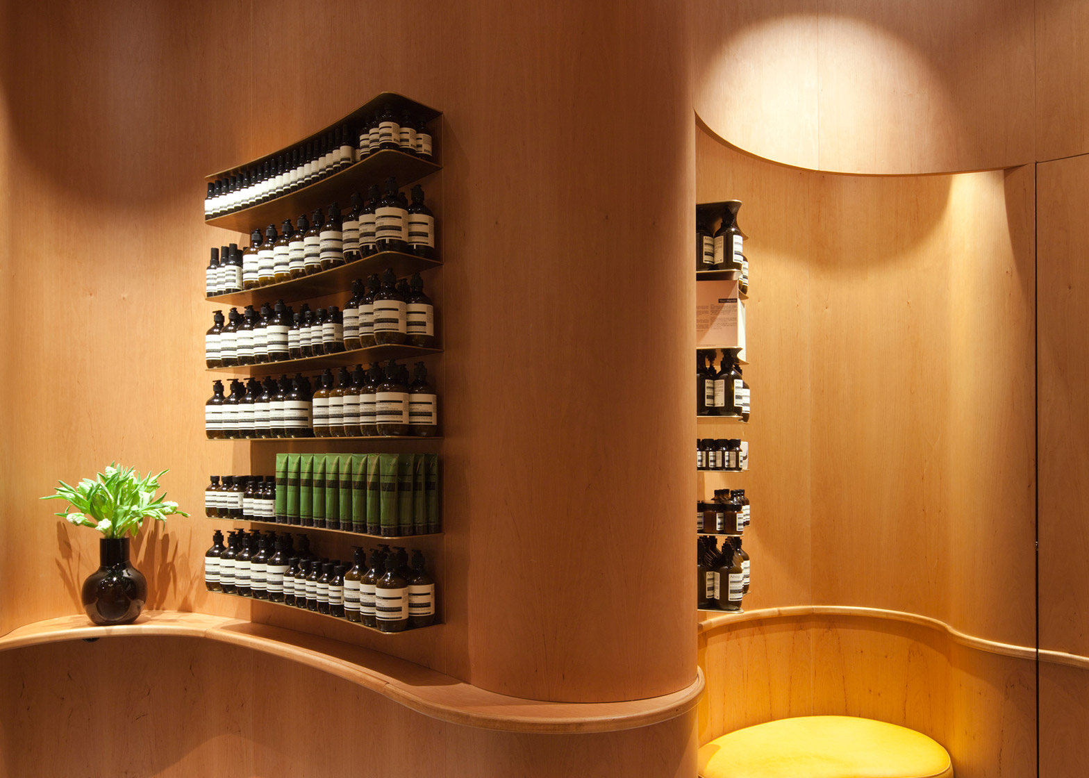
Hoping to create the informal atmosphere of a living room, the team lined the interior with a sinuous layer of wood veneer inspired by draping curtains – referencing Asplund's work at the Woodland Cemetery, also in Stockholm.
"We were inspired by Erik Gunnar Asplund's way of using bent wood in an functionally and spatially defining way at the Woodland Cemetery chapels," they said. "We chose to use wood in a thin layer of veneer, curved to a geometry that unifies the space."
Other materials used in the store are typically found in Swedish handicraft, including warm-coloured alder wood and vegetable-tanned leather from Tärnsjö.
Patinated brass shelving units curve to match the dips of the wall, while a leather-topped bench is tucked within a niche towards the back of the store.
A blocky alder wood centrepiece forms a sales counter. It also integrates a demonstration sink made from enamelled metal – an important fixture in all the Australian brand's stores.
The branch on London's Lambs Conduit street features bespoke copper basins and taps, while a Hamburg store contains a large stone sink.
"In contrast to the complex geometry of the surrounding walls, the shape of the centrepiece is strict and simple. but softened by rounded corners – a detail that relates to the rounded corners of the frame of the glass in the original entrance door," said the team.
For the flooring, the architects removed layers of old tiling to unearth an old concrete surface. This was then ground down and smoothed – allowing the aggregate to become visible.
The ceiling is painted in a pinky-beige colour – contrasting with the walls and highlighting the curves of the wood.
Individual interiors are designed for each Aesop store, and are often influenced by their surroundings. Dennis Paphitis, founder of the skincare brand, told Dezeen "architecturally our criteria is always to try and work with what is already there and to weave ourselves into the core and fabric of the street, rather than to impose what we were doing."
In Praise of Shadows also designed the interior of Aesop's first Swedish store, using dead wood from a Stockholm park to cover the walls and floor.

