McDonald's is rolling out simplified new packaging, designed by branding agency Boxer to function as a "mobile billboard" for the fast-food giant (+ slideshow).
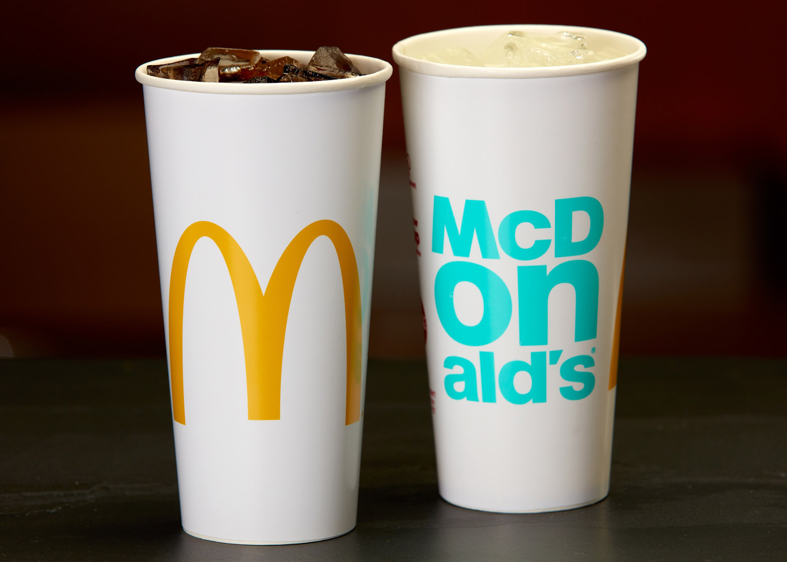
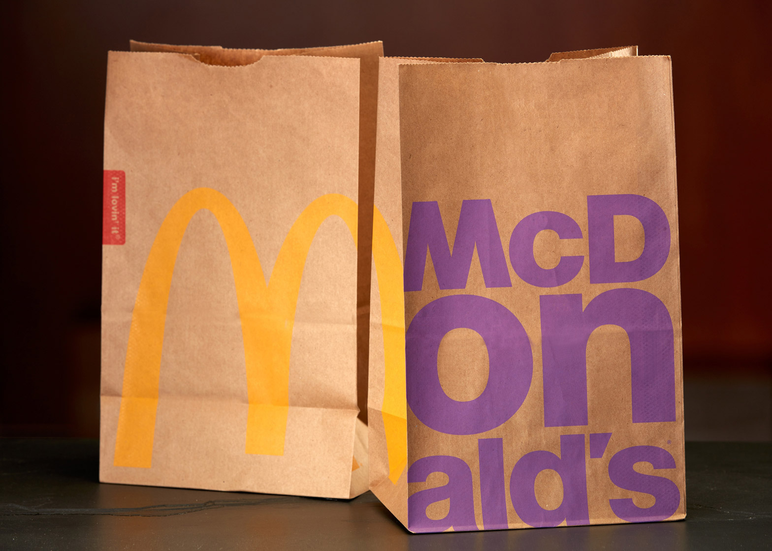
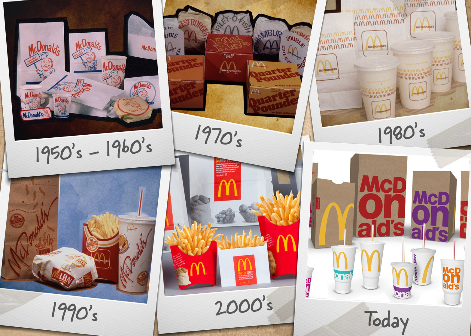
The updated carry-out bags, fountain beverage cups and sandwich boxes are launching in the US this month, and will be introduced in over 36,000 McDonald's branches throughout 2016.
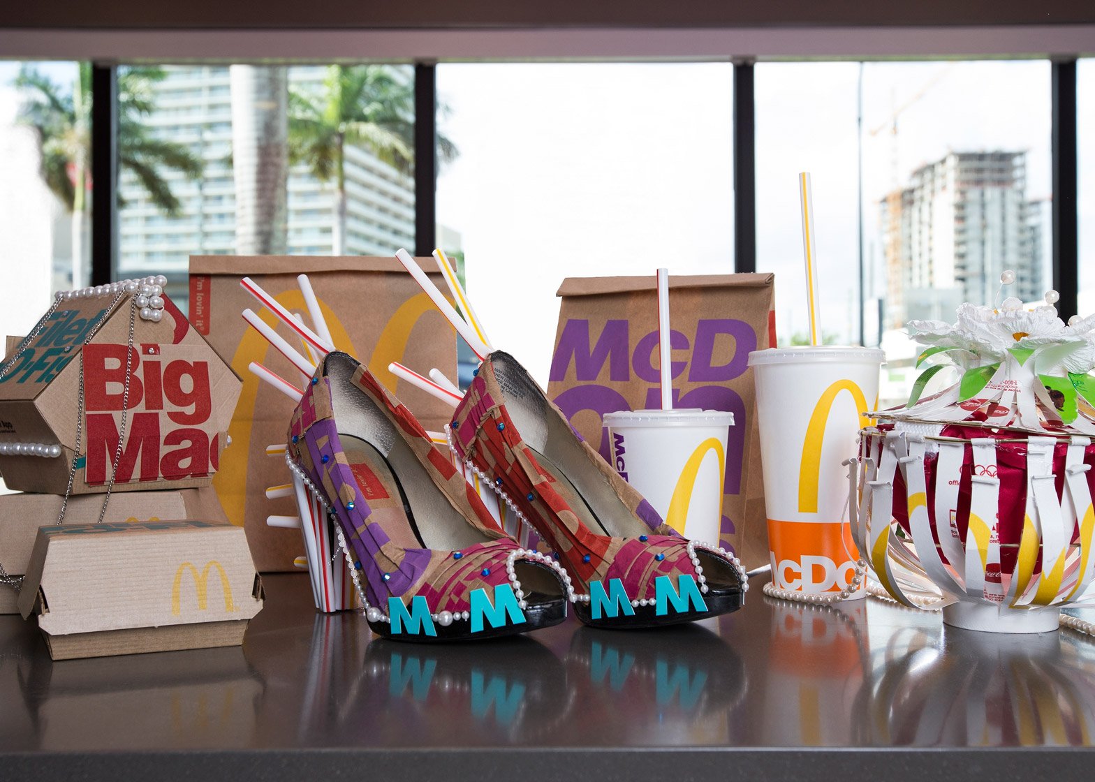
Bold typography in bright colours is used to cover surfaces of the paper and card containers, paired with the company's iconic golden arches logo.
"The new look is simple, fresh and consistent with the company's vision to be a modern and progressive burger company," said a statement from McDonald's.
"Every day 69 million customers visit McDonald's around the world and this new packaging will be a noticeable change," added Matt Biespiel, senior director of global marketing.
For the rebrand, McDonald's worked with a team of designers plucked from its various consultancies, including Leo Burnett, TBWA, DDB Hong Kong, Creata and Landini, Forpeople, and Boxer.
Boxer then developed the ideas at its UK office, then passed over the project to its outpost in Chicago.
"It's a new direction for the brand, which is being modernised and made more progressive; the new packaging strategically indicates that," said Boxer's chief creative officer Paul Castledine. "Because it's dynamic and simple, the packaging almost acts as a mobile billboard."
"They've had quite a tough time but so many people love the brand, we've seen that through our research," he continued. "This has meant that we can be playful with the type and the design. It's very striking and in-your-face because people love these products."
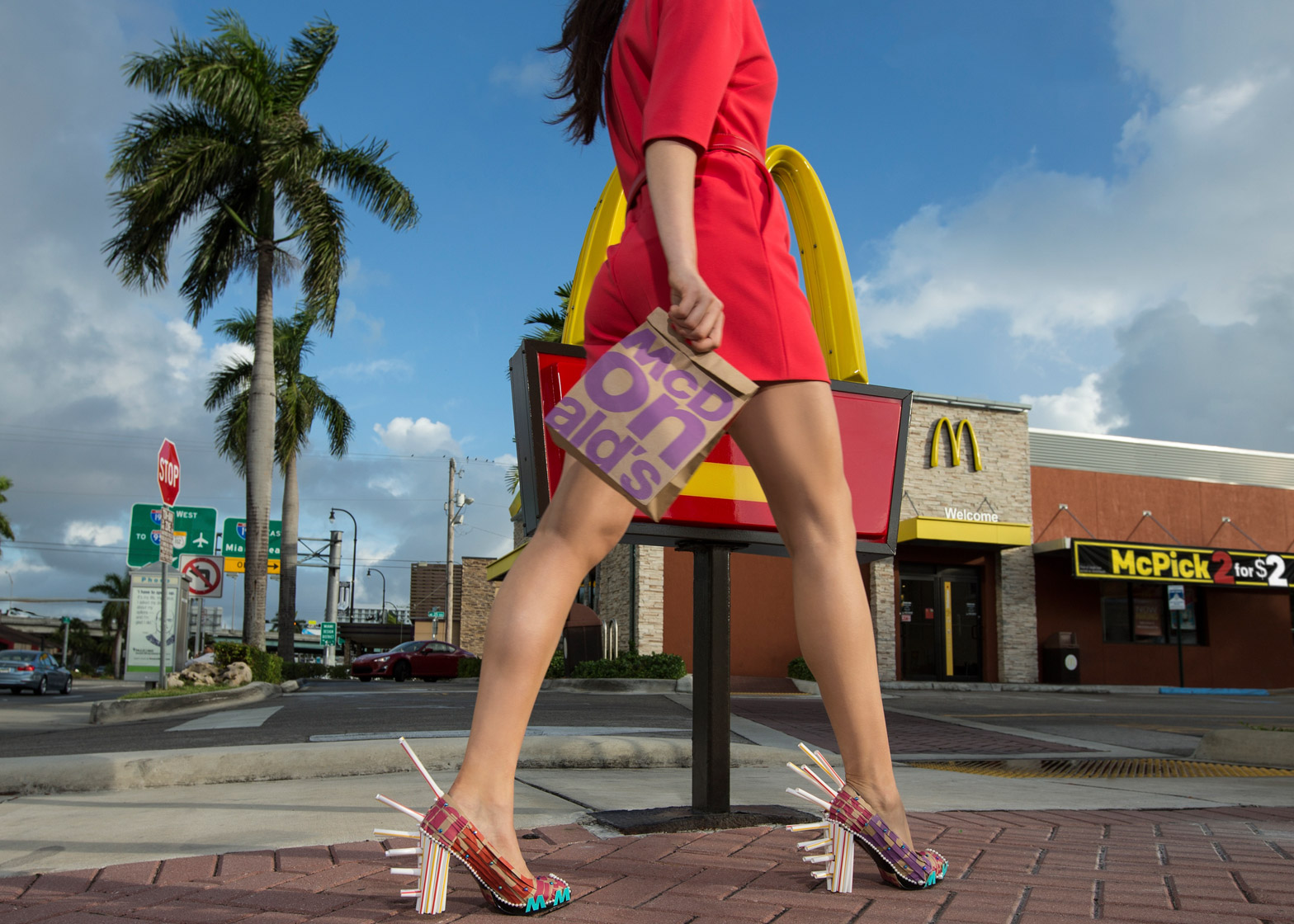
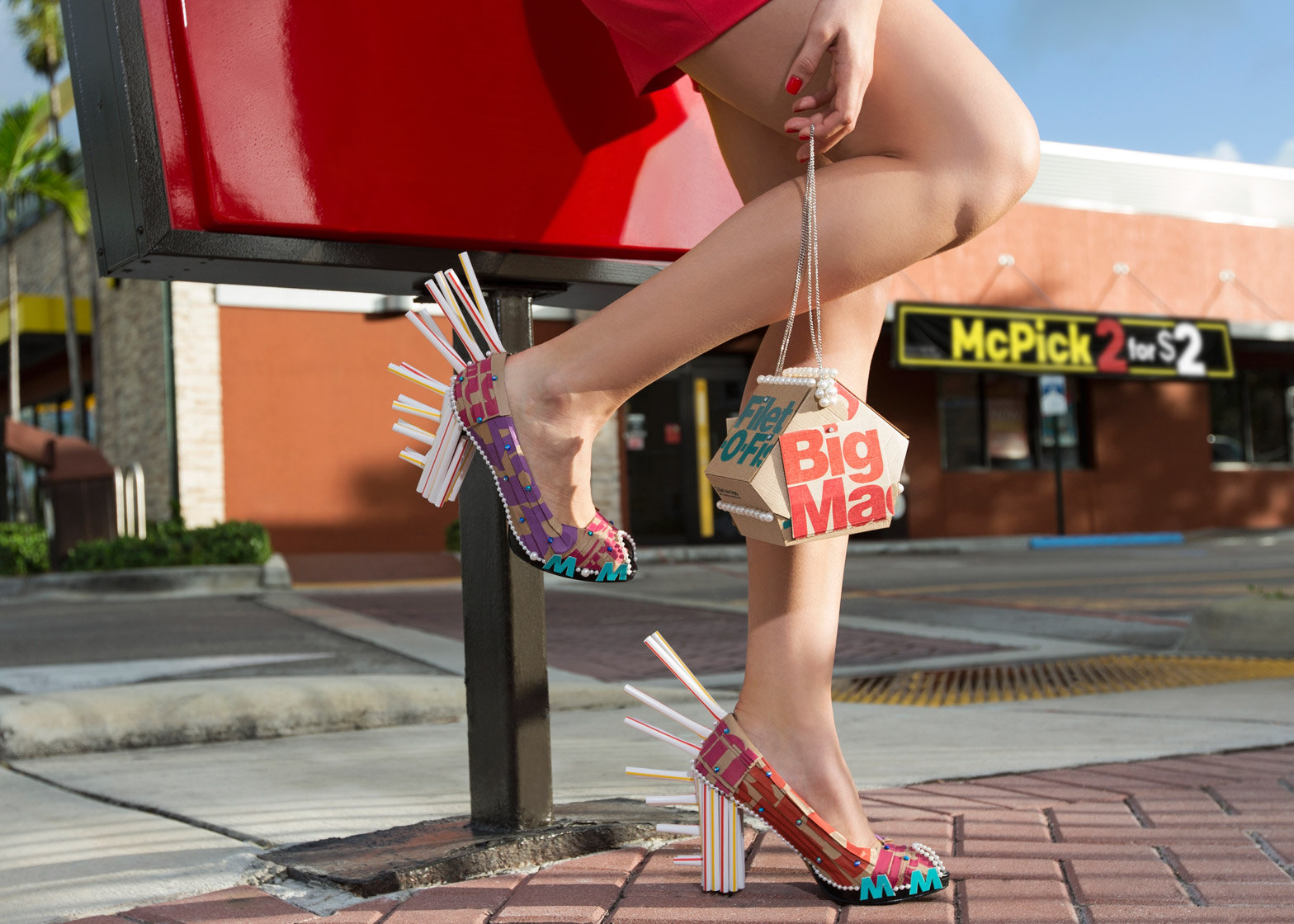
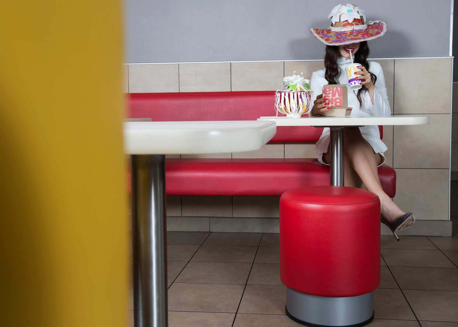
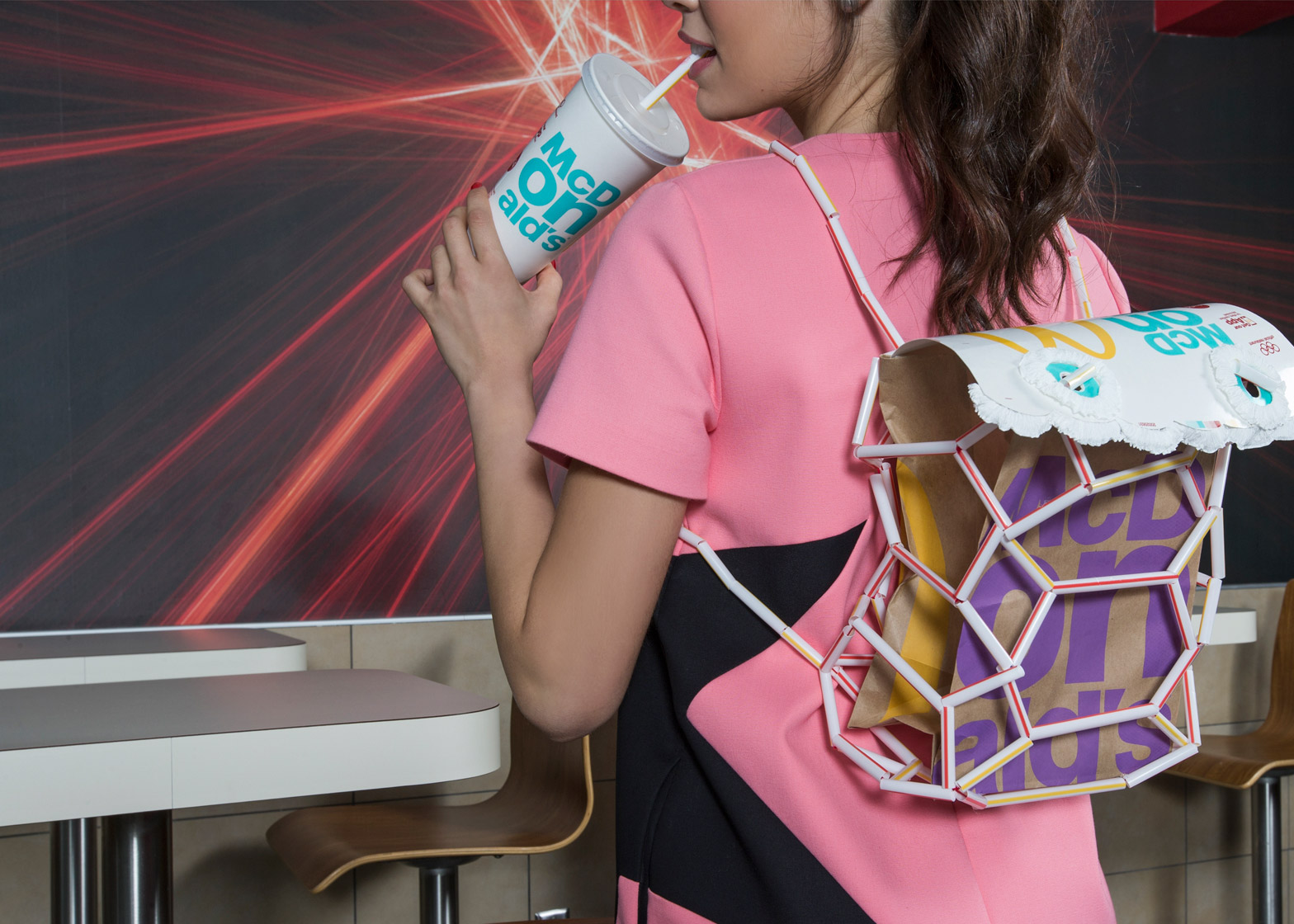
To coincide with the release, two students from Miami International University of Art and Design were asked to create fashion accessories using the packaging.
Current student Pablo Machado and recent graduate Ricardo Hardouin were given 48 hours to produce the items.
The duo used 50 bags, 72 straws, 22 cups and eight sandwich boxes, along with rhinestones and pearls, to create the collection that includes a sun hat, a pair of straw-spiked shoes, four handbags, and a backpack.
The project followed a collaboration between McDonald's and the institution during the Funkshion Fashion Week in Miami Beach last November, for which a group of students completed a similar task.
McDonald's has committed to sourcing 100 per cent of all its fibre-based packaging from recycled or certified sources by 2020.
"We're proud of the progress we've made and initiatives like this are important to our customers who care about the planet," Biespiel said.
In December 2015, McDonald's piloted a new take on its restaurant interiors at a Hong Kong branch, which features concrete tables and atmospheric lighting.
Previous overhauls of its branches include Patrick Norguet's rethink of outposts across France and Mei Architects' golden restaurant in Rotterdam.

