David Bowie was "facing his own mortality" with Blackstar album says cover designer
Exclusive interview: the cover of David Bowie's Blackstar album, released just days before his death, was designed to reflect the musician's mortality according to his long-time graphic design collaborator Jonathan Barnbrook.

Blackstar, represented by a ★ symbol, was released on 8 January 2016 – Bowie's 69th birthday. The musician died two days later, and the album has since been interpreted as a poignant farewell and has topped charts worldwide.
The album artwork was one of five that Barnbrook worked on with Bowie in the last 15 years, making the British designer one of the recording star's closest and longest-serving collaborators.

Speaking to Dezeen, Barnbrook explained how he would work directly with Bowie rather than via his management team, discussing ideas via email or Skype.
"He always wanted to do something interesting, often to the annoyance of the record company," Barnbrook said. "He understood the value of the image on a record cover, when other people had forgotten about it."
The designer added that Bowie was, more than anyone else, the artist responsible for bringing "art-school thinking into the mainstream."

Barnbrook's cover for Bowie's last record positions a large black star in the centre of a white background. The design is simple, but full of symbolism, he told Dezeen.
"This was a man who was facing his own mortality," said Barnbrook. "The Blackstar symbol [★], rather than writing 'Blackstar', has as a sort of finality, a darkness, a simplicity, which is a representation of the music."
"It's subsided a bit now, but a lot of people said it was a bullshit cover when it came out, that it took five minutes to design," he added. "But I think there is a misunderstanding about the simplicity."

The use of abstract shapes was developed from Barnbrook's previous controversial cover for The Next Day album. The design features a white square covering an old photo of Bowie and was influenced by Constructivist art.
The black star graphic also carries deeper meanings, said Barnbrook.
"The idea of mortality is in there, and of course the idea of a black hole sucking in everything, the Big Bang, the start of the universe, if there is an end of the universe," Barnbrook said. "These are things that relate to mortality."

For the vinyl edition, the star is cut out from the black sleeve so the record inside is visible.
"The fact that you can see the record as a physical thing that degrades, it gets scratched as soon as it comes into being, that is a comment on mortality too," said Barnbrook.
The graphic designer, 49, trained at London's Saint Martin's School of Art and Royal College of Art. He has designed a number of typefaces, many of which featured in a 2007 exhibition of his work titled Friendly Fire. He also worked on a book for British artist Damien Hirst, which ultimately led to his collaboration with Bowie.
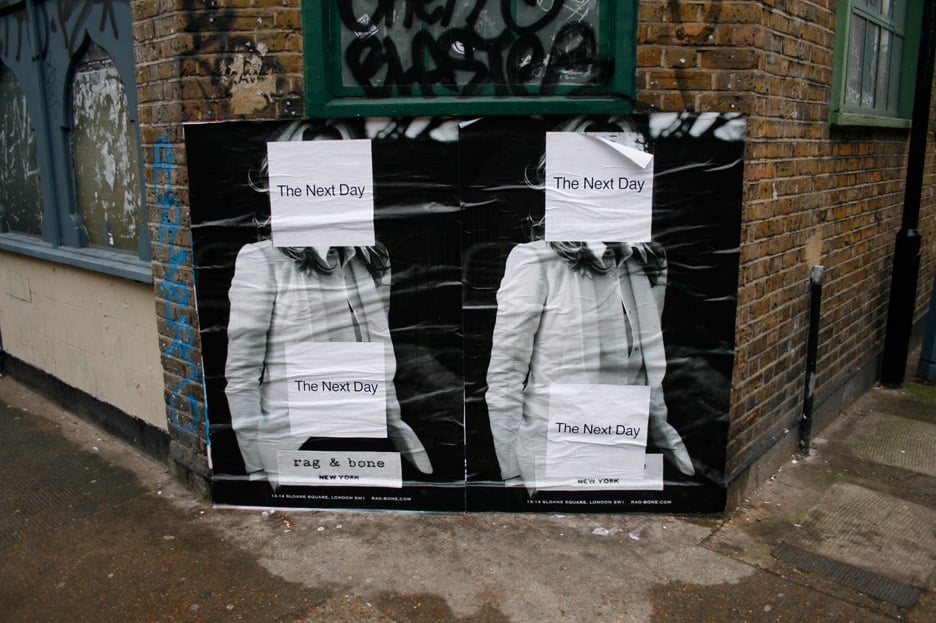
The pair created five album covers together and each design proved divisive with both critics and fans.
"I hope they are a fitting tribute to his amazing creative life," said Barnbrook. "He's one of the people who most brought the avant garde or intellectualism, or art-school thinking, into the mainstream."
Read an edited version of our interview with Jonathan Barnbrook below:
Dan Howarth: How did you meet David Bowie?
Jonathan Barnbrook: It was to do with a book for his wife Iman. They came to London and went to various design studios, because they wanted somebody a bit different as a book designer. I think he'd seen the Damien Hirst book that I worked on. I know that he went to see me, Tomato, and a few other people, and in the end they were kind enough to choose our studio.
Then our working relationship just grew from there to doing his album covers, because we had a lot of interaction when we were doing the book.

Dan Howarth: Which of his album covers did you work on?
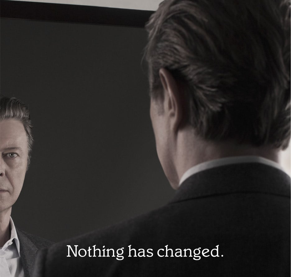
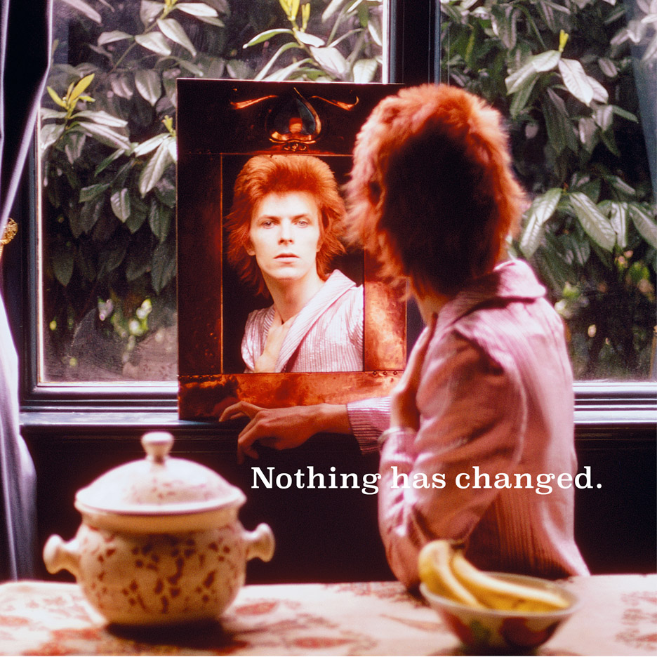
Jonathan Barnbrook: Heathen, which was 2002, and there's Reality (2003), and The Next Day (2013), and the last was ★ (2016). Also the compilation album, Nothing Has Changed (2014), as well.
Dan Howarth: What was your working relationship with him like?
Jonathan Barnbrook: It was very direct, we had worked with other musicians before and often you have to go through the manager, or sometimes you don't even speak to them. But he was in New York, so we were emailing all the time through the project, just me and him really.
And with a personal working relationship it is the small things are brought into the project that make it, the jokes, the stupid moments, and the discussions about other things, not just the project at hand. It was a very good way to work.
Dan Howarth: And what was his creative input?
Jonathan Barnbrook: He would look at the stuff, and talk about what he liked and what he didn't like, not in a rude way, just clear and explaining his reasons why, he was also fulsome in his praise when he liked something. Sometimes he would throw a spanner in the works and ask me suddenly to do something completely different for the project for an hour. That was quite a refreshing way of working and often produced good results as it meant you put aside all of the responsibilities of the project for a moment and could just play.
He was always really respectful about the people who bought his music, so he wanted them to understand the ideas. There was no point in doing something when it was so obscure that people wouldn't get the reference; it had to relate absolutely to the music.
He understood the value of the image on a record cover, when other people had forgotten about it. We had a renaissance in the 1970s and 1980s of album covers because the format of vinyl, but then it dropped when CDs were introduce. There are still good record/CD covers around, but a lot of time nowadays the cover just had to be "nice", it wasn't a thing that provoked discussion, our covers wanted to have that discussion again. Some people hated them, some people really liked them.
Dan Howarth: Why do you think they were so divisive?
Jonathan Barnbrook: The Next Day was the most divisive one, because we didn't do quite what people expected, which was a nice new picture of David Bowie on the front. We decided to play with that idea of image expectation.
Some people thought they'd been cheated because it's a reprint of an old album cover, which is a bit ridiculous, because the cover was in the concept. I think it just puzzled a lot of people too who just "didn't get it", which we thought would happen.
However there were a lot of people who also recognised it was a very brave thing to do, something quite new. I dont think anybody other than Bowie would have taken that risk. He was really interested to see how people were reacting to it.
Dan Howarth: Did you use symbolism in all of the covers you produced for Bowie?
Jonathan Barnbrook:: Yes. My work used to be quite visually complex, but recently it's become a lot simpler in form if not in meaning. I've always been influenced by Constructivist art, so there was the influence of Kazimir Malevich and John Baldessari on The Next Day cover – the obliteration but also the spiritual, meaningful context of the abstract shapes. That followed through on ★, definitely.
The main thing of course is put over the emotional feeling of the music, that's what a good record cover does, it lets you know somehow, somewhere within it, what the music is about, or what you believe the music is about is confirmed in it. And there's not necessarily any logic to that you just have to get somewhere in that area which you have designed, and hopefully it will work.
Dan Howarth: And Bowie was very on board with that idea as well?
Jonathan Barnbrook: He always wanted to do something interesting, often to the annoyance of the record company. Especially with Next Day, they were quite shocked with the cover, and they were pretty sure that it wasn't going to work. It actually became a very successful viral campaign.
Dan Howarth: What about the earlier projects you did for him?
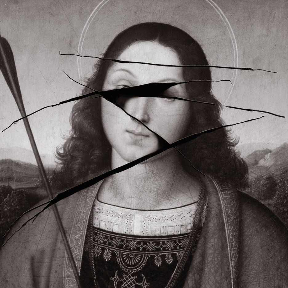
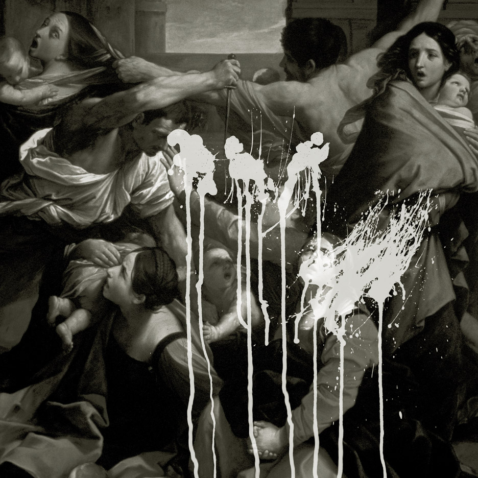
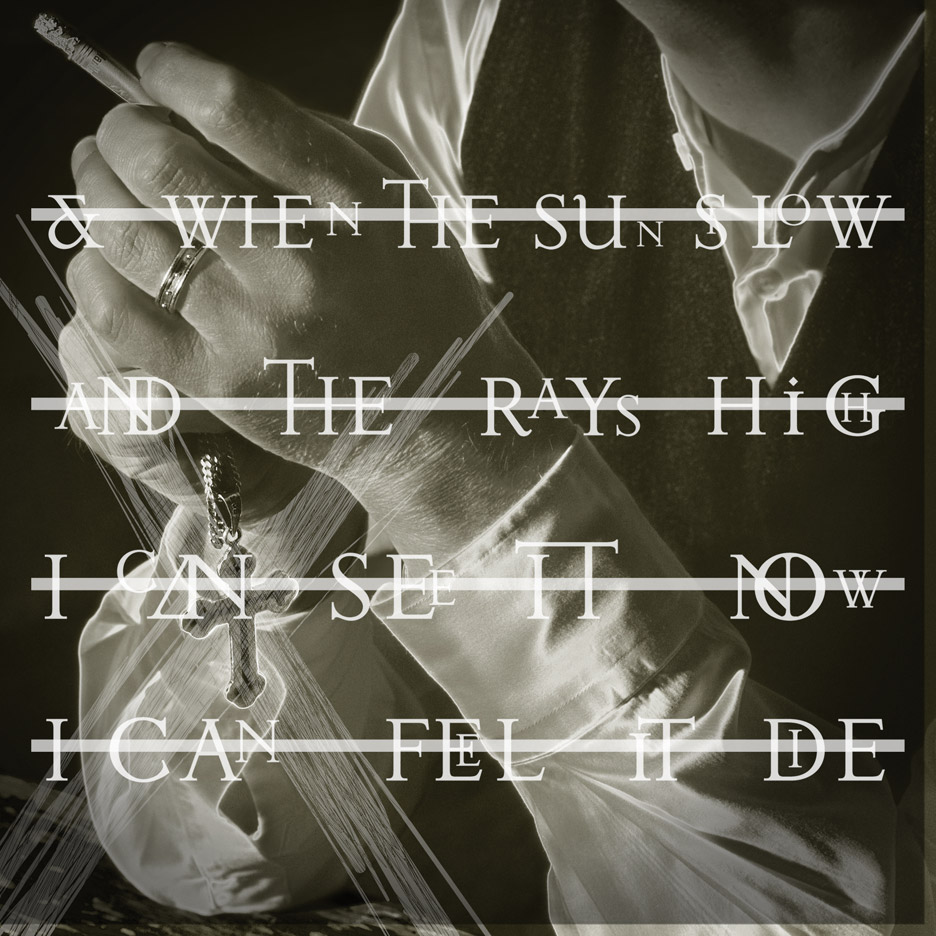
Jonathan Barnbrook: Heathen was the album released after September 11, so it's pretty clear from the lyrics on it that he was feeling pretty disillusioned with the world.
The design of that really tried to put over in a much more direct context, and a much more political context, a number of classical paintings and things that people would think of as great cultural value, but desecrated.
It's a violation of beauty, and it's also about a violation of things that we think are good morals, but actually are not. And it comes from the word Heathen – a desecrater of religious objects. I took religion to mean of things that are valued, rather than specific religious meaning.
Reality is the cover that people least like, because as the imagery is not so much or who you would consider David Bowie to be. There's a photograph of Bowie in the same pose, on the inner slip.
I'm not sure, some of the things work, some of the things don't. I don't think it worked so well and the typography didn't work so well. not everything is a success.

Dan Howarth: So how did you develop and move on from that?
Jonathan Barnbrook: We had 10 years in between, a bit of time to think about it. Nobody knew he was working on the Next Day album, and so part of process of design for that was completely keeping it secret, and trying to visually express why he'd been away. We were just playing with identities, which is again the reason for the white square.
For Nothing Has Changed, David sent me two pictures he liked, and one was him looking in the mirror. The concept came out of that – it was a thought about the different formats and a linking theme visually and a linking theme conceptually.
So each format has a different picture of him looking in the mirror, "reflecting" on his life and this is what a compilation does too, it is a summation of a life up to a certain moment. It's also about reflecting us as well, and how we see him as a pop star.
Dan Howarth: What were the ideas behind the Black Star cover?
Jonathan Barnbrook: He was always quite keen that I didn't reveal the meaning of everything. Also people are definitely still grieving for him (including myself) so I don't want to be too direct about it. When we discussed themes, they were more universal than specifically about him but they were to do with much of what has been speculated on in the press.
So the idea of mortality is in there, and of course the idea of a black hole sucking in everything, the Big Bang, the start of the universe, if there is an end of the universe. These are things that relate to mortality.
We would never talk about specific subjects in songs unless I directly asked, which I did on a few occasions. It is of course the thing that people would most ask me about, because he didn't talk to the media for 10-or-so years. I would rather not give that information second hand though as my telling of what he said would change the meaning.
For this album, I think it's not just about the symbolism in it, it is as much about the emotional feel of it, in particular, the vinyl, the black record, the black packaging, and the fact that you can see the record as a physical thing that degrades, it get scratched as soon as it comes into being, that is a comment on mortality too.

Dan Howarth: As a graphic as well, it is quite dark and quite powerful in a way.
Jonathan Barnbrook: It's subsided a bit now, but a lot of people said it was a bullshit cover when it came out, that it took five minutes to design. That's also what they say about Next Day. But I think there is a misunderstanding about the simplicity, about how it actually takes a long time to get there and that simplicity can be a little more eternal in it's meaning.
After all it's an album called ★, with a cover that has a ★ on it, which doesn't sound like a leap of imagination. But there was so many tangents we followed, until we realised that it has to cut through the noise of what is going on in the world. We see so many images every single second when we search the internet; it's a directness that is needed. The simplicity of the design also left it more open.
It also has to appear in many different kinds of media: on a website, on iTunes, in reviews, and in newspapers. These are all practical considerations for it, and as a designer you would always work within for the parameters you have. For instance, it's not actually written "Blackstar", it uses a symbol ★, and that symbol goes through different technologies, so it can be used wherever.
In terms of meaning, ★, rather than writing "Blackstar", has as a sort of finality, a darkness, a simplicity, which is a representation of the music.
Dan Howarth: Were you the only graphic designer he collaborated with over the last few years?
Jonathan Barnbrook: I think one or two worked on his videos, but it was always an honour that he would come back to me, I never presumed he would. He changed his musicians quite a lot, so there was no reason why he shouldn't change his designer.
I hope there was an element of trust there, an understanding that I would try my absolute best to do something new, that would appeal to his way of thinking of creativity.
The discussion obviously wasn't just about the record cover, it was about a lot of references, for instance on The Next Day we would talk about Malevich, the Black Square and Constructivists.
Out of anyone you can think of, he's one of the people who most brought the avant garde or intellectualism, or art-school thinking into the mainstream.
I'm like that as a graphic designer as well, I've done some commercial stuff, but the foundation of it is quite esoteric, often quite intellectually based. We were like-minded in that way, but I know I'm not in any way as much of a creative person as he was.

Dan Howarth: Throughout his career it seemed he would choose people – musicians, fashion designers – that he respected or admired, and then he would nurture his relationships with them.
Jonathan Barnbrook: Yes, ours was 15 years, which is quite a long time for a collaboration. I was very lucky.
Dan Howarth: What do you think the legacy of Bowie's record covers will be?
Jonathan Barnbrook: Firstly, the music is an important thing. All a record cover tries to do is to show, in some way, the music. I really don't need to be remembered, I would prefer the cover to be in service of his music.
I do hope though that in there there's something that will make people think about the image of the pop star, the process of buying a record, and your relationship to a pop star. (Although I don't even like the words "pop star".)
Lastly, I hope they are a fitting tribute to his amazing creative life, and the visual language is appropriate to someone who was honest in their music. He said to me that the lyrics in the [Blackstar] album are very honest. This was a man who was facing his own mortality, and I hope the design is appropriate to that.