"People love to hate Viñoly but his recent work is incredible"
Comments update: readers have been discussing Rafael Viñoly after the New-York based architect recently completed two high-profile projects, including a supertall skyscraper in New York and a circular road bridge in Uruguay.
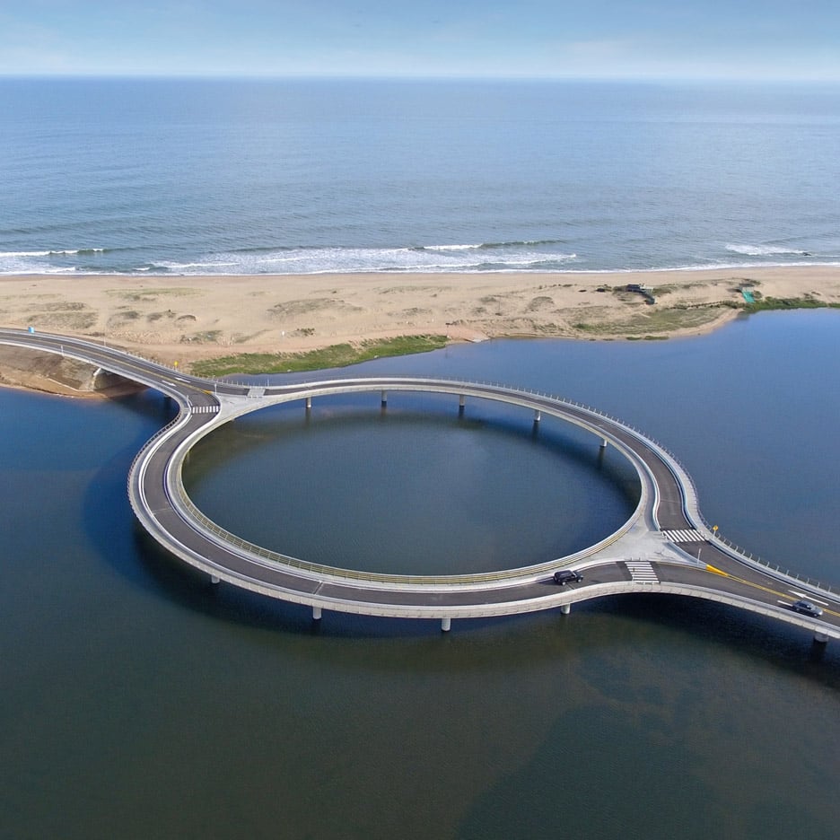
Circular argument: following the controversial 432 Park Avenue in New York, which was one of last week's most-discussed stories, Viñoly has completed a ring-shaped road bridge across a Uruguayan lagoon. But do the projects highlight an architect working at the height of his powers?
"People love to hate Viñoly but his recent work is incredible," wrote James. "432 Park Avenue has to be one of the most successful skyscrapers built in a decade and this bridge is a thing of poetic beauty."
A few readers agreed, but many more criticised Viñoly for this and other projects, including London's Walkie Talkie.
"[The bridge] represents a concept completely dislocated from the project," countered a guest commenter. "Inelegant and architecturally suspect by this somehow revered office." Read the comments on this story »

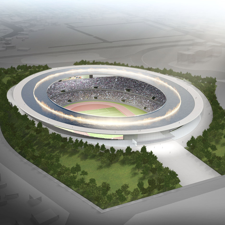
Ring of fire: readers preferred Japanese designer Tokujin Yoshioka's vision for the Tokyo 2020 Olympic stadium to all the other proposed and winning concepts, despite his design not being eligible for the scandal-ridden competition.
"This has so much vision in comparison to the current proposed design," said Roberto Sideris. "It also represents Japan much better."
"It is truly a simple but clever approach to designing a stadium," added Anton. "[Submerging the structure] gives a lightness to the design."
Others pointed out potential flaws with its structure, describing the proposal as a concept that could only exist on a drawing board. Read the comments on this story »

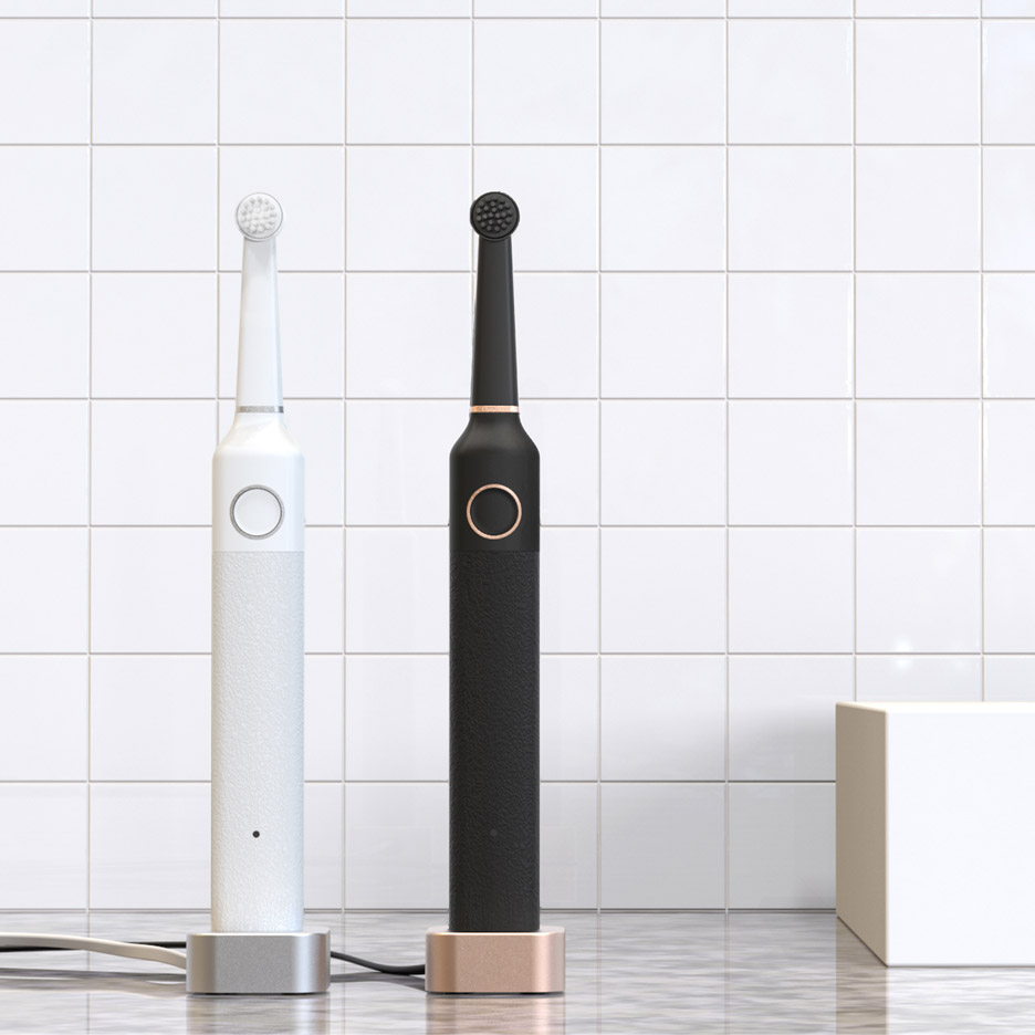
Smart brush: electronics startup Bruzzoni Global has created a minimal alternative to "ugly" toothbrushes, but not everybody was sold on its pared-back aesthetic.
"This product lacks character and sexiness," wrote
"How sexy is your toothbrush?" hit back Dan. "This is better looking than anything on the market, so for me it achieves its aim, [although] I have to agree the image of it charging from an overly shiny Macbook is a step too far."
"I'd much prefer this in my bathroom than the appallingly styled one I have now," concluded Paul B who likened the design to products by Apple and Dieter Rams. Read the comments on this story »

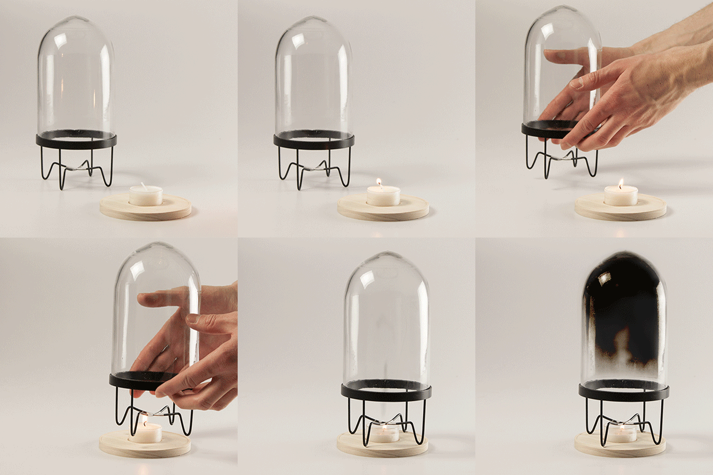
Stardust: a home-grieving set designed to help an astronaut's family overcome the untimely death of a beloved Mars explorer baffled commenters this week.
"Insensitive, senseless and vulgar attempt to get attention by merging the shocking subject of death with the trend of Mars travel," argued Raphael. "If I happen to die on Mars one day, I'd rather get my ashes spread on the red planet than end in a cheese bell."
"There is a clear rationale behind the project, so that's nonsense" replied Ian Nairn. "And is it so crazy that designers respond to the zeitgeist?"
"What you will find is that in most cases the deceased would rather be celebrated than mourned in such a sombre fashion," concluded Pete. "Products like this should be reversed so that the deceased help the living to celebrate life." Read the comments on this story »