Revamped Melbourne house hides a giant toy box under its floors
A floor that doubles as a toy box and a vivid yellow bathtub both feature inside this remodelled Melbourne house by local studio Austin Maynard Architects (+ slideshow).
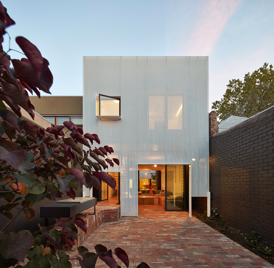
The Melbourne studio, previously known as Andrew Maynard Architects, was tasked with transforming a simple bungalow into a practical home suited to the lifestyle of two occupants – a woman and her young son.
To achieve this, the architects have more than doubled the size of the property, named Mills.
They added a new two-storey extension behind the single-storey building, and planned a layout to offer plenty of storage without compromising on space.
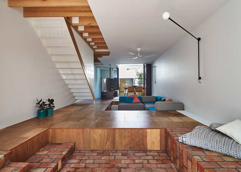
Rather than building cupboards along the walls, these are instead integrated into the floor of the family's new living room.
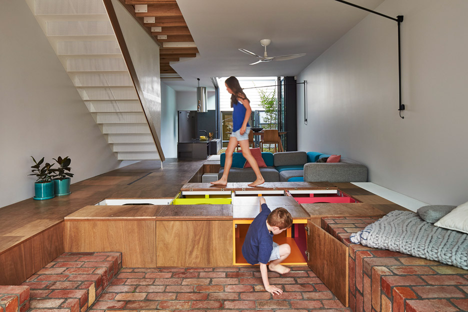
"For her and her newborn baby, the client wanted a light-filled home that could hide the mess. We gave her a floor that was a giant toy-box," explained the team, whose past projects include a property made up of seven house-shaped blocks.
"Everyone wants an abundance of storage. Terrace homes are roughly six metres wide," they added. "After adding walls, corridors, stairs, heating panels and cupboards, we are left with very little width for living space."
"What if we didn't have wall cupboards? We'd get almost one metre of space back into the width of our terraces."
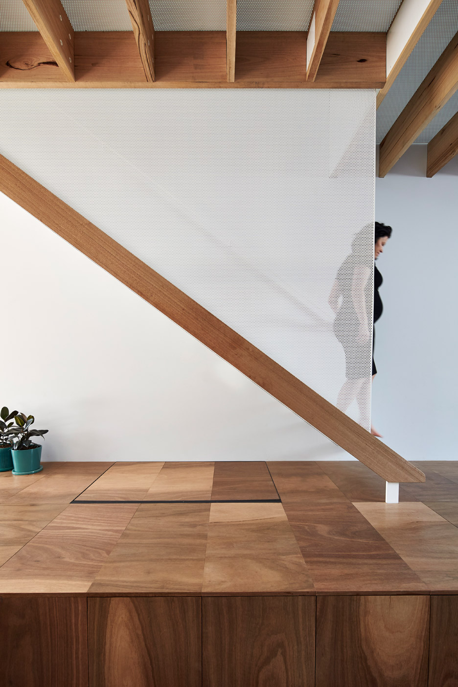
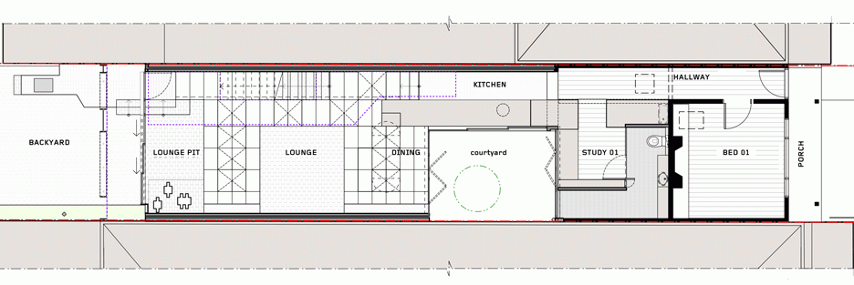
This living space occupies most of the ground-level floor space in the extension, which is separated from the original building by a courtyard. The raised flooring helps to divide the room into a lounge and a play space, and make it easy to tidy toys away.
This prompted a new name for the building: "the toy management house".
"Gravity is colluding with your child and conspires in its favour," said the team. "Parents constantly pick things up, whilst kids throw them down."
"The trick is to work with the chaos a child brings rather than naively hoping that your child will choose to be neat," they said. "At Mills we have made gravity the parent's ally rather than the child's by enabling the floor to swallow all the mess."
The gap between the two floor heights is 450 millimetres – meaning the stepped surface is also well sized for use as a seat.
A dining area is located on the higher level, positioned beside the courtyard.
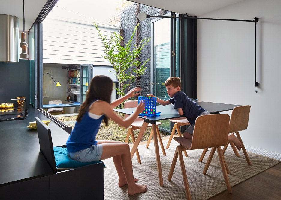
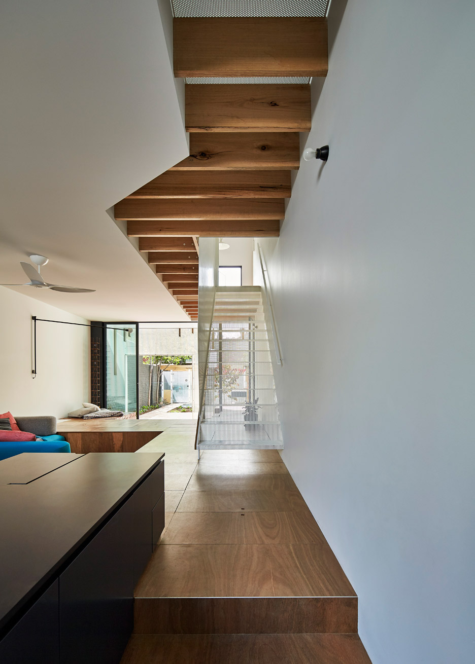
The kitchen counter sits on the lower level, occupying the corridor between the new and old parts of the house – a space that would otherwise have been useless. The counter has a height of 900 millimetres, and even integrates an extra seat for the dining table.
"We upholstered a seat under a flap on the kitchen bench so that there can be one extra seat at the dining table when visitors are over, or when Louis wants to cook with mum," said the architects.
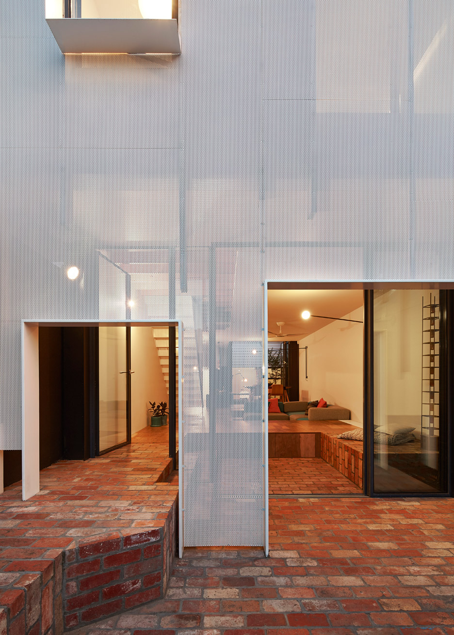
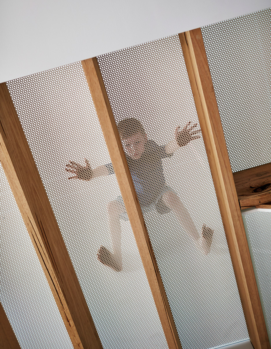
The extension is glazed, but has a perforated metal skin that helps to protect the interior from harsh sun exposure. This skin is punctured in two places at ground level, allowing the staggered living space to merge with the brick terrace outside.
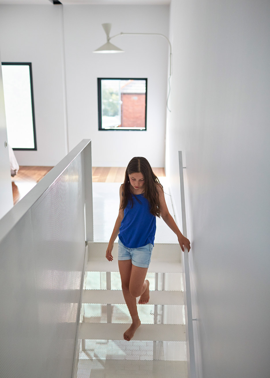
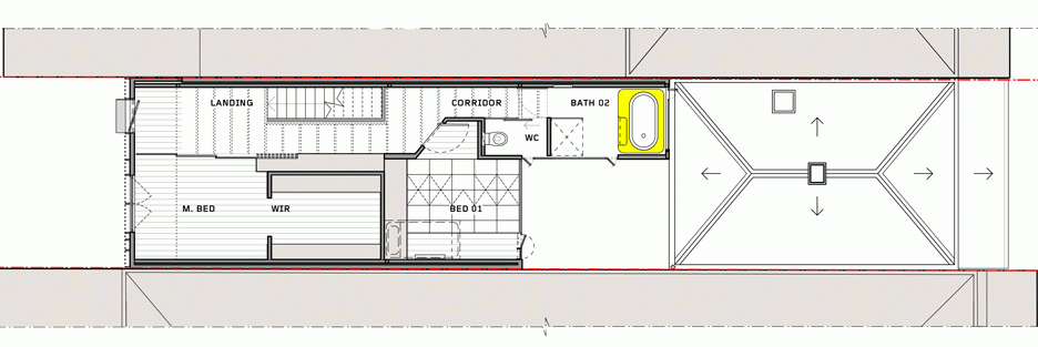
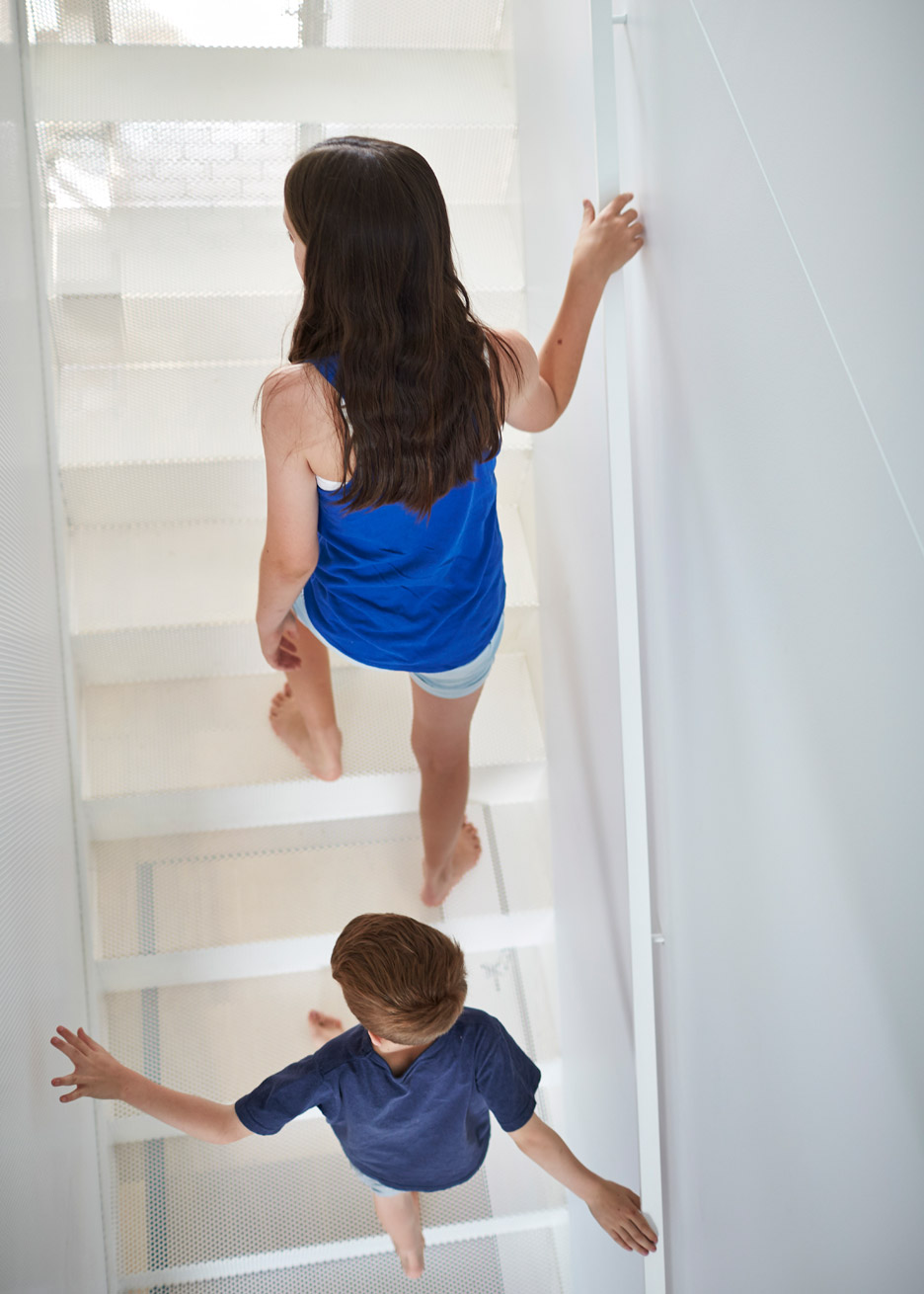
Perforated metal was also used inside the building, for the staircase leading up to two new bedrooms, as well as for the flooring of the upstairs corridor. The aim was to allow as much light to circulate as possible.
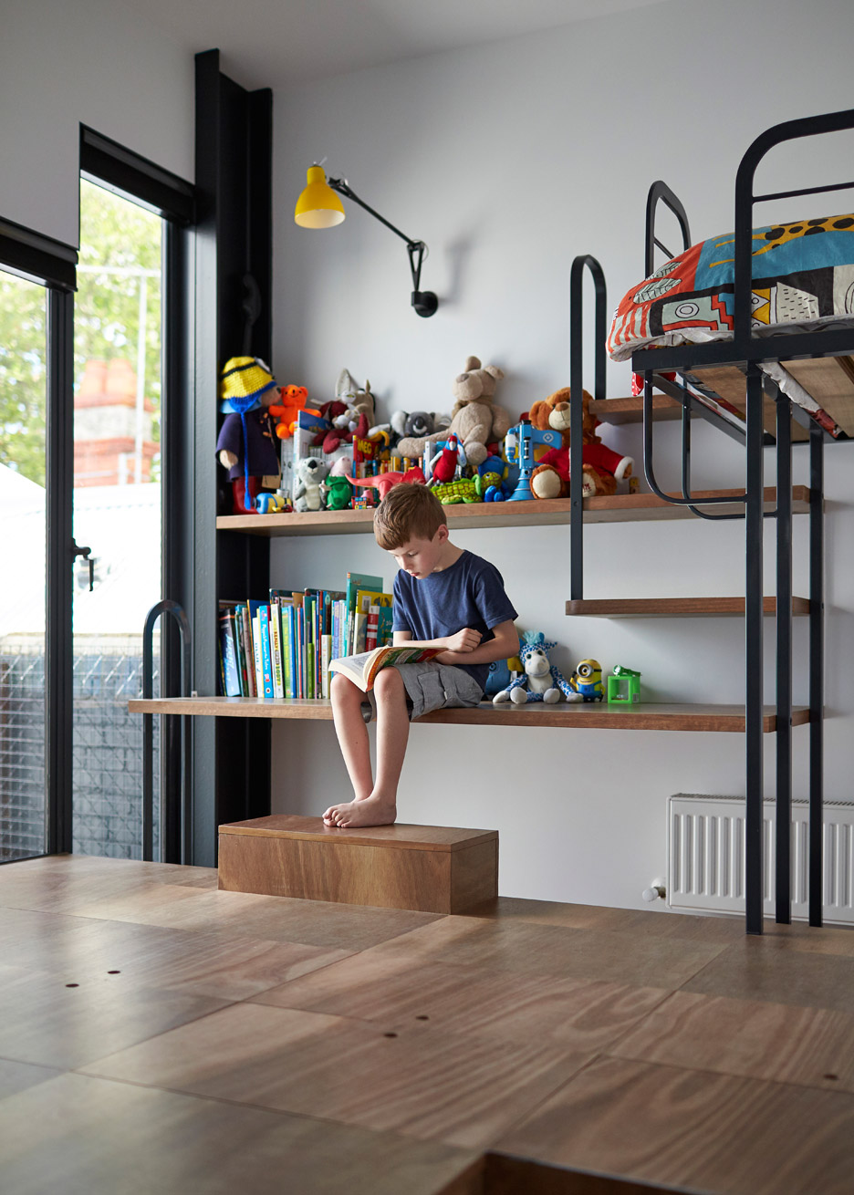
The master bedroom features a wall that slides open, while the children's room boasts more of the toy box flooring from downstairs, as well as a bunkbed that overlaps with a desk and bookshelf.
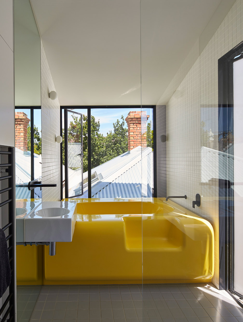
The family bathroom is also located on this floor, framed by a large window. The yellow bathtub is the centrepiece of this space.
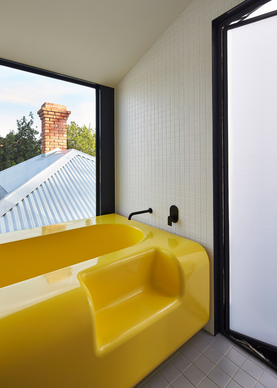
"No one likes cleaning a bathroom. Adding a bathtub to a small space creates a lot of fiddly details where grime, mess and mould can gather," said the design team.
"To avoid the mess, and to create a bathroom that was easy to maintain, we made our own bathtub out of fibreglass."
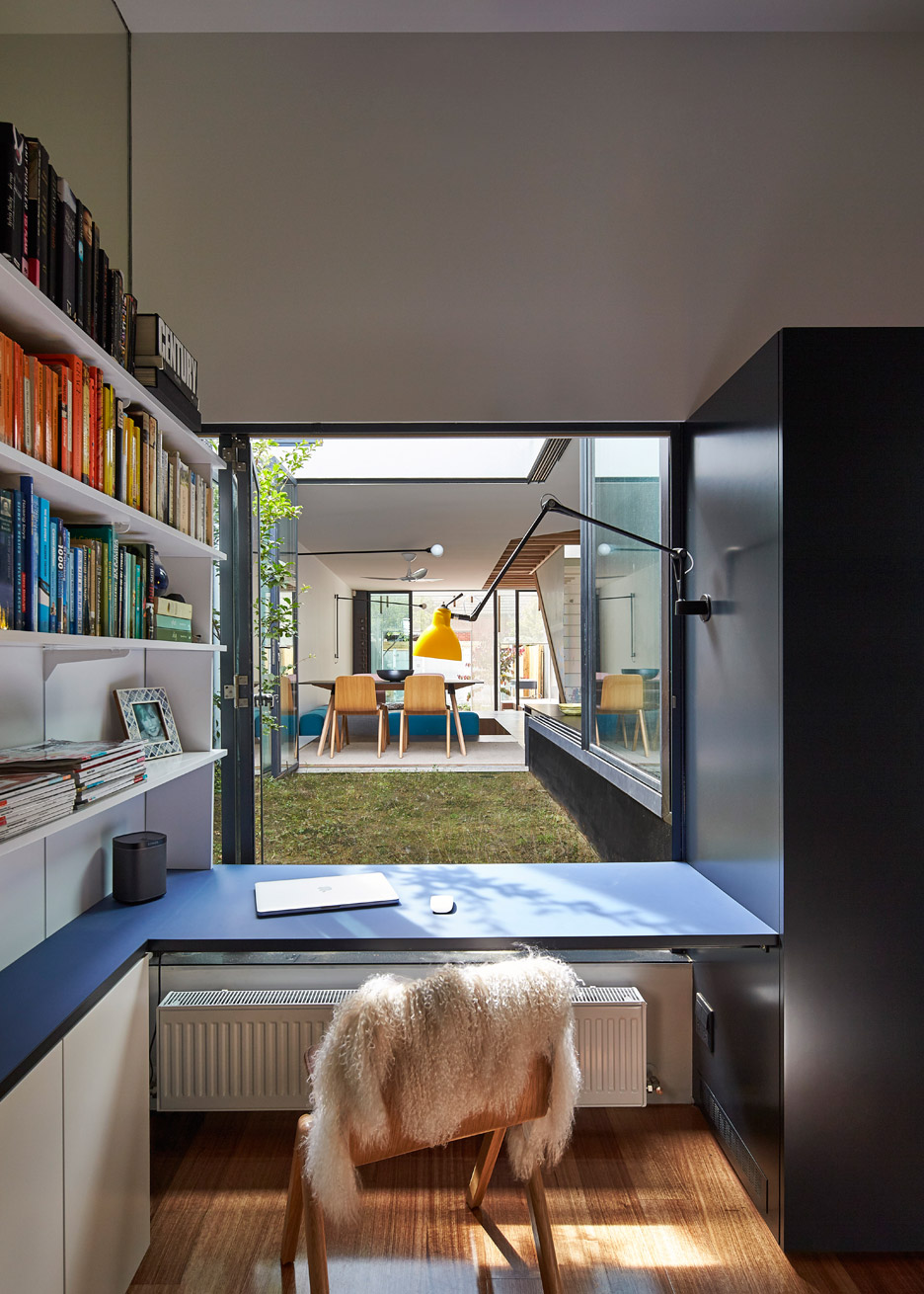
A second bathroom is located in the weatherboard-clad original house, along with a study and a guest bedroom.
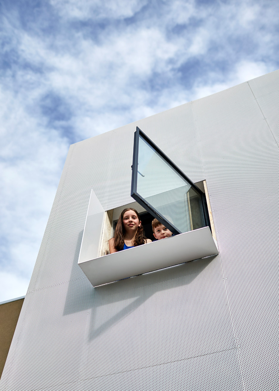
The 154-square-metre Mills house is the first project completed by Austin Maynard Architects since it rebranded to recognise the role of co-director Mark Austin, who has been working with studio founder Andrew Maynard since 2007.
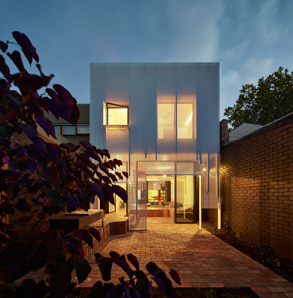
Other projects by the firm include a greenhouse-like house extension and a property with a periscope-shaped tower.
Photography is by Peter Bennetts.
Project credits:
Architect: Austin Maynard Architects
Design architect: Andrew Maynard
Project architects: Mark Austin and Natalie Miles
Builder: Grand Plan Properties
Engineer: Hive Engineering

