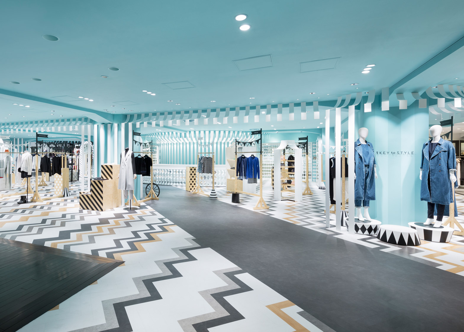
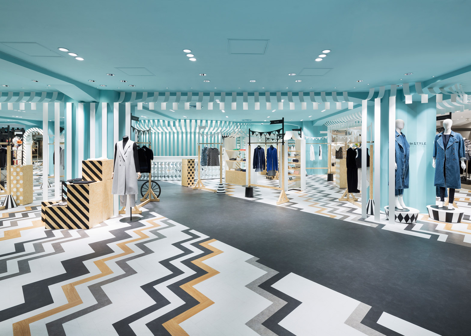
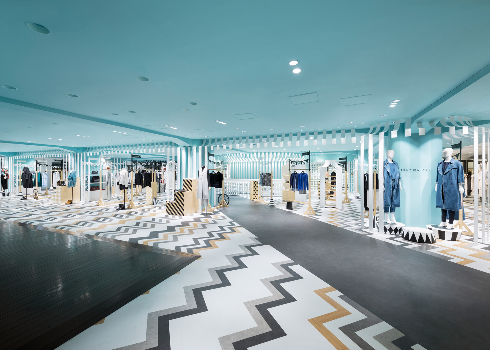
Japanese studio Nendo has returned to the Seibu Shibuya department store to revamp the women's fashion floor and hat area, using pastel colours and zig-zag patterns.
Nendo was tasked with overhauling the women's fashion department on the third floor of the Seibu branch in the Shibuya area of Tokyo, as well as the section dedicated to millinery on level two.
For the first zone – known as Key to Style – the studio built on the European park theme it previously used to style another women's clothing area at the store, situated in an annex building and named Compolux.
The latest project is located in the main building and connected to the annex by a walkway.
"We wanted to create a dynamic setting while maintaining the connection with the Compolux area that was inspired by a cozy European park," said Nendo. "Hence, we decided on the 'mobile amusement park' that is held at parks as the design theme."
The greyscale herringbone-patterned floor in the adjacent building extends halfway onto the bridge, so a reinterpretation as less regimented rows of zig zags continues into the new space.
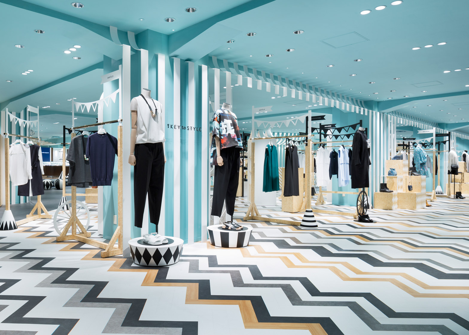
Turquoise paint was applied liberally, covering the ceilings and structural elements. This is paired with wood, black and white display stands, and decorative elements.
Striped awnings and lengths of bunting, abstracted into simple stripes and shapes, are used to divide spaces and embellish clothing rails.
"The design of the sales area is inspired by a circus tent, and the collection of the brands are arranged to give the impression of market stalls. The fixtures of the accessory floor were inspired by wagons.
Podiums for displaying accessories are surrounded by different black and white patterns, which are also used on pendant lamps and mirror surrounds in the jewellery area.
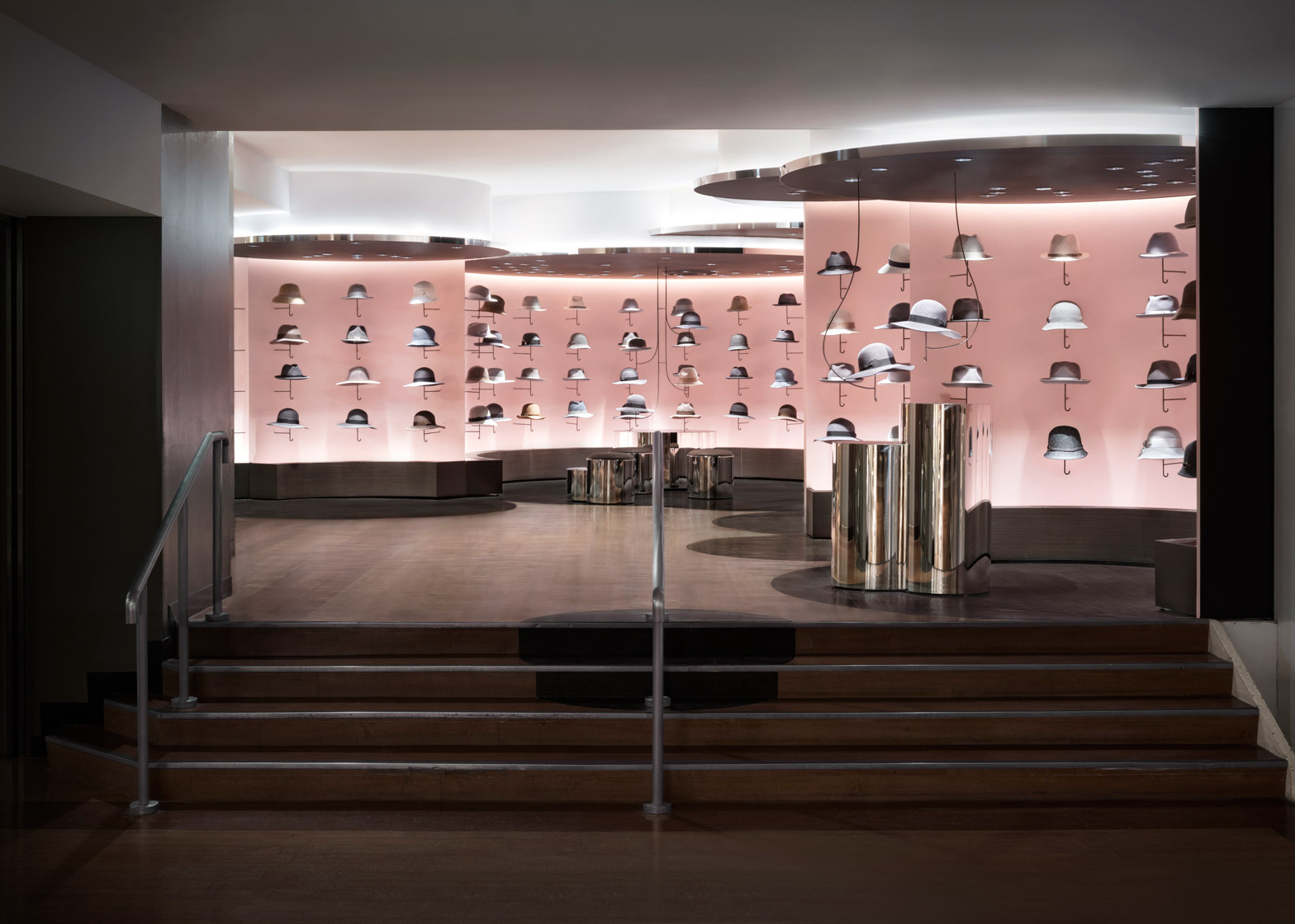
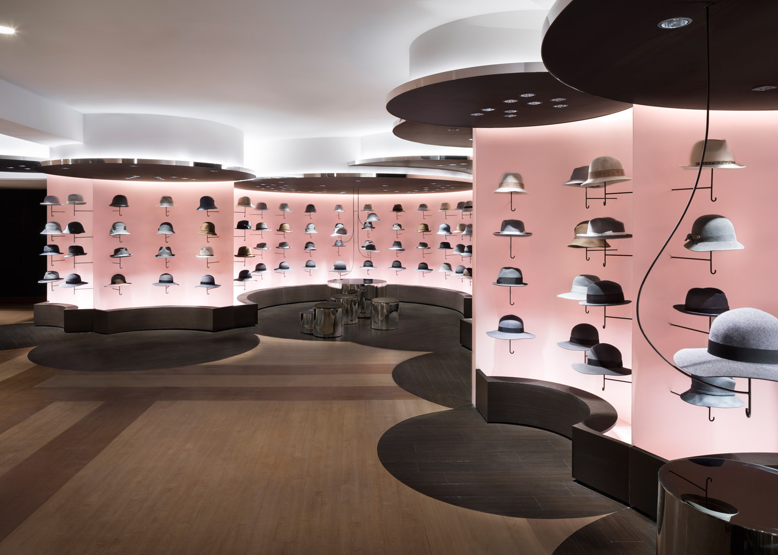
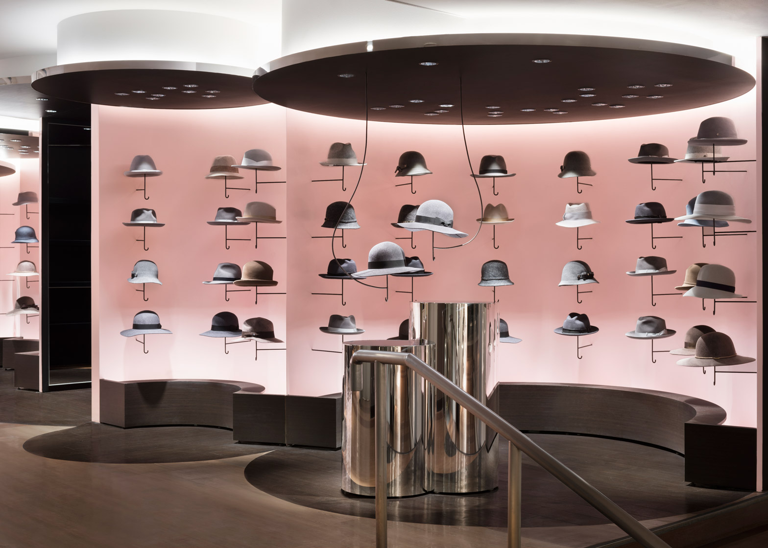
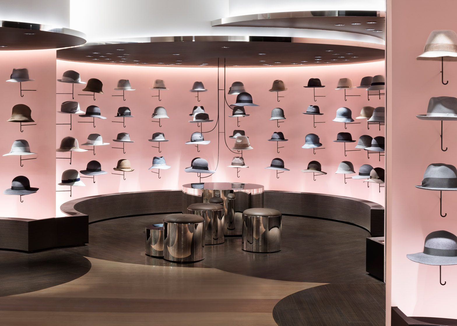
Nendo took a different approach in the hat department on the floor below, using cylindrical structures across the ceiling to hide uneven surfaces created by protruding beams.
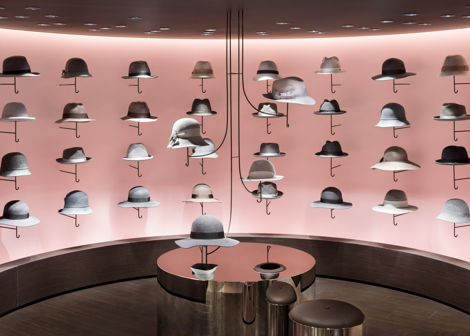
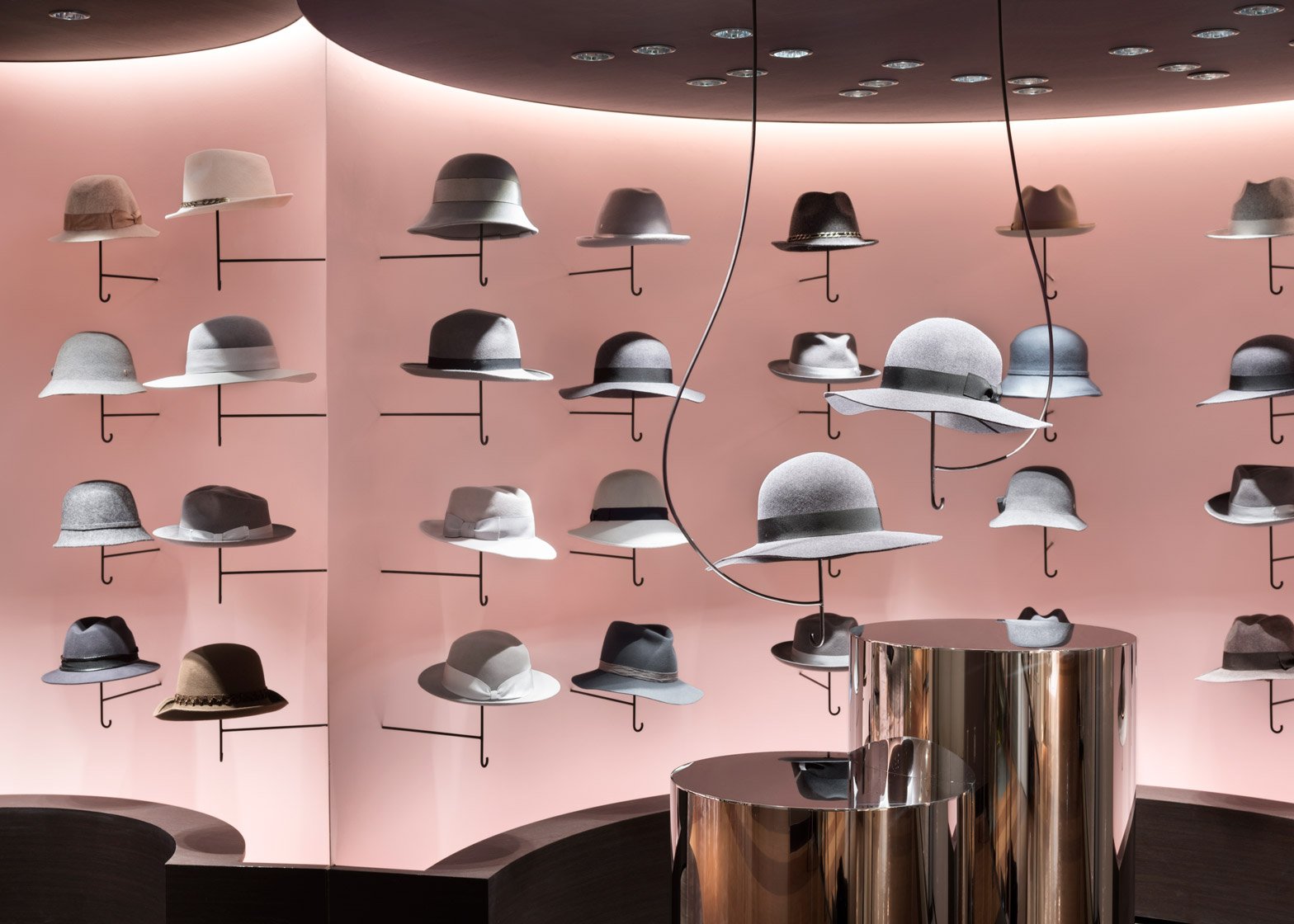
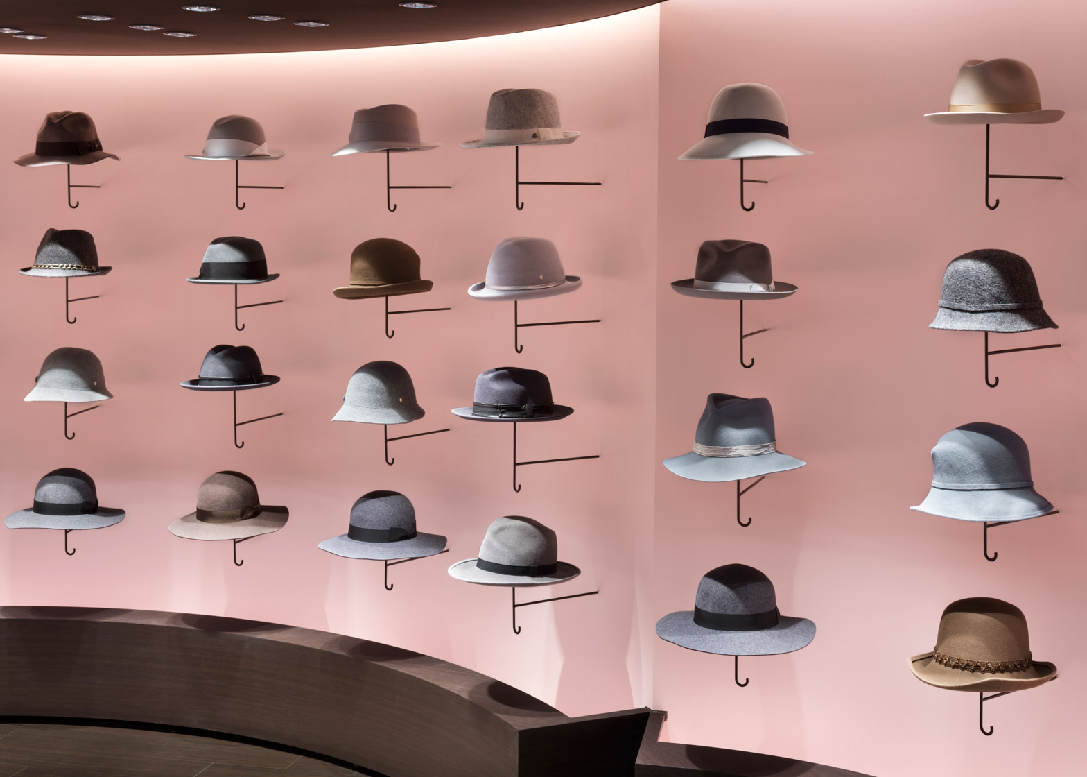
The circular elements are designed to look like clouds above the display areas, where hats are displayed on umbrella-like stands projecting from dusty-pink walls.
"Previously the goods in a hat store are displayed on shelves, and thus was the case with this store, however this time the hats were newly mounted on arms resembling a handle of an umbrella projecting from the wall," said the studio.
"Since hats help avoid the sunlight and protects the head, there is no out of place feeling with the image of an umbrella."
Umbrellas have been a common theme in Nendo's recent work. Over the past year and a half, the studio has launched a model that incorporates a cover into its handle and a design that stands up unassisted, as well as a squishy cube that helps store an umbrella vertically.
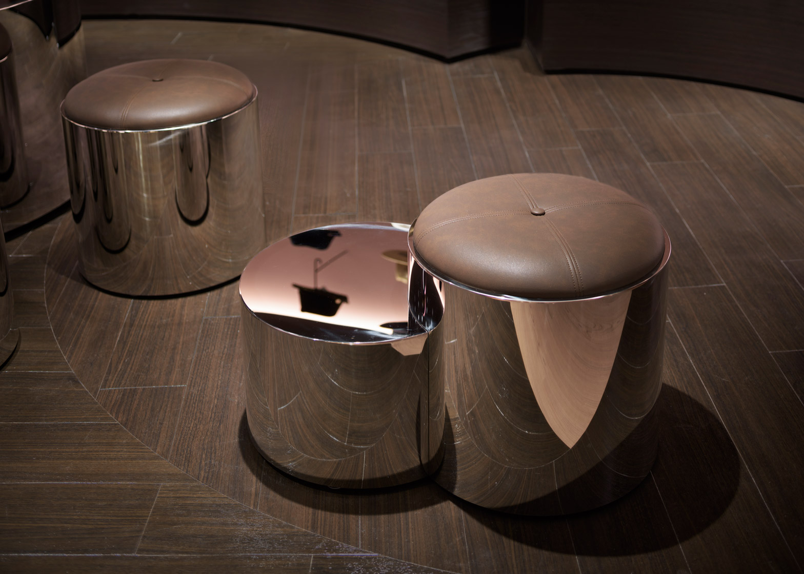
At the Seibu hat department, golden cylinders form stools and tables, with selected headgear highlighted on central ceiling-mounted branches. Areas of dark wood flooring mirror the "cloud" panels above, chosen to create a warm ambience.
In 2014, Nendo designed the concessions for its by|n range of products for Seibu – a subsidiary of Millennium Retailing, which also owns the Sogo department stores.
Better known for its product designs, Nendo is increasingly taking on interior design and architecture projects according to studio founder Oki Sato.
Photography is by Takumi Ota.

