Uber rebrands with location-specific "asshole" logos based on bathroom tiles
Taxi service Uber has launched a new identity designed by the company's CEO, which presents users in different countries with customised colours and patterns, and which has already been compared to an "asshole".
Unveiled yesterday, the branding is centred around a theme of bits and atoms to represent Uber's technology and human focus.
Rather than hiring a designer, CEO and co-founder Travis Kalanick worked with Uber design director Shalin Amin on the redesign. Kalanick told Wired magazine that this was because he didn't trust anyone else to do it for him.
The new design has already been called out as "confusing" by Techspot and likened to an "asshole" when turned on its side by Gizmodo.

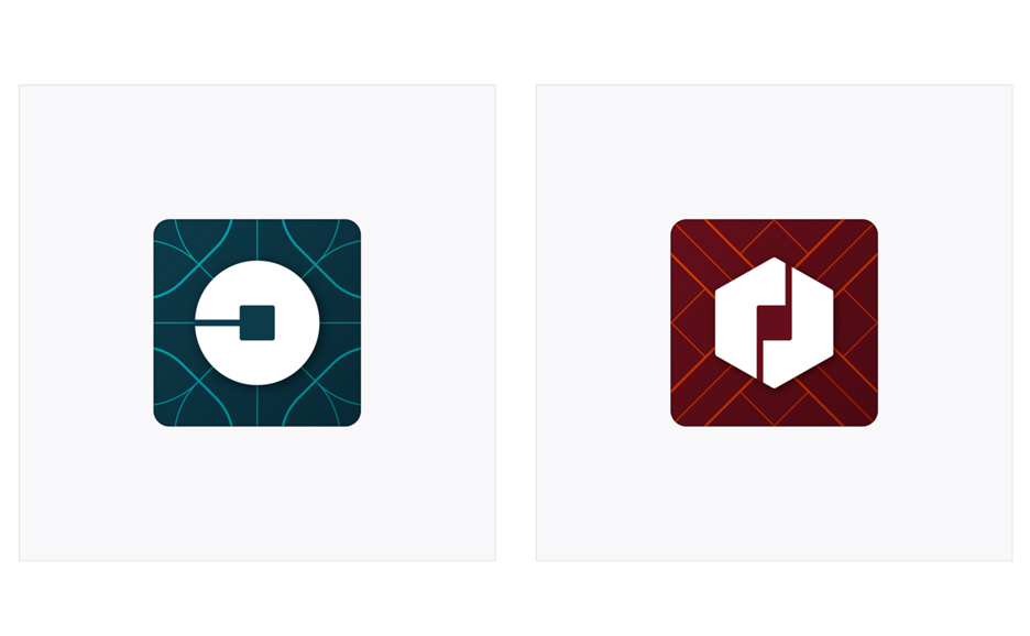
Patterns found across the background of the revised app icon and loading screen were devised by communications designer Catherine Ray, who was reportedly inspired by small square tiles in her bathroom.
The recognisable U on the icon has gone – replaced by a circular motif for riders and a hexagonal shape on partners' devices. Both have a square "bit" in the centre, which has led to the comparisons to an anus.
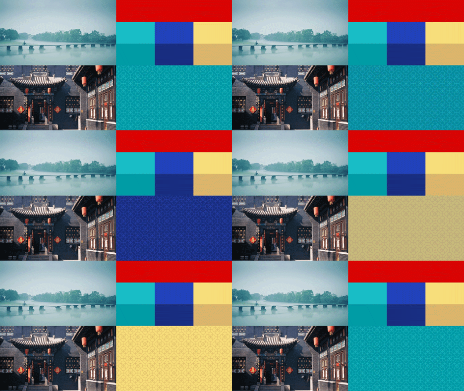
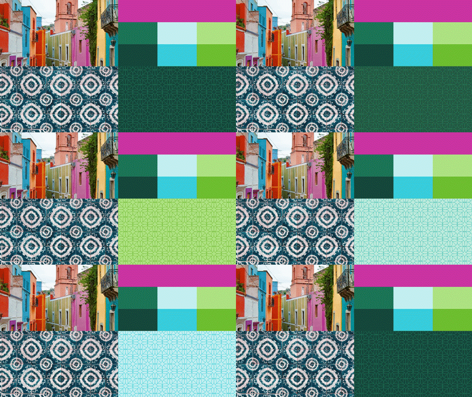
Instead of black and white, Uber has opted for a colourful palette influenced by mood boards of architecture, textiles, scenery, art and fashion in the countries it operates in.

"In Mexico, we were inspired by Mexican pink and the patterns in the local tiles; in Ireland, from the Georgian architecture and the lush greens; and in Nigeria, from the ankara, which came up again and again because of its bright colours and beautiful geometric patterns," said Kalanick.
Users in the different countries see a customised version of the identity to match these colours. The company also plans to roll out city-specific versions of the colours and patterns as time goes on.

The typeface used for the new written logo is thicker, more condensed and simplified to remove the curls on the U and R – a move the company described at cutting off its "1990s hairstyle".
"This will help you see Uber from afar, and when it's in small places," said Kalanick. "It also reflects a more substantial look as we too have matured as a company."

Kalanick set up Uber with Garrett Camp in 2009, as a black car service for 100 friends in San Francisco. Its first logo was a red magnet designed by Camp, which the greyscale identity the new logo replaces was introduced in 2011.
Other recent controversial rebrands include Airbnb's design overhaul, which was quickly compared to human genitalia, and sparked a series of variations and memes.