Glass walls and a generous light-filled atrium offer plentiful views of the surrounding garden and sky for residents of this north London house by Threefold Architects (+ slideshow).
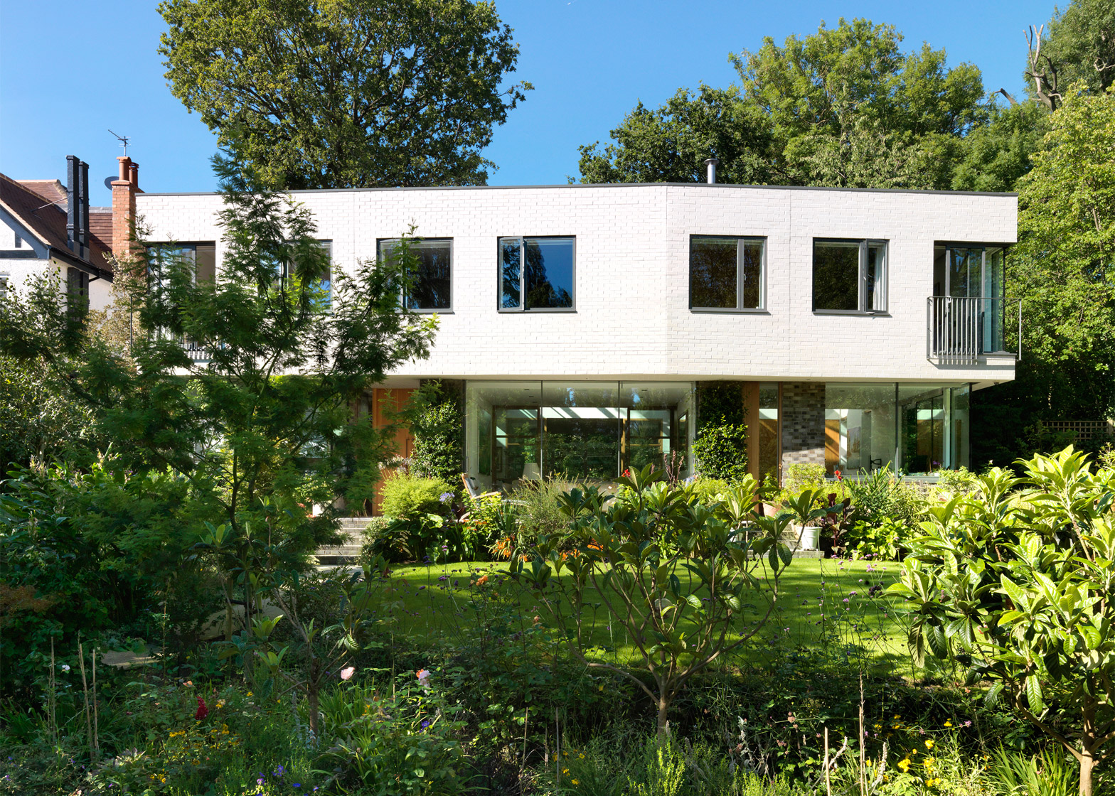
Located at the end of a terrace in Highgate, the two-storey residence was planned to sit amongst trees, plants and lawns, so the London-based Threefold Architects team allowed this to shape their design.
They added floor-to-ceiling glazing at ground level, created juliet balconies on the upper floor, and also arranged the floor plan around a top-lit atrium. This helps to brings light right through the building.
"We sought to create a house where the garden almost flowed though it," explained studio co-founder Jack Hosea.
"This led to an open ground floor plan that is dug into the site at the back and virtually glazed on all sides, with the central atrium creating a flexible space drawing light and views right into the heart of the house."
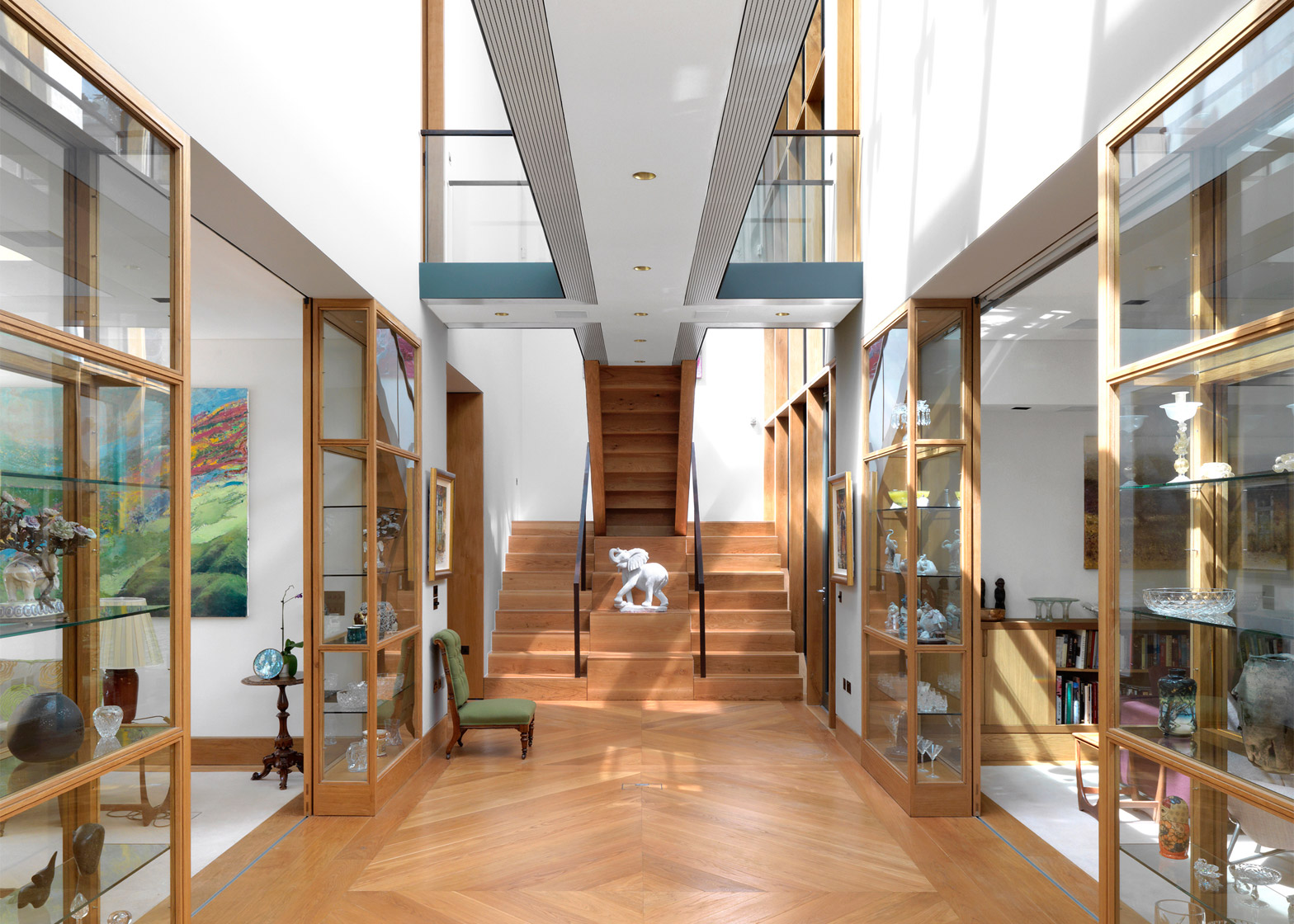
Named Garden House, the building provides a home for retired couple. The pair are keen collectors of objets d'art, so display cabinets become an integral aspect of the design.
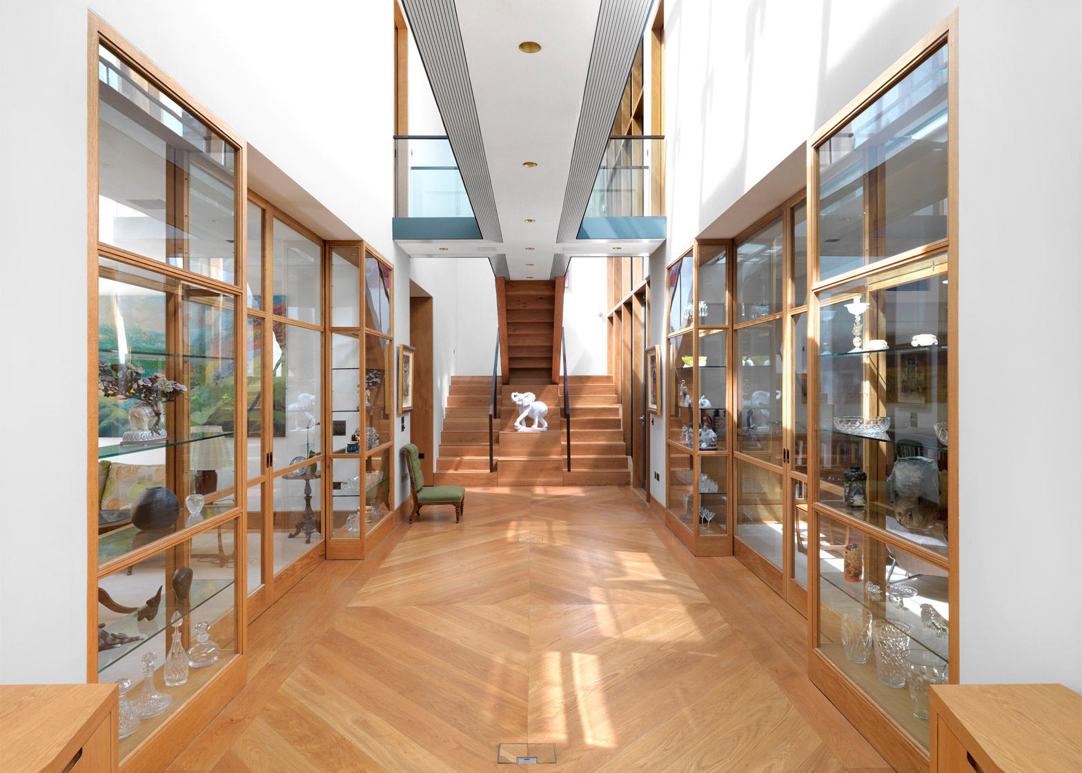
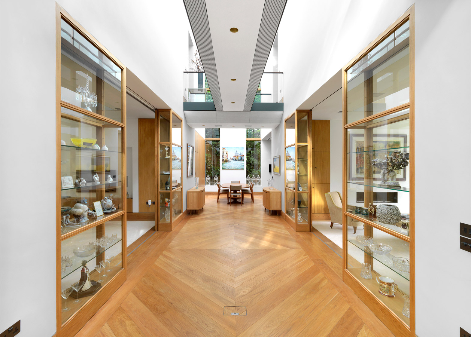
These are located on either side of the atrium, and are glazed on both sides to allow the objects within to be visible from different rooms. This arrangement also helps light to flow through the building, and increases the visibility of the garden.
"Having built up a significant collection over their lifetimes, the clients wanted to integrate the display of some of their favourite pieces into the main living spaces," Hosea told Dezeen.
"We designed a system of bespoke cabinets that act as semi-permeable walls to divide the ground floor living spaces, whilst at the same time allowing views through."
The atrium spans the entire building, with a staircase at the end. On the ground floor, it separates the living room and the study from a drawing room, a kitchen, a music room and the main entrance.
On the upper level, a pair of bedrooms are located on each side. These are connected by narrow bridges, creating a series of lightwells for the space underneath.
Two types of brick were chosen for the exterior walls to help visually break up the building's mass. At ground level, the large windows are framed by dark charred bricks, while textured white bricks were chosen for the bulkier upper level. This results in a light and shadow effect.
"The planners were insistent on a 'white' first floor volume that echoes the period houses on the street," explained Hosea. "Rather than render, we wanted to use a light brick to break up the surface of the volume."
"The ground floor is predominantly glassy, but where structural elements were required to support the volume above we wanted to express this clearly and solidly in a dark textured brick as a counterpoint to the slick glazing," he added.
Inside, the flooring has one of the most noticeable materials finishes – oak floorboards are laid in alternating diagonals to create a symmetrical pattern through the atrium.
Oak details are also picked up in other areas. The material frames the display cabinets and windows, and was used for the doors and staircase – which also integrates a display space for a large sculpture.
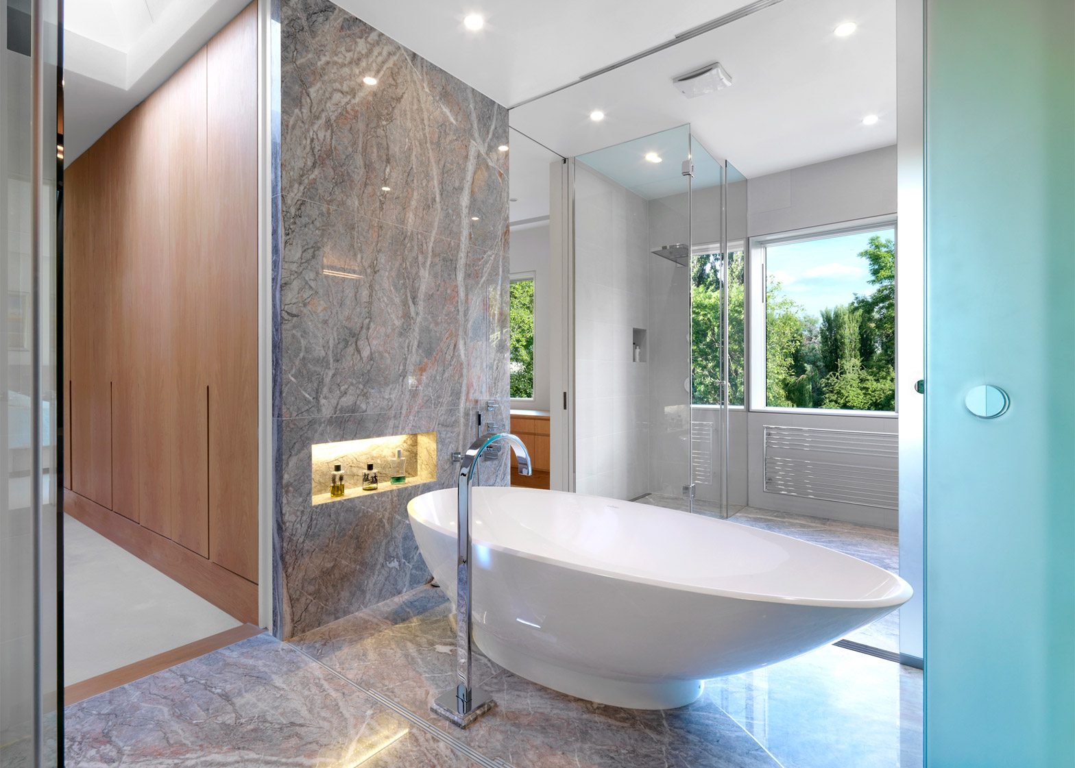
The bathroom is lined with grey marble, and contains a freestanding bath tub.
Threefold Architects is led by Hosea, Matthew Driscoll and Renée Searle. Past projects by the studio include a Norfolk artist's studio and a courtyard house on Richmond Park.
Photography is by Charles Hosea.
Project credits:
Architect: Threefold Architects
Structural engineer: TALL Engineers
Contractor: Bryen & Langley
Glazing: Vitrine Systems, Fineline, Velfac
Bricks: Wienerberger
Flooring: Chauncey's, Brinton Carpets, Fiore Di Pesco
Sanitary Ware: Dorn Bracht, Crosswater
Kitchen: Mark Wilkinson
AV: Firefly

