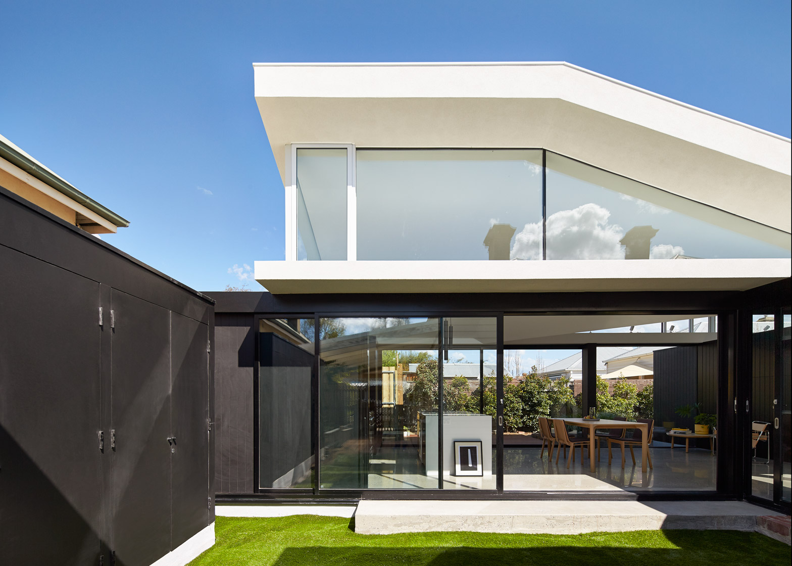
A corridor framed by reclaimed bricks and glass separates this Melbourne house from a new extension built in the back garden by local architecture firm MODO (+ slideshow).
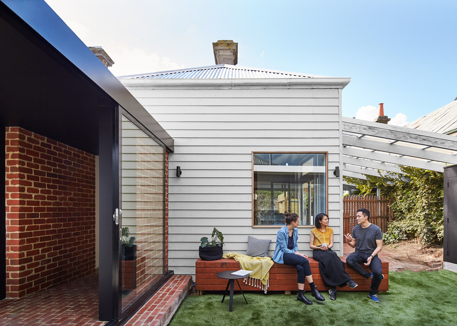
MODO founder Michael Ong was keen to create a clear distinction between the extension and the original property – a typical bungalow located in east-Melbourne suburb Hawthorn.
The aim was to allow as much light into the building as possible, and also frame courtyard areas for the residents.
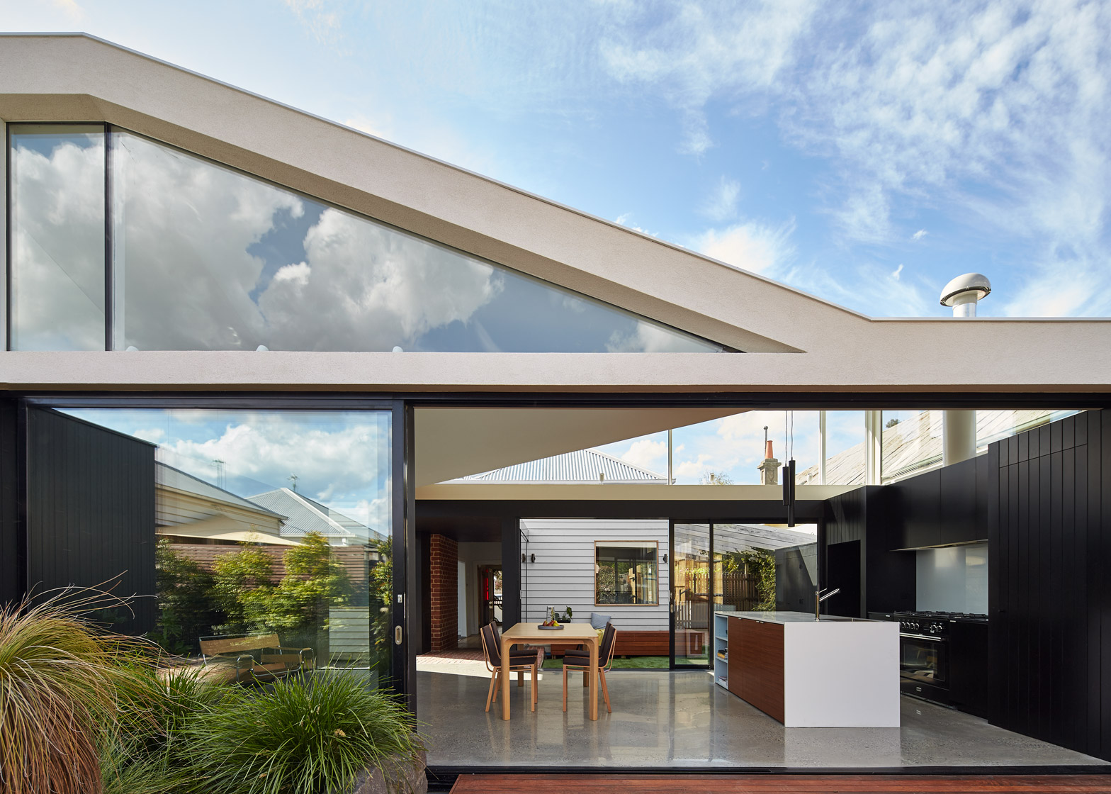
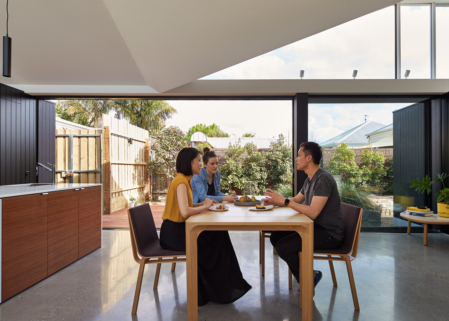
With a design based on park pavilions, the new structure provides a generous kitchen and dining space that can be fully exposed to the garden.
"After a few briefing sessions with the clients, it became very clear that their lifestyle revolved around their garden and spending their days outdoors," explained Ong, whose past projects include a boxy wooden house perched over masonry walls.
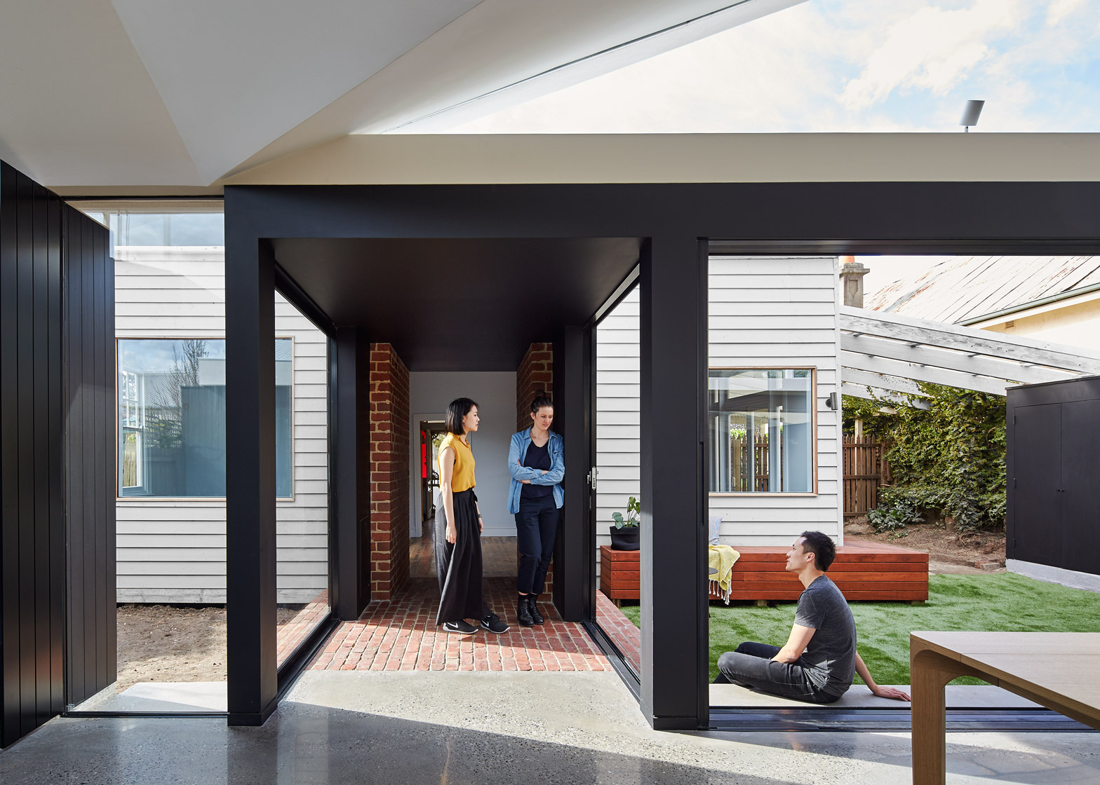
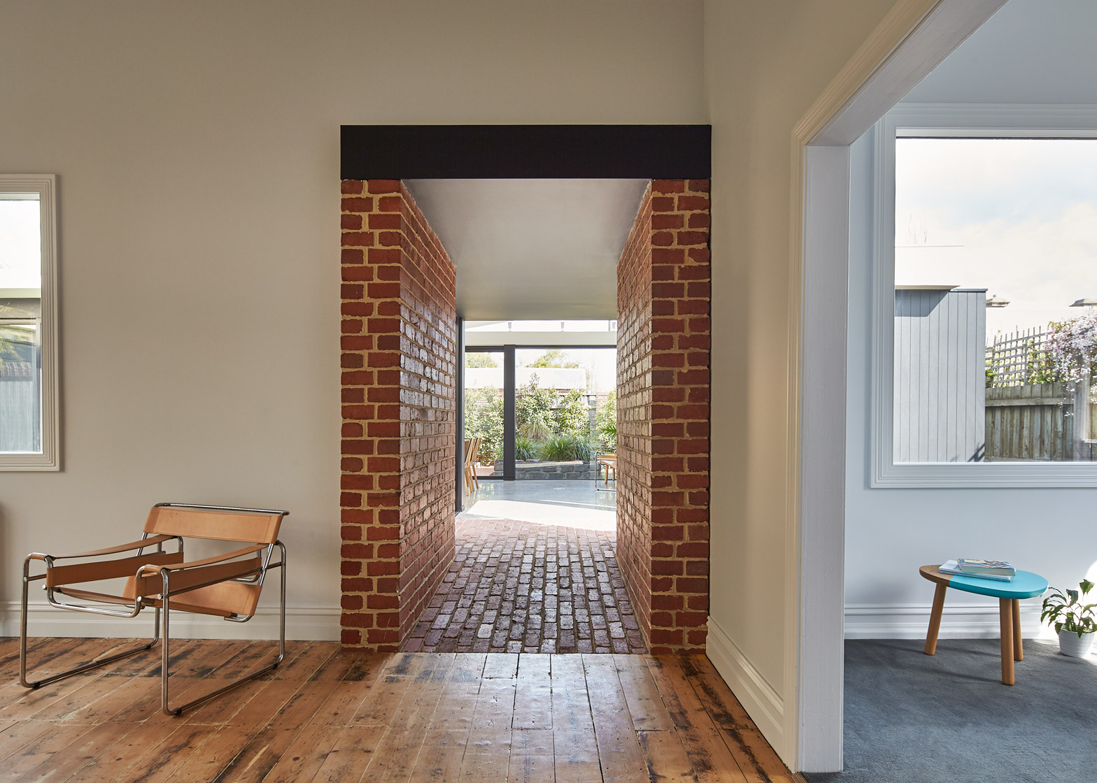
"We decided to build a stand-alone structure off the front house and connect the two spaces with a central passageway," he added.
"Conceptually, this allows the two built forms to contrast their individual characteristics, creating an architecture that provides clear distinction between old and new."
While the main house features a simple facade of white-painted wooden siding and rectangular windows, the extension is almost entirely glazed at the front and the back, making it possible to see through the building and to open it up to the garden.
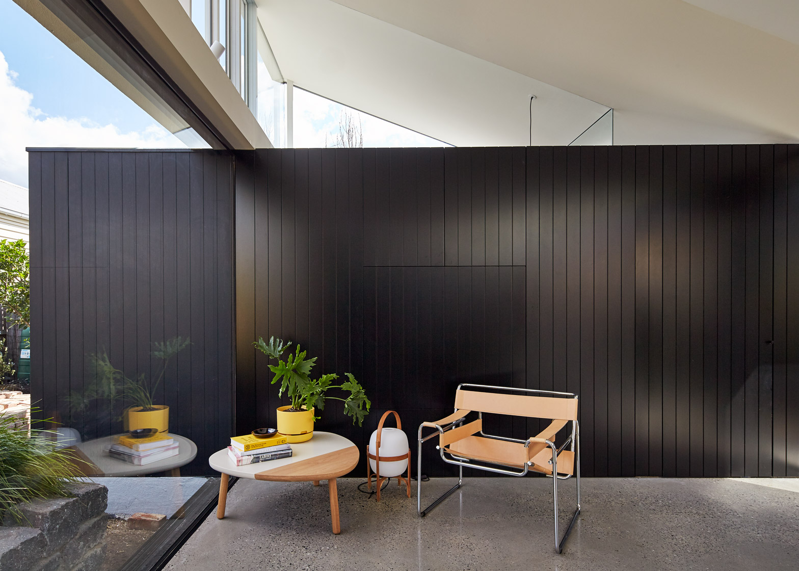
The few opaque walls are painted black rather than white, emphasising the contrast between the two different blocks.
"The concept of the addition is to borrow qualities you may find in a park pavilion," said Ong. "Rather than creating a wall space with windows and doors punched out, we decided to mirror it and place objects, lines and planes to hold the space, with the spaces between glazed."
"By reversing this approach, we visually open the living areas to the garden, the 'walls' are now the garden itself, which subtly changes throughout the day, evening and season," he added.
The tunnel-like corridor connects the extension with the living room in the main house. Reclaimed bricks form the ground surface and the framing walls, but it is glazed on both sides.
The project is named Tunnel House in tribute to this addition.
The spaces either side of the corridor form a pair of grassy courtyards for residents. There is also a decked terrace on the opposite side of the extension, surrounded by raised planting beds.
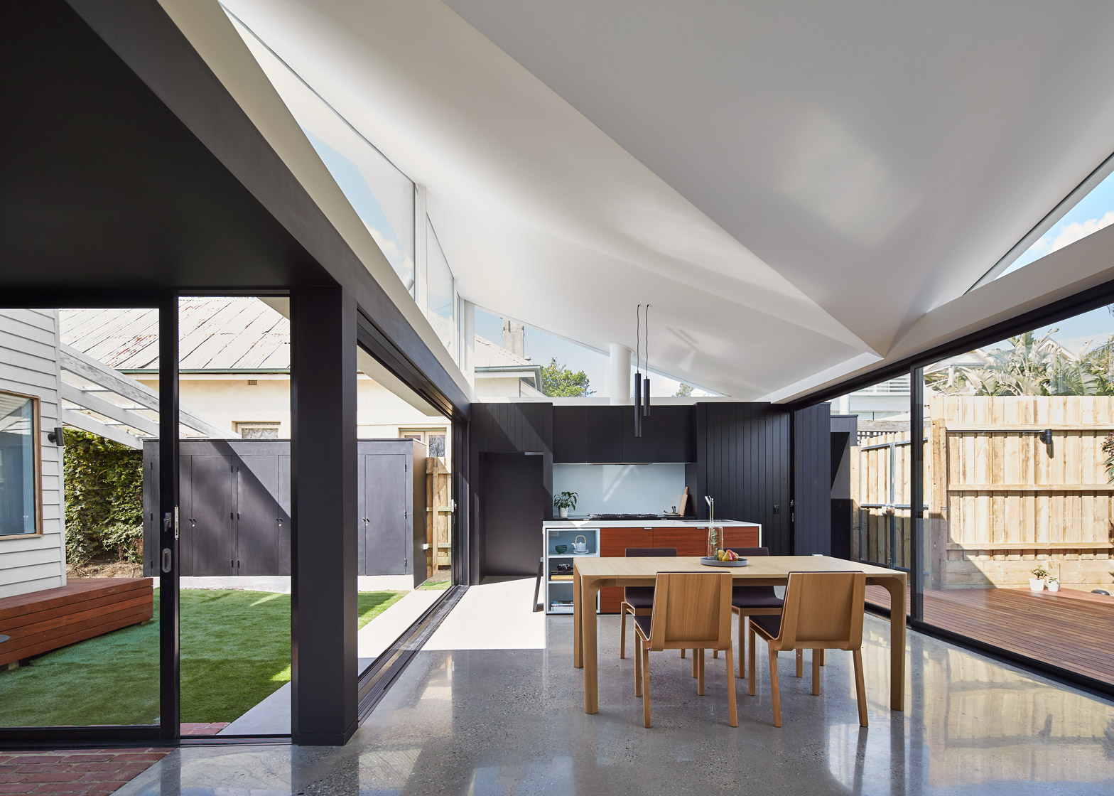
Inside, the large open-plan extension features a concrete aggregate floor, as well as a faceted ceiling that follows the irregular form of the roof.
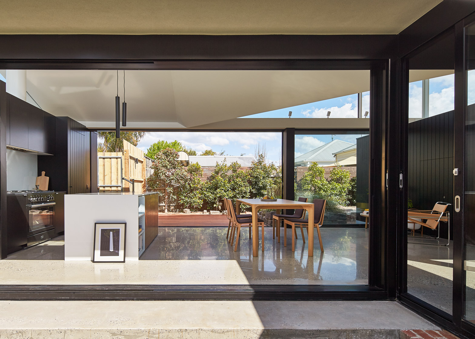
The kitchen comprises a white island with wood-fronted cabinets, as well as a worktop recessed into the rear wall. A pantry is tucked away behind this space.
The rest of the space accommodates a large dining table, lit from above by low-hanging pendent lights. There is also a bathroom slotted behind the western wall.
"With the doors fully opened, the interior space becomes incredibly permeable and invites the garden through the space to become the hero of the story," added Ong.
The existing house was left largely untouched, aside from a few repairs. The addition of the new kitchen and dining space leaves enough space for two bedrooms and a study.
Photography is by Peter Bennetts.
Projects credits:
Architects: MODO
Builder: Seventy7 Projects
Furniture design: Ajar design & furniture


