NC Design & Architecture hides Hong Kong restaurant behind grocery stall
A facade resembling a Thai grocery stall disguises this restaurant in Hong Kong, which local firm NC Design & Architecture designed to look like a film set (+ slideshow).
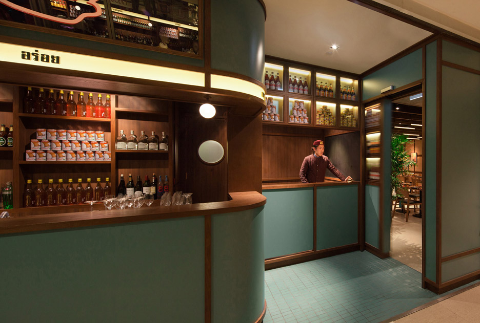
NC Design & Architecture looked to wooden villas and shophouses – a type of building typical in Southeast Asia – as the starting point for the Mak Mak restaurant interior.
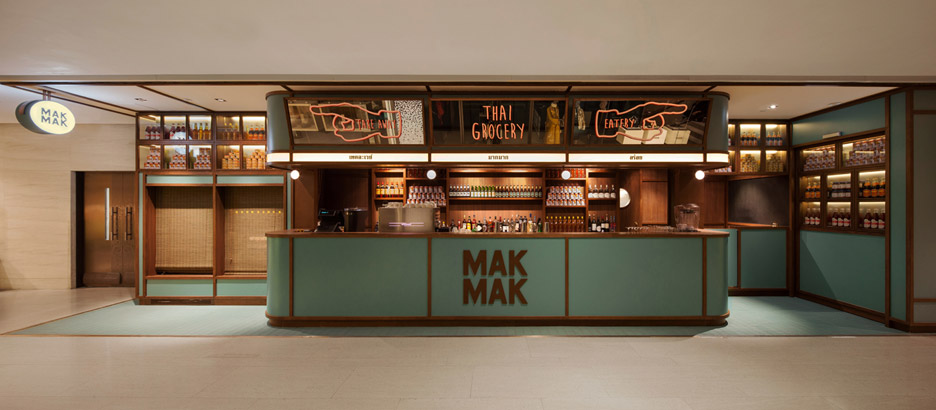
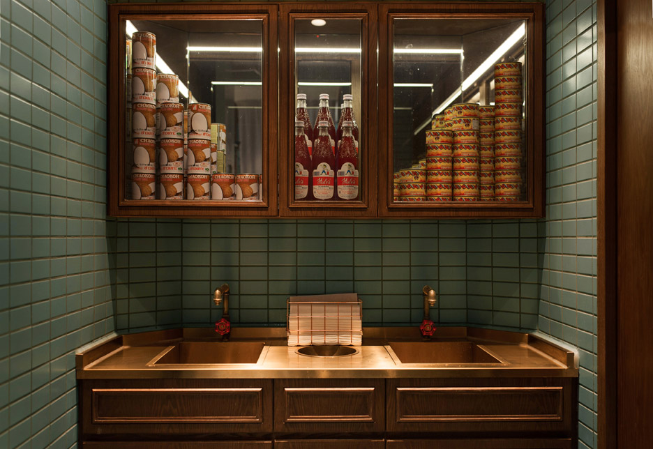
This led to a decision to conceal the restaurant behind a facade resembling a 1960s Thai grocery shop, featuring cabinets and shelves stacked with canned coconut milk, chillies and bottles of red sala syrup.
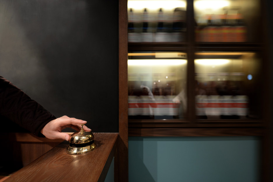
The entrance area functions as a bar and a takeaway counter. But pressing a button disguised as a service bell causes a grocery display cabinet to open, revealing the entrance to the restaurant.
"To gather inspiration for Mak Mak, we spent countless hours researching shophouses and wooden villas in Thailand," said architect Nelson Chow.
"We knew we wanted to give the space a uniquely cinematic environment, so we re-watched our favourite Wes Anderson and Wong Ka Wei movies – films that have characteristics everyone recognises, but often with a twist in terms of the colours or contexts."
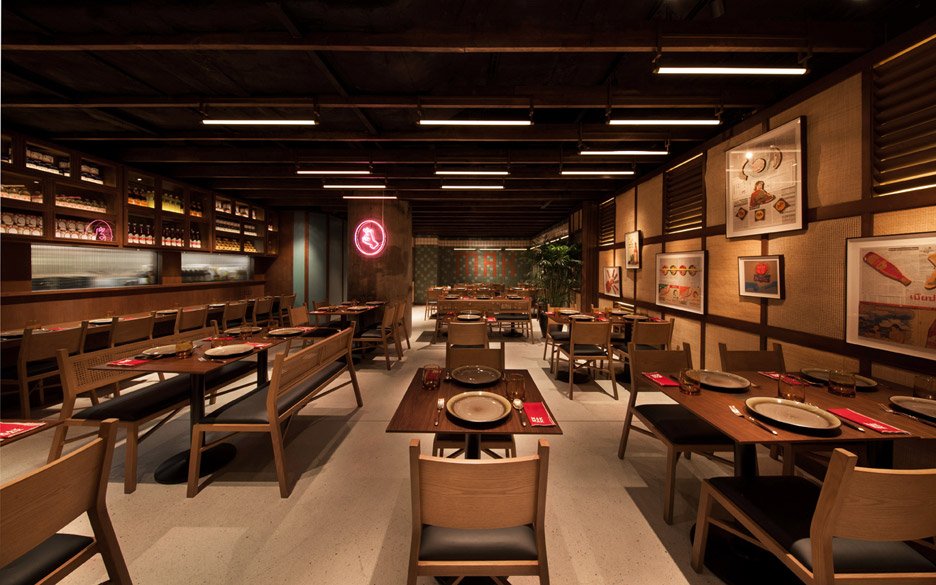
"In a good film set, everything from the interior to the details are equally important," he added. "That said, with Mak Mak we designed everything from the interior, furniture, lighting and making of the artworks, to create a holistic experience for the visitors."
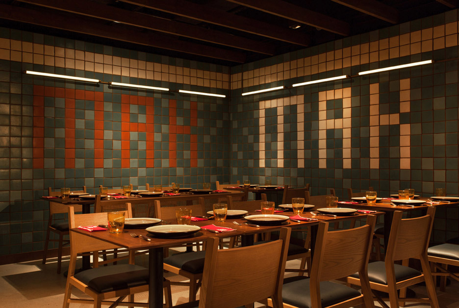
"Our goal was to transport visitors away from their normal, everyday lives so and inspire them in the company of good friends and good food for a few hours."
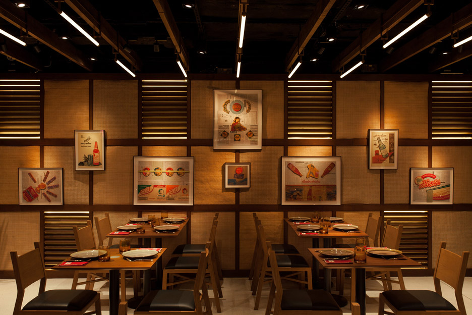
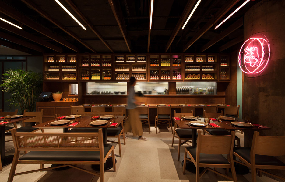
Inside the windowless restaurant, lights shine behind rattan-covered walls to create a soft glow that could be mistaken for sunlight.
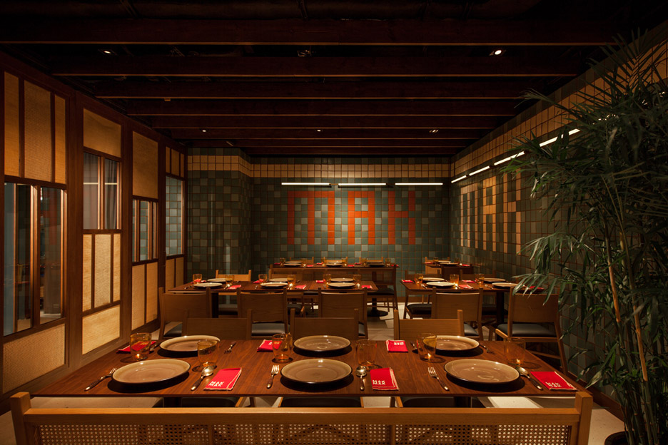
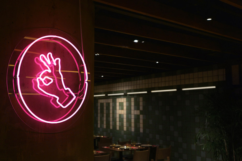
Teal, red and while tiles cover two of the restaurant's walls, and are used to spell out the restaurant name.
Fluorescent LED lighting tubes are installed throughout the eatery. A pink hand-shaped neon is mounted on an interior pillar in the centre of the restaurant, creating the outline of a hand giving the A-OK gesture.
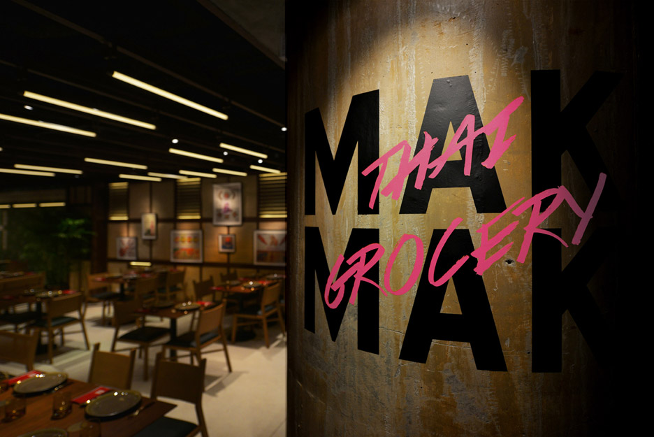
Timber chairs and benches are upholstered with moss-green leather. Wooden tables are adorned with earth-toned plates and bright red menus.
NC Design & Architecture also recently disguised a Hong Kong speakeasy as an umbrella shop. Other projects by the studio include a monochrome fashion boutique and a restaurant that references Malaysian coffee shops of the 1920s.
Photography is by Dennis Lo.