"It's probably not the solution to obesity"
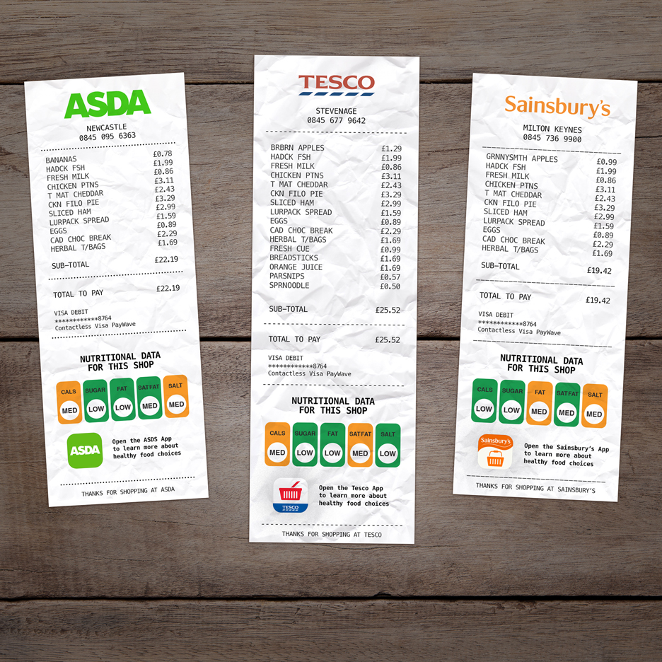
Comments update: introducing graphics that show nutritional information on supermarket receipts isn't enough to solve the "obesity epidemic", according to readers. Read on for more on this and explore our comments page to keep up with the latest discussions.
Fat busters: UK designer Hayden Peek proposed adding a simple colour-coded design to all supermarket receipts that would give shoppers an overview of how healthy their purchased items are.
But some readers felt it didn't go far enough. "Maybe they could print warning pictures of morbidly obese people and amputees with diabetes on overly fat or sweet products," wrote one guest commenter.
"It's probably not the solution to obesity, but it would definitely get people thinking and that is a great start," replied Durgen Jensen.
"Getting people thinking is the key," agreed Peek, who replied to a number of criticisms from Dezeen readers. "Research shows that people are often blind to obesity itself and this idea was designed specifically to try and cure this curious blindness," he added. Read the comments on this story »

Brooklyn heights: SHoP Architects unveiled new images of its supertall tower proposal for Brooklyn and commenters were quick to air their views on the controversial skyscraper design.
While some described it as "gorgeous" and "beautiful", many were unconvinced.
"The bronze looks great conceptually," said Laura Ryerson, "but wait until it's a disgusting glass and oxidised-green bronze blemish in the skyline."
"I feel like the affordability and humility of Brooklyn is its greatest asset," added regular commenter Archi-Nerd. "Putting it on the 'global stage' is the opposite of what New Yorkers should want."
"Debatable as the project may be, at least it shows the architects investigating more than just the impact on the skyline," replied Heywood Floyd. Read the comments on this story »

Appiness: a concept for a stripped back, app-free mobile phone designed to prevent users acting like "mindless zombies" was one of last week's most-discussed stories.
"The one downside of this concept would be having to talk to people," joked Aaron, while others recommended purchasing old devices for those frustrated with new technologies.
"I know plenty of older people who like talking on the phone and find smartphones too complicated," said Elizabeth. "My only issue would be the lack of language, as a contacts list would be great."
"The biggest reason this is a backward step," countered Felix, "is because a smartphone can already do everything this phone does simply by installing a simplified OS or launcher." Read the comments on this story »

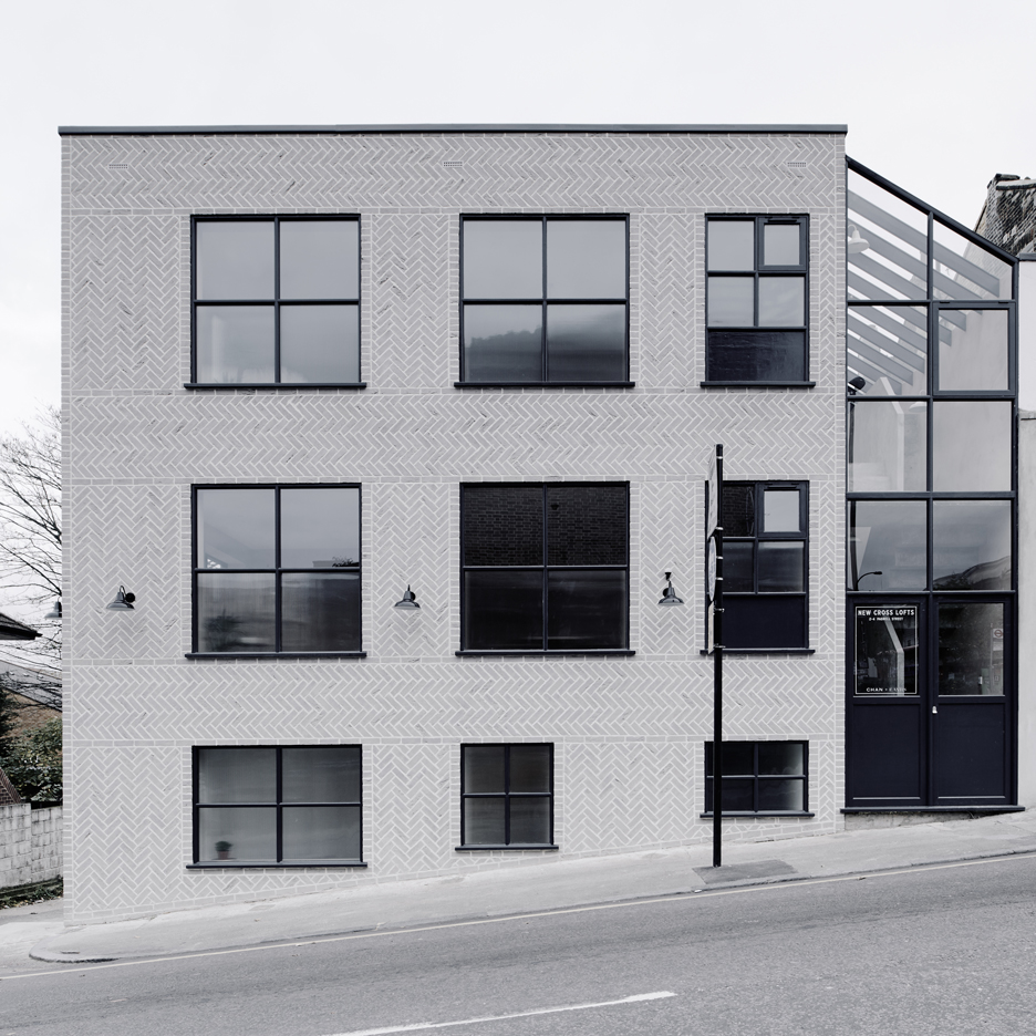
Herringboner: commenters were almost unanimous in their praise for this new housing block constructed in New Cross, southeast London, which features a herringbone pattern across its facade.
"It's an absolutely stunning property," said Kobi. "The use of materials is almost pornographic."
However, others didn't think the property's design connected to the local area.
"To me it looks like something built in Sweden rather than southeast London," wrote James. "Why doesn't it speak of the vibrant place in which it sits?" Read the comments on this story »