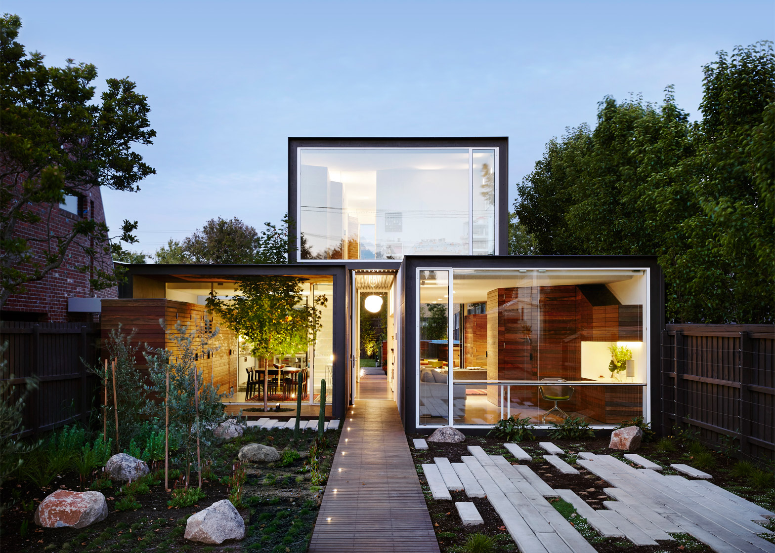
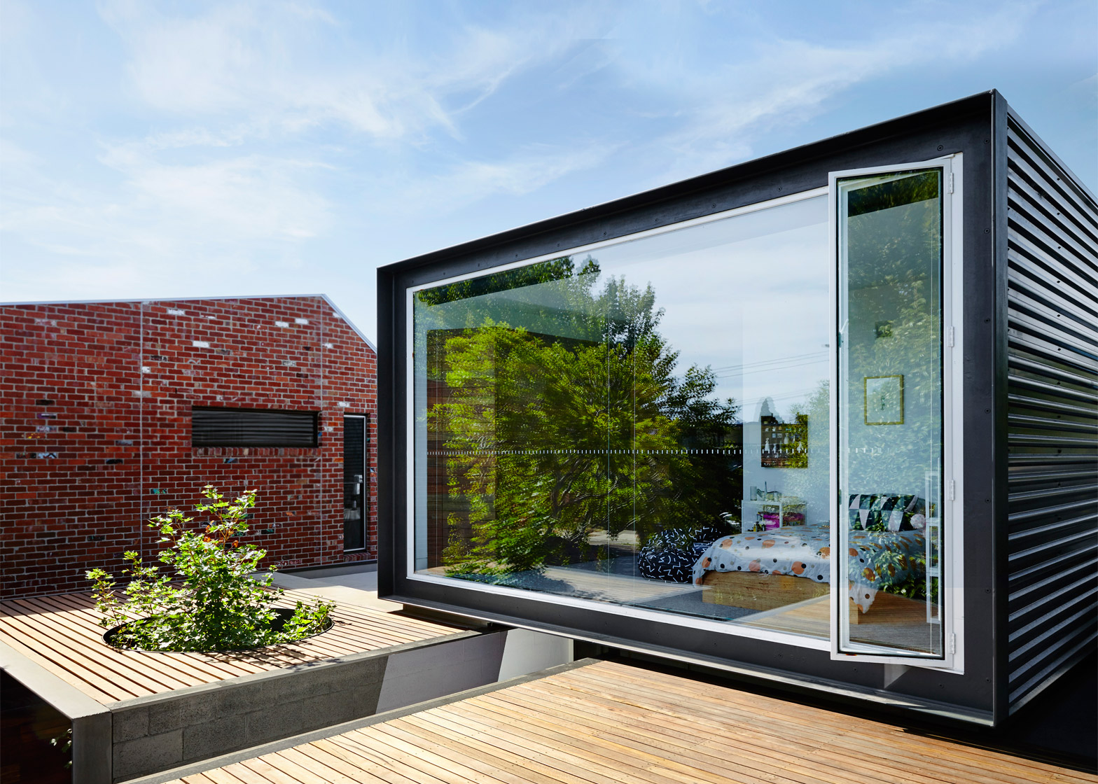
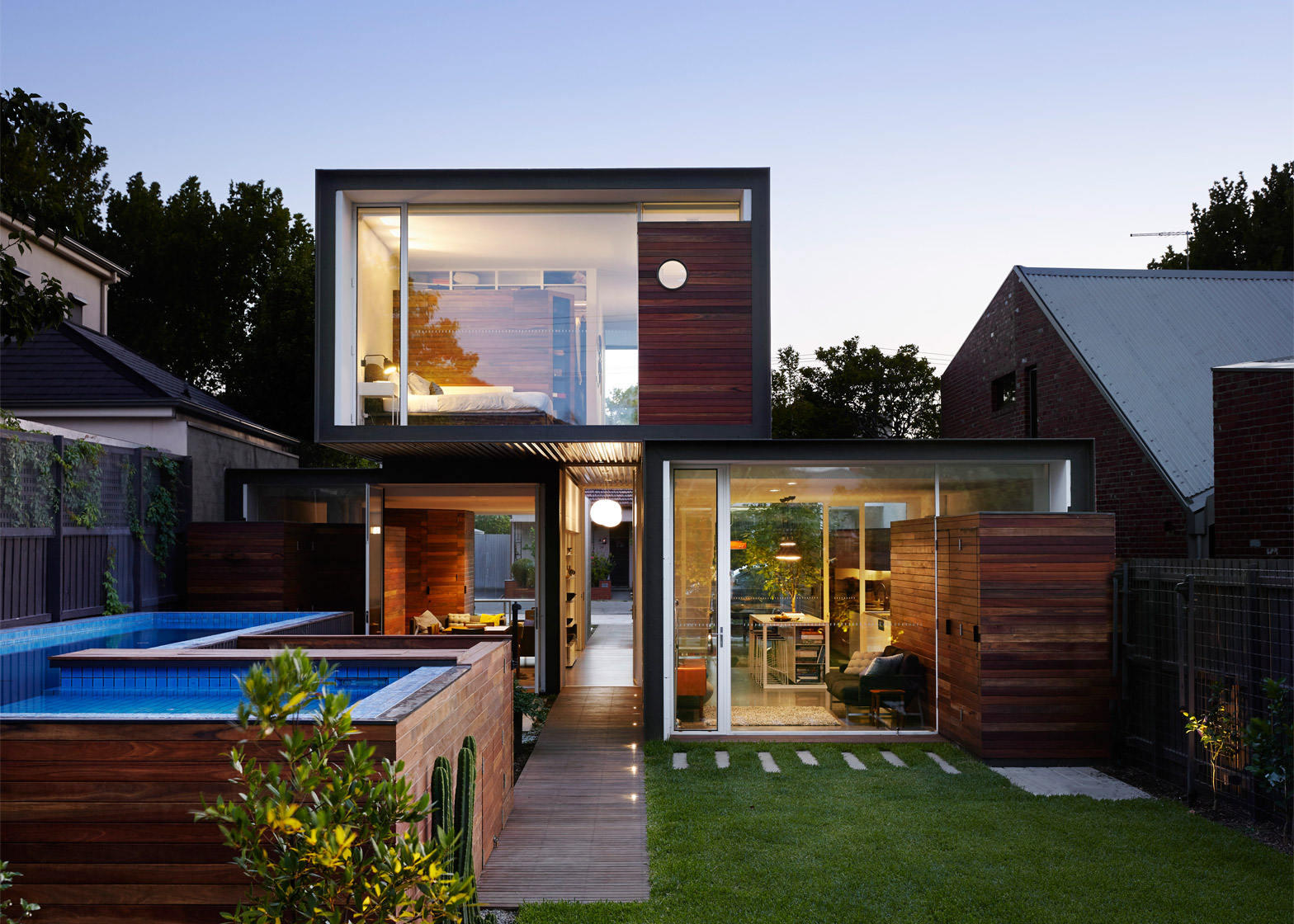
A trio of glass-ended boxes forms this compact Melbourne house by Austin Maynard Architects, which was designed to give the resident family "just the right amount of space" (+ slideshow).
Named That House, the two-storey residence is located in a neighbourhood filled with large properties. But locally based Austin Maynard Architects felt it would be better to make a more modestly sized dwelling for the family.
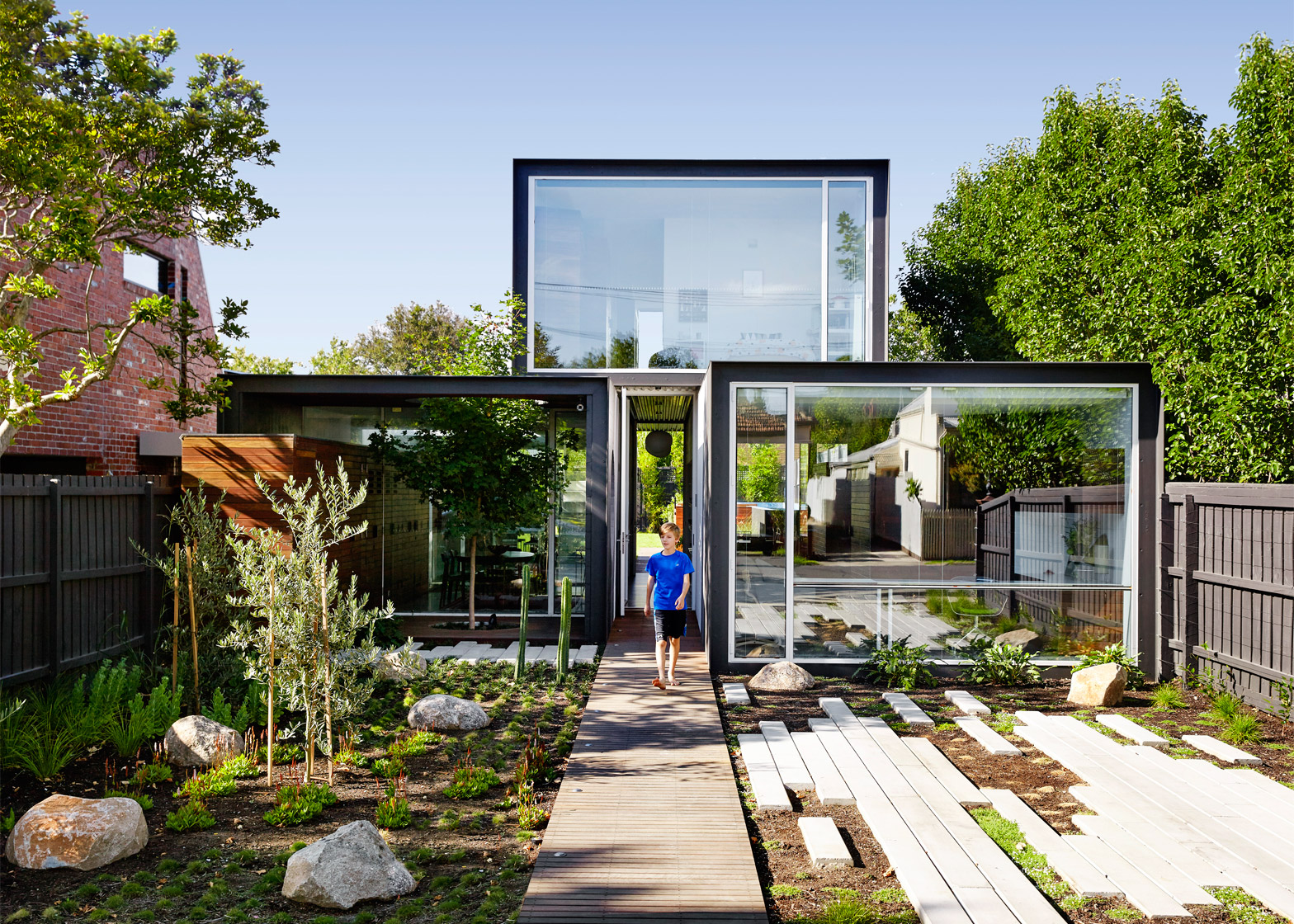
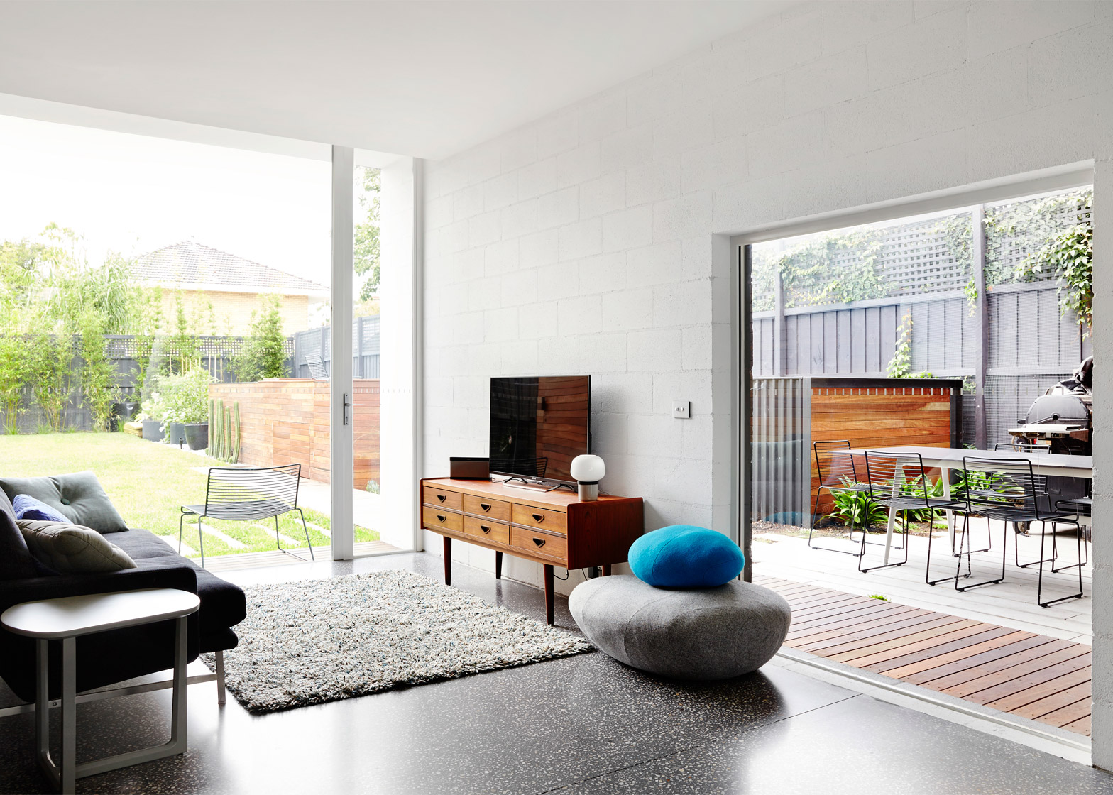
The aim was to create intimate spaces that open out to an expansive garden, as well as a series of courtyards and terraces.
"Large homes are an environmental disaster for our cities, whilst also being a cultural/social disaster for our communities," explained the team, which is led by architects Andrew Maynard and Mark Austin.
"By creating large openings and generous connections to the garden we aimed to make this modest-sized house feel abundant and broad," they said. "The result is a home that is almost half the size of its neighbours without compromising liveability."
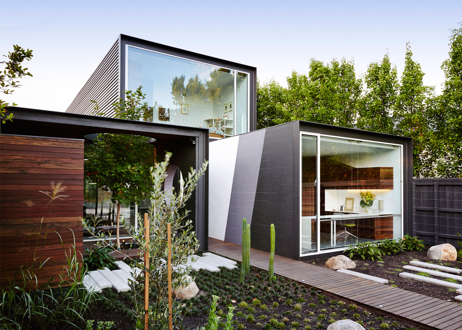
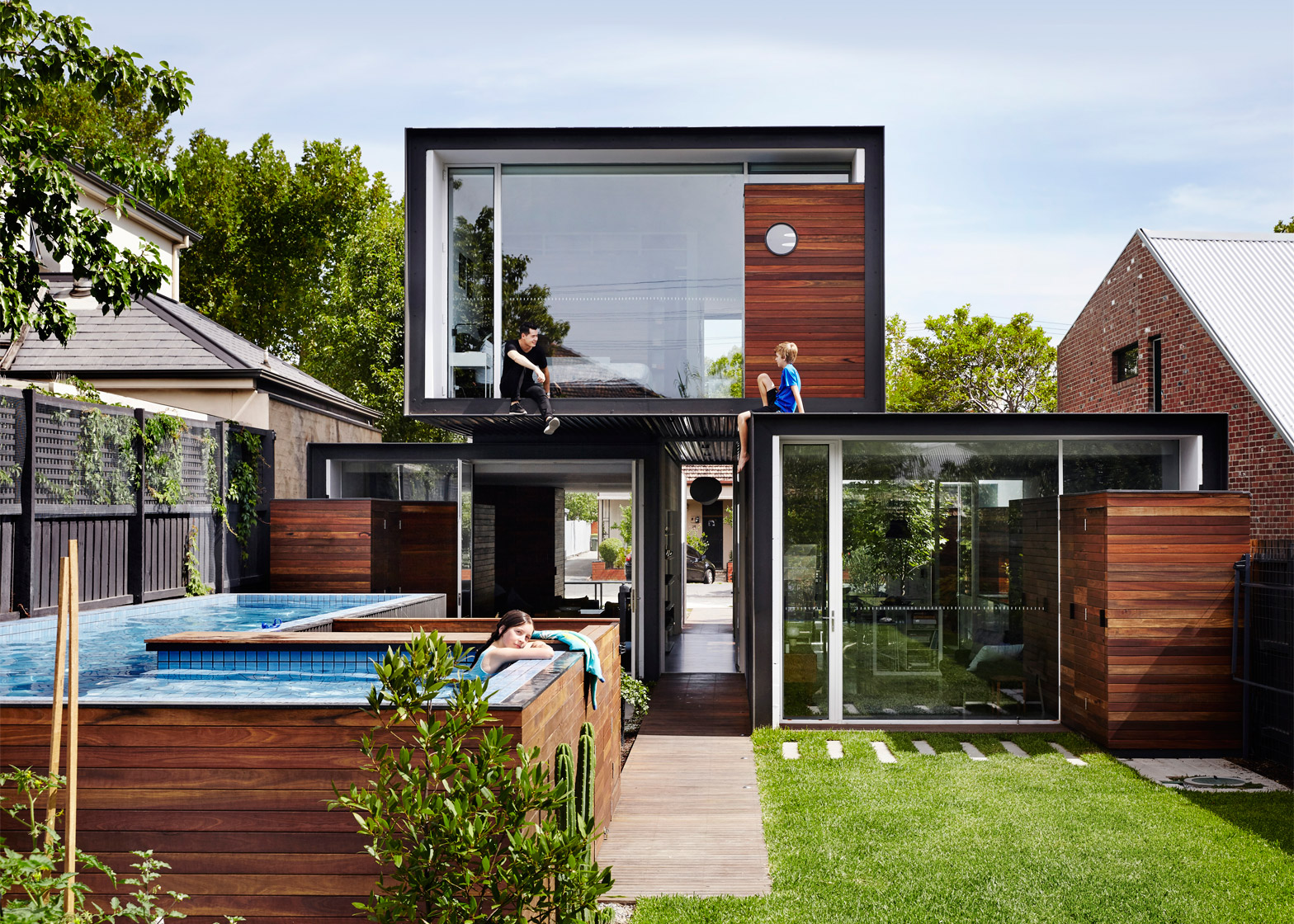
The 255-square-metre building has a relatively simple layout, divided up into three rectilinear blocks. Two sit side by side at ground level, with a gap in between that becomes a central corridor, and the third sits on top, bridging both below.
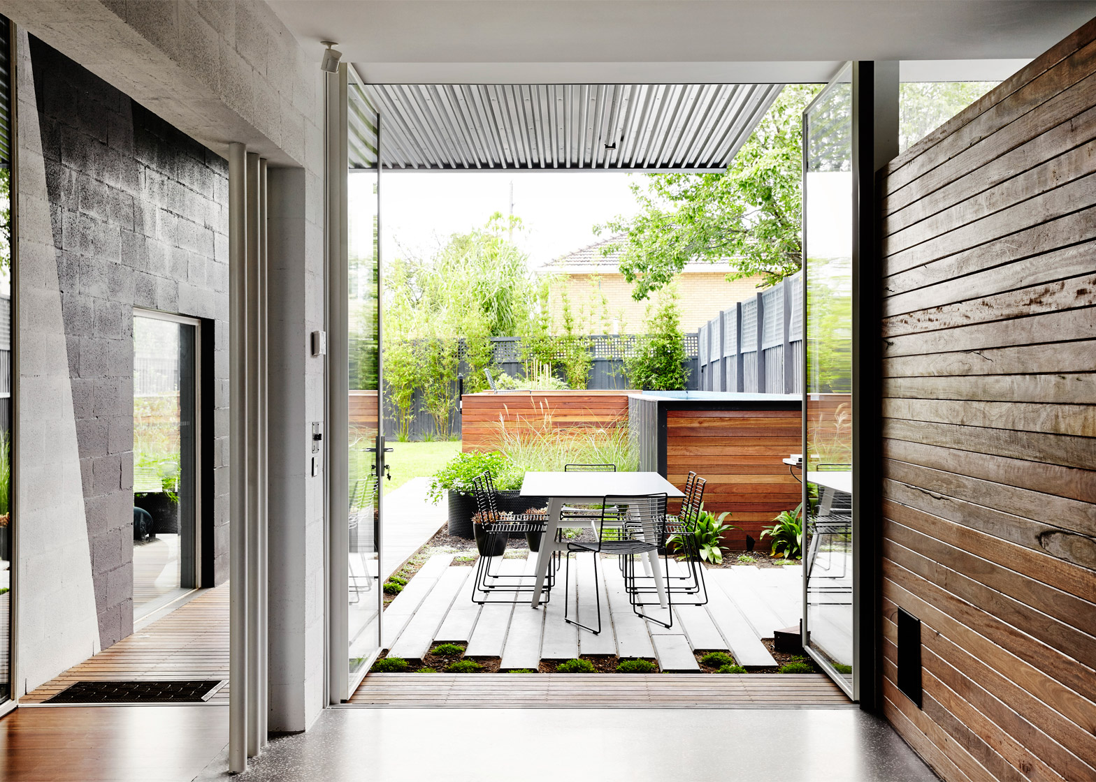
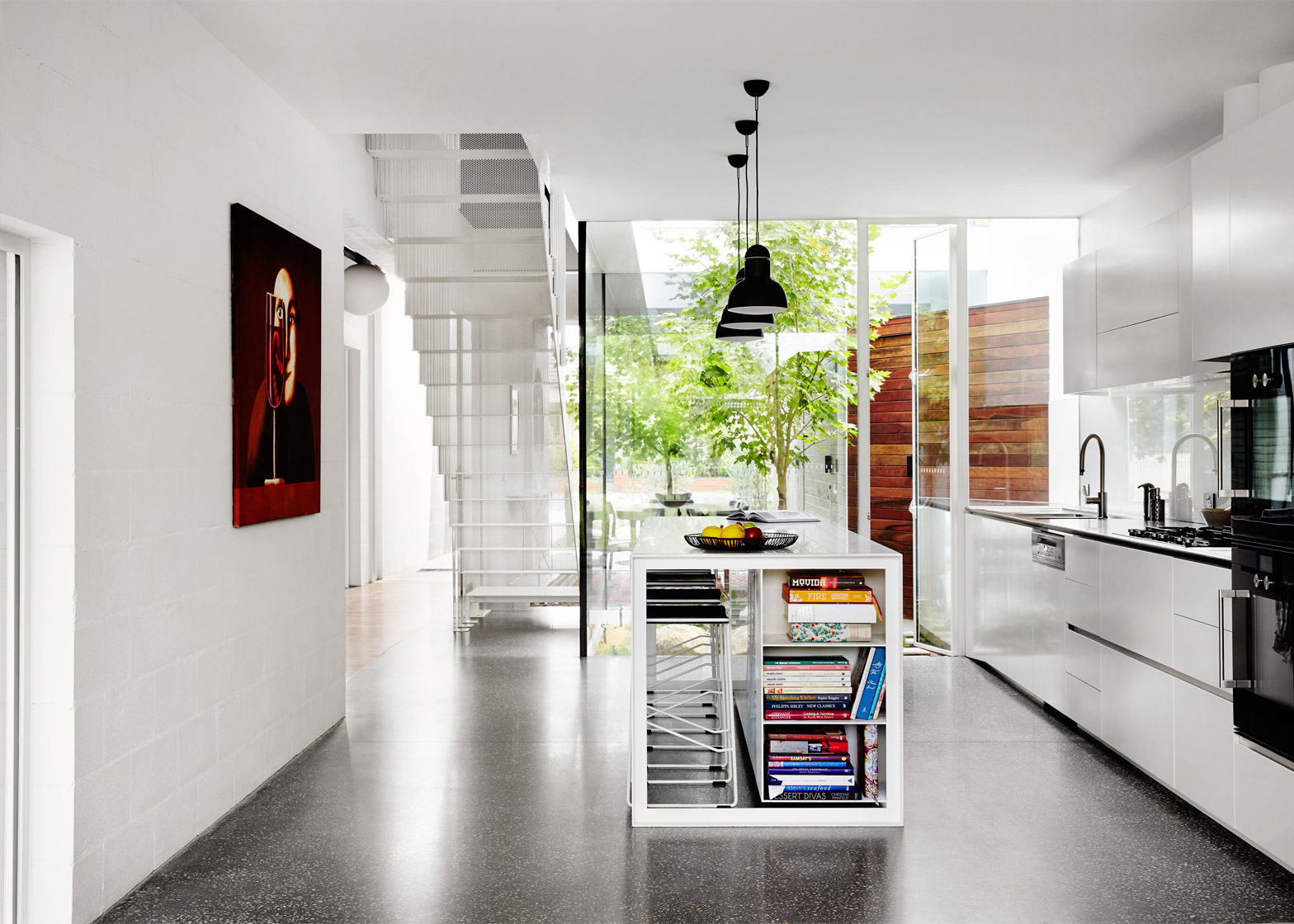
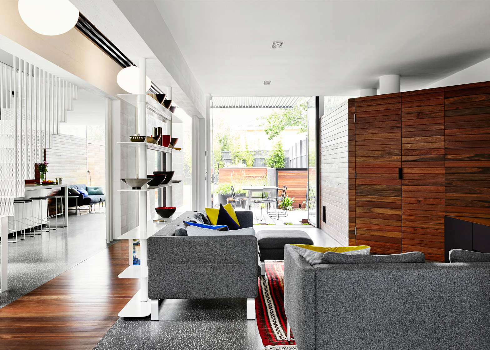
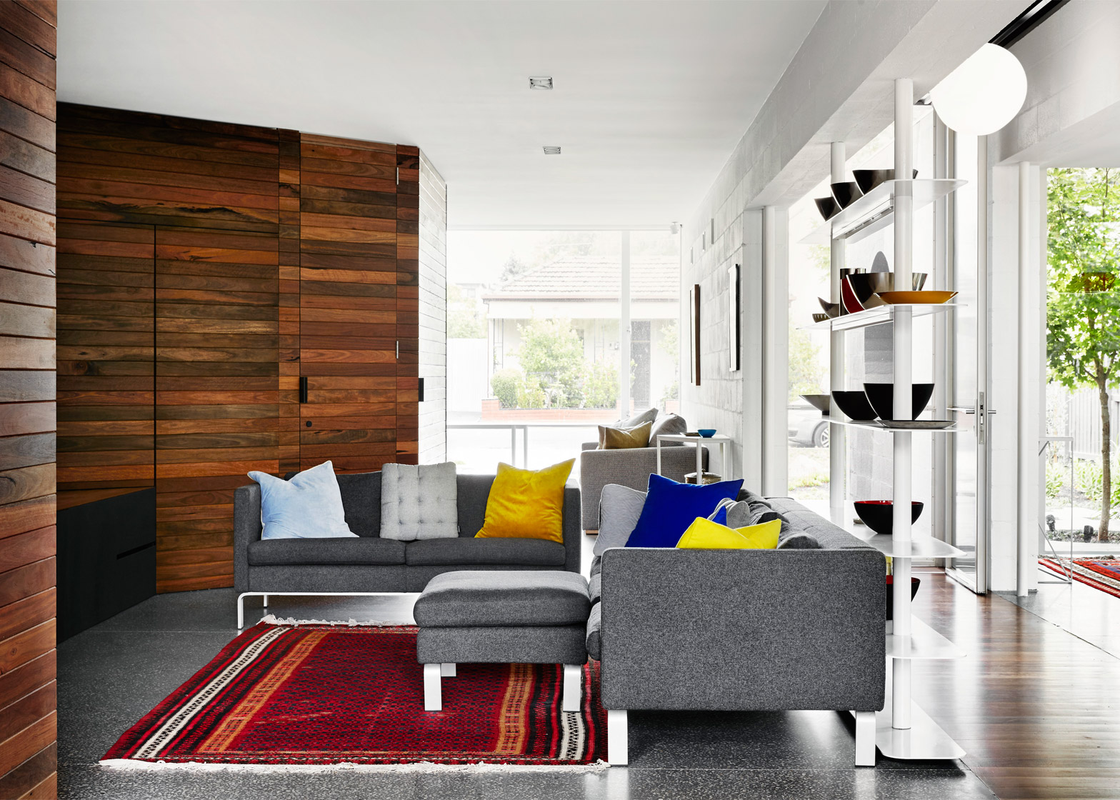
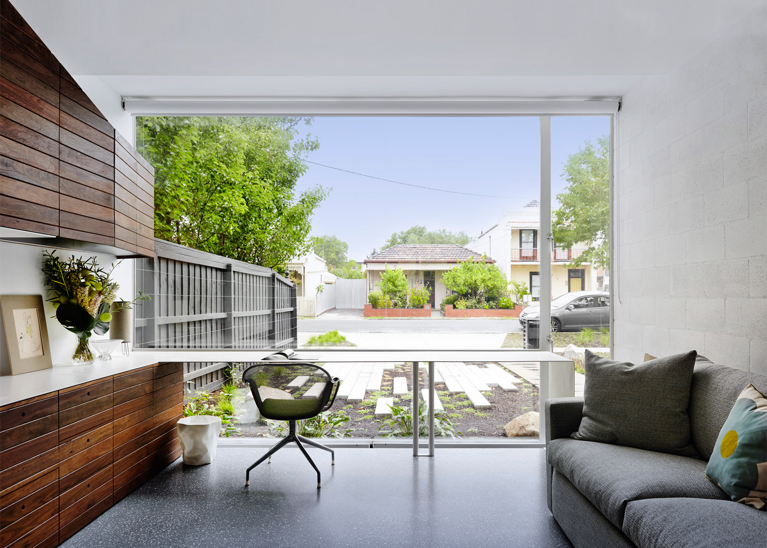
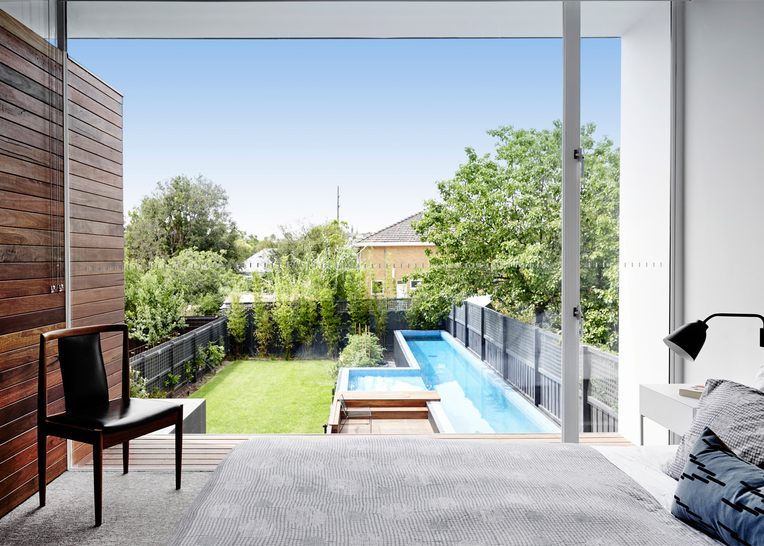
All three blocks have glazed ends, making it possible to look through from the street all the way to the garden at the rear. This helps the clients appear more welcoming to their neighbours.
When they need more privacy, blinds can be used to cover the glazing. But these blinds extend upwards rather than downwards.
"How many times have you seen huge windows with their blinds permanently down? This happens because of the binary a downward blind creates – a downward blind provides no privacy until it is completely down," said the architects.
"An upward blind enables you to cut out almost all view into a home while still being able to look out to the garden, and the street beyond," they added.
"This gives control over all levels of privacy and intimate control over the light let into each space."
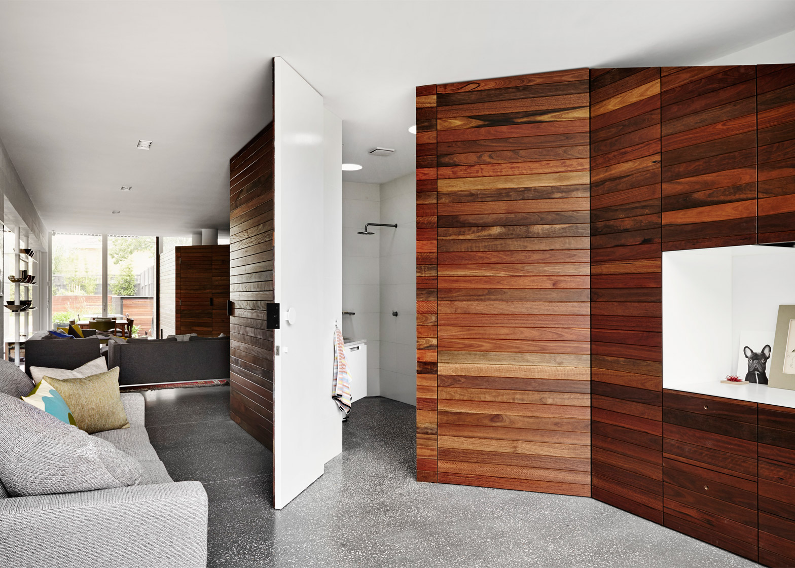
The ground floor of the house is divided up into a series of separate but visually connected living spaces.
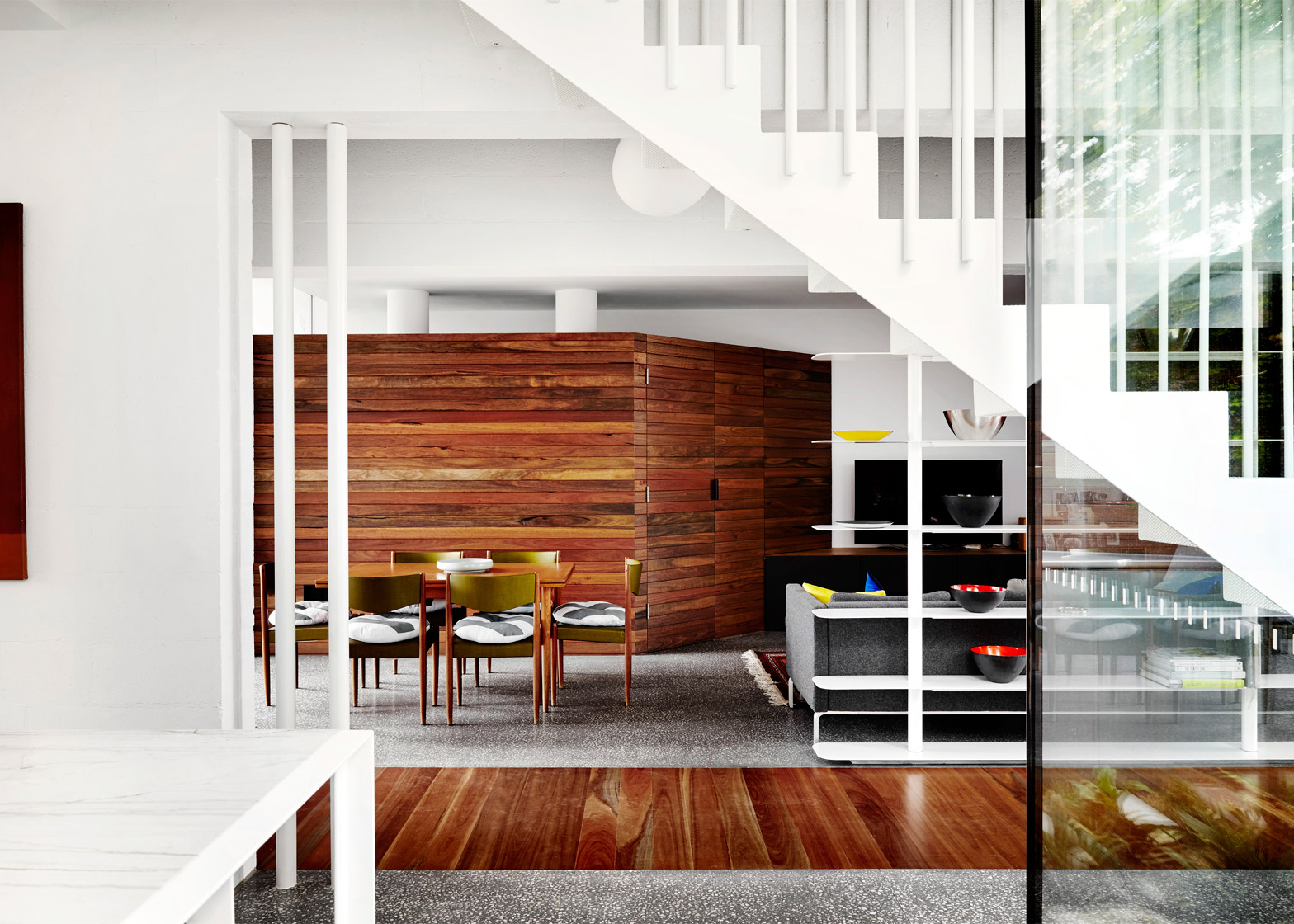
A large lounge and study are on one side, while the other side contains a dining room, kitchen and smaller lounge.
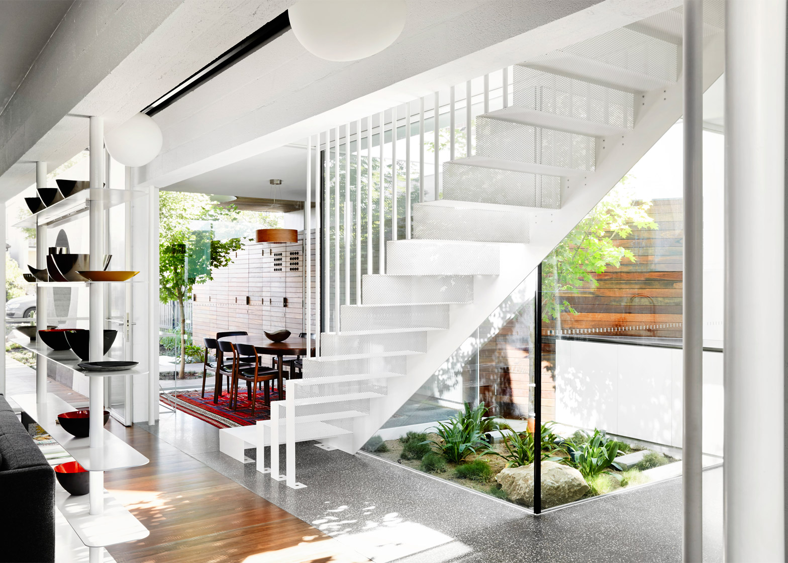
The corridor in between is framed both by free-standing bookshelves and partition walls with cutaways – resonating with the growing trend for "broken-plan" rather than open-plan living.
"We're not fans of open-plan living," said the team. "We also avoid completely enclosing rooms or functions. We try to make the connection of each space adaptable and loose."
"The ground floor of That House is ostensibly open, however the arrangement of spaces allows the owners to be together, or secluded, or any level of engagement in between," they continued.
"For example, someone could be quietly reading in the study, whilst another family member watches cartoons in the sitting space, and two others are discussing football at the dining table. They are within a large, shared area, however it is not a noisy open plan, nor is it a series of enclosed cells."
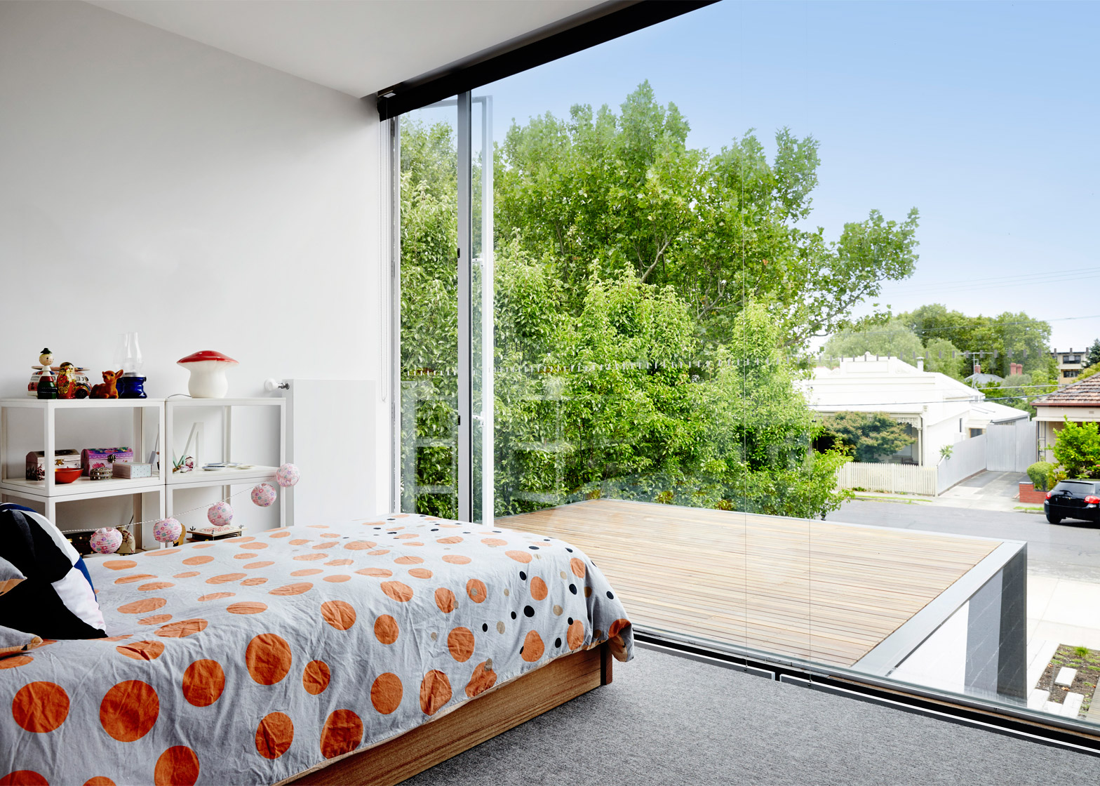
At the centre of the house, the white metal staircase is perforated to allow light to pass through. It leads up to three bedrooms on the upper floor, two of which open out to balcony terraces.
There are two planted courtyards on the ground floor. One sits between the dining area and the kitchen, while the other fronts the garden, offering a barbecue area.
An assortment of materials features through the building. Blockwork used for load-bearing walls is painted both white and grey, while red-hued timber fronts small rooms and storage areas, and also cover sections of flooring.
In the garden, slender paving slabs recall planks of wood. There is also a timber-clad swimming pool that forms a T shape in plan.
Austin Maynard Architects previously went by the name Andrew Maynard Architects, but recently rebranded to recognise the role of co-director Mark Austin, who has been working with Maynard since 2007.
Other projects by the firm include a house that hides a giant toy box under its floors and a residence designed to look like a village.
Photography is by Tess Kelly.
Project credits:
Architect: Austin Maynard Architects
Project team: Andrew Maynard, Mark Austin, Kathryne Houchin
Builder: Sargant Constructions
Landscape architect: Ben Scott, Garden Design
Engineer: R Bliem & Associates
Quantity surveyor: Cost Plan
Building surveyor: Code Compliance
Pool contractor: Out From The Blue

