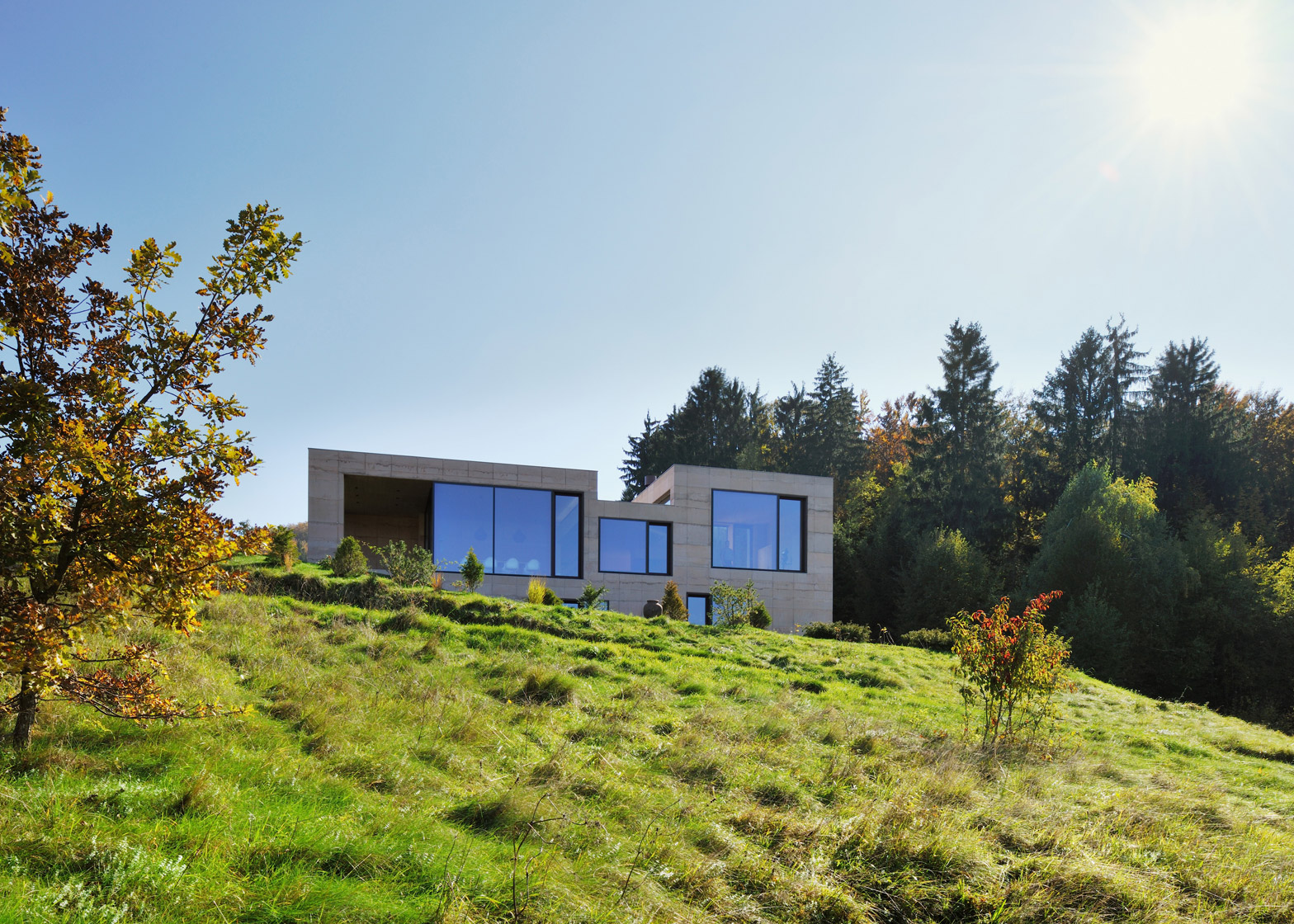
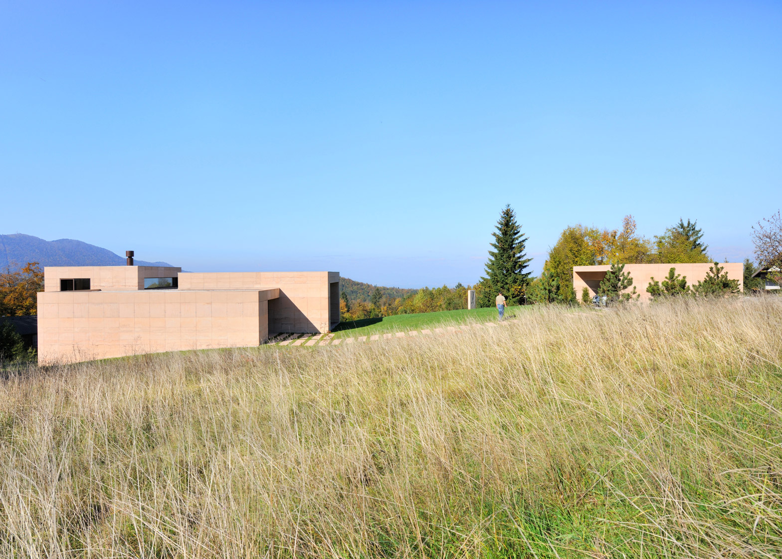
This fair-faced concrete house was designed by Arhitektura Krušec to look like rocks emerging from a sloped meadow facing the Slovenian Alps (+ slideshow).
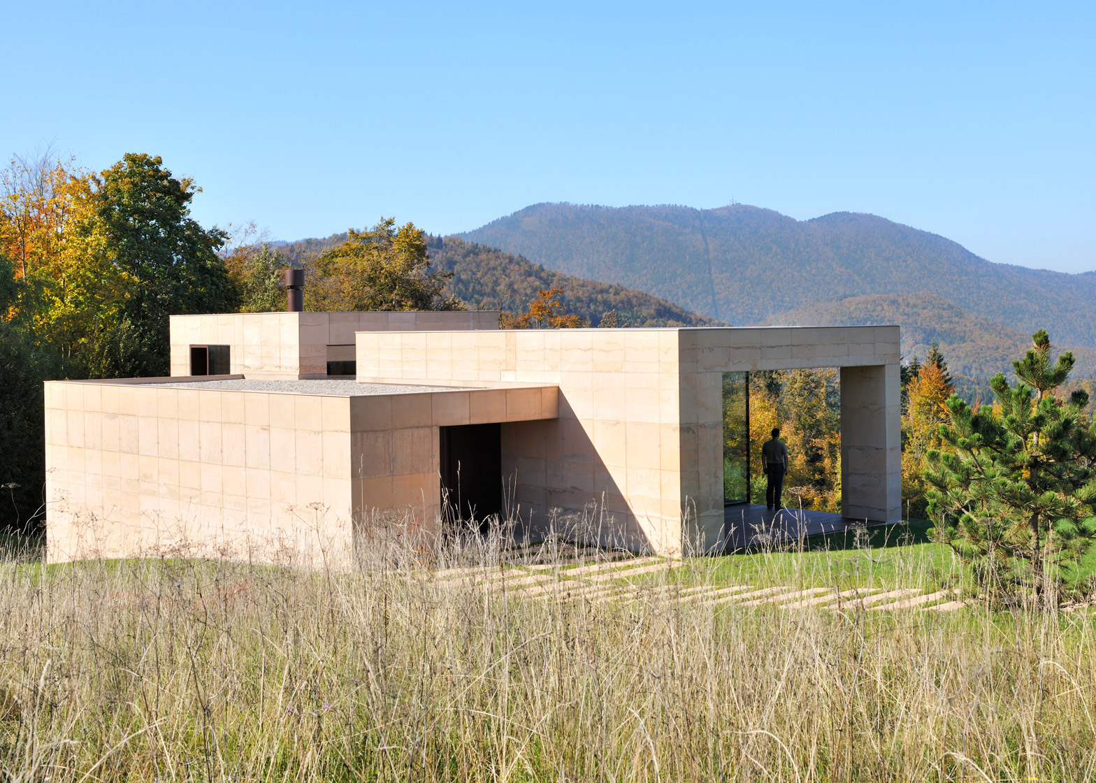
The Slovenia-based studio wanted to impact the landscape as little as possible and capitalise on surrounding views with its design for House on Golo.
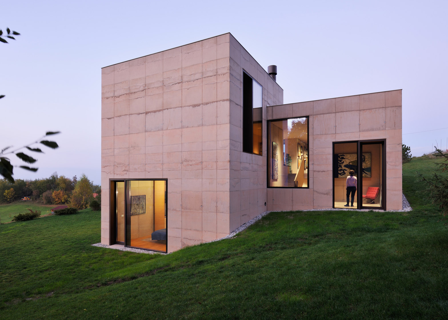
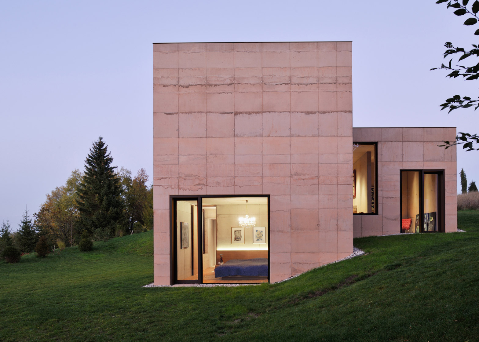
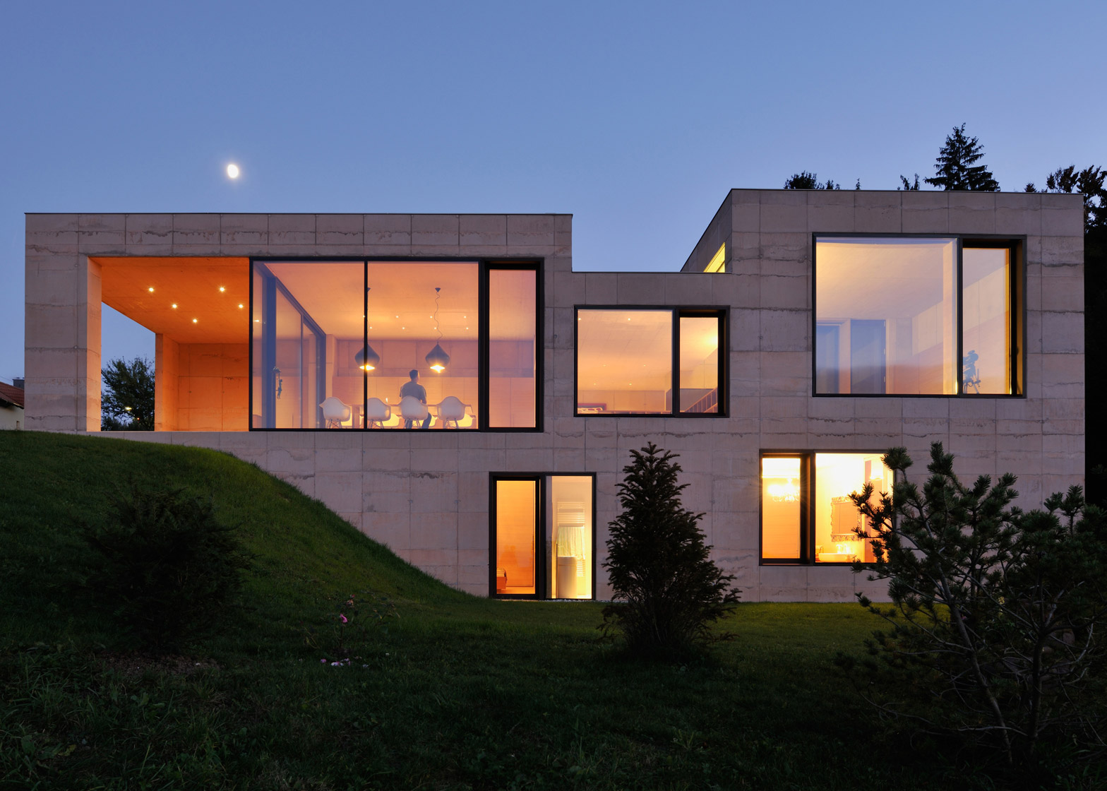
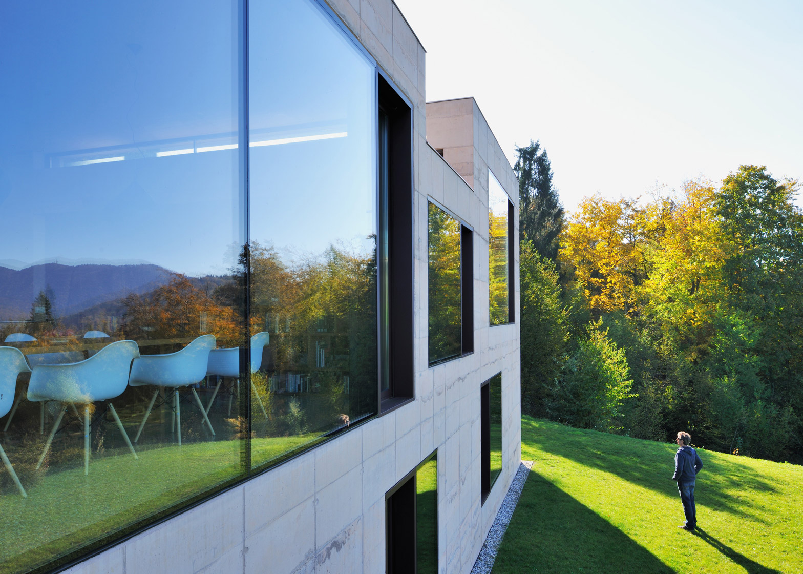
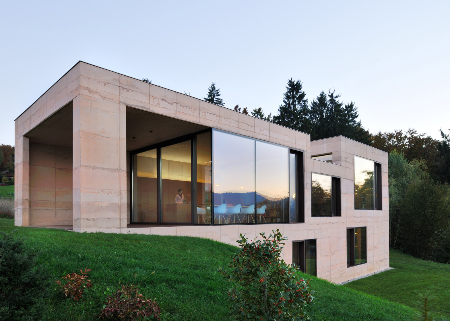
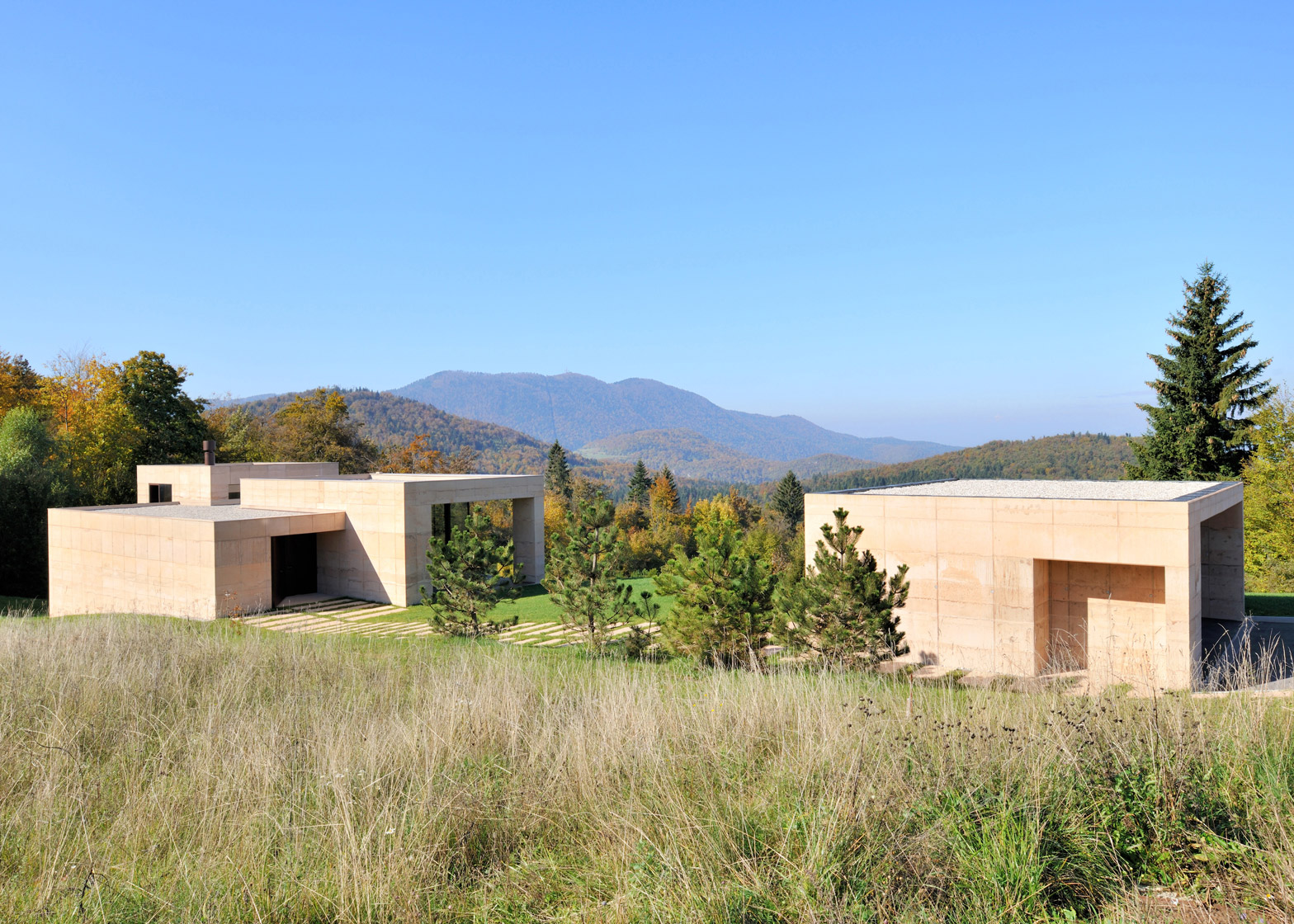
The home was divided into a trio of volumes on different levels, which respond to both the topography of the site and the silhouette of the peaks opposite.
"The house was designed as a composition of three volumes, laid out in such a way that they follow the configuration of the terrain, keeping the topography of the site completely unchanged," studio founder Tomaž Krušec told Dezeen.
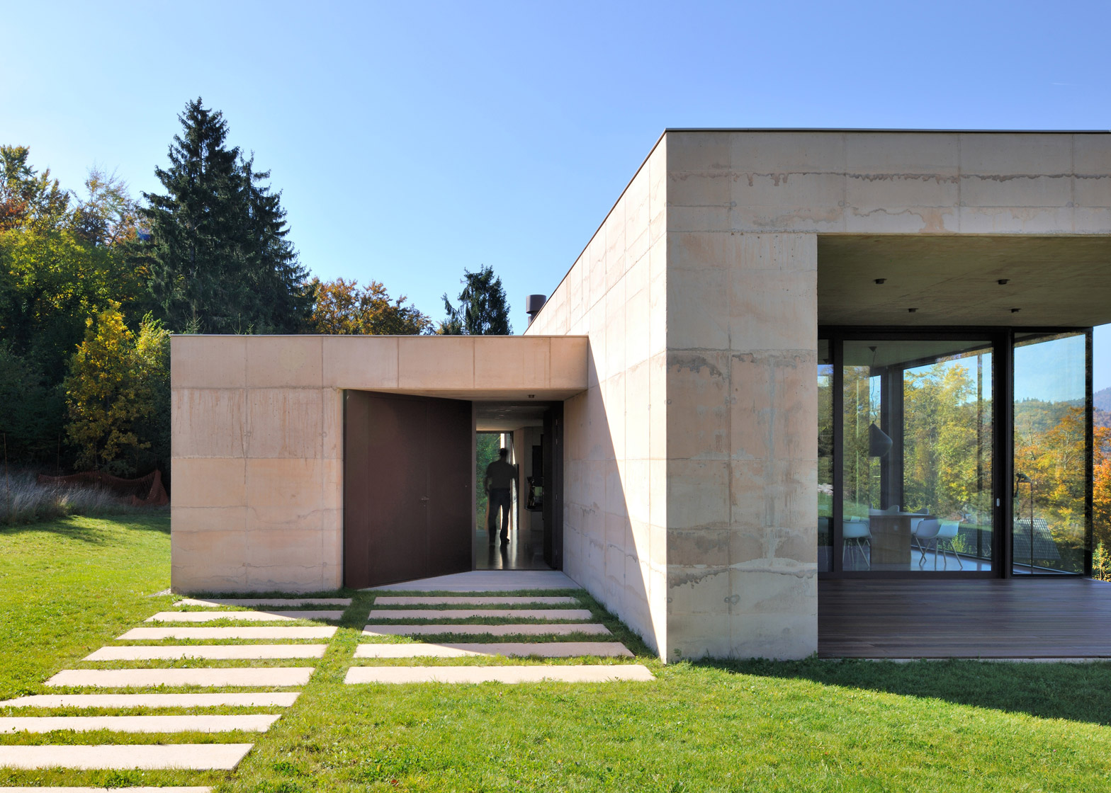
"We leave the site as it was with only three 'concrete rocks' added to the middle of the existing lawn."
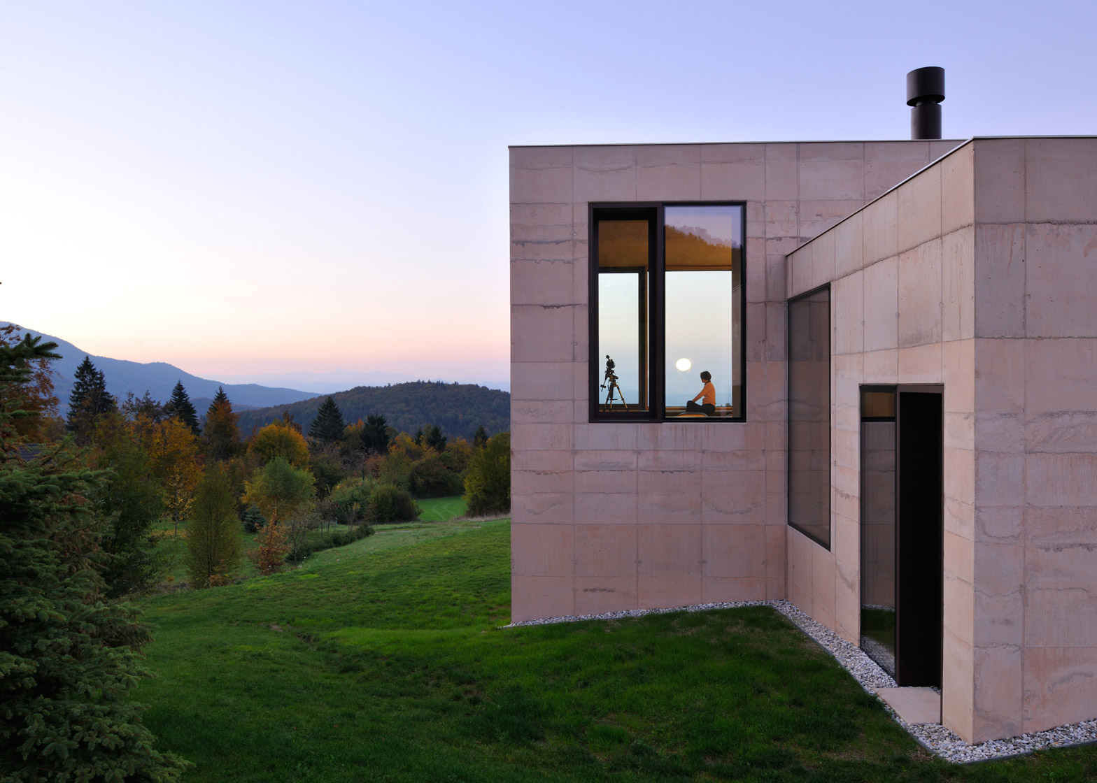
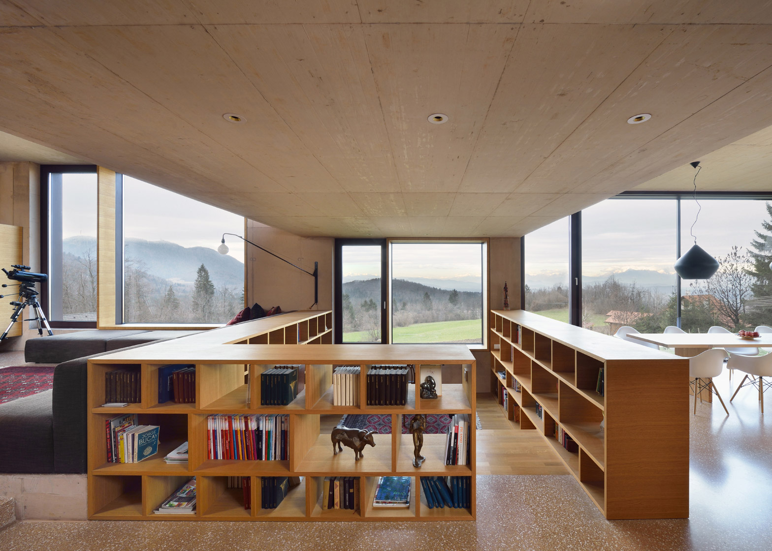
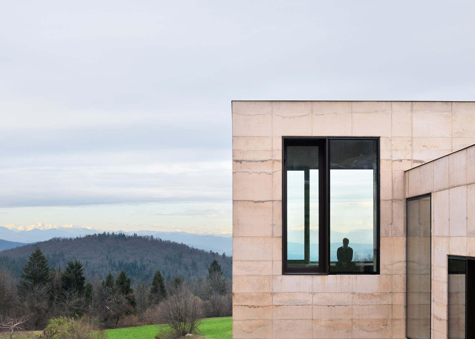
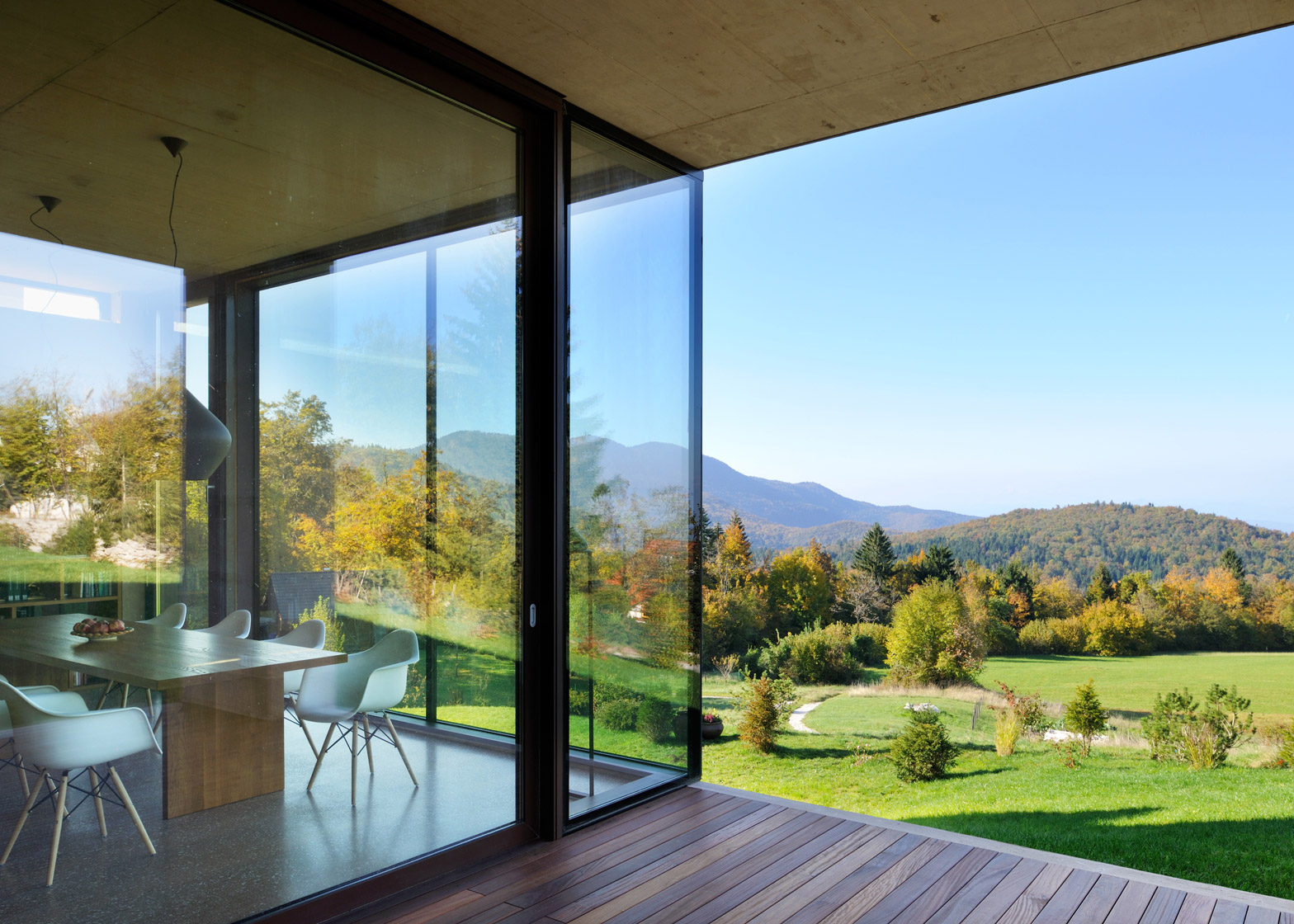
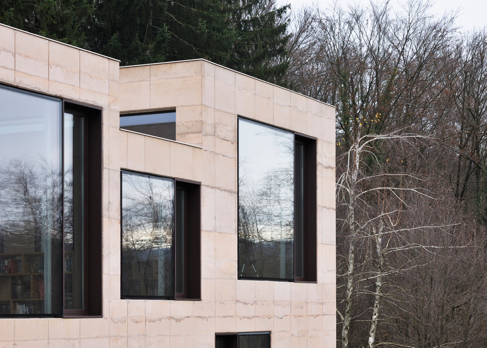
Large windows in each volume frame the peaks of three mountain ranges: Julian Alps, Karawanks and Kamnik–Savinja Alps, and the view towards the valley.
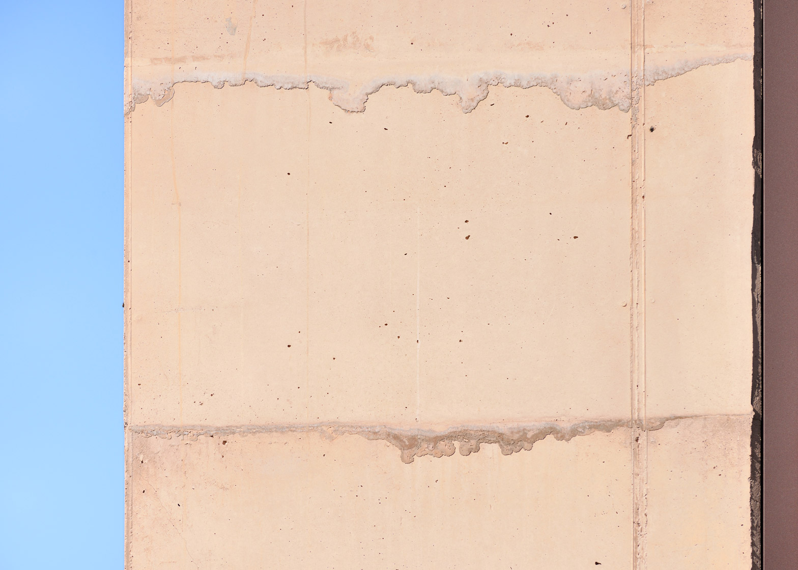
Crushed rocks that were excavated at the building site mixed into the concrete, which is also coloured to mimic the layers of the soil below as a way to embed the house into the landscape.
"When we excavated the construction pit we were very taken with the characteristic colour of the rocks and the way that they were layered," explained Krušec.
"This experience led us to an unusual technique of casting the concrete – we deliberately poured the concrete in layers and in a way so the upper layer always partly 'dripped' over the layer below it."
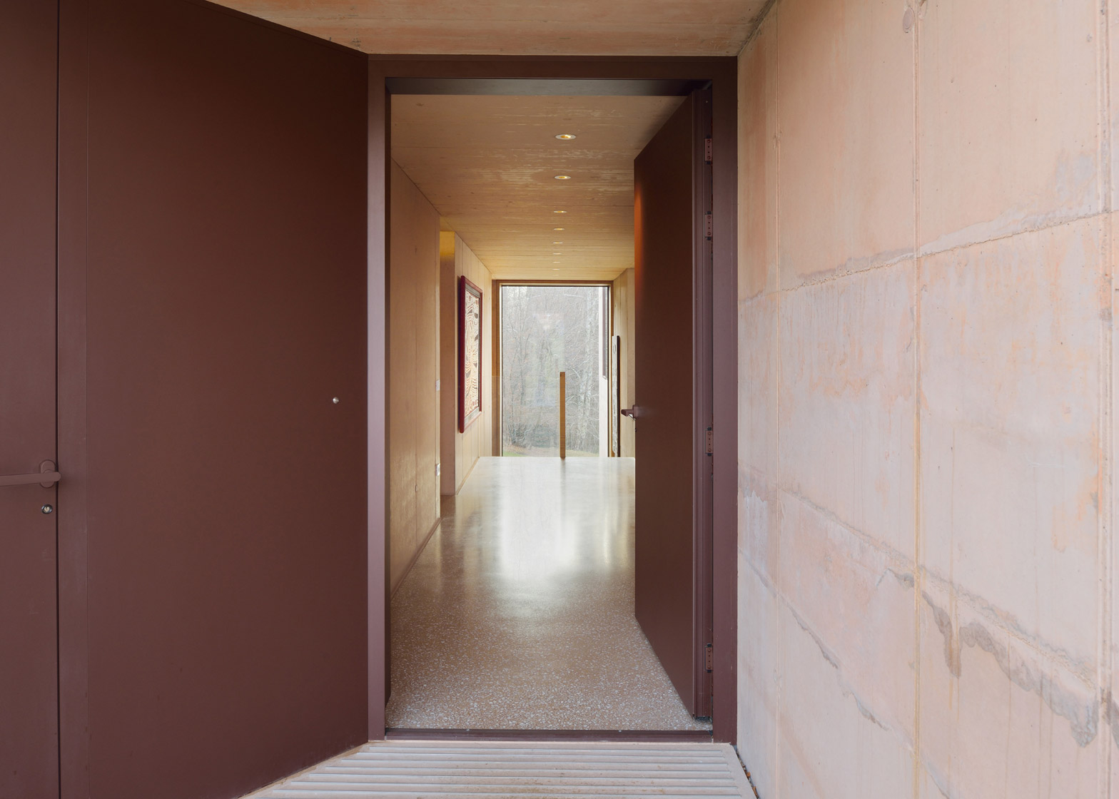
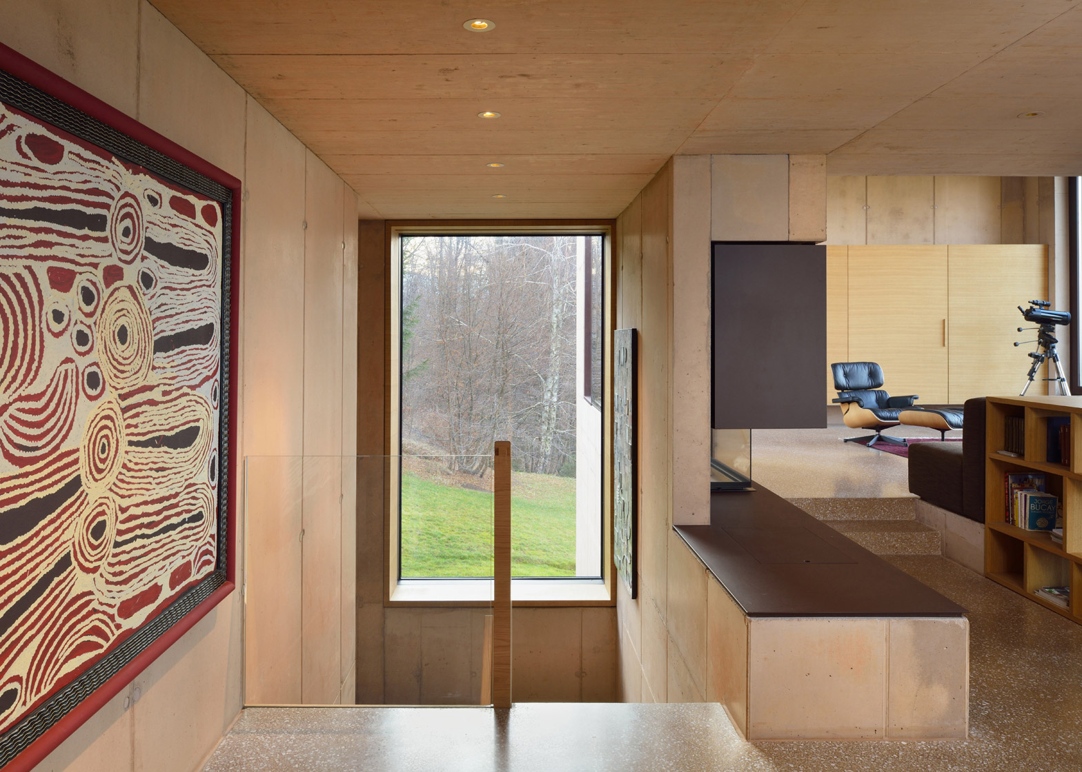
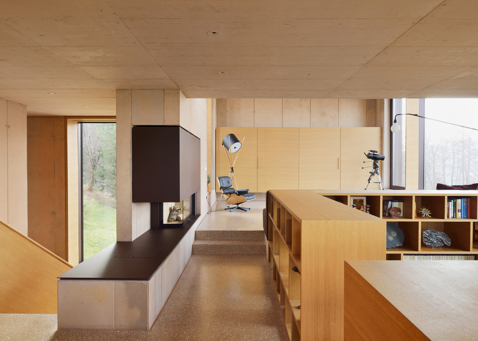
On the rough exterior of the house, the concrete is textured with lines where the overspill has occurred, while inside the concrete is smooth and the floors are polished terrazzo.
Arhitektura Krušec designed the house for the family of a college professor who wanted a space to conduct his research. The study was placed at the house's centre, located in the lowest volume of the first floor in between the lounge and the dining room.
"This opens the views from the dining area, over the study room, towards the living room, which is situated on a third level, 50 centimetres above the dinning area," said Krušec.
The study has a lower ceiling height and its surrounding walls are formed from a wooden bookcase, distinguishing it from the concrete interiors.
Also on this level is a kitchen, a covered outdoor space and the main entrance, located opposite a window.
From the entrance, a corridor leads to a staircase, both of which were designed as places for the owner to hang artwork.
Two bedrooms with bathrooms are located on the floor below.
A separate garage block acts as a gateway to the main building, with a path of concrete steps set into the ground that lead down to the main entrance.
Architect Miguel Marcelino also used fair-faced concrete for Portuguese house to make it appear rooted to its location, while polished, bush-hammered and board-marked concrete all feature in a house by Ipli Architects.
Photography is by Miran Kambič.
Project credits:
Architecture firm: ARK Arhitektura Krušec
Authors: Tomaž Krušec, Lena Krušec andVid Kurinčič
Collaborators: Nina Bobinac, Janez Vrhunc and Jurij Nemec

