FrontOfficeTokyo strips back small Tokyo apartment by pulling down walls
To make better use of space inside this small Tokyo flat, local studio FrontOfficeTokyo replaced almost all of the walls with multi-functional box units and a series of sliding partitions (+ slideshow).
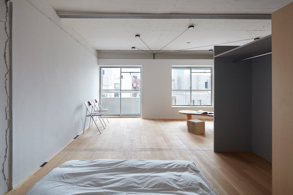
The apartment, which measures 50 square metres, is located in the Akasaka neighbourhood of Tokyo.
It was originally constructed in the 1970s and, like many apartments of its kind in the city, it was built with low ceilings and short narrow rooms.
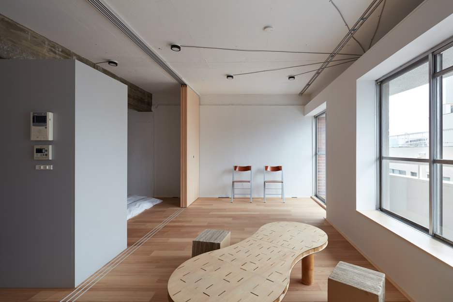
To make the space feel bigger and brighter, FrontOfficeTokyo stripped the space down to a single room.
It then created a new open-plan layout by dividing it up into three areas – a living and dining space, a sleeping area and a kitchen.
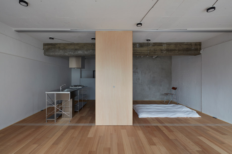
"The original subdivisions in the apartment created spaces that were more symbolic than functional, and a lot of the living space was dark as well as under-sized," architect Bill Galloway told Dezeen.
"We removed the false ceiling to gain some height, and by removing the walls we were additionally able to bring light to the back of the room, making the room as large as it possibly could be."
"From a more poetic view, this ties into our approach to architecture in Tokyo," he added. "We have come to see the urban landscape outside the building as an extension of the home, and take some small hints from the way the city is organised."
"Not to overstate the idea but there is a lot of richness in the way spaces overlap and intersect in Tokyo, and the choice the city offers are worth copying at the smaller scale of the home," he continued.
"From this point of view, within the limited scope of the project we took the opportunity to make the spaces as continuous as possible, and that works most easily without walls."

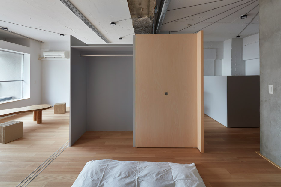
An S-shaped partition in the middle of the room forms the main divider for the space. It contains a closet for the bedroom on one side, and a space for the fridge on the other.
A grey-coloured box unit houses the laundry, while the bathroom is contained in a concrete box in the corner of the space.
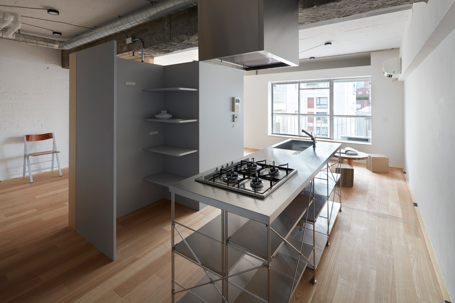
Simple and raw materials feature throughout the property. Pale wooden boards cover the floors, while the apartment's original ceilings are exposed and painted light grey.
"The design is intended to act as a background to the clients life and so we chose to keep it simple," Galloway said Dezeen. "As they live in the home the character will come from the daily life of the owners."
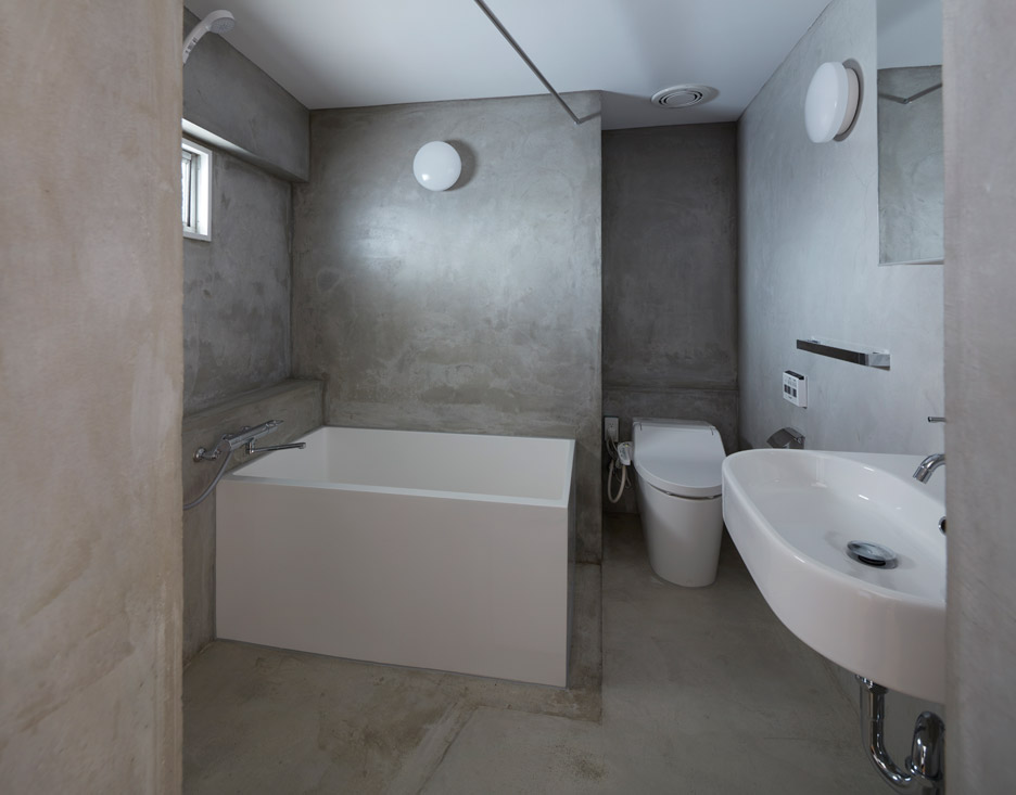
"There is a kind of aesthetic of course, however we hope it anticipates the future inhabitants and their habits and preferences - because it is simple the design will retain its character and appeal over time," he added.
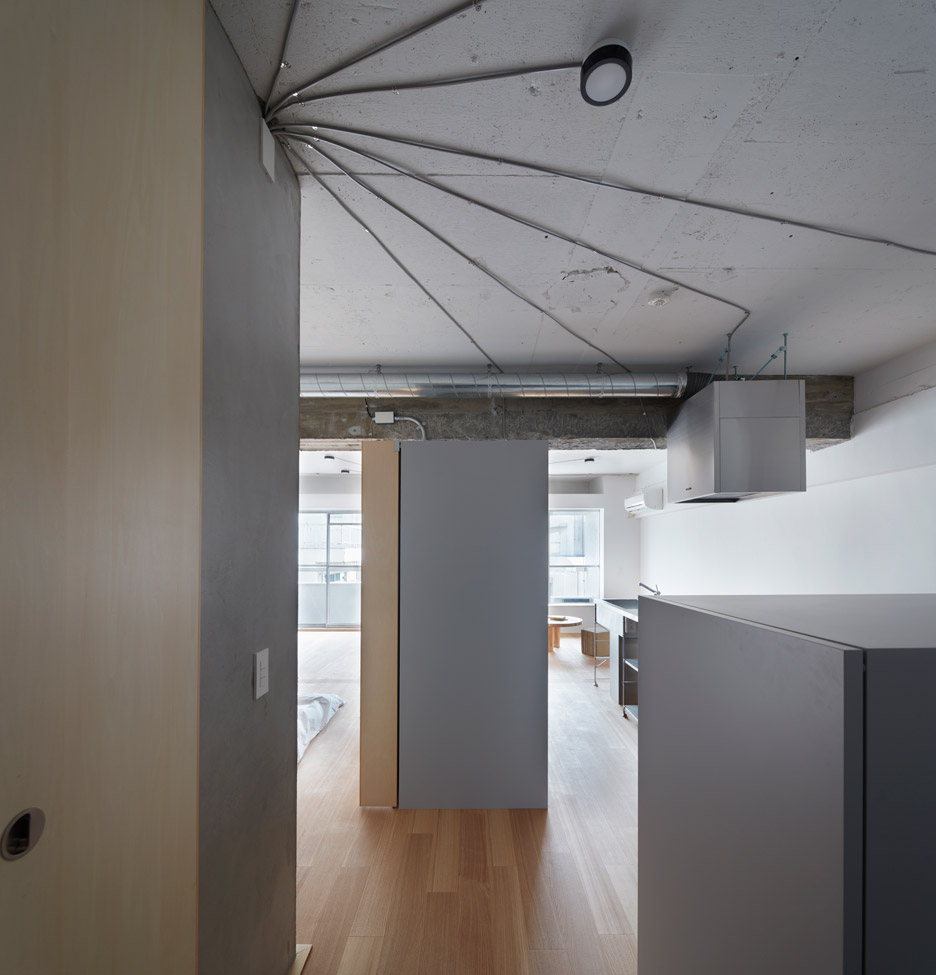
Sliding doors can be pulled across the length of the apartment – providing the client privacy in the bedroom and defining the communal spaces.
Architects are frequently coming up with interesting ways to maximise space in small apartments.
Anna and Eugeni Bach suspended a desk from the ceiling of a Barcelona home so residents can use its mezzanine level as a study, and Shimpei Oda transformed part of a balcony into an extension of the living room inside a 36-square-metre studio apartment in Osaka.
Photography is by Toshiyuki Yano.

Like Dezeen on Facebook for the latest architecture, interior and design news »