Contemporary Japanese architects have created "a legacy with more consistency" than the famous names that dominate architecture elsewhere, says the curator of a major new MoMA exhibition (+ slideshow).
MoMA's show, which is titled A Japanese Constellation, focuses on the work of three generations of Japanese architects, including Toyo Ito, Kazuyo Sejima and SANAA, and Sou Fujimoto.
The exhibition's curator Pedro Gadanho told Dezeen that this group were unlike other famous architects working today, who "find a formal or stylistic recipe and just keep repeating it any new situation, and therefore exhaust a certain creative input".
"I think what is different is that these [Japanese] architects have really cherished and cultivated the idea that their peers, and some of their disciples, can all bring something to the mix," said Gadanho, "and they all benefit from sharing themes, influences, information and even supporting each other in terms of competitions."
"It is way more beneficial because it leaves a legacy that has more consistency and can spread an influence more resistant to time," he added.
MoMA originally approached Ito with the idea of staging a solo show, but the architect said that in order to understand his architecture, it was important to see the work of all the other architects that had influenced him and who had been influenced by him.
The exhibition begins with Ito's transparent Sendai Mediatheque and ends with his National Taichung Theater, but emphasises his role as a mentor to architects such as Sejima, Ryue Nishizawa and Fujimoto, and then highlights the architects they have gone on to mentor in turn.
"[Ito] has received many people in his office and he absorbed also the influence of these people that have passed by," said Gadanho. "He is quite open-minded in the way every new project is an opportunity to start again and test new ideas, to change architectural language."
Gadanho said that the individuals featured in the exhibition had a major influence on young Japanese architects and smaller domestic projects in the country.
"Rather than offering a very banal response to conditions of the Japanese metropolis – of high density – [young Japanese architects] are very experimental and therefore very influenced by the way these architects were successful in maintaining a very experimental and avant-garde practice," he said.
A Japanese Constellation: Toyo Ito, SANAA, and Beyond is on show at New York's MoMA until 4 July 2016.
Dezeen spoke to Gadanho about some of the key projects featured in the exhibition:
Sendai Mediatheque, Miyagi, Japan by Toyo Ito & Associates, 1995–2001
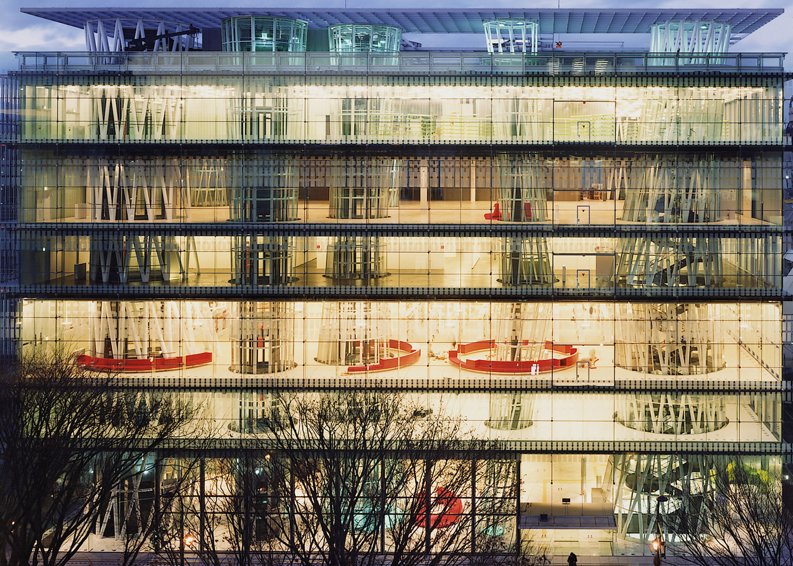
The Sendai Mediatheque, which was completed in 2001, is one of Ito's best-known projects and the starting point of the exhibition.
"The images that were published were very strong and they have influenced many younger architects," Gadanho told Dezeen "That is why I think we still now have to refer back to it as a project with a very lasting impact, both in Japan and outside."
The unique structure is defined by bunches of vertical "seaweed-like" pillars that puncture through the building's floor plates and can be seen through the entirely glass facade.
"It is a project that was truly refreshing in the way it approached structure," said Gadanho. "It had a strong metaphorical sense that translated into a very contemporary architecture; the poetic idea that there would be 'algae' giving you a spatial impression of fluidity, that would then leave the space of the mediatheque to be used in a very informal, non-hierarchical way."
21st Century Museum of Contemporary Art, Kanazawa, Japan by SANAA, 1999–2004
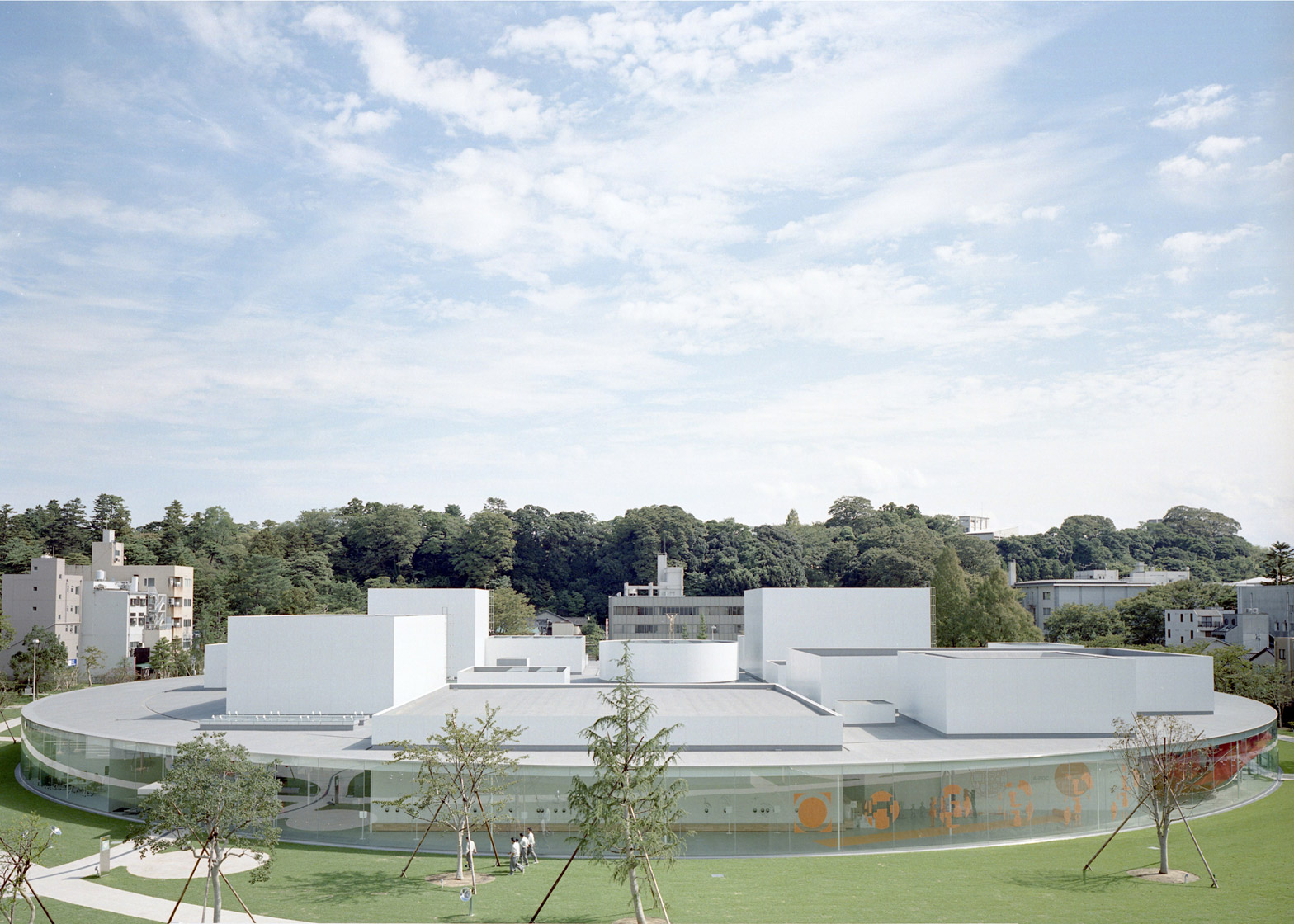
SANAA's 21st Century Museum of Contemporary Art sits within a low, flat open space in the city of Kanazawa. The one-storey building is wrapped by a circle of glass, with white box galleries arranged informally within it.
"With just one floor, it has totally reorganised the galleries and spaces of the museum, sweeping away any preconceptions, and creating a non-hierarchical building," said Gadanho.
"Here you have a space in which everything has almost the same value, in which there are no corridors that are secondary, but they become part of the strong architectural experience," he added. "You can also enter the building from different places and have a very different experience, in a random way."
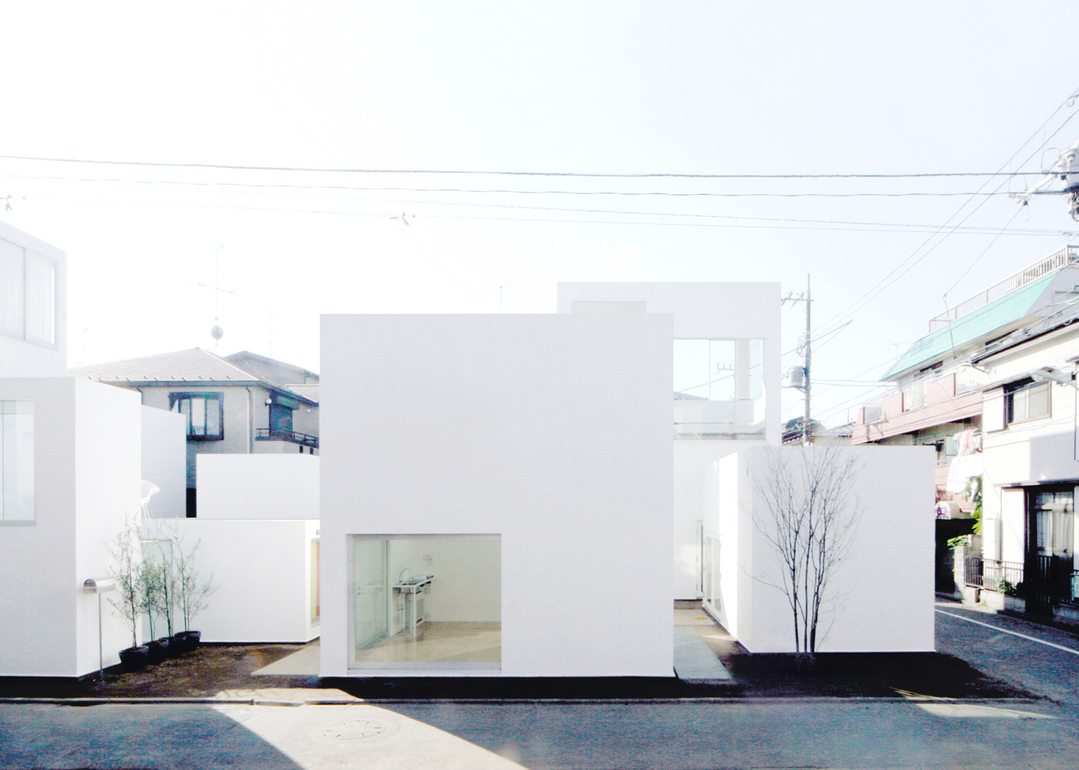
Moriyama House, Tokyo, Japan by Ryue Nishizawa, 2002-2005
Ryue Nishizawa's Moriyama House is a steel prefabricated house, made up of 10 separate buildings that are one to three storeys high.
"The house is a reaction to the density of Tokyo and it totally disrupts our idea of what a dwelling should be," said Gadanho. "It does so by dividing the house into discrete spaces, different rooms, and then having these scattered in the plot of land. People then share the external spaces, the patios and so on."
"There are houses that you can combine in different ways, or that the owner could rent out in different combinations," he added. "It is a very interesting conception of contemporary living that highlights the way these architects are constantly providing new possibilities for how we understand living in today's cities."
House NA, Tokyo, Japan by Sou Fujimoto, 2007–2011
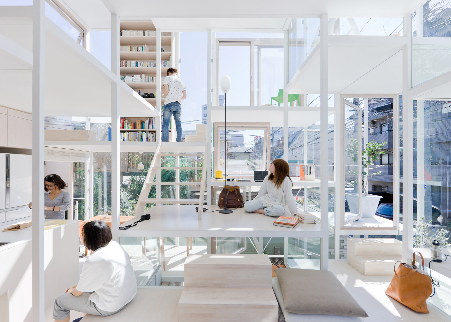
Sou Fujimoto's House NA has a distinctive scaffolding-like structure, which is based on a thin, split-level steel frame with hardly any walls surrounding it. The Tokyo house has three storeys that are subdivided into many staggered platforms.
"It is not only the transparency which is incredible," said Gadanho. "When you look at the plan is not only composed by rooms but articulated in different spaces horizontally and vertically, so that the further you go into the house and the higher you go, the more intimate the spaces become."
"It represented a total restructuring of how we see a dwelling, but also it is a feat in terms of structure, like many of his projects are," he added. "The structure is reduced to the square profile of five centimetres by five centimetres for the columns and the platforms. It is pretty amazing."
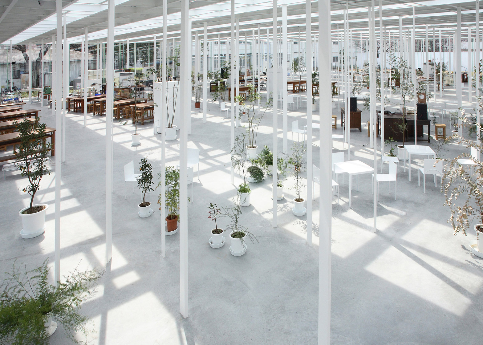
Kanagawa Institute of Technology Workshop, Kanagawa, Japan by Junya Ishigami, 2005–2008
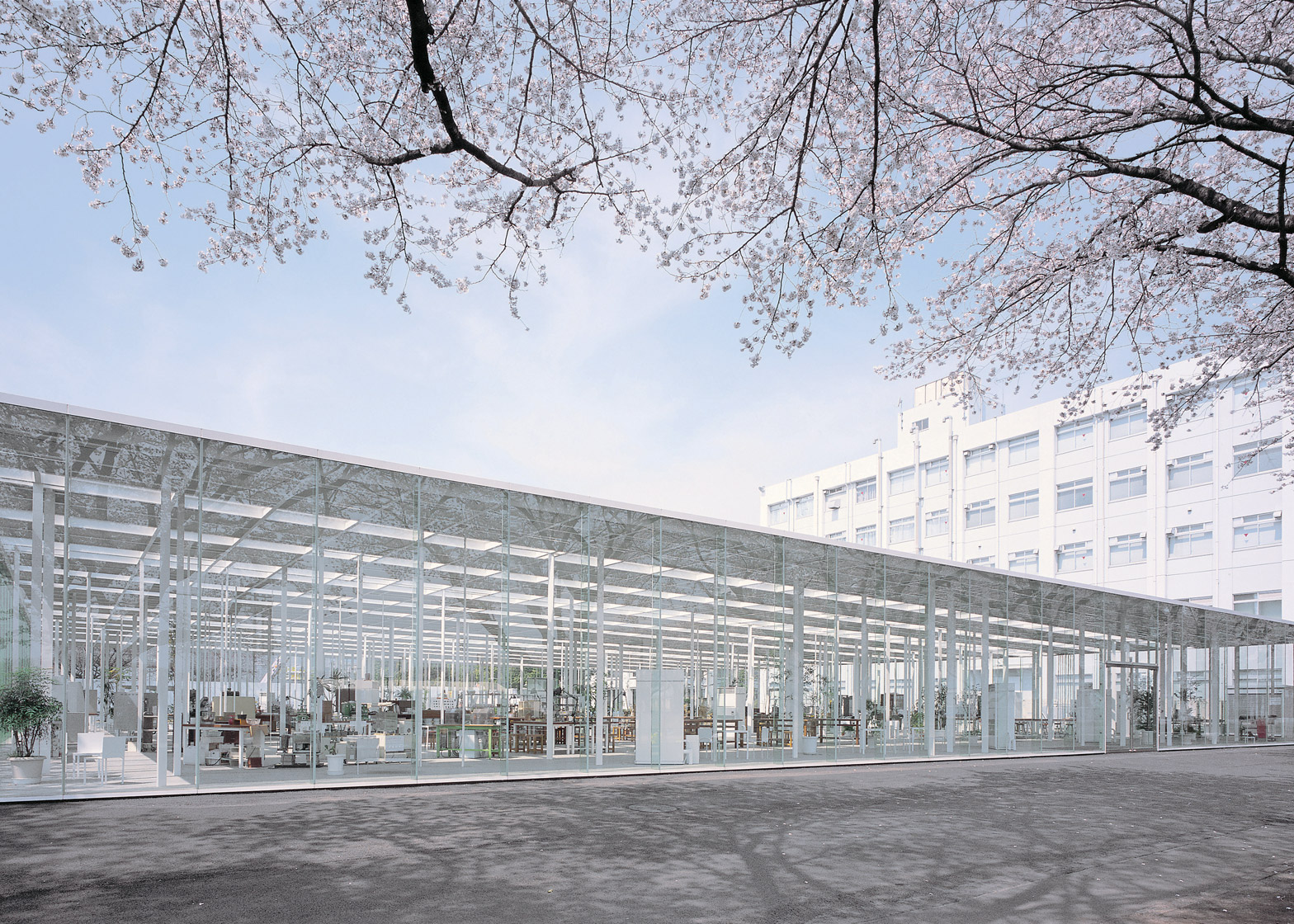
Junya Ishigami's workshop for the Kanagawa Institute of Technology is one large open-plan room entirely enclosed in glass walls, which can be accessed from all sides.
"The space is full of more than 300 columns that are used to sustain a very thin roof, which creates very informal spaces as if you were in a forest," Gadanho explained.
"By their shifting direction, by their position, they then lead to a very informal occupation of the space. It is non-hierarchical, not predetermined by the architect but determined by the way people will occupy and appropriate the space."
"It is amazing how people take possession of that very simple structure that is offered by the architecture, a sort of matrix for real life," he added. "Architects are sometimes so obsessed at determining everything, but here you have an indeterminate principle which is well constructed in terms of aesthetics and technical realisation, but then still gives space for the creativity of the user."
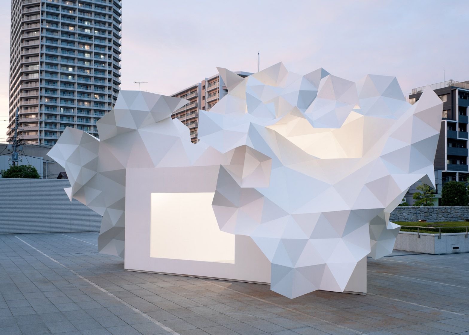
Bloomberg Pavilion, Museum of Contemporary Art Tokyo, Japan by Akihisa Hirata, 2010-2011
Akihisa Hirata's Bloomberg Pavilion is located in the grounds of the Museum of Contemporary Art, Tokyo. The pavilion has a pleated metal surface that echoes crumpled paper, but was designed to resemble the form of a tree.
"The pavilion is based on ideas of folding, and even Japanese principles and the idea of origami," said Gadanho. "The idea of how you can create structure only through the folding of metal sheets and create space out of that structure, leaving behind the traditional notions of pillar and floor plates, that comes from Corbusier."
"It is really encloses all the principles that have led Nirata’s investigations and which is now leading to one of his first collective housing projects," he added.

