Asymmetric French house designed by GENS as a collage of "banal components"
One half of this house in northeast France has a tiled roof and rendered walls, while the other is clad in corrugated plastic and has a chamfered corner (+ slideshow).
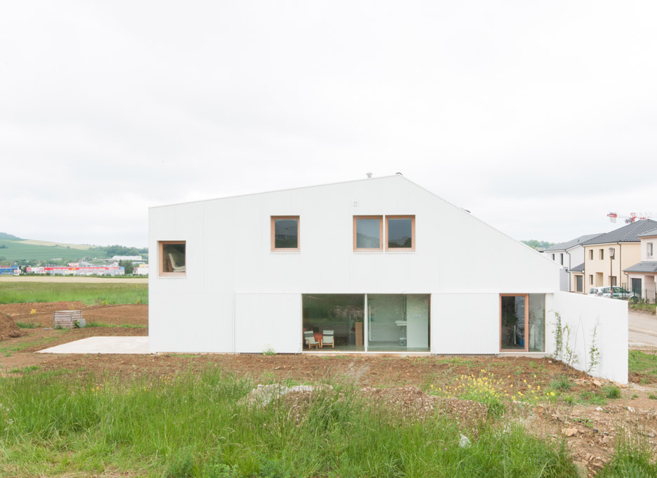
French studio GENS: Association Libérale d'Architecture created the residence as a first home for a family with design ambitions that exceeded their budget.
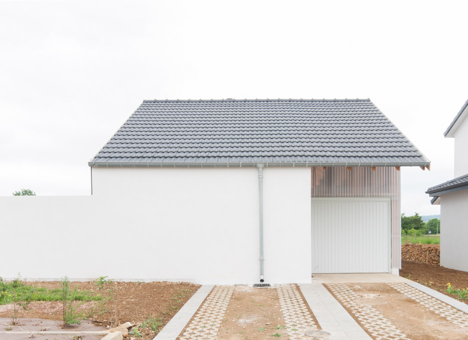
The site is located on a partially built housing estate in the town of Pulnoy. The architects wanted to design a property that would resonate with its neighbours – but not too much.
This led them to design the building as a collage of "banal components", including a tile-covered roof and white rendered walls. But they arranged these elements in non-standard ways, to achieve a building that is slightly unusual.
"The brief was to accommodate this 'ugly' context and the good will of the client," architect Guillaume Eckly told Dezeen, "to fit in [with] the surroundings without surrendering to the 'ugly' architecture it usually houses, nor proposing an architectural piece of work that would look totally strange within the ambient banality."
"The volume of the house answers to both the attempt to look like – or at least to get close to – the neighbours and the precise policy of the estate, which defines distances to the limit of the plot, maximum height, etcetera."
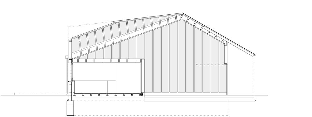
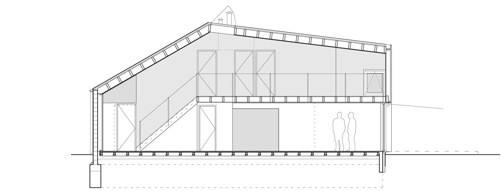
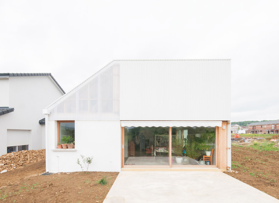
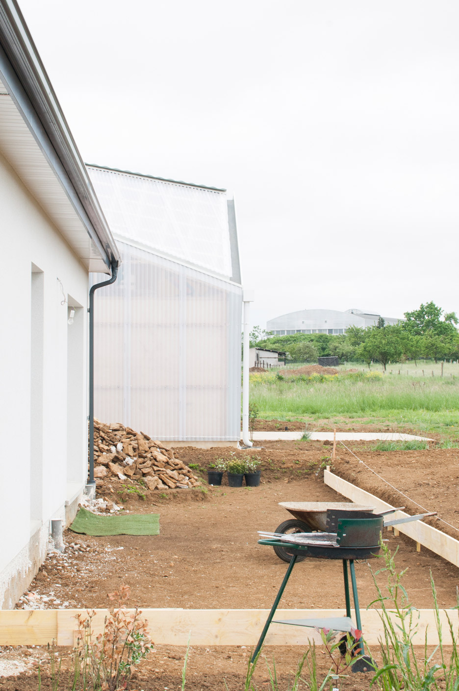
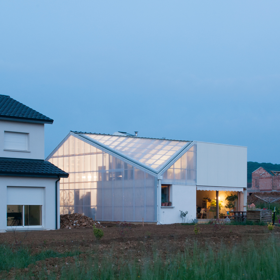
The unusual roof form is traditionally pitched and tiled on its road-facing aspect, but chamfered and covered in polycarbonate sheeting at the rear.
This form is designed to maximise the inner volume, while minimising intrusion to neighbours. It led the architects to name the project Individual Hangar.
This missing corner at the back is designed to prevent the house from casting shadow over the adjacent plot, while the appearance of the front portion matches the proportions of its neighbour, out of "politeness".
The studio took a similar approach for its top-heavy house in Alsace, which has a traditional front but a contemporary rear to fit in with its conservative neighbours.
The walls are clad in white corrugated metal, as well as translucent polycarbonate. At night, when the lights are on inside, the building's wooden structure is visible through the plastic.
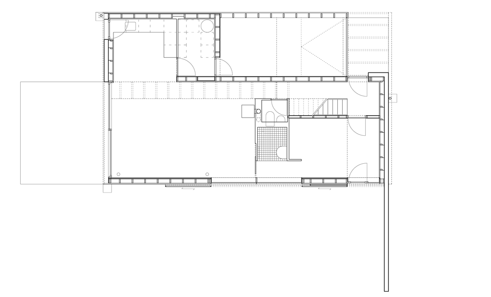
Sliding shutters, also made from white corrugated metal, can be drawn across large glass doors at ground level to give the house the appearance of a warehouse.
"To the back, the hangar-like volume that accommodates the programme within the maximum capacity and cost efficiency gives the weird shape of the asymmetrical south facade," said Eckly.
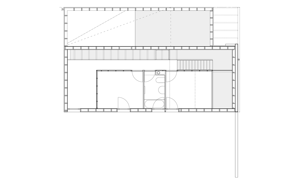
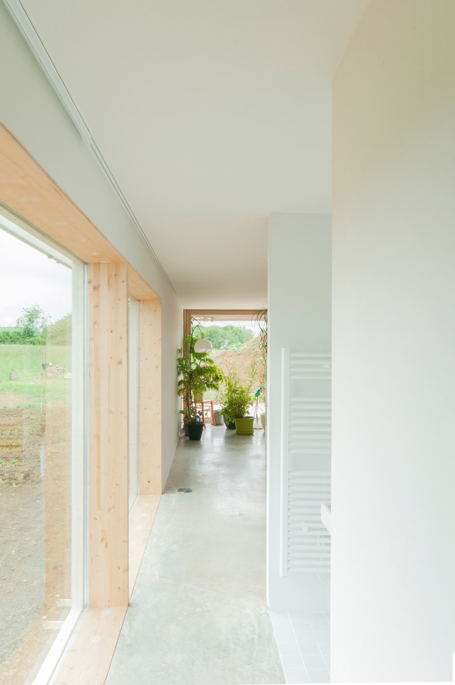
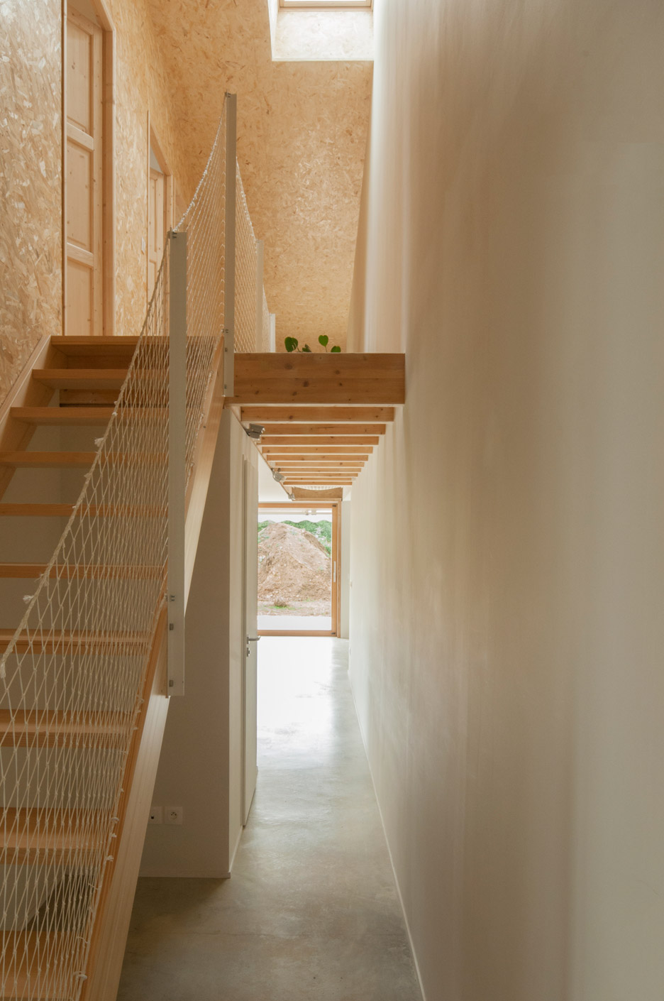
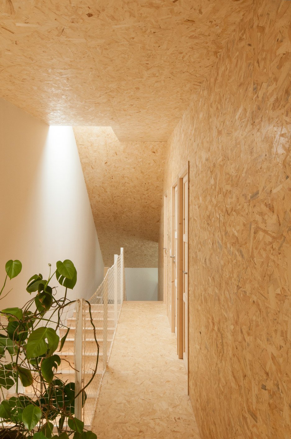
Inside the ground floor living room, kitchen and master bedroom have white plasterboard walls and exposed concrete floors, while the upper floor or "children's world" is lined in oriented strand board – an engineered wood product – to achieve a warmer finish.
Photography is by Ludmilla Cerveny.
Like Dezeen on Facebook for the latest architecture, interior and design news »
