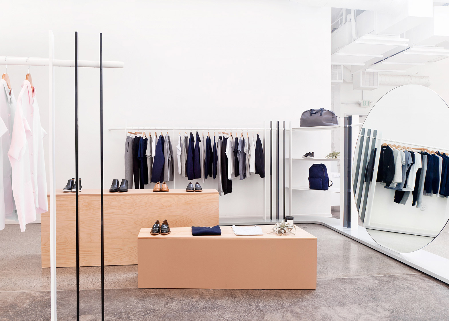
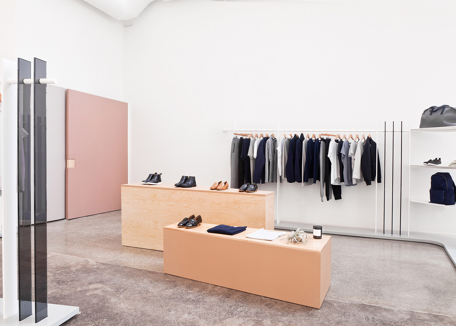
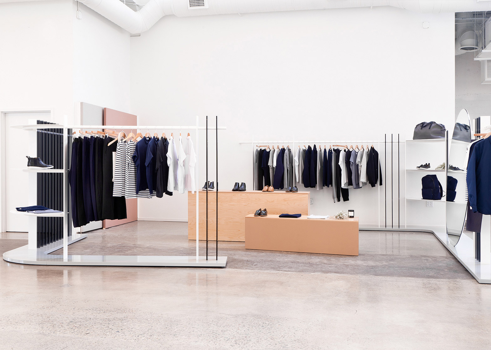
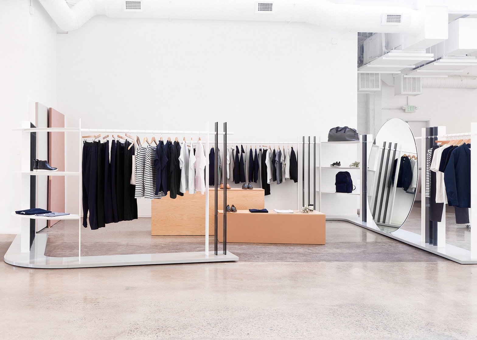
US design studio Brook&Lyn has used pastel-coloured panels and a huge circular mirror to create the first physical showroom for Everlane, at the online clothing retailer's San Francisco headquarters (+ slideshow).
Everlane approached Brook&Lyn in December 2015 to create a display area within a 20-square-foot (7.1-square-metre) space in the centre of the open office.
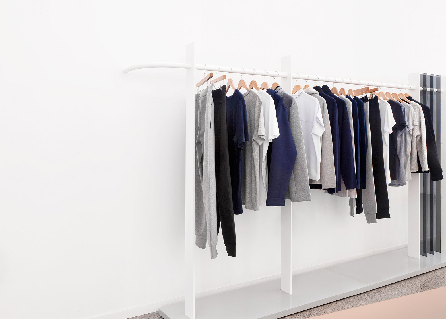
The company's first showroom needed to include a rack system, flat shelving, mirrors and seating, in materials and colours that would compliment Everlane's existing palette.
"Conceptually, we were really inspired by Everlane's principles around transparency," said Brook&Lyn, founded in 2009 by husband-and-wife team Mimi Jung and Brian Hurewitz. "It was a theme that informed both the aesthetics and construction of our design."
With this in mind, the duo decided not to use walls to enclose the showroom, but instead created a variety of more open partitions.
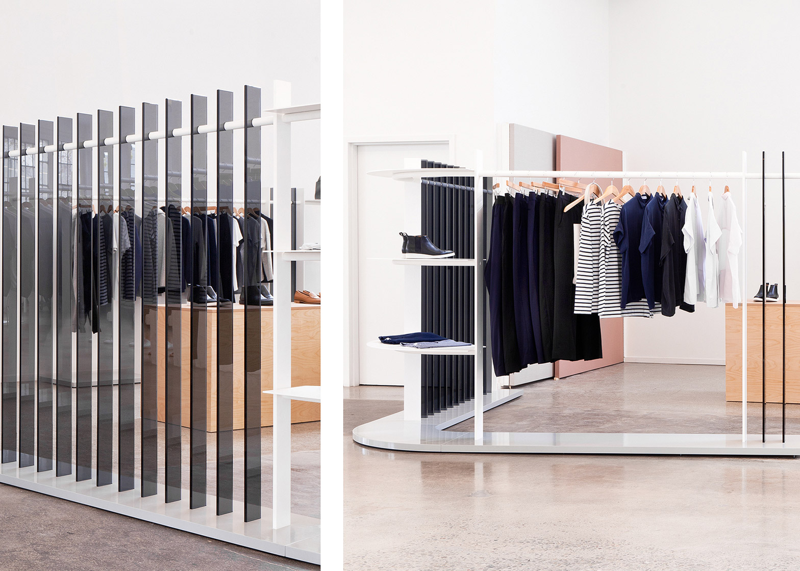
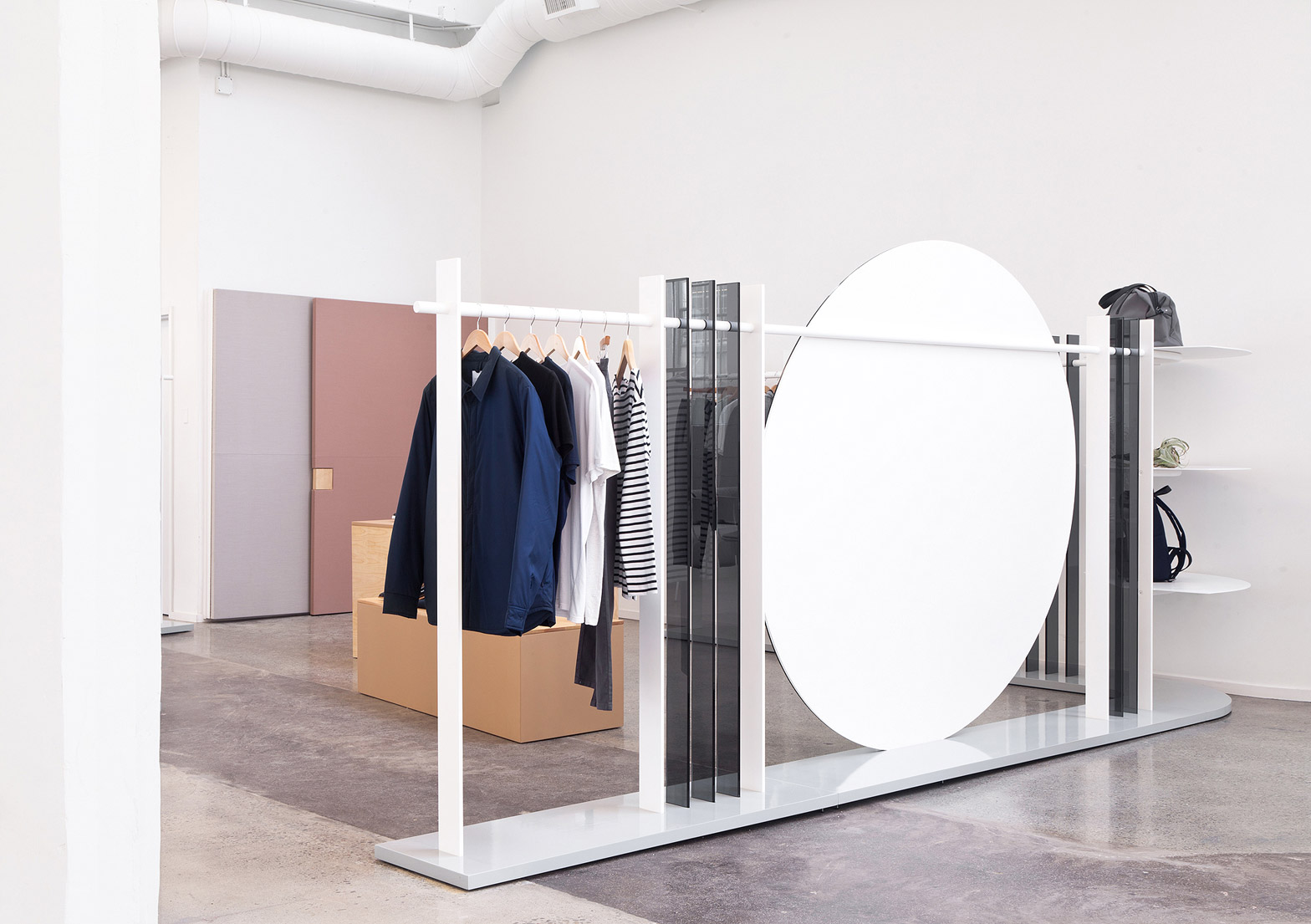
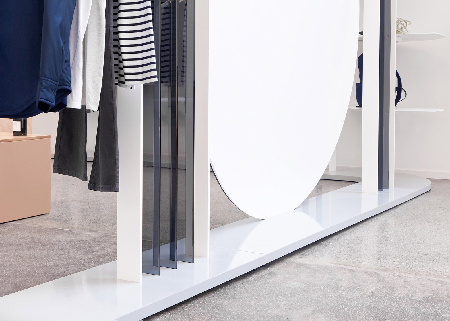
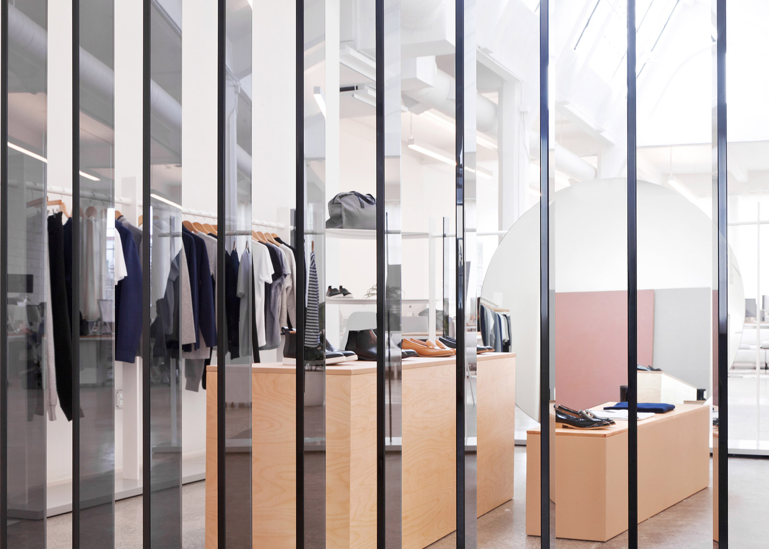
Vertical slats of black glass, white shelving and rails for clothing are all used to define the space.
On one side, a circular mirror with a 76-inch (193-centimetre) diameter rests on the same steel rail that runs around the edge.
"We used the height of our continuous steel hang rails, just above eye level, with strategically suspended and spaced glass panels to create a subtle distinction between the showroom and office spaces," said Jung and Hurewitz.
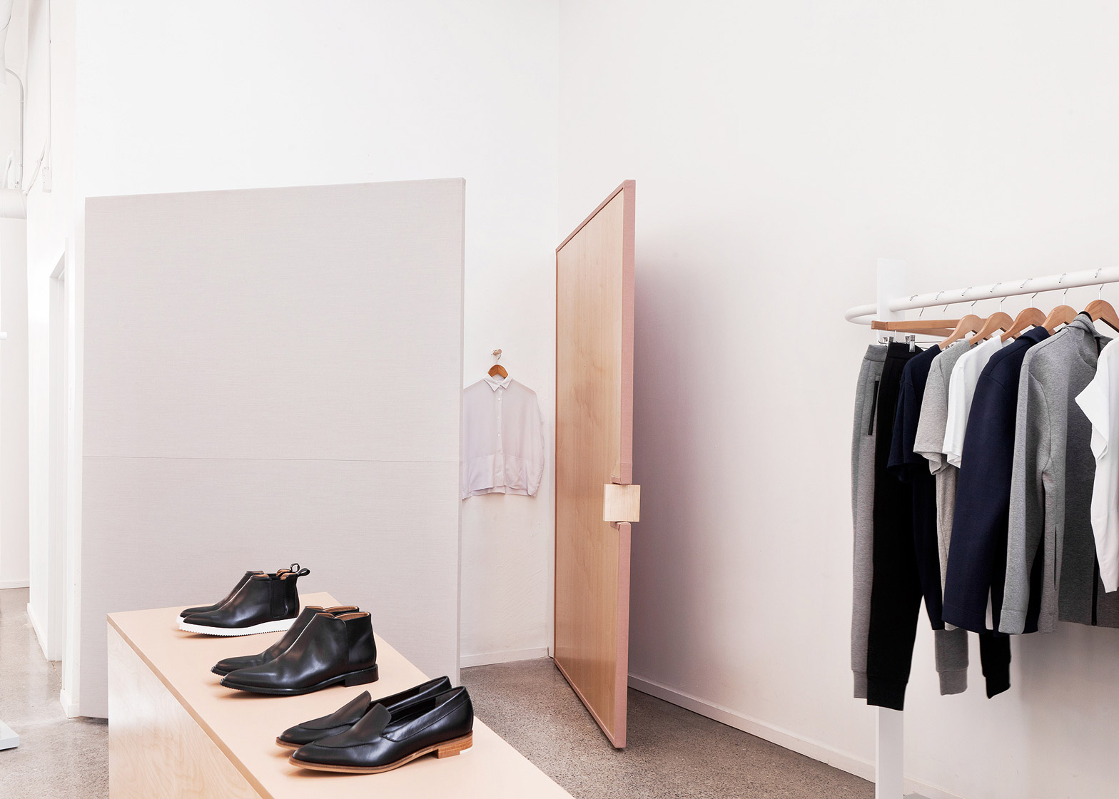
In the centre, two podiums of different heights are made from birch and maple wood. The stands are topped with leather and are used to display shoes.
An existing wall is covered with two panels upholstered with fabric, one in grey and the other soft pink. These panels swing open to reveal more clothes hung from the wall behind, and create a temporary fitting room.
The pared-back materials palette is intended to work with the polished concrete floor and white walls of the office, as well as the products on show.
All of the custom furniture elements were crafted by hand near Los Angeles.
"For many consumers, this will be the first time they interact with the brand's in the physical world," said Brook&Lyn. "We wanted them to try on and experience Everlane clothing and accessories in a truly unique retail environment while still feeling as if they were part of the behind-the-scenes, open office environment that makes it all possible."
Similar colours and materials were used by Snarkitecture to create a fashion showroom for COS, while John Pawson took an equally minimal approach when designing the London store for Christopher Kane.

