Lensvelt designs collection of intentionally boring office furniture
Milan 2016: Dutch furniture brand Lensvelt is producing a collection of "boring" office furniture intended to "restore the balance between work and play" in the workplace (+ movie).
The Boring Collection was conceived as a comment on the "ugly" appearance of affordable contract furniture and the distracting designs being added to some workplaces in the wake of the Google office.
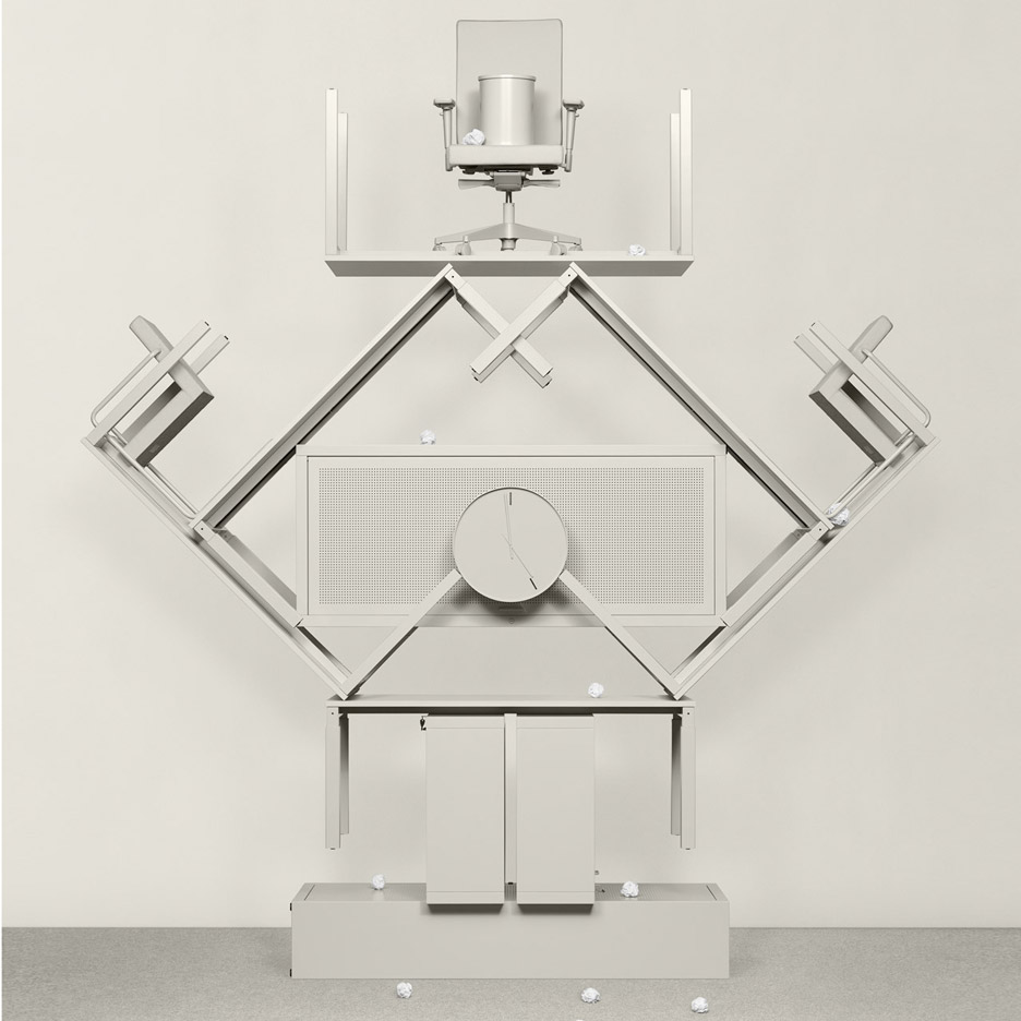
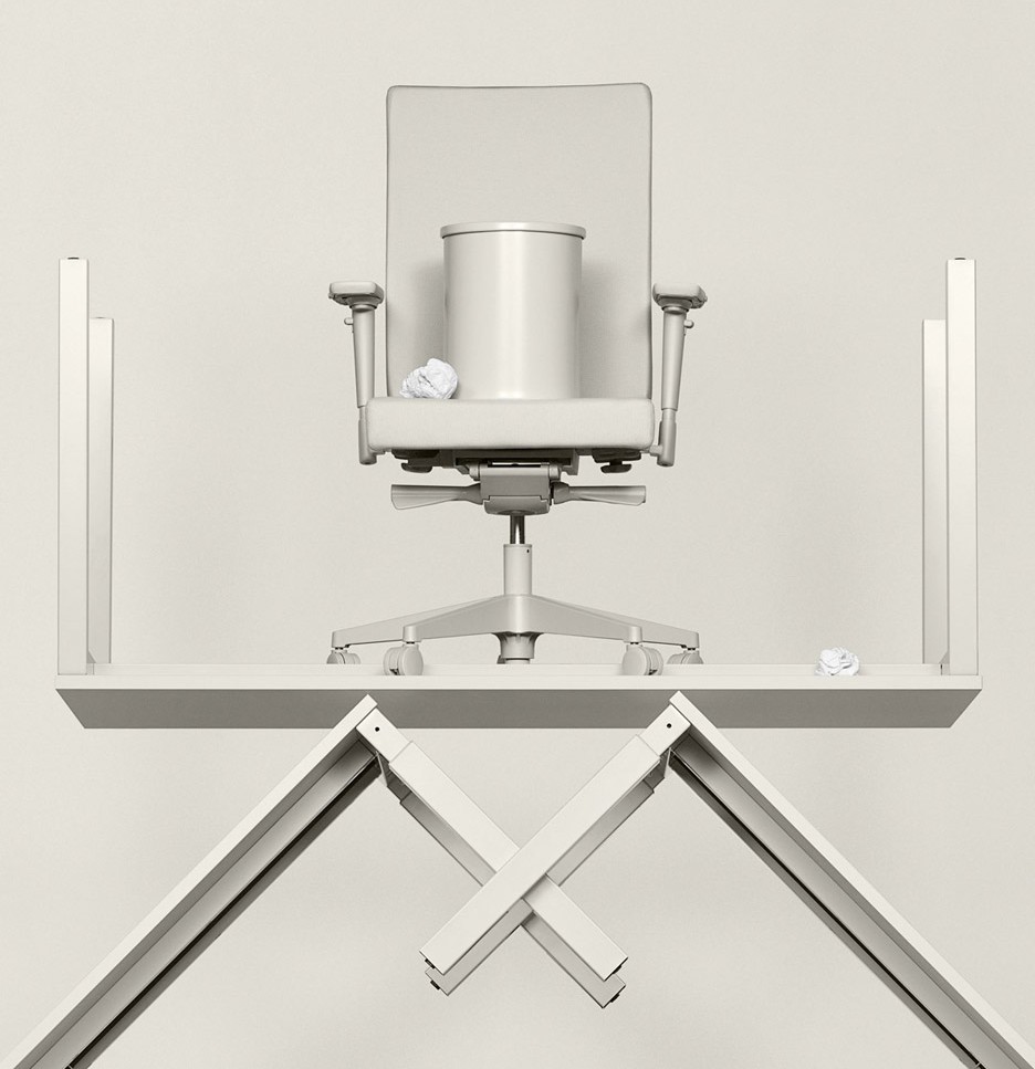
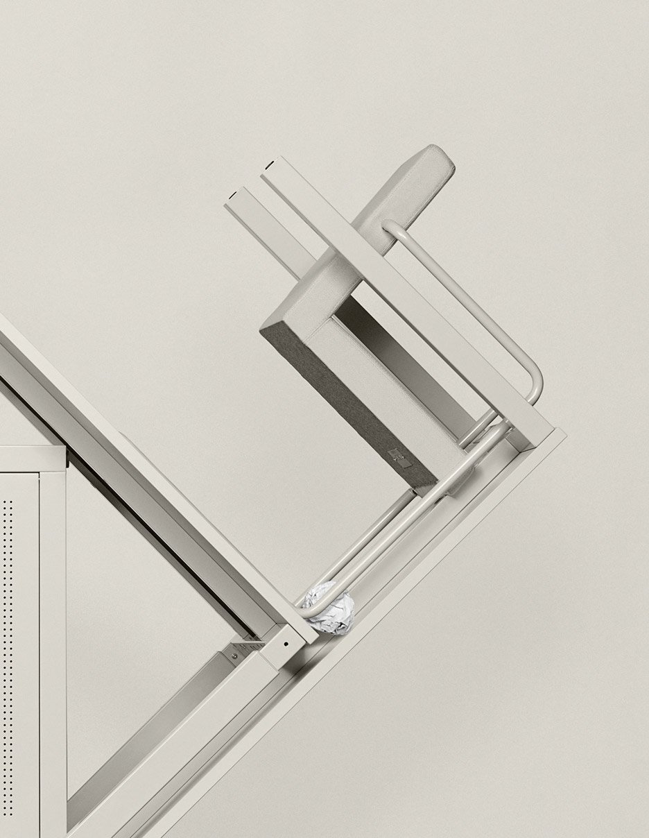
Created in collaboration with Amsterdam architecture studio Space Encounters, the collection consists of a plain grey desk chair, visitor chair, acoustic panel, low and high cabinets, and four types of desk. The team also created a "boring" bin and clock.
Each piece is made up of simple, archetypal shapes in order to help the furniture be less conspicuous.
"The looks of affordable office furniture are pretty much dictated by legislation and therefore often detonate with the rest of the interior and surroundings," said the design team.
"The Boring Collection does not pretend to be more beautiful, in fact the Boring Collection does not claim any attention," they told Dezeen.
The team's opinion on modern-day office design is similar to that of expert Jeremy Myerson, who told Dezeen that the Google-inspired fad for slides and ping-pong tables has had a damaging impact on the workplace.
"Partially thanks to Google, the modern day office is nothing like it was before," said the Boring Collection team. "Office cubicles were torn down and replaced with open-plan floors, dimly lit meeting rooms turned into cappuccino bars, and damp office buildings abandoned in favour of spacious warehouses."

"These are all meaningful improvements, but somewhere in the process we went too far," they continued. "When slides, brainstorm mattresses and ping-pong tables started appearing we lost sight of what offices are actually meant for work."
"With Boring Collection we want to give designers the tools to restore the balance between work and play again."
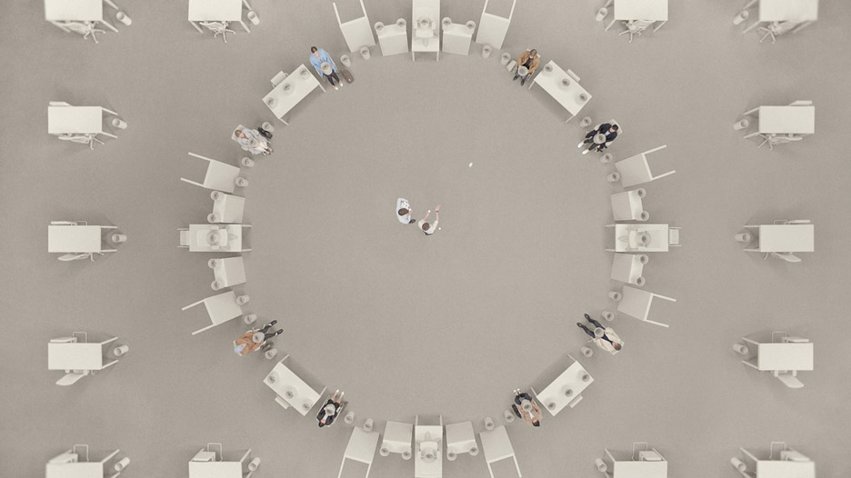
Dutch artist duo Lernert & Sander, who are well known for their moving image campaigns for fashion brand COS, were enlisted to create a video and a series of interesting images of the pieces.
One of the images shows the furniture pieces stacked on top of each other in a shape inspired by Ettore Sottsass' Carlton bookcase.
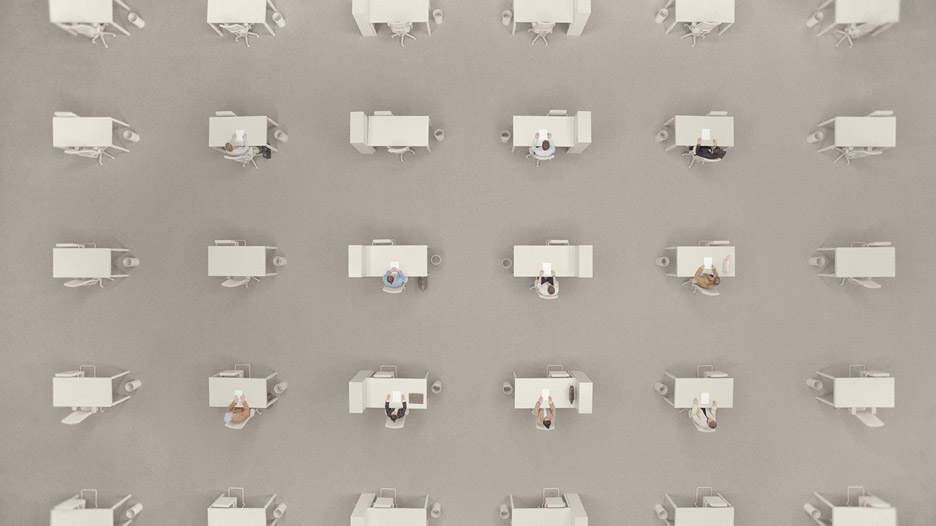
"We can totally relate to the idea that furniture should not demand too much attention," said Lernert Engelberts. "For this project, we worked with the most iconic gesture of boredom: the attempt to throw a ball of crumpled paper into the trashcan until the clock turns five."
"The office people steal the scene even though they are surrounded by the designs of Boring Collection. Just like the architects intended," he added.
Lernert & Sander's concept will be repeated for the furniture collection's debut at this year's Milan design week with an installation at Ventura Lambrate.
The furniture will be placed in a clock-like formation, and will stand in an artificial landscape of 150,000 paper balls made from leaflets about the collection.