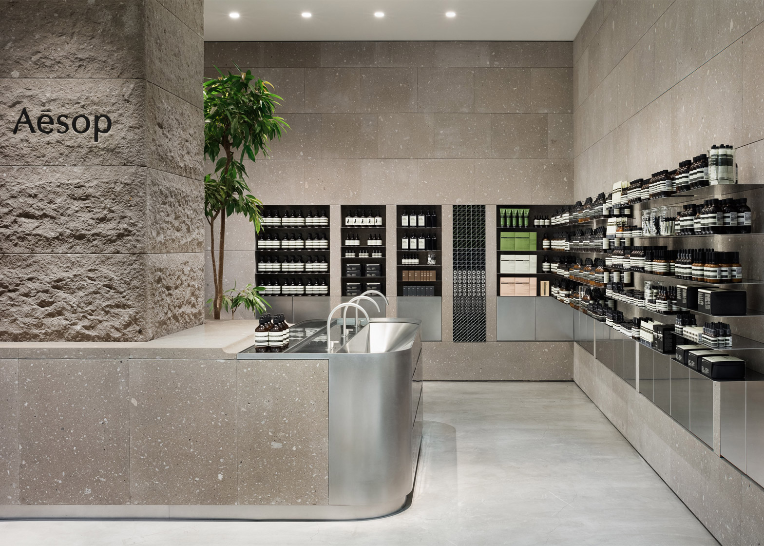
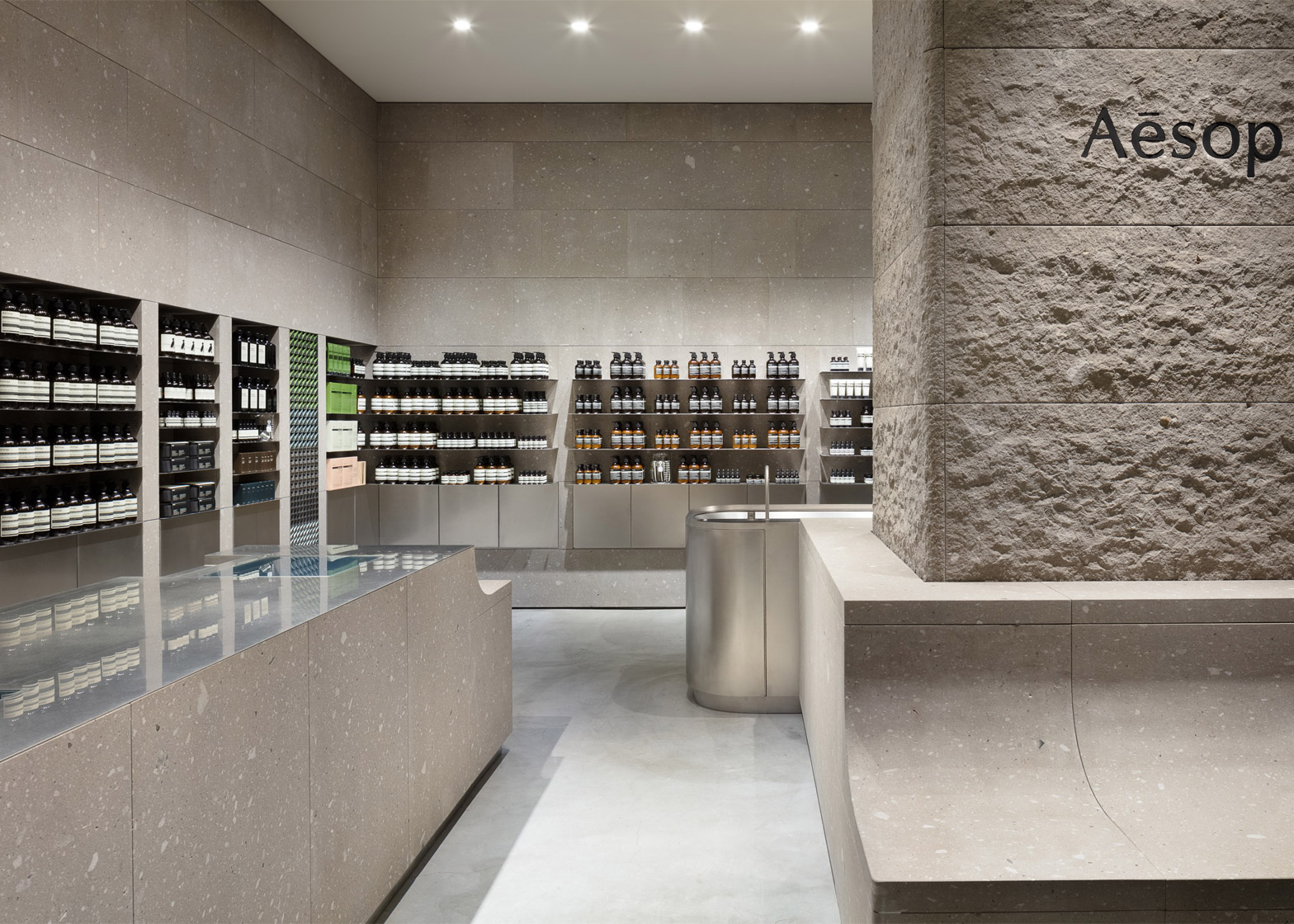
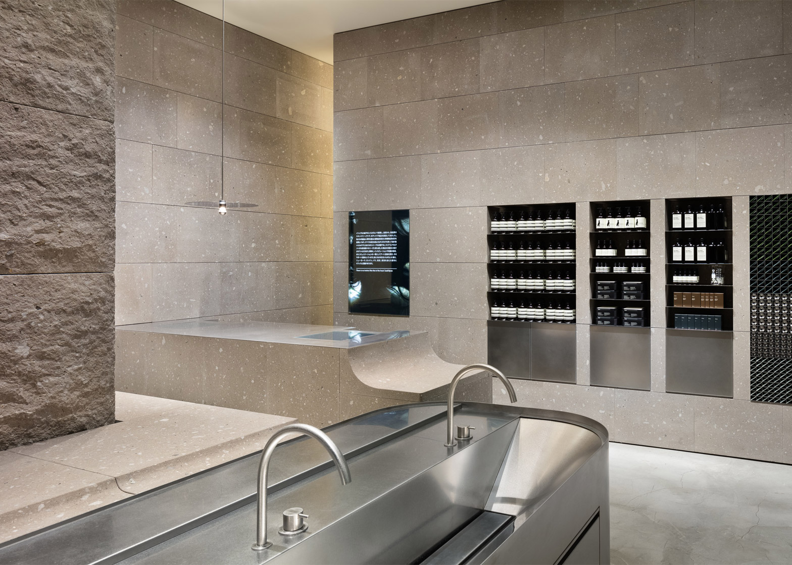
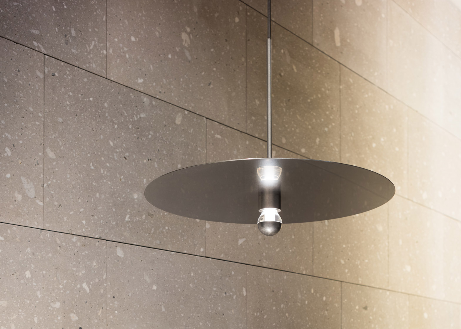
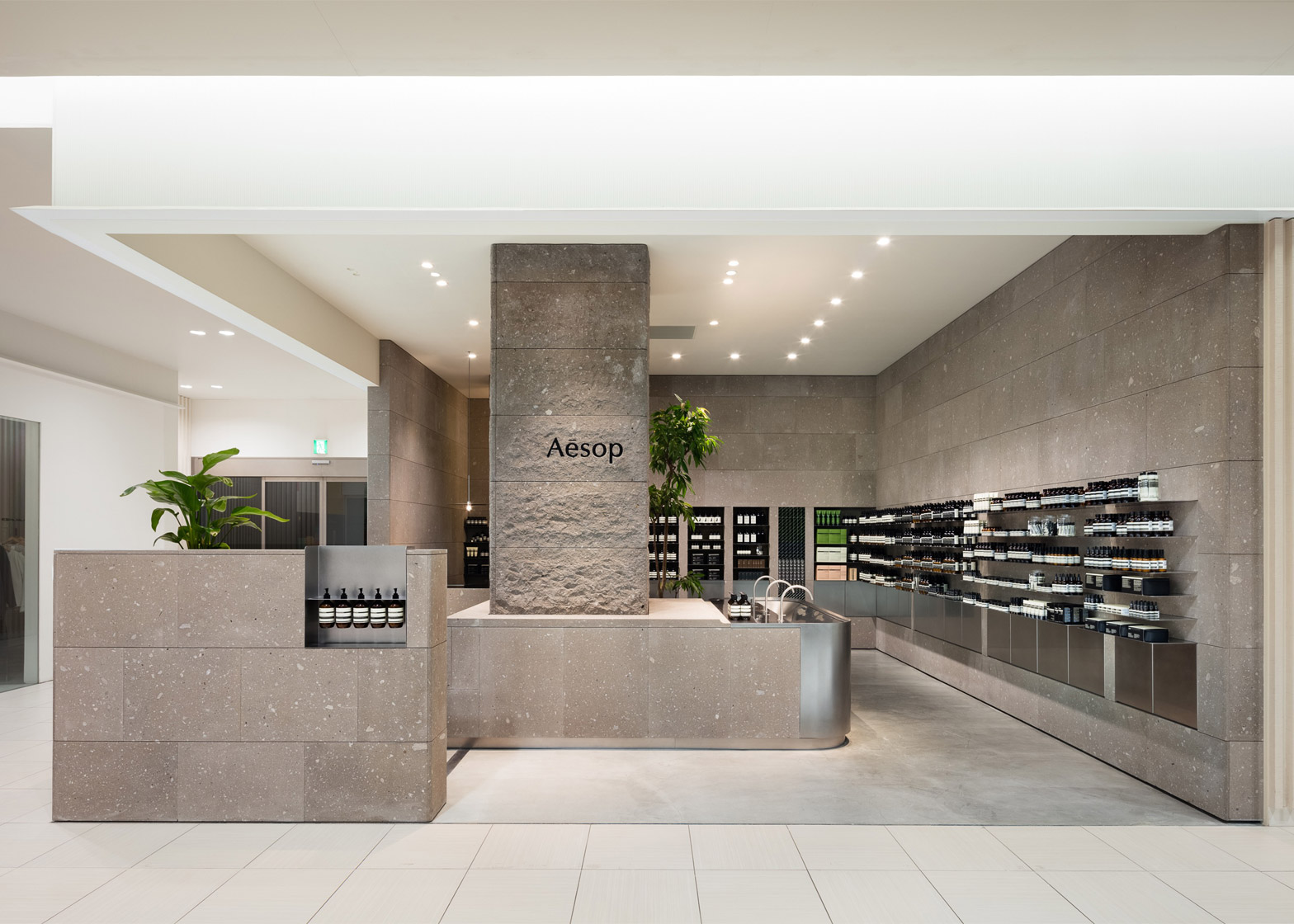
Materials and colours used throughout the interior of this Aesop store in Sapporo, Japan, were designed by architecture studio Case-Real to mimic the surrounding landscape of snow-topped mountains (+ slideshow).
Fukuoka-based Case-Real designed the interior for the Australian skincare brand's 15th Japanese store, which is located inside the JR Tower shopping centre.
The architects wanted to portray the "poetic and scenamatic" atmosphere of Sapporo and its Hokkaido setting, which includes a number of mountains and volcanic plateaus.
"These are scenes that withhold contradictory elements, which are at the same time dynamic but somehow fragile, with a sense of roughness but also delicate, and in pale darkness but with sunlight," the designers said.
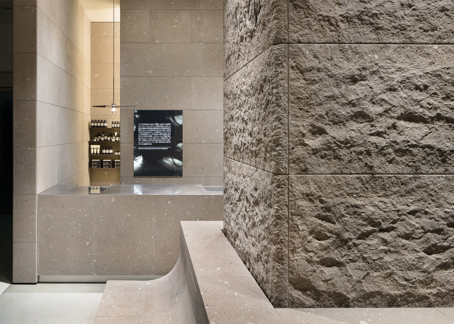
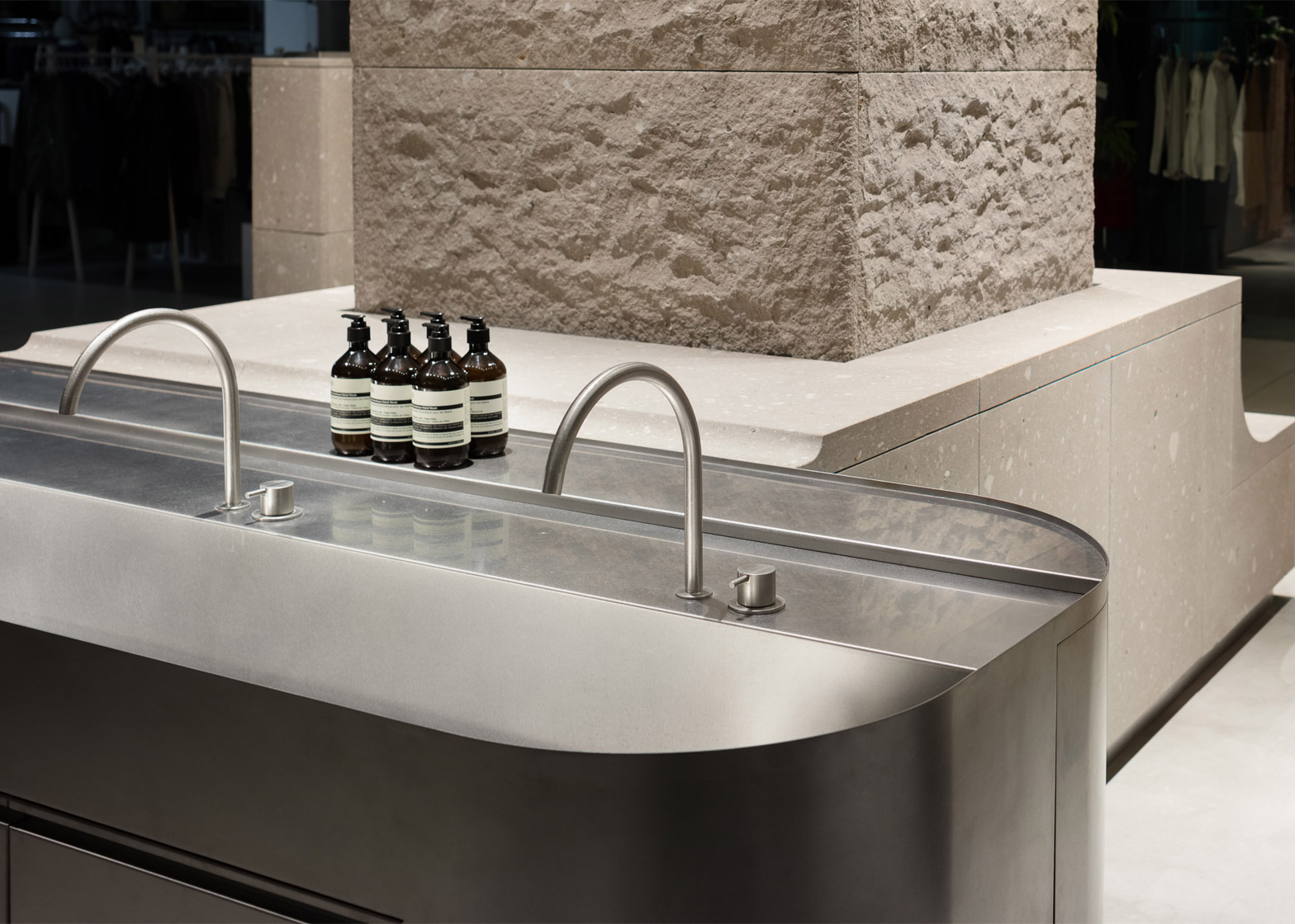
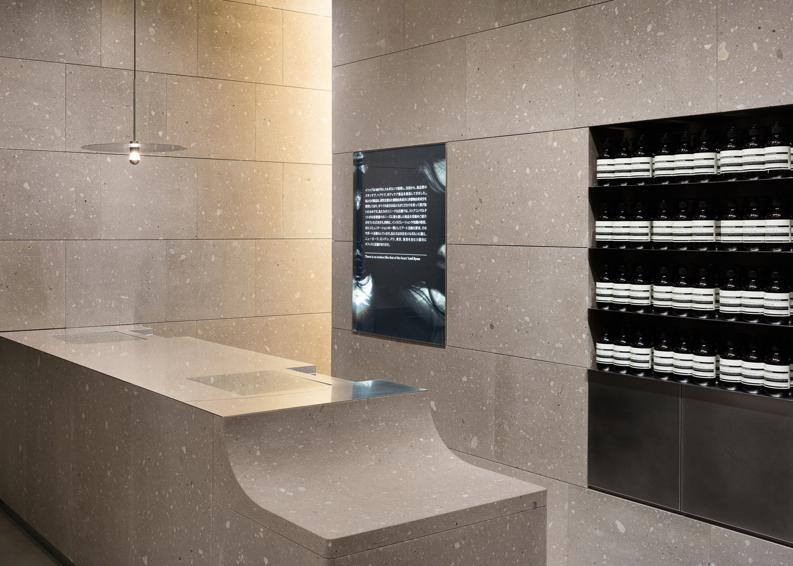
The main material used to cover the walls and main counter is Sapporo freestone – a type of volcanic stone, which the architects say has been used as a construction material in the region for more than 100 years.
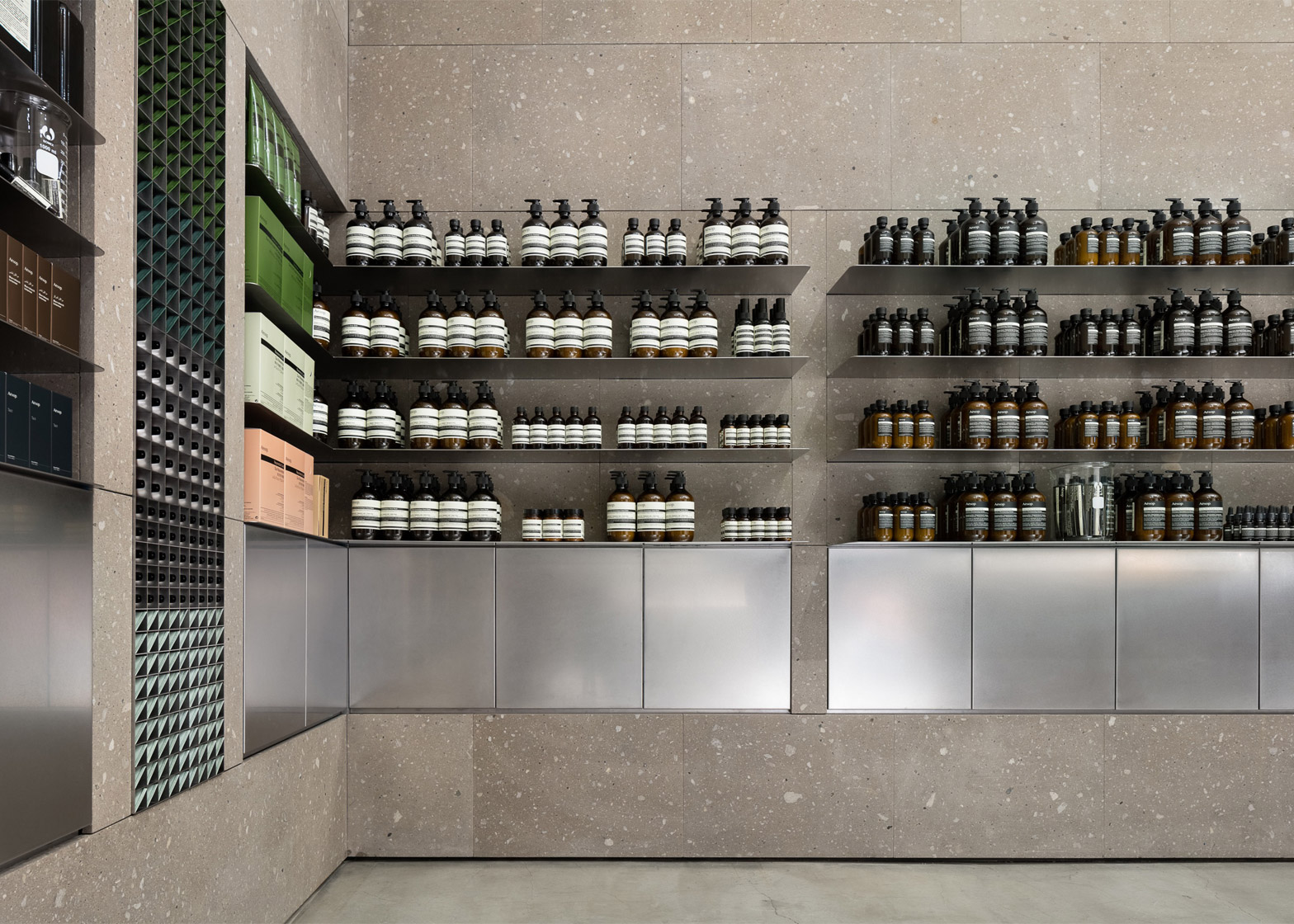
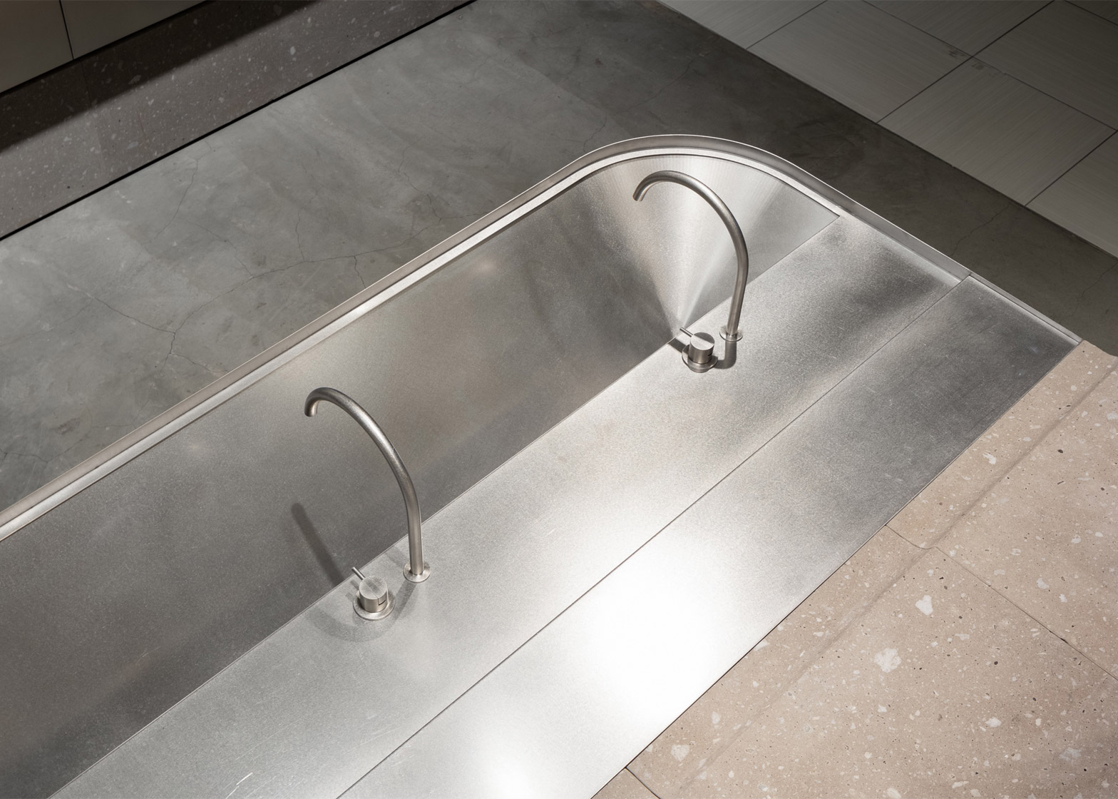
Stainless steel was used to create the display shelves and other functional fixtures throughout the store including the demonstration sink – an important fixture in all the Australian brand's stores.
The branch on London's Lambs Conduit street features bespoke copper basins and taps, while a Hamburg store contains a large stone sink.
"We used freestone for its fine surface and suitable solidity, for its easy mining, light weight and its heat-retaining, highly fire-resistant characteristics," said the architects.
"With the abstract expression and the texture of the material when this freestone is finished roughly, we aim to overlap the distinct landscapes of the region."
Each of Aesop's stores feature individual interiors. Dennis Paphitis, founder of the skincare brand, told Dezeen: "there's a direct correlation between interesting, captivating store spaces and customer traffic within a store."
Materials used are often indigenous to the region, such as Kerstin Thompson Architects' perforated gum wood details for a store in Melbourne or make local cultural references, as in the case of a branch in Stockholm inspired by the work of Danish filmmaker Lars von Trier.
Photography is by Takumi Ota.
Like Dezeen on Facebook for the latest architecture, interior and design news »

