Nendo designs symmetrical space for Marsotto Edizioni's Light and Shadow exhibition
Milan 2016: Japanese studio Nendo has created a half black, half white installation to display marble furniture for design brand Marsotto Edizioni (+ slideshow).
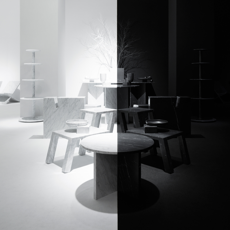
The Spazio Bigli space is divided into two sections, with the brand's black and white marble tables and bowls organised by colour in a symmetrical configuration.
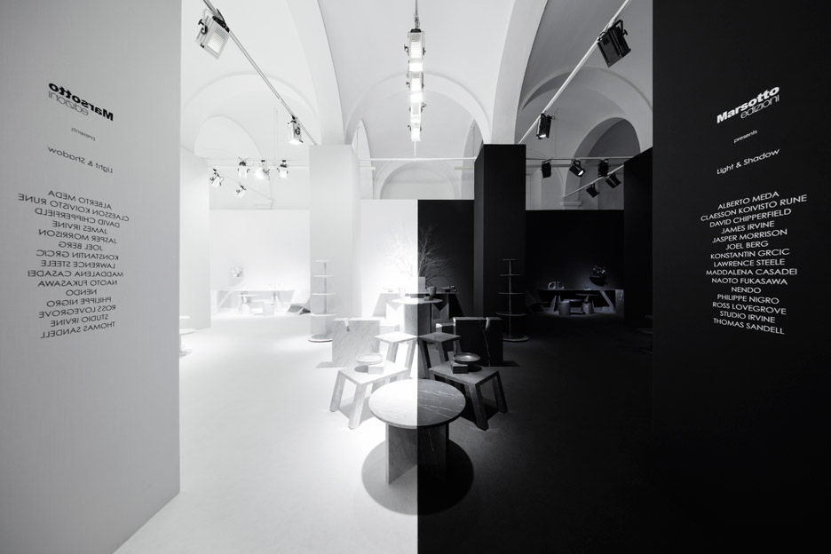
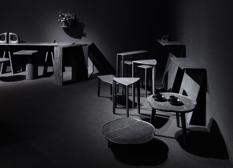
Nendo has painted each half of the room to correspond with the colour of the pieces, with a dividing line along the centre of the space.
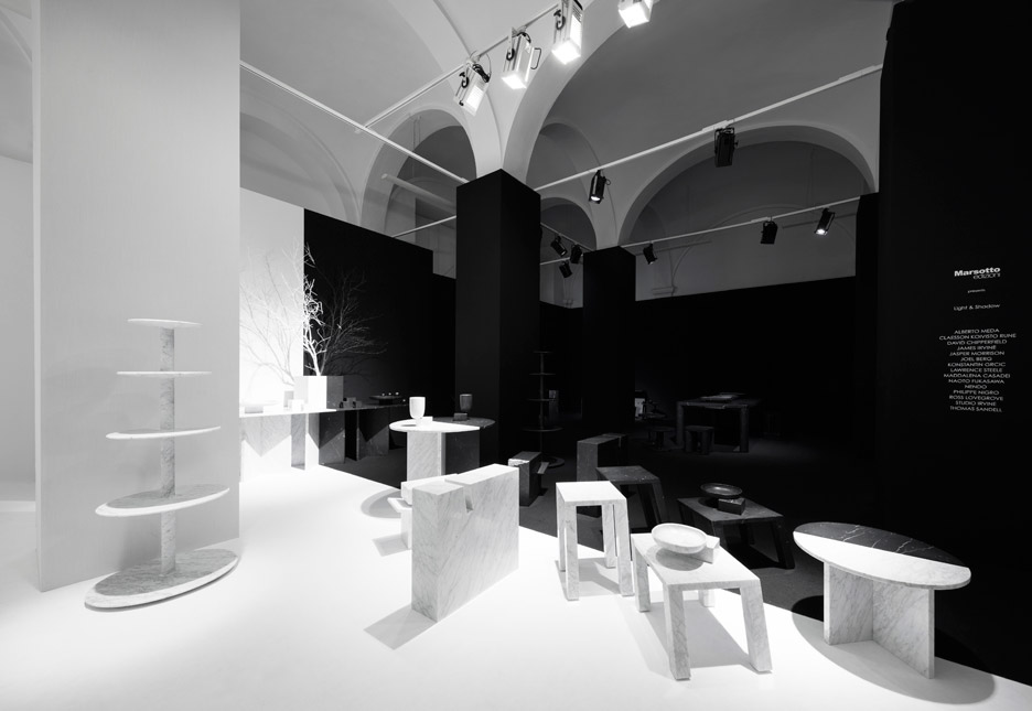
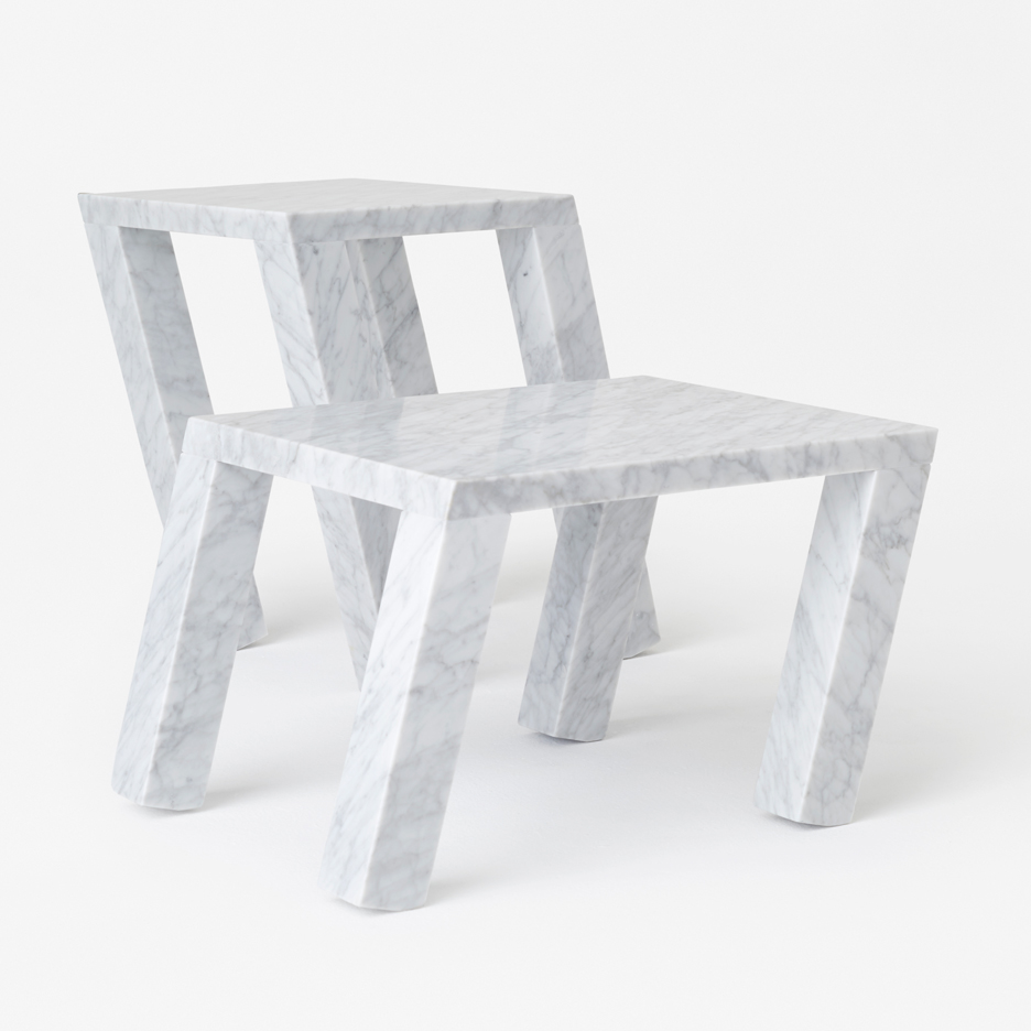
At the middle point, furniture is arranged as a mirror image, with slanted black and white tables – also designed by Nendo – leaning into one another.
"The weight of marble is often perceived as a negative factor, but this element has been actively exploited, resulting in the creation of a table that is tilted to one side," said the studio.
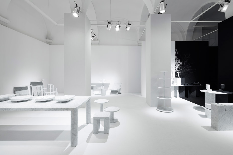
Other circular tables by Nendo are made of contrasting halves that can be split apart. Black and white sections are positioned to appear as reflections of one another.
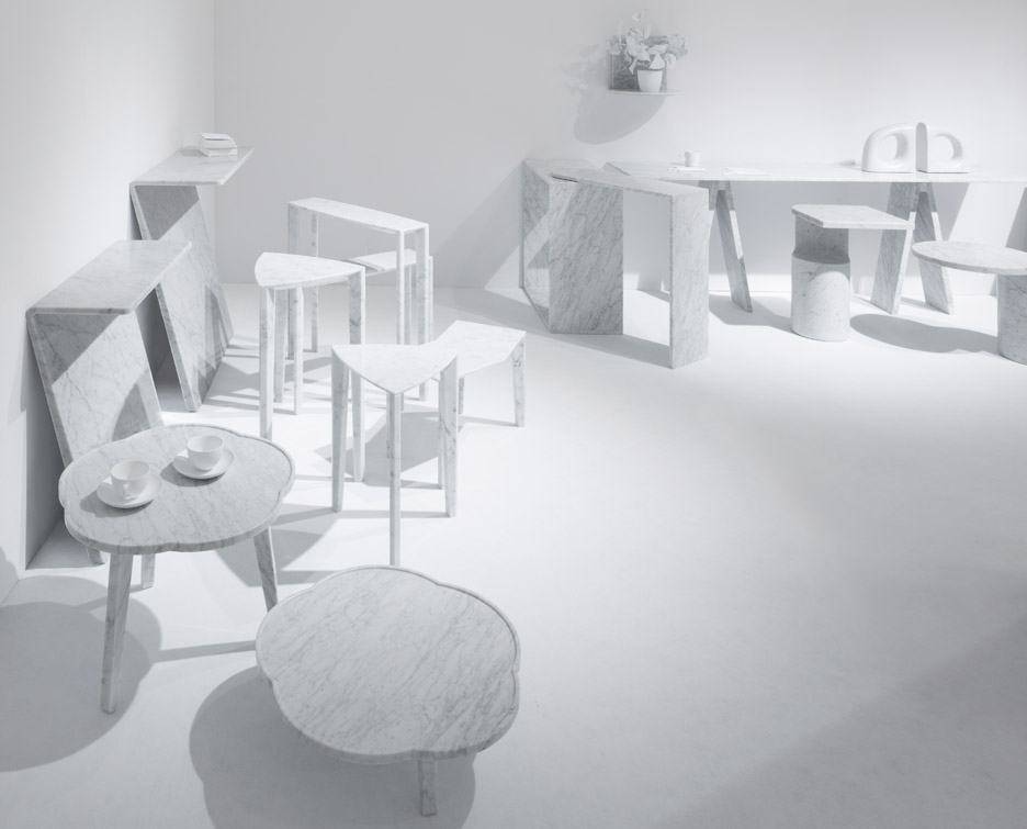
The tables can also be combined with other furniture from the range to create a longer piece.
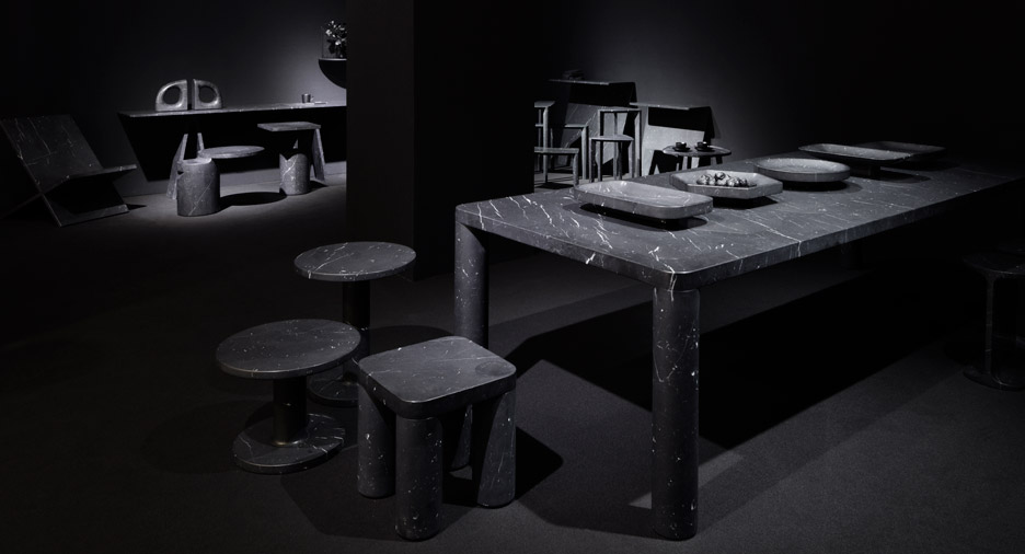
Elsewhere in the Light and Shadow exhibition are Nendo's Under fruit bowls and vases, which feature round vessels attached to square pedestals, and the Gap side table – made from a solid marble slab with a rectangular "notch" for books and magazines.
"In order to utilise the rather unsightly regularly spaced pillars and the spatial feature of the entrance being in the middle of the space, it was decided that the exhibition space would be divided left and right," said the studio.
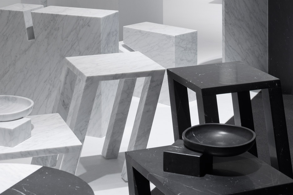
"As soon as one enters the room they are standing right at the boundary of the spaces," it added. "A visual effect was created as though the spaces were reflecting each other like a mirror, along with the pillars that were rhythmically arranged."
The exhibition is taking place in Spazio Bigli at Milan's Palazzo Ponti, and remains open until 17 April 2016. Nendo is also presenting an installation of 50 chairs influenced by manga comics at a historic cloister in the city, and a transparent rocking horse for Kartell at the Salone del Mobile furniture fair.
Further furniture highlights from Milan design week include Zaha Hadid's Mew table, which is the architect's last piece of design, and Michael Anastassiades' first range for Herman Miller.
Photography is by Takumi Ota.
Read Dezeen's guide to the top 10 unmissable exhibitions and installations at Milan 2016 »