"He's made architecture approachable to people who didn't care about it"
Comments update: readers have been discussing Bjarke Ingels' impact on architecture this week, after Time magazine named him as one of this year's most influential people.
BIG deal: Rem Koolhaas, OMA founder and Ingels' former employer, likened the Danish architect to a Silicon Valley entrepreneur. Some commenters questioned whether Koolhaas meant this as a compliment.
"I think the [people] are wrong to see Rem's comments as wholly positive endorsement," said Peter Smisek. "Saying that someone 'responds fully to the current zeitgeist' is not only a compliment, but a critique as well."
Others suggested that Ingels is "overrated", damning his architecture for being too simplistic.
"Showmanship does not equal greatness," said Stephen Mallory, while Heywood Floyd described him as an "expert media manipulator" before comparing his built projects to a "dumbed-down populist cartoon".
Many leapt to Ingels' defence. "He's made architecture approachable to people who didn't care about it," wrote Noah.
"The problem with insularity in the profession today is that professional members believe they have the rules laid down of what constitutes good architecture," added a guest commenter. "BIG is despised because they break the mould."
Tell us what you think about Bjarke Ingels in the comments section »

On brand: designers are increasingly moving away from the beleaguered royalty system by setting up their own brands, according to Stefano Giovannoni, who recently launched online company Qeeboo.
Some readers have accused the emerging entrepreneurs of being slow to catch on to a changing market.
"They are quite late to the so-called revolution," wrote Vlad. "They're already dinosaurs claiming to have reinvented the wheel".
"You really don't know what you are talking about," replied Stefano Giovannoni in the comments section. "If you know one company in the world producing industrial products for the house based on a similar business model to Qeeboo, please let me know."
Others questioned Giovannoni's comments about the royalty system, prompting the Italian designer to set the record straight.
"I never criticised the royalty system and I think it is the only way to create a long-term relationship with a company," wrote Giovannoni. "What I really said is that the royalty system doesn't work anymore as [it did] in the past." Read the comments on this story »

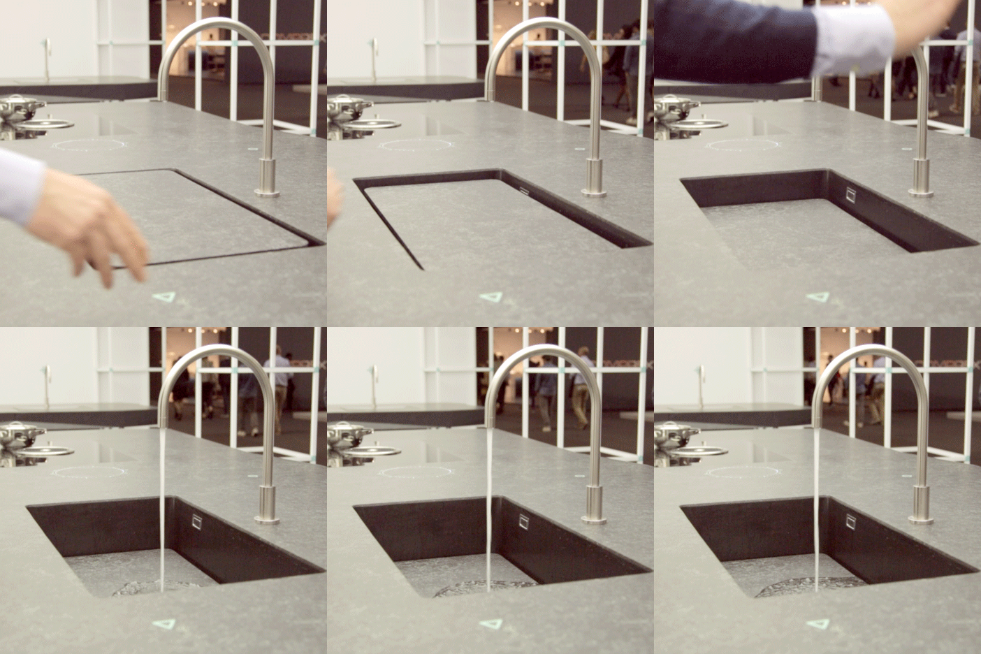
Sinking feeling: commenters flocked to our Facebook page to criticise the design of a sink that appears and disappears at the wave of a hand.
"So instead of immediately getting water by just turning on the tap, you have to make some strange hand motion, wait for the sink to lower a bit, then another motion to start the flow of water," wrote Diego Sebastian. "If it ain't broke, don't fix it."
"Is it really necessary?" asked another commenter while Joel described the design as a "half-baked idea".
"It doesn't seem practical at all," concluded Tiago de Sousa.
What do you think of the disappearing sink? Let us know in the comments section »

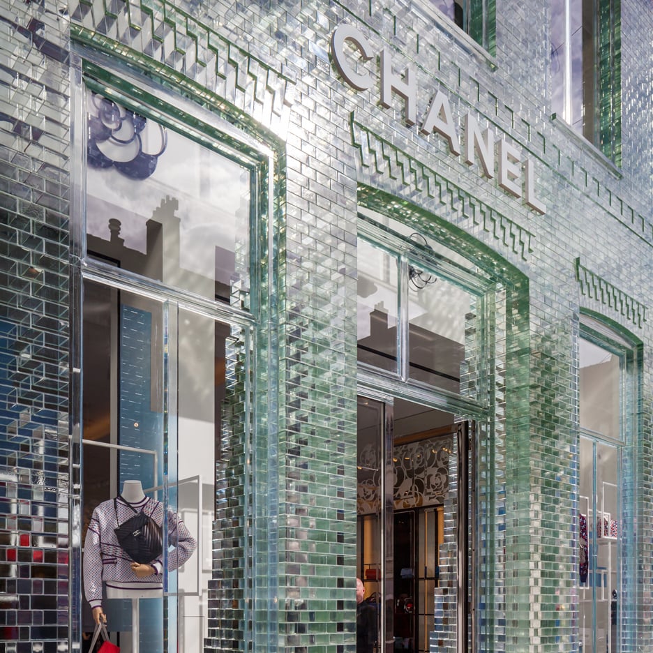
Smashing it: MVRDV's transformation of a Chanel boutique with glass bricks "that are stronger than concrete" quickly became one of last week's most-discussed stories.
"I love this, but for some reason I feel guilty about it," said Heywood Floyd while regular commenter Kay imagined what an entire city built with the transparent blocks would look like.
Lots of readers complimented MVRDV for the overall aesthetic of the facade, but others weren't as impressed.
"Had this been for a big corporation it would've been excessive, dumb and unnecessary," said a commenter calling themselves Rem. "But since it's for a liberal corporation designed by such architects, it is beautiful and amazing. Bunch of hypocrites."
"It's an interesting story and an interesting use of a glass bricks," replied another guest commenter. "If it was done badly this would be the first place it was called out." Read the comments on this story »