"Could joined-up thinking finally be breaking out in Milan?"
Opinion: three years ago Dezeen editor-in-chief Marcus Fairs wrote an impassioned article complaining about the frustrations of visiting Milan during its annual design week. This year he found more to smile about. Here's his take on the 2016 fair.
Milan sorts itself out
As a design capital, Milan has long been frustratingly reluctant to redesign itself. While rival metropoli have invested in making themselves more liveable, Milan stuck obstinately with the gritty, traffic-choked model of the industrial dinosaurs. This, together with an apparent lack of concern for the hordes of visitors to the city, made it a nightmare to visit (read my infamous 2013 rant about the frustrations of negotiating the city during design week).
However last year's Milan Expo 2015 triggered a wide range of overdue improvements, including a general sprucing up and a number of traffic calming and pedestrianisation schemes. The city's BikeMi cycle-sharing scheme has been expanded and the congestion-charging initiative introduced in 2012 has helped make the city centre less of a war zone.
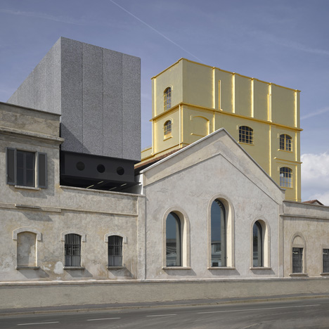
Like much of Italy, Milan has also been curiously resistant to interesting new architecture, but with OMA's Fondazione Prada it finally has a world-class contemporary public building.
It still has work to do to weed out rip-off taxi drivers and aggressive beggars, who both seemed more prevalent than ever this year, and street sleepers abound. Hotels continue to crank up their rates – the price of my room jumped by a factor of six between the pre-Salone Sunday and the fair's opening day on Tuesday – and apartment owners have cottoned on to the rich pickings: while the Dezeen team were searching for accommodation earlier this year they saw apartments listed on local flat-share sites mysteriously disappear and later reappear on Airbnb for double the price.
But overall Milan this year felt like a prettier, more civilised place. It's possible that the worst of the hard times are over too: it's hard to accurately gauge the financial health of the fair as brands will always tell you they've had their best year ever and the Salone del Mobile always sends out a press release boasting of "incredible success", although visitor figures of 372,151, rammed aisles and queues to get onto stands at the Rho fairground all point in a positive direction.
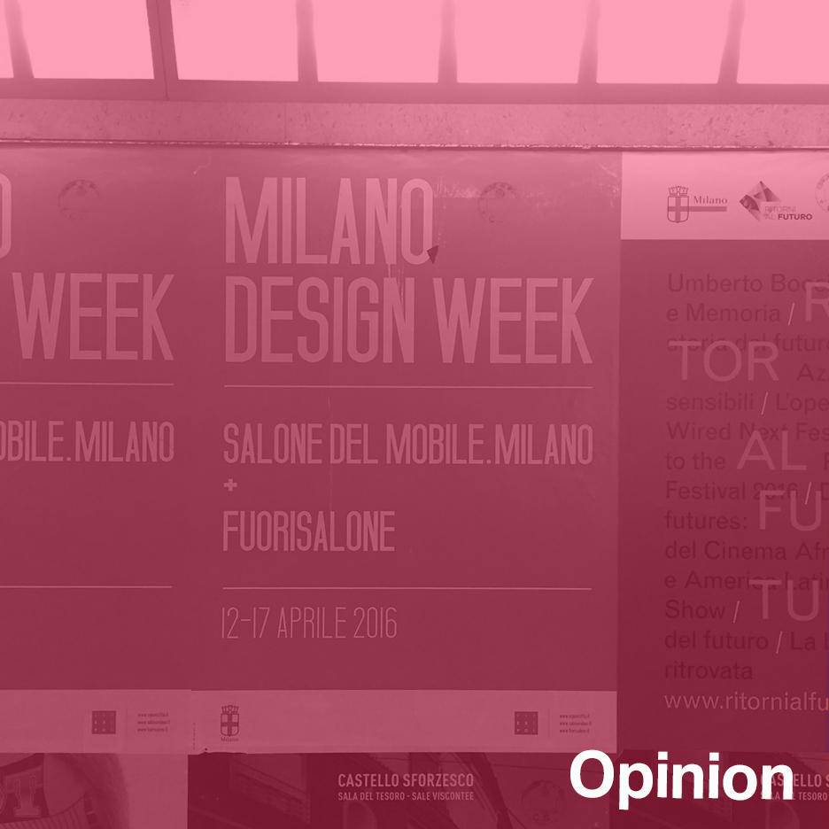
I even saw posters paid for by the city promoting "Milano Design Week" as an umbrella for both the furniture fair (which has rebranded itself yet again as Salone del Mobile.Milano but finally has its own website) and the fuorisalone events around the city. Could joined-up thinking finally be breaking out in Milan?
It helped that the sun was shining of course, but Milan went a long way to winning back my heart this year.
Art upstages design
This year's design week gave many people their first chance to check out the unmissable Fondazione Prada, with Bjarke Ingels and Jean Nouvel among architects spotted exploring the art complex. As you might expect of a love child of Rem Koolhaas and Miuccia Prada, the building is sharp and exquisite but also somewhat intimidating. We are cleverer than you, they seem to be saying.
However the real wow experience in Milan was to be found at Pirelli HangarBicocca, a former locomotive factory in a northern suburb of Milan that has been turned into a vast art space.
Opened in 2004 and refurbished in 2012, this awe-inspiring space somehow escaped the attention of the design world until this year. Anselm Kiefer's monumental, permanent The Seven Heavenly Palaces installation of multi-storey towers and Carsten Höller's fairground-like Doubt solo show (an updated version of his Decision exhibition in London last year) upstaged both the design shows and Fondazione Prada and proved that while design is useful, art is essential.
Cassina shows Italian brands how to do it
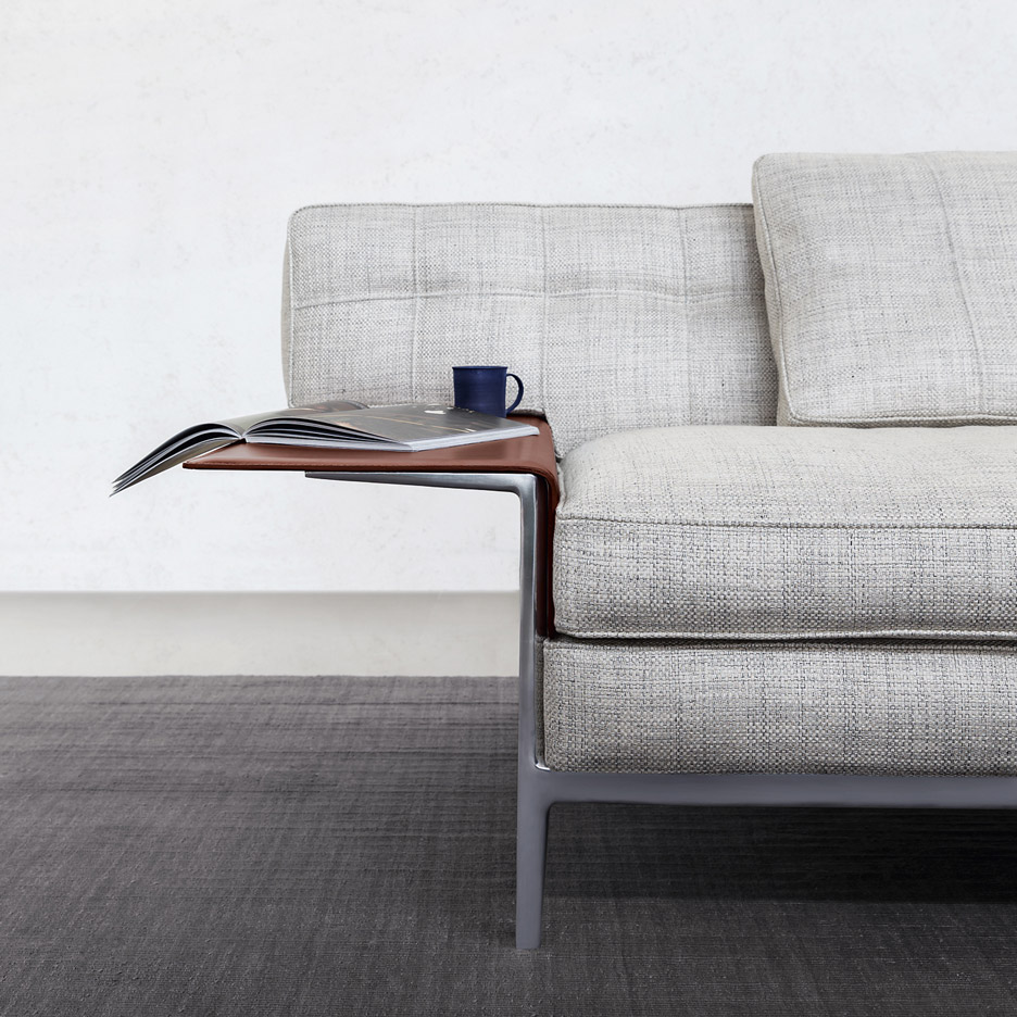
Last year venerable and somewhat staid furniture brand Cassina (now part of the giant Haworth group) appointed Patricia Urquiola as art director; this month the Spanish designer presented her first collection for the company. What a transformation.
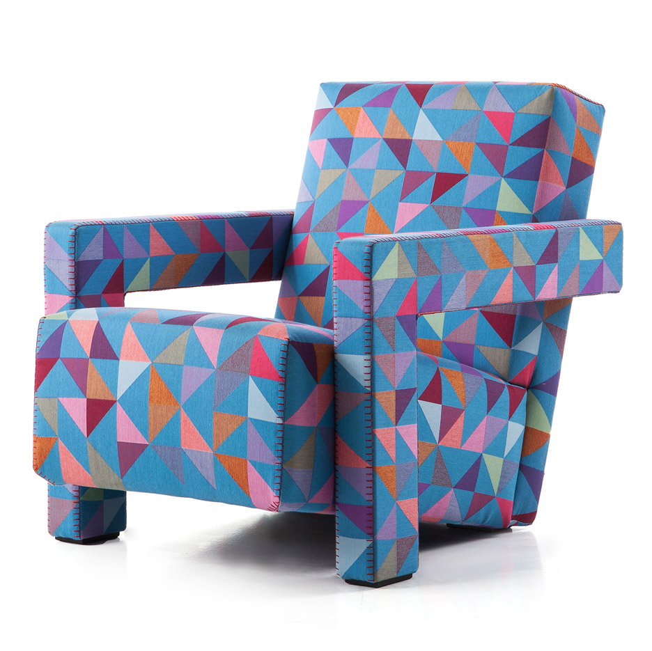
At Cassina's showroom in Via Durini she threw a prismatic burst of sunshine over back-catalogue items (notably the pairing of limited-edition Bertjan Pot textiles with Gerrit Rietveld's 1935 Utrecht chair) as well as corralling the usual famous names to produce the obligatory smattering of press-friendly products.
Furniture brands, and particularly the Italian ones, have long suffered from an identity crisis since they hire the same roster of international names and have little in terms of USP to distinguish themselves from rivals.
Meanwhile overseas brands with strong, coherent identities have thrived: Vitra, Moooi and Hay were among the standout furniture presentations in Milan this year (interestingly, they were all in the city rather than at the Salone del Mobile).
It's perhaps no coincidence that they all have strong personalities in charge of their creative direction: Hella Jongerius at Vitra, Marcel Wanders at Moooi and Rolf and Mette Hay at Hay.
Could this be the way forward for the somewhat stagnant Italian furniture industry? Molteni&C and Driade seem to think so, with the former appointing Vincent Van Duysen as creative director and the latter hiring David Chipperfiled a couple of years ago. Hopefully they will be given enough freedom to stamp their personalities on the brands and lift them out of the samey morass.
It's getting harder to stand out in Milan
I've already written about how megabrands stole the show in Milan this year; Nike's vast installation was not only the biggest but also the most talked-about, with even the discerning Rossana Orlandi raving about it. Elsewhere Hay made a big impression, taking over the huge Pelota sports hall with their largest-ever Milan presentation, while Moooi once again put on a blockbuster in Via Savona.
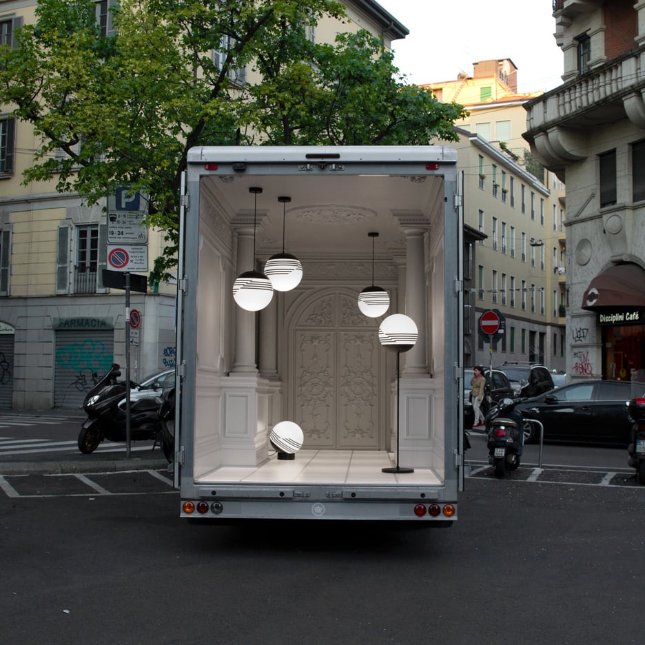
But with so much going on around the city it's getting harder to choose an itinerary, let alone see everything. Kudos therefore to Lee Broom, for coming up with the simple-but-effective idea of putting his show in a van and parking it in various pre-planned locations around the city. To get noticed in Milan these days, you either need to be big, or you need to be clever.
Qeeboo who?
The furniture design world is slowly waking up to the internet, with brands including Hay and Normann Copenhagen introducing flat-pack items for easier shipping and Stefano Giovannoni launching Qeeboo, an internet-enabled brand.
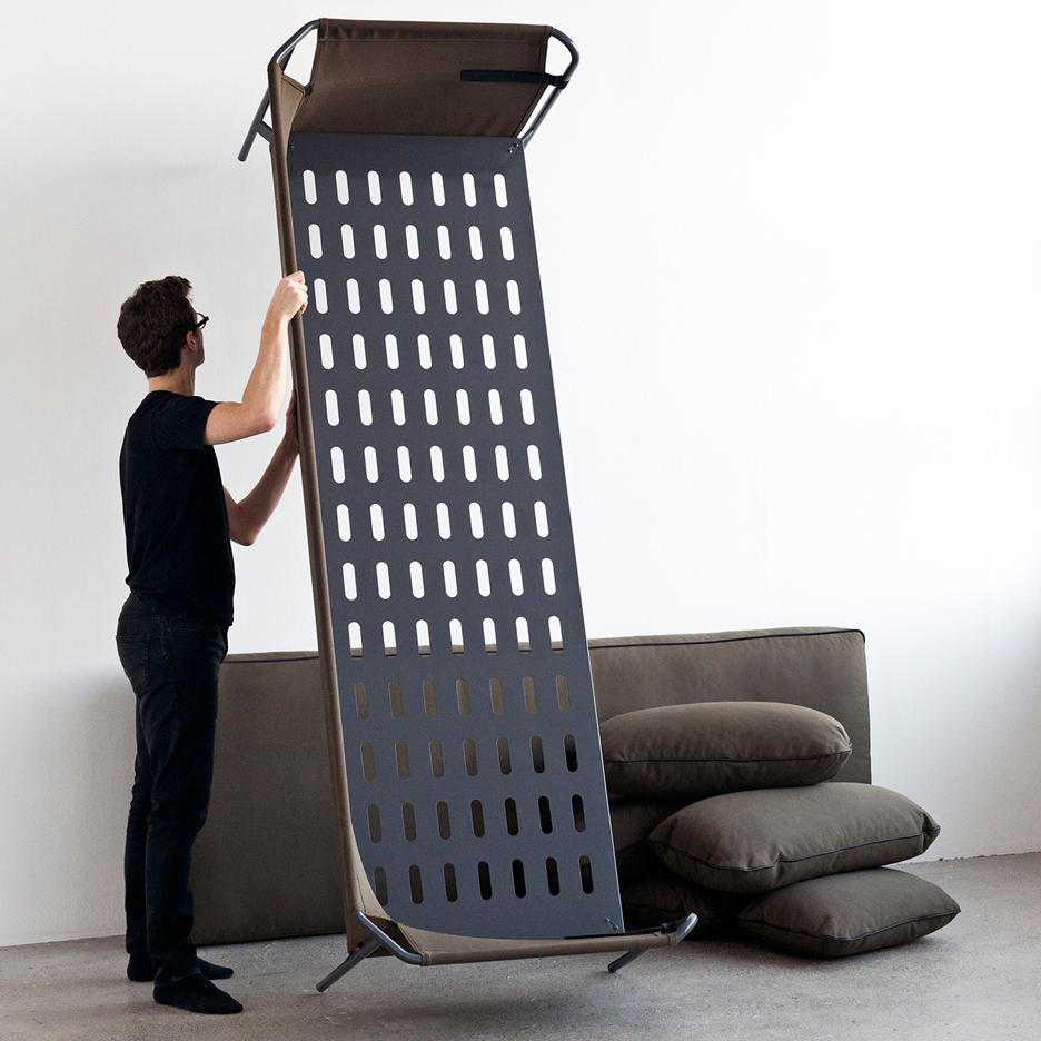
But what does Qeeboo mean? It turns out Giovannoni chose it because of its shape rather than its meaning. "I tried to find a dotcom name," the designer told us. "All the names on the web are not available any more. So after long research I found this one, which is six circles, one with a leg down and one with a leg up. I liked it and I selected it."