Four competing designs unveiled for Pershing Square in downtown Los Angeles
The four competing proposals for the revamp of LA's Pershing Square have been finalised and revealed, by designers including Morphosis and James Corner Field Operations (+ slideshow).
Set to be presented to the public today, the schemes are evolutions of initial concepts that were shown last December, and all four aim to revitalise the square, which is one of the city's oldest public parks.
Totalling five acres (two hectares), Pershing Square covers an entire downtown block and abuts a jewellery district, civic centre and major transit station.
The 150-year-old park has been through various upgrades, the most recent being an overhaul in the early 1990s designed by the late Mexican architect Ricardo Legorreta and LA-based landscape architect Laurie Olin.
But the park has been criticised for its raised entryways and barrier-like walls that deter people from using the space. LA Times architecture critic Christopher Hawthorne has described the park as a "perfectly depressing symbol of LA's neglected public realm".
The design competition was organised by Pershing Square Renew, a public-private partnership focused on renovating the park. Its creation was initiated by city council member José Huizar.
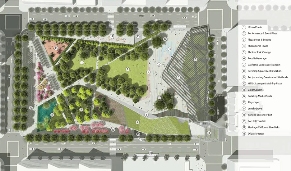
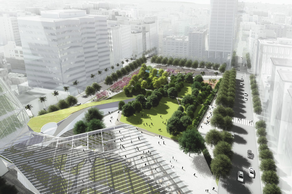
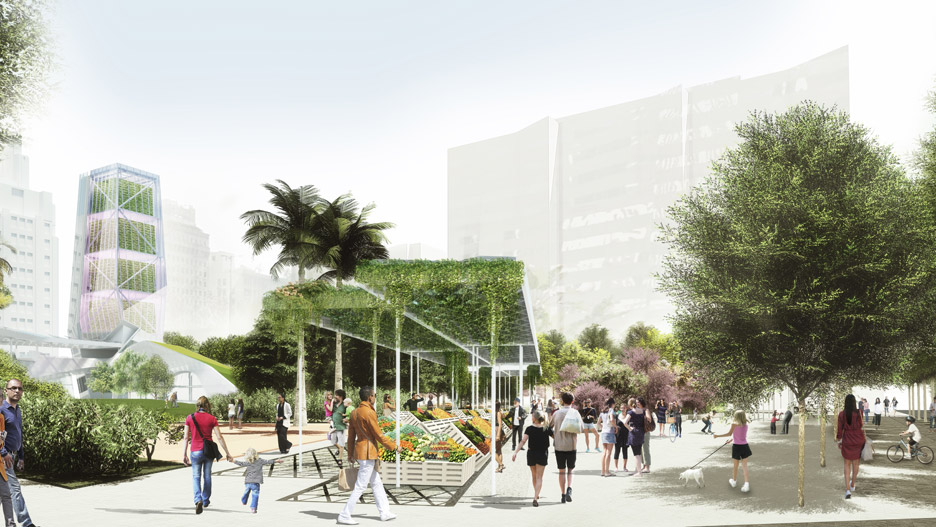
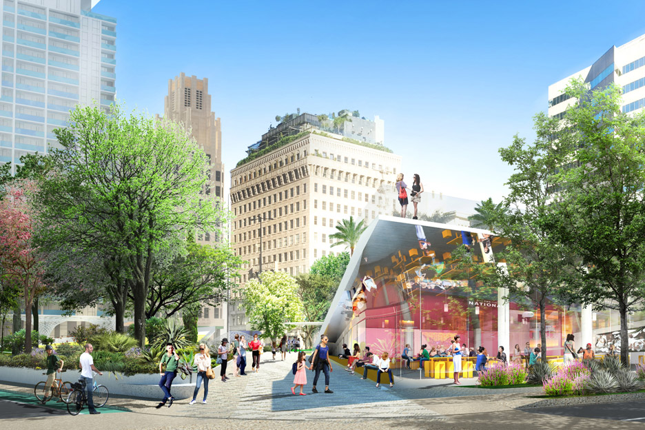
LA studios Morphosis and SWA teamed up to create a scheme that features dining areas, concessions and educational facilities. They envision the park being active throughout the day and night.
"Downtown LA's renaissance as a premiere location for retail, offices, dining, entertainment, and residences calls for a central square that enhances the district's emerging position within a greater social, political, environmental and economic context," the team said.
"Our proposal reasserts Pershing Square as a dynamic living platform that animates the urban centre and advances the long-term vision of the city of Los Angeles."
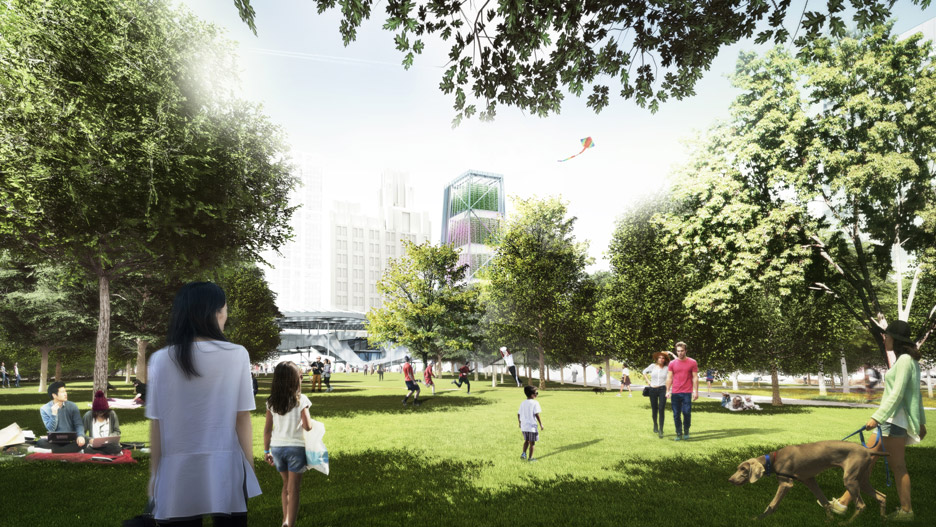
A vast lawn would be accompanied by a garden, a children's playground and a water feature, along with a structure that the team describes as "a solar-powered hydroponic urban farming tower".
"The park provides the vital park elements that everyone enjoys, while advancing a future of economic and ecological sustainability," the team explained.
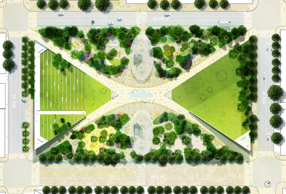
Another scheme was conceived by New York-based James Corner Field Operations – one of the firms behind the hugely successful High Line park in Manhattan – and LA studio Frederick Fisher & Partners.
"Field Operations' team vision for Pershing Square clearly demarcates a new centre, with gently curving diagonals that reach out to connect to the four quadrants of DTLA (downtown Los Angeles)," the team said.
"The design offers iconic, memorable features, as well as verdant and comfortable spaces for everyday life."
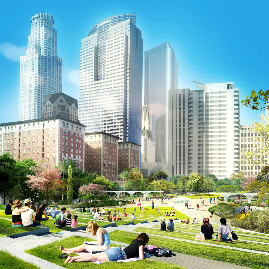
The design features a large terraced lawn for social gatherings, with an elevated balcony that would serve as an overlook. Gardens would include clearings for amenities such as a playground, a hammock grove and a dog run.
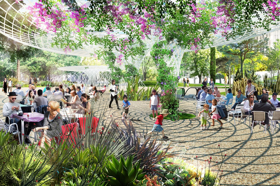
The east and west sides of the park would contain movable tables and seating. Trellis-style canopies laced with vines would provide shade and would extend down to connect with a below-grade parking garage.
In one corner of the park, a restaurant would sit under a cluster of trees.
"By distinguishing each corner with activity, overlooks and greenery, the corners of the park are inviting and always active, animated with people and use," the team said.
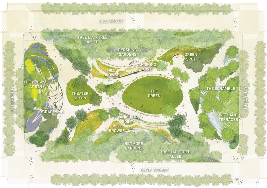
Another scheme was envisioned by local firm wHY and Denver's Civitas Landscape Architecture group.
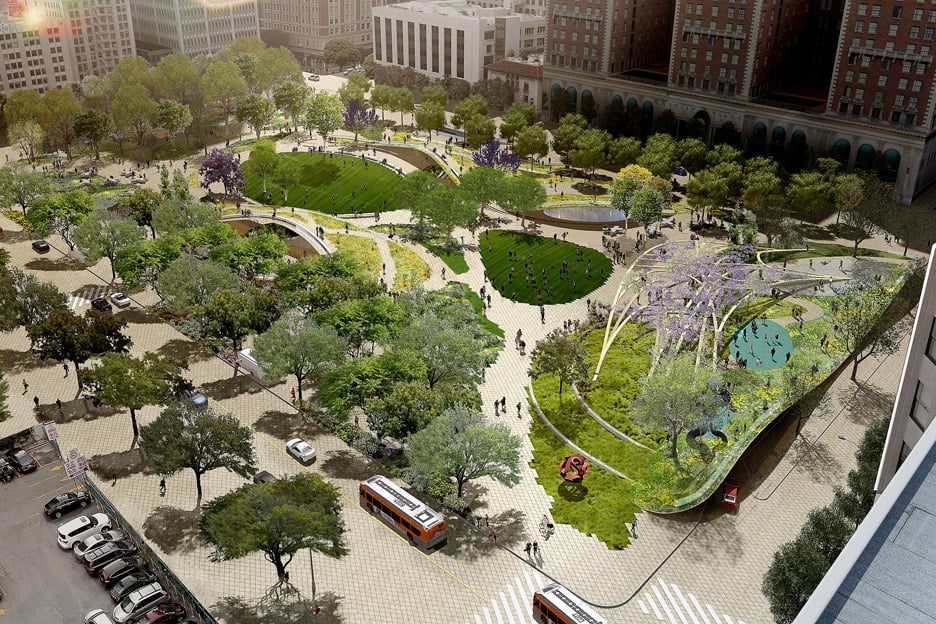
The team proposes renaming the park Pershing Green and incorporating numerous gardens and wooded patches, all of which would be organised around two central lawns.
"A new surface is created based traditional urban park layouts, patterns and principles – with an LA twist," the team said.
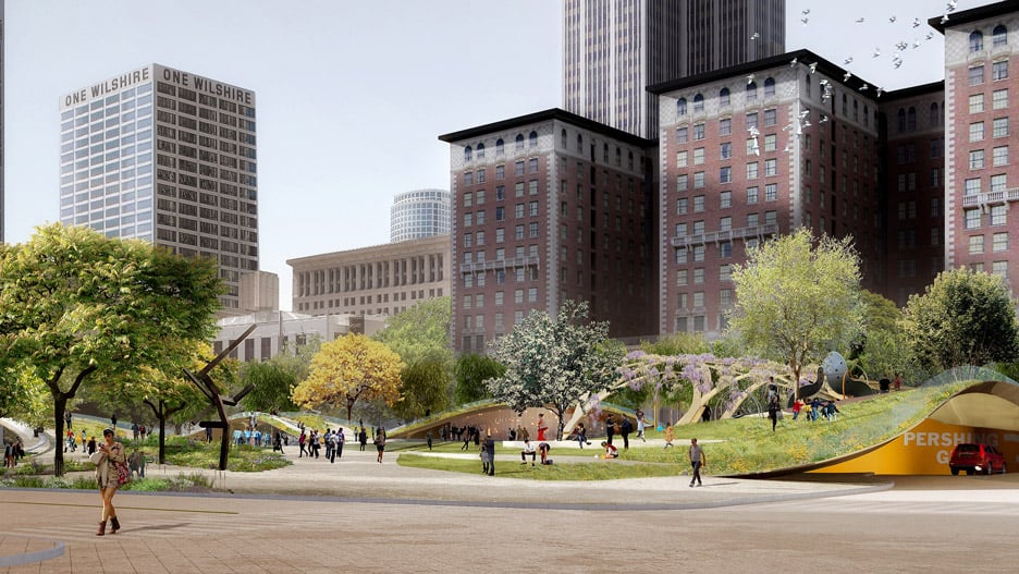
"This new surface enables movement, social encounter and views while also greatly increasing green space and a variety of spaces for park programs and activities," it added.
One side of the park, called The Grapevine, would feature a vine-covered canopy structure whose design references "the complexity of our freeways".

The perimeter of the park would be lined with tree-lined walkways, while the interior would feature a series of elevated paths that form large archways. These "pedestrian bridges" reference the hills found in and around Los Angeles.
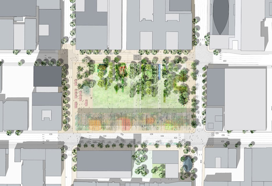
Paris-based Agence TER worked with LA's SALT Landscape Architects to design a scheme that calls for "flattening the park" by removing its existing perimeter walls.
"This simple action is a unique opportunity and the first and most critical step towards rediscovering Pershing Square as the heart of Los Angeles," the team said.
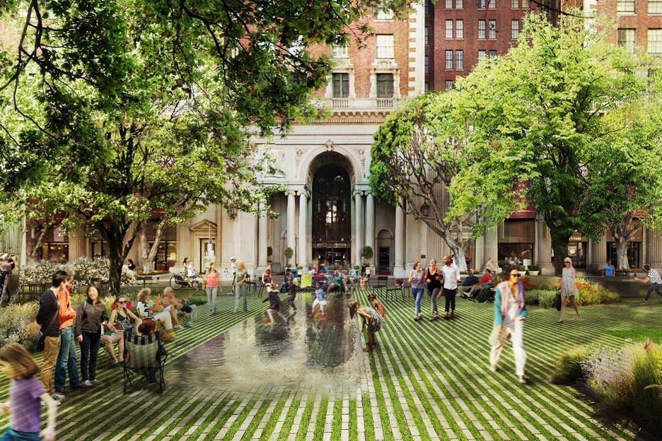
"A continuous surface extends the urban environment and positions the park on an equal level with the city, establishing a real dialogue."
A great lawn would be bordered on one side by a series of gardens with themes such as edible, wind and moonlight.
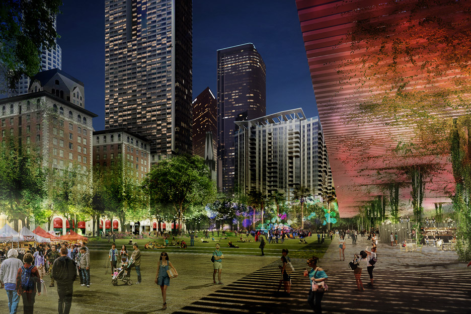
The other side of the lawn would feature a shaded area topped by a large canopy that stretches the length of the park.
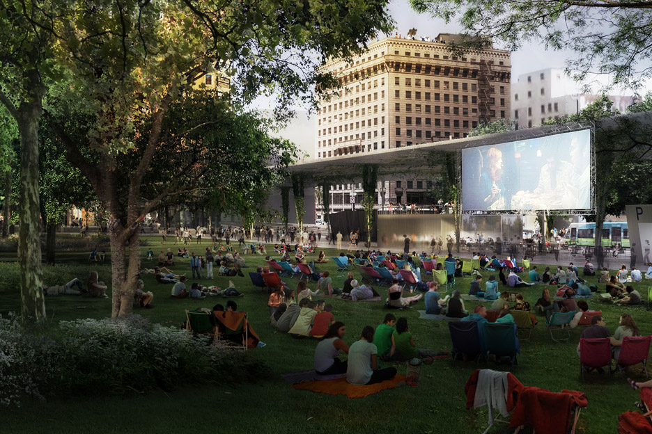
"This 'smart' canopy will be the beacon for the park throughout the day and night, announcing the presence of Pershing Square to anyone driving towards the park or looking out on it from adjacent buildings," the team said.
Several "boxes" underneath the canopy would house commercial functions, as well as entrance ramps and stairs leading to the underground car park.
The Pershing Square Renew launched its competition last September and attracted 54 team entries.
LA has recently started to enjoy an architectural renaissance. In September, leading studios told Dezeen that LA has become "the hottest destination" in America for international architects.
