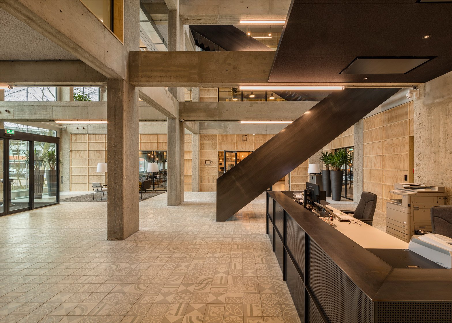
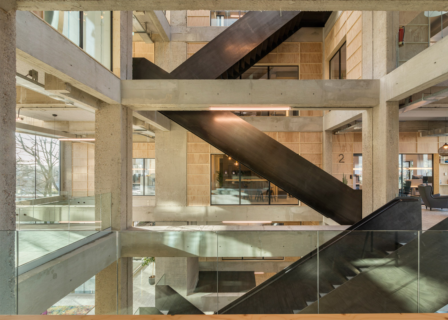
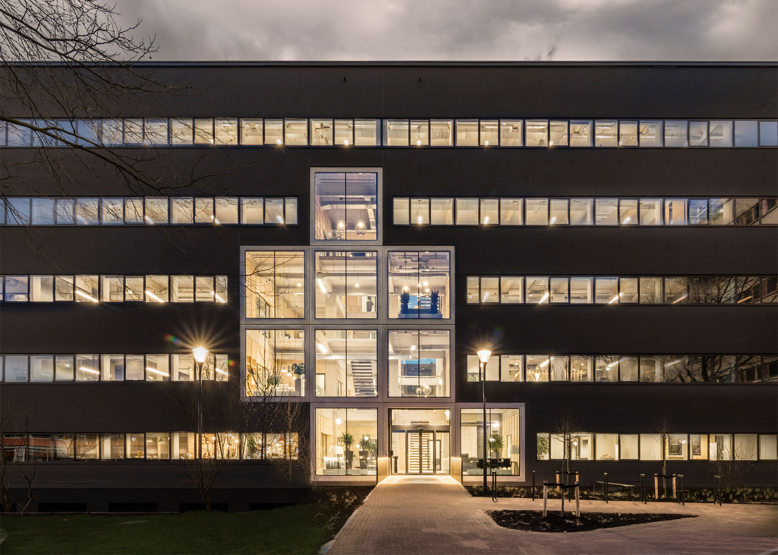
Dutch firm Studioninedots has renovated a 1970s office building in the Dutch city of Hilversum, removing sections of the existing walls and floors to create a four-storey void crisscrossed by steel staircases (+ slideshow).
The building is located on a former industrial site that was later home to the offices of telecommunications firm Alcatel-Lucent.
Housing corporation De Alliantie is transforming the entire site into a new residential and commercial district, including the renovation of two of the existing five office buildings.
Amsterdam-based Studioninedots – which previously added an angular wooden staircase to a renovated office building in Hoofddorp – is turning the other building into an apartment complex, in addition to designing the new headquarters for De Alliantie.
A main aim of the renovation was to create a communal space that connects the various levels.
This involved carving out a full-height atrium from the existing floorplates to bring a bright and spacious feel to the building's entrance and circulation areas.
"The most eye-catching intervention for this transformation is the removal of infill floors and walls from the concrete structure," the architects told Dezeen.
"We designed this intervention of light and a lively void that zigzags within the frame in order to create both a greater number and more meaningful connections than a straightforward rectangular atrium would have done."
Large windows lining the atrium flood this space with natural light.
From outside, these openings interrupt the homogenous anthracite-coloured exterior and their staggered arrangement gives the building a new identity.
As the building consolidates the company's various regional offices, its interior is designed to facilitate improved interaction between employees on different floors.
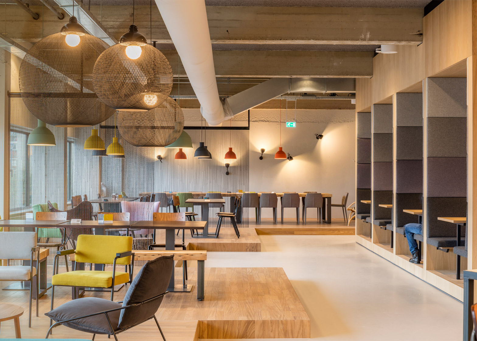
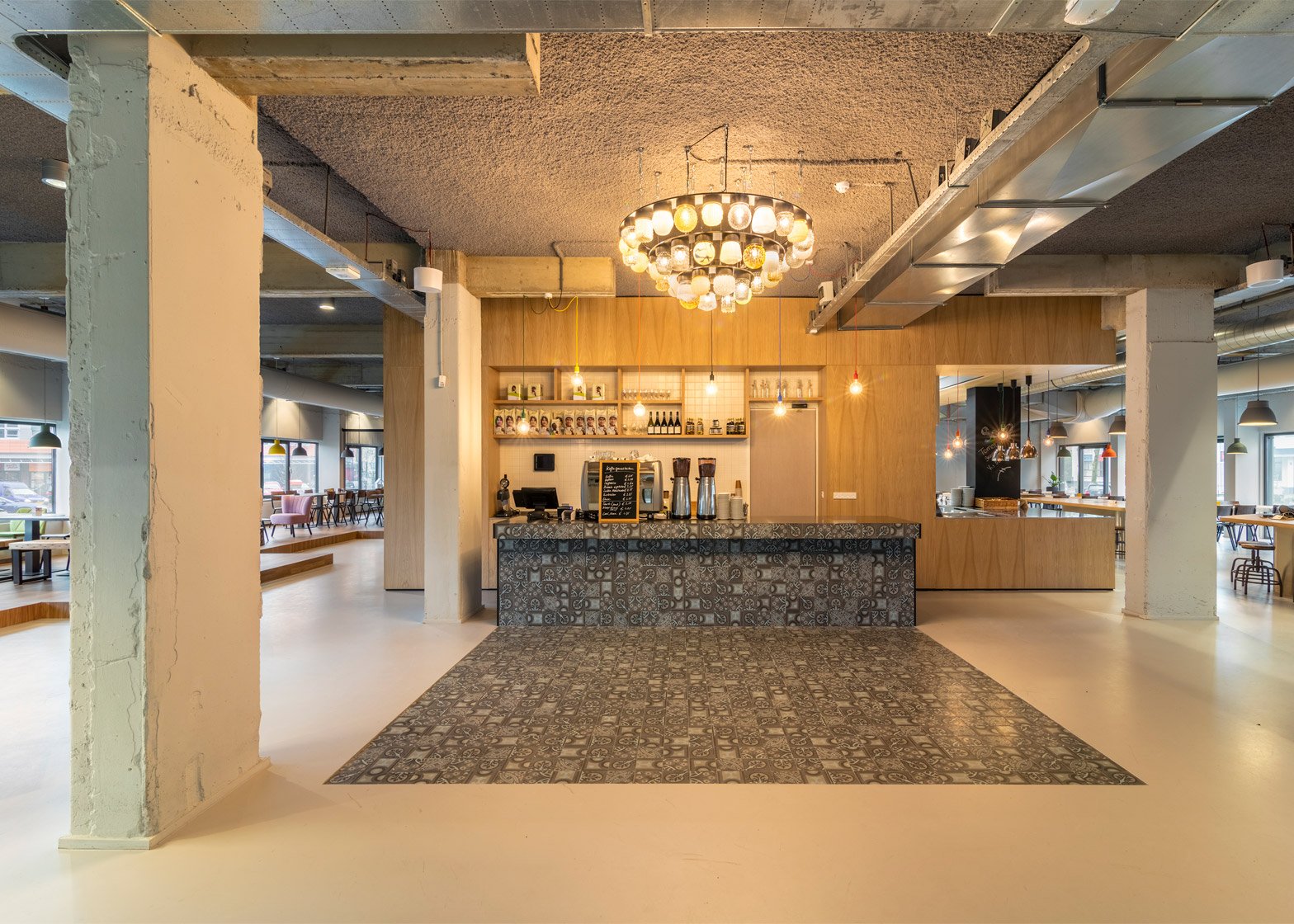
The atrium therefore contains spaces with shared functions, including a lobby, restaurant, library and kitchenettes on each level.
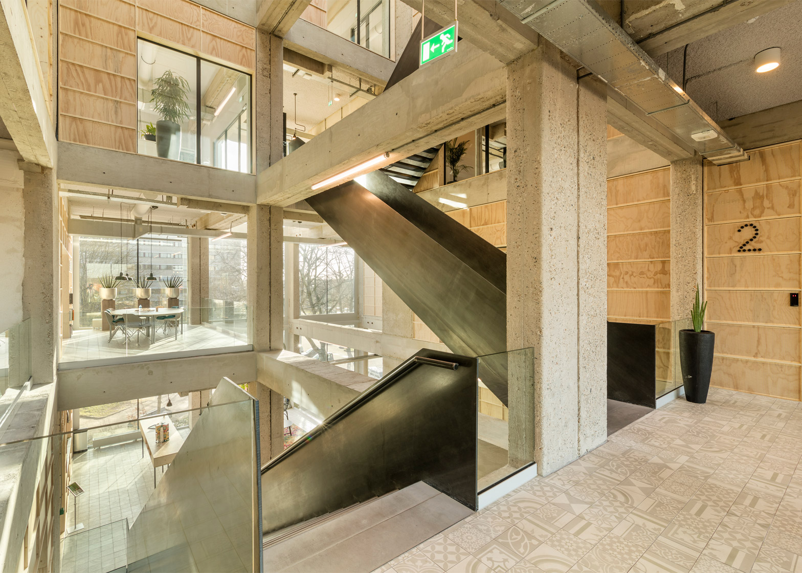
Occupying the gaps between the building's concrete mainframe, the void is staggered across the different floors and its various landings accommodate a range of informal meeting rooms and breakout areas.
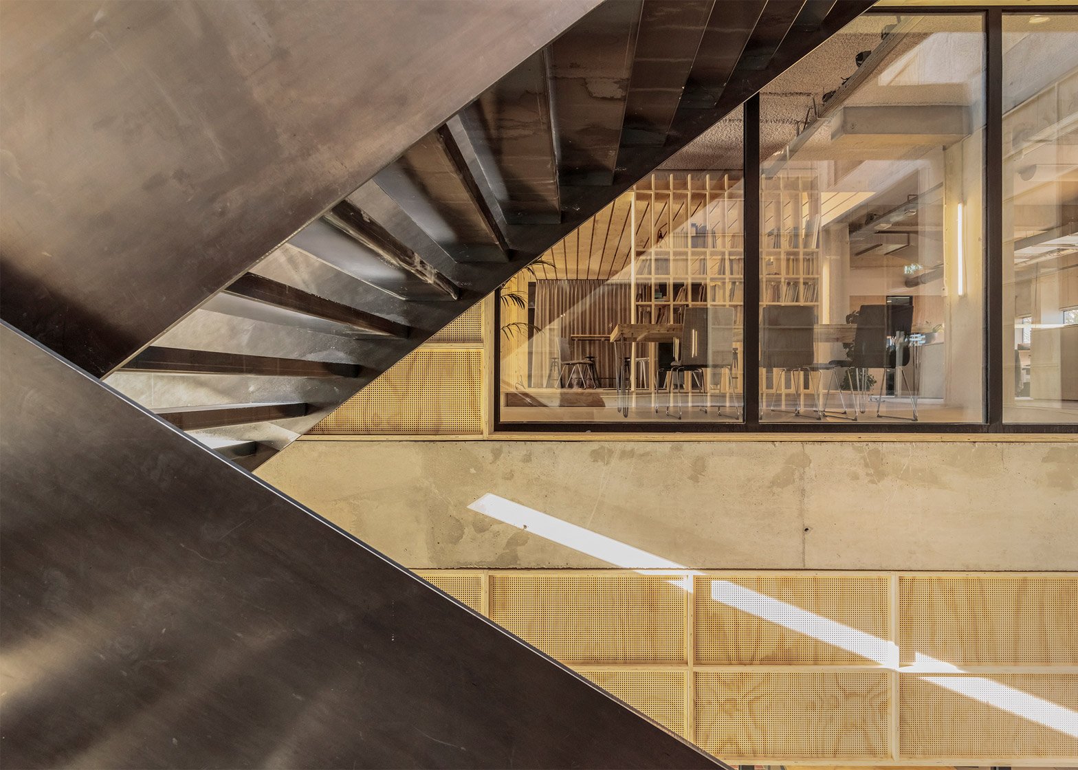
"A set of crisscrossing steel staircases connects these informal spaces, illustrating the new dynamics it brought about for the company," the architects added. "We also like the Tetris-like form that now makes the facade much more expressive than before."
The staircase provides a unifying presence at the centre of the atrium, which also contains cantilevered balconies, walkways and rooms with glazed walls that offer views across the space.
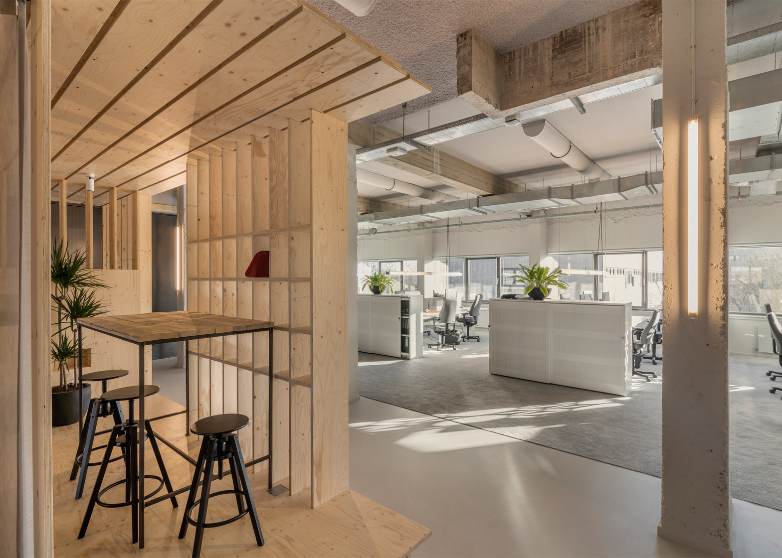
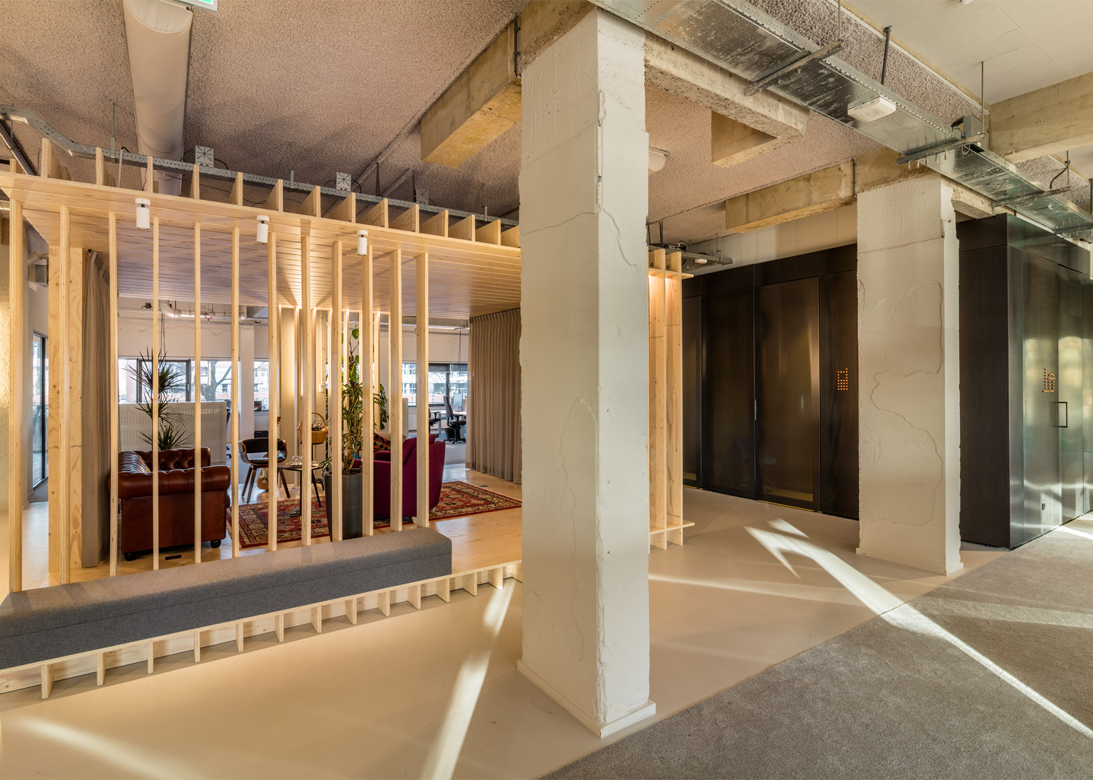
Perforated wooden panels used to fill in the surfaces around the concrete framework were chosen for their acoustic properties. These walls also contain shelving, display areas and the kitchenettes.
Photography is by Peter Cuypers.
Like Dezeen on Facebook for the latest architecture, interior and design news »
Project credits:
Architects: Studioninedots
Design team: Albert Herder, Vincent van der Klei, Arie van der Neut, Metin van Zijl
Project team: Stijn de Jongh, Jurjen van der Horst
Contractor: Van Wijnen Utrecht BV
Construction: Adams Adviesbureau
Installation: Landstra Bureau
Furniture: Logge, Dylan & van Laatum, Fiction Factory
Light consultancy: Clemens Lichtadvies
Graphic design signing: Lesley Moore

