Studio Zero85 recreates outlines of Tokyo market stalls inside Italian sushi bar
Diners at this sushi restaurant on the Italian coast sit inside house-shaped booths, based on the angled silhouettes of stalls in Tokyo's old street markets (+ slideshow).
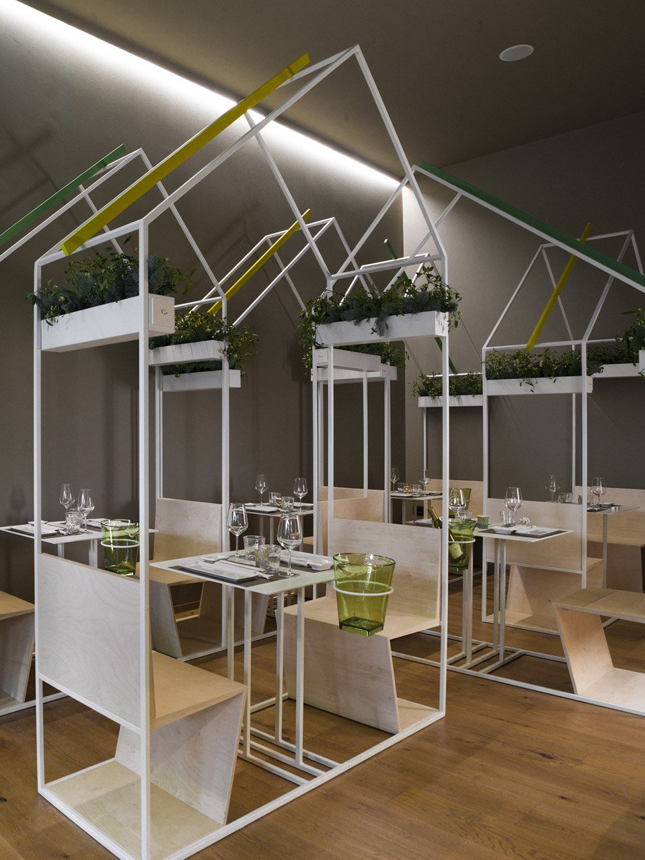
CasaMaki sushi bar is located on the Piazza della Rinascita in Pescara. Given it's European location, designer Studio Zero85 wanted to bring some of the cuisine's origin to the restaurant.

To achieve this, the locally based studio created a series of house-shaped volumes in the dining areas. Made up of white coated metal frames, each one surrounds a table and two seats.
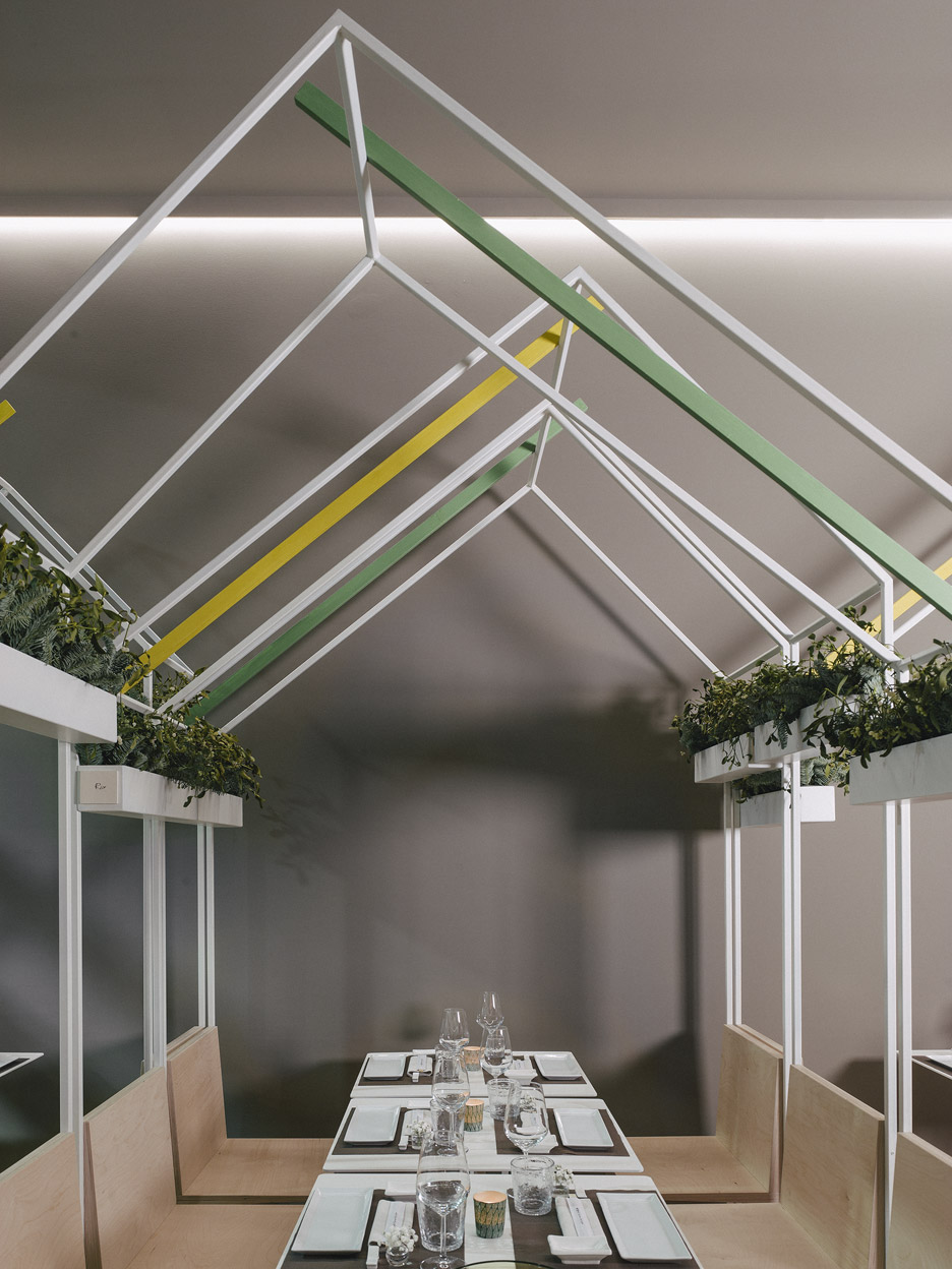
"Sushi is the object of a transformation from the 1300s to the early 1900s, evolving from a means of preserving fresh fish to a quick meal consumed in the markets of Tokyo," said the studio, who previously completed a hilltop house for an artist in the Italian countryside.
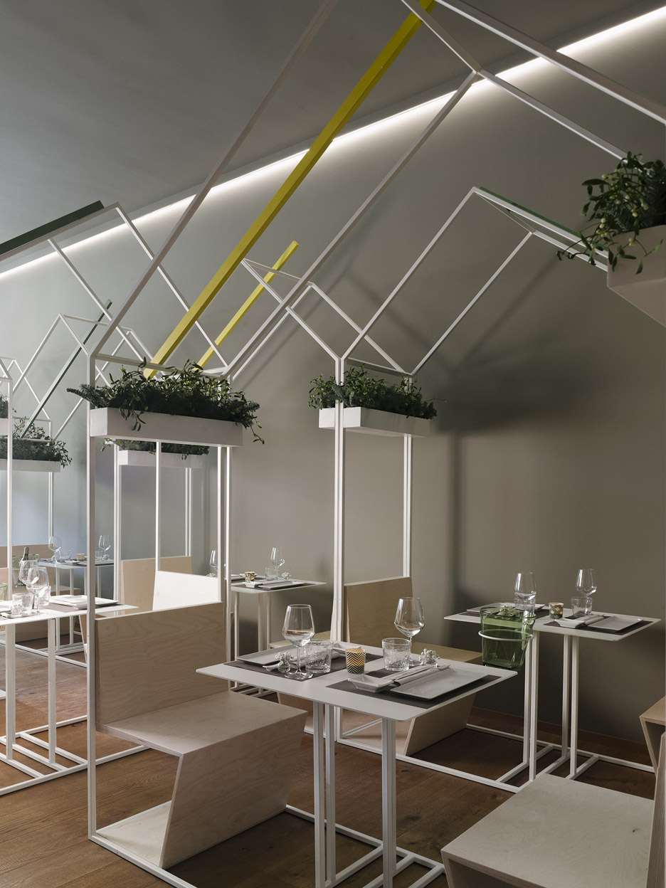
"This street food has conditioned the appearance of the project and the choice of the form of the house, which in its simplest form is an overlapping of rooflines that covered the market stalls," they added.
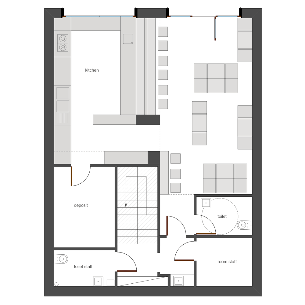
"The resulting composition is an ordered chaos of lines. Contrary to what happens above, with the hysteric overlap of rooflines, the layout of the tables below orders the room."
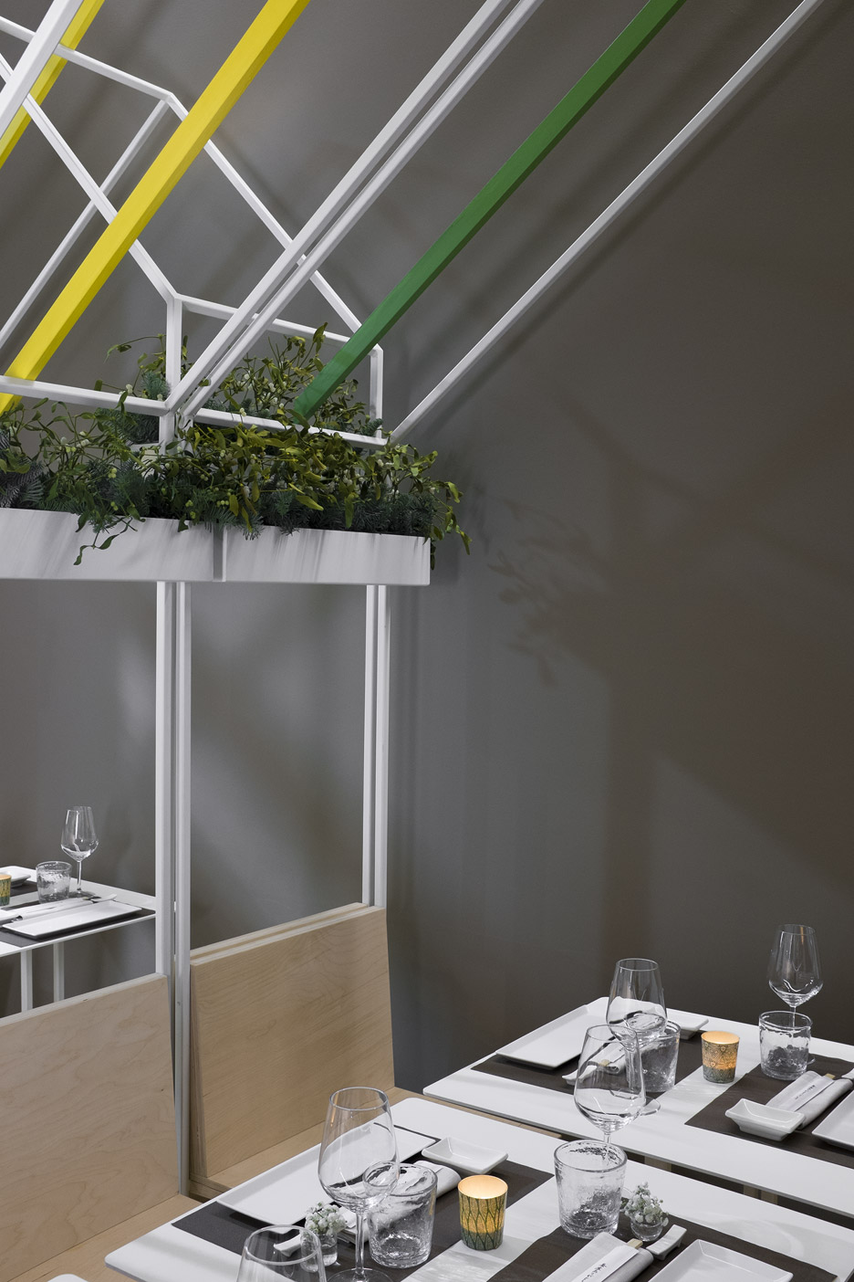
Each table module also integrates planting boxes, which are filled with greenery.
A long counter-height table facing the kitchen allows single diners to eat their meal while observing the chefs at work.
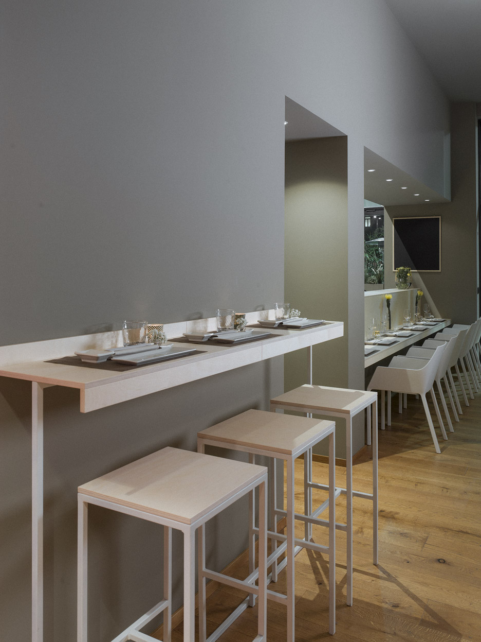
The combination of colours and ingredients seen in Japanese dishes inspired the studio's choice of simple materials, linear forms and colours, which range from dark grey to yellow and green.
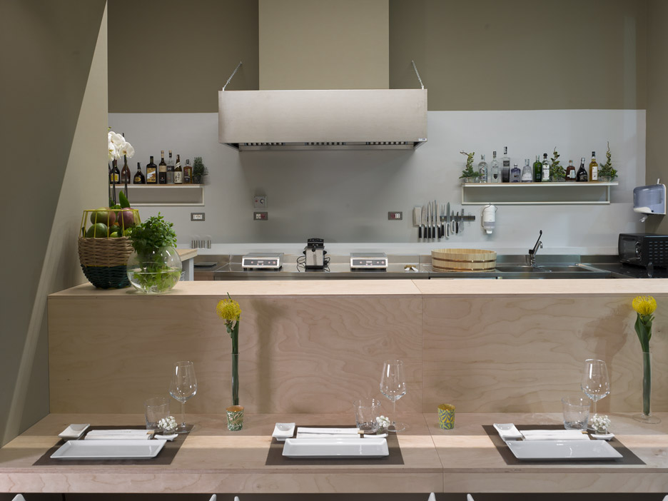
Muted colours and simple finishes are a common feature in Japanese restaurants. Architect Giles Reid recently used similar materials for his fit-out of a Japanese restaurant in east London.
Other examples include a theatrical sushi bar in Tokyo by Suppose Design Office, and a dining space in London by architects Gundry & Decker where food is prepared upon a faceted white counter.
Photography is by Sergio Camplone.
Like Dezeen on Facebook for the latest architecture, interior and design news »
