"We could never recreate Mario Botta's SFMOMA" says extension architect Craig Dykers of Snøhetta
Interview: San Francisco Museum of Modern Art reopens this month with a Snøhetta-designed extension to its original Mario Botta building. In this interview, Snøhetta partner Craig Dykers explains how he tried not to step on the toes of Botta's Postmodern structure.
The Norwegian firm's addition almost triples the amount of gallery space at SFMOMA, which has been closed for three years while work took place.
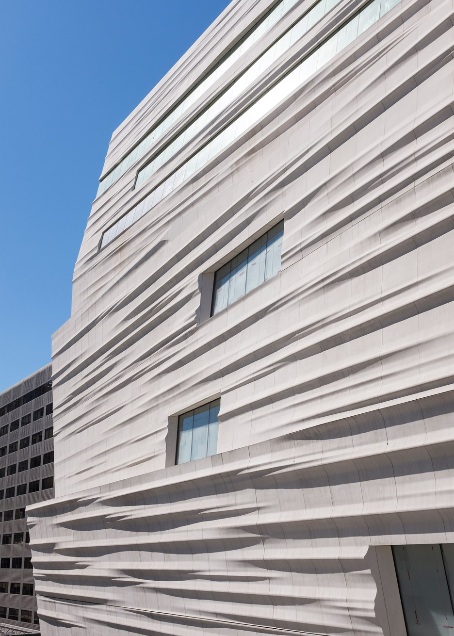
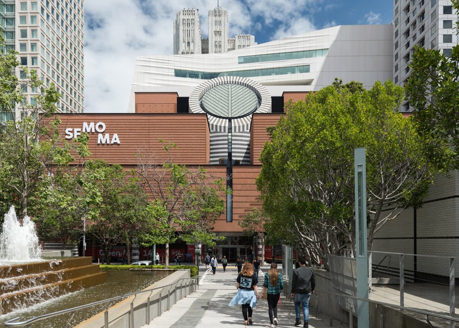
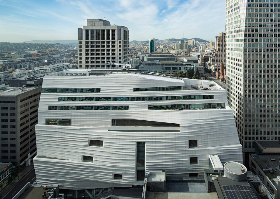
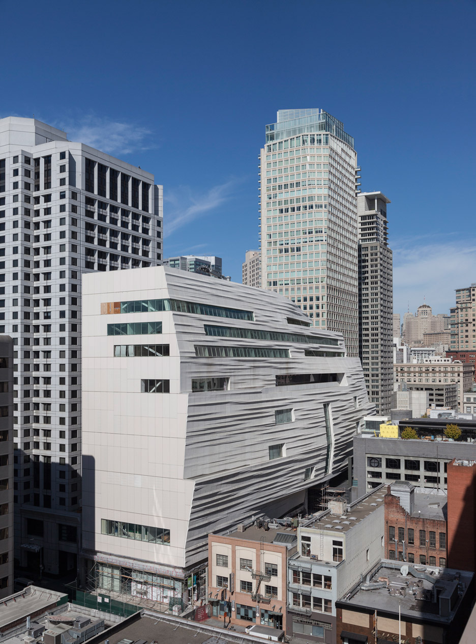
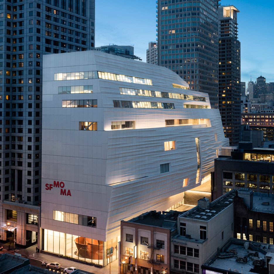
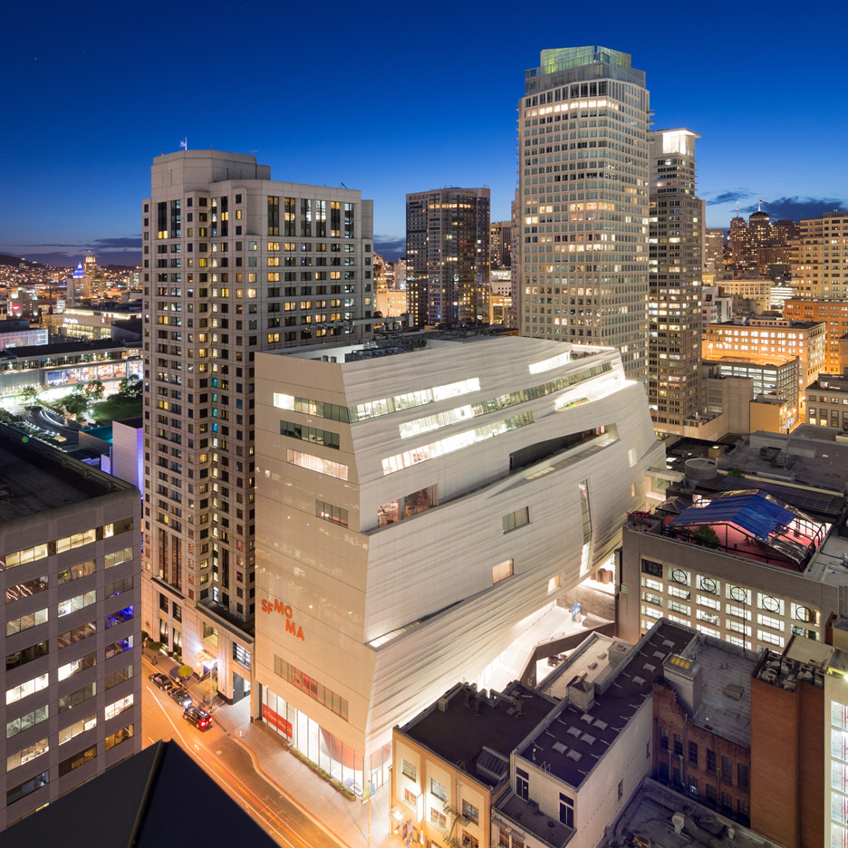
The pale cliff-like exterior of the extension was designed to provide a stark contrast to Botta's 1995 Postmodern building, which is predominantly clad with red brick.
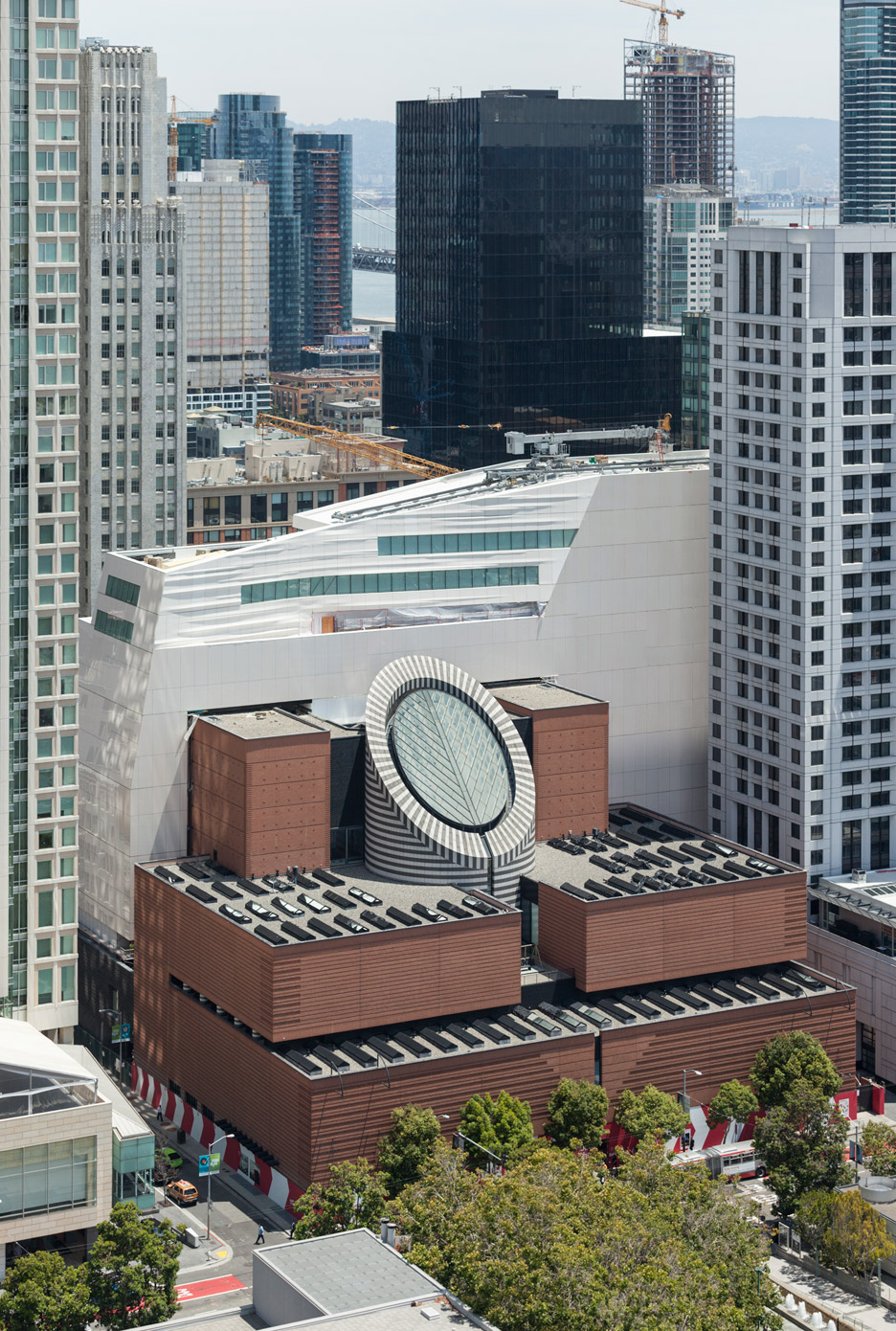
"We could never recreate Mario Botta," Dykers told Dezeen. "We didn't want to just take red brick and extend it, for somebody to say 'that's a very strange Botta building'."
"You don't want to copy your dance partner, you want to be complimentary to it so you don't step on each other's toes," he added.
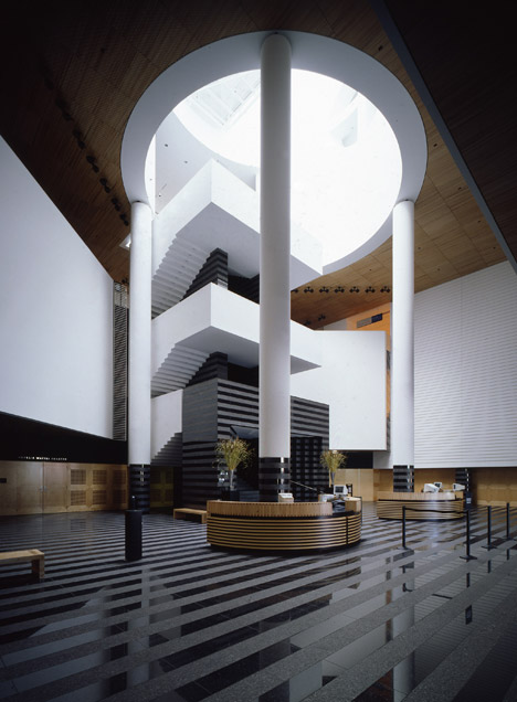
Renovation of the original structure involved the controversial removal of the granite staircase located beneath the building's iconic oculus.
The steps were dismantled and given out in bits to museum staff, then replaced with a timber staircase that doglegs at an angle to connect the building's two lobby levels.
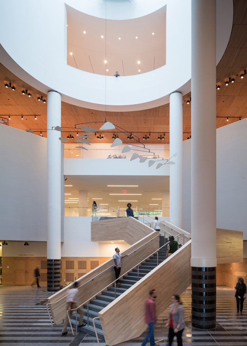
"Probably the moment that was trickiest with the Botta building was the staircase, where we had to take down this iconic staircase," SFMOMA deputy director Ruth Berson told Dezeen. "There were lots of physical reasons why we had to do it."
She described how Dykers travelled to Lugano, Switzerland – where Botta founded his practice and has designed some of his most important projects – to meet with the 73-year-old architect and discuss the intervention.
"When Craig explained that we were going to have to do something to the staircase, [Botta] was incredibly generous," Berson said.
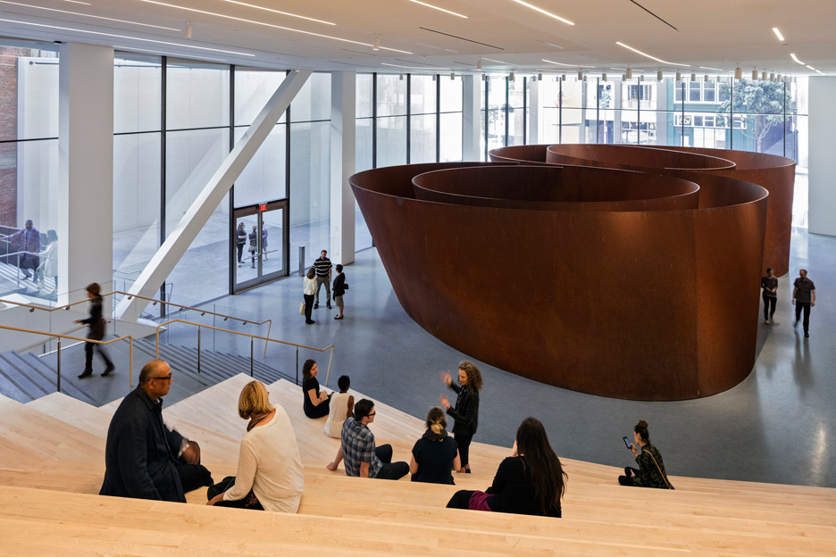
"[Botta] said to Craig: 'I've had my moment with the building, now it's your moment'," Berson recalled. "Then there's was a little pause, and he got this little twinkle in his eye and he said: 'but that's not going to prevent me from criticising you later if I don't like it'."
However, Botta was less generous when he spoke to Dezeen about the project last year.
"The building, as I conceived it, compared itself either with the sky or with the top of the skyscraper dating back to the 1930s at its back. Now the expansion looks like a mute wall, an enlarged wardrobe," he said. "My impressions simply come from the images I saw in newspapers. I hope the accomplished work will be better and prove me wrong."
Botta declined to comment further on the project when contacted by Dezeen this week, stating that he "wasn't asked for advice" about the extension.
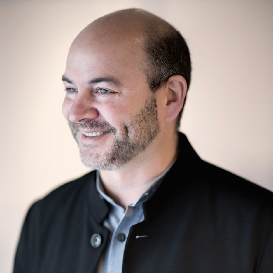
Dykers cofounded Snøhetta in 1989 with Kjetil Trædal Thorsen and heads the firm's US operations. Its other completed projects in the country include the National September 11 Memorial Museum in New York and the James B Hunt Jr Library in North Carolina.
For the new portion of the museum, the studio took inspiration from San Francisco's climate, geology and architecture, as well as SFMOMA's collection of Northern Californian art.
"When you make a building in a city, one's first reaction is to think about abstract notions of design," said Dykers. "Why can't you start by saying: 'I want to make something that let's you know where you are'?"
"That's very different from the uniformity that we often see," he added. "Even in highly complex architectural designs, there's a ubiquity to them. You're not often aware of your place."
SFMOMA reopens to the public on 14 May 2016.
Read an edited version of the transcript from our interview with Craig Dykers and Ruth Berson below:
Dan Howarth: What were the initial ideas behind the design?
Craig Dykers: We were greatly inspired by the topography of San Francisco. Some of the collections at SFMOMA are paintings about the landscape, and about the experience of being in San Francisco. So we thought it would be interesting to bring the collection and the city together in a piece of architecture.
When you look at the building, it has a kind of undulating form that's almost like the hills of the city. It can be very dramatic and vertical. If you've ever been in a taxi in San Francisco and looked at one of these almost cliff-like perspectives, you have the same kind of experience as inside and around the building.
It also feels that it represents the maritime climate of the city. Its proximity to the Pacific makes an interesting setting where the hills create fog, and the fog moves in and out of the city. When you're in the city when the fog approaches, it almost cuts the city into slices and it's very dramatic.
There are places where you look up at the building and see this undulating facade with the rectilinear structures behind, and it's as if the fog is slicing through the city.
We wanted it to feel very much about its place and about its collection.
Dan Howarth: How did you use materials to evoke that?
Craig Dykers: San Francisco had a terrible earthquake in 1906 and everything was rebuilt. The city was known like Chicago as a white city, which great Beaux-Arts structures that remain to this day.
The white colour reflects light and gives a little brightness to a city that at times can be grey with rain.
Furthermore, the Mario Botta building uses bits of white stone as highlights, and we wanted to create a moment where it somehow addresses those colours as well. There's a building immediately behind SFMOMA called the Phlueger Building, after the architect that designed it in the 1920s – it's an Art Deco building – and that also has a similar colour.
Much of the building is masonry, and that was important to relate to the geology of the peninsula and of Northern California.
There's also a planted wall, on which many of the plants are from Northern California. They're the kind of plants you might see in a redwood forest, below the canopy, and those are the things that draw you in and help to understand where you are.
Ruth Berson: The choice for that makes a lot of sense because that wall actually gets about an hour of daylight a day, so it has to be something that survives the shade.
Craig Dykers: It's funny, when you make a building in a city, one's first reaction is to think about abstract notions of design. Like "I like this type of thinking" or "I theorise this type of abstraction of geometry". Why can't you start by saying: "I want to make something that let's you know where you are", and doesn't knock you over the head with that. "Hi, I've got a Golden Gate Bridge on my roof" – it's more like something that feels like this place, like San Francisco.
That's very different from the uniformity that we often see. Even in highly complex architectural designs, there's a ubiquity to them. You're not often aware of your place.
Dan Howarth: How did you work with the original Botta building?
Craig Dykers: From my perspective, I was so happy that we had a great building to work with. If you'd asked me to add on to a Walmart somewhere in the middle of nowhere I would have been very unhappy. A boring, uninteresting building is no fun to be around, but this building has great character.
We were very interested in becoming a dance partner. You don't want to copy your dance partner, you want to be complimentary to it so you don't step on each other's toes.
We merged things together, but we also created clarity in knowing that, when you look at the outside, this is the original and this is the new. We didn't want to just take red brick and extend it, for somebody to say "that's a very strange Botta building".
We could never recreate Mario Botta, so in that sense there's a relationship that's moving from familiarity to difference.
Dan Howarth: Do you personally like the Botta building?
Craig Dykers: Everyone has an opinion about the Mario Botta building. I found the building very interesting in many ways.
First of all, South of Market [district] would not be what it is today and SFMOMA not decided to build here. Mario Botta made such a dramatic, iconic structure. It kickstarted life, so it did what it needed to do.
Secondly, the galleries are wonderful. There's some of the cleanest, clearest, most direct galleries you'll find certainly in the United States. Because American architecture tends to move stuff around a lot, it's very nervous.
Ruth Berson: For us, and for our curators, these galleries just functioned. They didn't call a lot of attention to themselves, they spoke to the kind of flexibility that we needed.
Probably the moment that was trickiest with the Botta building was the staircase, where we had to take down this iconic staircase. There were lots of physical reasons why we had to do it.
When we really understood that we were going to have to remove this element of the old museum, and we knew we had a lot of public feelings behind that, there was no way we couldn't not do it.
One of the things that Craig said was that we need to go and make a pilgrimage and see Mario Botta. I think it was exactly the right thing to do and we showed up in Lugano. Every 10th building in that city is a Mario Botta and you can see them as you go by in the taxi, which is really interesting. He had his son with him that day, we went to a restaurant that he had selected. [Botta] had designed the restaurant, and the wine label, and he paid with a credit card that he had also designed.
When Craig explained that we were going to have to do something to the staircase, he was incredibly generous. Speaking in translation through his son, he said "I've had my moment with the building". He'd got to a spiritual place where he was designed a lot of churches, and he was of a certain age, and he could afford to be gracious and generous.
He said to Craig: "I've had my moment with the building, now it's your moment". Then there's was little [pause], and he got this little twinkle in his eye and he said: "but that's not going to prevent me from criticising you later if I don't like it".
I was so glad that Craig and the museum decided that it was a lunch worth having, because it showed the right kind of respect – if this was going to be one building in the end, with two wings if you will.
Dan Howarth: What happened to the staircase?
Craig Dykers: [jokes] It was auctioned on eBay.
No, it had to be disassembled very carefully.
Ruth Berson: The staff actually got bricks of the granite that were engraved with "Thanks for stepping up in helping build the new SFMOMA". So we recycled a lot of the pieces.
Dan Howarth: Do you think your extension is going to be as controversial as Botta's building was when it first opened?
Craig Dykers: Was Botta's building controversial?
Dan Howarth: It received very mixed reviews from the press, yes. Some were very negative.
Ruth Berson: I'll say one thing. What Craig said before is really true, which is that San Francisco prior to the Botta building was not used to what I'd call contemporary architecture. He kicked the door down on that.
Even though this was a redevelopment district, and even though it was full of chain-linked fence, parking lots. And even though it didn't really matter what we put here because it was going to be an improvement over what existed, I think that it was controversial in a sense that San Franciscans love their Victorians. This was not one of those.
Mario paved the way for all these other buildings that have come to San Francisco – the Herzog & de Meuron, the Libeskind building, the Thom Mayne building and so on.
I'm hopeful that it won't be quite as controversial in the same way, but I'm not afraid of controversy.
Craig Dykers: A building like this is meant to be experienced over time, and it's meant to be filled with people. Trying to understand it from a photograph without people in it or trying to judge it from a distance is a lot more difficult than many of the traditional types of spectacle architecture we're accustomed to these days. Things that you can take a photograph of from a great distance away and understand it.
Over time, as people use it – whatever criticism there might be or not – the people that would've come here would leave with, I hope, a very authentic and very meaningful memory. And that's all that
we care about.