UUfie completes light-filled Ontario medical clinic with translucent polycarbonate walls
Canadian architecture studio UUfie has inserted polycarbonate partitions into a medical clinic, part filling them with glass to create a hazy "horizon" (+ slideshow).
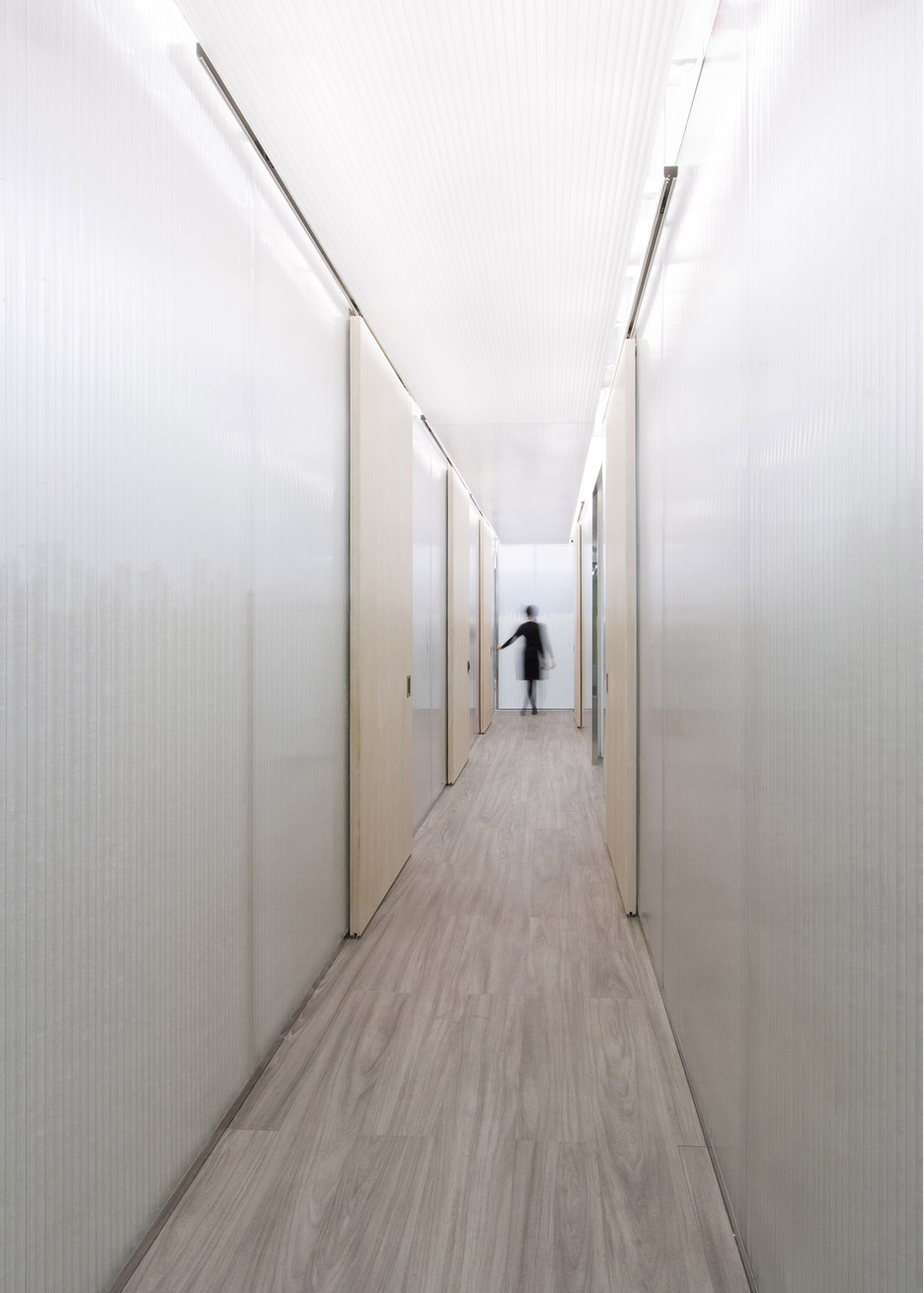
The designers were tasked with creating an "economical, flexible, practical and clean" medical office in Ontario.
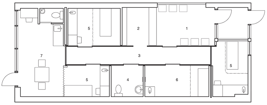
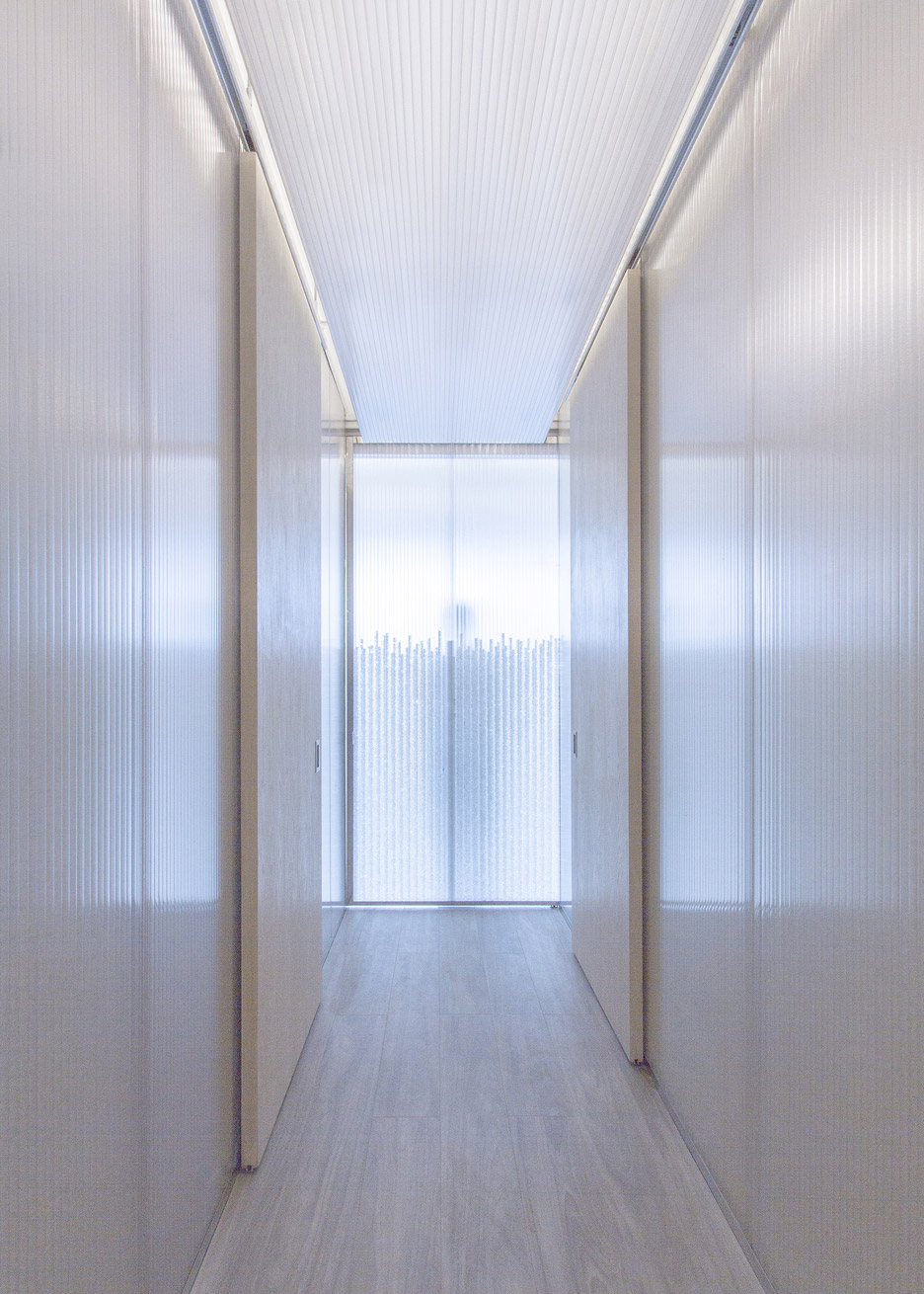
To achieve this, they envisaged a simple layout of rooms around a central corridor but realised that, since the unit only has windows on one side, the partitions would create a dark and uninviting interior.
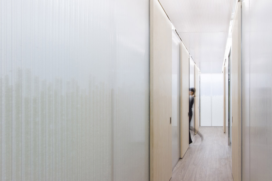
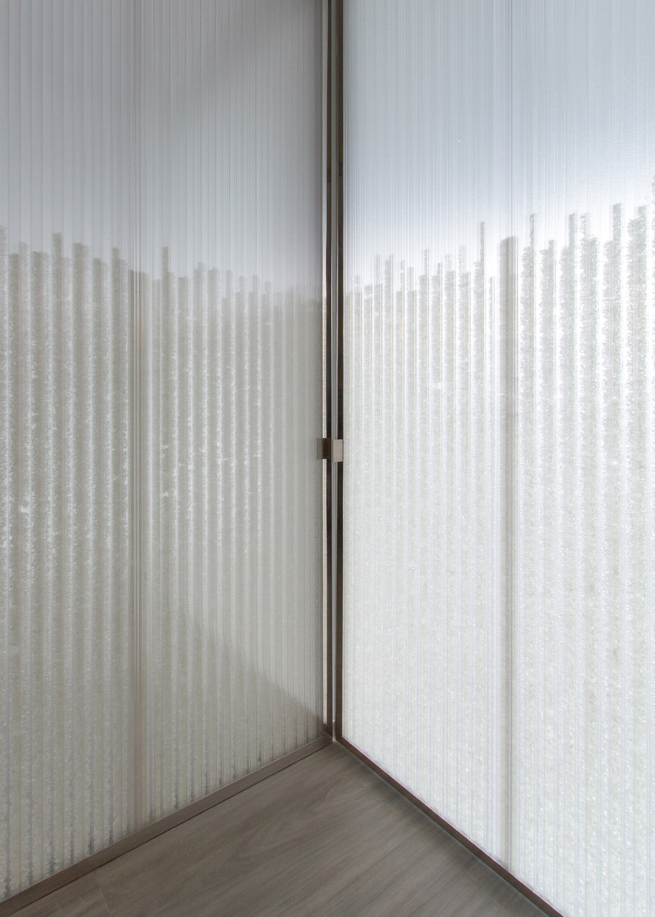
Concerns about privacy meant that transparent walls were not an option, so the studio used translucent panels that are more opaque at the bottom and more transparent above.
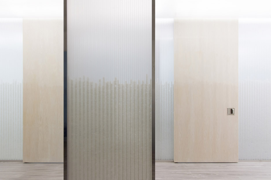
The project is named 1.4, after the 1.4-metre-high "horizon", designed to be midway between average eye-level when sitting and standing.
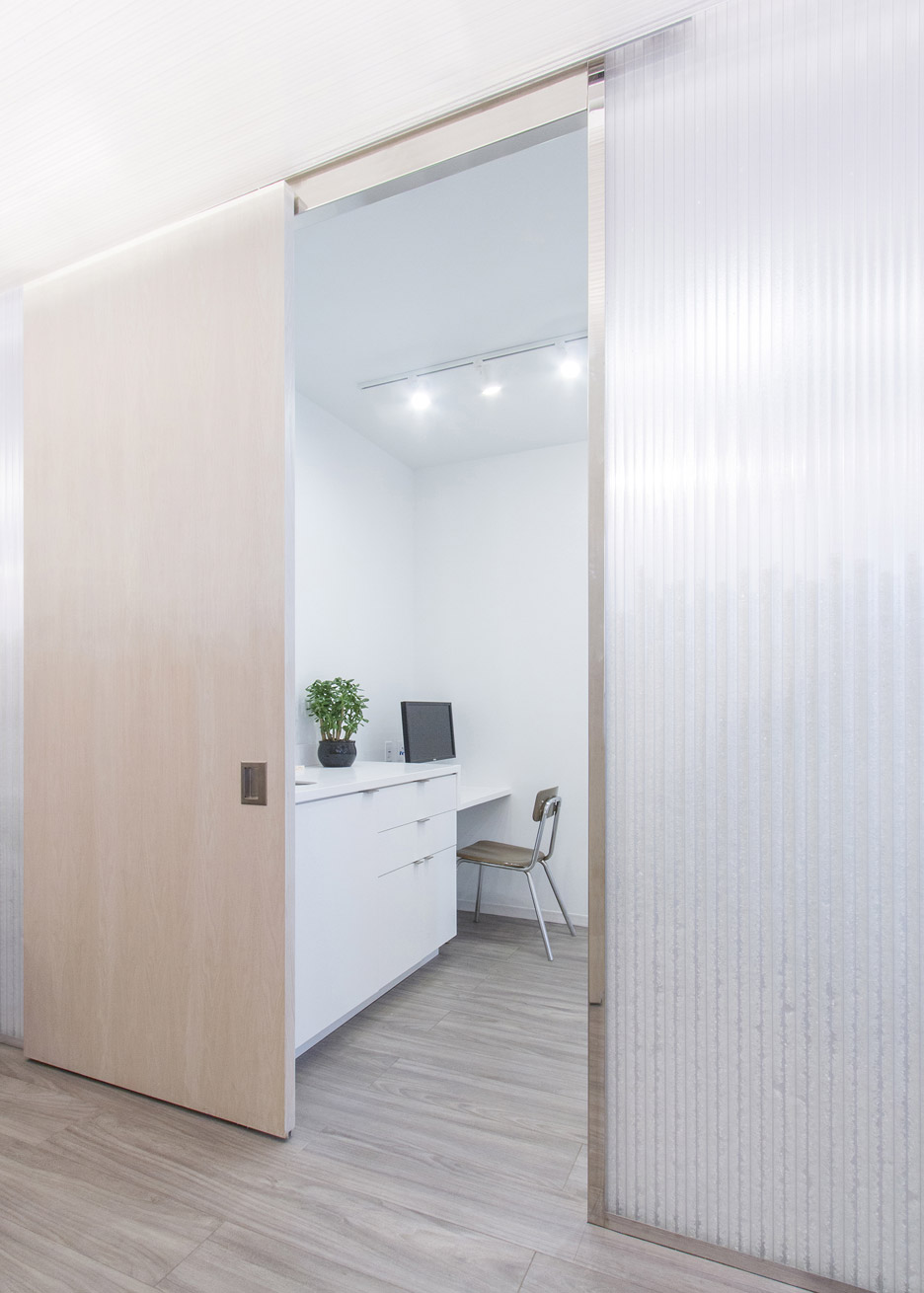
"The clinic is experienced in two different types of space: one is openness with transparency for visual connection and lightness and the other is protected for privacy," the Toronto-based studio told Dezeen.
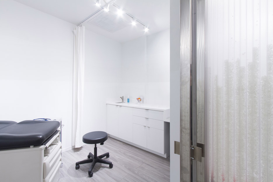
"When people stand up, they are in open and transparent space, and when they sit down, they have more privacy."
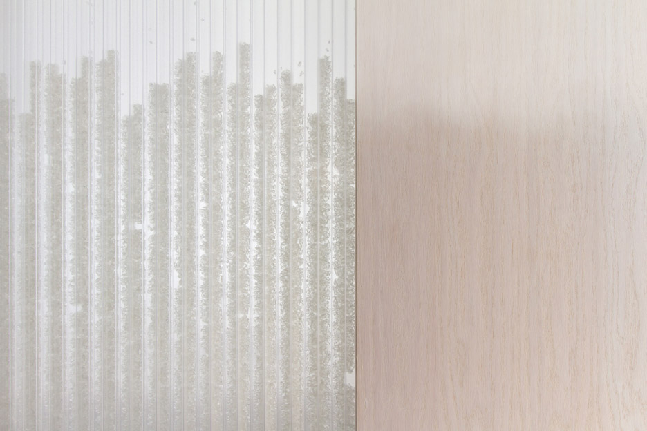
The internal walls are made from polycarbonate panels, typically used for more industrial projects. The panels contain hollow chambers that have been filled with pieces of smoothed glass.
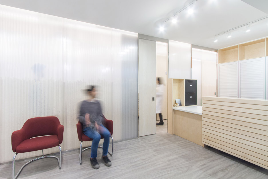
Each of the cavities is a slightly different size so that when the same amount of glass is poured in, they are filled to different levels, softening the border between the two levels of transparency.
"We purposely used a delicate, more handmade and complicated process for the addition of tumbled glass to each honeycomb polycarbonate sheet," said the designers.
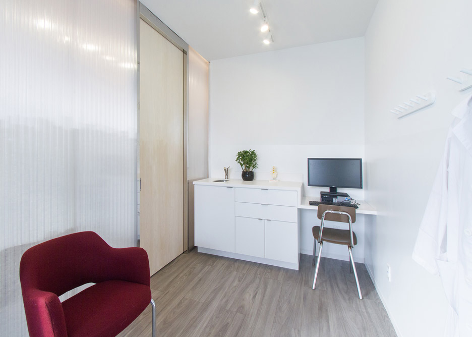
"The amount of tumbled glass in each cell is the same, but the size of each cell is different. Elevating and giving another dimension to a very standard industrial material."
The horizon line continues across to decorate the walls of the clinic. Here the designers have used two different types of white paint – one matt and one gloss.
The difference in reflectivity between the two portions is subtle, but the gloss of the lower portion is intended to be more resistant to wear and tear.
In the main corridor, polycarbonate has also been hung from the ceiling, with lighting positioned behind it to create a diffused glow throughout the office.
"Through the design of space and the layered elements of precision and relativity, a meditative ambience is felt, inducing the impression of looking into an endless horizon of a vast ocean," said a statement from UUfie.
While historically it has been an industrial material, polycarbonate is increasingly being used for commercial and residential projects.
A pair of Oslo-based studios have used the material to transform an old boat house into a summer home.
Bangkok office All(zone) has also designed a temporary home made from polycarbonate that could be erected in unfinished highrises.
Like Dezeen on Facebook for the latest architecture, interior and design news »
