Neri&Hu combines Japanese and Californian design for Selfridges' Body Studio
Chinese studio Neri&Hu has designed the biggest-ever retail department at London department store Selfridges, dedicated to women's underwear, sleepwear and sportswear (+ slideshow).
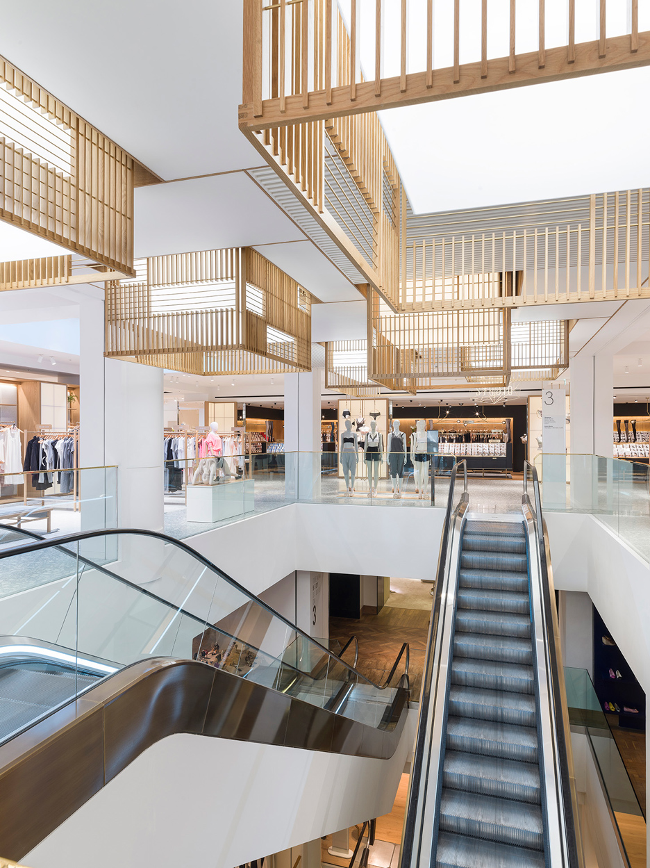
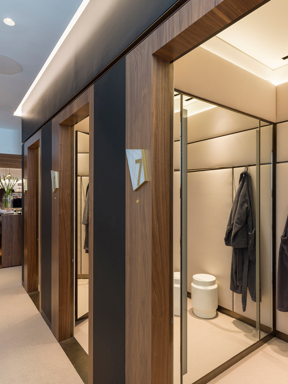
The Body Studio encompasses over 3,400 square metres – Selfridges' largest-ever department – and brings together all fashion categories designed for the body, including underwear, lingerie, sleepwear, loungewear, sportswear and athletic leisurewear.
It offers fitting and personal-shopping services, as well as a beauty salon and a cafe.
Neri&Hu, which has offices in London and Shanghai, was tasked with overhauling the area within the 1909 building in what Selfridges describes as the world's most ambitious architectural transformation of a heritage department store.
Founders Lyndon Neri and Rossana Hu combined Japanese and Californian design references for their concept, aiming to create an environment that was neither too sexy nor too boring.
"These kinds of spaces are often designed in two extreme spectrums," said Neri. "One being the over-rich, luxurious, boudoir-type aesthetic; and, at the opposite end, a strategy of a very utilitarian, almost undesigned, storage-like display is used."
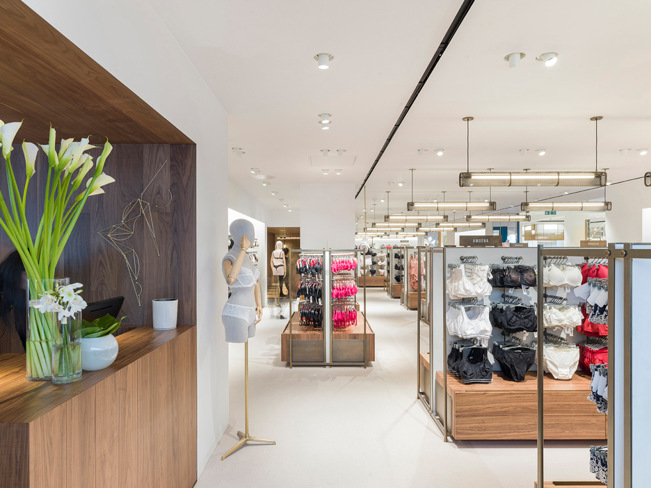
"We wanted to transform what was a low space into a sanctum for the merchandise that is presented there and for the women who shop the space," he added.
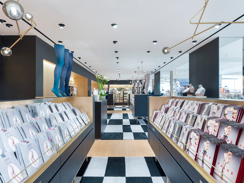
Although presented as one department, the different types of clothing are displayed in their own spaces.
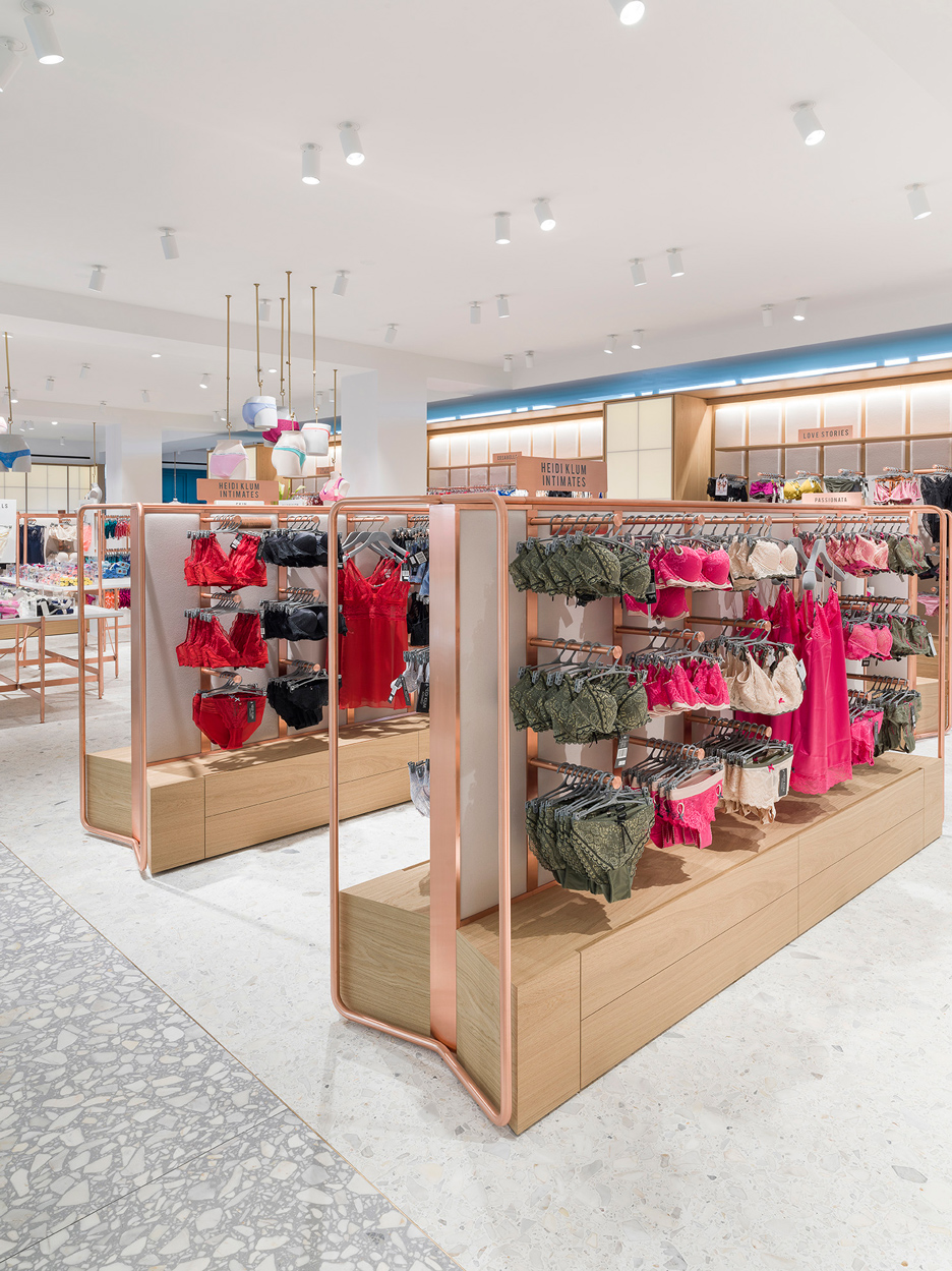
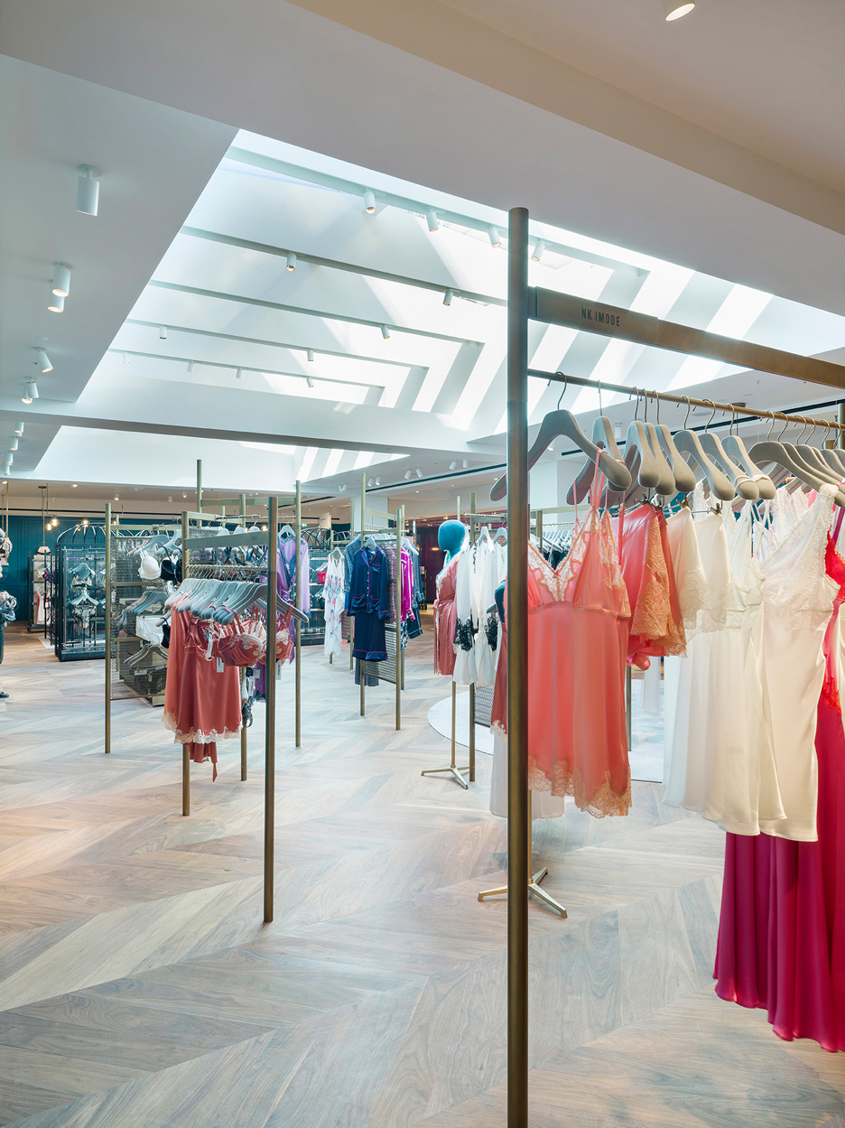
Each uses similar materials in a variety of ways, particularly for furniture, fixtures and display racks.
"We created a series of rooms with different play of materials responding to the different qualities of the products," said Hu. "A progression of spaces that shift in atmosphere, light and materiality while playing with notions of private and the public; from the intimate and personal to the overt and playful."
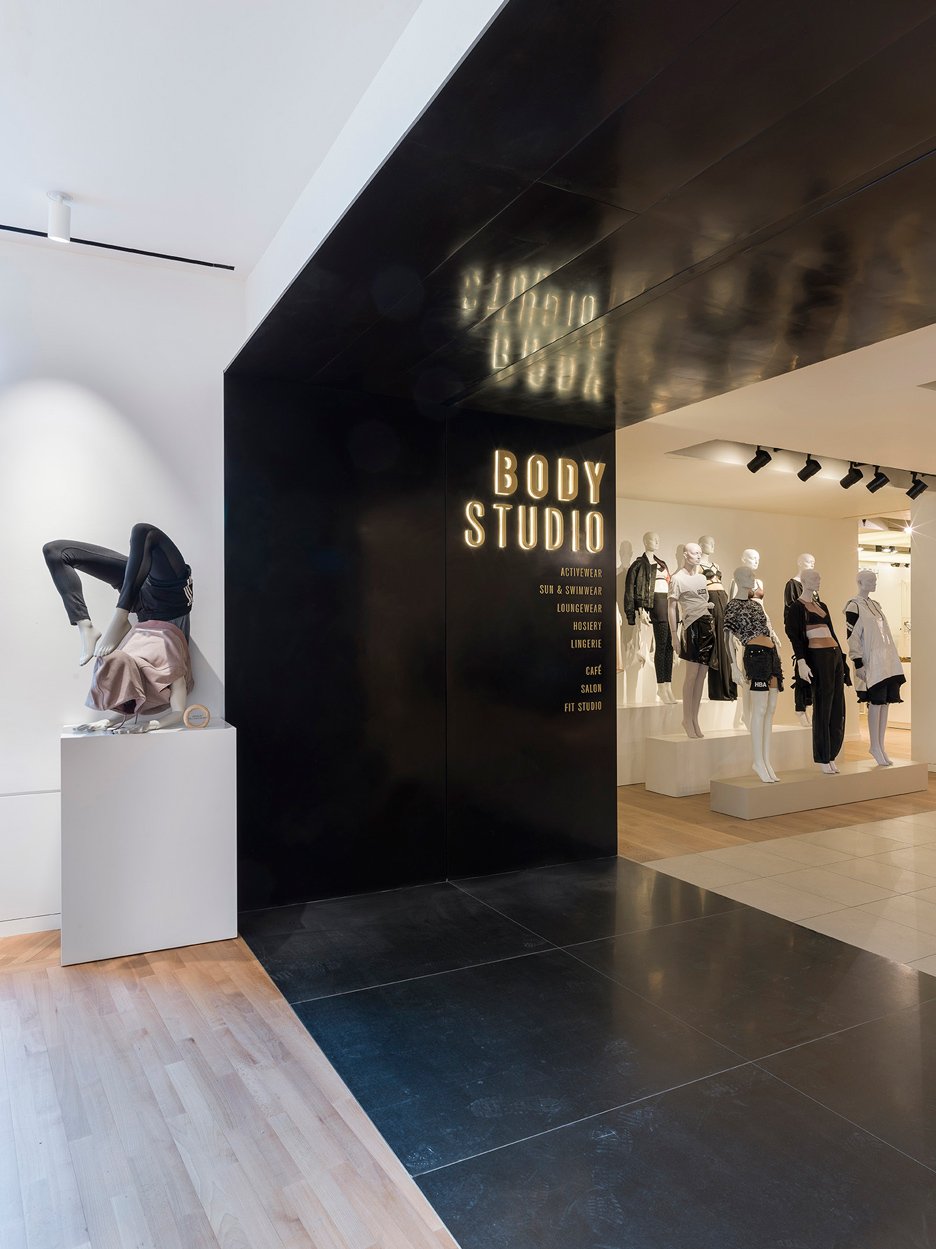
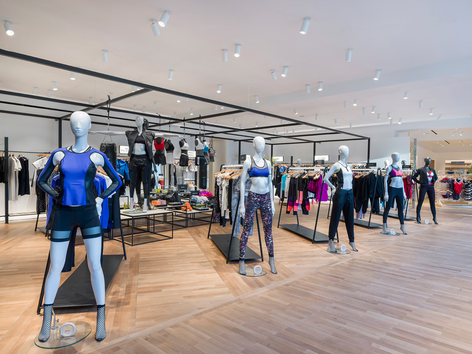
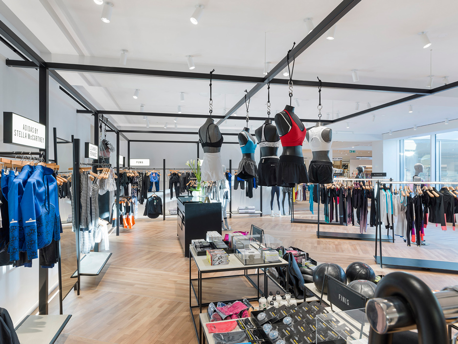
The Activewear and Athleisure space is influenced by gym and sports courts, and has fixtures made from black metal tubing and illuminated light rails. These can be cleared away and rearranged to make room for fitness classes and events.
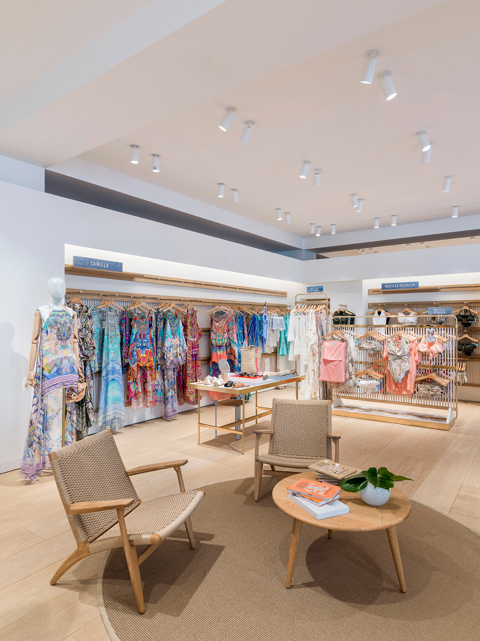
Beachfront fences and weathered driftwood are evoked in the Sun and Swim space, where racks comprise brass frames and white-washed timber strips, and solid wood is stacked up to form accessory tables.
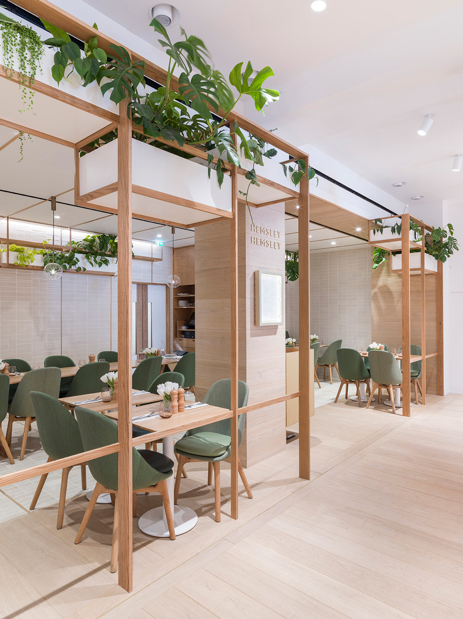
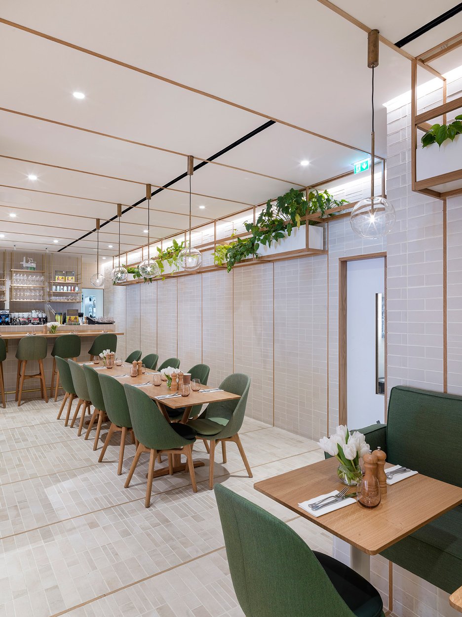
The adjacent Hemsley + Hemsley Cafe features textured tiles, long oak tables and hanging vegetation.
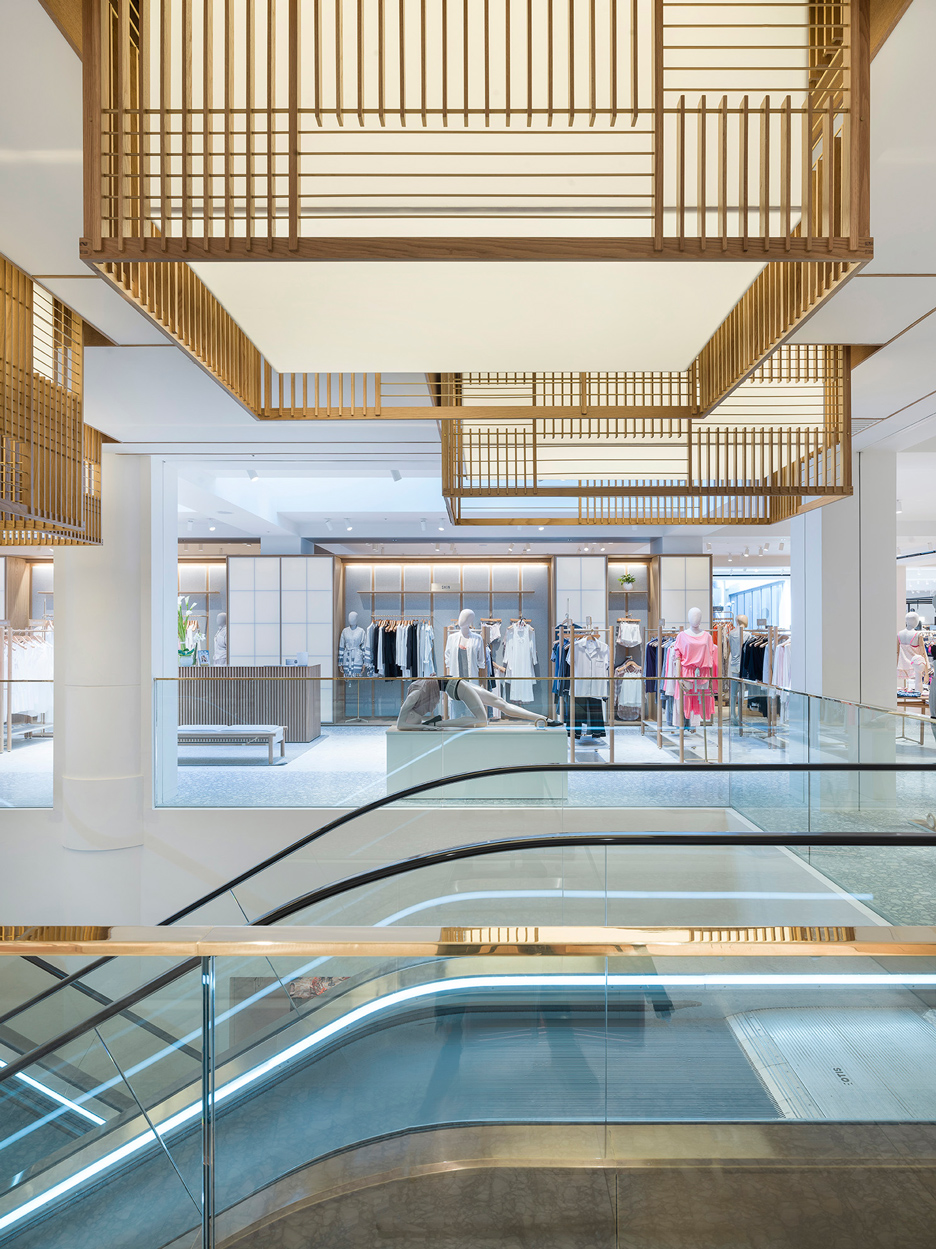
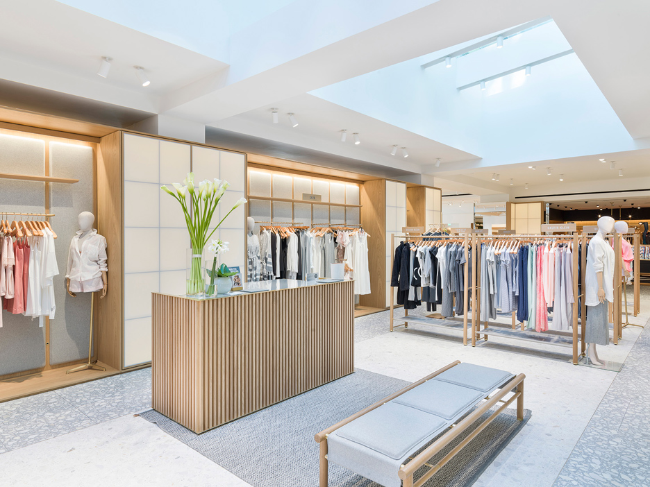
Backlit Japanese paper screens – known as shoji – and fabric panels provide backdrops for displays in the Loungewear area. Eastern-influenced lanterns are located above the escalators, which are surrounded by a grey terrazzo floor.
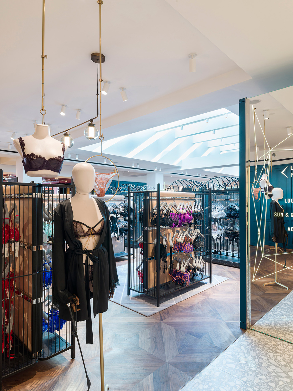
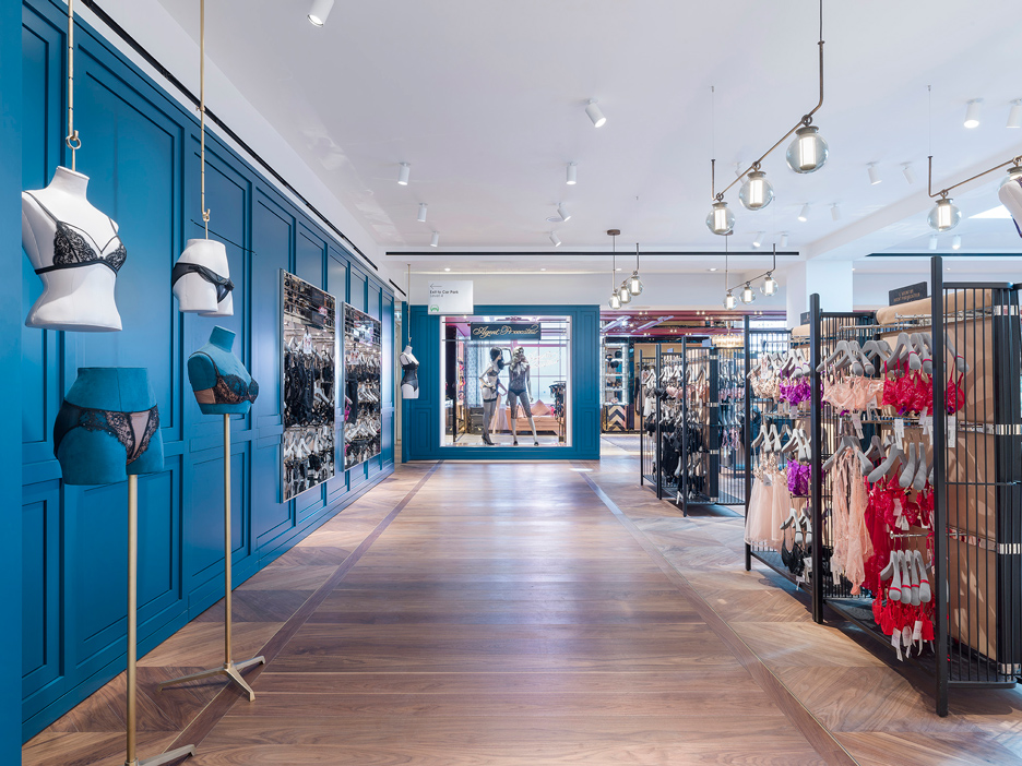
Luxe Designer and Naughty Designer sections are made much darker by blue panelled walls, cage-like display cases and parquet flooring.
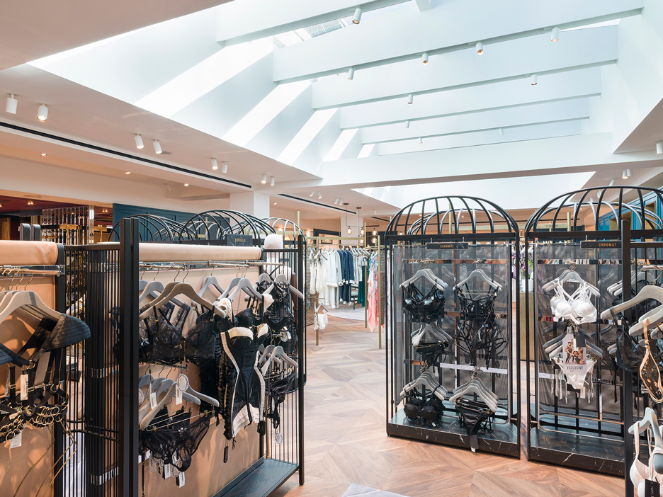
Hu described the design for the Body Studio as: "a layered approach to space with custom furniture and display fixture specifically made for each area with boundaries blurred between modern and classical, inside and outside, light and dark with an overarching architecture outline that ties the Studio as a whole."
The firm's previous retail interiors include fashion brand Comme Moi's first shop and the Shanghai flagship store for shoe brand Camper, as well as its own design gallery, shop and event space in a former colonial police station.
Selfridges has previously collaborated with architects such as OMA, Alex Cochrane, Klein Dytham and FAT to create shopping and event spaces. Last year, Faye Toogood designed gender-neutral concept retail environments.
The east side of the store, located London's Oxford Street, is also undergoing an overhaul headed up by David Chipperfield.
Photography is by Andrew Meredith.