"Foster's old, Modern, boring architecture versus Bjarke's new positive architecture"
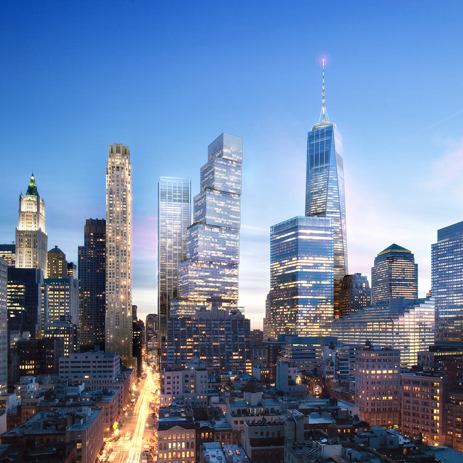
Comments update: the developer of New York's Two World Trade Center tower is torn between BIG's design and the original proposal by Foster + Partners, prompting readers to take sides.
Tale of two towers: commenters stepped in to defend Foster's design, which features a slanted, diamond-shaped top. "The Foster plans were always the superior of the two," said Matthew. "I did hear that the 90s are cool again," agreed Kieran, perhaps ironically.
But others found BIG's proposal – which consists of stacked boxes – more exciting. "The 'bad' architect Foster with the old, Modern, boring architecture versus the new kid Bjarke with a new positive architecture!" said Rob ten Napel. "Hopefully the client will choose innovation and risk, and not safe, we've-seen-it-all-before architecture."
The rest weren't convinced by either tower. "Both are rigid, non-inventive and sterile," said one reader. "The drama is unbearable," claimed another.
Which proposal do you prefer? Let us know in the comments section »

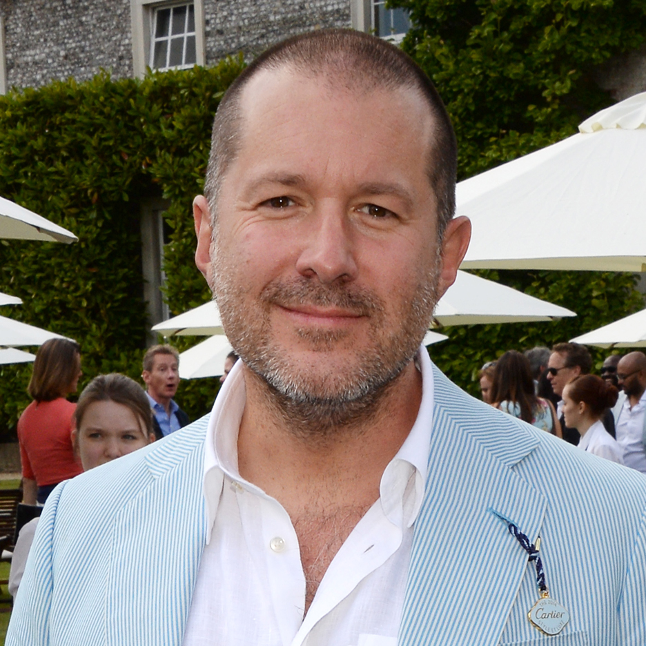
Ive made it: fewer designers seem to be interested in creating things by hand, according to Apple's Jonathan Ive, encouraging readers to debate the shifting priorities in design education.
"As someone who has spent seven uninterrupted years in the workshop at college, I do agree," said one reader. "Now students have to book workshop time and think that a design is a design if they can draw it in Rhino."
"Young architects that have never held a hammer don't know wood characteristics and species," agreed Chad Sutter. "Someone has to know how to make the machines that make the stuff."
However, Ive's statements caused some raised eyebrows. "Apple, the champion of handmade craftsmanship?" wrote TurkeyMuffin. Another commenter labelled Apple's own making processes "inscrutable". Read the comments on this story »

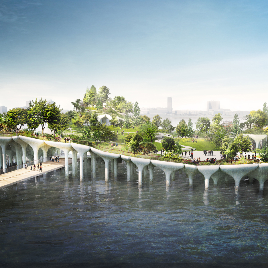
Troubled waters: Thomas Heatherwick's elevated park over the Hudson River has been given the go-ahead, prompting a fresh debate over the future of the British designer's widely disputed Garden Bridge.
"New York can keep Heatherwick's foray into gardens suspended over water," said Roberto Sideris. "Fingers crossed that London's new mayor agrees," added HHGeek.
"Heatherwick jumped the shark," said Derek_V.
But some readers are defending the designer. "Heatherwick is often criticised unfairly and without grounds," said one user. "This is another iconic design that will become a hugely popular destination in New York." Read the comments on this story »

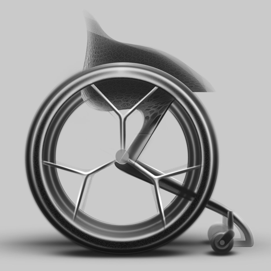
Behind the wheel: readers are praising Benjamin Hubert's studio Layer for a made-to-measure wheelchair design that will be manufactured using 3D-printing technology.
"Great to see Dezeen publishing design that matters," said one commenter. "Designing a desirable wheelchair with cutting-edge technology is a huge step," agreed Kay.
But is the design playing catch-up? "Semi-robotic leg prosthetic devices have already started to make wheelchairs redundant," Calvin pointed out. Read the comments on this story »