Mobile photo-sharing app Instagram has ditched its iconic retro camera logo in favour of a simple illustration set against a multicoloured gradient.
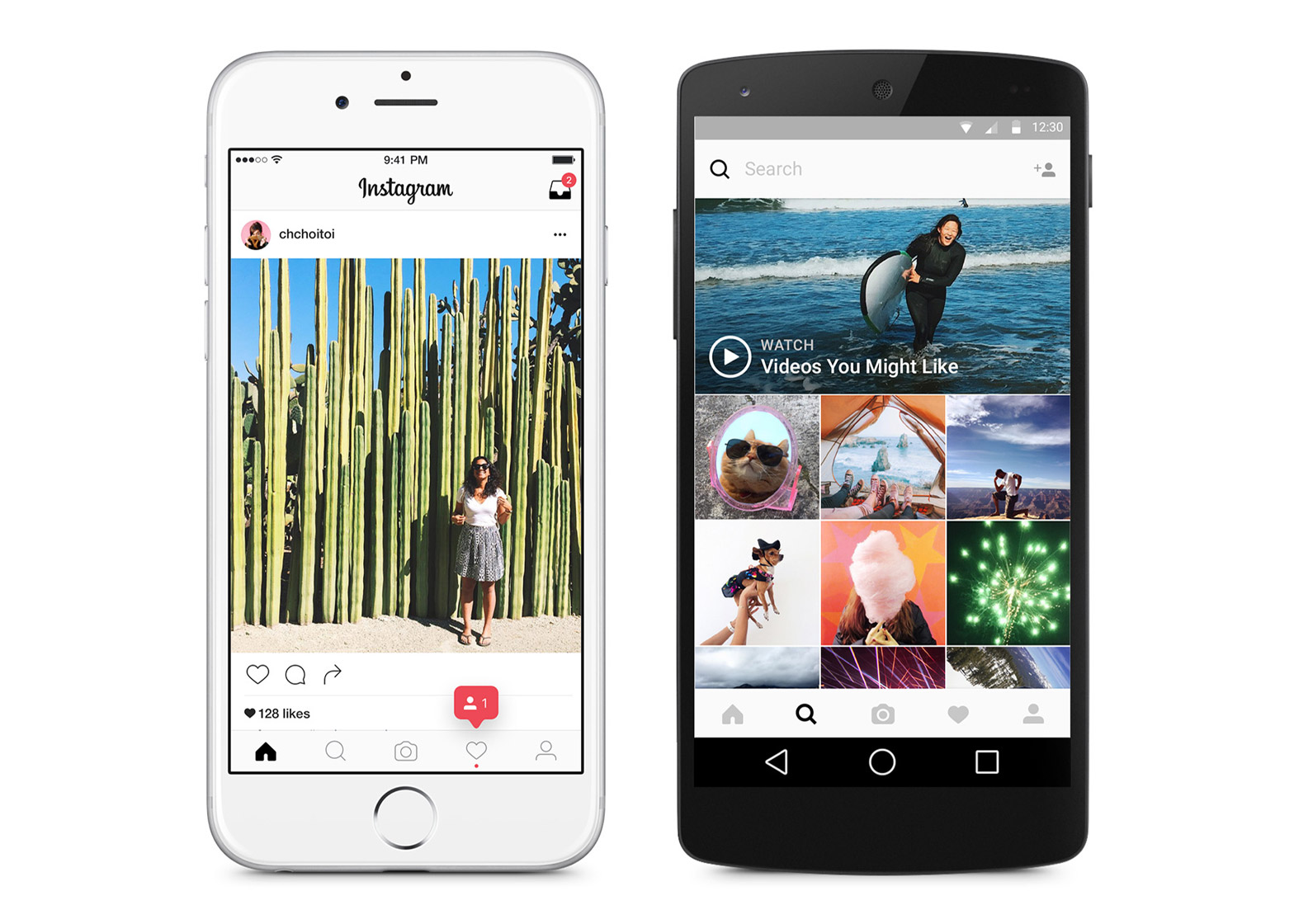
The new logo was introduced today, along with a pared-back, black-and-white interface and a corresponding set of buttons for Instagram's Layout, Boomerang and Hyperlapse apps.
In order to make images and videos stand out, the interface is flatter and less colourful, with white and grey replacing its signature blue.
Notifications now appear in pink instead of orange, and toolbar icons are simplified to an outline, which turns black when selected.
In a blog post, design director Ian Spalter said the company, which was founded in 2010, had been considering a redesign since last year.
"Last year, a group of us started digging into how we could support [the app's] evolution while staying true to Instagram's heritage and spirit," he said. "We wanted to create a look that would represent the community's full range of expression — past, present and future."
The design team began by flattening the existing retro-looking camera icon, which they believed was "no longer reflective of the community".
"The original icon's skeuomorphic style had the benefit of making it feel tangible despite being pixels, and our initial explorations involved trying to modernize it as it was," said Spalter.
"These early flattening explorations lacked the visual weight of the original, and we turned our focus to figuring out exactly what people loved about the classic icon and how we could carry that over."
They then approached the company's employees to draw the Instagram icon from memory in five seconds – and almost all of them drew the rainbow, lens and viewfinder.
Considering this, they translated these three key elements into an app icon, and arrived at a simple outline backed by a colourful gradient.
"We decided to translate these elements into a more modern app icon that strikes a balance between recognition and versatility," said Spalter.
Instagram was sold to Facebook in 2012 for $1 billion. It now has over 400 million users – more than Twitter – and more than 80 million photos and videos are shared on the app every day.
In an interview with Dezeen, Hem's Jason Goldberg said that the photo-sharing app is now "as important" as the New York Times.
Skeumorphism – which involves using visual cues from a physical product to indicate its digital counterpart like Instagram's old camera logo – was popular in the first wave of app design, but is increasingly being phased out.
In 2014, Google unveiled skeumorphism-free design guidelines for software across its desktop and mobile platforms, called Material Design.
"Material Design is part of a new way of thinking about software presentation commonly referred to – if maybe a little too broadly – as 'flat design'," wrote Alex Wiltshire in an article for Dezeen.
"Flat design recognises that we've learned to understand what we can and can't interact with on computer screens, allowing the interface to slip away, and what you're reading, watching, or whatever, take the stage."
Other recent brand redesigns include taxi service Uber, which was so widely criticised following the rebrand that its head of design Andrew Crow stepped down from the company.

