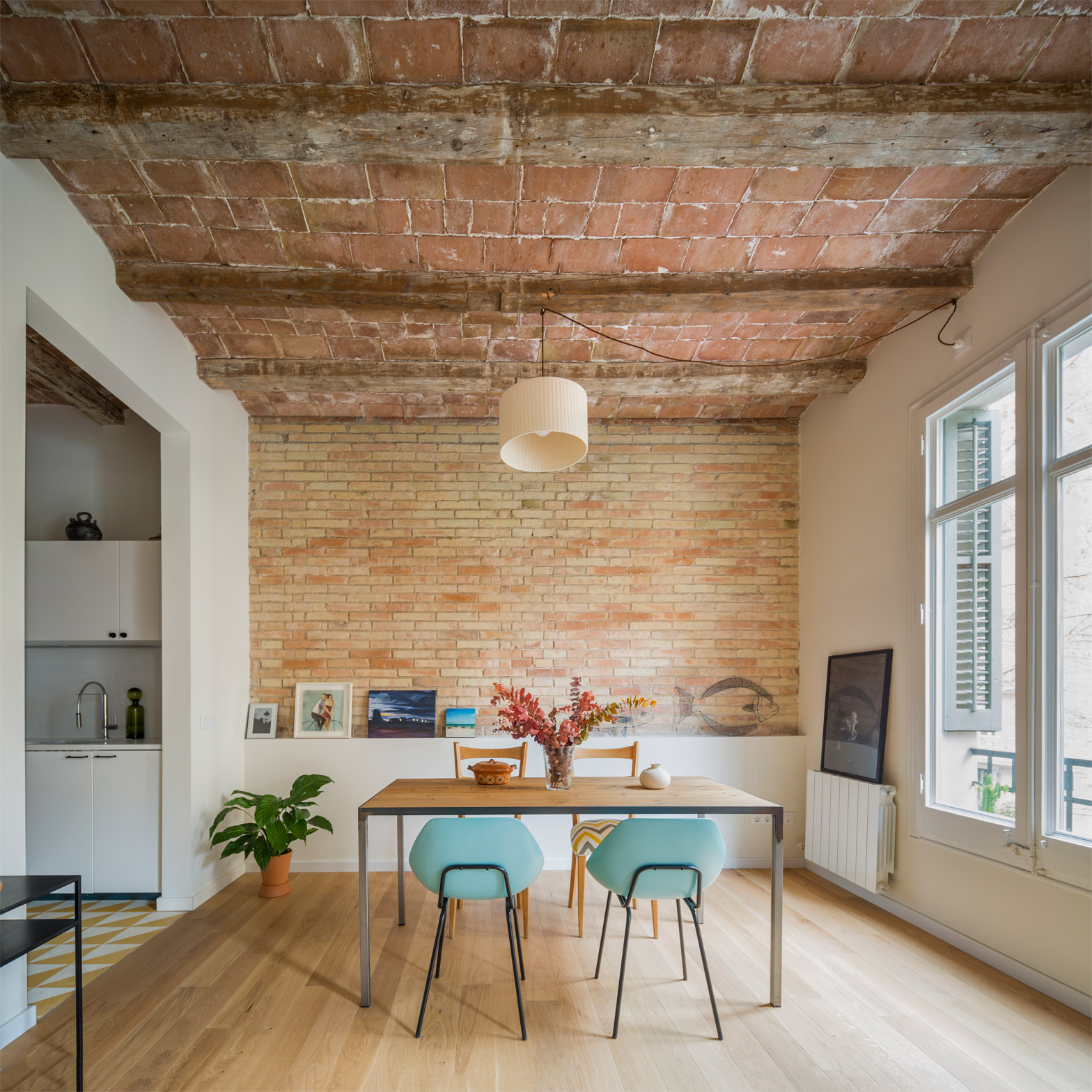
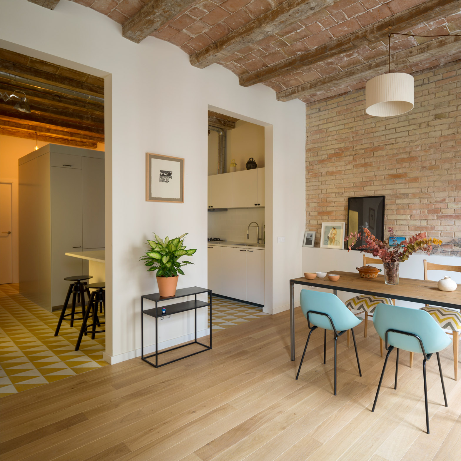
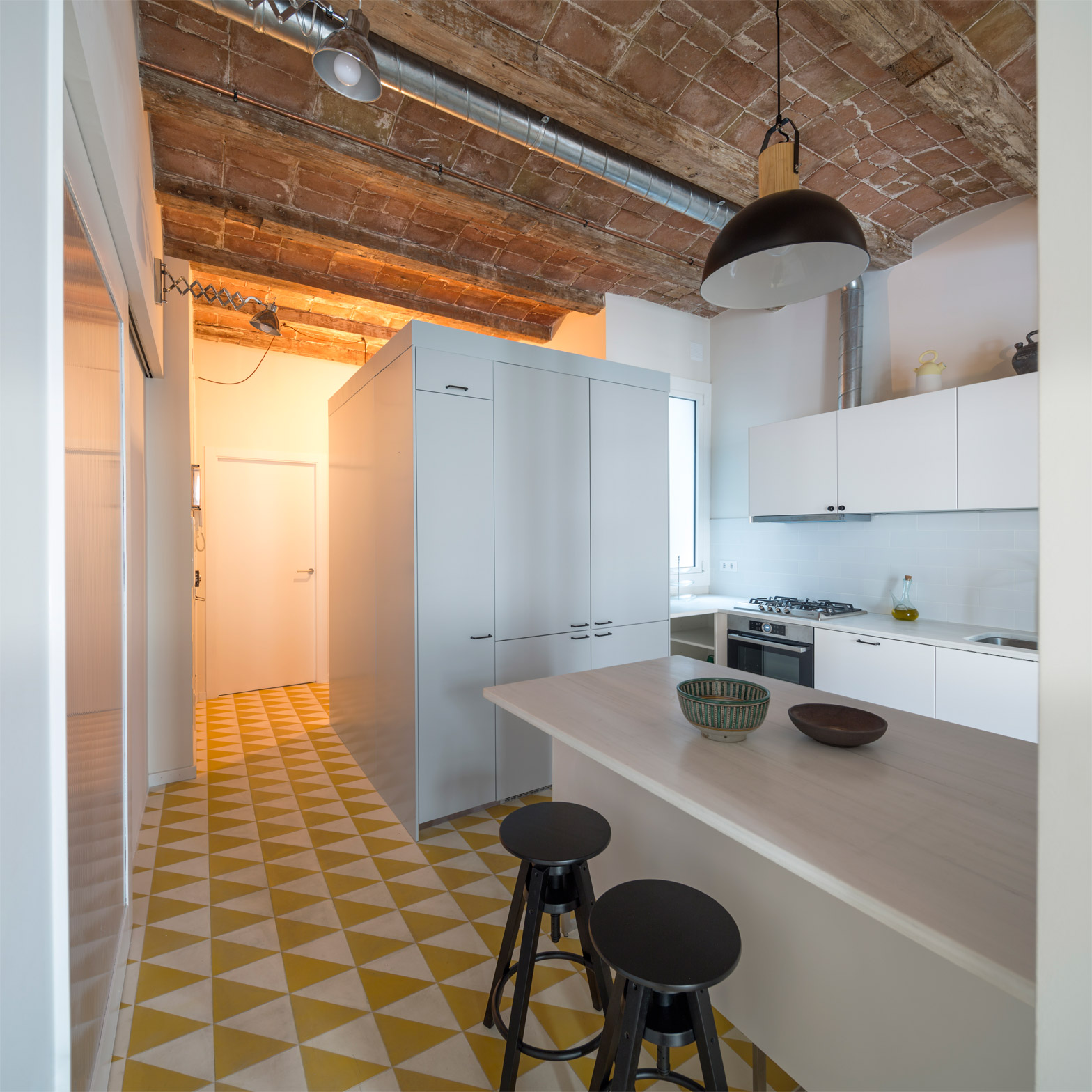
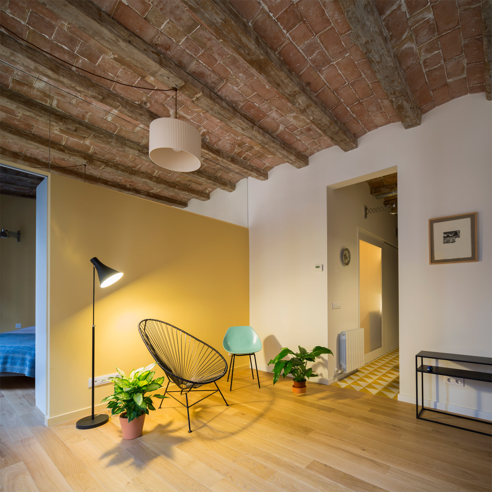
Barrel-vaulted ceilings and exposed brick walls evoke the heritage of this apartment in Barcelona, which local firm Nook Architects remodelled to make better use of the awkward existing plan (+ slideshow).
Named Sardenya, the two-bedroom apartment is situated in a building originally constructed around the turn of the 20th century in the city's Eixample District.
Nook Architects was asked to oversee its modernisation, focusing on improving the distribution of natural light and connectivity between the communal rooms.
The studio has previously renovated several residences in Barcelona, including a two-storey house with stairs and mesh partitions separating its living and sleeping areas, and a narrow apartment featuring geometric floor tiles and tracks for sliding partitions.
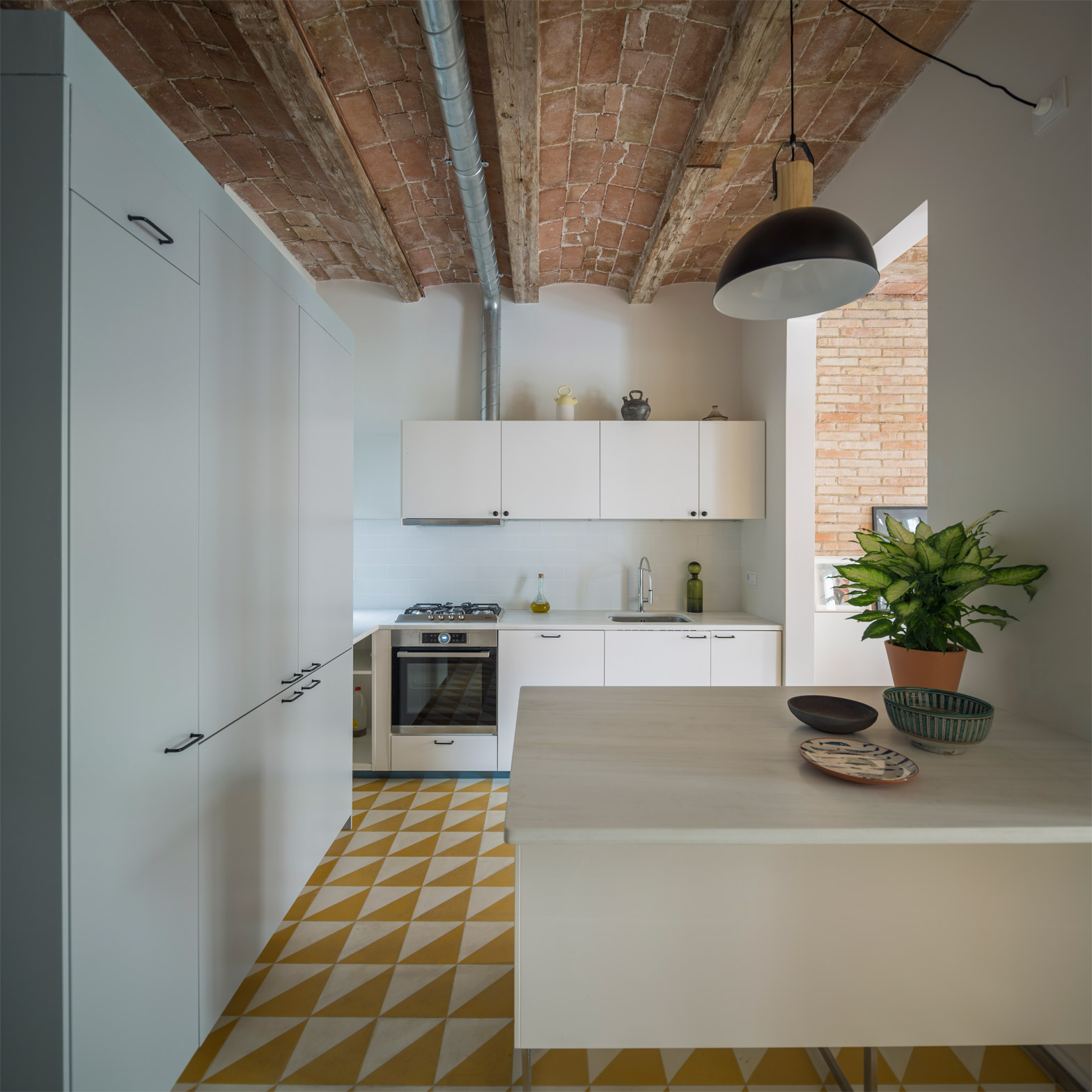
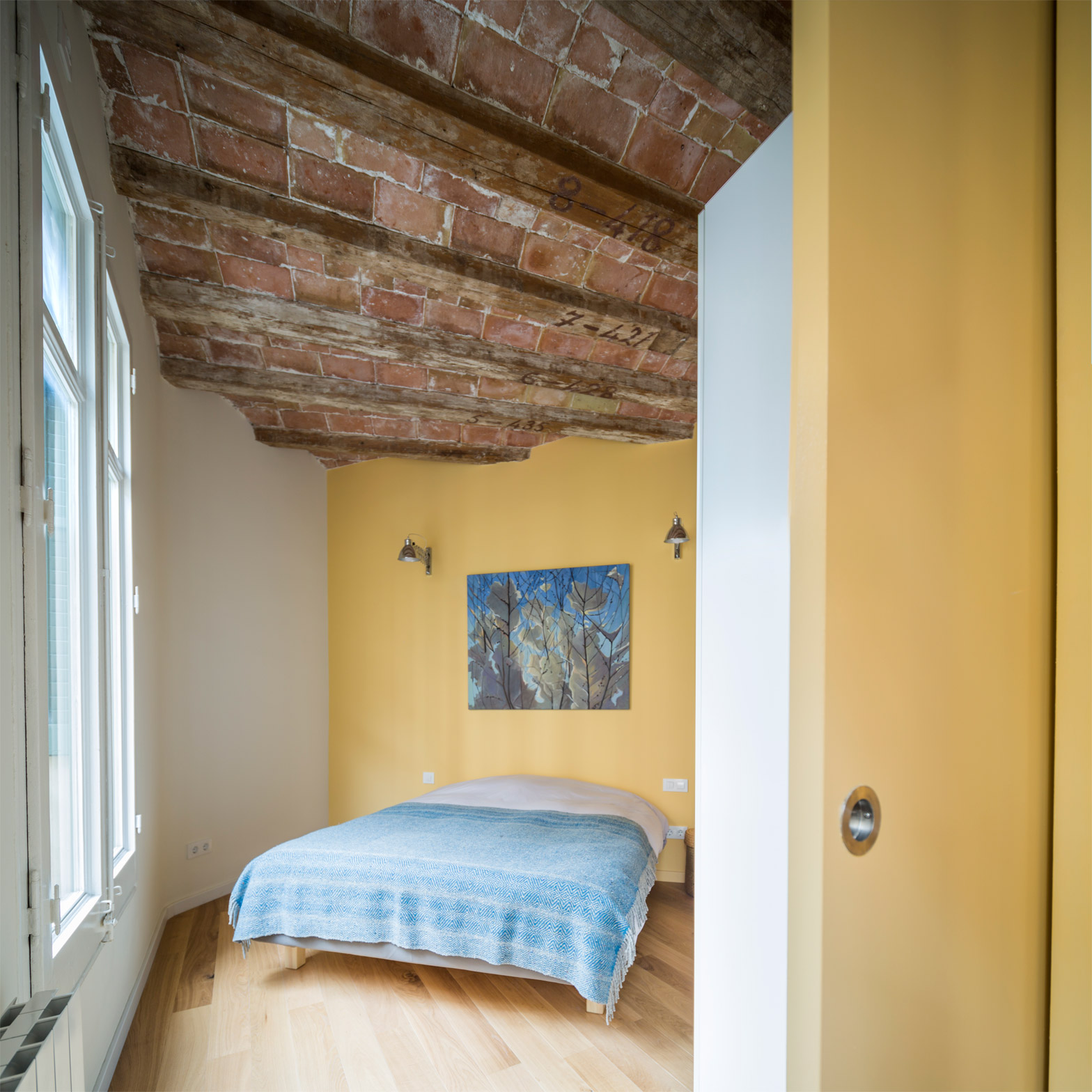
Sardenya's floor plan incorporates some unusual spaces, including chamfered corners where beams traversing the ceilings take on a fan shape. This type of ceiling is known as a Catalan vault.
"We wanted to improve the functionality of the old apartment and adapt it to the client's needs," Nook Architects told Dezeen.
"We used the complexity of the plan as a positive input for the new distribution, playing with the reflections of mirror and the unexpected position of the main bathroom, which works as a big lamp when its door is closed."
The original layout of the apartment resulted in a series of awkward and cramped rooms arranged around a narrow central corridor. These spaces were dark and made it difficult to install fixed furniture and services.
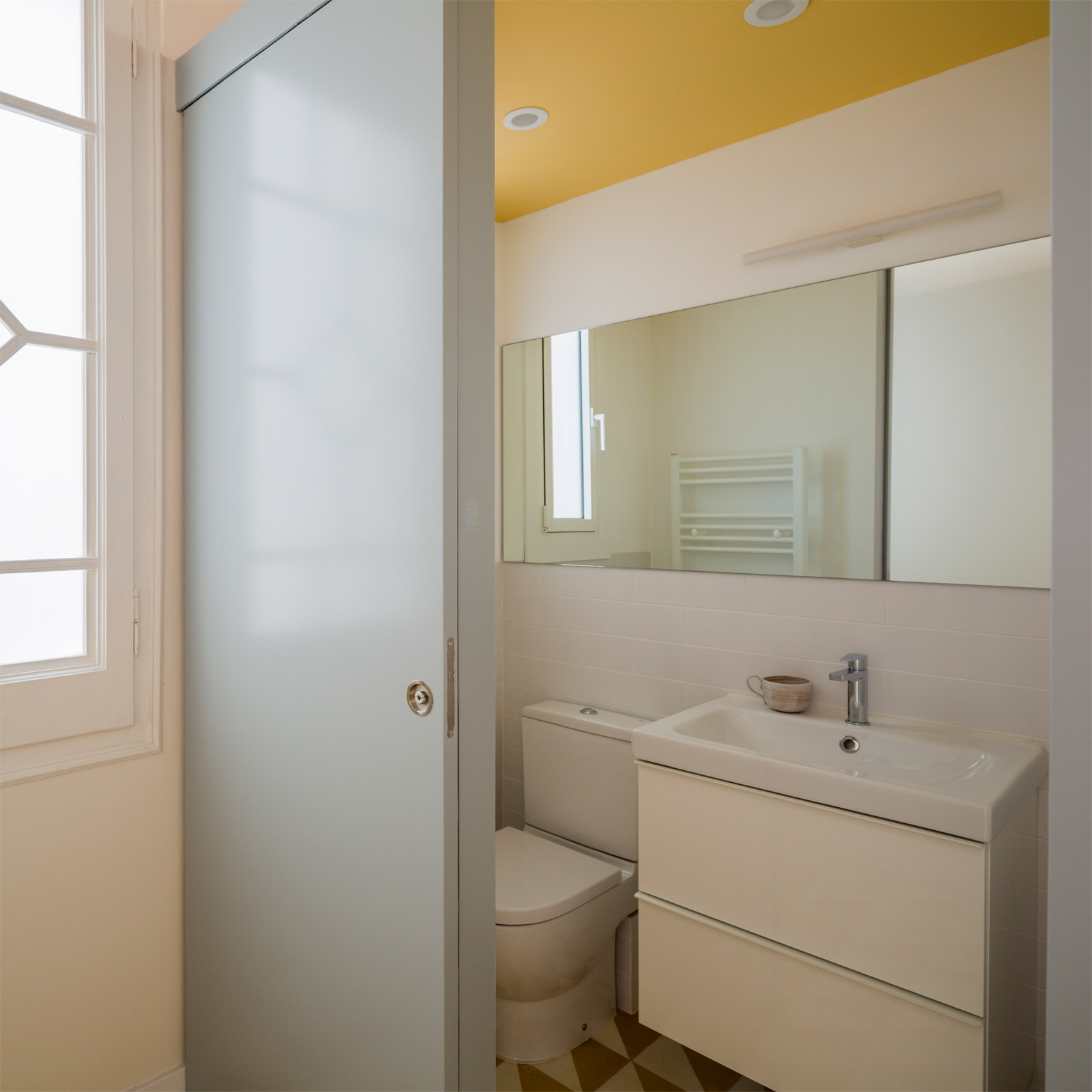
Most of the rooms have been rearranged, with only the second bedroom and a WC remaining in their original locations. The WC has been completely remodelled and incorporates a freestanding unit that also contains storage for the kitchen on the other side.
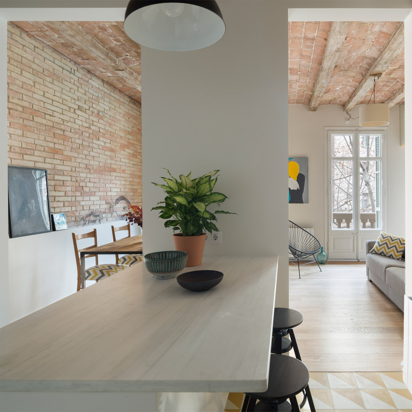
To ensure the interior makes the most of the available natural light, the architects located the main living spaces adjacent to the wall containing most of the windows. They also added an opening in a load-bearing wall, which allows light to permeate into central areas.
"The new opening on the wall connecting the kitchen with the living space drags the light to the centre of the apartment," the architects added, "and placing the big sliding door of the main bedroom next to the facade means that the light coming from outside helps to brighten the main space."
The kitchen was previously tucked away in its own small room off the central corridor, but the removal of a superfluous third bedroom allowed it to be moved to a larger space with a better connection to the living room.
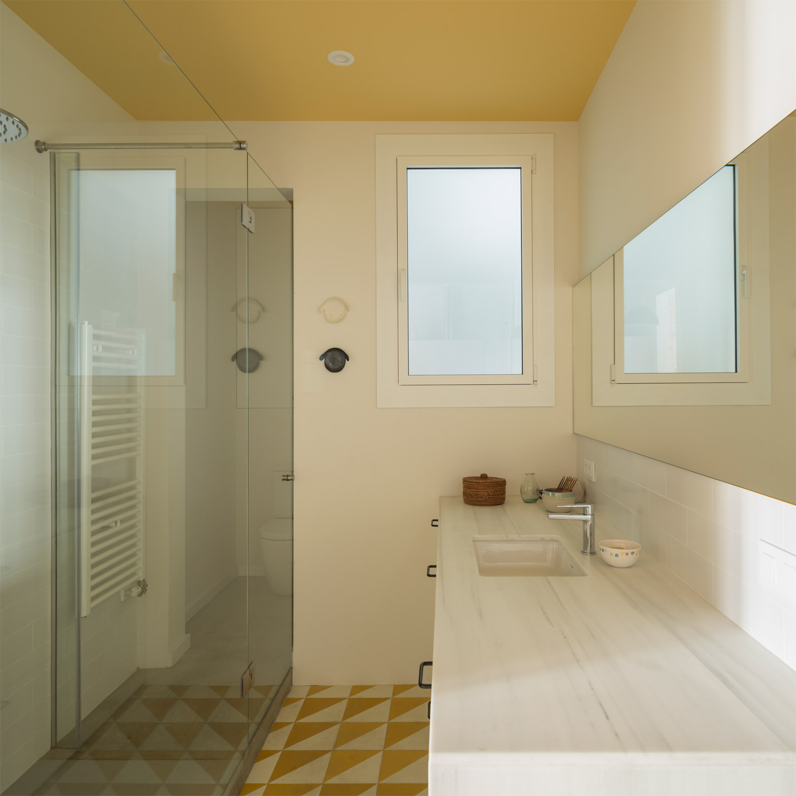
The main bathroom replaces the previous kitchen. It is separated from the rest of the space by a sliding door featuring a polycarbonate surface that emits a gentle glow when the light inside is turned on.
The master bedroom was moved to the chamfered corner of the plan to extend its floor area. It is separated from the living room by a sliding door painted the same shade of yellow as the partition wall.
The spacious feel of the living room is accentuated by the inclusion of a mirrored panel at the top of the wall. This creates the illusion that the wall does not reach the ceiling, and the reflection of the parallel ceiling beams suggests that the space continues beyond the partition.
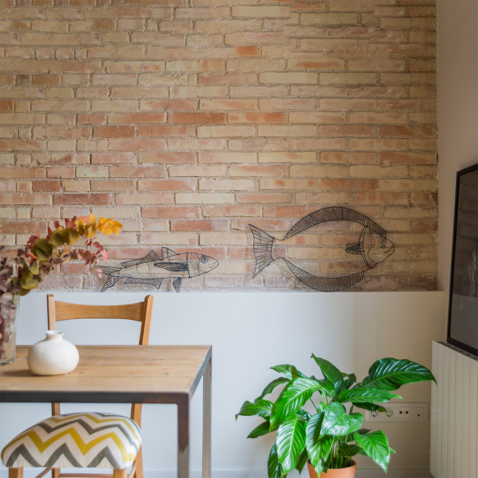
Stucco that previously covered some of the load-bearing walls was removed to reveal the original brickwork. Other preserved details include traditional windows, which were updated with new double-glazed panels.
Natural wood flooring in the living room and bedrooms, as well as mosaic tiles in the kitchens and bathrooms, contribute to a simple materials palette with a predominantly natural and warm character.
Nook Architects is based in a co-working office in Barcelona's Poblenou district. The studio was behind the design of the office space, which incorporates meeting pods made from yellow-painted chipboard and glass.
Photography is by Nieve.

