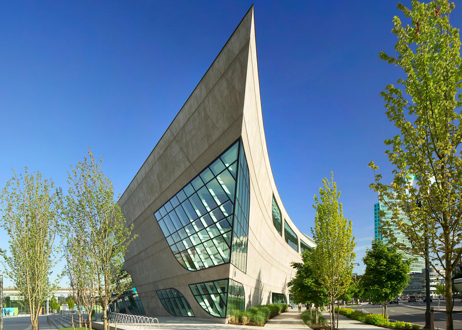
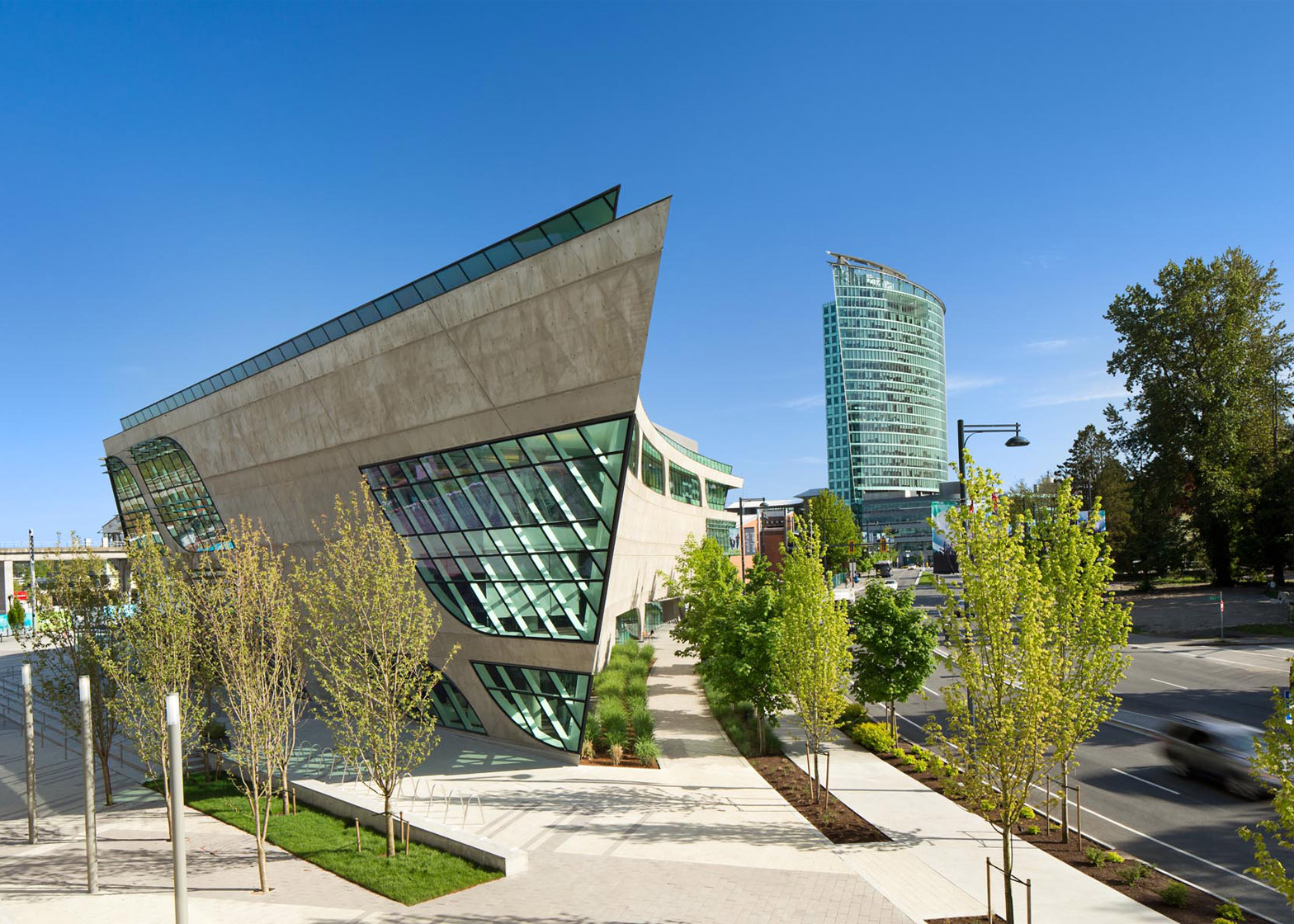
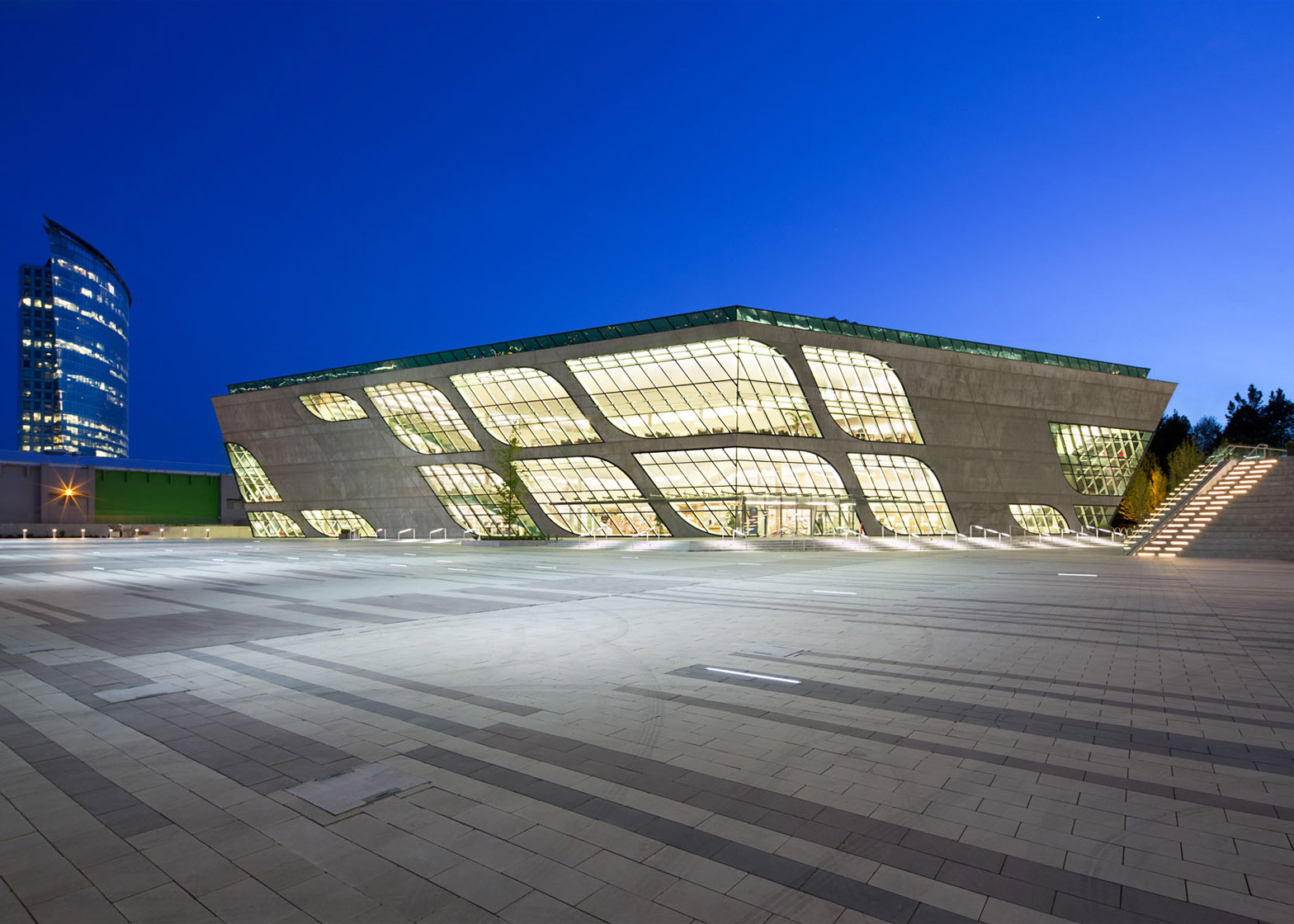
Bing Thom Architects has completed a library near Vancouver featuring angled concrete walls, curved windows and a pointy corner that resembles a ship's bow (+ slideshow).
The Surrey City Centre Library is the main branch of the public library system in Surrey, a suburban city about 50 kilometres southeast of downtown Vancouver.
Completed in 2011, the four-storey library replaced an outdated facility and marked an important phase of "a major civic investment in the transformation of downtown Surrey," said Bing Thom Architects, a Vancouver-based firm founded in 1982.
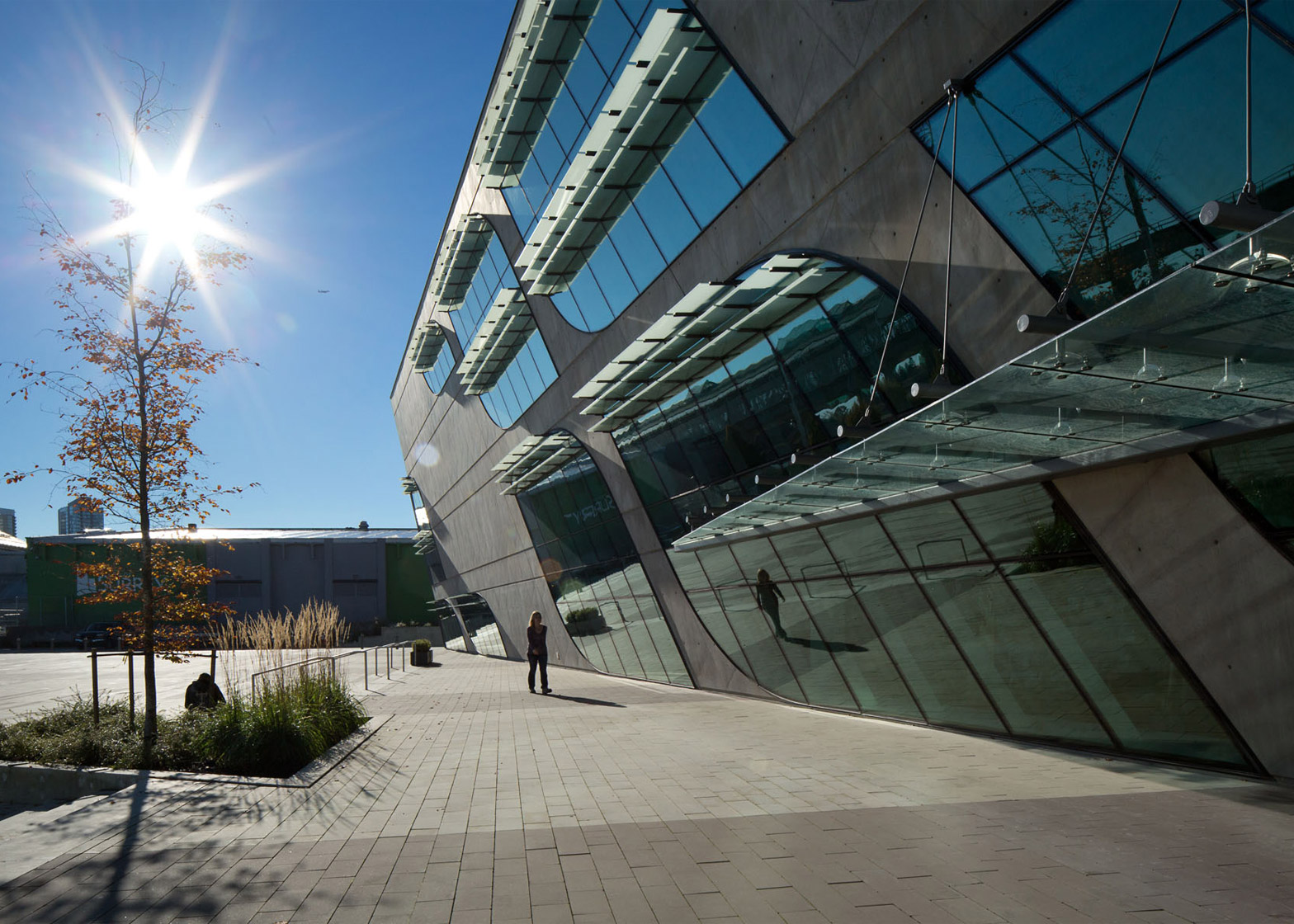
The building's sculptural form consists of concrete walls that partly slope inward, providing visual interest while also minimising solar heat gain.
The northern side of the building comes to a sharp point, resembling the bow of a ship, while windows include both curves and points – both features that have been popularised by the work of the late Zaha Hadid.
Computer modelling software was used to ensure the concrete formwork was "highly efficient and easy to construct".
"The exterior concrete structure was carefully detailed as the final surface, thereby eliminating the need for expensive building cladding," the firm added.
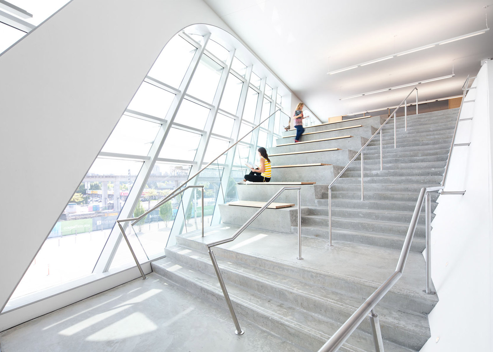
The team incorporated expansive areas of glazing, ensuring plenty of light enters the building. They also designed the entrance to feature clear sight lines, allowing visitors to quickly get oriented once inside the facility.
Encompassing 82,000 square feet (7,618 metres), the building's programme includes multipurpose rooms, a cafeteria, a children's zone and a "world languages area," with books printed in more than a dozen languages.
"The building design evolved out of the need to provide a space for reading, studying, and above all, gathering as a community," said the firm.
"With advances in easily available electronic information, the role of libraries is changing and the book collection is no longer the central focus."
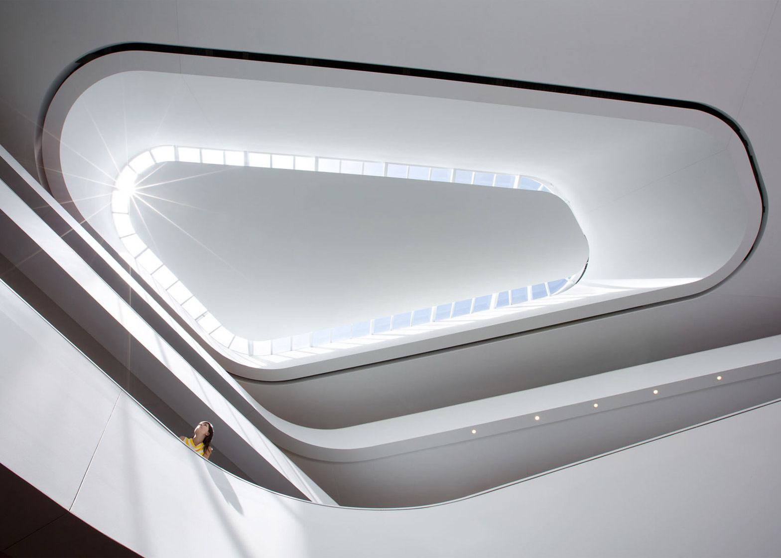
The interior was conceived as a series of spaces of varying heights, all organised around a central atrium.
Illuminated by a large skylight, the atrium is encircled by a sinuous ribbon of solid white railings. Wide stairs double as seating areas.
The rooms are a mixture of bright and open "high" spaces and more intimate "low" zones, which accommodate book stacks and individual activities such as studying and writing.
Providing a casual environment was a key concern during the design process. "Spaces have been deliberately kept informal to make the library feel like an extension of the patron's home," the firm said.
A centrepiece of the interior is the "living room," which is a double-height reading area lined with a window wall overlooking a public plaza.
The firm worked with the city's librarians to develop a social media strategy that engaged the community in the design process.
"BTA developed a social media strategy using blogs, Facebook, Twitter and Flickr to engage the community in the design of the building, encouraging the public to post comments and photos," the team said.
"City Centre Library is arguably the first public building in the world to be designed with the aid of social media."
Other recent libraries include an angular building in Kansas by Gould Evans, which is wrapped in a terracotta skin, and a rounded library in Chicago's Chinatown by SOM, with a design that references Feng Shui principles.
Photography is by Ema Peter.

