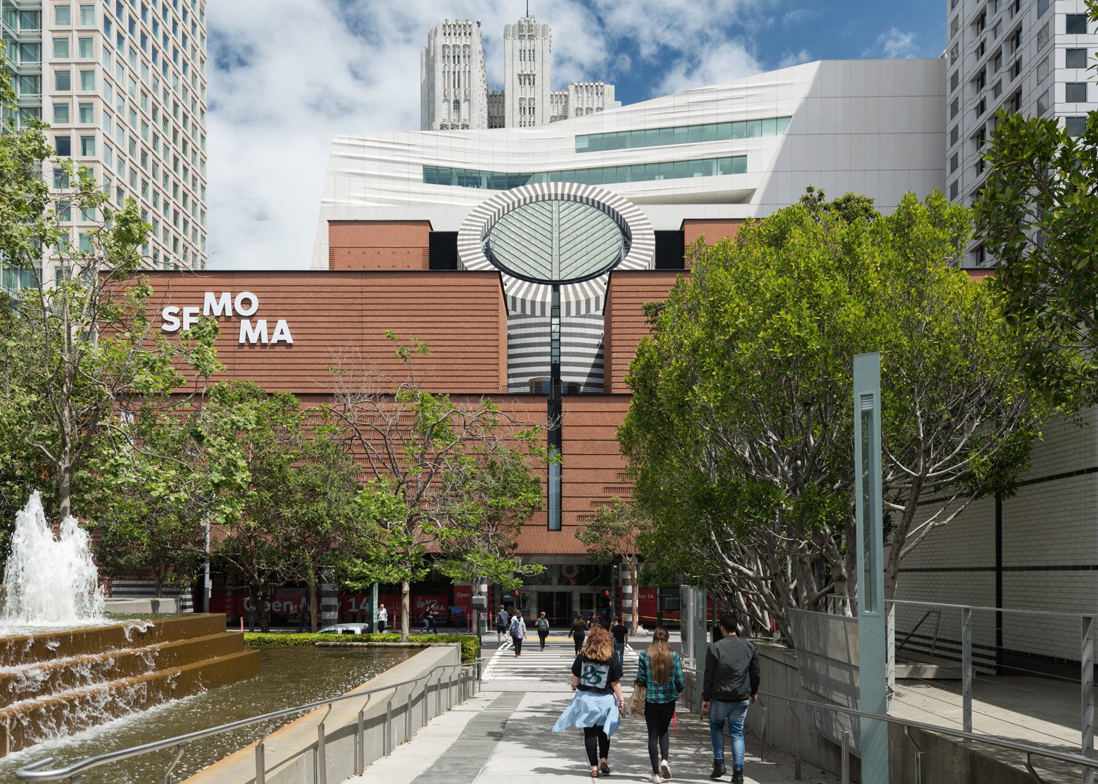
Critics have had mixed reactions to the Snøhetta-designed extension of Mario Botta's San Francisco Museum of Modern Art, with descriptions ranging from a "good citizen" to a "baked alaska slumped on the skyline".
Now with almost triple the amount of gallery space, the museum welcomed back the public on 14 May 2016 after a three-year renovation and expansion undertaken by New York and Oslo firm Snøhetta.
Given a first look at the building two weeks before, critics were quick to come up with comparisons to its wrinkled cliff-like form, which lead architect Craig Dykers said was influenced by the city's foggy weather and dramatic topography.
"Fog isn't the first thing that springs to mind when you encounter the rippling white cliff face that now looms behind the museum's original home," said The Guardian's Oliver Wainwright.
"It looks more like a gigantic meringue, a building-sized baked alaska slumped on the skyline between Botta's weighty temple and the elegant Art Deco tower of the Pacific Bell building behind."
The LA Times critic Christopher Hawthorne described the extension as "apologetic about both its ambition and its bulk".
"It is everywhere shaved off and pinned back, forever curving away from you as you stand on one of its extensive outdoor terraces and try to assess its scale and civic personality," he added.
In The New York Times, reporter Jori Finkel simply stated that it resembles a "cruise ship".
In a piece for Curbed, Alexandra Lange said the enlarged SFMOMA works in glimpses but sits uncomfortably in the surroundings of the city's South of Market district. "Partially obscured, the Snøhetta building reads as a good citizen, adding texture and a refreshing lightness to a dense urban quilt," she said. "As a fragment, it makes sense, but the expanded museum only does intermittently, its architectural language stretched too thin in its attempt to corral competing buildings and competing ideas about how to engage the public."
The main facade of the new structure is clad in off-white panels of fibreglass-reinforced polymer. Wainwright referred to these as having a "flimsiness", while John King of the San Francisco Chronicle said they look "as though you could pry one off and carry it home".
In an interview with Dezeen, Dykers explained how his firm tried not to step on the toes of the existing building, completed by Swiss architect Mario Botta in 1995.
But some critics don't think the relationship between the contemporary 10-storey extension and the original brick-clad Postmodern building works.
"The pair do not make a particularly happy marriage," Wainwright said. "It makes you wonder why one was deferentially kept at the expense of the other, while being considerably lobotomised in the process."
Others were more positive. Julie V Iovine from The Wall Street Journal described the meeting of the two as "stark and revealing", while the Architectural Record's Josephine Minutillo said that Snøhetta had "found more success than most in adding to an iconic, or idiosyncratic, building".
"Inside and out, there are sublime smaller touches that show us why Snøhetta won the job," said King. "But several major aspects seem forced, like a collection of problems being solved rather than an architectural creation that fits right in."
Inside the Snøhetta addition, the levels are connected behind the bulging facade by a series of long staircases, which Hawthorne described as the "only interior moments of architectural drama".
Lange praised the smaller, tucked-away galleries on the upper floors, but revealed that her main issue was with the two lobby spaces.
The new entrance on Howard Street, accessed up an external flight of steps alongside rows of wooden bleacher seating inside, is intended as an area for the public to see artworks for free.
"This entrance feels generic," said Lange. "You could walk by the glass walls and read the building as a corporate headquarters, because the FRP panels don't touch down on the sidewalk."
"The blonde-and-white aesthetic is Scandinavian default, with little to underline this as an art space," she added.
In the original lobby, one of the project's most controversial moves was the removal of Botta's staircase, which sat below the building's iconic oculus.
Intended to let more light into the space and improve circulation between the two entrances, Snøhetta replaced it with a doglegged wooden structure that sits at an angle to the Swiss architect's geometry. Few had kind words to say about the decision.
"It's vapid, it disrespects the architecture, and it still doesn't make this lobby a place I'd like to hang out," said Lange. "It's like a Norwegian and an Italian of different generations, on a blind date that will end after one uncomfortable drink."
"The effect is like erecting an Ikea flat-pack in a temple, the blonde wood jarring with the weighty granite columns," agreed Wainwright.
"The really striking quality of that moment of aggression toward the Botta building is that is seems altogether out of character with the rest of the addition," said Hawthorne. "In almost every other way the Snøhetta design is handsome, carefully intelligent, self-effacing and agreeable."
But Iovine doesn't miss Botta's staircase. "It was always too narrow for everyday public use," she said. "Its replacement is a less intrusive, more generous staircase that inscribes a square as it rises in deference to Botta's love of primary forms."
Overall, the critics disagreed about the building's success on the whole.
"The greatest achievement of the project is the way it is rooted within place," said Minutillo. "By taking as many cues as it does from the city, and its neighbours, Snøhetta's addition is pure San Francisco, quirks and all."
"Should the museum simply have knocked down the older building and started from scratch on a prominent and roomy site?" asked Hawthorne. "My trip to San Francisco has left me thinking it probably should have."

