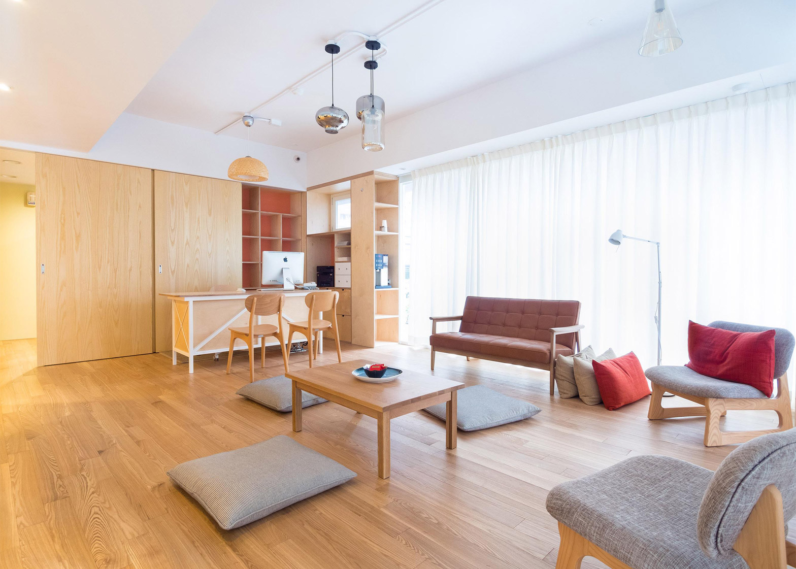
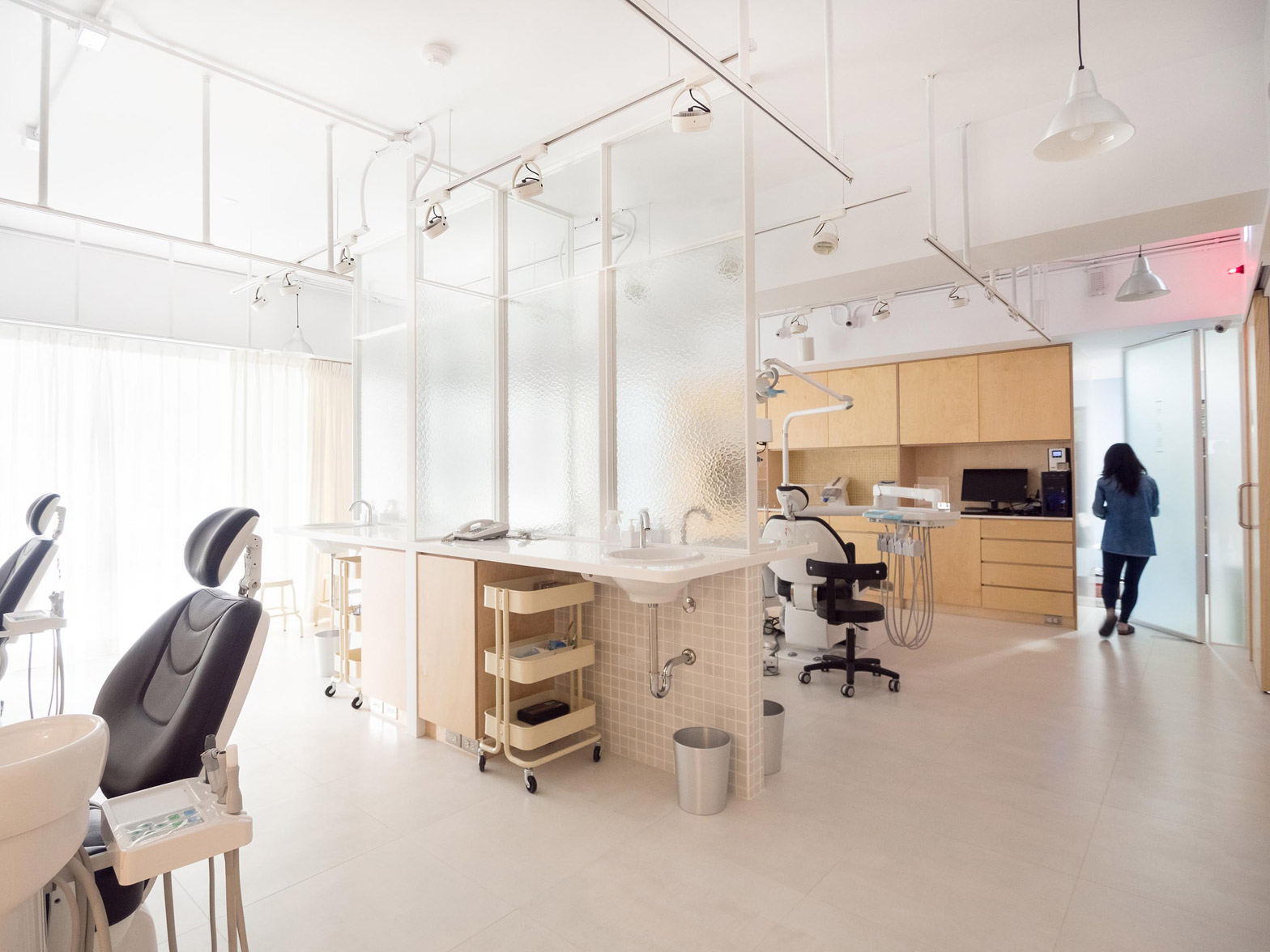
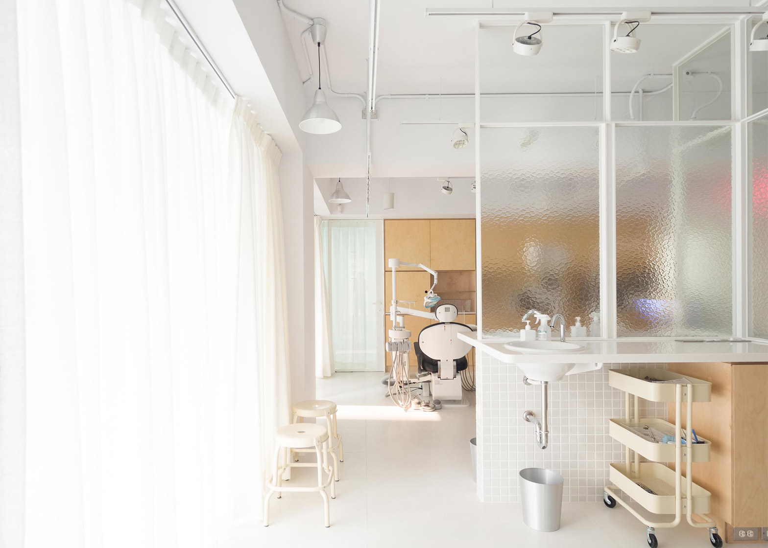
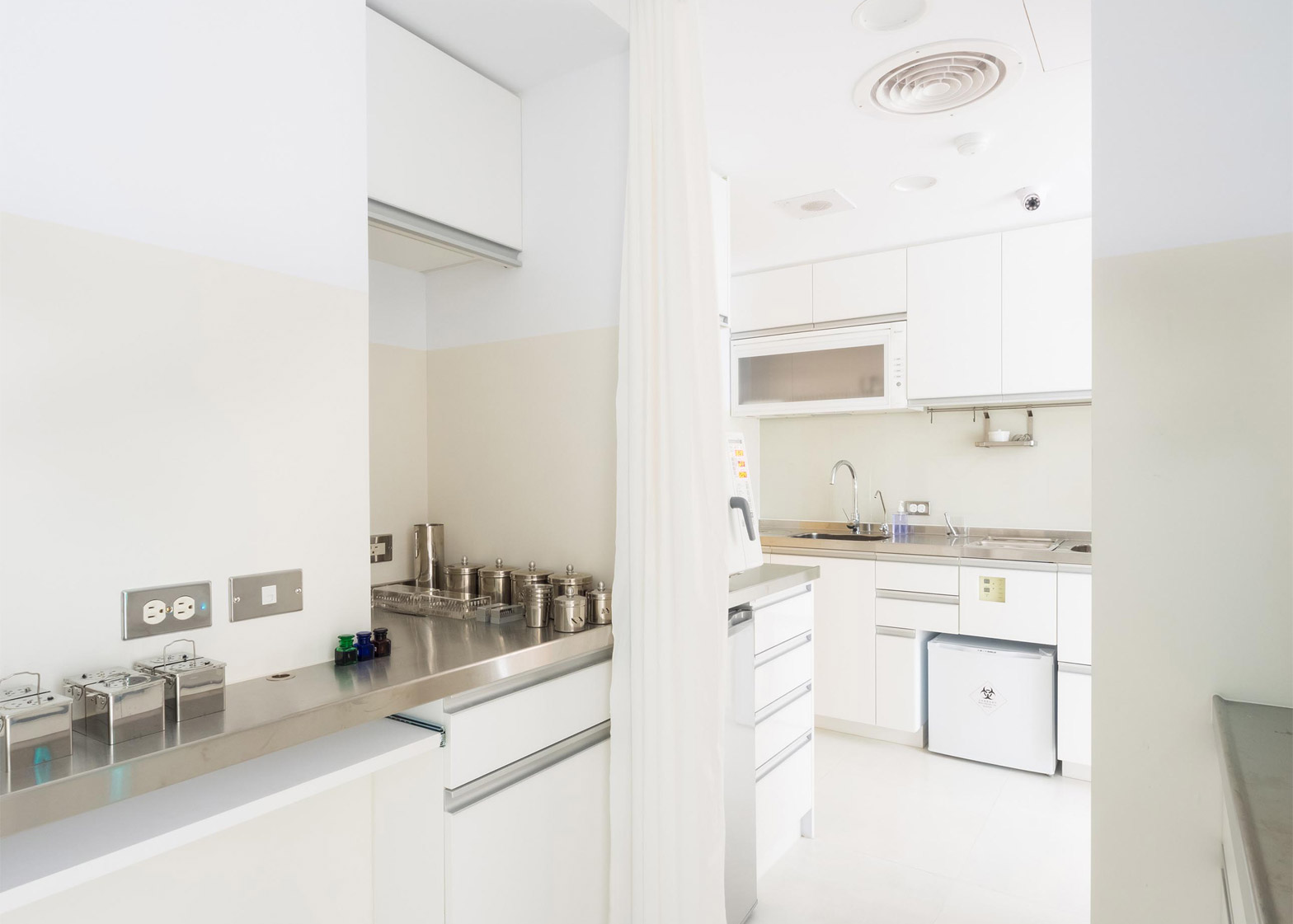
Architect Germain Canon and industrial designer Li Mengshu have used glass panels to divide the rooms of a Taiwan dental clinic, which features a waiting area designed to feel like a living room (+ slideshow).
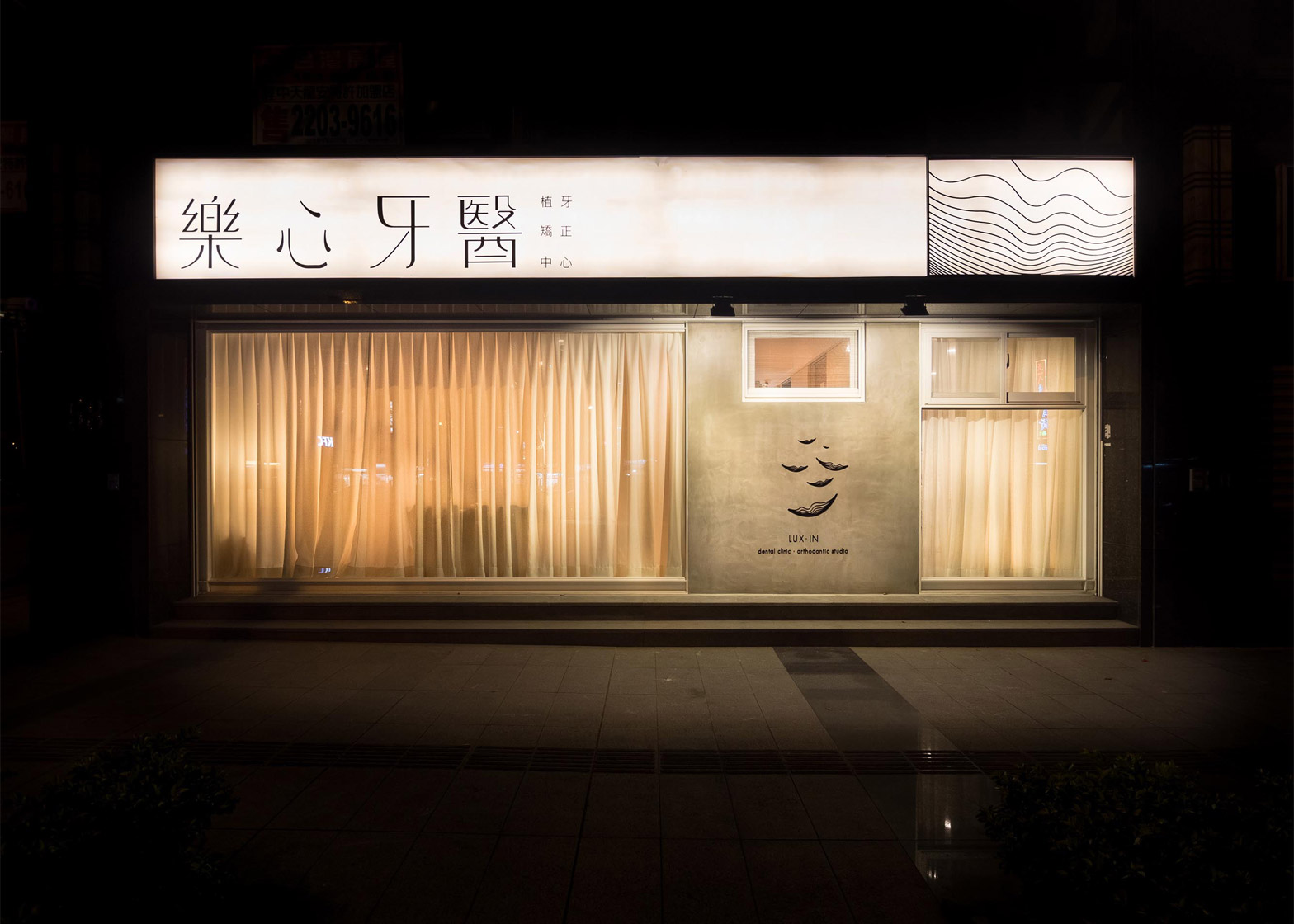
The clinic, which is in Taoyuan city, has been created to feel accessible to visitors, rather than "hermetic".
"Our aim was to design a clinic we would be less afraid to go to," said Canon, a Belgian architect who lives in Taipei and is also a photographer and illustrator.
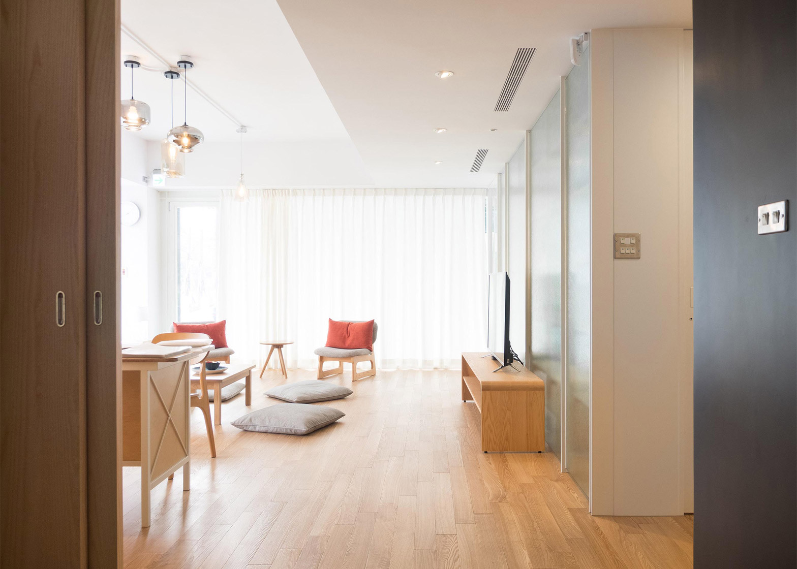
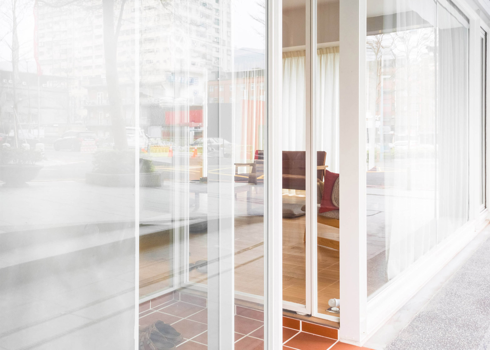
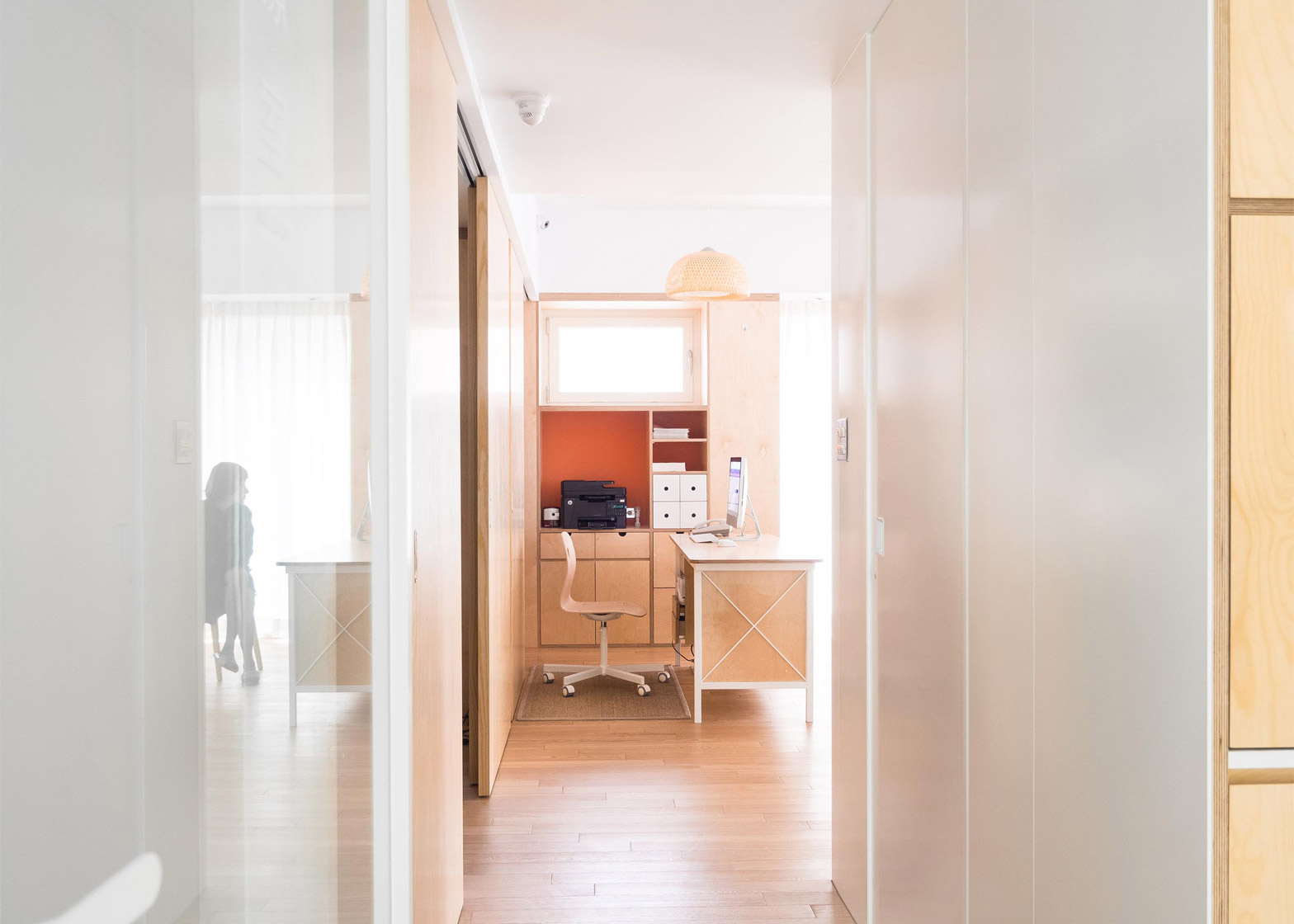
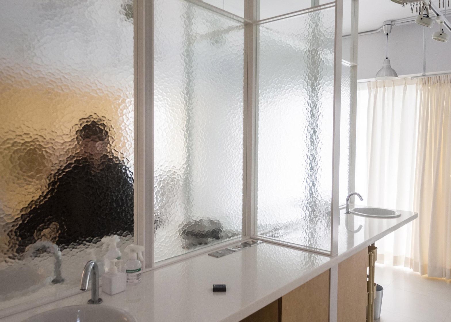
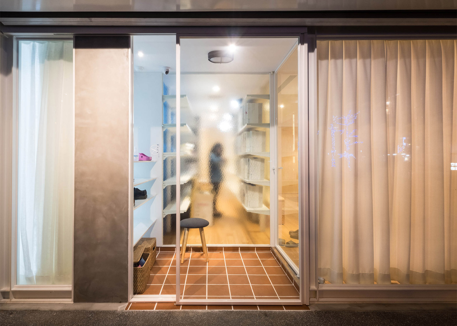
The treatment and reception rooms of the centre are connected by a main hallway that is placed adjacent to the street so it is filled with natural lighting. Spaces are divided by frosted partitions and sliding panels, used to make rooms feel like an extension of one another.
The designers used wooden surfaces and glass because they find the materials offer "small surprises" to patients.
They completed the space with low furniture, including large floor cushions in the waiting room that make it feel more like a living area.
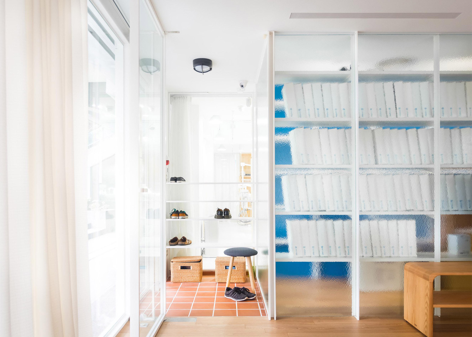
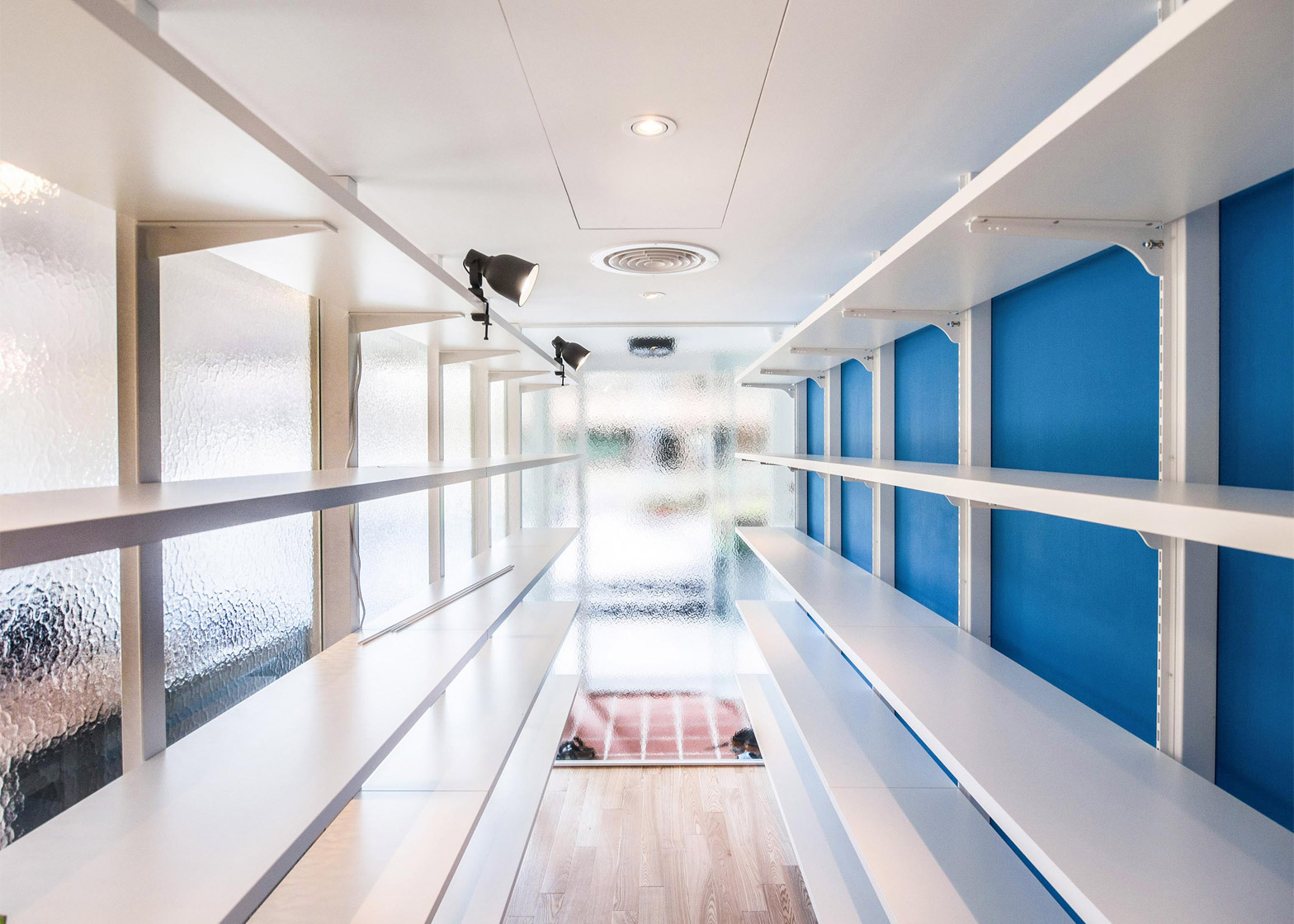
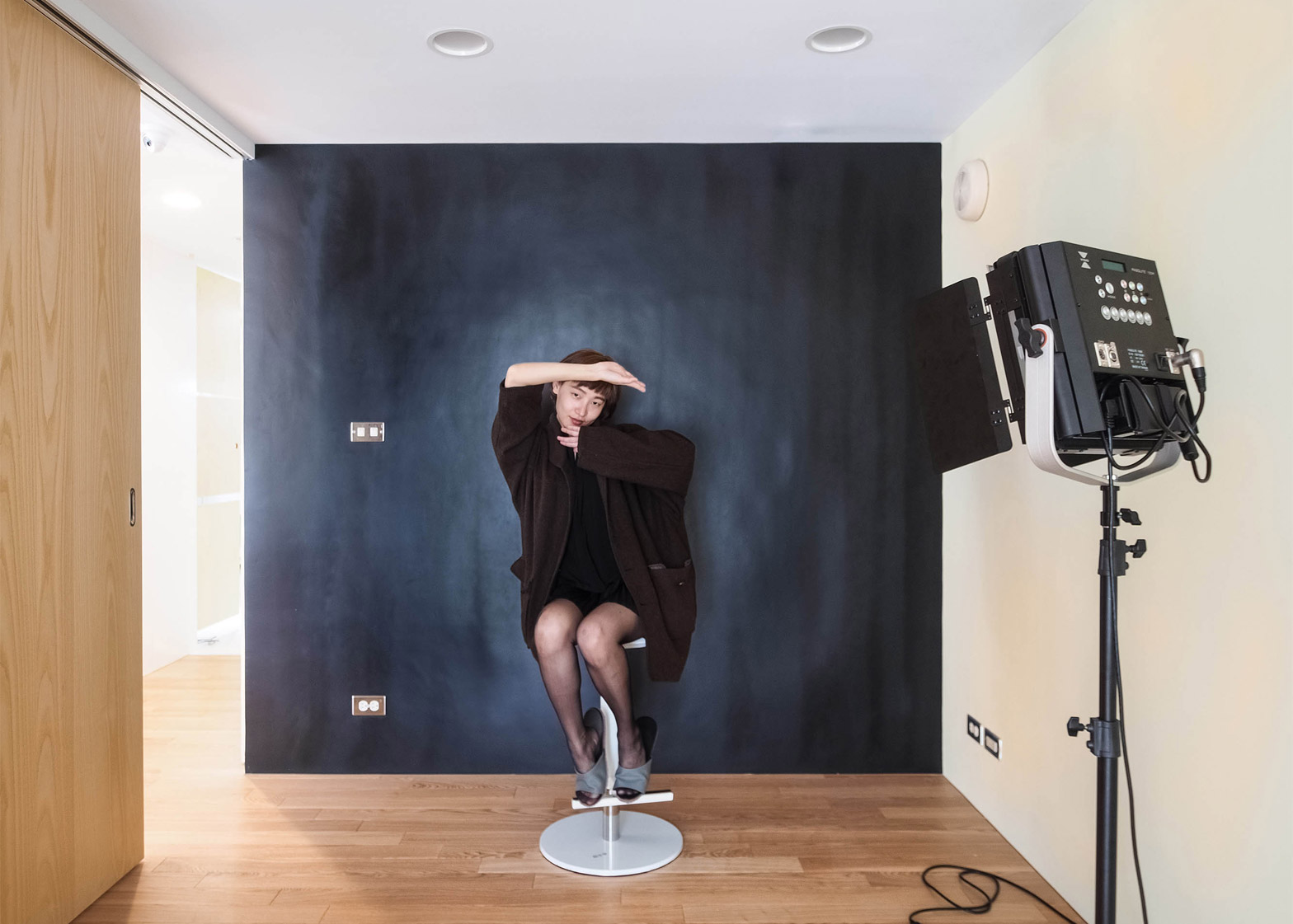
A small room in the practice is a dedicated mini studio for before-and-after treatment photographs. The space is separated from the treatment area with a rectangular glass-enclosed file room, which has shelves for storing patients' documents.
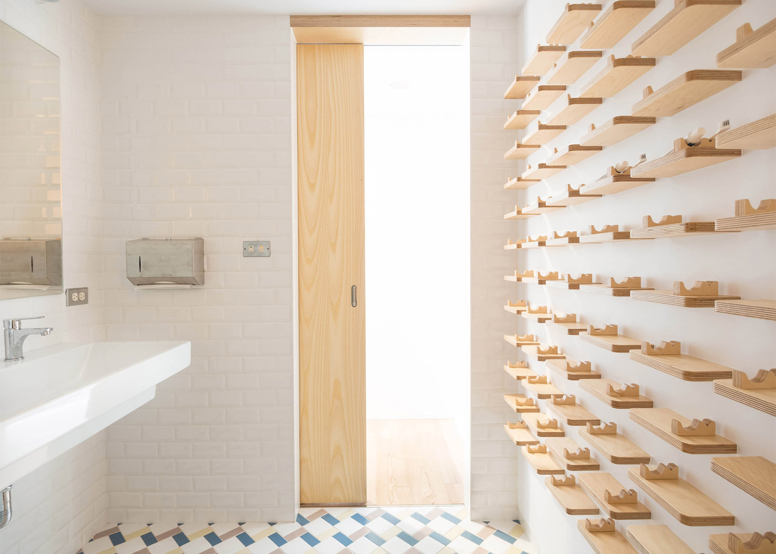
The nearby bathroom is tiled in a zigzag pattern of contrasting colours, and features small wooden shelves with grooves to store toothbrushes and toothpaste.
Other architectural projects have explored dental anxiety from a different perspective. Casey Vallance of Cox Rayner Architects used natural materials to create a calming environment for an Australian oral health eduction facility, addressing the high stress levels reported in the profession.
Photography is by Germain Canon.

