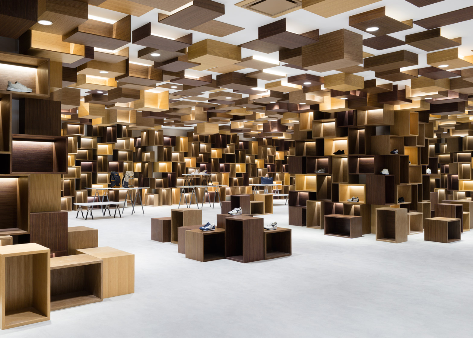
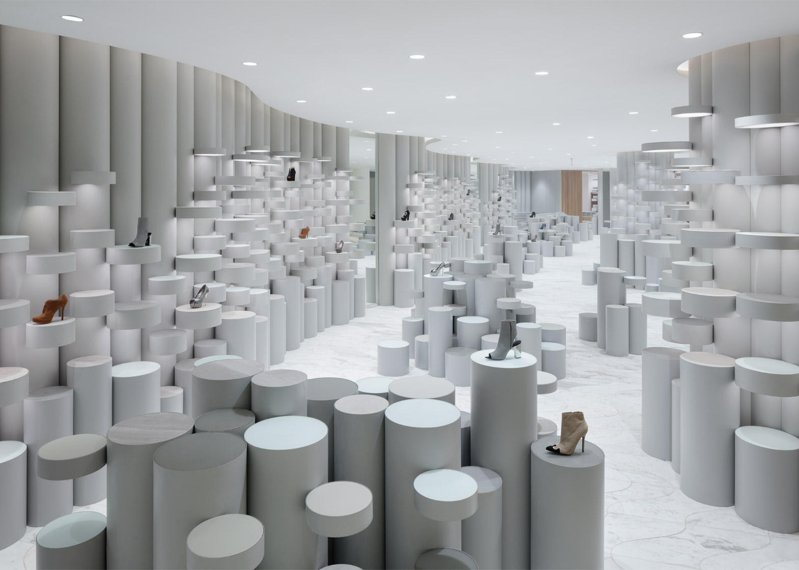
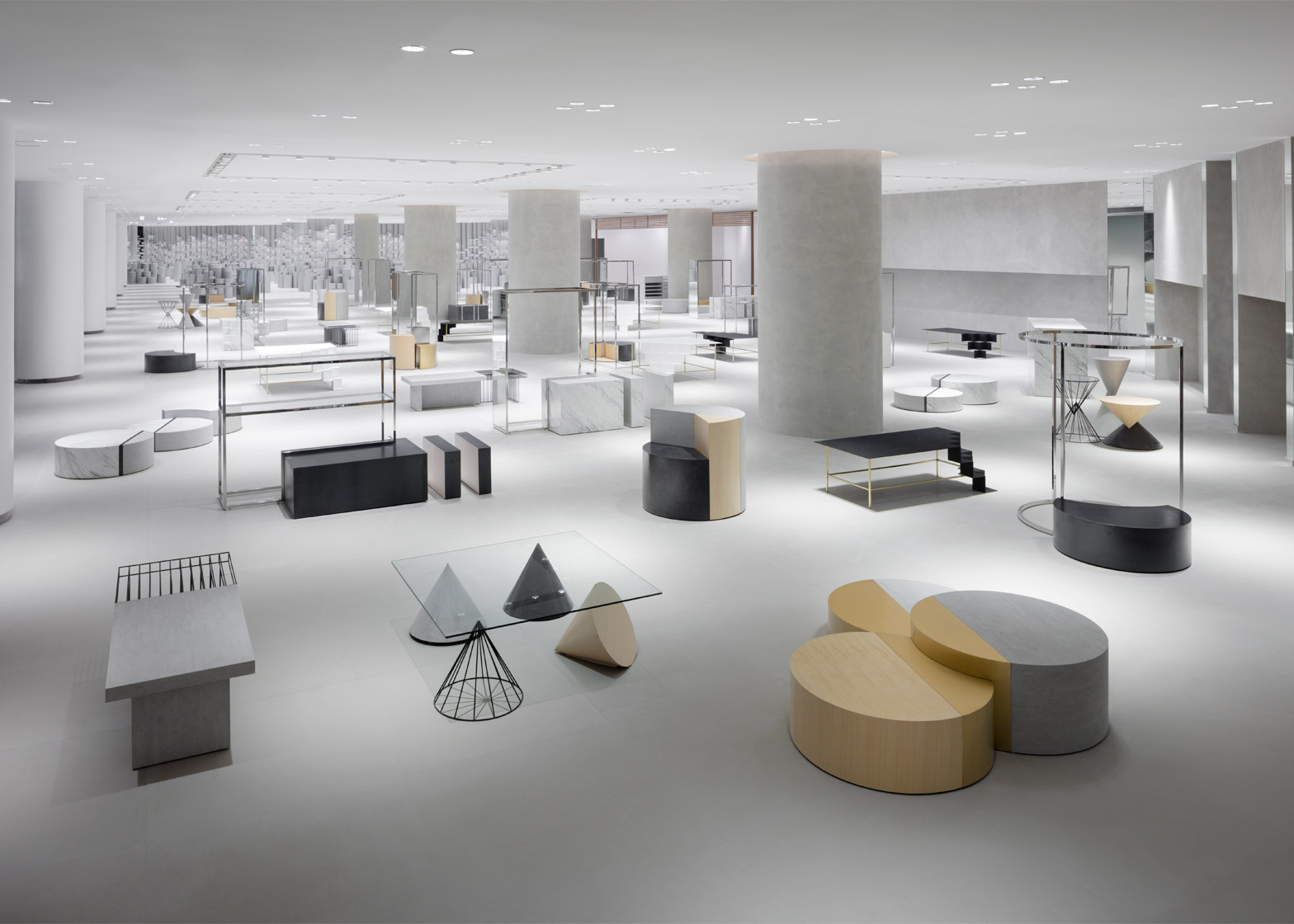
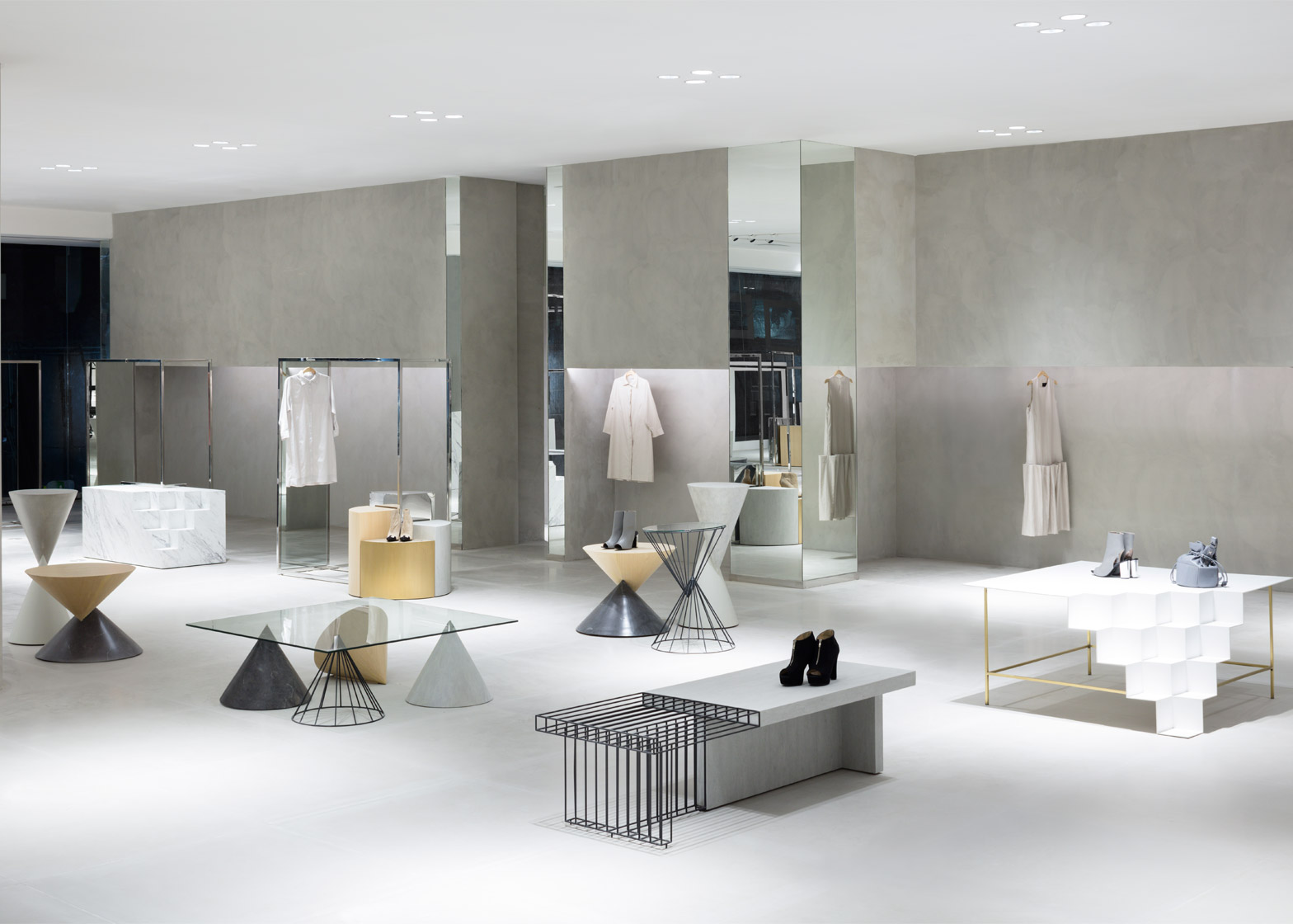
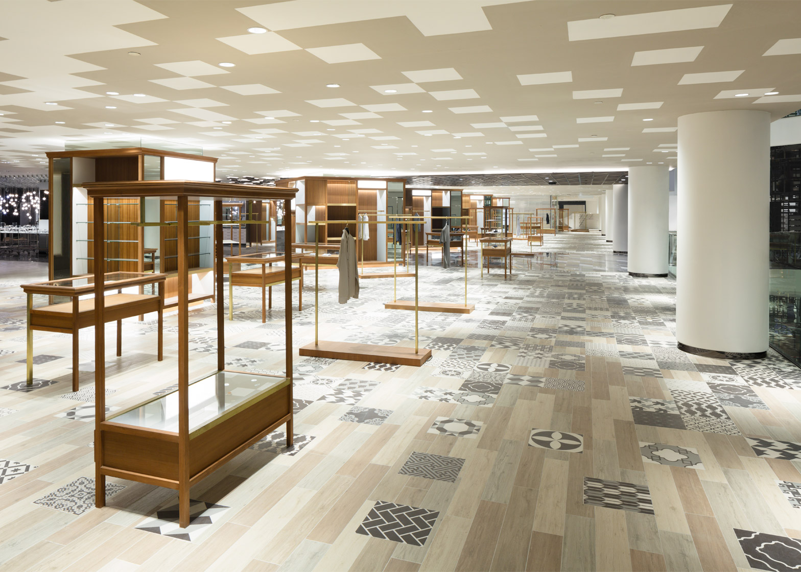
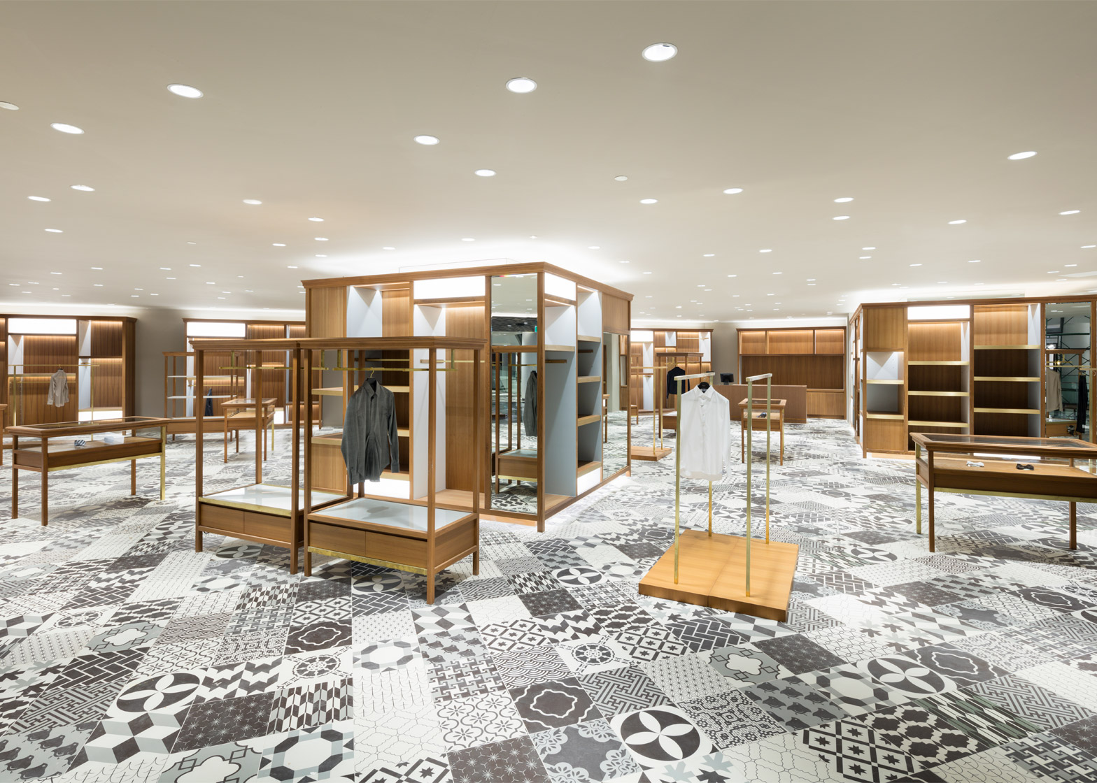
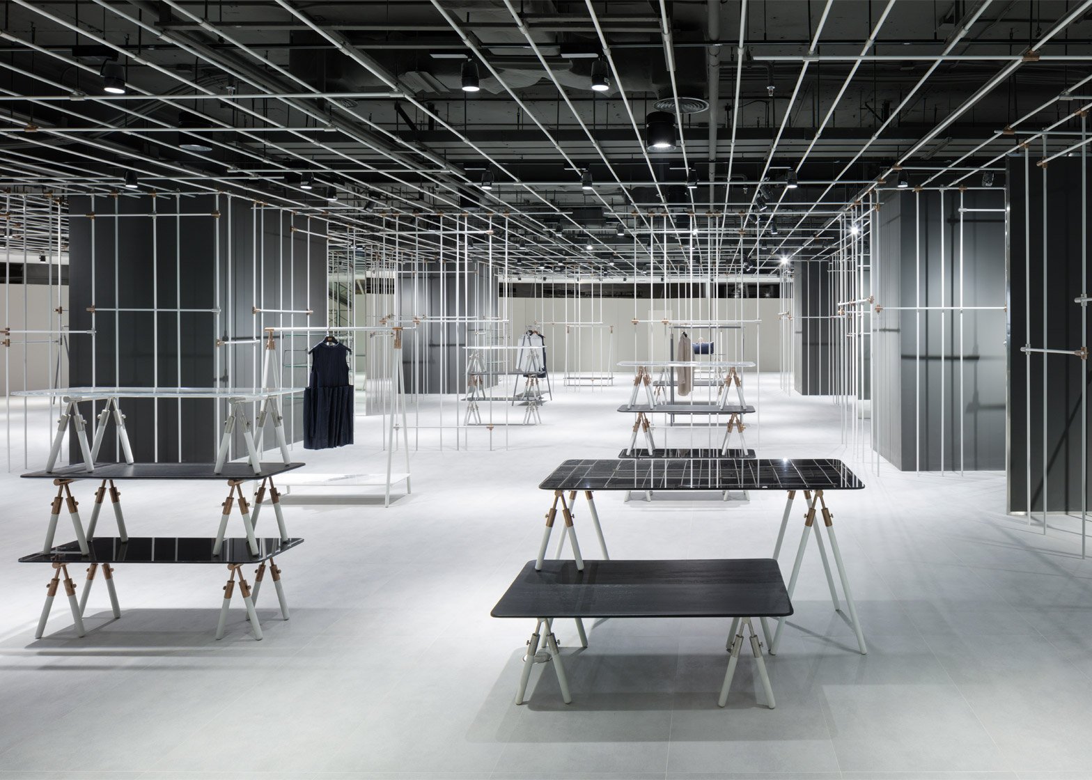
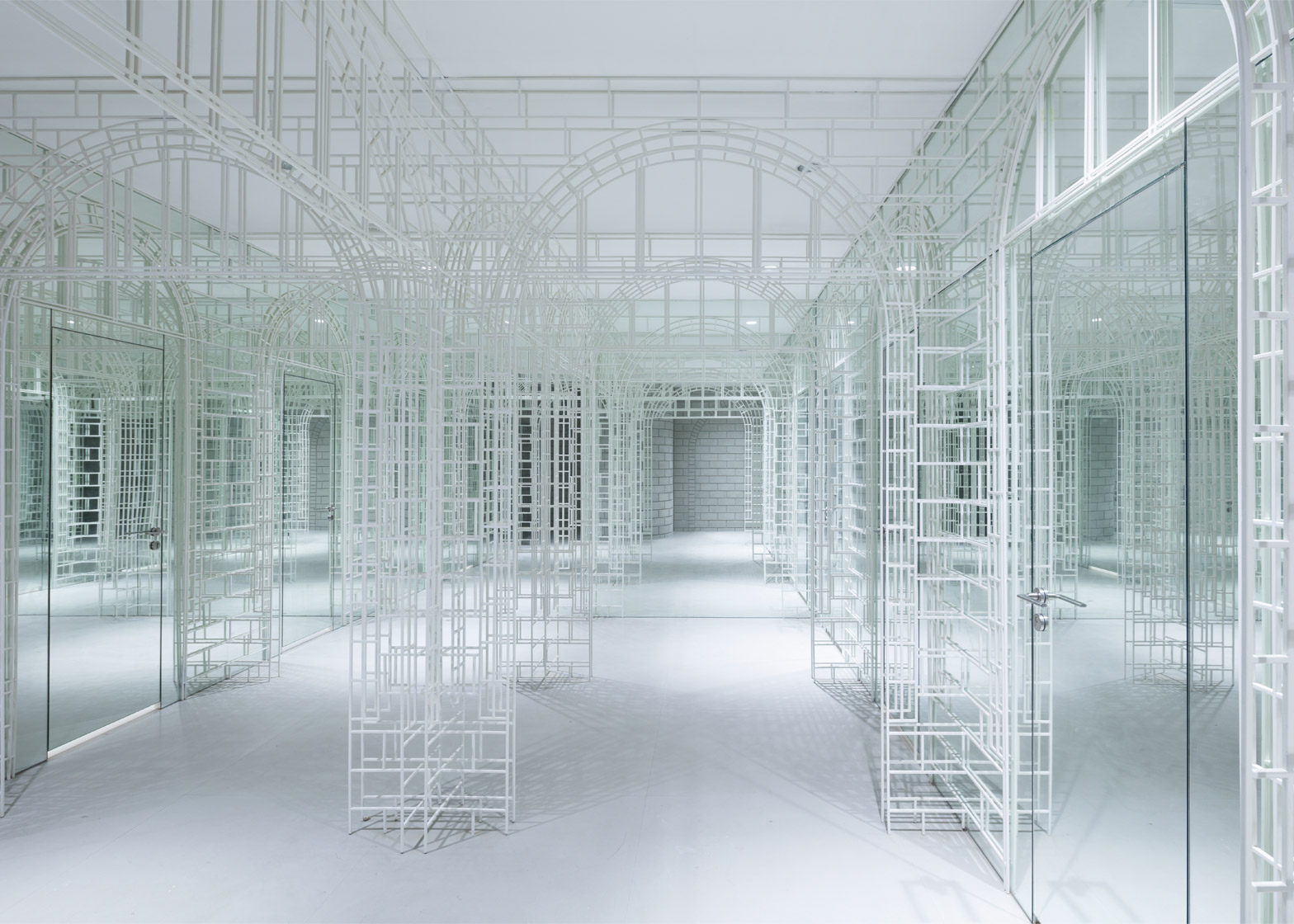
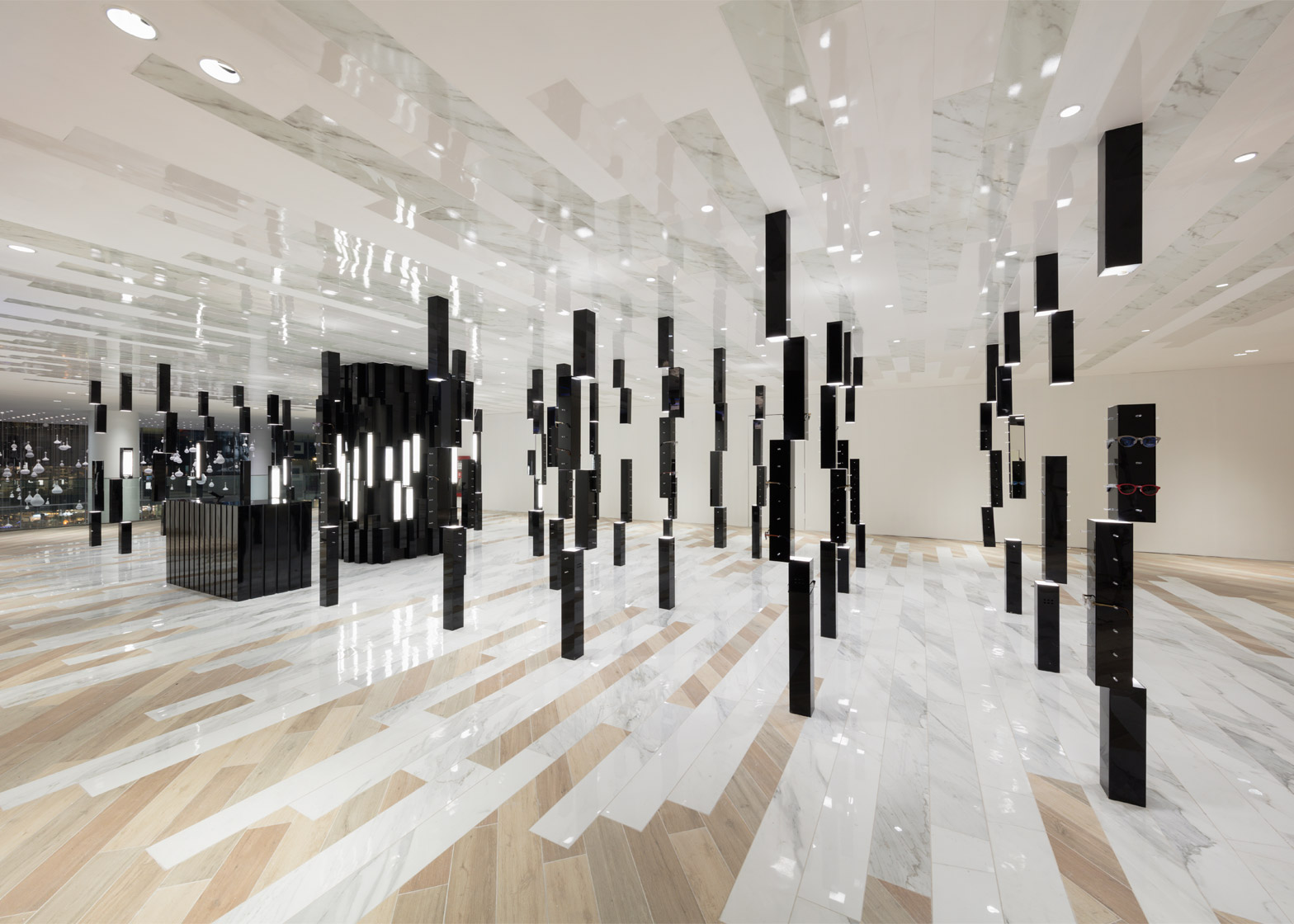
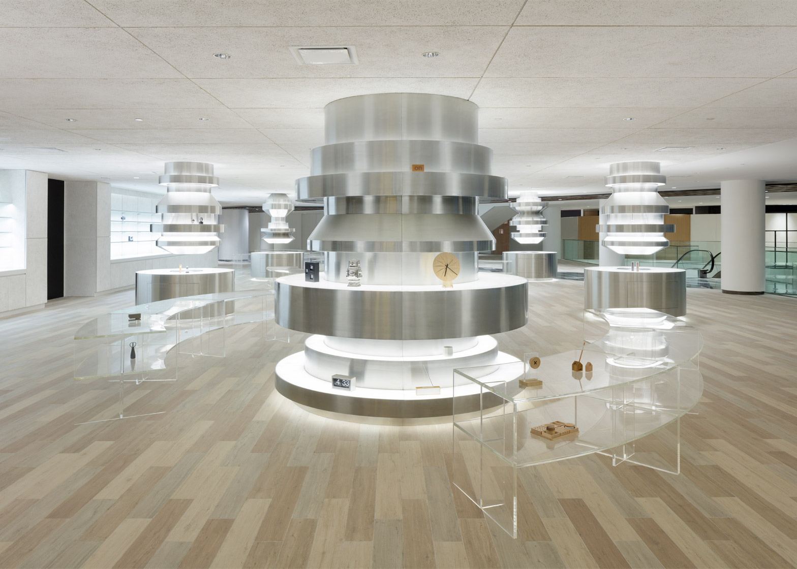
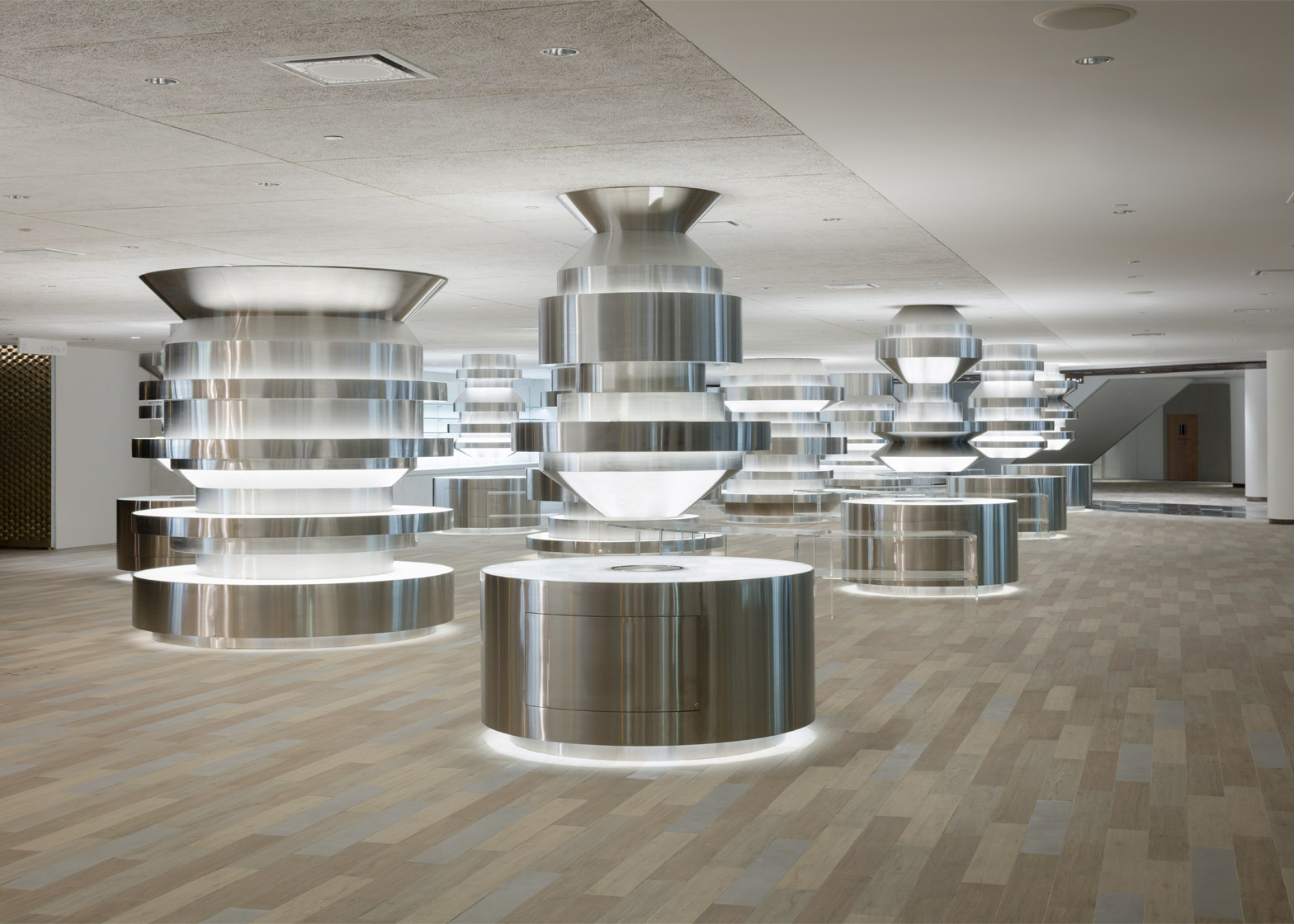
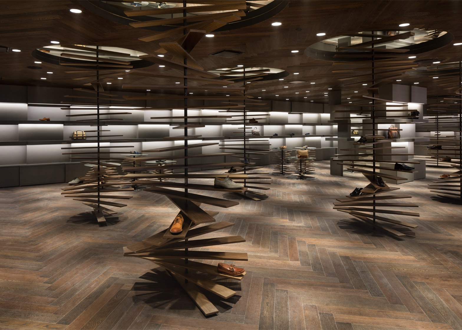
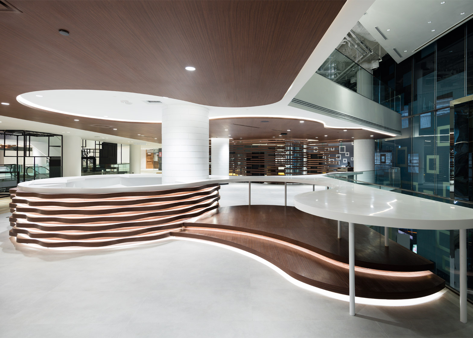
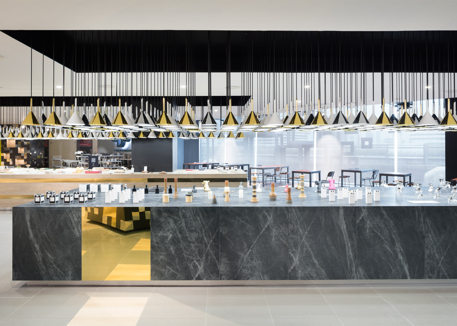
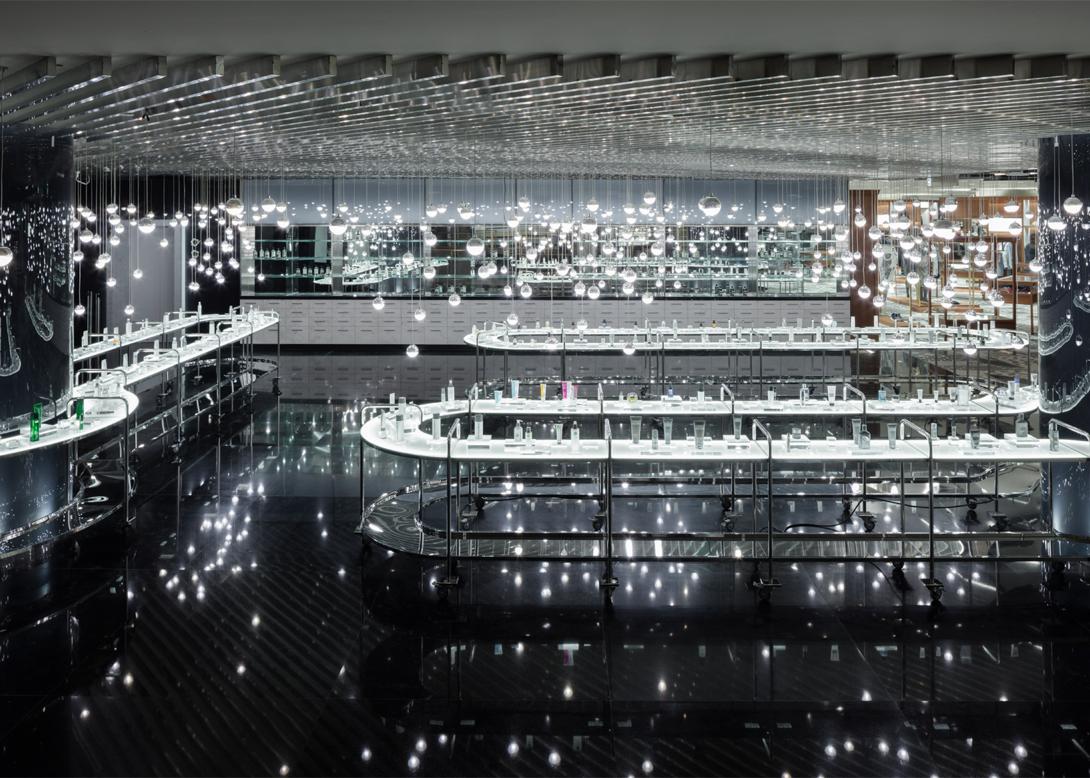
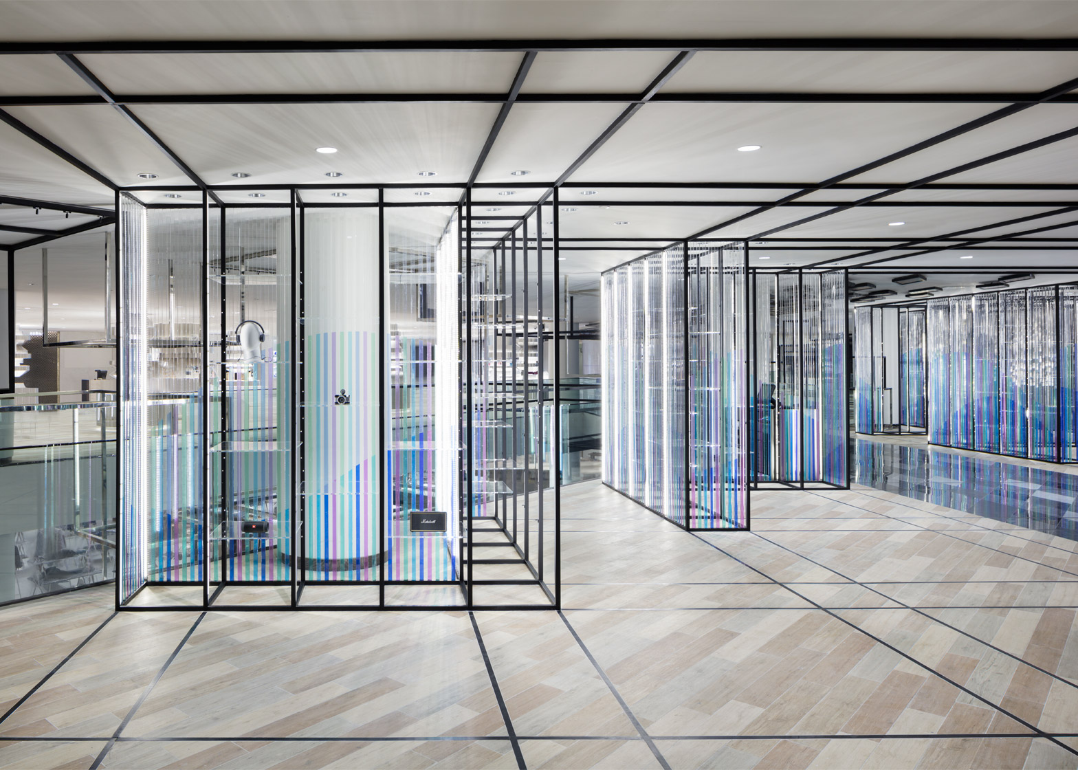
Japanese studio Nendo has completed its biggest-ever project: the exterior and interior renovation of a department store in Bangkok that founder Oki Sato believes represents a new way of shopping (+ slideshow).
Siam Discovery is operated by Thai retail and development company Siam Piwat, which invited Nendo to oversee the refurbishment of the interior and exterior of the 40,000-square-metre mall on Bangkok's Rama 1 thoroughfare.
The studio was tasked with implementing a radical vision for a new retail experience built around curated environments rather than the familiar branded concessions.
"The building is a new concept for retail," Sato told Dezeen. "It's a hybrid of a department store and a shopping mall, so there are tenants but there are also 13 self-curated retail points, which is what makes it different."
Instead of categorising products by brand, as is typical in traditional department stores, the different retail points present customers with a range of lifestyle experiences, including a digital lab, street lab, creative lab and play lab.
This "lifestyle laboratory" concept provided a theme which Nendo interpreted throughout the 13 spaces.
Beakers, flasks, test tubes, diagrams of molecular structures and other laboratory equipment recur throughout the interior as motifs, emphasising that the building is a space for creativity and experimentation.
"Retail is not about shopping any more, it's about creating an ever-changing experience for customers so it feels very dynamic and energetic," explained Siam Piwat CEO Chadatip Chutrakul.
"I decided to make the whole place a Lifestyle Laboratory, meaning anybody can come and do their own experiment – testing, creating and cultivating something for themselves."
The existing department store building featured a narrow frontage and deep plan punctuated by several circular atriums.
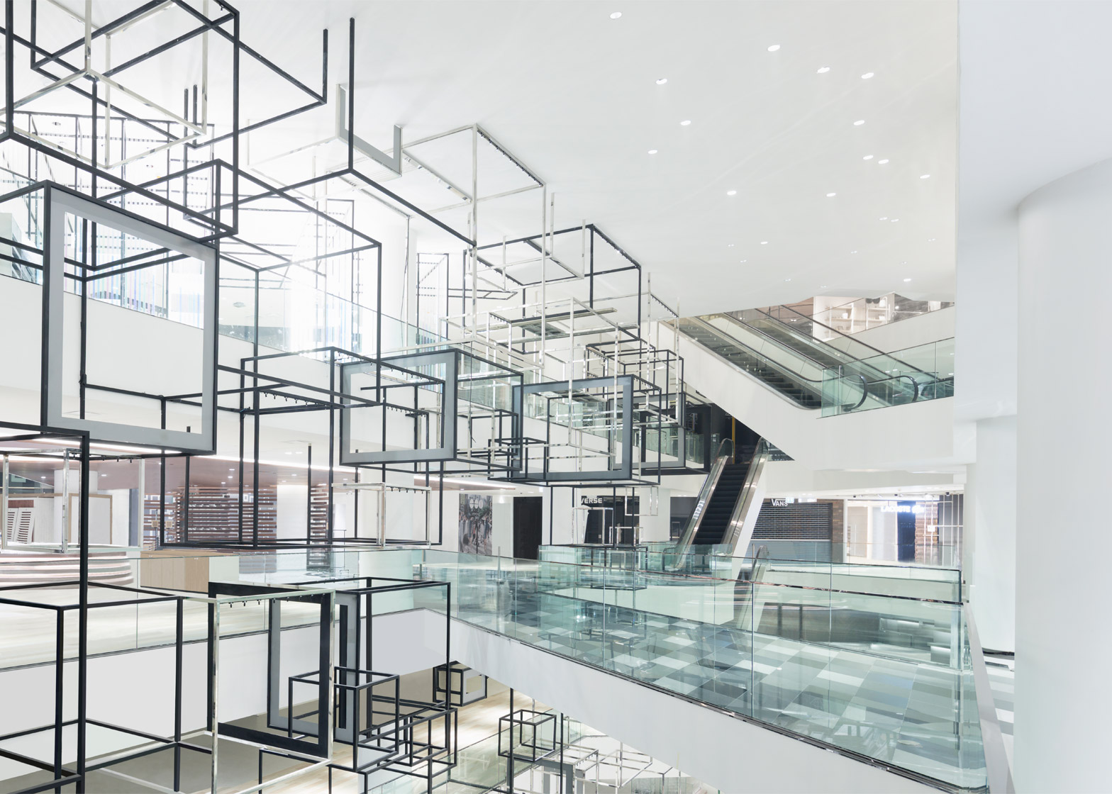
The designers connected these circulation spaces to create a canyon-like room that extends towards the rear and improves the customer flow.
One side of the atrium is lined with 202 frame-shaped boxes containing video monitors, digital signage and merchandise displays that can function as a directory of what's going on inside Siam Discovery.
The display wall extends over four storeys, drawing visitors towards the upper floors. The flow of shoppers is also encouraged by graduated finishes applied to floors and ceilings between the common areas and retail spaces.
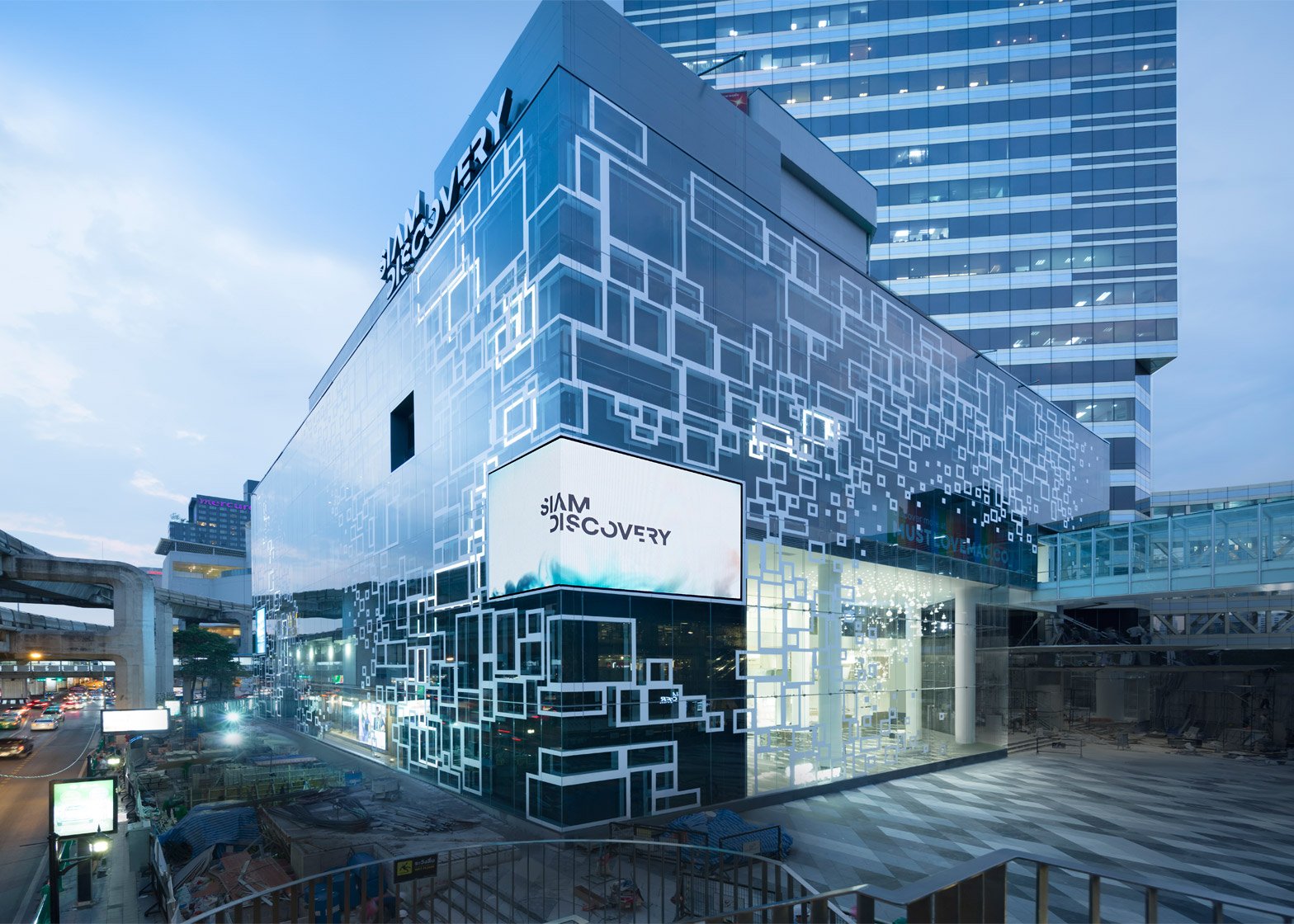
Nendo's intervention to the building's exterior focused on enhancing its open and welcoming feel by creating as much space as possible around the glazed curtain walls.
A patterned facade treatment that references the stacked boxes inside the atrium was added to protect the interior from the harsh sunlight.
The retail points designed by Nendo include a space for electronics featuring displays that reference microscopes. Their lens-like forms provide surfaces for displaying merchandise illuminated by integrated lighting.
The prolific Japanese firm has designed everything from a transparent plastic rocking horse to a line of T-shirts featuring versions of the Hello Kitty character reinterpreted for a male audience, but founder Sato told Dezeen that the building is on a different scale to anything it has done before.
"This is definitely the biggest project we've ever done," said Sato. "It took us about two years and it was totally different [from previous projects], it was a big challenge for us."
"It was as if we've been cooking small dishes and suddenly we had to make a full dinner."
Nendo's previous retail work has included the womenswear department at iconic Milanese department store la Rinascente, and a women's fashion floor for the Seibu Shibuya store in Tokyo featuring a pastel palette and zig-zag patterns.

