Economic crisis made Spanish architecture more radical, says Biennale pavilion curator
Venice Architecture Biennale 2016: this year's Golden Lion-winning Spanish Pavilion focuses on unfinished structures left in the wake of the 2008 financial crash and architects who are developing a "radical" approach to rebuilding Spain (+ movie).
Titled Unfinished, the pavilion presents a series of photographs of incomplete construction projects, alongside 55 recent buildings that demonstrate a range of solutions to working under economic constraints.
According to co-curator and architect Iñaqui Carnicero, the economic crisis – which hit Spain harder than many other European countries – forced local architects to become more resourceful.
"[We have become] more radical, and more intelligent in many cases," he told Dezeen.
"My own experience of working under this economic constraint [is that] when you are suffering from budget cuts sometimes the solution becomes more intense, more radical, and even better."
The exhibition is a direct response to Biennale curator Alejandro Aravena's request for architects to show work that responds to the major challenges in their countries as part of his theme, Reporting from the Front. The Spanish Pavilion was awarded the Golden Lion for best national pavilion at the 2016 Biennale.
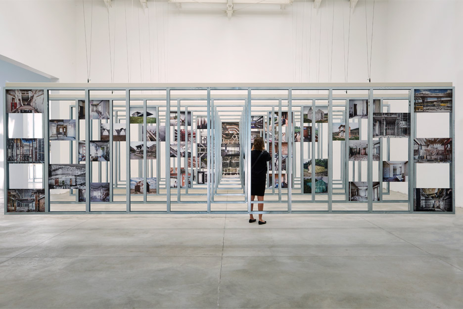
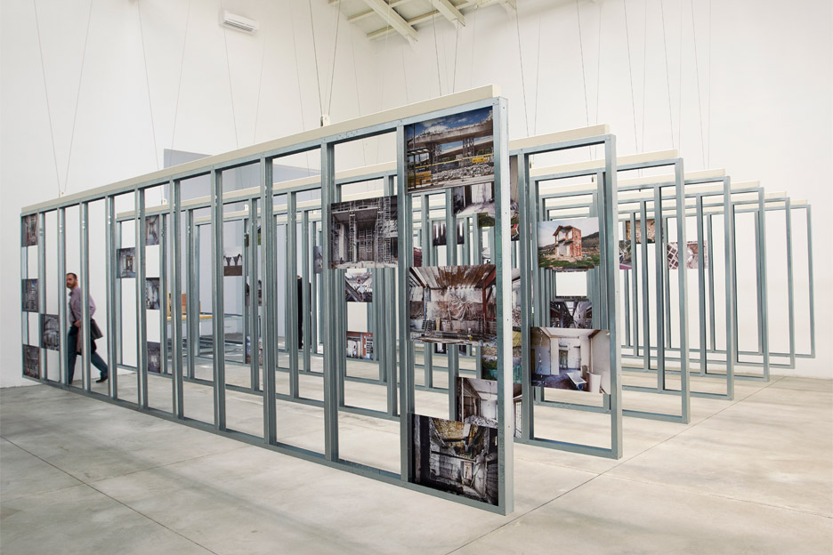
Carnicero and fellow curator and architect Carlos Quintáns Eiras collected photographs by seven different artists of structures they describe as "contemporary ruins". These are displayed in the pavilion's central space on steel frames hanging for the ceiling, and range from major construction projects to small private houses and apartments.
Carnicero said there were few places on earth where so many unnecessary construction projects had been started in such a short period of time, and then abandoned because they couldn't be finished or maintained after the economy collapsed.
"Many of the buildings that were under construction remain unfinished," said Carnicero. "We wanted to present this problem, but we didn't want to do it in a narrative way. We didn't want to find who was guilty or be complaining about it."
"When you look at these pictures you discover a certain beauty, the beauty of architecture in process, the beauty of things that are meant to be hidden," he said.
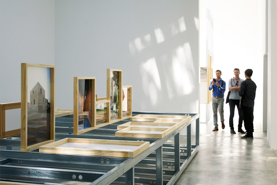
The rooms around the main space are devoted to displaying 55 contemporary projects in Spain or by Spanish architects, grouped into nine categories.
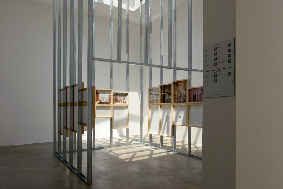
Carnicero said that the projects were selected for "under economical constraints, showing new solutions and new strategies to intervene in what already exists, instead of building new things."
The Consolidate section features examples of architects who have helped save historic buildings, with examples including the installation of new structures by Morales de Giles Arquitectos inside the Convento de Santa Maris de los Reyes in Seville.
Reappropriation focuses on the revival and reuse of abandoned heritage buildings like churches, industrial spaces and military complexes. These include the renovation of a Baroque palace in Palma de Mallorca by Flores & Prats and Duch-Pizá to create a new cultural centre.
Adaptable looks at projects that explore changing use and flexibility in buildings, with projects like an an apartment in Madrid by PKMN Architectures, which features sliding chipboard units that can be used to change the space. Also in this section is Casa Luz, a renovated Spanish home organised by Arquitectura-G around a new central courtyard.
Infill displays structures that fill in the space between existing buildings, like the Museuo de Bellas Artes de Asturias in Oviedo, where Francisco Mangado added a crystalline glass building behind the leftover facade of a demolished block.
Naked is about buildings that are "nude" and make the most of their incomplete appearance. These include Casa OE, a house in Catalonia that is split into two parts for summer and winter, and a concrete pool house by FRPO Rodriguez and Oriol Arquitectos.
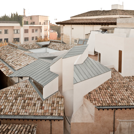
Perching features structures that "perch" on top of others, built in "places where they don't belong". Grupo Arenea's Casa Lude, a sculptural grey apartment on top of an old house in Cehegin, southern Spain, is included here.
Reassignments focuses on examples of projects that "questions the established uses of materials and alter their typical position, dimensions, connections and uses. Casa 1014 by H Arquitectes – a home in Catalonia that is hidden behind a brick wall slotted between two crumbling facades – is among the examples.
Guides shows projects that aim to offer a blueprint or propose solutions for future structures, like H Arquitectes and DataAE's student housing for the Polytechnic University of Catalonia.
Finally, Pavements is about public space interventions, including the renovation of Malpica Port by CreuseCarrasco.

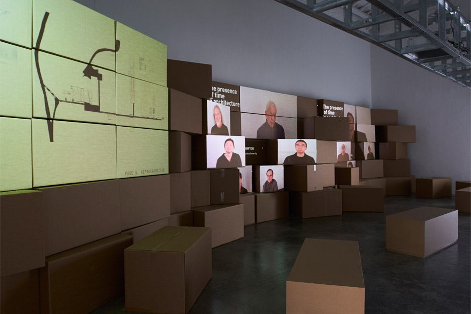
These are all shown as photographs and plans, in wooden frames mounted on steel structures to suggest an unfinished building. A room at the back also features short interviews with leading architects, academics and critics about the state of Spanish architecture, the legacy of the economic crisis, and the potential of unfinished buildings.
Many of the buildings share a similar aesthetic driven by the available materials, like brick and plywood, and the history of the structures that formed the foundations of each project.
"I wouldn't call it a style, but I guess you recognise certain solutions that put value into what already exists," said Carnicero.
"The materiality of our structures – the stone, the wood, what is already there, even the history of the buildings – becomes part of the new image," he added. "Not because it's a new aesthetic, but because it's part of the history. And you don't have a choice. And people like it!"
Photography by Fernando Maquieira and video by Miguel de Guzmán.