Terry & Terry converts historic brick building in downtown San Francisco into creative workspace
San Francisco firm Terry & Terry Architecture has transformed a century-old brick building into a design agency's headquarters, adding a second level that features a folding glass wall and roof terrace (+ slideshow).
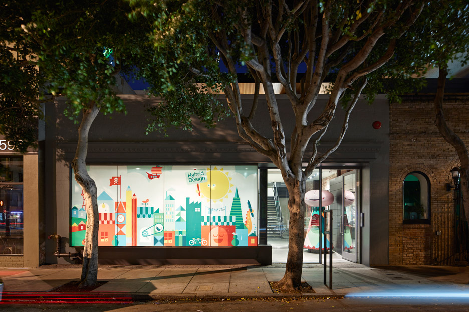
The project called for creating an office within an existing masonry building for Hybrid Design, a graphic and product design agency. The building is located on a dense, rectangular site in the historic Jackson Square neighbourhood in San Francisco's urban core.
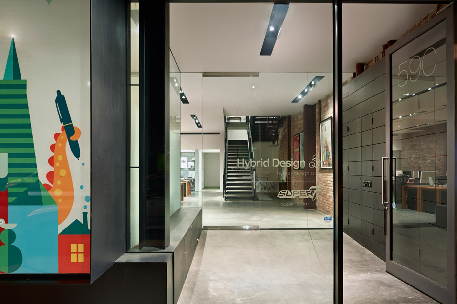
The building was constructed in the early 1900s in the city's former red light district and once housed a saloon. It was altered over the years, and most recently contained a cafe and an office.
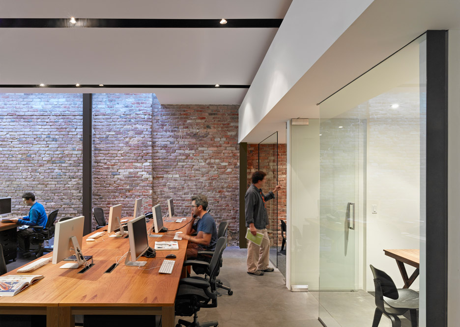
The architect sought to preserve original elements wherever possible. "Most of the existing structure was retained and renovated rather than demolished," said Terry & Terry Architecture, which has offices in central San Francisco and Berkeley.
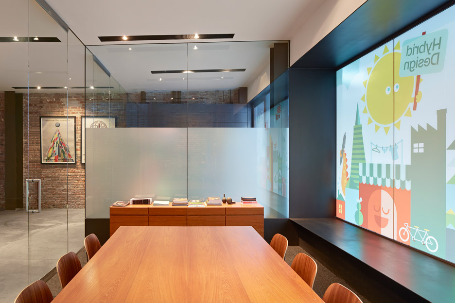
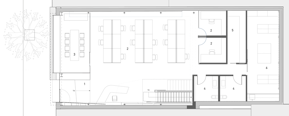
The design team replaced a portion of the front facade, installing a steel frame around a large bay window and adding a frosted decal with colourful graphics. Behind the street-facing elevation is an entry vestibule and conference room, both surrounded by glass walls.
The ground level contains an open work space with long, wooden tables, two enclosed offices and an area for storage and shipping. The main area is illuminated by recessed lighting and skylights.
The architect stripped away old surfaces to reveal the building's original brick walls. The masonry walls provide thermal mass and absorb heat during the day, in turn "keeping the interior comfortable and helping maintain a moderate, baseline temperature for the cooler evenings".
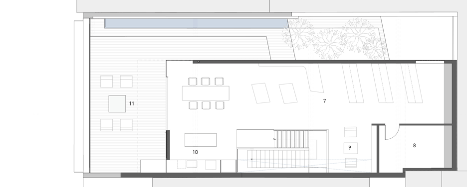
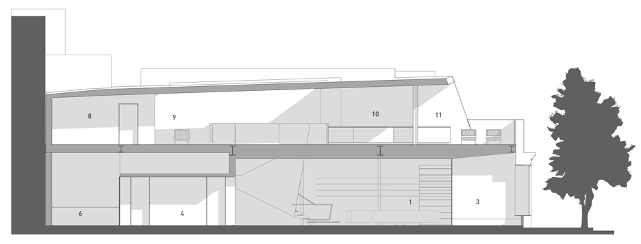
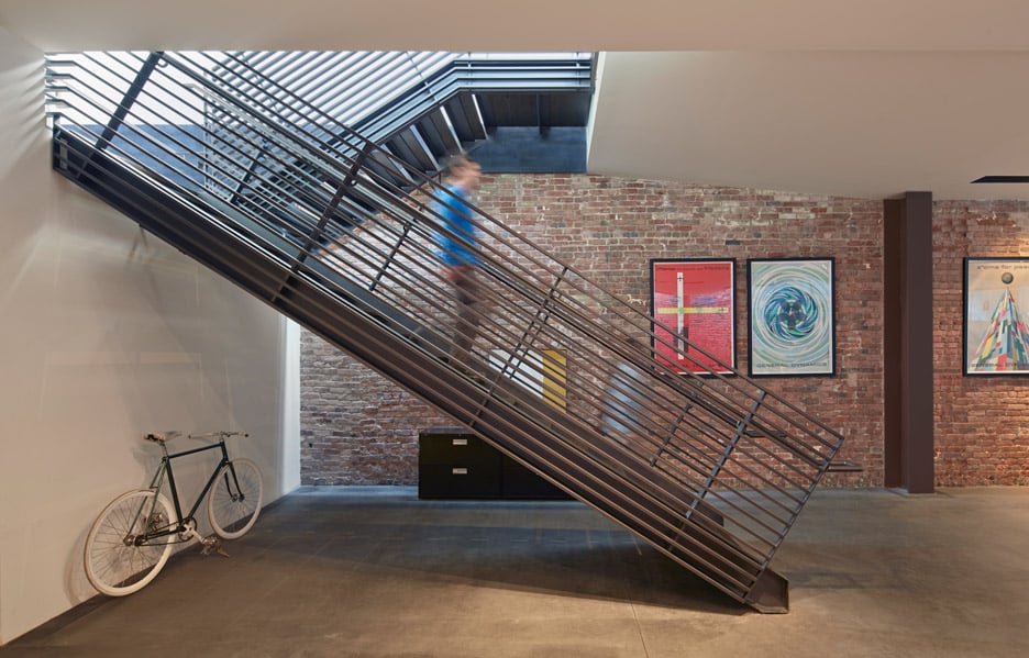
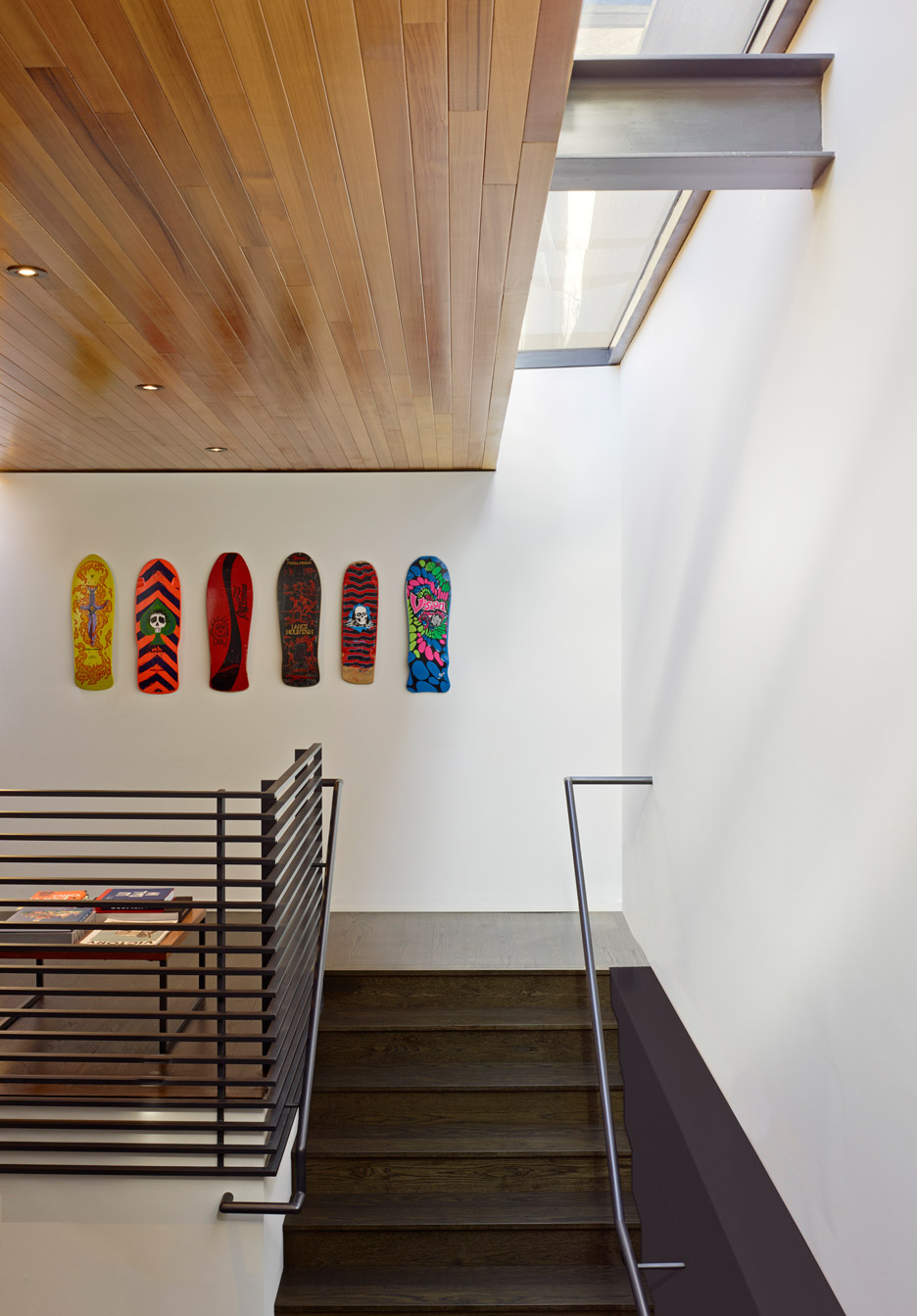
To make the office larger, the team added a second storey to the building, which is accessed via a metal staircase.
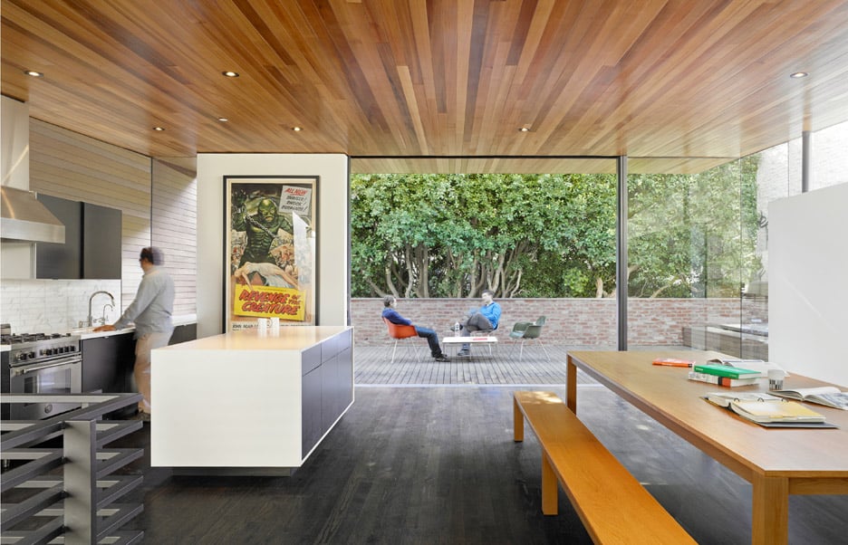
The upper level houses additional office space, an exhibition area, a reading alcove and a kitchen. One side is lined with an oversized, folding glass door that opens onto a landscaped terrace.
The ceiling is sheathed in warm-coloured wood that merges with the roof soffit. Deep roof overhangs allow diffused natural light to enter the space, in turn reducing the need for artificial lighting.
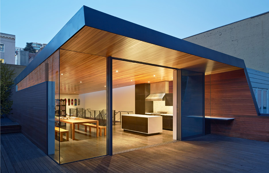
The new second floor is structurally supported by steel moment frames, which also provide protection in the case of an earthquake.
Other creative workspaces include a former factory in Toronto that was converted into an office and events facility and a co-working space in Brooklyn that features angular and brightly coloured stairwells.
Photography is by Bruce Damonte.
Project credits:
Architect: Terry & Terry Architecture
Structural engineer: Santos & Urrutia
Geotechnical engineer: Earth Mechanics
