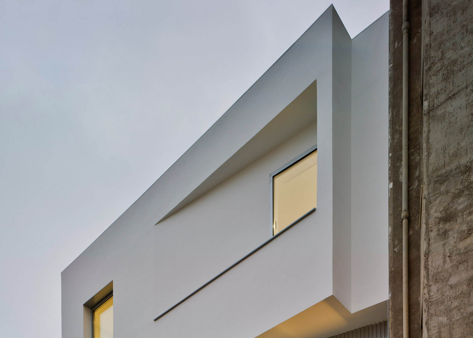
The facade of this house in the Spanish town of Novelda is divided into three sections that are each angled to make the most of the available views and sunlight (+ slideshow).
House F&M was designed by Luis Navarro Jover and Carlos Sánchez García of local architecture studio La Errería for a young couple looking to upsize from their small apartment.
Situated in a residential neighbourhood made up of buildings of varying sizes, the property is squeezed onto a narrow plot, and is designed to take advantage of the site conditions and natural light.
The facade is intended as an expressive element that differentiates the house from its neighbours, but also articulates the relationship between the internal spaces and the surrounding environment.
"We wanted to take advantage of the best views and the Mediterranean light, which is so nice in these latitudes," Navarro Jover told Dezeen. "Therefore, each floor rotates looking for the best light and view conditions."
The main elevation faces east, but the surfaces on each level are pushed in or pulled out in response to the requirements of the interior spaces. On the ground floor, the entrance and garage door are recessed to make them feel more separate from the street.
The first floor is angled to the north to optimise views towards the nearby mountains from the dining room, while the second floor faces east to make sure the bedrooms on this level receive the morning sun.
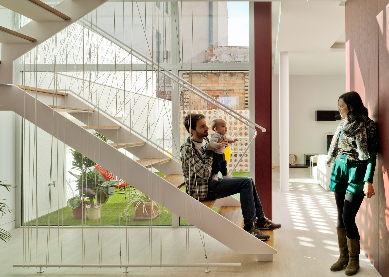
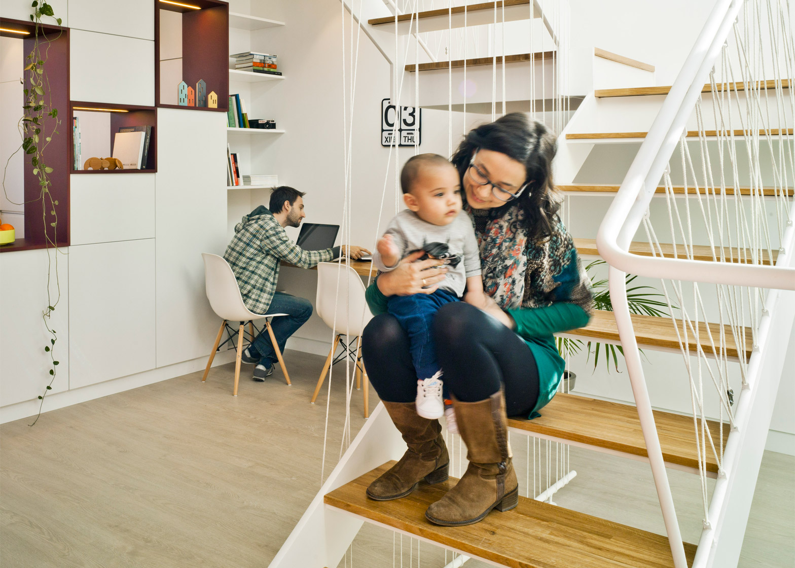
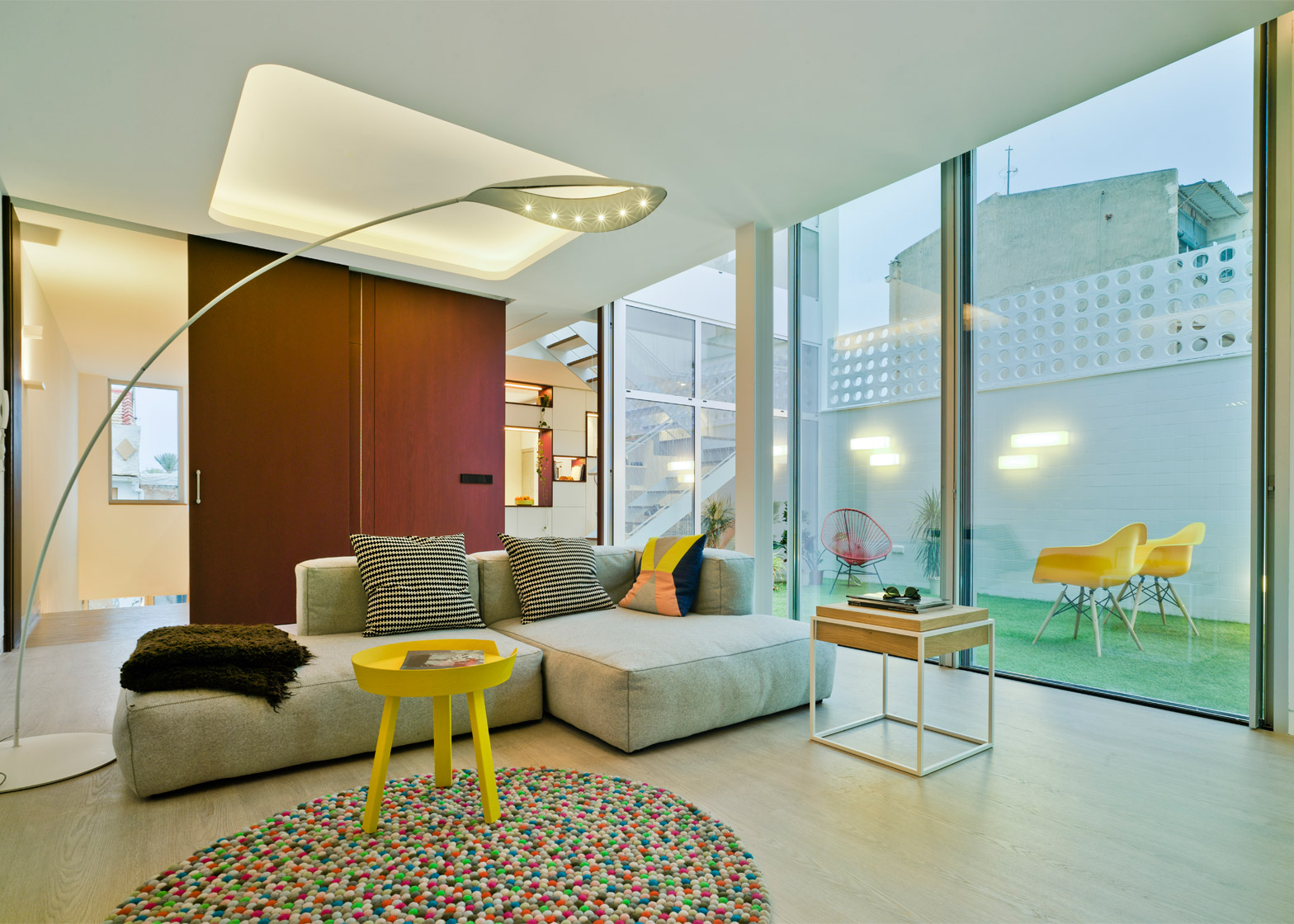
When the clients approached La Errería they were expecting their first child, so wanted an open and flexible house suited to their new lifestyle. The proposal responds to these requirements by arranging the open-plan living spaces around a glass-lined patio.
"In this context where we can find even taller buildings, the patio plays an essential role," Navarro Jover added, "not only introducing the light into the house, but also articulating the spaces according our interests."
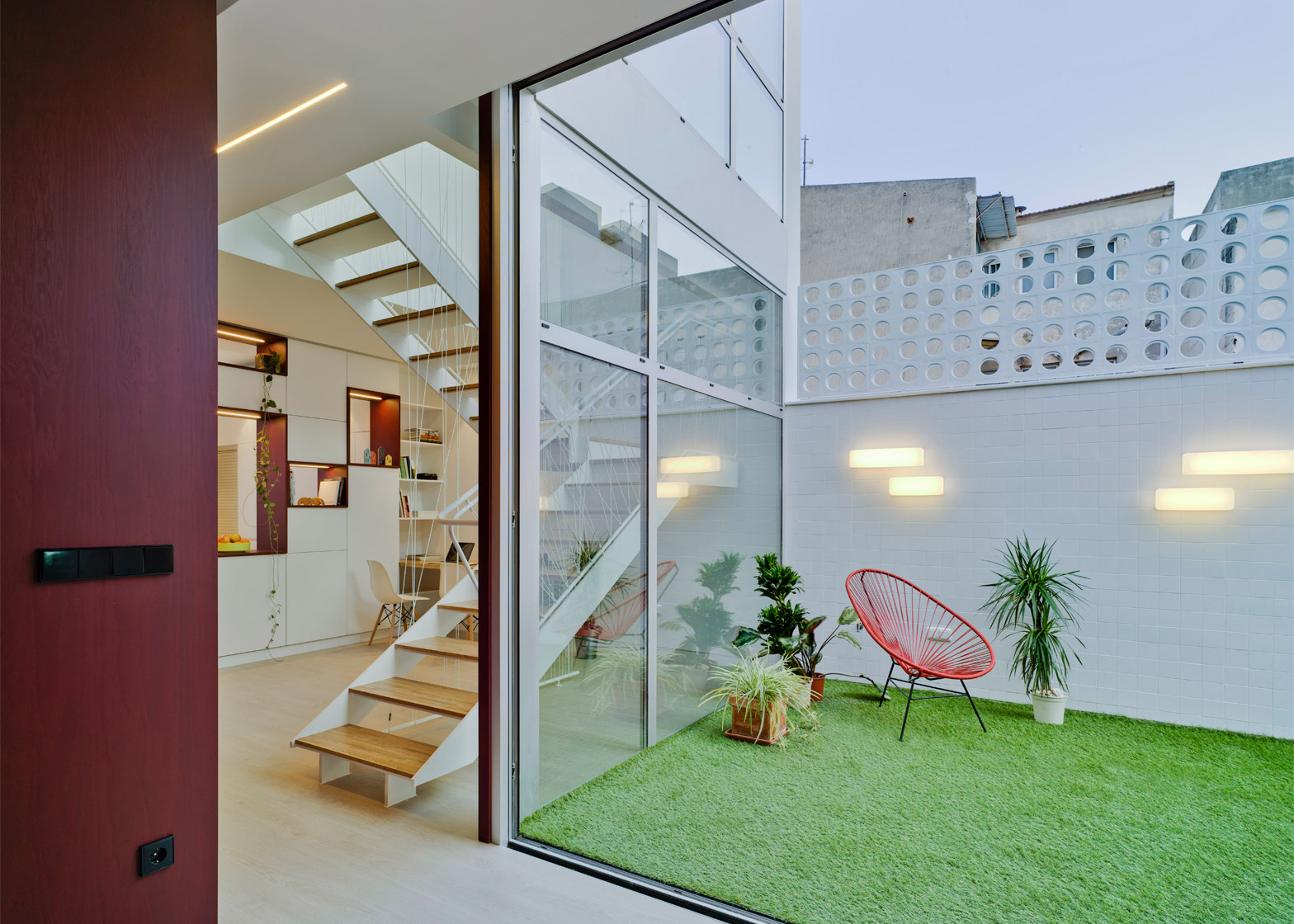
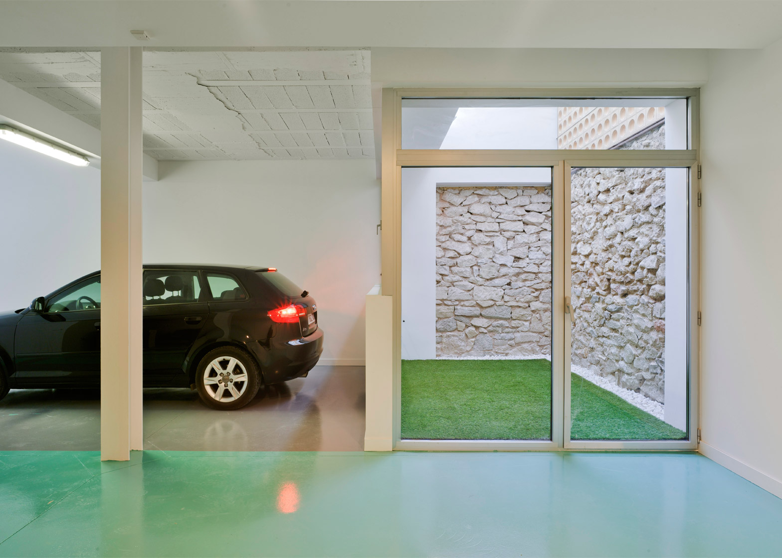
On the ground floor, a large garage receives natural light from a courtyard lined with glazing.
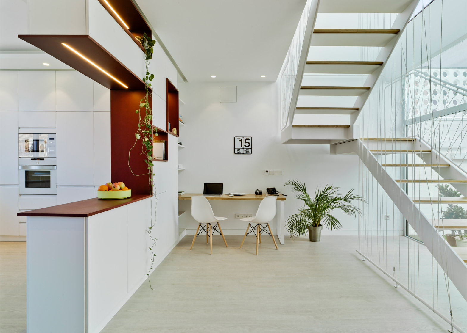
A staircase leads from the entrance on this level through a void that extends into the floor above.
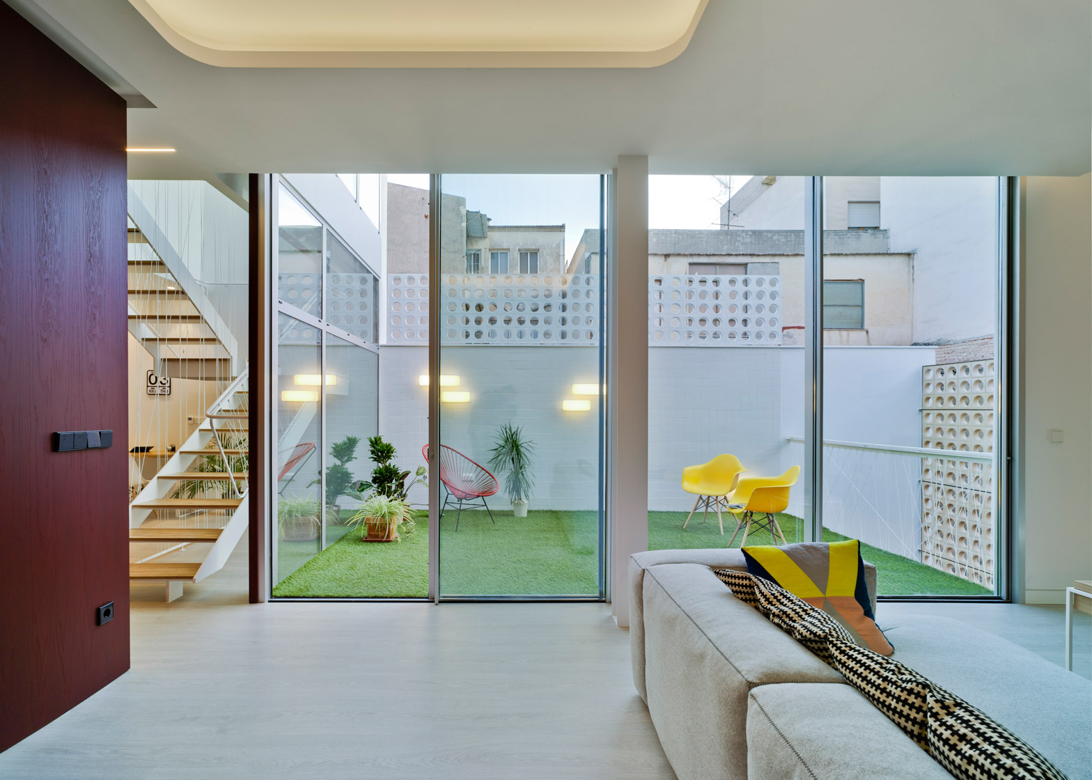
The patio is situated at the rear of the property next to the lounge and main dining area.
Full-height glazing, which incorporates sliding doors, allows these spaces to be opened up to one another.
The patio's floor is covered with artificial turf and its walls are clad with white tiles.
Perforated masonry screens provide privacy, while still allowing dappled light to pass through.
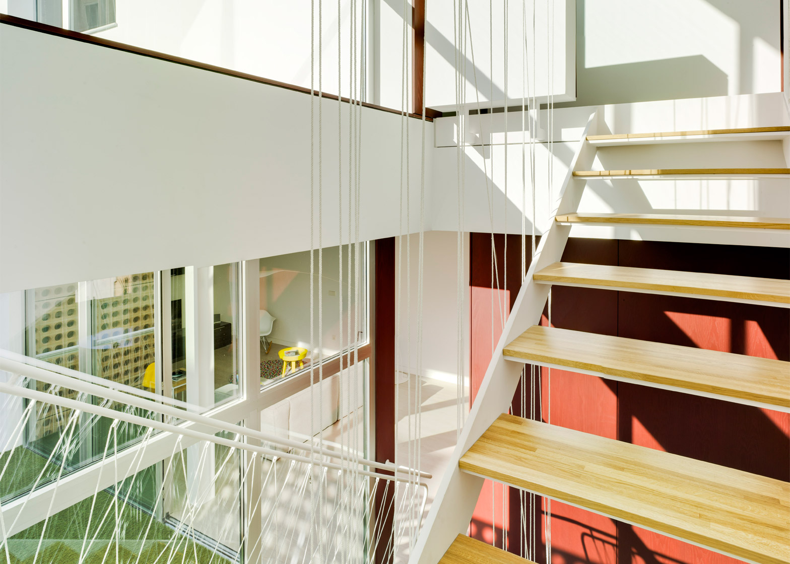
A staircase ascending to the second floor is lined with windows that overlook the patio, helping to maintain a line of sight between the two main levels.
This visual link is enhanced by the staircase's open treads and minimal wire balustrade.
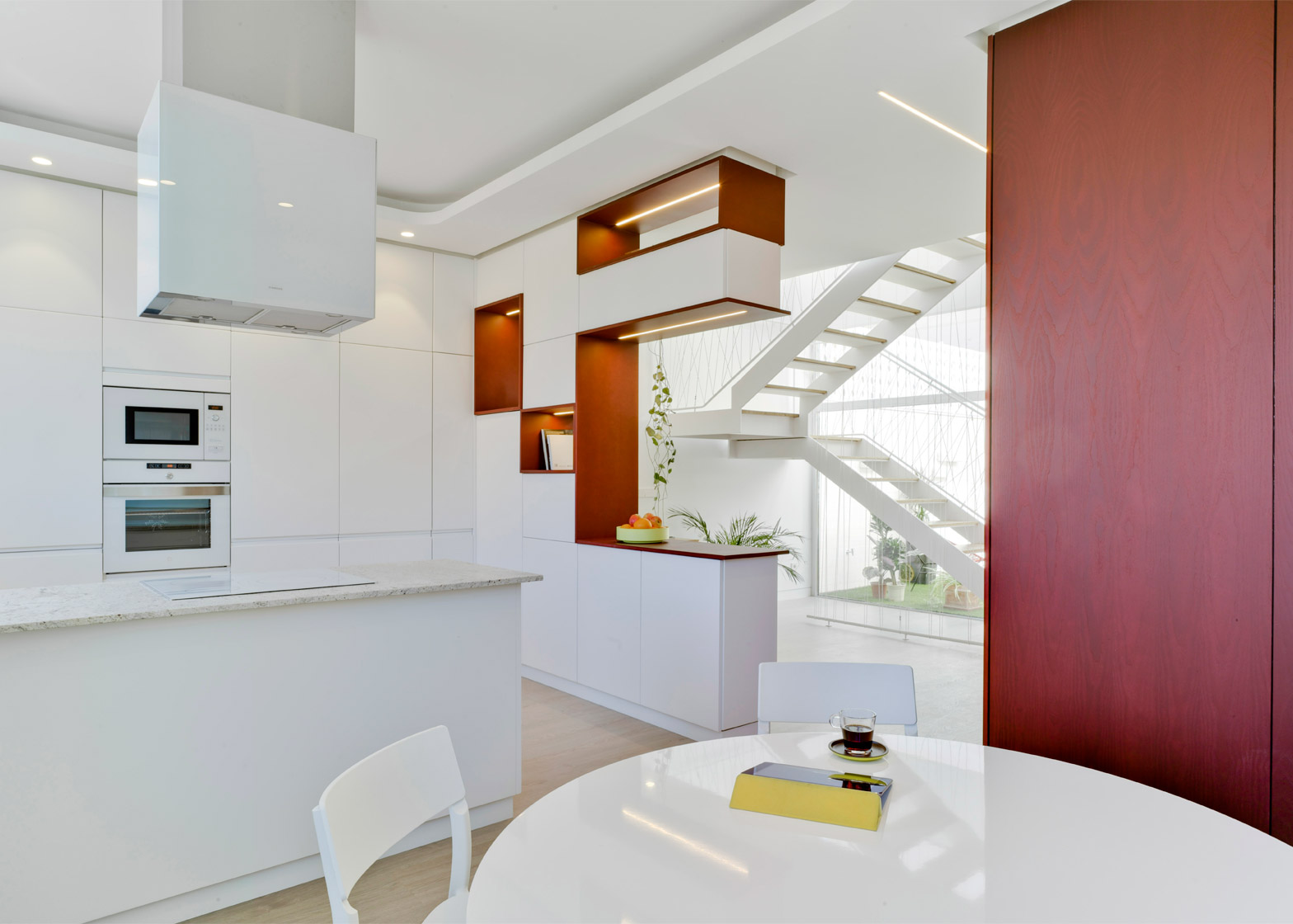
The interior material palette is predominantly soft and neutral, with injections of colour created by the red-stained wood and the bright green of the patio floor.
Bedrooms on the top floor also feature the stained timber surfaces, and wood is also used to add a warm, tactile element in the master bedroom's en suite.
Spain was recently awarded the Golden Lion at the Venice Architecture Biennale for an exhibition highlighting the new "radical" architecture to emerge in the country after the 2008 economic crisis.
Other examples of new Spanish architecture include a house made up of irregularly stacked blocks and a creative workplace in a converted factory.
Photography is by David Frutos.

