Monotype overhauls London Underground's 100-year-old Johnston typeface
International font company Monotype has brought the London Tube's 100-year-old typeface into the 21st century, adding the hashtag, at sign and lighter weights more suitable for digital use (+ slideshow).
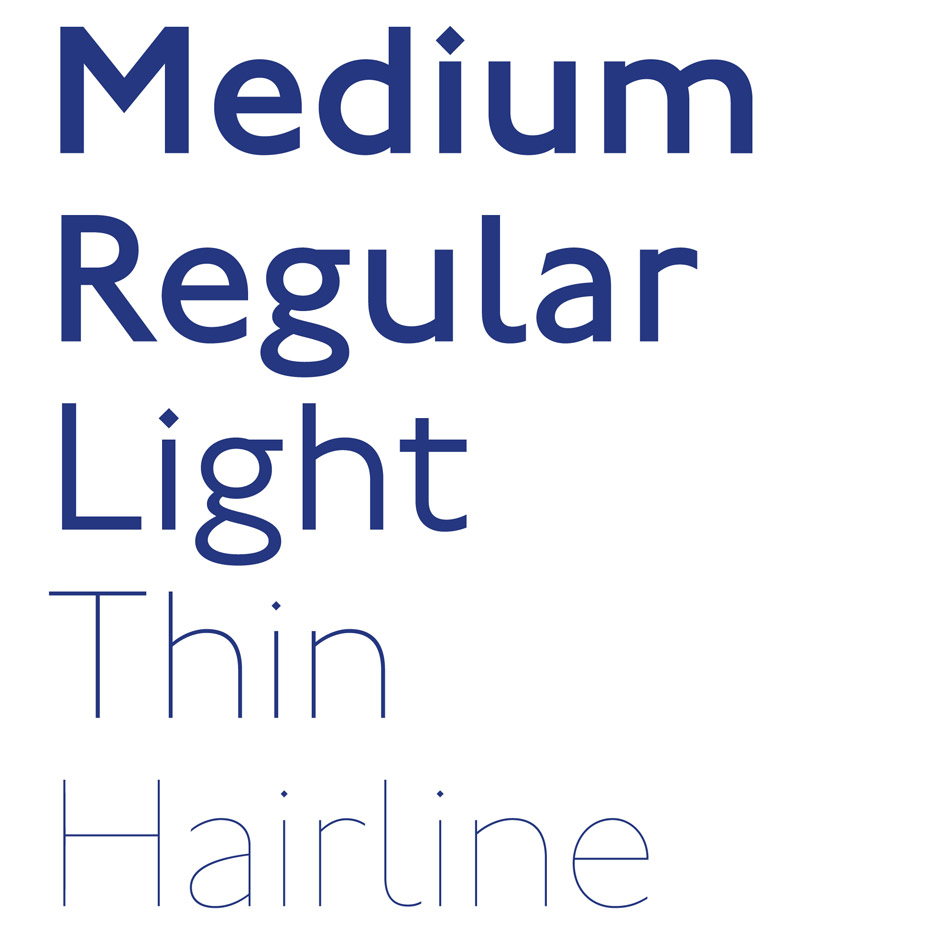
The Johnston typeface is deployed across Transport for London's maps, signage and posters. It is known for its distinctive diamond-shaped tittle – that is, the dot over a lowercase i.
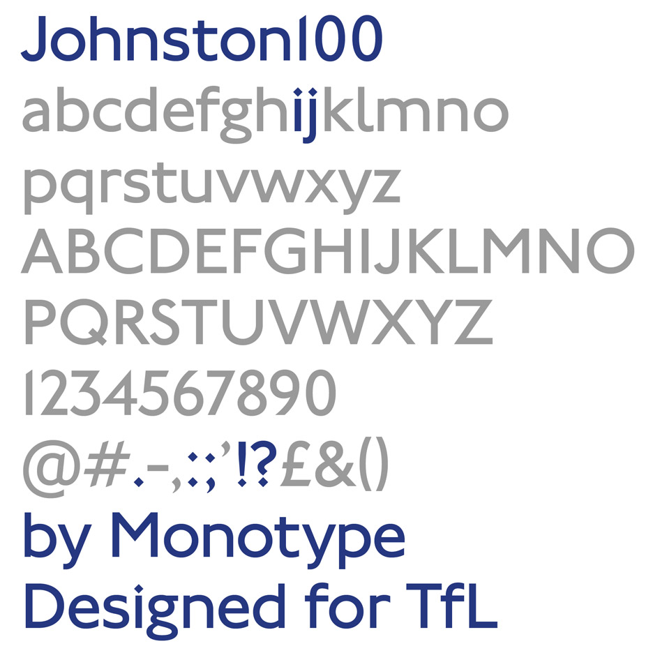
The typeface was originally created by British artist and calligrapher Edward Johnston, and introduced into the company's train and bus services in 1916.
Monotype's updated version of Johnston, dubbed Johnston100, adds a pair of new weights to the font family – hairline and thin – which have been created specifically for digital use.
Characters that had previously been missing from the original design – notably, the hash (#) and at (@) symbols – have also been included in the update.
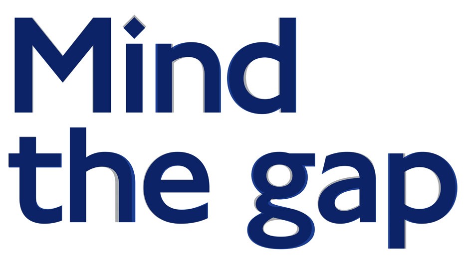
"The Johnston typeface speaks London," said TfL's head of design Jon Hunter. "It's been around 100 years. It will be around 100 more years if not longer."
"We want to make sure it's used consistently across all our platforms and across all future platforms we may have, so we asked Monotype to go back to the original principals of Johnston."
The typeface was most recently updated in the 1970s by London studio Banks & Miles, who created New Johnston – the version that has been used ever since.
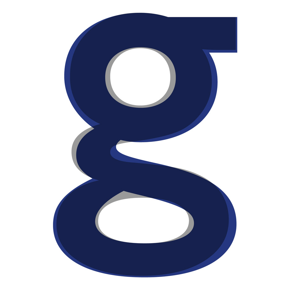
Referring back to archive drawings, Monotype designers Nadine Chahine and Malou Verlomme focused on reintroducing design quirks that had been lost – such as a more angular bowl on the lowercase g.
"The philosophy of the Johnston design is consistent throughout, and in such a way, the typeface was versatile enough that it could sustain all of these different fashions and usages that have come in the last 100 years," said Chahine.
"It was very important to TfL that we add the extra-thin weights, because of today's digital trends."
Johnston100 will make its debut across TfL's bus and train services from July, appearing first on printed materials like maps and posters.
Monotype has also partnered with the service to commission a set of 10 posters in celebration of the original typeface's centennial, with design agency Pentagram and British graphic designer Alan Kitching contributing limited-edition prints.
The type foundry recently produced a project referring to historic designs by artist Eric Gill. It used archive drawings to create the first new typeface based on his work in a century.