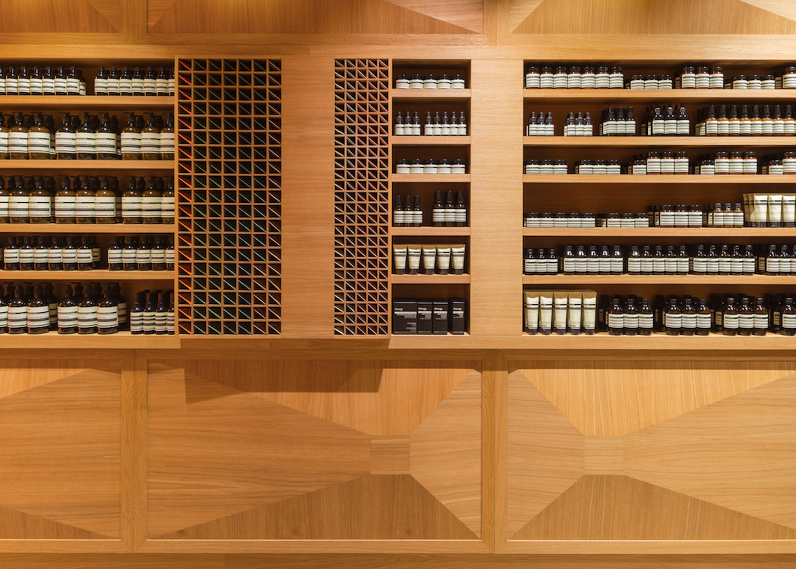
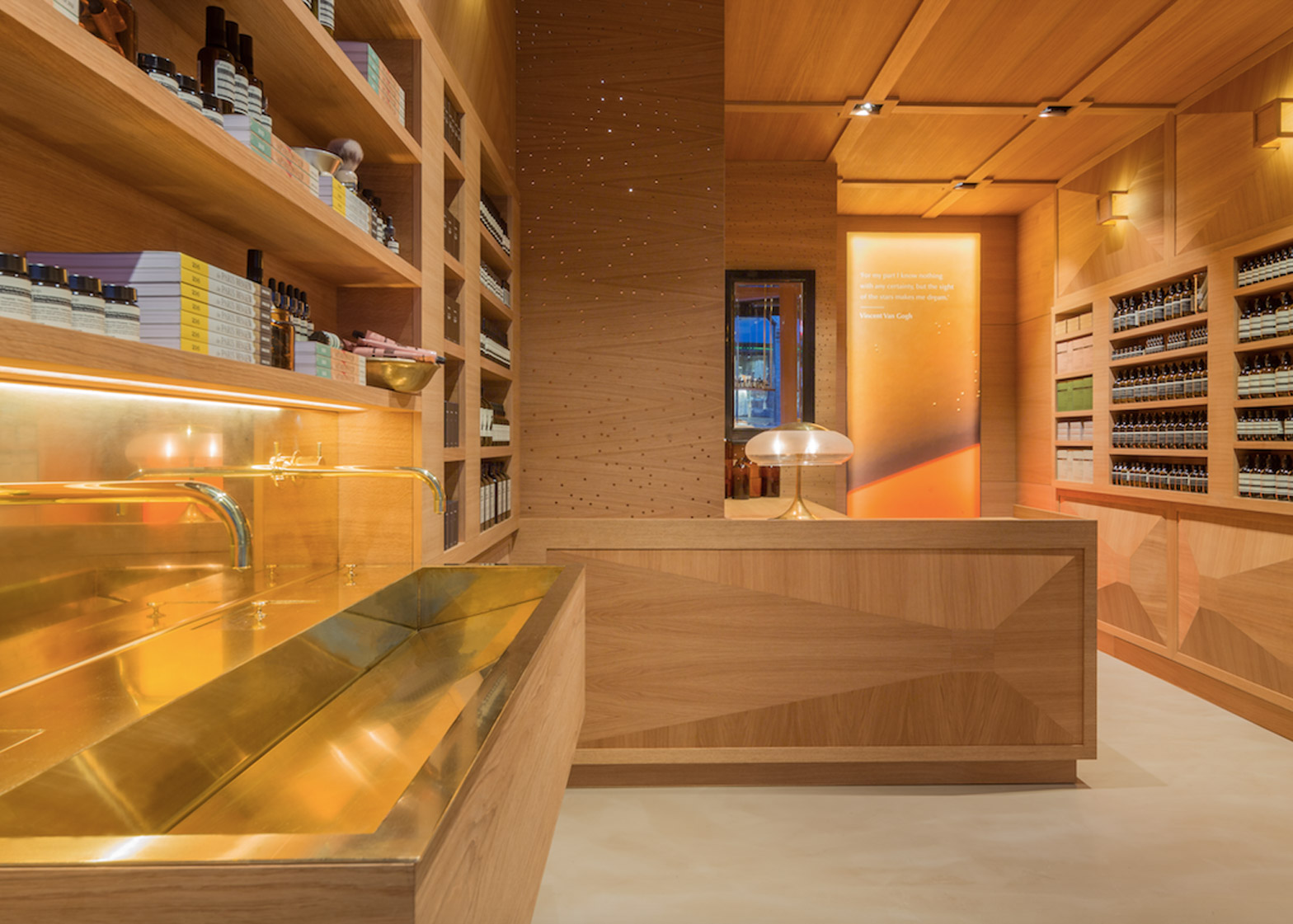
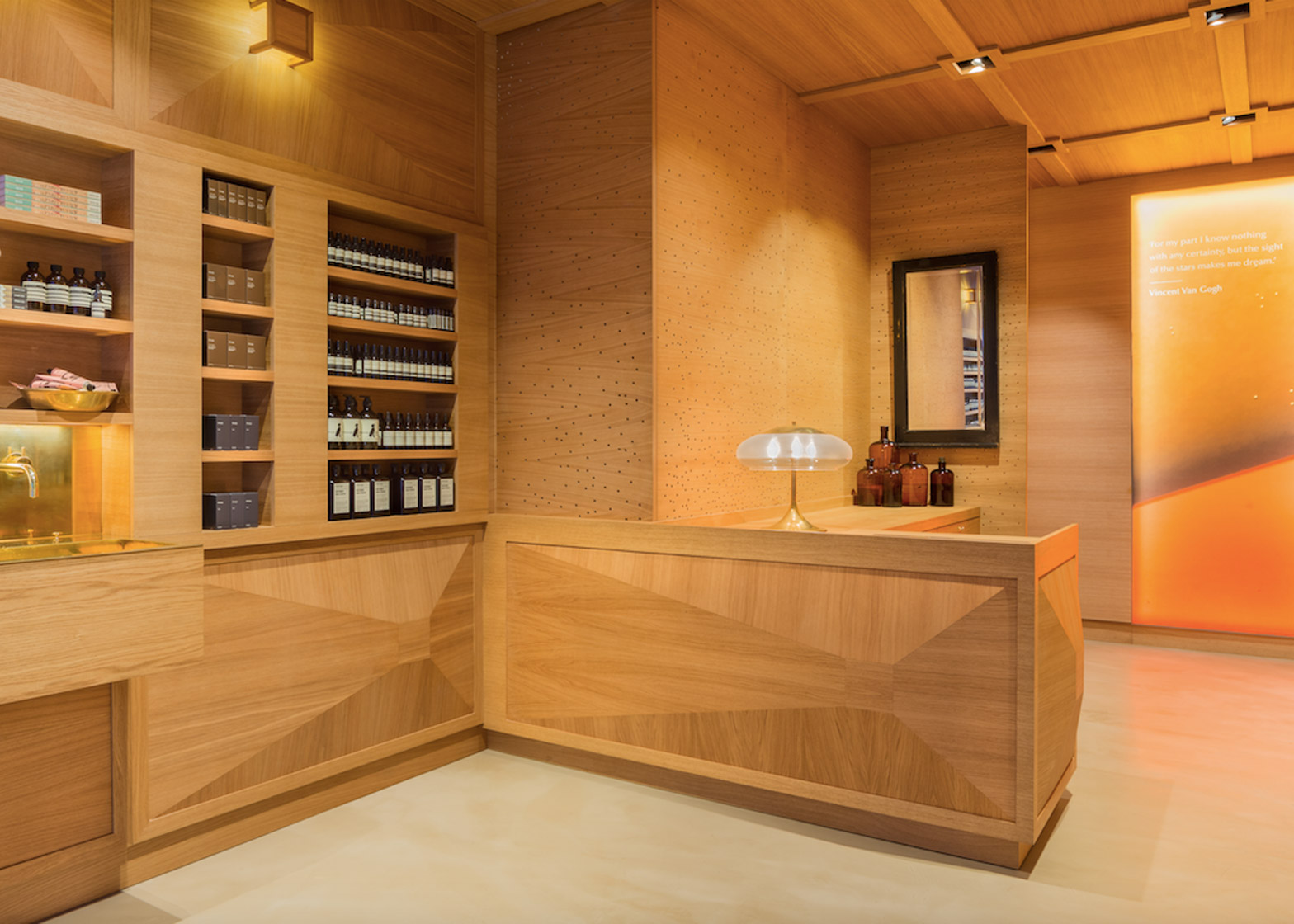
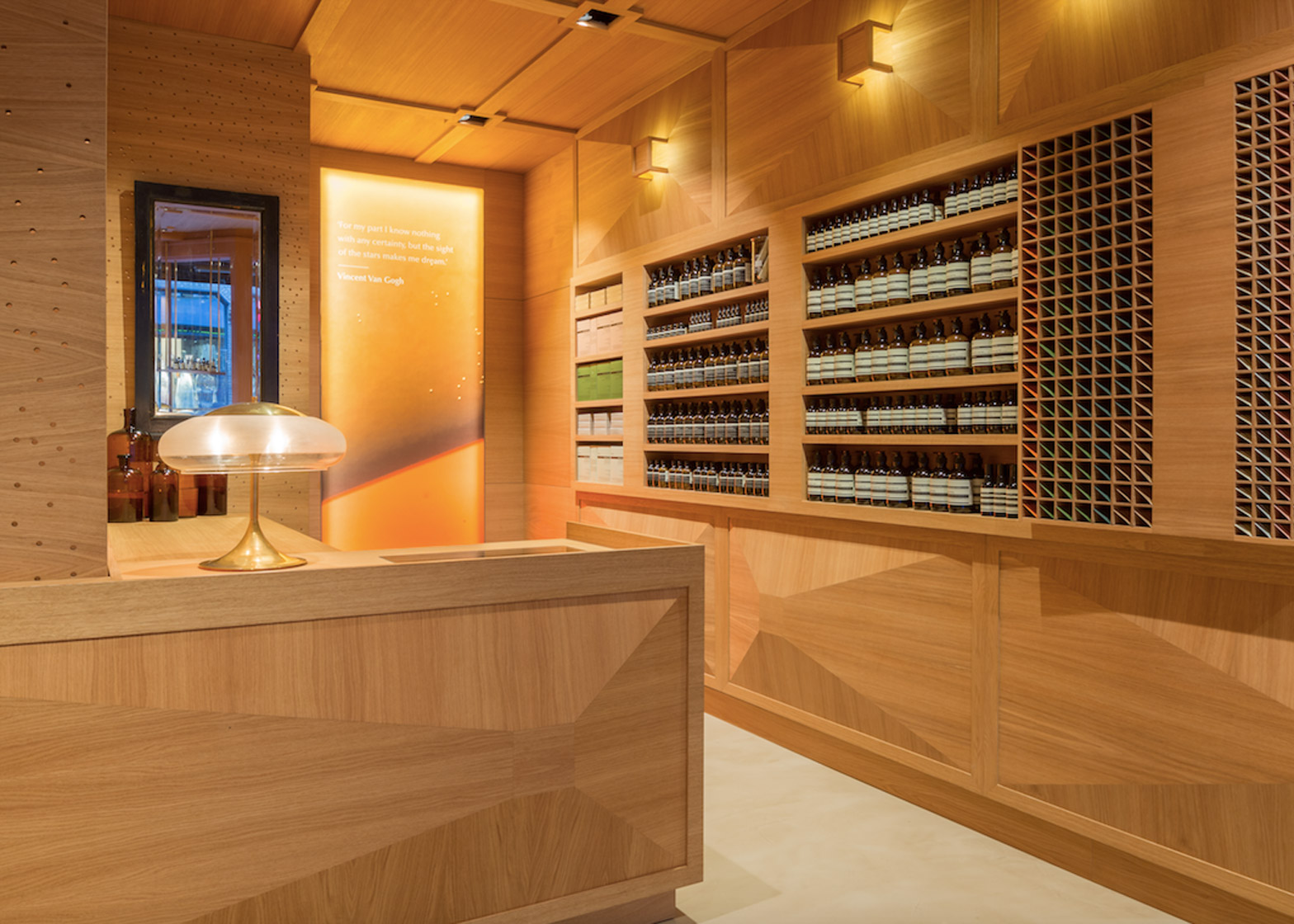
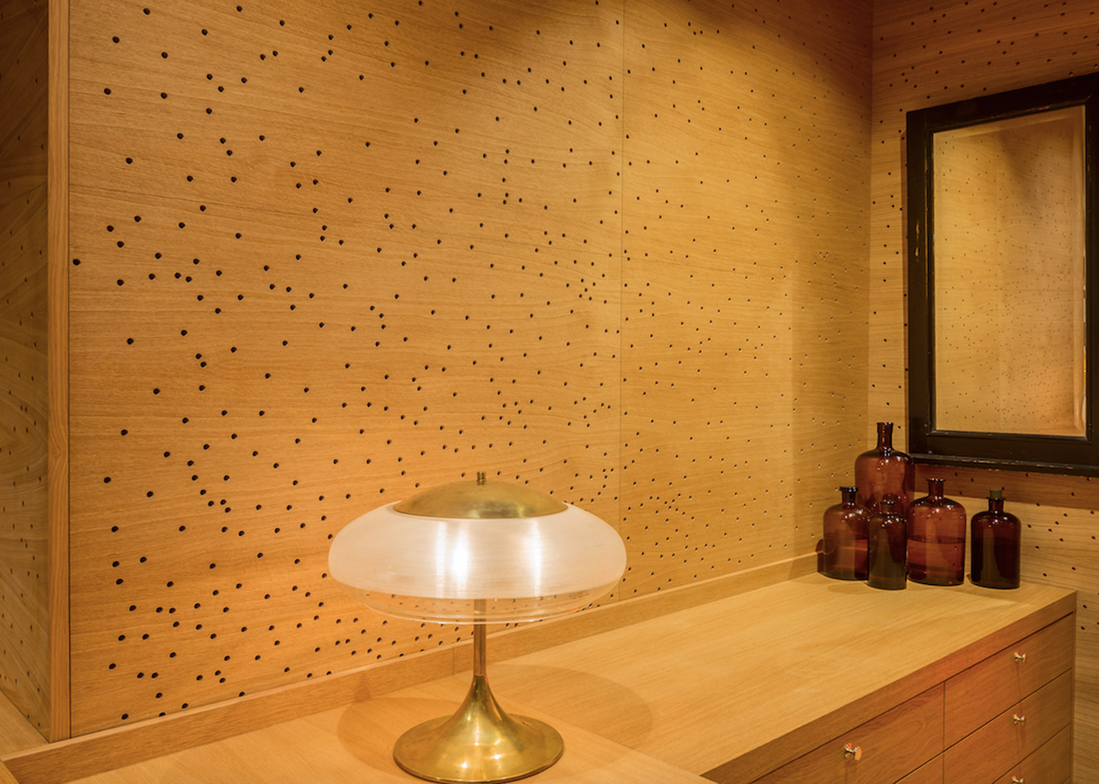
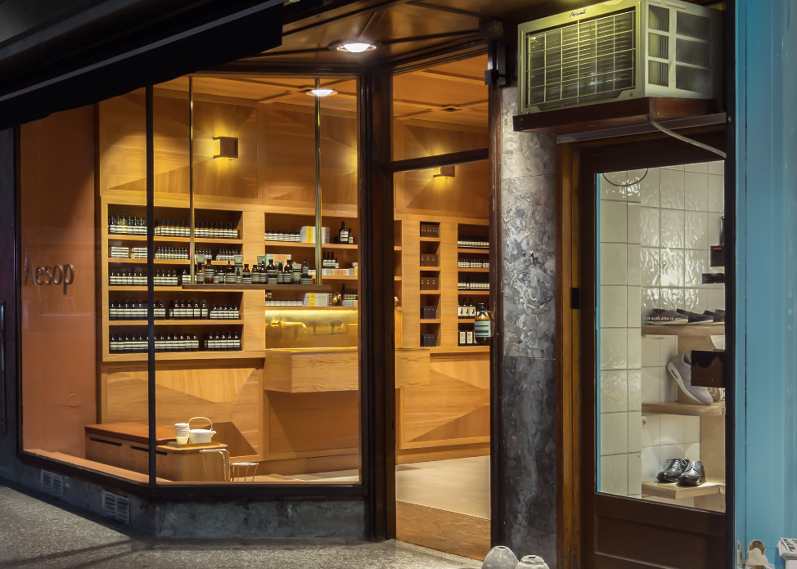
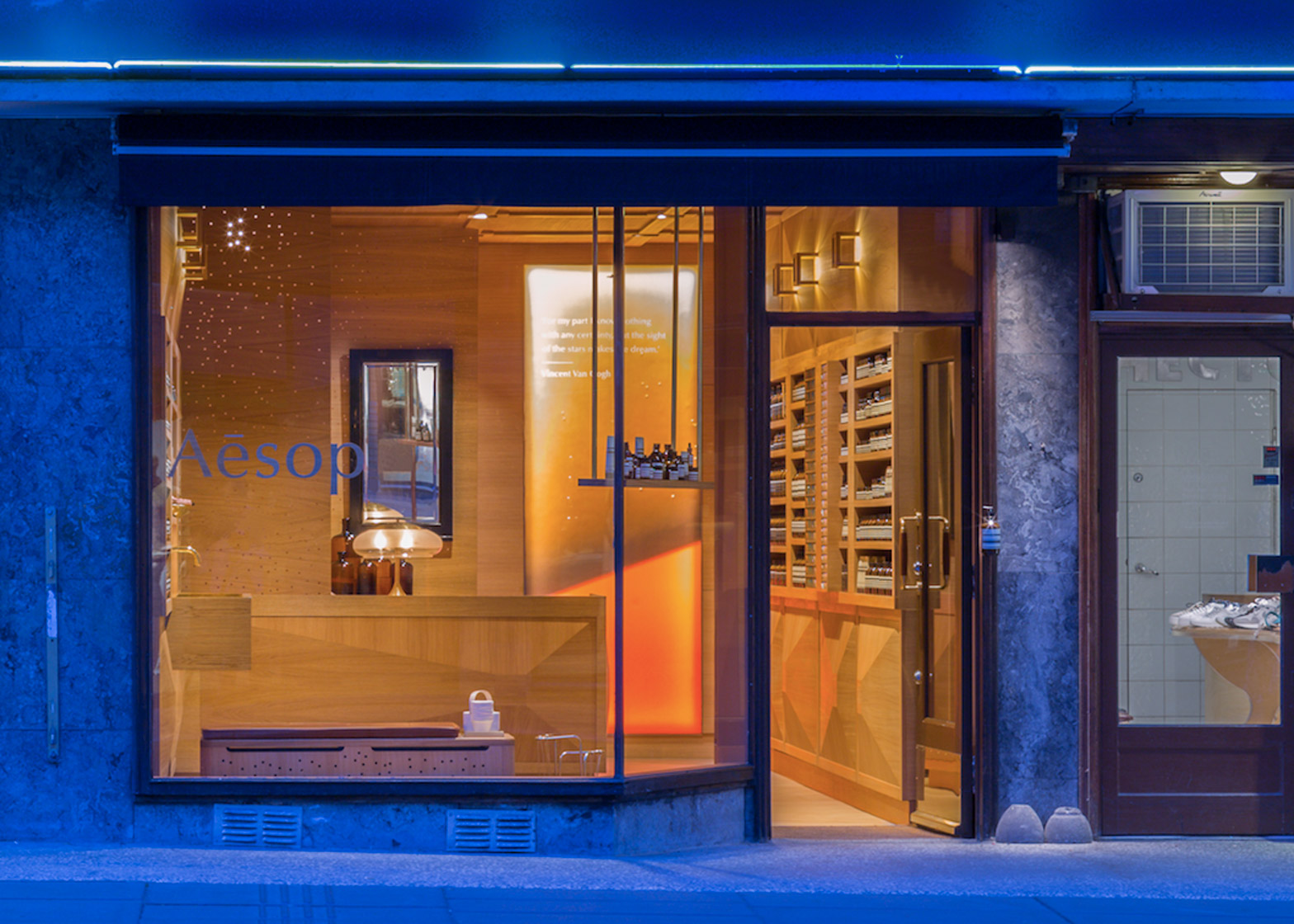
Three-dimensional oak panelling covers the walls, ceiling and counter of this Aesop store interior in Oslo, designed by Norwegian architecture firm Snøhetta (+ slideshow).
The oak panels feature randomly dispersed perforations that allow light to fall into the space below. They conceal a staircase that leads to a storage and staff room in the basement.
Built-in shelving along each wall is broken on one side by an elongated sink, over which Snøhetta has placed brass plumbing elements.
Housed in the ground floor of a 1940s Functionalist apartment building, the 63-square-metre store takes inspiration from neighbouring properties, including an antique book store and a pharmacy.
"[The oak] sort of gives the feeling of being in an old library," said Snøhetta.
"The use of wood emphasises a remembering of the old, and contributes to a warm and comfortable atmosphere."
Aesop stores always take inspiration from their locale or setting. Dennis Paphitis, founder of the skincare brand, told Dezeen "there's a direct correlation between interesting, captivating store spaces and customer traffic within a store."
New York and Chicago firm Norman Kelley recently used reclaimed Chicago common bricks to clad the brand's first store in the city, while Kerstin Thompson Architects lined a Melbourne branch with dark Australian timber.
For the new Oslo store, oak fittings were produced locally by bespoke furniture maker and carpenter Henriksen Snekkeri.
The geometric panelling was inspired by the traditional woodworking technique intarsia – a form of wood inlaying used to create the illusion of depth.
Located in the residential district of Majorstuen, the interior is designed to be a "handsome complement" to Aesop's first Oslo store in Prinsens Gate – also designed by Snøhetta.
The firm has also designed an Aesop store in Düsseldorf that invokes the shape of an amphitheatre, as well as an outpost in Singapore based on a nutmeg plantation formerly on the site.

