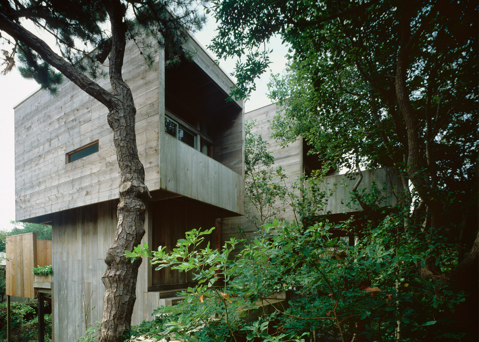
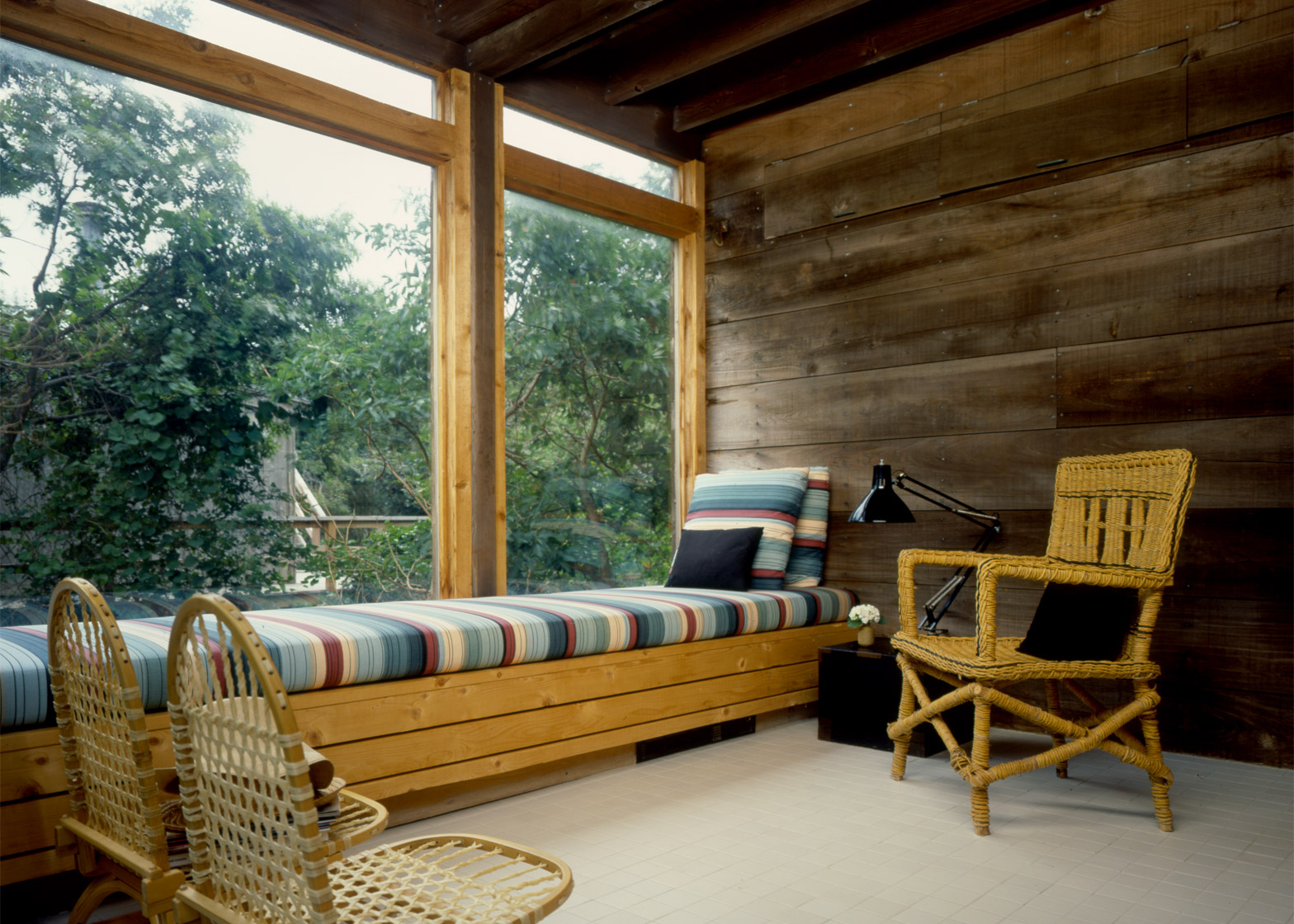
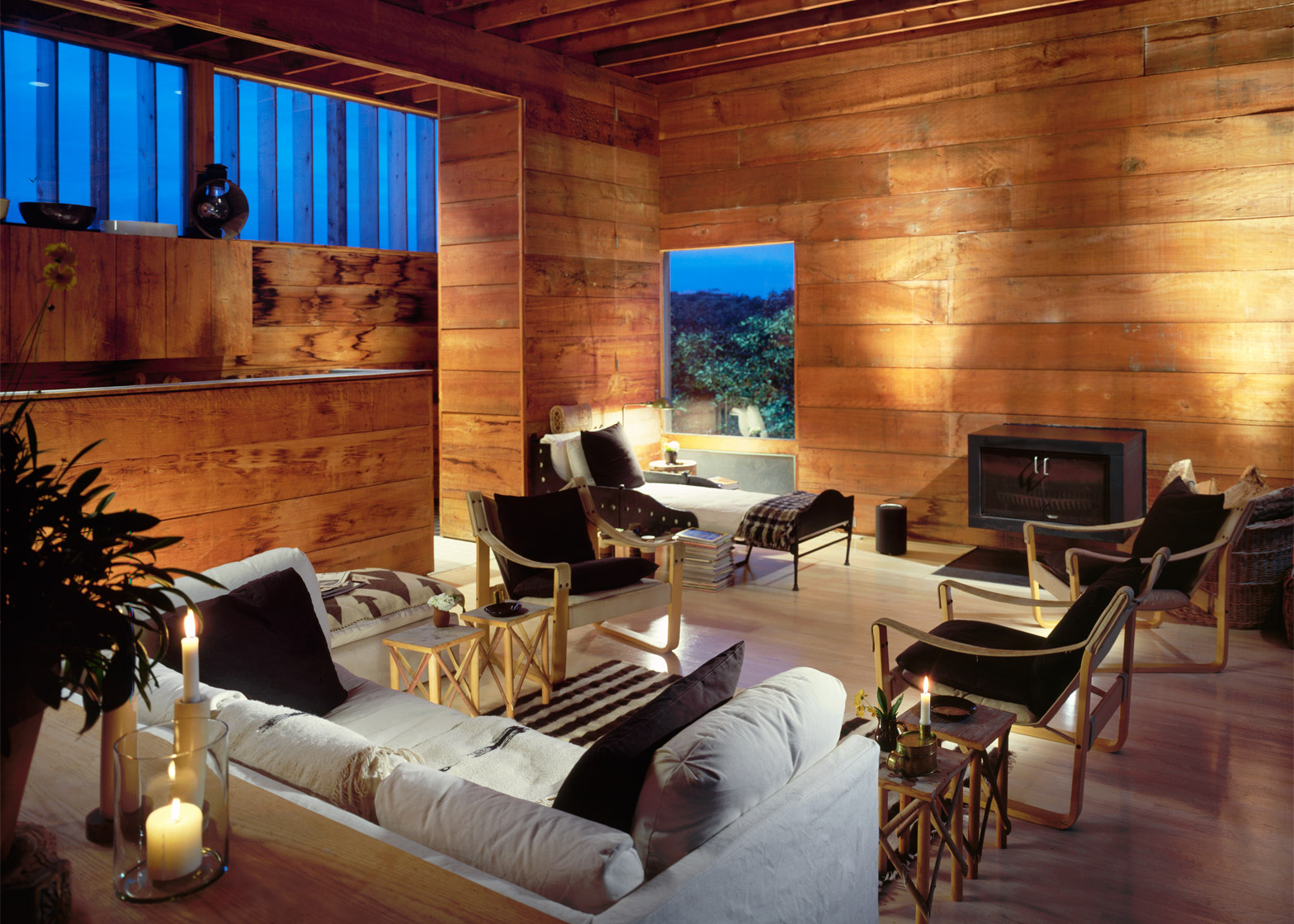
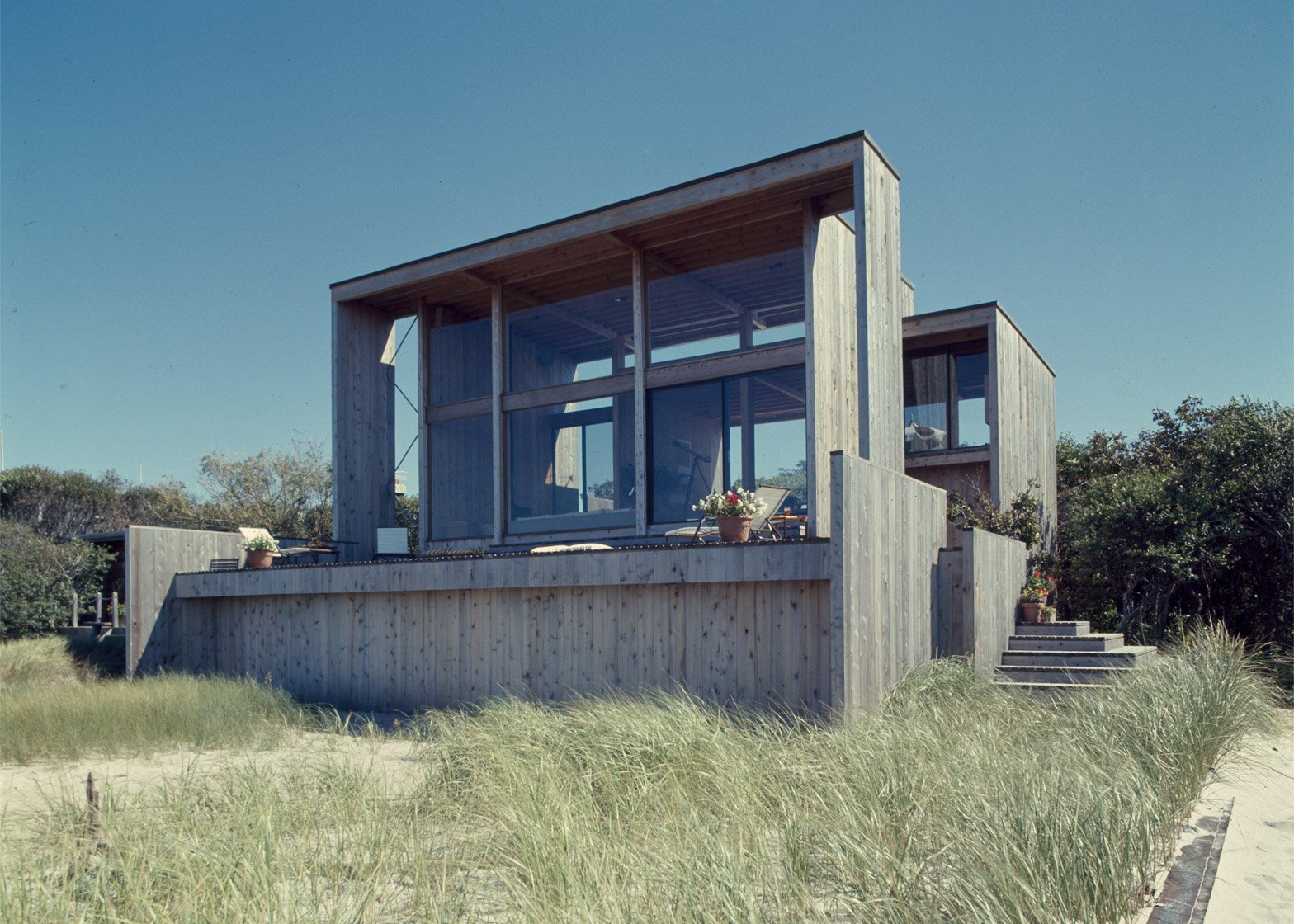
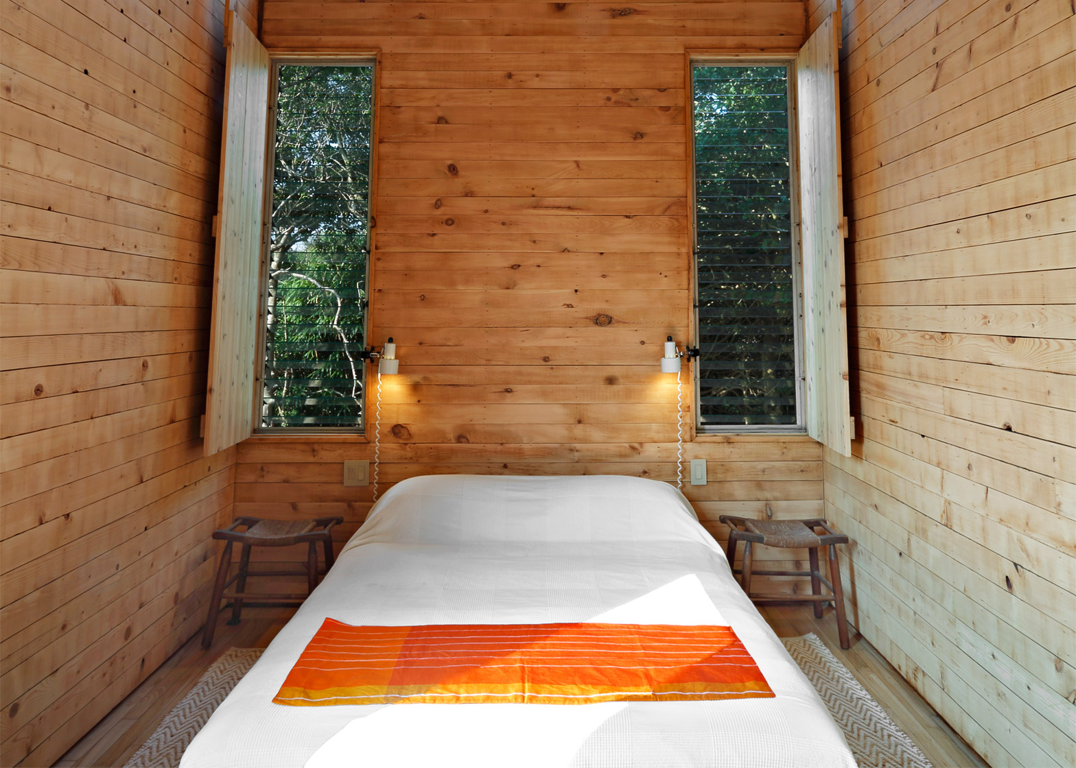
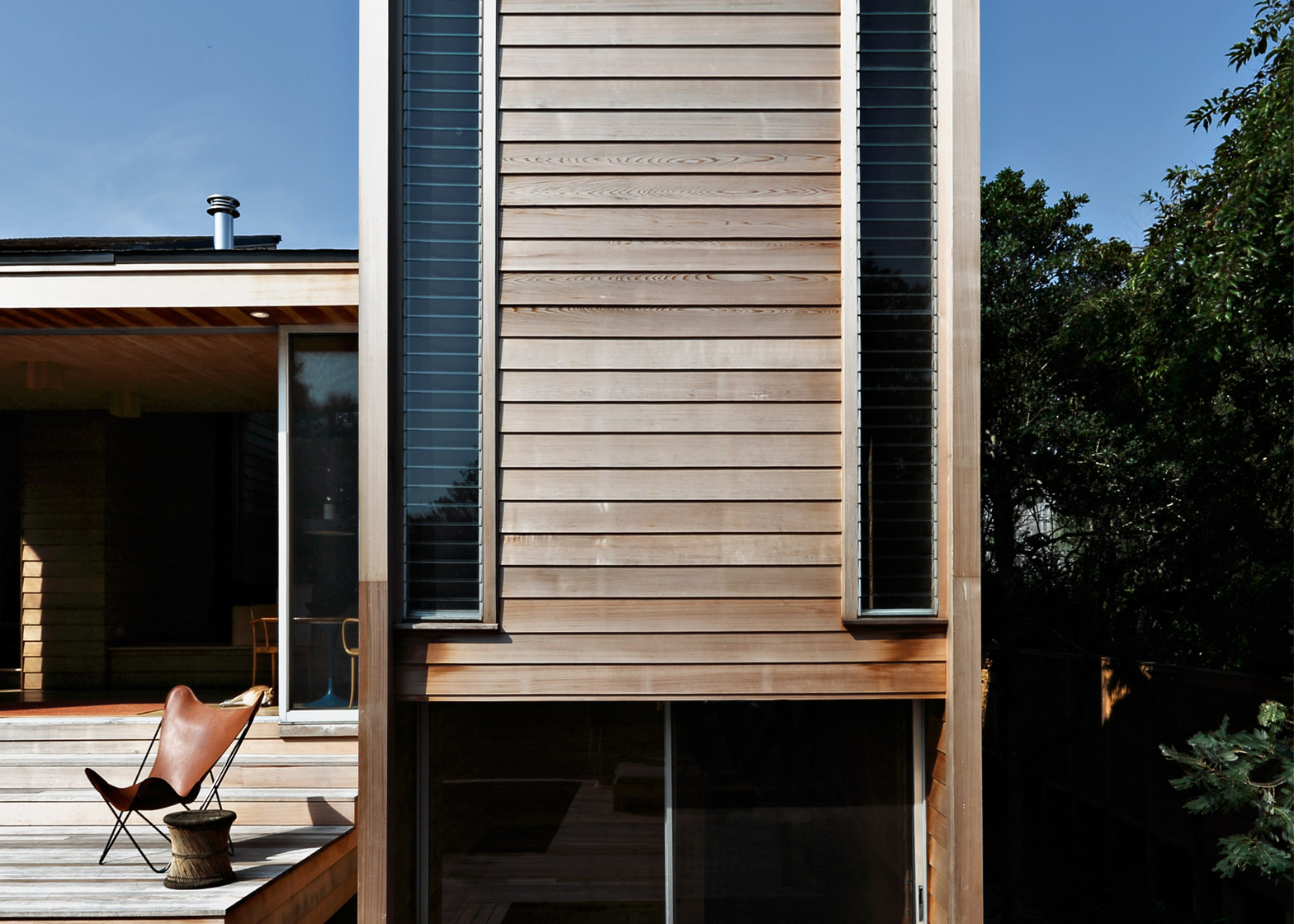
As the Fire Island Pines resort off New York's Long Island recovers from its annual summer party, architect and Pines Modern founder Christopher Rawlins has chosen 10 of his favourite Modernist retreats dotted among the dunes (+ slideshow).
Located approximately two hours' journey from Manhattan on a long, thin slither of land, Fire Island Pines has been a summer getaway – predominantly for New York's gay community – since the mid-20th century. It is reached via passenger ferry and has no cars, instead properties are connected by timber boardwalks.
The island is empty for most of the year, but visitors flock during the summer weekends – turning the retreat into a party mecca.
"Since my first foray to Fire Island Pines, I have been peering over fences and knocking on doors," Rawlins told Dezeen. "It was immediately apparent to me that the Pines is a community that looks and lives like no other."
Beginning in the 1950s, architects who lived and worked on the island – Harry Bates, Marcel Bretos, Earl Combs, and the prolific Horace Gifford – began making their mark by building wooden Modernist homes for wealthy clients.
"The Stonewall generation artfully and gently colonised this fragile landscape," said Rawlins, who is working on the restoration of some of these houses. "They realised that, like most beautiful things, the Pines is an easily marred countenance."
Rawlins has recently launched the Pines Modern website that provides interactive, audio-visual tours of the resort's architectural highlights – to be used virtually or by actual visitors. Here, he describes 10 of the most interesting and significant buildings from the archive:
556 Ocean Walk by Horace Gifford, 1969
No one embodied the Stonewall-era pulse of the Pines more than Stuart Roeder, a Warner Brothers PR man who never lacked for friends or lovers. He purchased a cottage at the western edge of the Pines, enlisting Horace Gifford for its transformation.
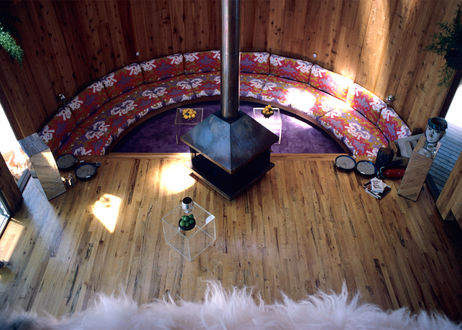
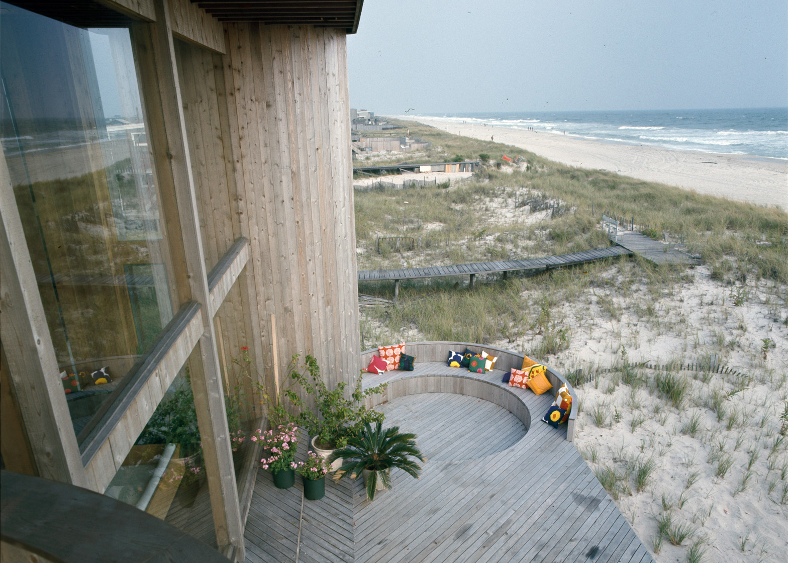
Gifford sheathed a dowdy square cottage in a dynamic diagonal wrap that gyrated towards a tract known as the Meat Rack. Form followed foreplay in the Makeout Loft.
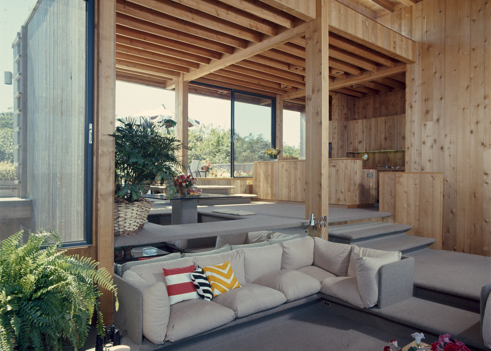
Lined in sheepskin with angled edges for bodies in repose, this high perch for base desires surveyed the psychedelic swirl of the conversation pit below.
The abstract, sculptural gestures of the Roeder House and subsequent designs revealed an affinity with the Brutalist movement shaped by architects like Paul Rudolph.
But Gifford skillfully channeled the ponderous concrete forms of Brutalism into light and lyrical wooden structures.
547 Beachcomber Walk by Andrew Geller, 1961 (Renovation by Larson and Paul Architects, 2006)
Andrew Geller began to turn Fire Island's architecture on its head in 1958 with quirky and endearing beach houses that revealed "how far a little plywood and a lot of guts will take you".
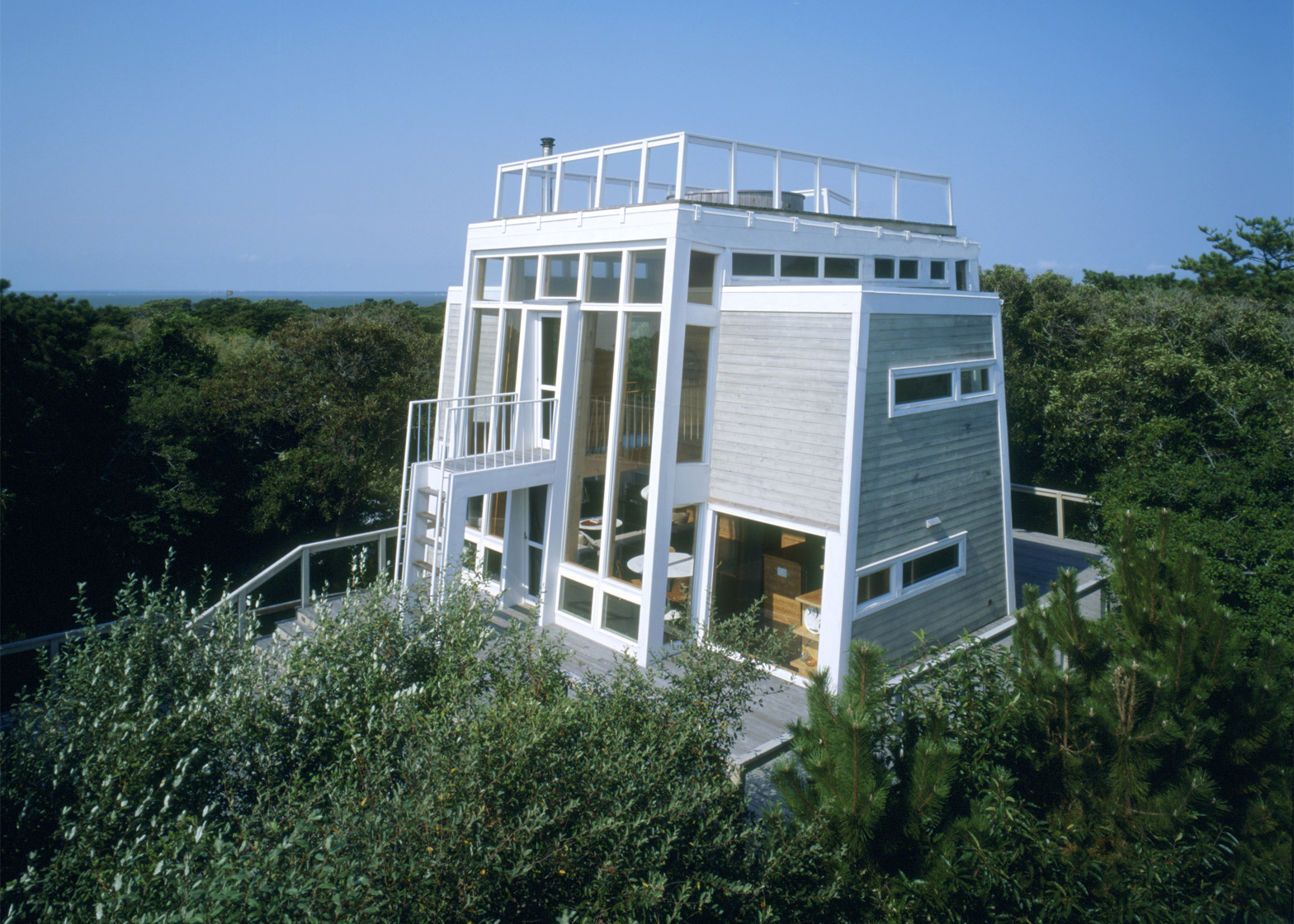
In 1961, Rudy and Trudy Frank built a Geller-designed home on one of the highest dunes in the Pines. It was inspired by the truncated pyramids that the Franks had recently explored in Mexico.
The Franks rented out their house in the summer of 1971, only to discover that it had achieved immortality as the setting for the third act of gay pornographic film Boys in the Sand.
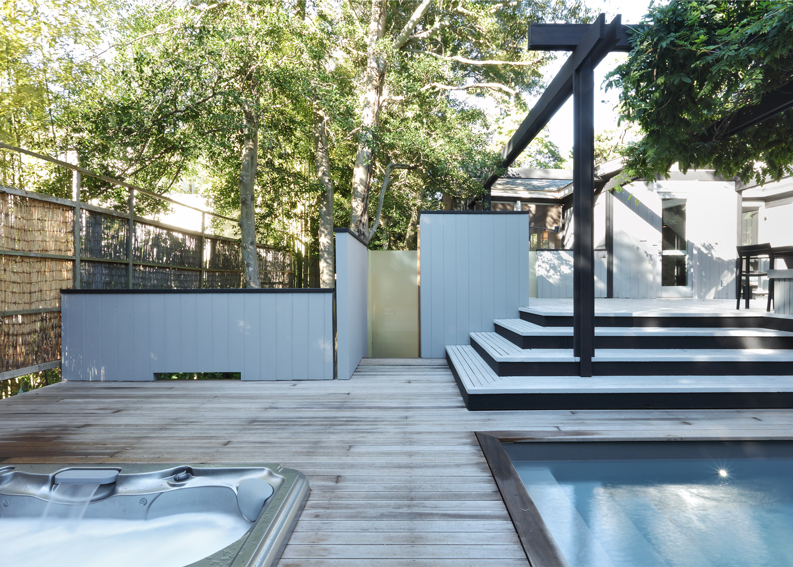
In 2006, Larson and Paul Architects undertook a painstaking reconstruction that preserved the character of the home while adding modern conveniences like insulated windows, air conditioning, and a swimming pool.
A relocated kitchen allowed for the creation of a third bedroom, while a new roof deck recovered water views that were lost as the forest canopy grew to surround the house.
566-67 Driftwood Walk by Horace Gifford, 1972. Addition, 1980
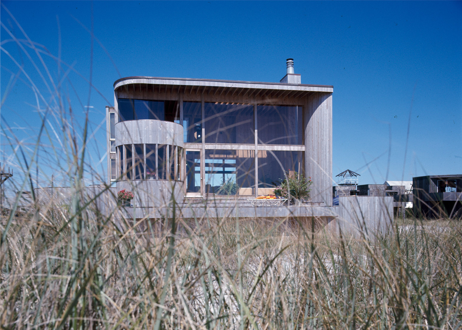
Norton and Marlo Sloan, one of many heterosexual couples who embraced the freewheeling culture of the Pines, commissioned a luxurious home whose smooth volumes appeared to have washed up on their site.
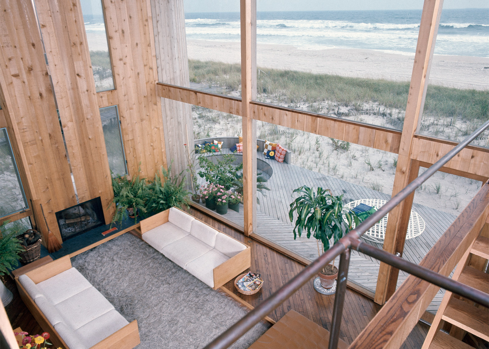
Curved spaces extended, clover-like, from a lofty living room animated by the painterly slash of a diagonal stairway. A mirrored wall brought ocean views to both sides of the space.
A leather ottoman bridged the conversation pit, while the dining room projected like a prow towards the ocean. Outside, a lazy Susan lounge rotated to catch the best rays for the sun-worshipping Marlo Sloan.
Tall fences and security systems soon transformed the former Sloan residence into the Calvin Klein compound, where Gifford was hired in 1980 to add a pool, a gym, a garden, and quarters for the "pool boy".
Hurricane Gloria nearly destroyed the home in 1985, but Klein restored it before selling it to David Geffen. It was a principal setting for Longtime Companion, the first wide-release drama to address the AIDS epidemic.
214 Beach Hill Walk by Don Page, 1962. Restoration and addition by Rawlins Design, 2015
Seeking a coastal retreat as well as a place to display his art collection, Time Inc PR executive Stanley Posthorn called upon Charles "Don" Page – head of the graphic design department of I M Pei's office.
Starting with a rectangular platform that hovered over its site on wooden pilings, Page laid out a grid overlaid with an S-shaped interior plan that cradled two planted courtyards. The remaining space was further delineated into a symmetrical array of screened porches and terraces.
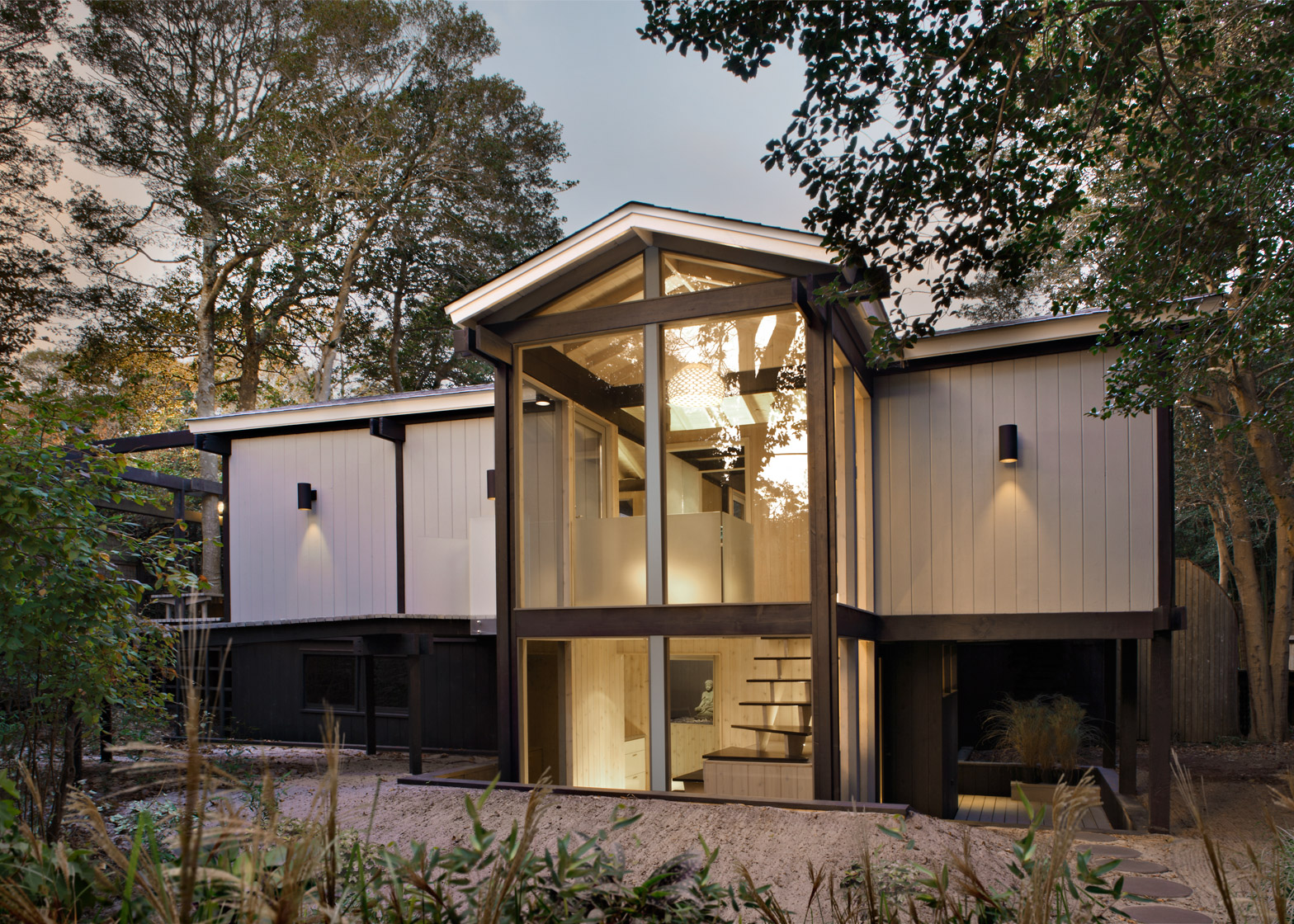
As part of an ongoing renovation, Rawlins Design has reconfigured and integrated a lower-level apartment into the main house by transforming the covered entry porch into a glass-enclosed stair that presents a more inviting face to the public boardwalk.
The entry boardwalk was rebuilt in keeping with the original winding approach, while the lower apartment level was stained black to blend into the vegetation and restore a sense of lightness to the original, grey structure.
603 Tuna Walk by Horace Gifford, 1965
With his customary dry humour, Horace Gifford began his design presentation to his client Murray Fishman by declaring, "You will now have twenty closets to come out of".
Twelve robust columns, containing closets above and below, lifted the Fishman residence into the air. Early Fire Island cottages squatted akimbo upon skinny pilings, evoking the architectural equivalent of "martini legs".
Gifford composed and selectively clad his own version of these posts, realising a muscular base in harmony with the architecture that it supported.
241 Bay Walk by Michael Kinlaw, 1970
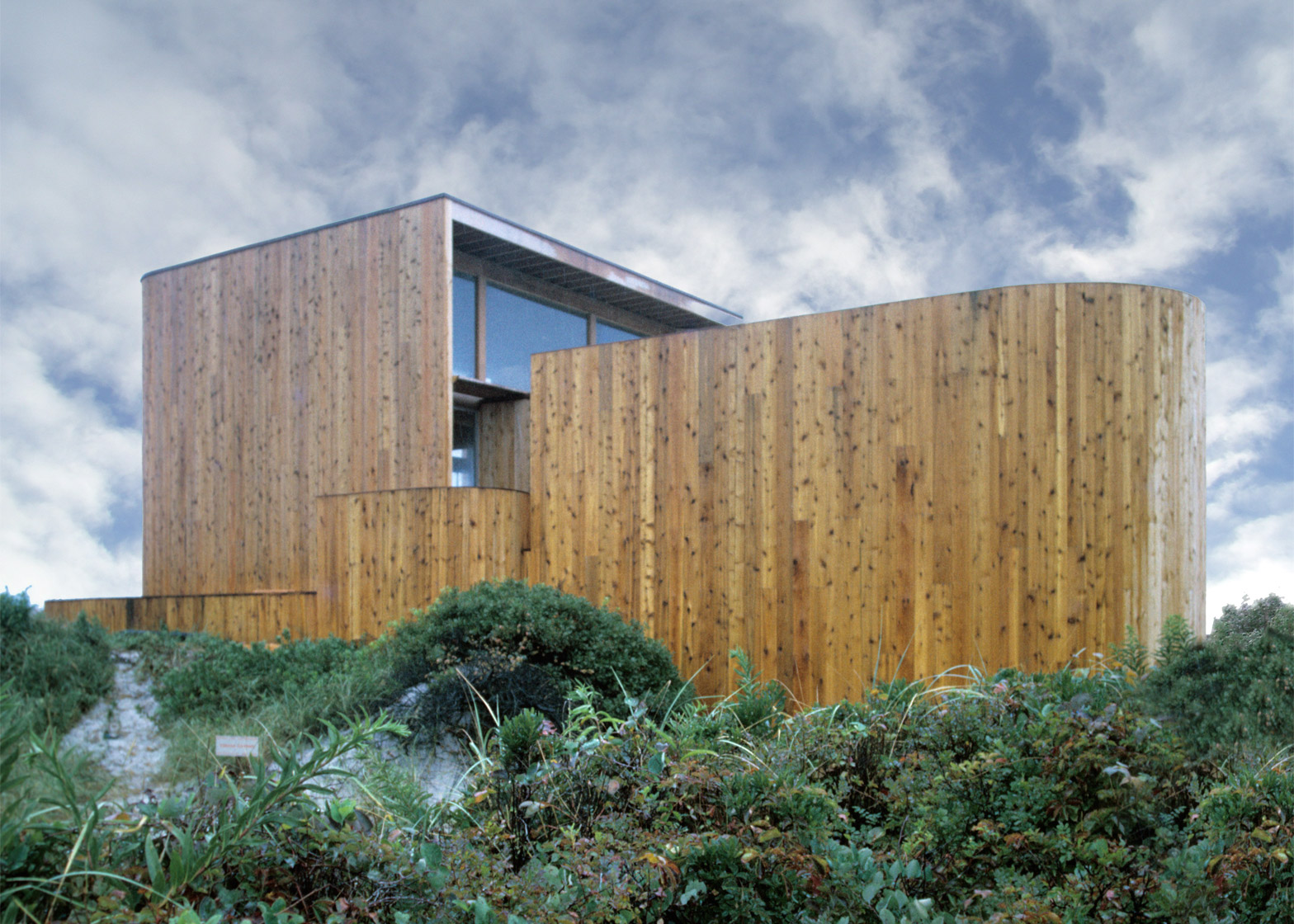
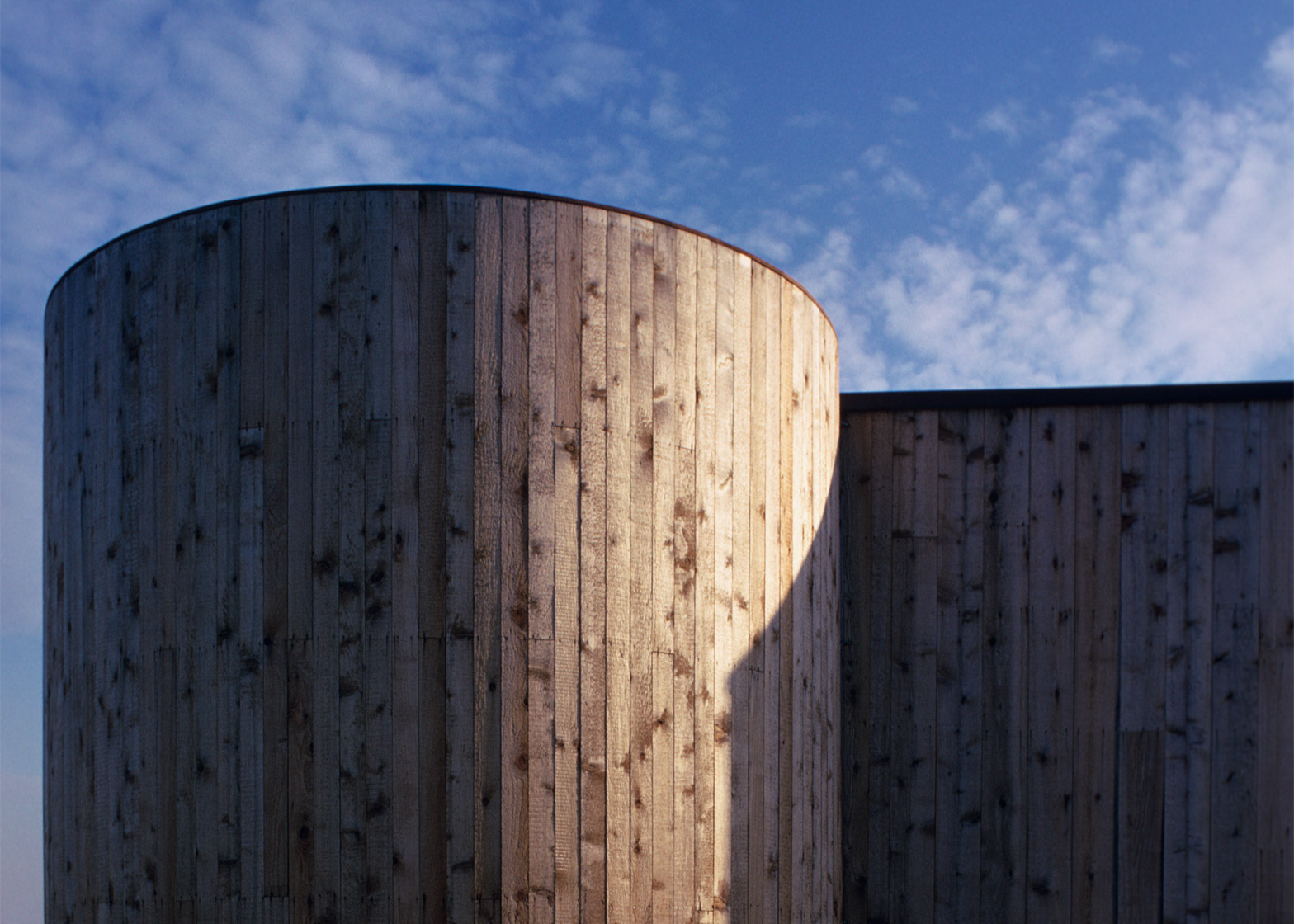
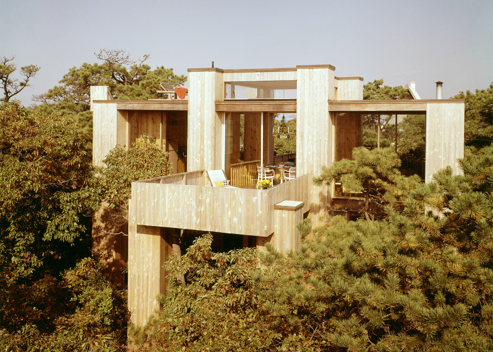
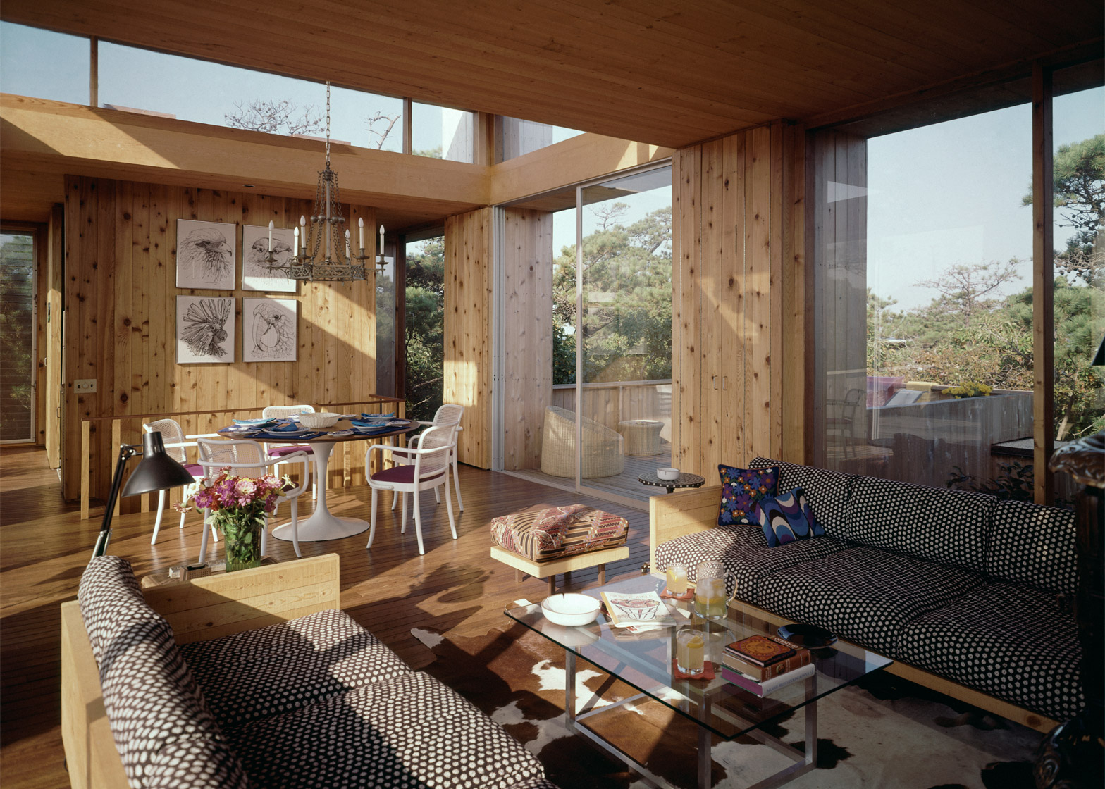
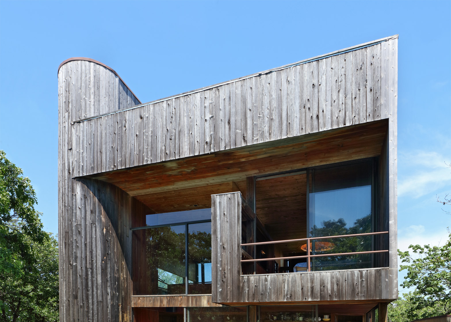
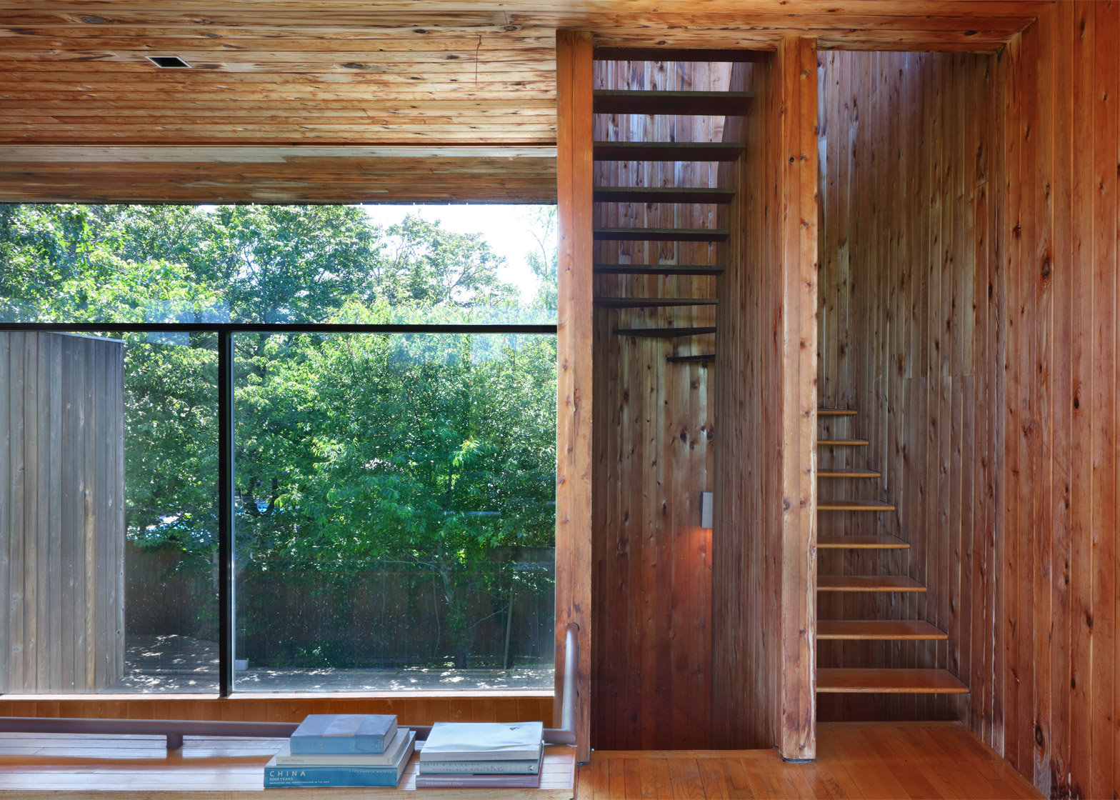
A muscular composition in glass and cedar, 241 Bay Walk possesses one of the most animated facades in the Pines. The open plan is articulated with abrupt changes in height: tall expanses where one walks, contrasted with intimate realms for sitting. All are connected by a semicircular stair tower.
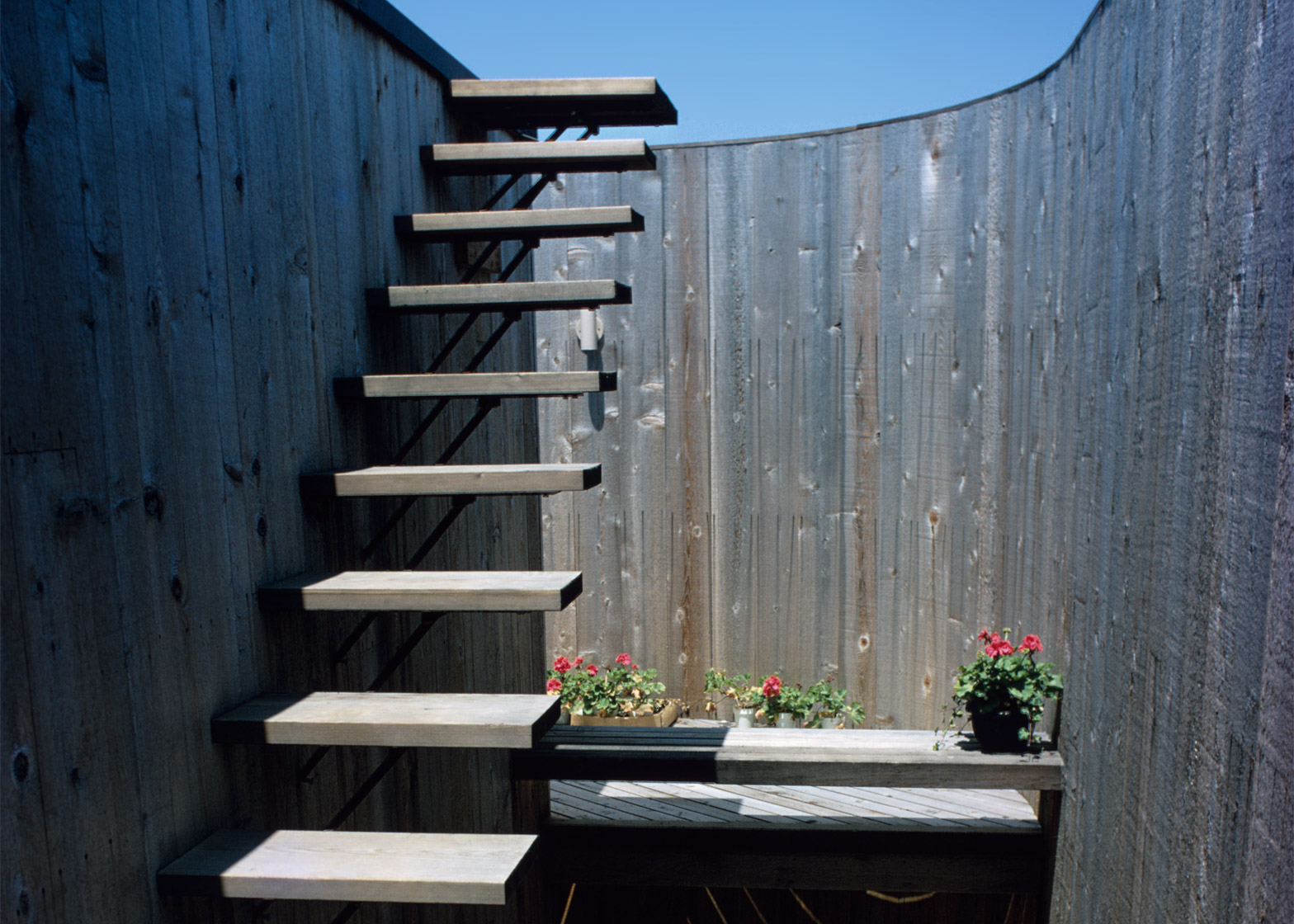
This narrow, precarious space with open risers and no railings suggests that this is a house that wants to be touched. Other sensual features abound, like the space designed exclusively for growing orchids that is arrayed around a vast, sky-lit shower, partaking in its ambient humidity.
The home was designed by architect Michael Kinlaw as his personal residence.
122 Ocean Walk by Horace Gifford, 1970
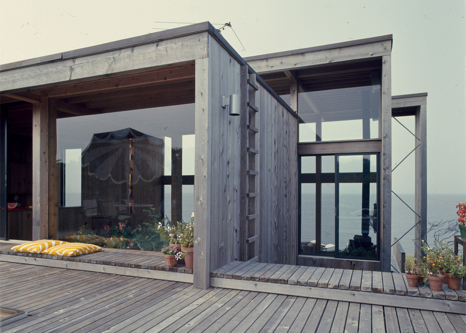
With its pulsating roofline and thrusting cantilevers, Horace Gifford conjured a discotheque upon the dunes at the Lipkins House. All was bared, with floor-to-ceiling windows across the entire coastal elevation.
Control panels operated a futuristic array of blinking, multicoloured lights installed by Broadway Maintenance, the clients' street-lighting company.
A sunken living area led down to the "cave," a windowless den of electric blue shag-carpeted walls and oversize pillows. Rechristened the "womb" by its owners, it looked like a sex pit but allegedly functioned as its opposite – a solitary and shadowy retreat from the voyeuristic spaces above.
With the aid of original drawings from the Horace Gifford archive, held by Christopher Rawlins, the Lipkins House exterior was restored back to its original condition in 2011.
274 Bay Walk by Harry Bates, 1967
Juxtaposed with the "barely there" qualities of Horace Gifford's glass-walled aeries are a number of robust homes by Harry Bates, the second most prolific mid-century architect in the Pines.
Seeking privacy and bay views on a corner lot dotted with pine and cypress, Bates designed a brooding tree house with elevated public spaces, solid deck rails, and a minimum of side-facing windows.
Top-heavy volumes and an entry bridge evoke the cantilevered architecture of Brutalist buildings like Marcel Breuer's Whitney Museum. But while many Brutalist structures were rendered in cast concrete, Bates' pleasing scale and wide cypress siding dispensed with the more dispiriting effects of that style.
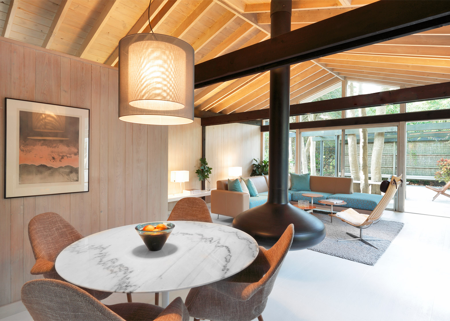
The client specified bleached oak floors, with black and white furniture in harmony with the spare elegance of the house. Water stains on the cypress walls and other signs of age were accepted and even celebrated. Texture and patina served as all the artwork that was needed in this quietly assured work of Modernism.
252 Bay Walk by Horace Gifford, 1972-75. Addition, 1977
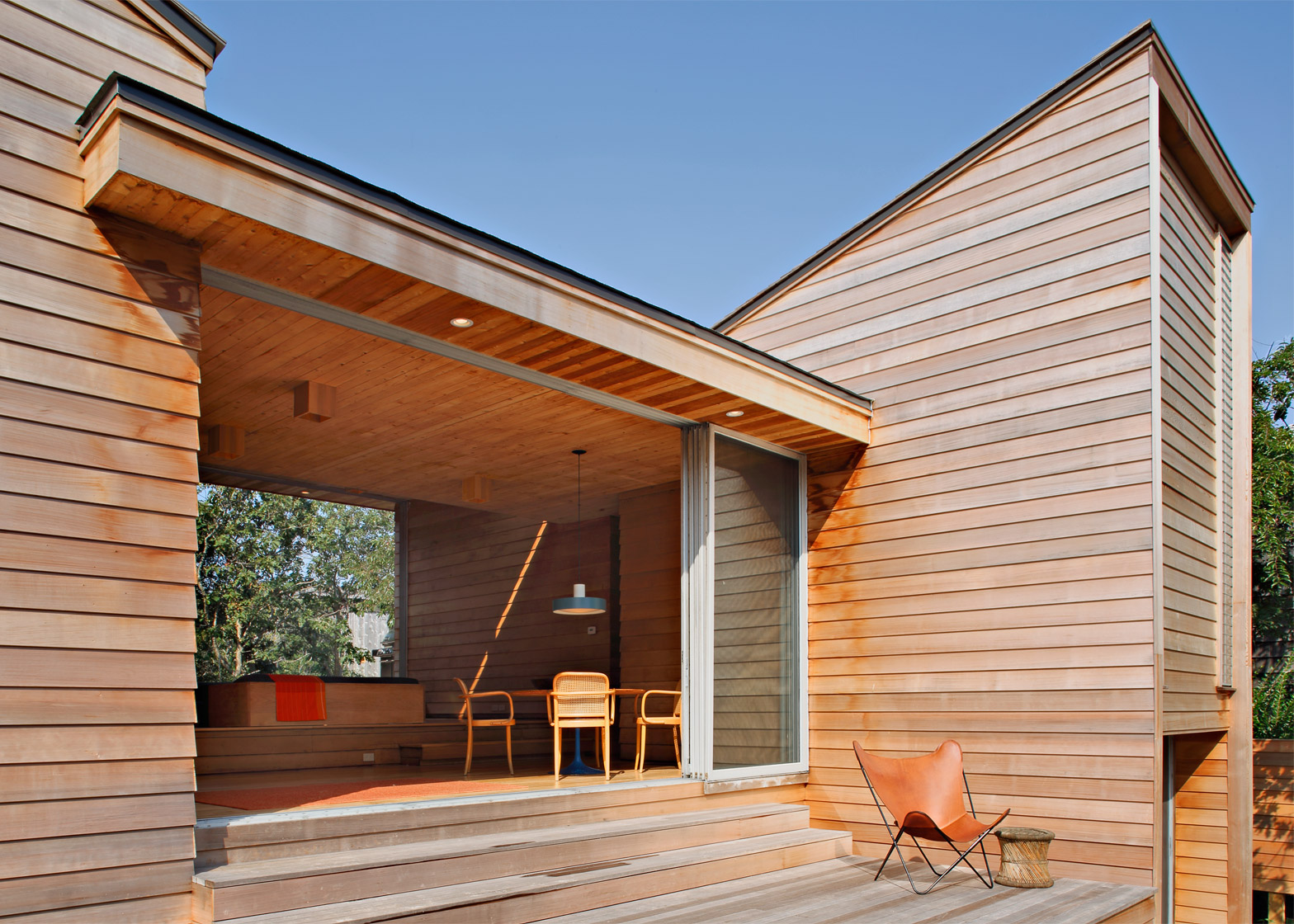
252 Bay Walk uncoils across the landscape as a series of telescoping cubes. The footprint of the home was reduced to save costs, but an echo of a larger home persisted in a "disembodied facade".
This north-facing brise-soleil provided minimal shade; its function was entirely aesthetic, framing the view, providing an airy complement to the layered opacity of the entry approach.
Gifford's customary descent from the common boardwalk into mulch wound through a thicket of trees, leading to a three-sided staircase. An elaborate swimming pool extension stretching to the Great South Bay was constructed in 1977.
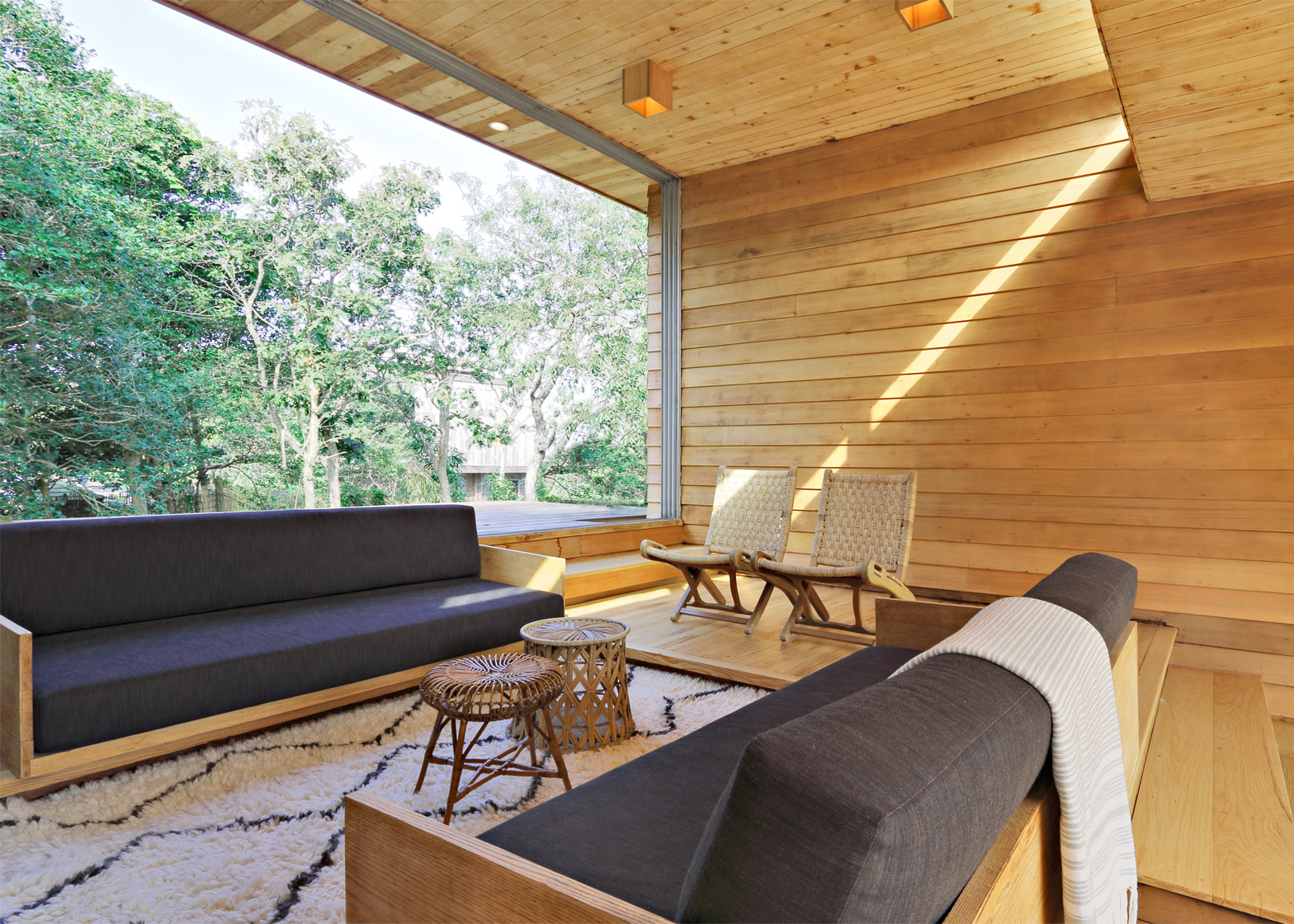
In plan, the public spaces were laid out as a 27-by-27-foot square (8.2 by 8.2 metres) that was divided in half, slid apart, and tiered, differentiating the spaces and allowing water views from every vantage point.
A high deck toward the boardwalk and a low deck toward the bay extended the two interior rooms into an ensemble of indoor/outdoor stages.
523 Snapper Walk by Horace Gifford, 1965
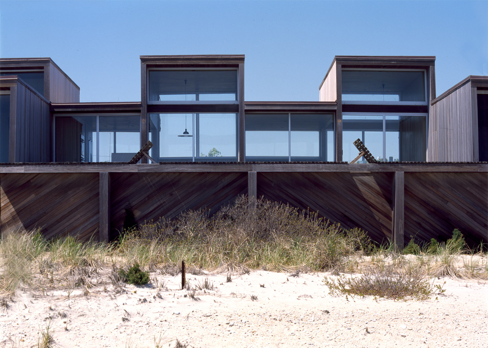
Gifford's second personal residence formed a pinwheel of shed-roofed towers around a living area that exploded into voyeuristic stages for living.
Glass doors opened wide in the public spaces to create a breezeway, achieving a remarkable tension between the openness of the flat-roofed public spaces and the high-waisted sentinels housing the bedrooms, bathroom, and kitchen.
On this low-lying site, Gifford conjured "towers that reach out and grab for light". A shifting ceiling plane acted as an ever-changing foil to a floor plan that was consistently composed using "golden section" proportions.
Upon stepping off the common boardwalk, a leaf-strewn path threaded between two trees and ascended two exterior decks, which progressed to two interior stages, and culminated in a fifth outdoor level at the other end of the inhabited breezeway.
This progression formed a multitude of special experiences, from leaves and shade toward western light, treetops, and a water view. Gifford was so proud of this project that he sent photographs to Louis Kahn; his mentor replied, "Horace, you have created a mountain and a valley".


