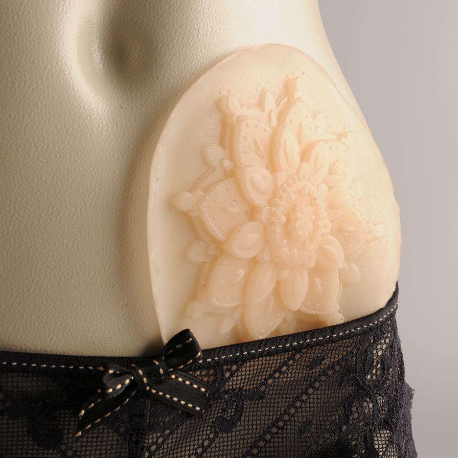
Comments update: readers were almost unanimous in their praise for a graduate designer's idea to create a colostomy bag for "intimate moments", as they contemplated the merits of choosing the right projects to address with design.
In the bag: Stephanie Monty's pouch that can be customised with a range of tattoo- and lingerie-inspired patterns is exactly the type of work that designers should be focussing on, according to commenters.
"I applaud the time and creativity that went into such a sensitive brief – these are the challenges I love to see designers tackling," said Brogan Barker.
"Great design, and fantastic that the practicality has also been improved," agreed Felix M. "Insightful decision to make the bag smaller for short-term wear."
The project even impressed regular commenter Concerned Citizen: "Monty may well be the first 'artsy' designer to tackle such a device. A job well done all around."
Jane, however, thought the design could have been kinkier. "I would rather have a black latex one to match the rest of my outfit," she said. "Lace and floral patterns are so prudish." Read the comments on this story »
Null points: an open-air hotel room created by Null Stern to give guests panoramic views of the Swiss Alps did not have commenters queuing up to book.
"This is like marketing a pool floatie as a sail boat," said Adam, while Chad Sutter described it as the "epitome of stupid."
"A bed does not a hotel make," he added.
One guest commenter appreciated the tongue-in-cheek idea. "They've gone to a lot of trouble for a leg-pull," they said. "Funny though."
Would you stay in a hotel room with no walls? Let us know in the comments section »
Och aye: Rural Design's shed-like holiday home on Scotland's Isle of Skye features corrugated aluminium walls that reference local agricultural buildings, and readers agreed that this helped building feel appropriate for its setting.
"This house is a wonderfully appropriate addition to the landscape in which it sits," said Balfour.
"This is what a holiday house should be like," added Sim. "Simple, durable materials, in a nice place. Not too big, not too expensive, not too precious."
"I have a serious case of envy," Greco chimed in. Read the comments on this story »
Dezeen dream? opinion was split over Pernilla Ohrstedt's design for our new canalside offices in London, with some anticipating more from the open newsroom environment.
"I expected something better for Dezeen's offices," said al. "'Vibrant'? You're joking, right?" asked samcooke6.
Others thought the interior was spot-on for the brand. "I'd say the personality of the space matches my perception of Dezeen perfectly," said Kobi.
"When can I join the team and move in?" inquired Mr Walnut Grey. Read the comments on this story »

