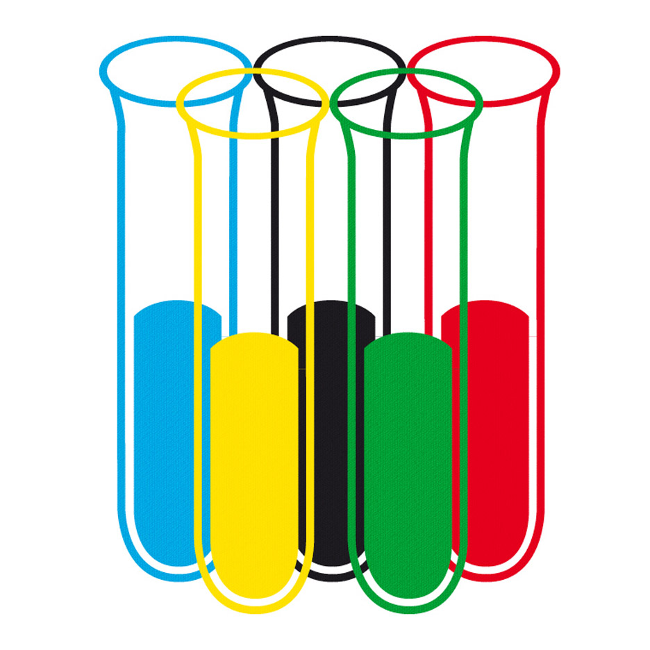
Björn Karnebogen proposes alternative Olympics logo in light of Russian doping scandal
Rio 2016: German art director Björn Karnebogen has created a tongue-in-cheek alternative logo for the Olympic games after a swathe of Russian athletes were found guilty of doping.
The banner plays on the colourful five-ring logo, turning the circles into the tops of test tubes for urine samples.
"I looked at the Olympic rings and thought, maybe I can blend it with test tubes, which are referring to doping, medicals and drug tests," Karnebogen told Dezeen. "Then I put it on a flag, which made the fake more realistic."
He designed the logo in light of evidence that many Russian athletes have taken performance-enhancing drugs ahead of the Rio 2016 games, which begin on 5 August.
Although the team escaped a blanket ban, over 100 athletes that were due to compete in events including track and field, swimming, rowing and cycling are barred from taking part.

After Karnebogen shared his proposal on social media, graphic design legend Erik Spiekermann described it as "brilliant".
The original symbol – which comprises interlinking rings in blue, yellow, black, green and red – was originally designed in 1912 by Pierre de Coubertin, co-founder of the modern Olympic games.
Others that have reinterpreted the logo include graphic designer Sarah Hyndman, who spent a year photographing objects arranged in groups of five to look like the Olympic rings ahead of the London 2012 games.
Along with the iconic rings, each Olympic games carries its own logo and branding – which have proven controversial on several occasions.
The official logo for London by Wolff Olins received a hostile response from critics including Alice Rawsthorn, and was also marred with claims that its online version triggered epilepsy.
Tokyo 2020's motif has proven equally problematic. After it was first unveiled last year, its designer was accused of plagiarism and the symbol was withdrawn.
A new design has since been chosen following a public competition.