Aurora Arquitectos draws attention to additions and "ruptures" in Lisbon apartment
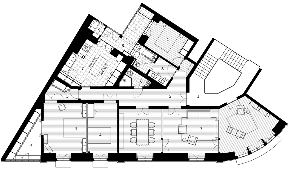
Aurora Arquitectos knocked through walls to create a large living room in this old Lisbon apartment, and inserted a wall with curving edges to form a pair of bedrooms (+ slideshow).
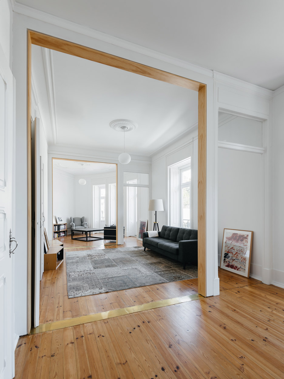
The Lisbon studio wanted to use noticeably different materials to highlight "ruptures" to the original design of the apartment, which is located near Lisbon's Estrela Basilica.
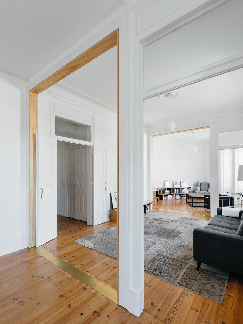
Wooden frames and slim brass flooring plates outline new openings in the living space. Similarly, a wall separating two bedrooms has curving edges to highlight it as a new addition.
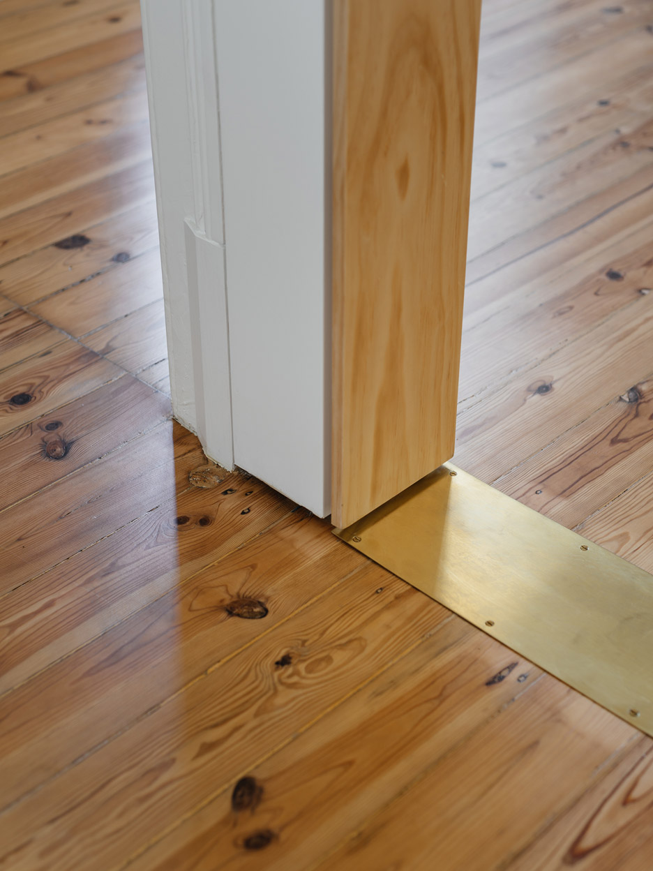
"The intervention done in the Apartment in Estrela reveals its own renovation logic, making the time-based and formal ruptures explicit," said the architects.
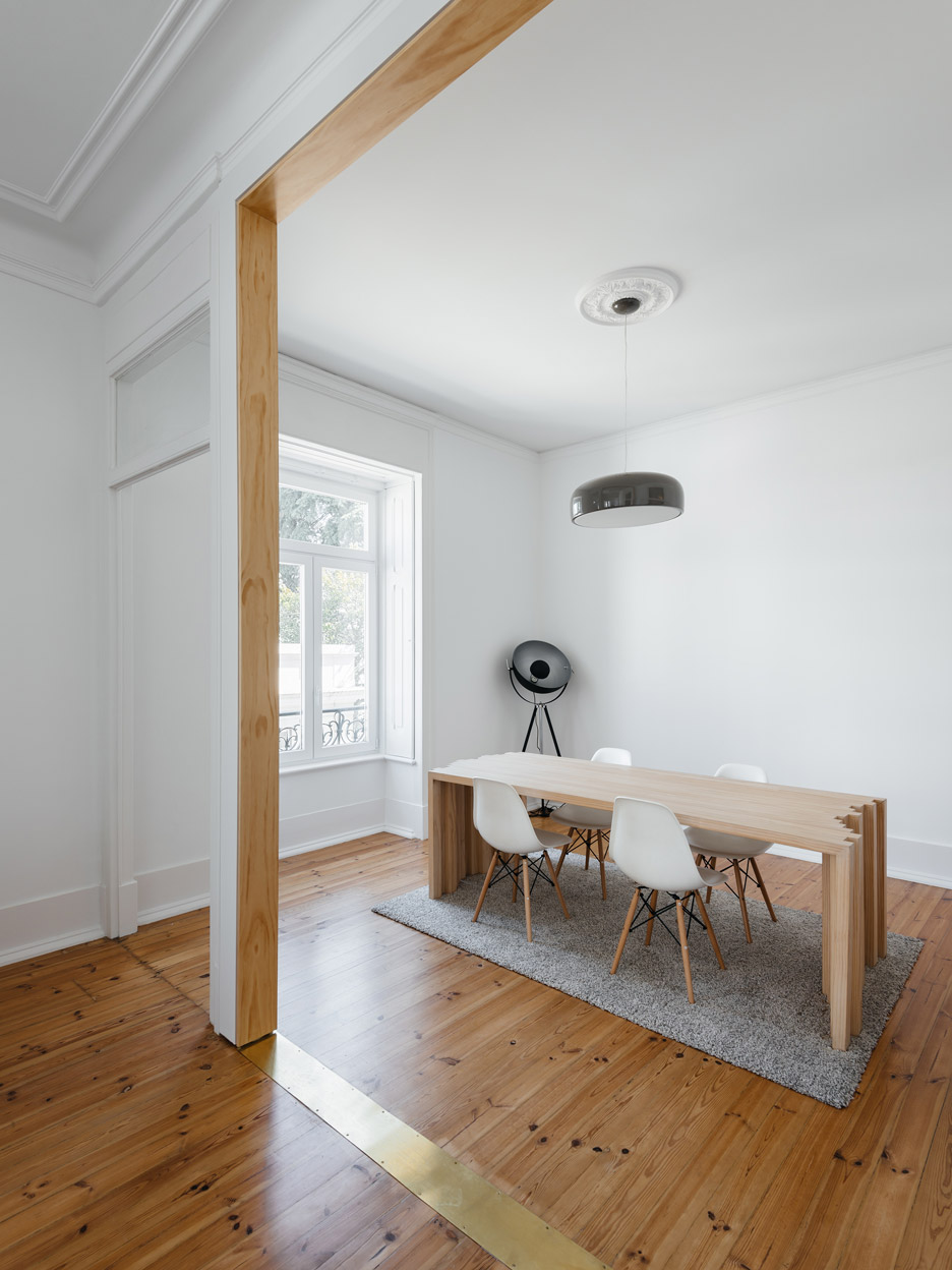
New storage spaces also feature curving edges to differentiate them from the linearity of the original space.
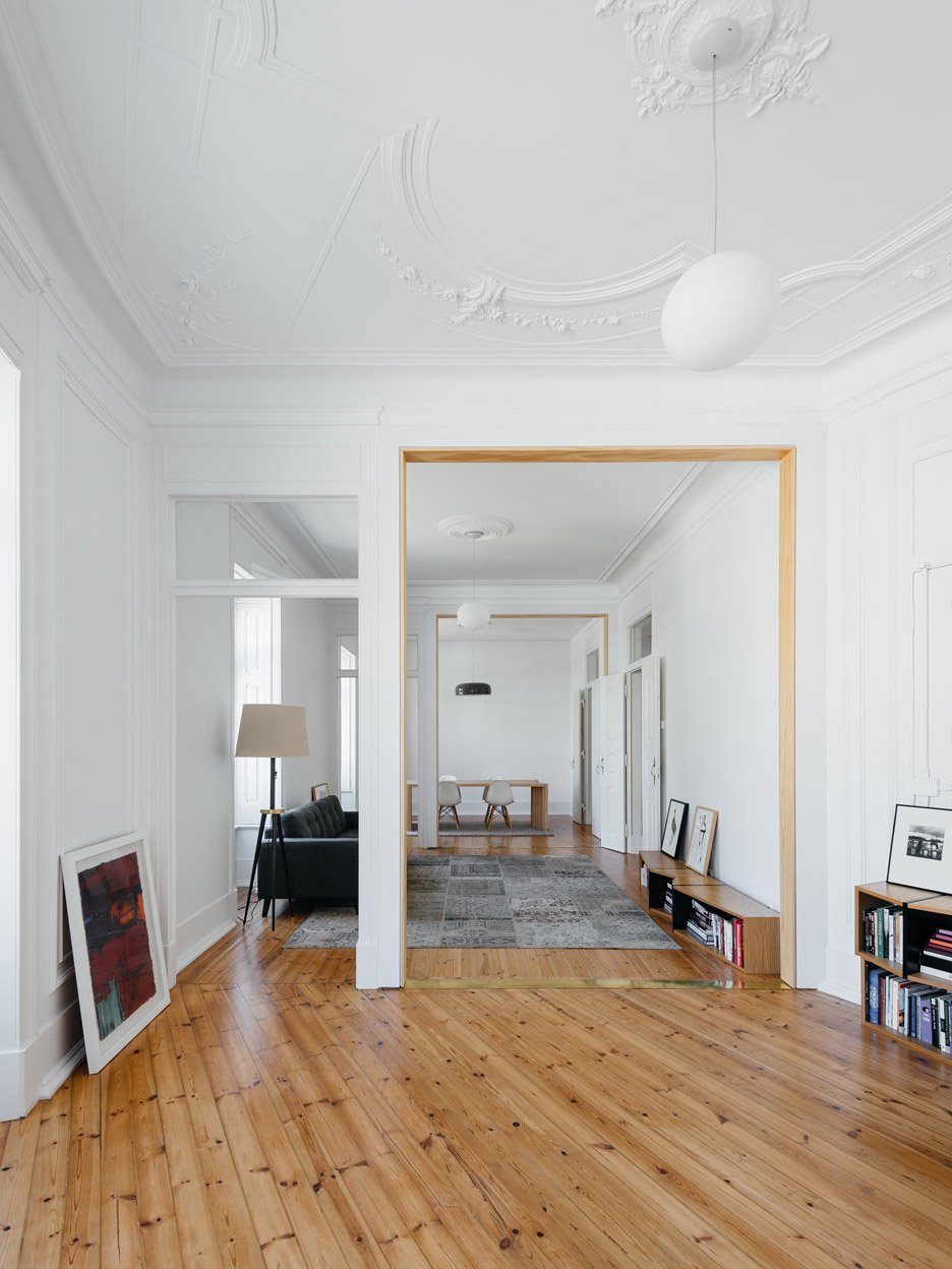
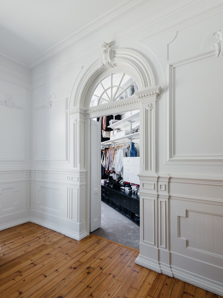
But Aurora Arquitectos also retained many of the original features, including wooden floors that run throughout, kitchen tiles, door trims, and wall and ceiling mouldings.
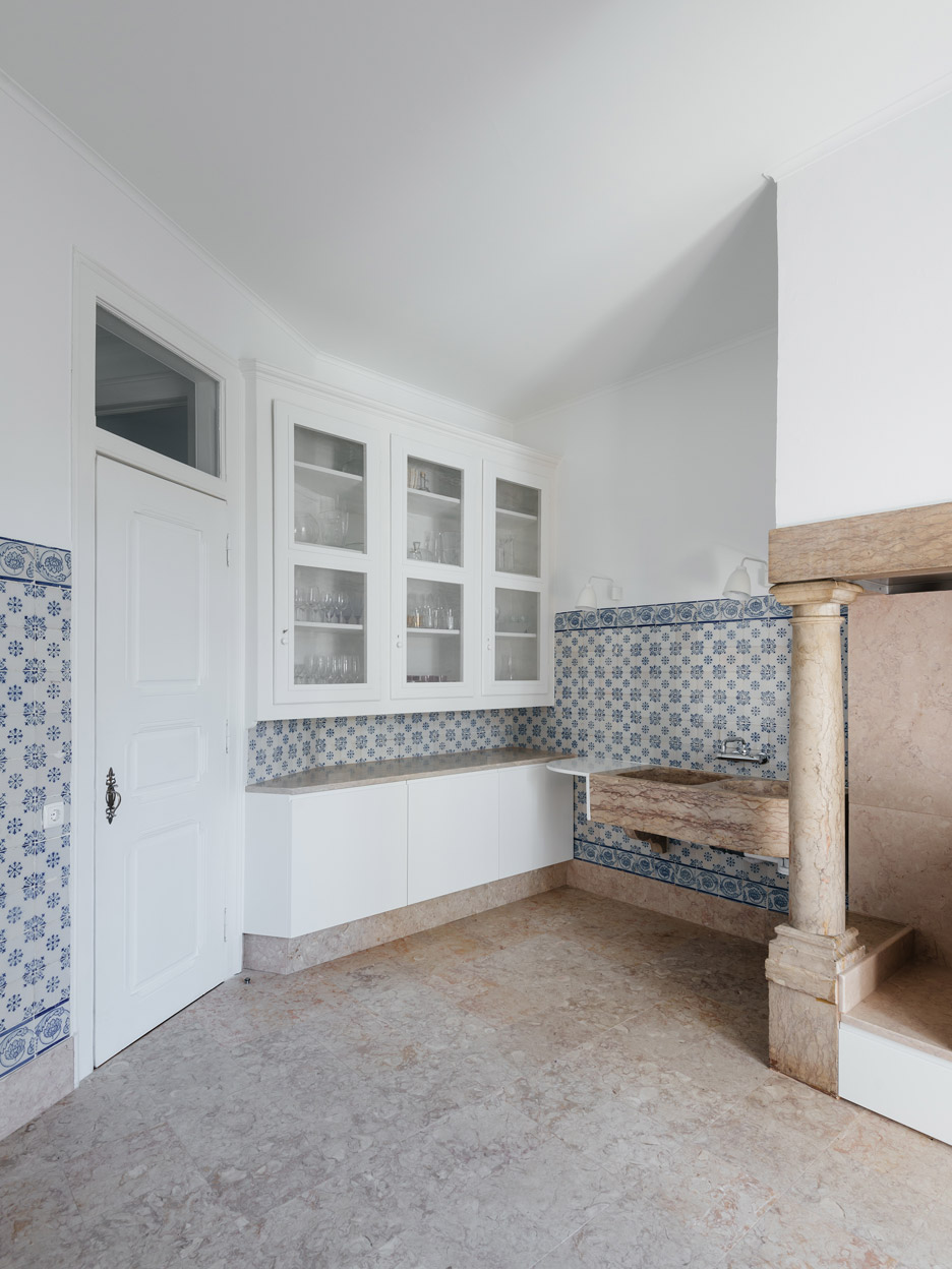
The southern side of the apartment – comprising the kitchen, utility spaces and a third bedroom – remains largely untouched, but features a few new furniture elements.
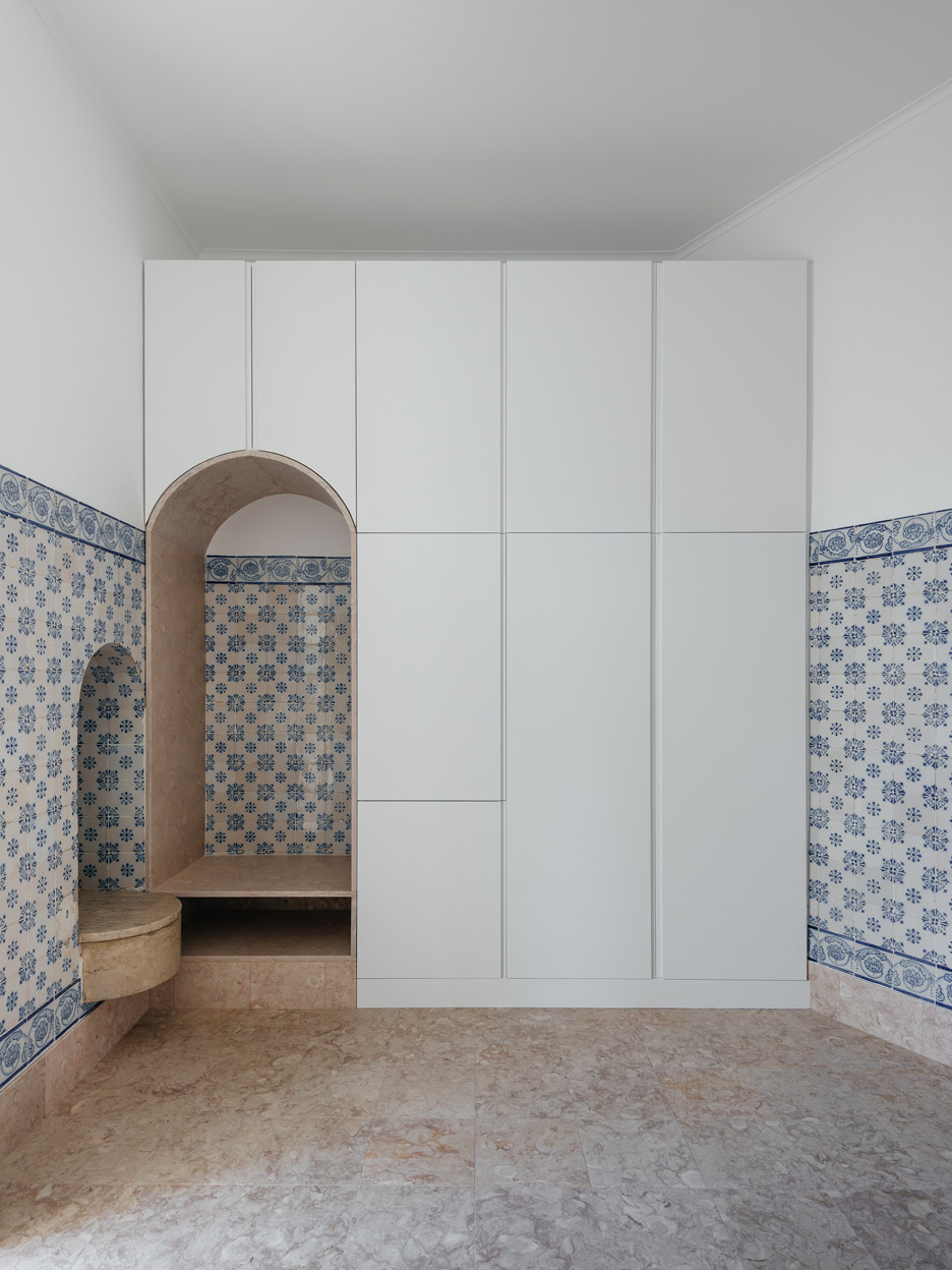
New cabinets are fitted around a pink marble arch in the kitchen, which also features blue and white tiled walls. This space opens out to a terrace.
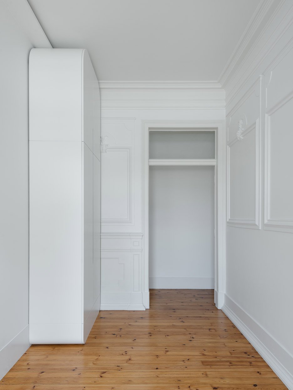
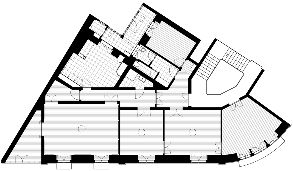
The bulk of the alternations are confined to the rooms on the northern side of the property.
Here, walls were removed between three bedrooms to create a single living space, and a former lounge and study was converted into a pair of bedrooms with a walk-in wardrobe.
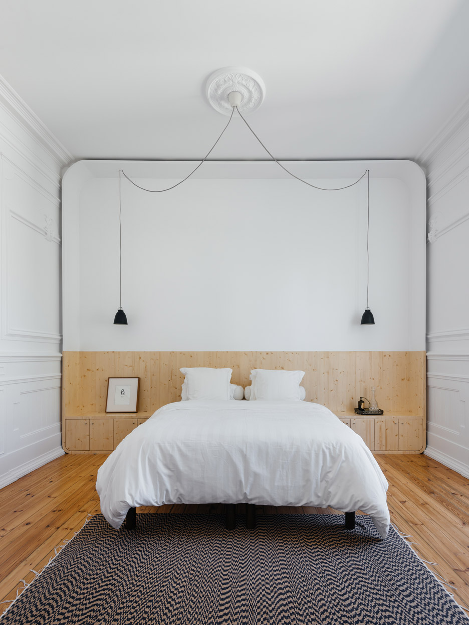
Tiny gaps are left around the edges of the new wall separating the bedrooms, allowing original decorative panelling to continue seamlessly between the rooms.
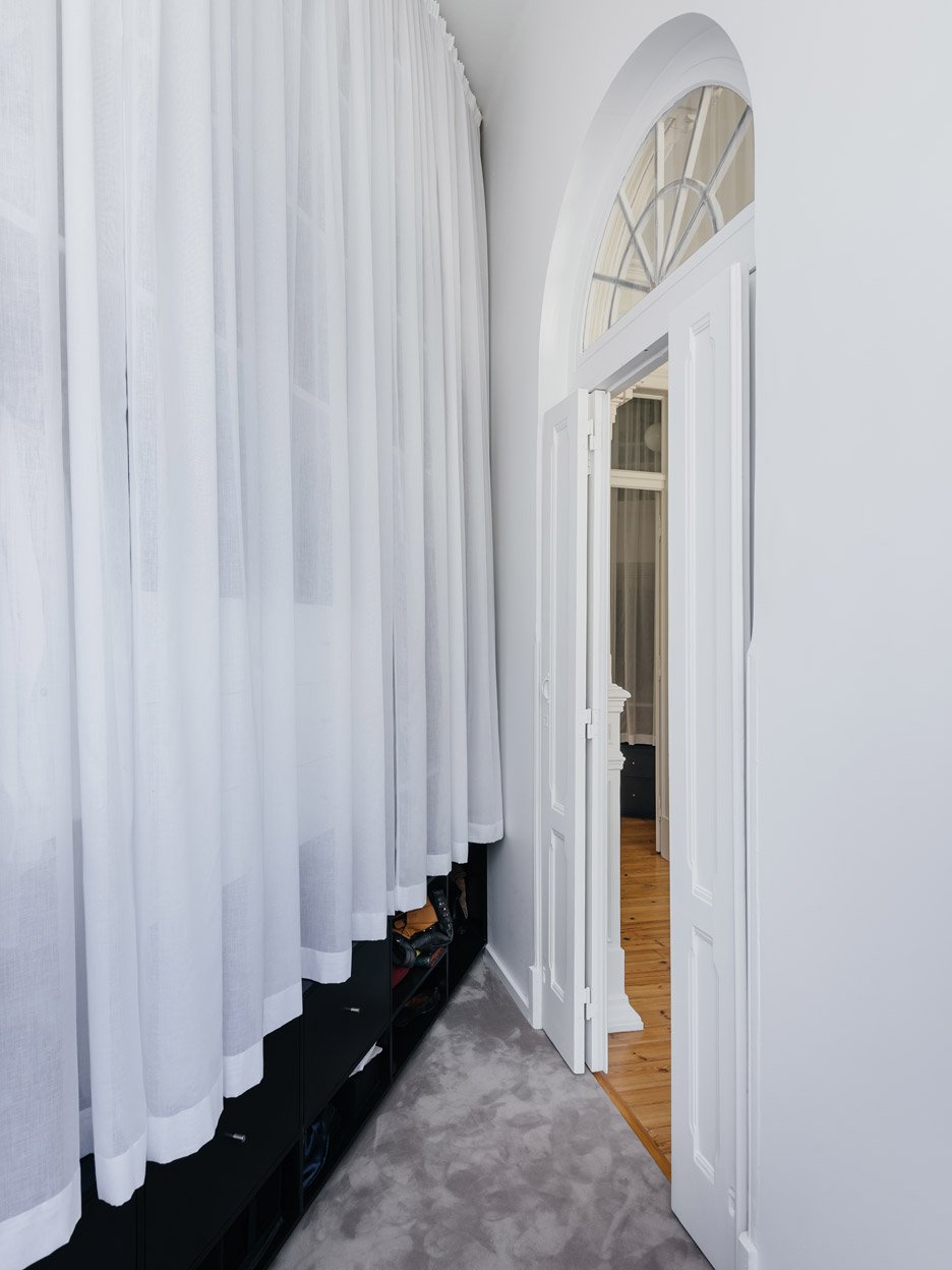
A white curtain drapes the storage unit that runs along one wall of the walk-in wardrobe adjoining the end bedroom.
Street-facing windows and glazing above the arched entrance bring light into the small triangular room.
"What could be easily understood as an act of uniting and separating becomes one of the project's main themes – reversibility," said the team, explaining that they wanted to ensure the works could be reversed at a later date.
"The space issue becomes a time-related concern. Now we have come to accept that renovation is part of an ongoing process of change and constant revising of its own validity."
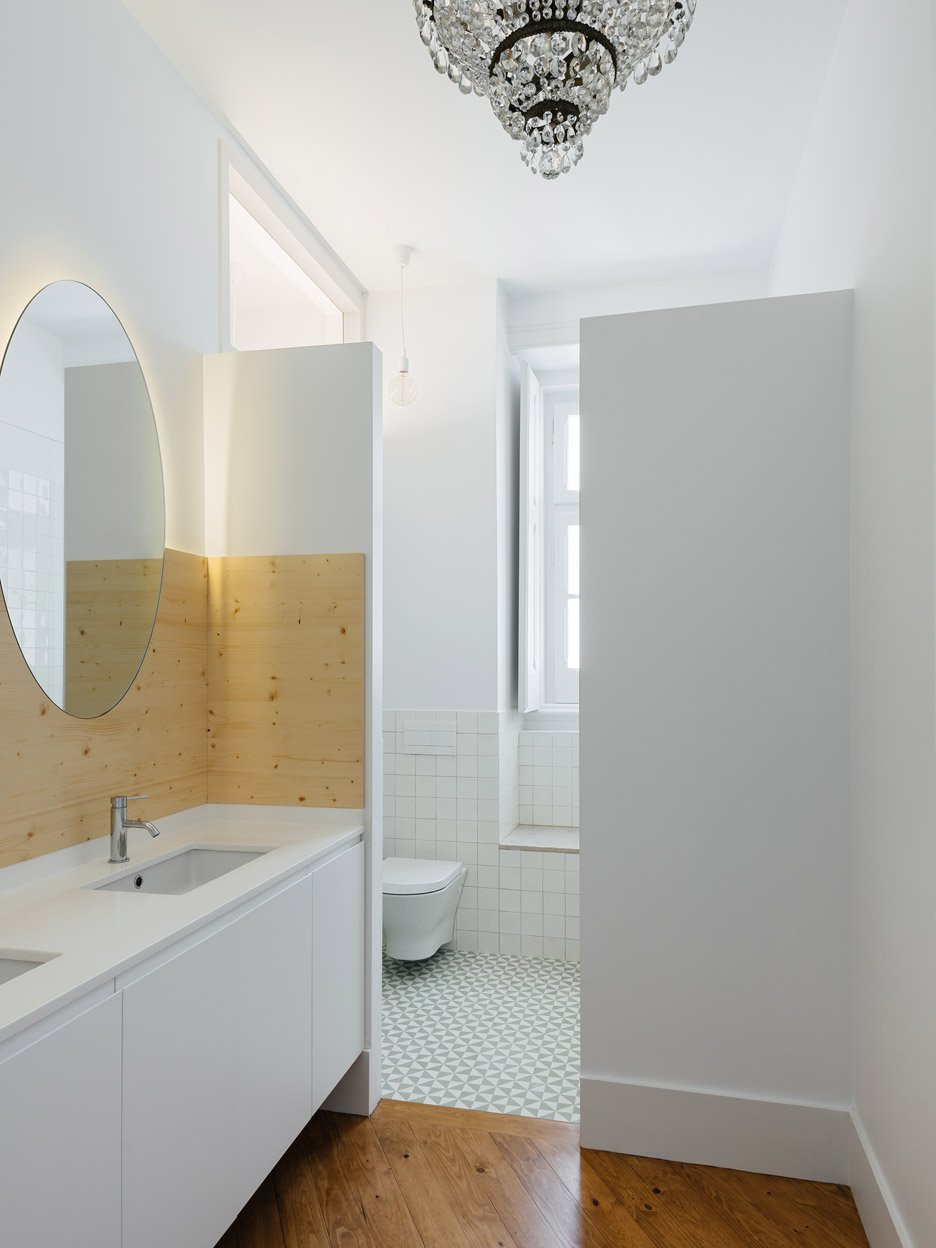
"It is, then, from the constant dialogue between the previous elements and the new ones, that the creation of unexpected possibilities emerges," they added.
"A kind of palimpsest as a way of rethinking and challenging the pre-established functions and relationships, from dwellers to architecture itself."
Photography is by Do Mal o Menos.
