Restaurant chain TGI Fridays has ditched its dark wood and red-striped interiors in favour of a muted Scandinavian-style aesthetic at a branch in Corpus Christi, Texas, following similar revamps by McDonalds and Burger King (+ slideshow).
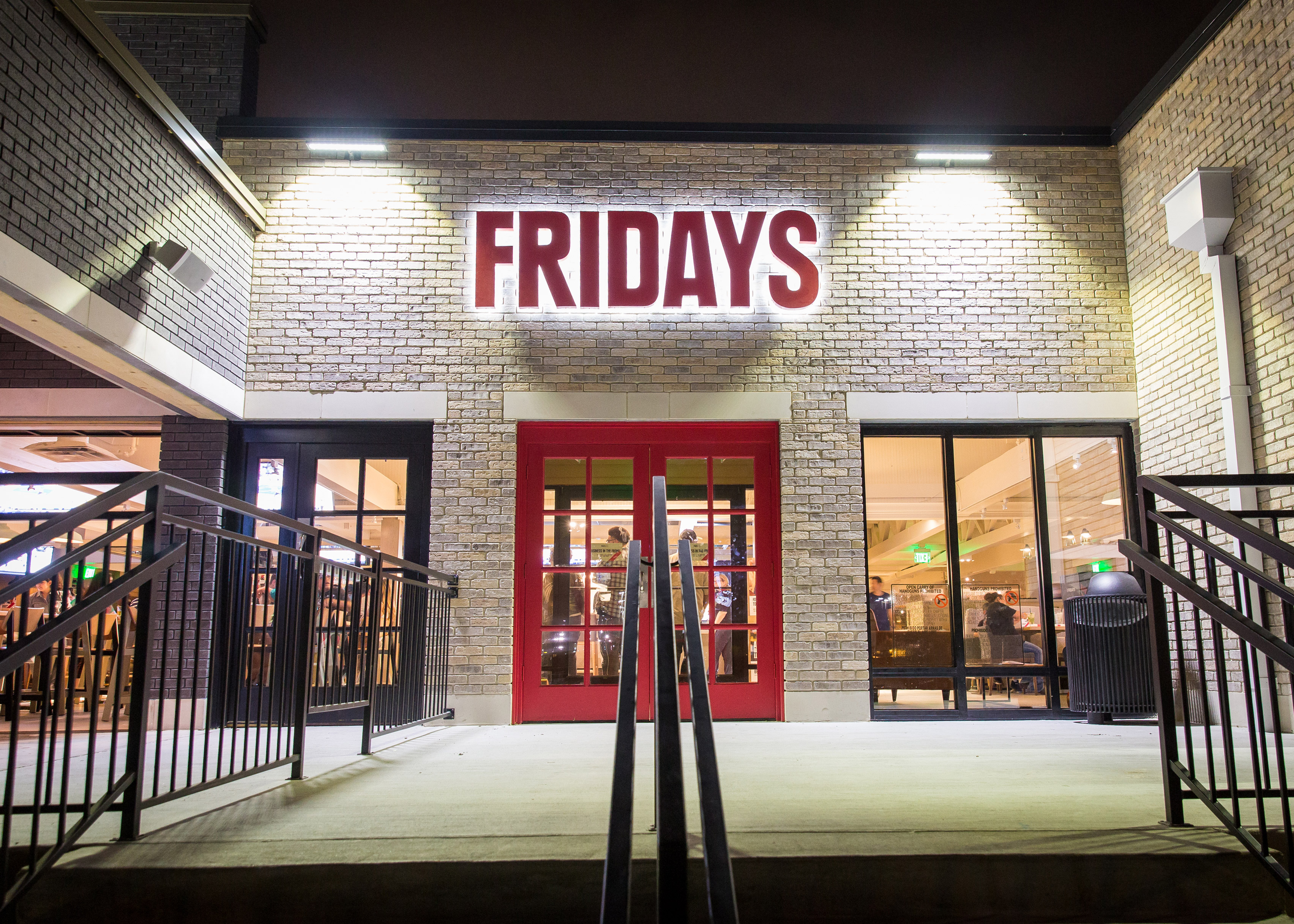
The American company's in-house team "completely re-imaged" its standard interior and exterior formats for the outpost, which opened earlier this year.
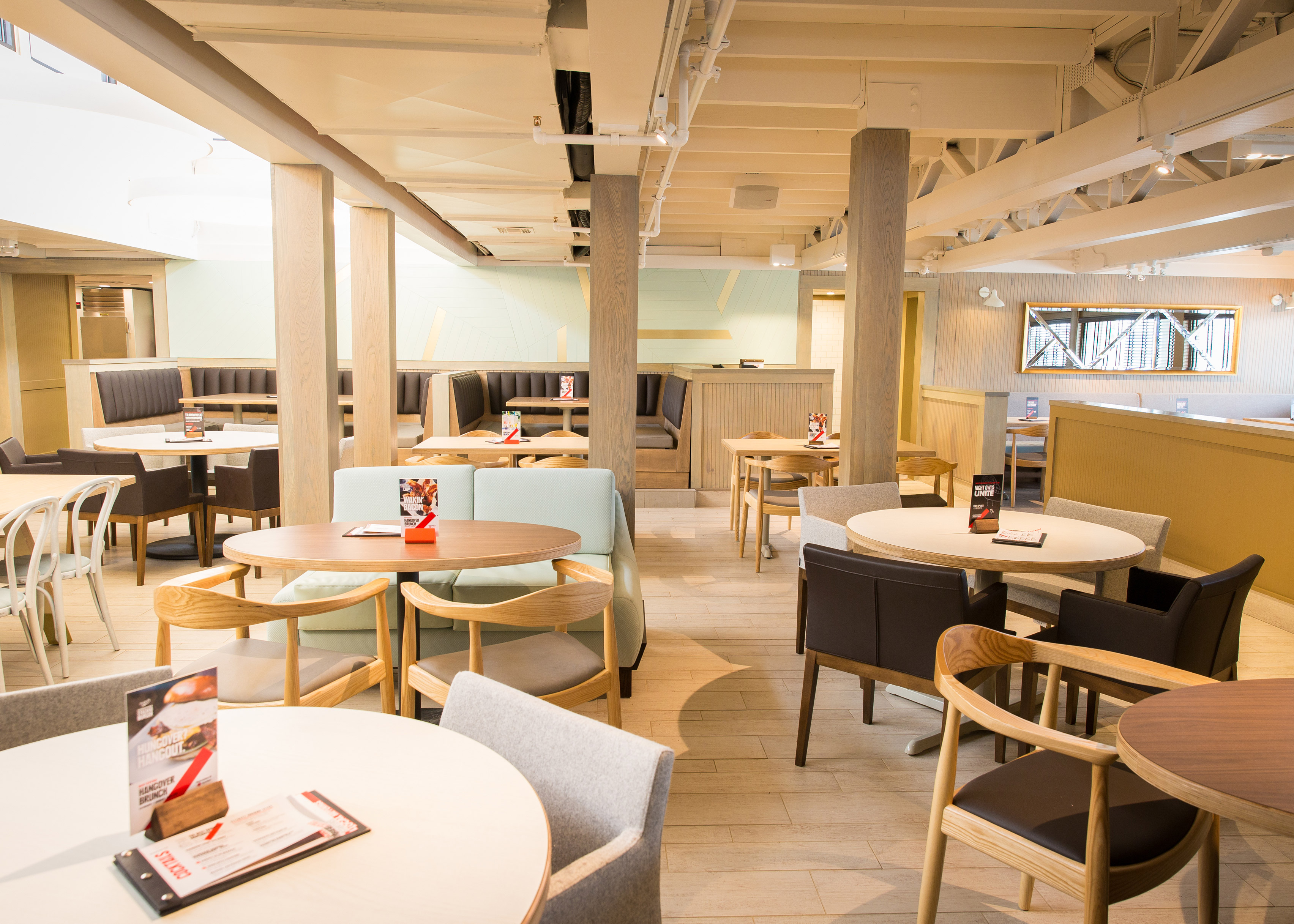
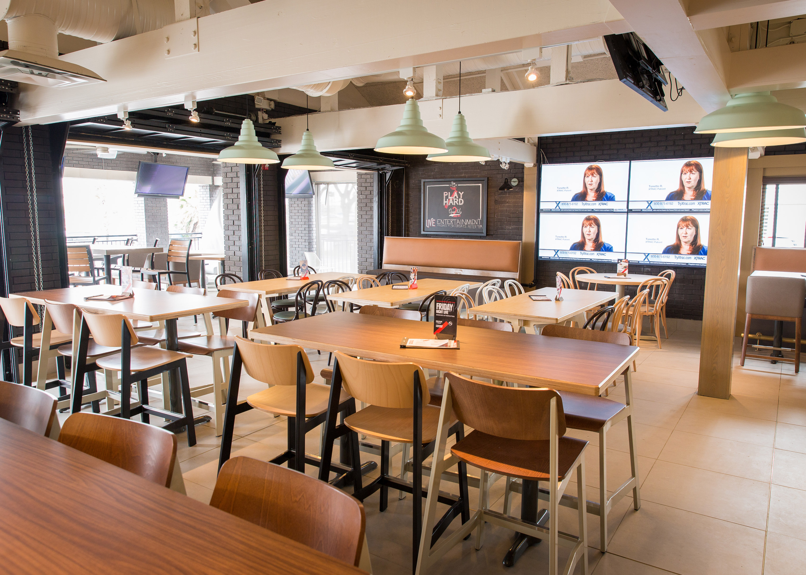
Instead of the dark diner-like interiors filled with booth seating, light-coloured wooden furniture and flooring create an atmosphere more typically associated with Scandinavian design.
Red upholstery and stripy tablecloths are replaced with grey, brown and pale green fabrics.
The move follows a series of similar decision made by chain restaurants to pare-back their interiors.
Last year, McDonalds piloted a design with concrete tables and atmospheric lighting as an alternative to its standard bright and colourful fast-food restaurants.
A similar aesthetic was then applied its branch on the Champs-Elysées in Paris. In 2012, Burger King opened a more rustic restaurant in Singapore.
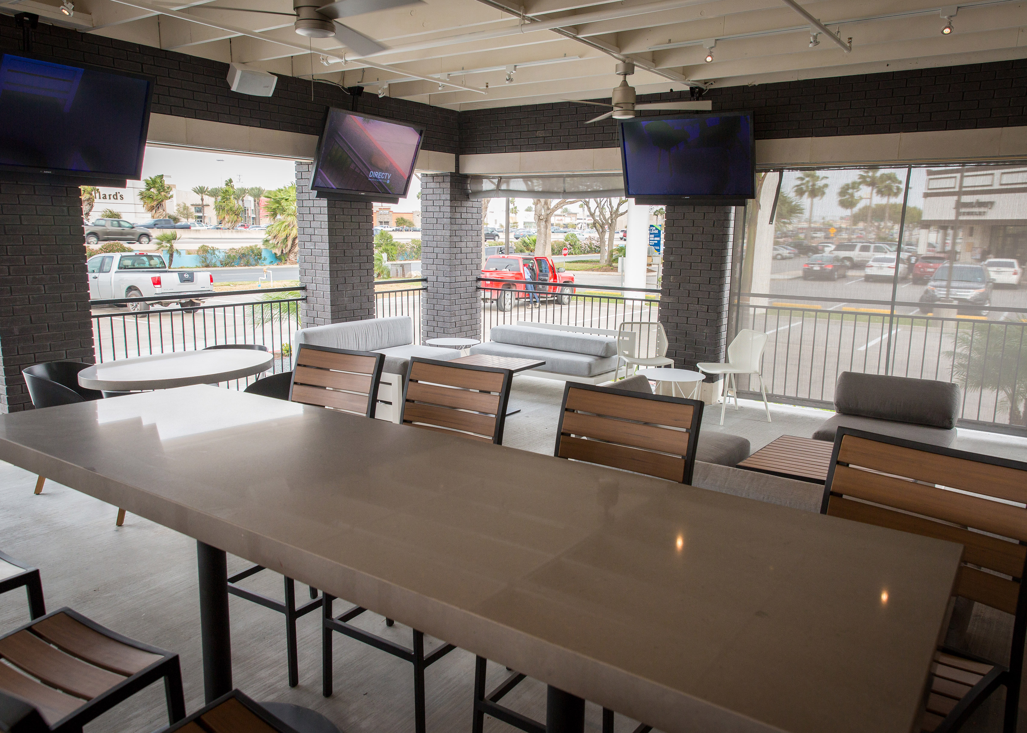
TGI Fridays has created a larger footprint for this restaurant compared to its others, providing space for multiple bars and a casual hangout area more akin to a coffee shop.
Also part of the overhaul, the branch has extended opening hours to encompass late-night events and a "hangover brunch" on the weekend.
The branding for the restaurant is also more minimal, again in line with McDonald's simplified packaging launched in January 2016.
TGI Fridays will now roll out similar design principles to its other restaurants around the world.
"It isn't a one-size-fits-all approach," said a spokesperson for the company. "Fridays is taking the learnings gained from the Corpus Christi location and applying them to the subsequent restaurant re-imaging."
It will begin in the US, with the next opening in Forest Hills, New York, later this month.


