"Scrapping the Garden Bridge wouldn't indicate that the UK has lost confidence"
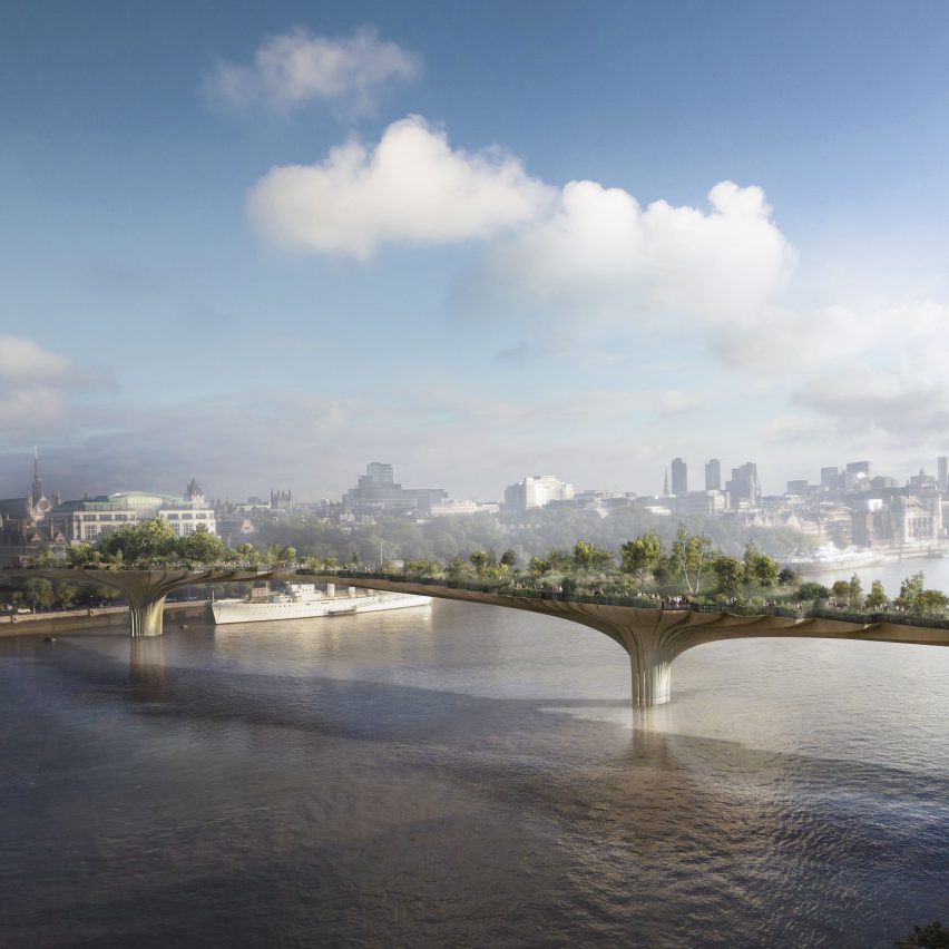
Comments update: readers are discussing Thomas Heatherwick's controversial Garden Bridge this week after the British designer suggested that ditching the project so soon after Britain's vote to leave the European Union would be a step "backwards" for the country.
Bridge over troubled waters: Heatherwick appeared on national television to defend his Garden Bridge design after a BBC report found that the project was missing £22 million in funding. Most commenters were not convinced by his arguments.
"Scrapping the Garden Bridge wouldn't indicate that the UK has lost confidence in itself," wrote Yola Dragon. "It would indicate that the UK has lost confidence in Thomas Heatherwick and his clunky design for an overpriced bridge."
"There is no public demand for this vanity project," added a commenter calling themselves Optimist. "There is no requirement for a pedestrian crossing of the Thames at this location."
Others were outraged at the suggestion that the project could be scrapped and agreed with Heatherwick that it would send out the wrong message.
"I'm ashamed of London's lack of belief in this project," hit back one guest commenter. "Where has our can-do attitude gone?"
Should the Garden Bridge project be scrapped? Tell us what you think in the comments section »

Changing attitudes: Pritzker Prize-winning Australian architect Glenn Murcutt caused a stir after releasing images of his first mosque in Melbourne, which readers praised for being contemporary and modern.
"If there is one thing that this project symbolises," wrote Dean, "it's that architecture can play a fundamental role in changing attitudes towards Islam."
"No minaret? Wow that is bold!" exclaimed regular contributor Kay. "In Islamic culture minarets play a major role. It is really interesting seeing a mosque that veers away from that."
However, some readers weren't so keen on the mosque and felt its roof – which comprises rows of lantern-like skylights – looked "too crowded" and could even act to block out the sun. Read the comments on this story »

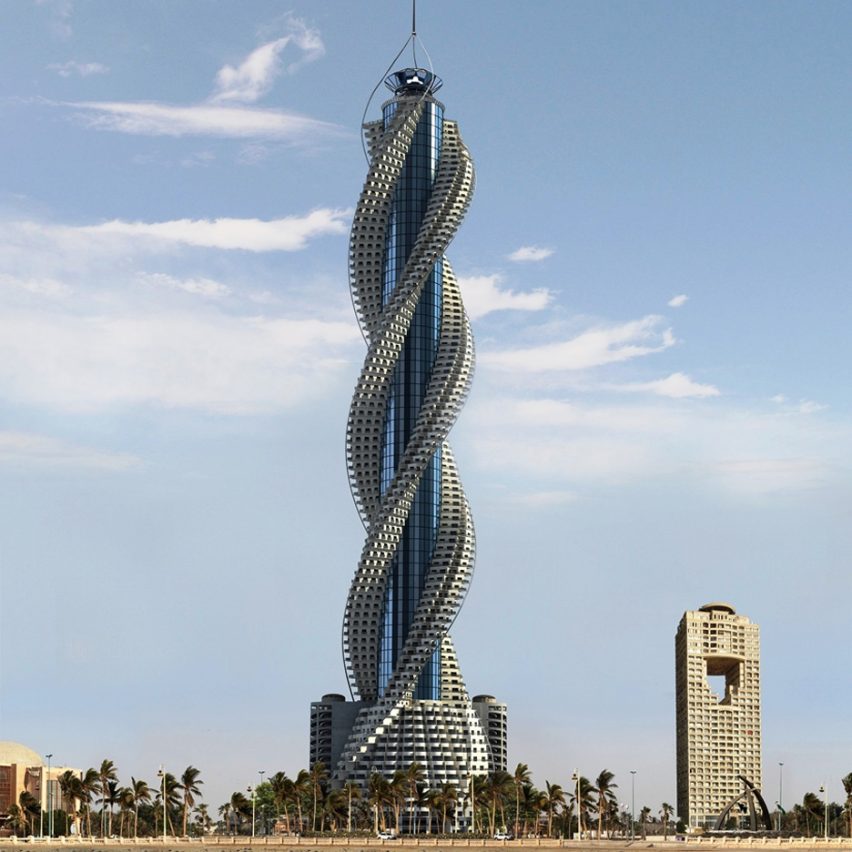
Round the twist: spiralling skyscrapers are more popular than ever according to a new industry study, but many commenters think the distorted designs are resulting in unsightly skylines.
"Why are there so many of them," asked Mies. "Don't these architects see that they are just dumb and boring? In the future they will look back to this era and laugh about it."
"It might be the tallest, but it is without a doubt the second ugliest thing on this earth," said in Chris MacDonald referencing Gensler's 632-metre-high spiralling Shanghai Tower. "Just goes to show money can't buy taste."
"I actually think variety in the skyline is necessary to make urban environments interesting to live in," countered James. "As technology advances, architecture and design should continue to push the boundaries." Read the comments on this story »

Flash mob: New York design studio Sagmeister & Walsh created a campaign for fashion brand Milly's comprising flashing models. Some commenters attacked the imagery for sexualising women needlessly, but others described it as tasteful.
"Get rid of the nude, tasteless images degrading women Dezeen," wrote Wolfgang.
"I'm not so sure it is degrading as you describe," replied Luke Matthews. "It's an interesting, vibrant campaign that sits just the right side of tasteful. It's also kind of funny."
"Great campaign but perhaps it could have done with some men in there too to keep everyone happy," concluded a guest commenter. Read the comments on this story »