From artisanal boutique to superstores, the trend for minimalist packaging design continues to pick up pace. We've rounded up 12 examples, including name-brand ketchup without the name, a CD packaged in bubble wrap, and a stylish kit for surviving the apocalypse (+ slideshow).
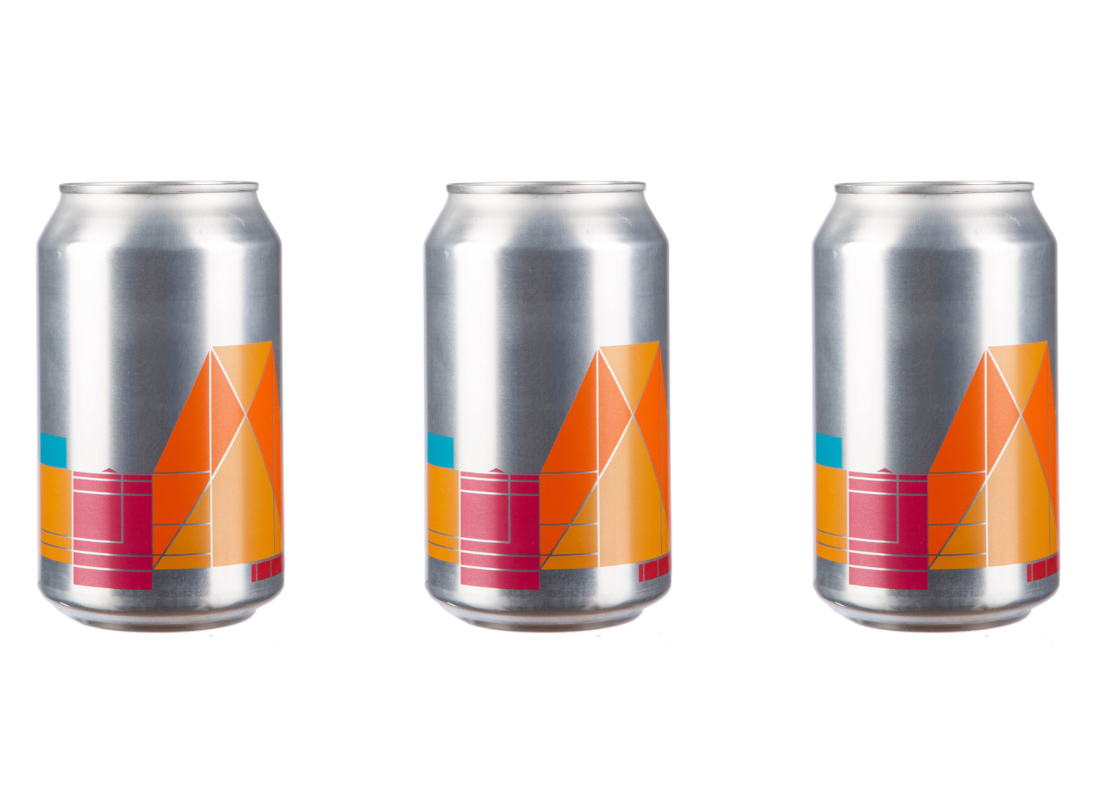
Tate Modern pale ale by Peter Saville and Tate Design Studio
British design legend Peter Saville adapted his graphic identity for the Tate Modern into a new Switch House beer can.
The can has no words, and instead relies on Saville's distinctive imagery to communicate what the product is. Read more about Tate Modern pale ale »
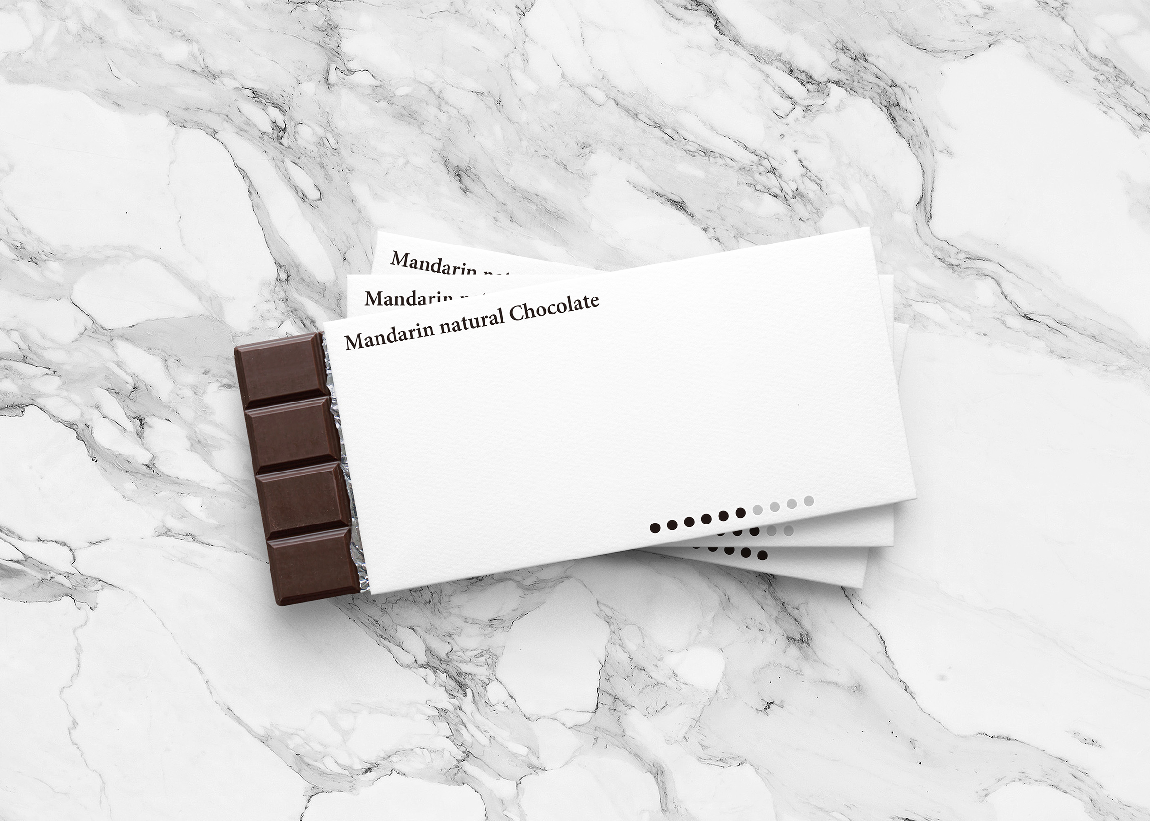
Mandarin Natural Chocolate bars by Yuta Takahashi
Yuta Takahashi's packaging design for Mandarin Natural Chocolate takes minimalism to the extreme.
It features an almost entirely white wrapper, with lettering in a simple black serif font and a line of 10 dots to subtly indicate the chocolate's intensity. Read more about Mandarin Natural Chocolate bars »
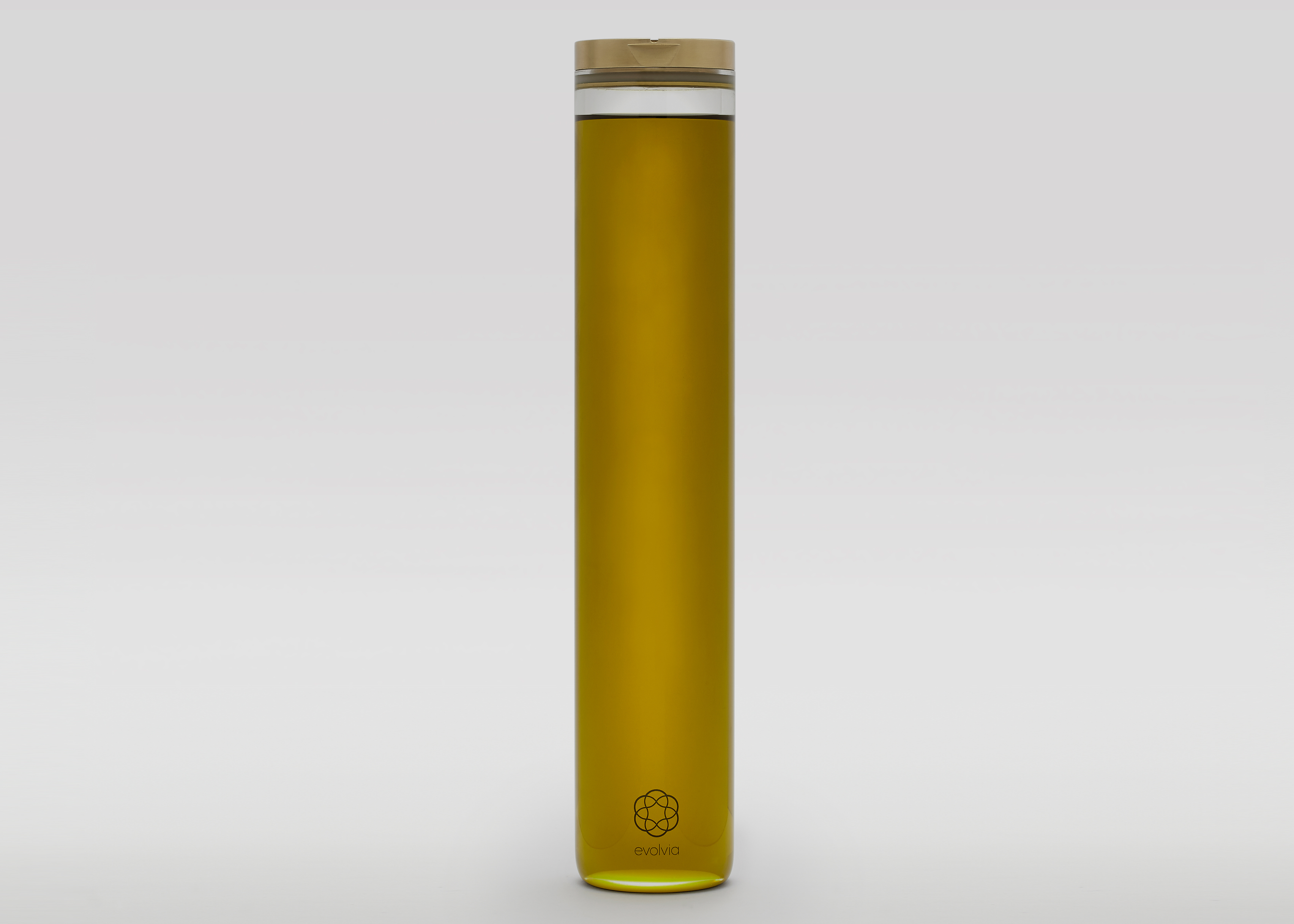
Evolvia By Evolve organic extra virgin olive oil bottle by Alex Theodorou
By Evolve's Alex Theodorou designed the company's organic extra virgin olive oil bottle to be elegantly minimal for one key reason – so it would last.
His hope was that consumers would reuse the glass bottle as a pourer even after the initial supply of oil was gone. Read more about Evolvia By Evolve organic extra virgin olive oil bottle »
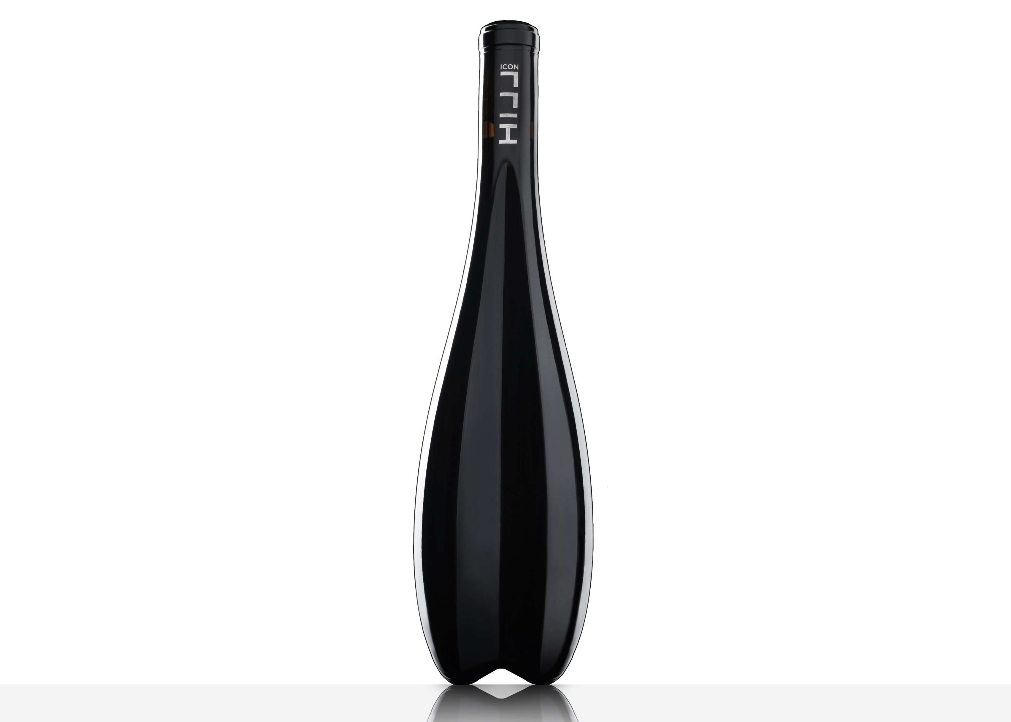
Leo Hillinger wine bottle by Zaha Hadid
Zaha Hadid's bottle for Austrian winemaker Leo Hillinger has a concave indentation that matches the curve on the back of the bottle, so a row of them can interlock.
With no traditional label, the bottle's minimal branding is limited to fine lettering on the neck of the bottle. Read more about the Leo Hillinger wine bottle »
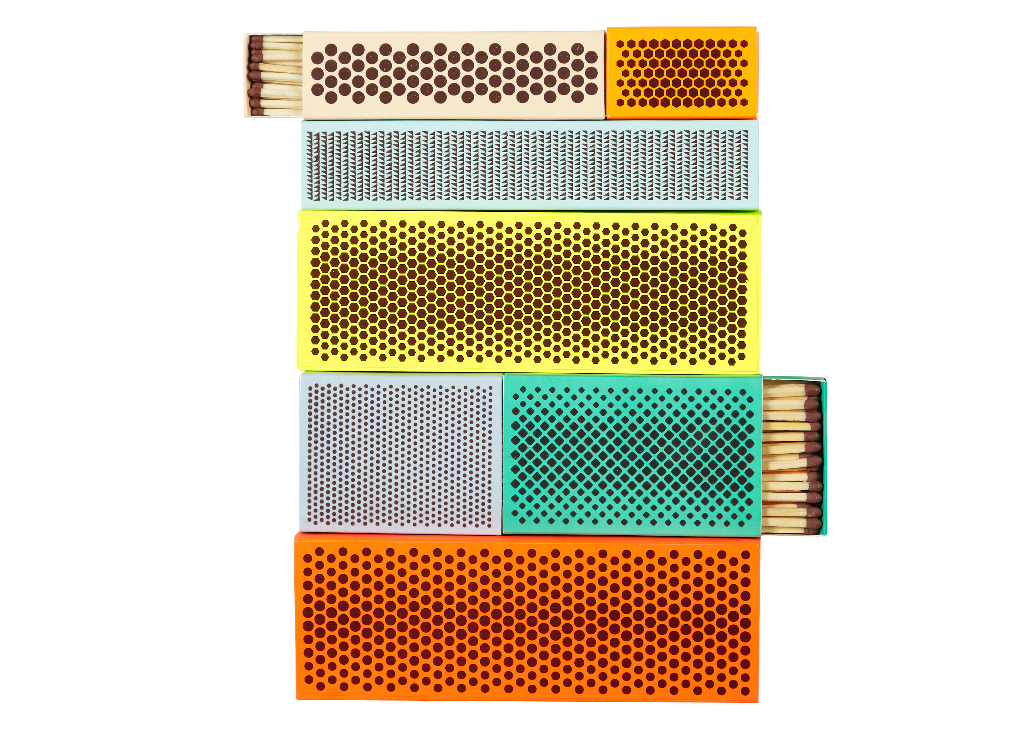
Strike Matchboxes by Shane Schneck and Clara von Zweigbergk for Hay
American product designer Shane Schneck and Swedish graphic designer Clara von Zweigbergk disposed of the usual branding on matchboxes to create their packaging for Hay.
Instead, the Strike Matchboxes give prime position to the striking surface, which is normally squeezed onto one side of the box. Read more about Strike Matchboxes »
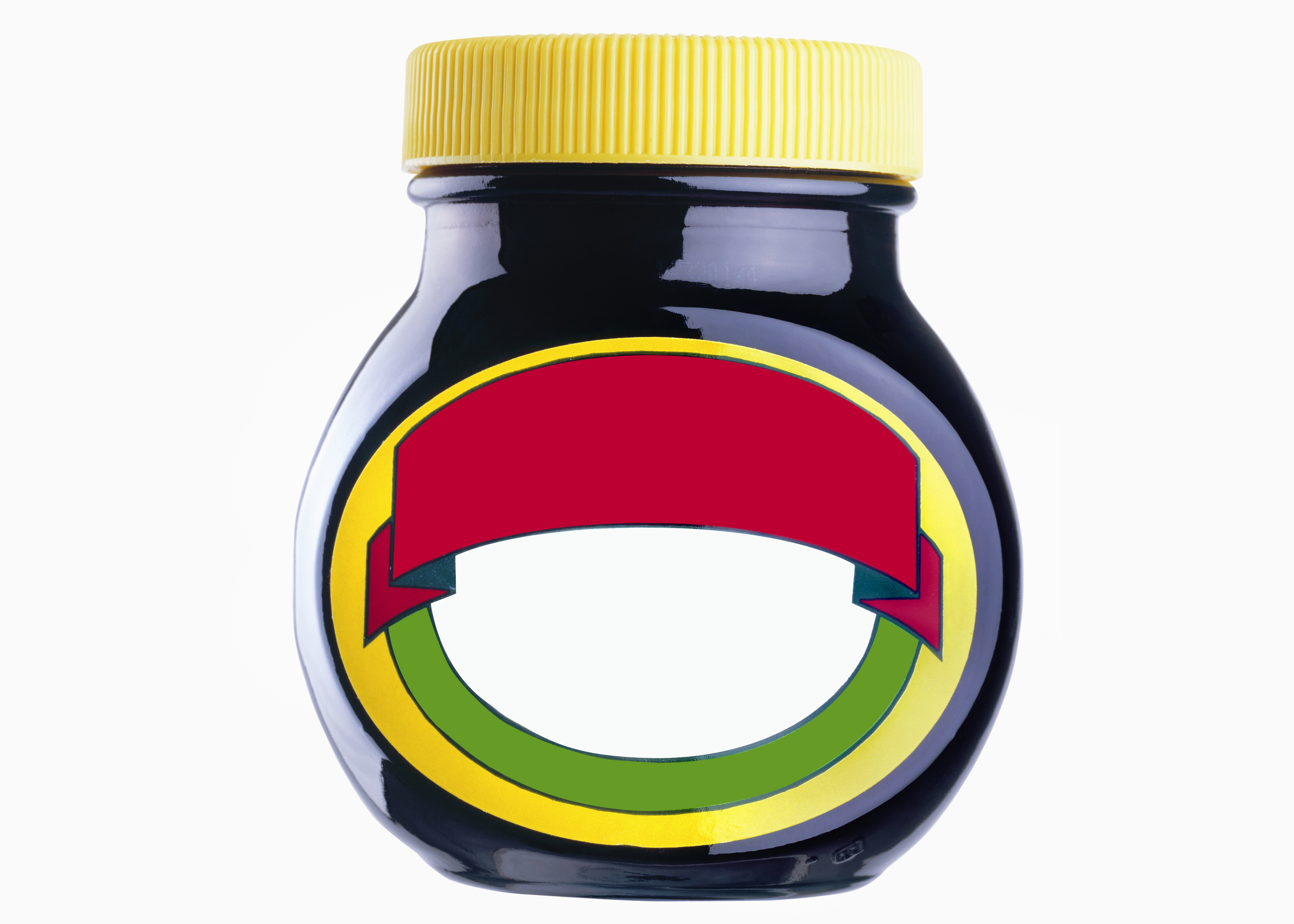
No Noise de-branded design for Selfridges
Famous brands including Heinz, Marmite and Levi's produced limited editions of their products with no brand names on the packaging for London department store Selfridges.
The range of pared-down packaging was created for a concession called The Quiet Shop. Read more about No Noise »
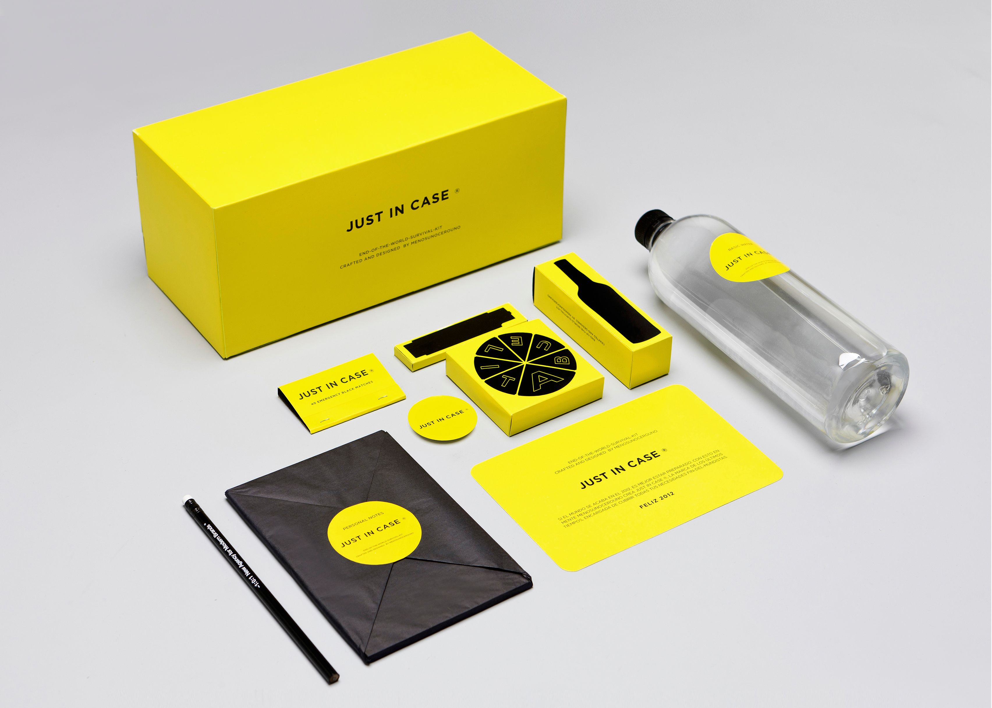
Just in Case by Menosunocerouno
Mexican branding company Menosunocerouno faces the apocalypse in minimalist style with this survival kit.
Although it is packed full of items – including chocolate and hard liqueur – the design of the kit is simple and consistent, with everything wrapped in yellow and black. Read more about Just in Case »
Minimalist Effect in the Maximalist Market by Antrepo
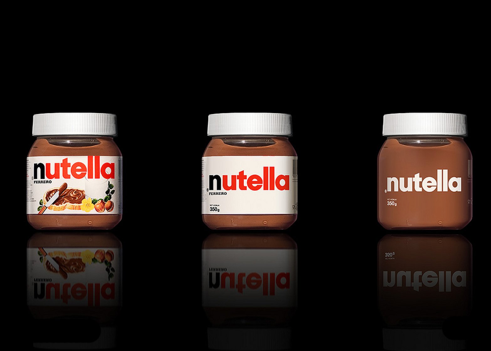
Back in 2010, before minimal design was as widespread, consultancy Antrepo inspired brands with its conceptual packaging for well-known supermarket products.
It stripped back the products' existing graphics in stages, showing they could still be identified with simplified branding. Read more about Minimalist Effect in the Maximalist Market »
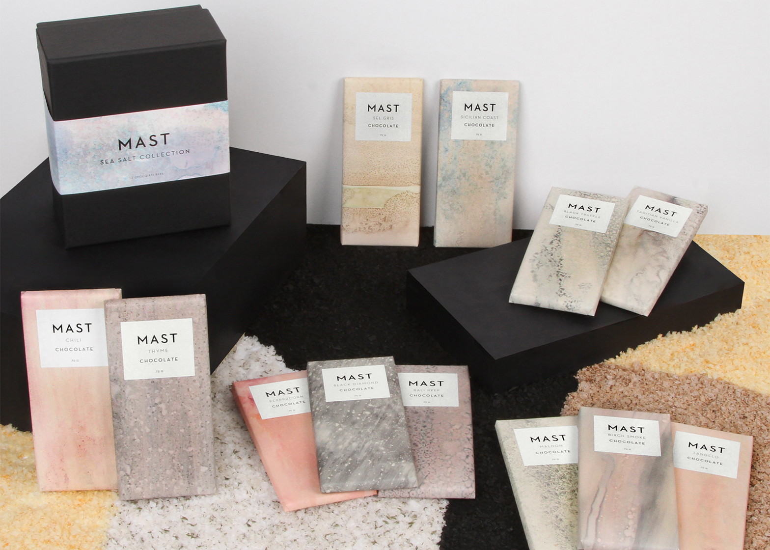
Mast Brothers chocolate bars by Calico Wallpaper
A simple marble effect gives these otherwise minimal chocolate bars a feeling of restrained luxury.
Calico Wallpaper used the salts featured in Mast Brothers' confectionary as materials to create the marbled packaging. Read more about Mast Brothers chocolate bars »
Spectrum CD packaging by Spread
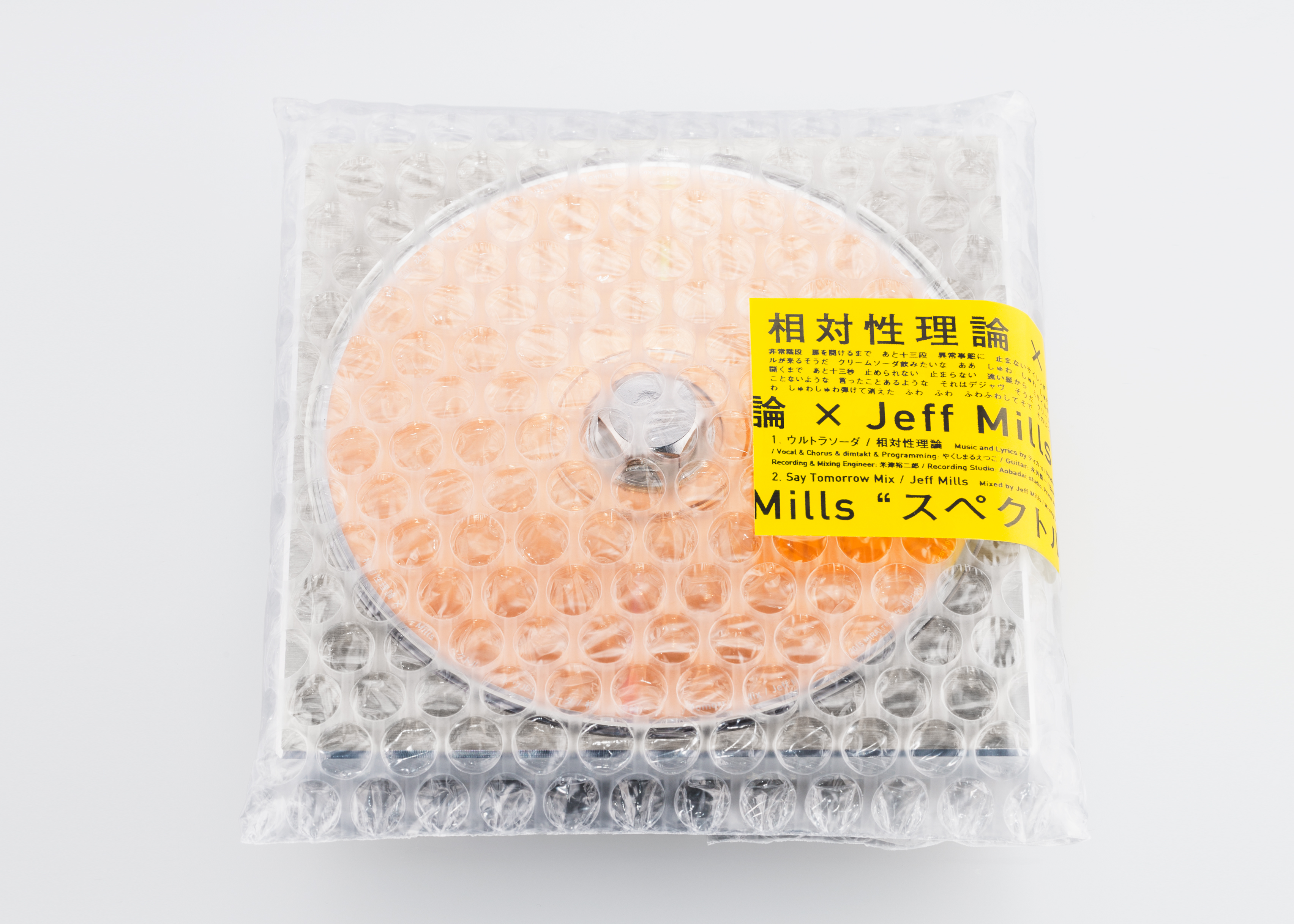
Tokyo design studio Spread used industrial materials to create this minimal CD packaging design for Japanese band Soutaiseiriron and American producer Jeff Mills' track Spectrum.
The light weight and lack of a CD jacket were intended "to convey deep consideration for the musicians' work and the presence of the object itself." Read more about Spectrum CD packaging »
SOTO bottle by Joe Doucet
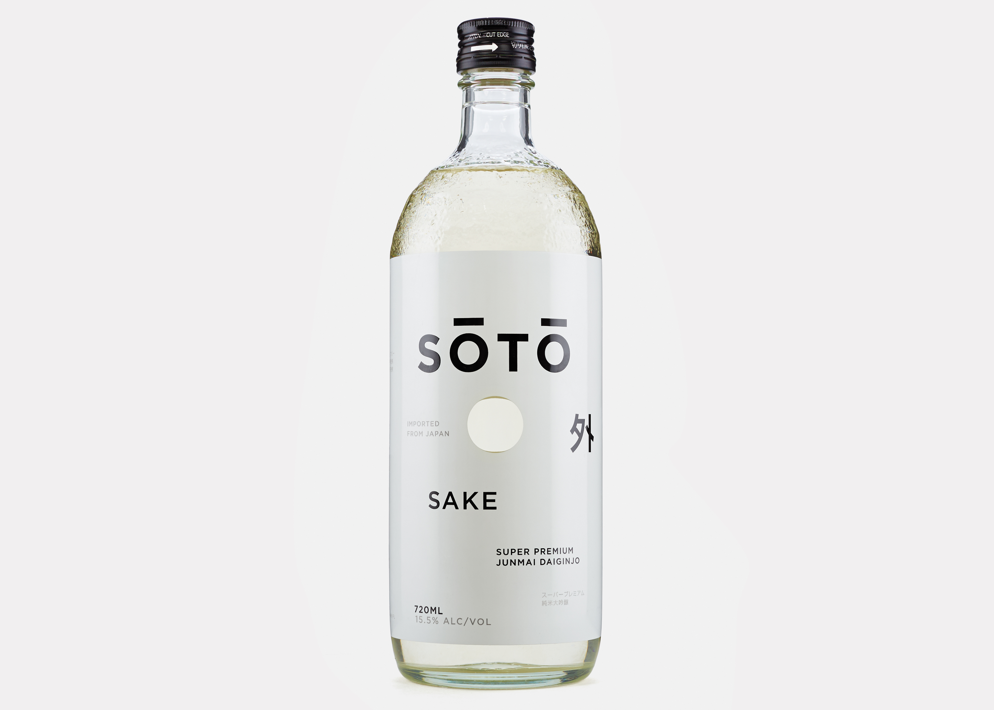
For sake brand SŌTŌ, Joe Doucet blended the visual language of luxury spirits with elements that would evoke SOTO's artisanal Japanese origins. This resulted in a minimal, white label.
However, the New York designer used dimpled glass on the bottle and black denim on the topper to add texture. Read more about the SOTO bottle »
TCM+ skincare by Nendo
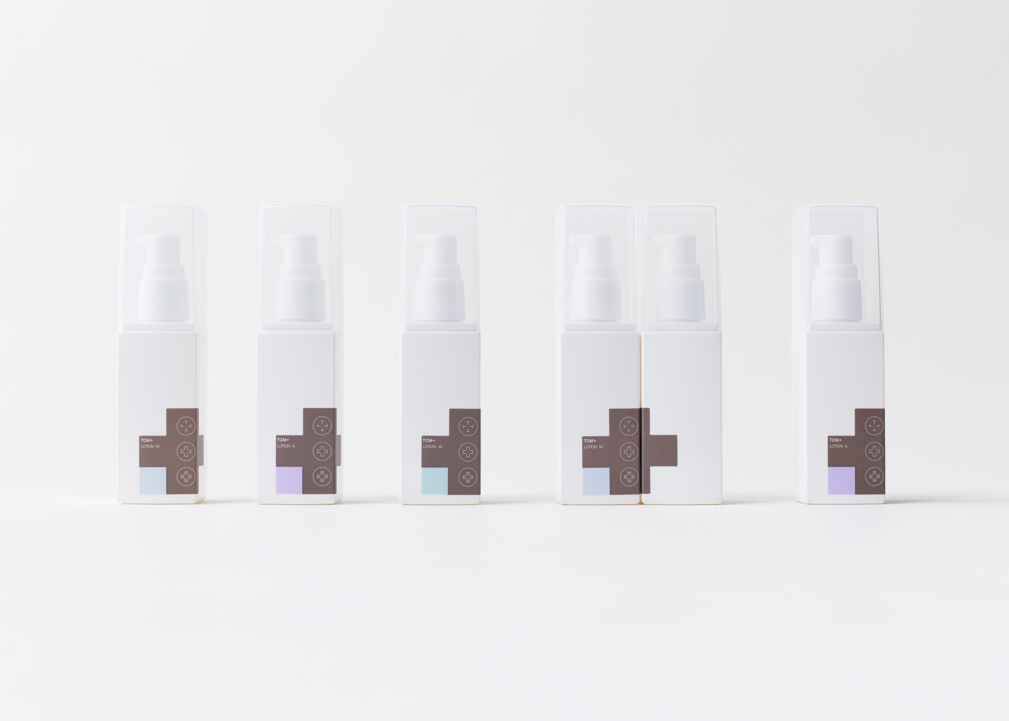
One advantage of minimal branding is that it can easily be gender neutral, an aesthetic for which there is growing consumer demand.
Japanese studio Nendo used grey and white for this line of TCM+ skincare products, which reference the practices of Chinese medicine. Read more about the SOTO bottle »

