"It looks like a mess from a distance until you see how perfectly it is executed"
Comments update: Diller Scofidio + Renfro's vertically designed medical building for Columbia University has divided opinion, with some readers labelling the structure a "mess".
Vertigo: the unusual vertical layout of Diller Scofidio + Renfro's recently completed medical building in New York has come under scrutiny after Dezeen published Iwan Baan's photographs of the structure.
"That building is nuts," said regular commenter Chris MacDonald. "It's not your 'classical' proportions or forms but still looks brilliant for it!"
"It looks like a mess from a distance until you see how perfectly it is executed," wrote a user called ABruce.
But some readers disagreed. "A building shouldn't look like a mess from any angle, and this unfortunately does," hit back a user calling themselves Gues.
"To me this building looks like it is 20 years too late for the whole 'OMA/Koolhaas continuous route, folding' thing, which was terribly hip in the latter half of the 1990s," wrote a user under the pseudonym of Ben Dover. Do you love or hate this building? Tell us in the comments section »

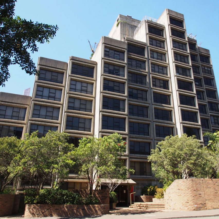
Sirius business: one of Sydney's only Brutalist buildings is at risk of demolition, following a decision by New South Wales officials not to heritage list the Sirius apartment building. Some readers jumped to its defence and shared a petition calling for the building to be saved.
"This is my favourite building in Sydney and a beautiful – and rare – example of Brutalism," wrote a reader using the name Sad. "In a young city like Sydney it's so important to preserve our history."
"This building is loathed and loved, I personally love it," wrote Chris.
But some readers believe the site needs redevelopment. "I won't belittle the history this building holds for the city," said Joel K. "However, I am very much against preservation if it inhibits progress."
"To have the freedom to change a part of the city without constraints, that's an advantage. Otherwise you restrict it forever," agreed Rafel. Read the comments on this story »

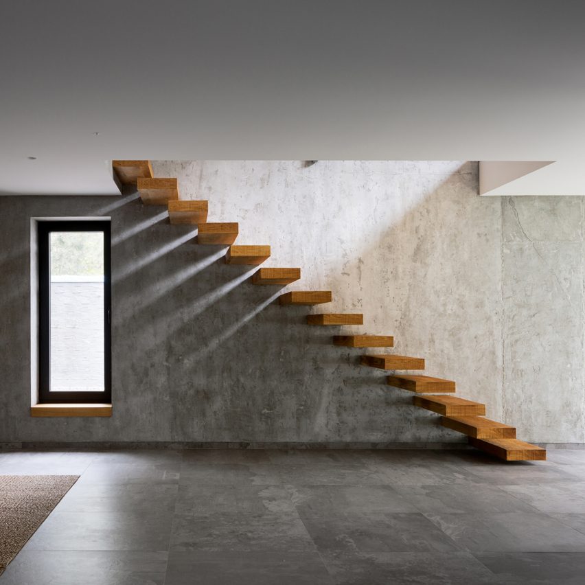
Tread carefully: this staircase formed of cantilevered wooden treads inside a Ukrainian house by Azovskiy & Pahomova Architects – which also features a hay-bale seating area – left readers concerned for the safety of the occupiers.
"Spot the building regulations violation," wrote Yogesh Mistry. "Very cool though! It would make a good starter lair for any aspiring super villain."
"That stair void looks designed to kill you – no barrier from the upper floor?" questioned guest user Domnhal.
"Absolutely gorgeous. Two notes; don't sleepwalk and take the rabbits out of the closet so that they can eat their hay," said EFS. Read the comments on this story »

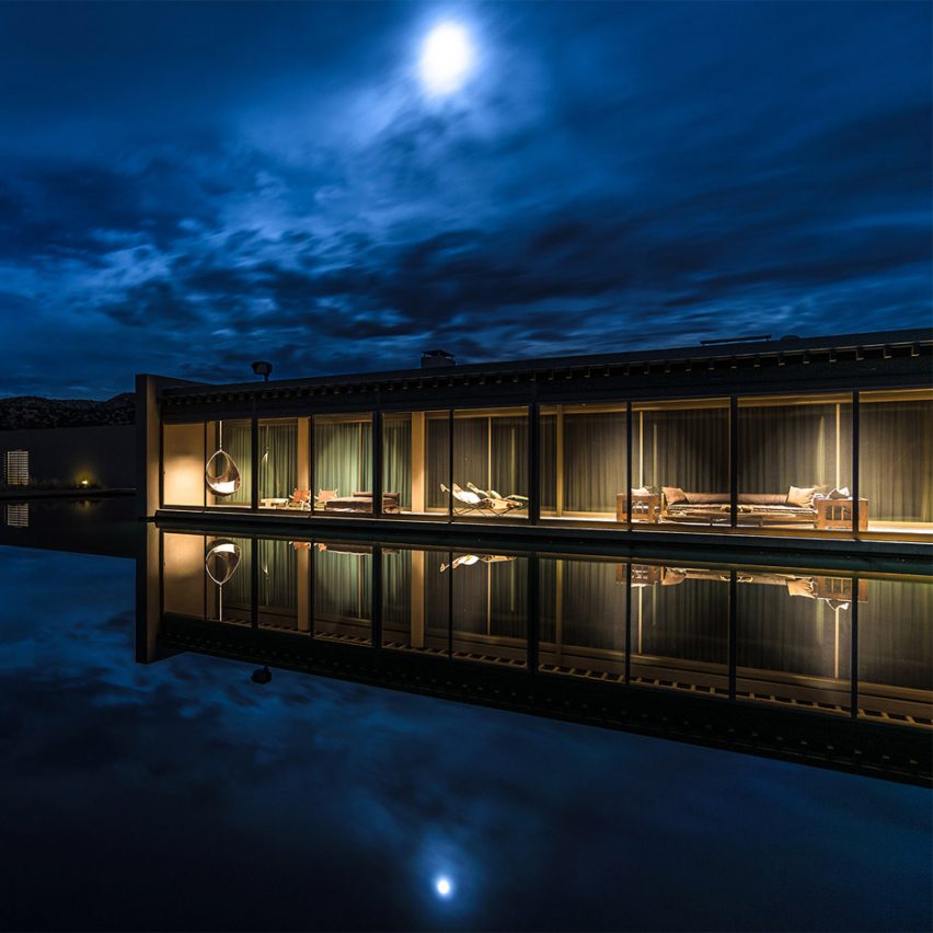
Ranching out: readers have been poking fun at a theatrical movie made to promote a massive ranch in New Mexico owned by fashion designer Tom Ford and featuring buildings by Japanese architect Tadao Ando.
"Reminds me of the Holiday Inns that were built in the 60s," wrote a guest user called Scotsims.
"In my opinion, all the drama went to waste when they put rendered cows running through the valley," said Jack Twist.
"I think it is amazing. Not in the least because someone who could lead a pompous cushioned lifestyle chose to subject himself to a minimal building designed by Ando," wrote Sim. Read the comments on this story »