Seven of the most effective minimalist rebrands
Brands have been scrapping their previously complicated logos in favour of flat designs. We've rounded up seven of our favourite minimal redesigns from the last few years, including simplified lions, sans-serif icons and a "responsive W" (+ slideshow).
UK Premier League 2016 rebrand by DesignStudio
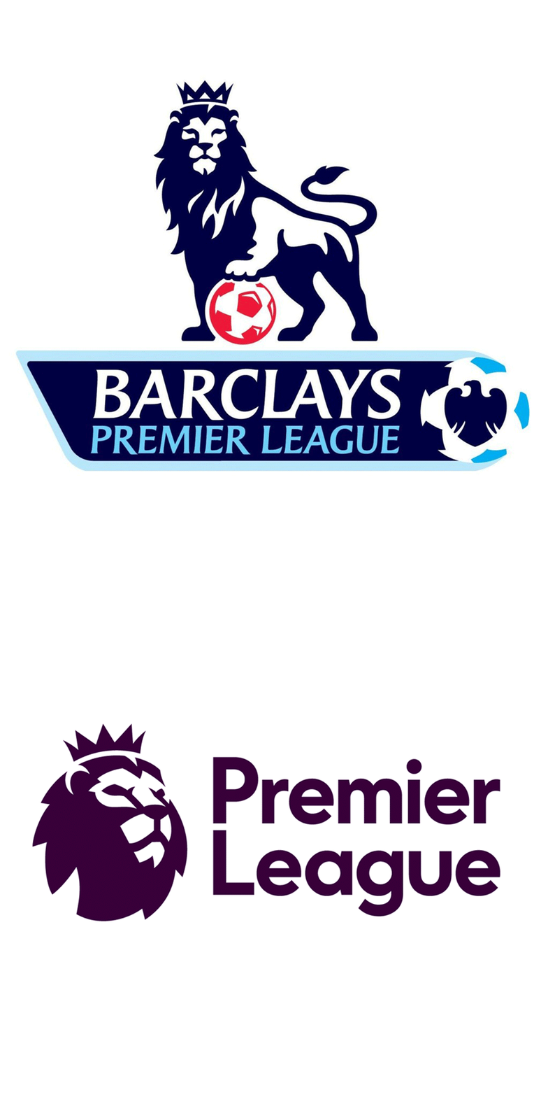
England's primary professional football competition kicked off its 2016/2017 season with a significantly more minimal lion's head logo.
London- and San Francisco-based agency DesignStudio evolved the Premier League's traditional lion logo, created for its founding in 1992, into a more stripped-back form. Read more about the UK Premier League 2016 rebrand »
Mastercard 2016 rebrand by Pentagram
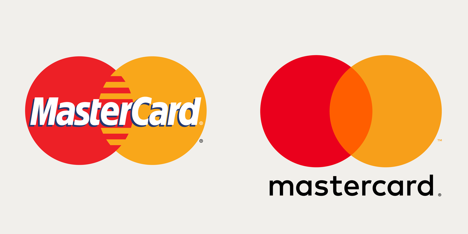
Design agency Pentagram gave Mastercard its first branding redesign in 20 years, creating a more minimal logo and visual identity for the credit card company.
The new design retains the two overlapping red and yellow circles, but swaps the stripes in the central portion for a block orange colour. Read more about the Mastercard 2016 rebrand »
Google 2015 rebrand
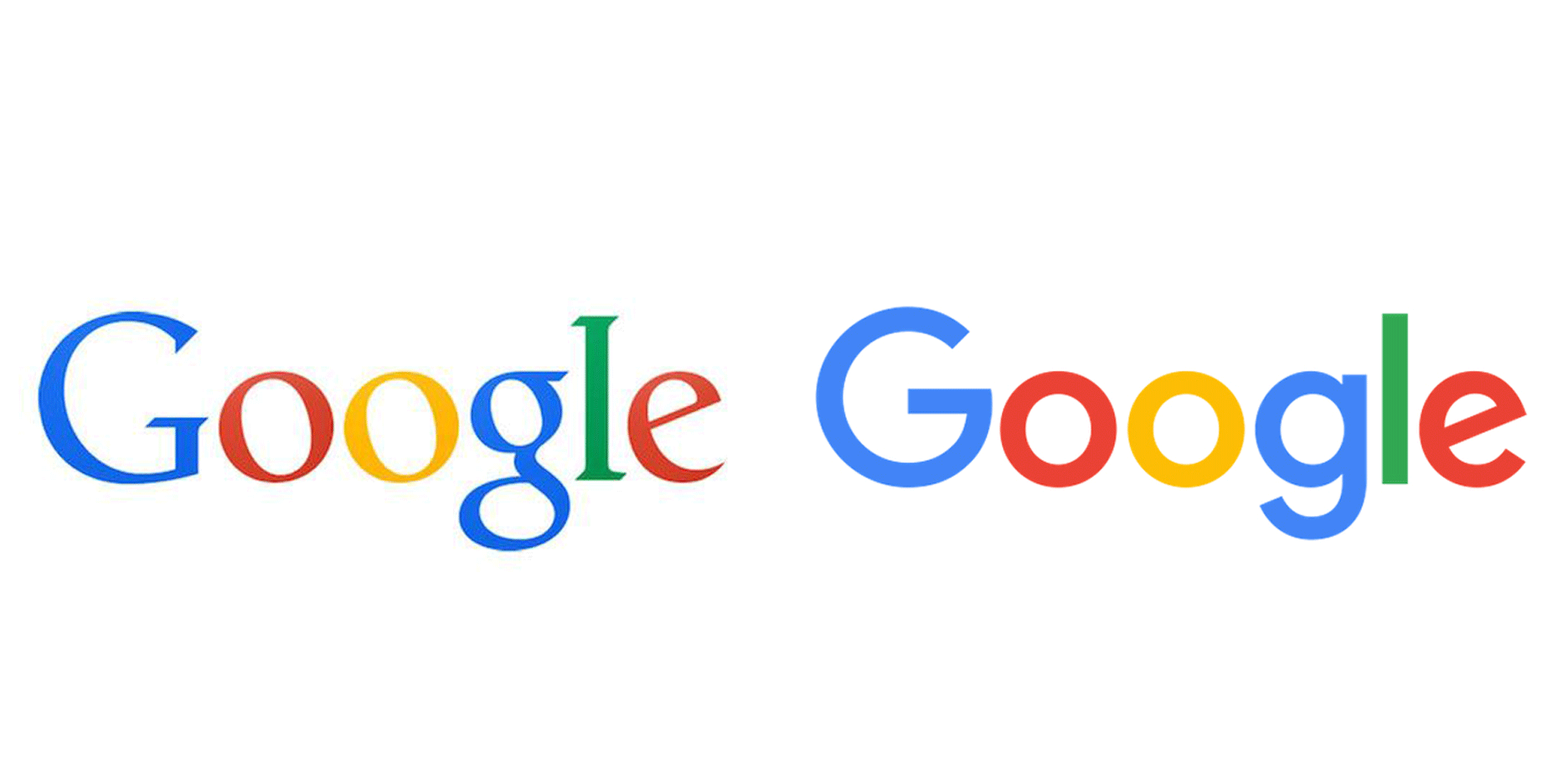
Having abandoned drop shadows and gone flat with an earlier redesign, Google's 2015 update went more minimal still, replacing the serif typeface with a sans-serif alternative that many news outlets welcomed as "friendlier".
What remains is the distinctive colour order of previous Google logos, as well as its playfully tilted "e". Read more about the Google 2015 rebrand »
MIT 2014 rebrand by Pentagram
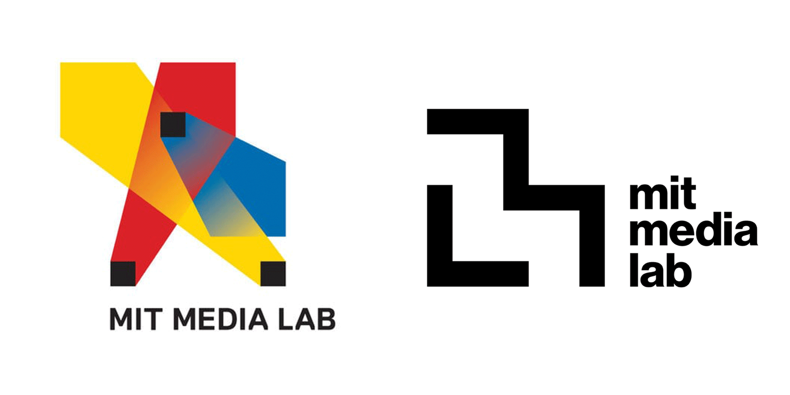
Design agency Pentagram used a simple grid of squares to create a new visual identity for the Massachusetts Institute of Technology's research centre.
Pentagram designers Michael Bierut and Aron Fay based the branding on a seven-by-seven grid logo created for MIT Media Lab's 25th anniversary in 2011 by designer Richard The, with variations for each of the 23 research groups. Read more about the MIT 2014 rebrand »
Airbnb 2014 rebrand by DesignStudio
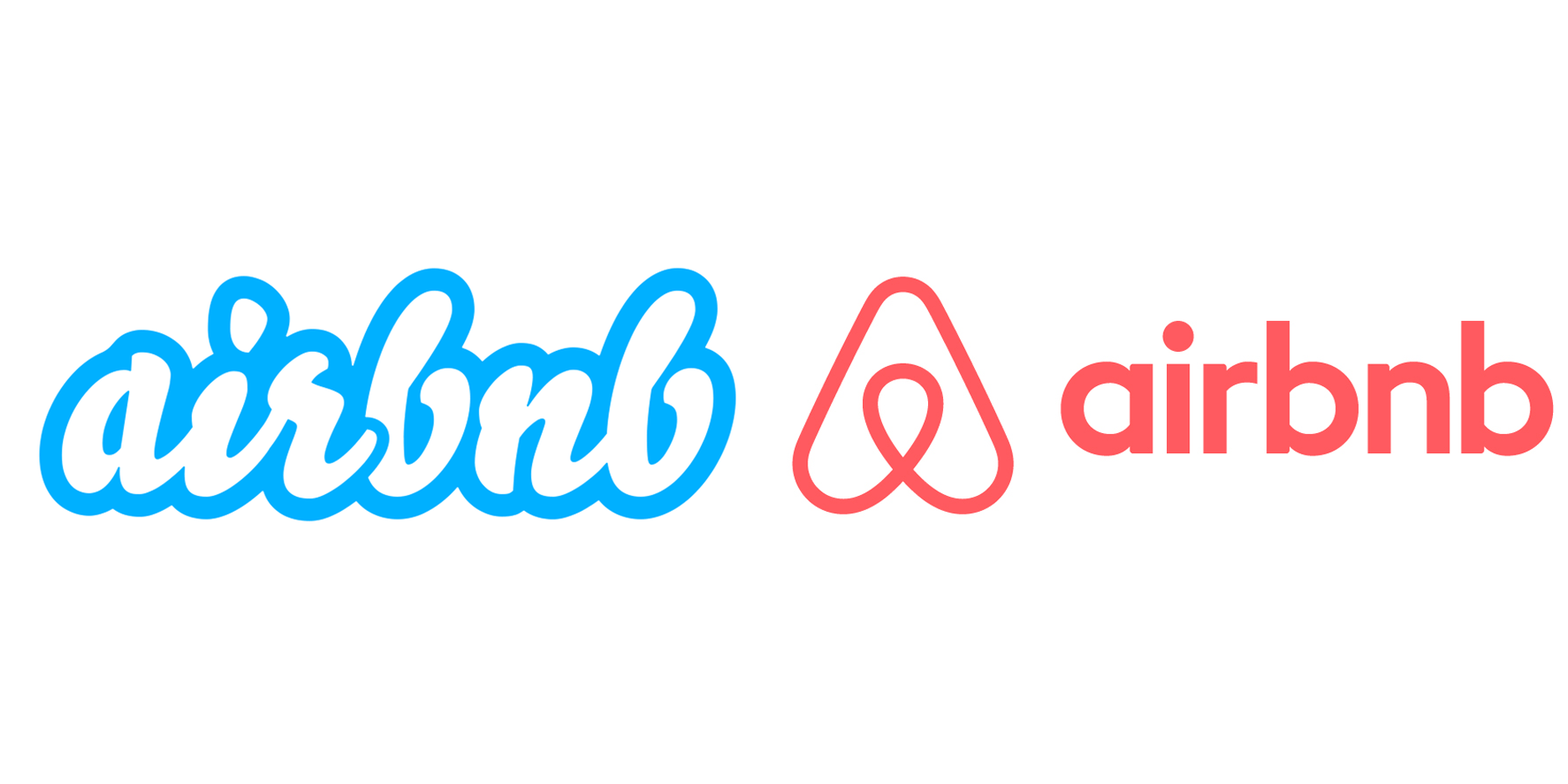
Using the brand principle of "belong anywhere", London agency DesignStudio came up with a symbol for Airbnb – called the "Bélo" – "that can be drawn by anyone".
Although it came under fire at the time for its similarity to other logos, DesignStudio's aspirations that the visual identity become easily recognised internationally have arguably been fulfilled. Read more about the Airbnb 2014 rebrand »
McDonald's 2016 rebrand by Boxer

Earlier this year, McDonald's rolled out simplified packaging, designed by branding agency Boxer to function as a "mobile billboard" for the fast-food giant.
Bold but simple typography in bright colours covers the surfaces of paper and card containers, paired with the company's iconic golden arches logo. Read more about the McDonald's 2016 rebrand »
Whitney Museum 2013 rebrand by Experimental Jetset
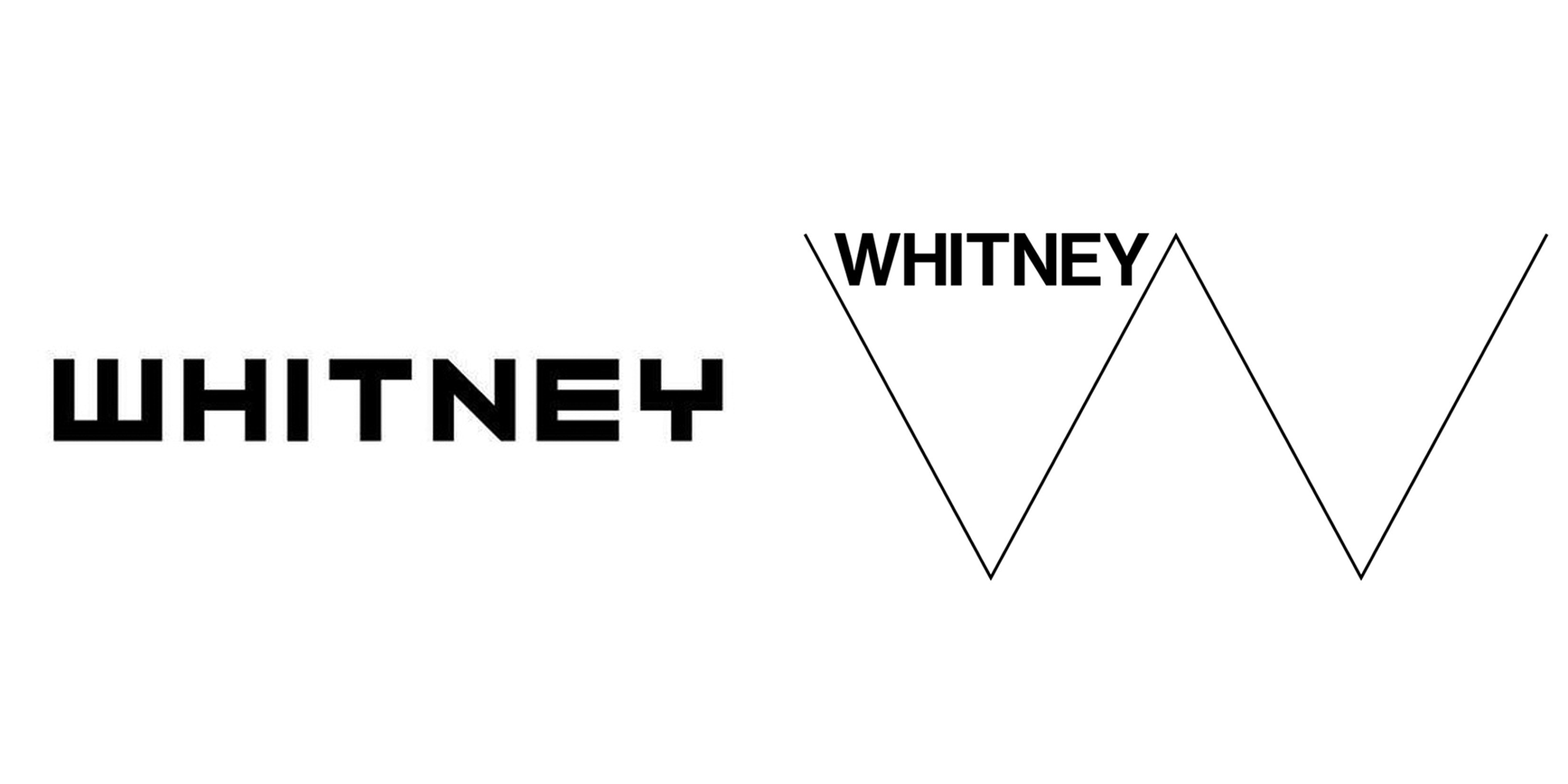
Dutch graphics studio Experimental Jetset redesigned the minimal logo for the Whitney Museum of American Art in New York as a slender W that changes shape to respond to its setting.
"We came up with the idea of the zig-zag line, with the zig-zag being a metaphor for a non-simplistic, more complicated (and thus more interesting) history of art," said the designers. Read more about the Whitney Museum 2013 rebrand »