Deliveroo has become the latest company to scrap its complicated logo in favour of a flat design, launching a pared-back rebrand by London agency DesignStudio (+ slideshow).
The food delivery company rolled out its new logo earlier today, alongside a blog post by the design team detailing the design process.
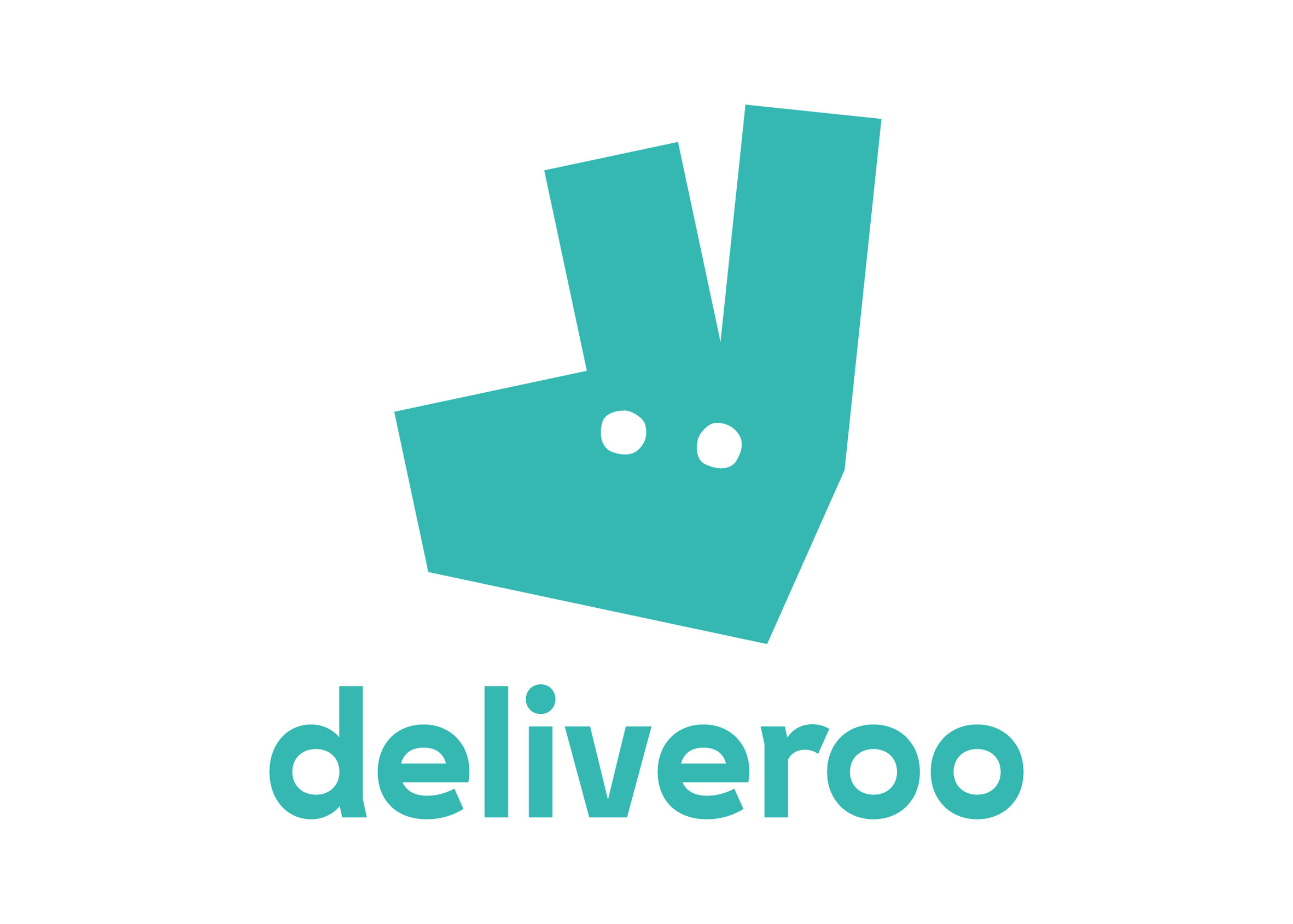
While the old logo features a cartoony kangaroo holding a shopping bag, the new one is more graphic and abstract.
It depicts a kangaroo's face in the form of a polygon with two eyes and two ears, though some have likened the design to a hand sticking up two fingers.
The design team explains that the new logo is still based around the same two aspects as the old one – a kangaroo and the teal colour.
"We explored a variety of routes for a new logo – some that kept the kangaroo as its primary inspiration, to completely new logos that left our kangaroo roots behind," they said in the post.
"What we landed on was an evolution from our original and more literal take on the kangaroo, turning it into a striking new mark, bold and impactful."
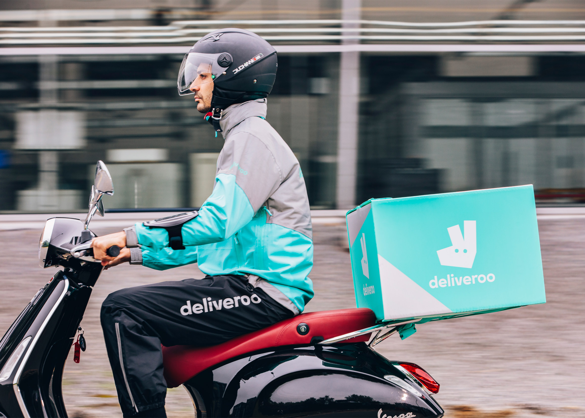
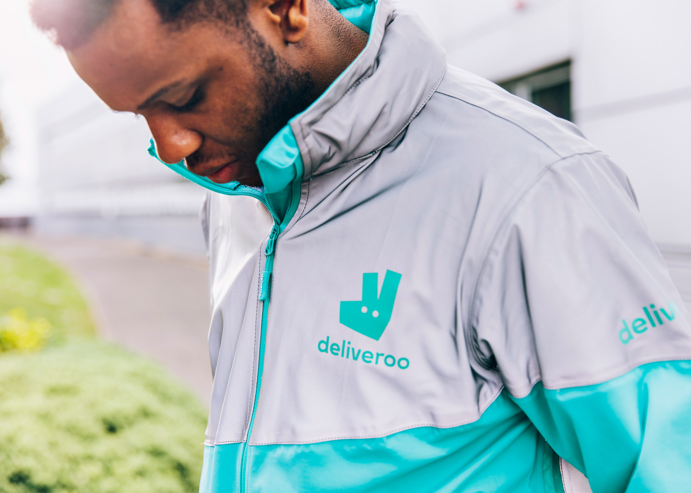
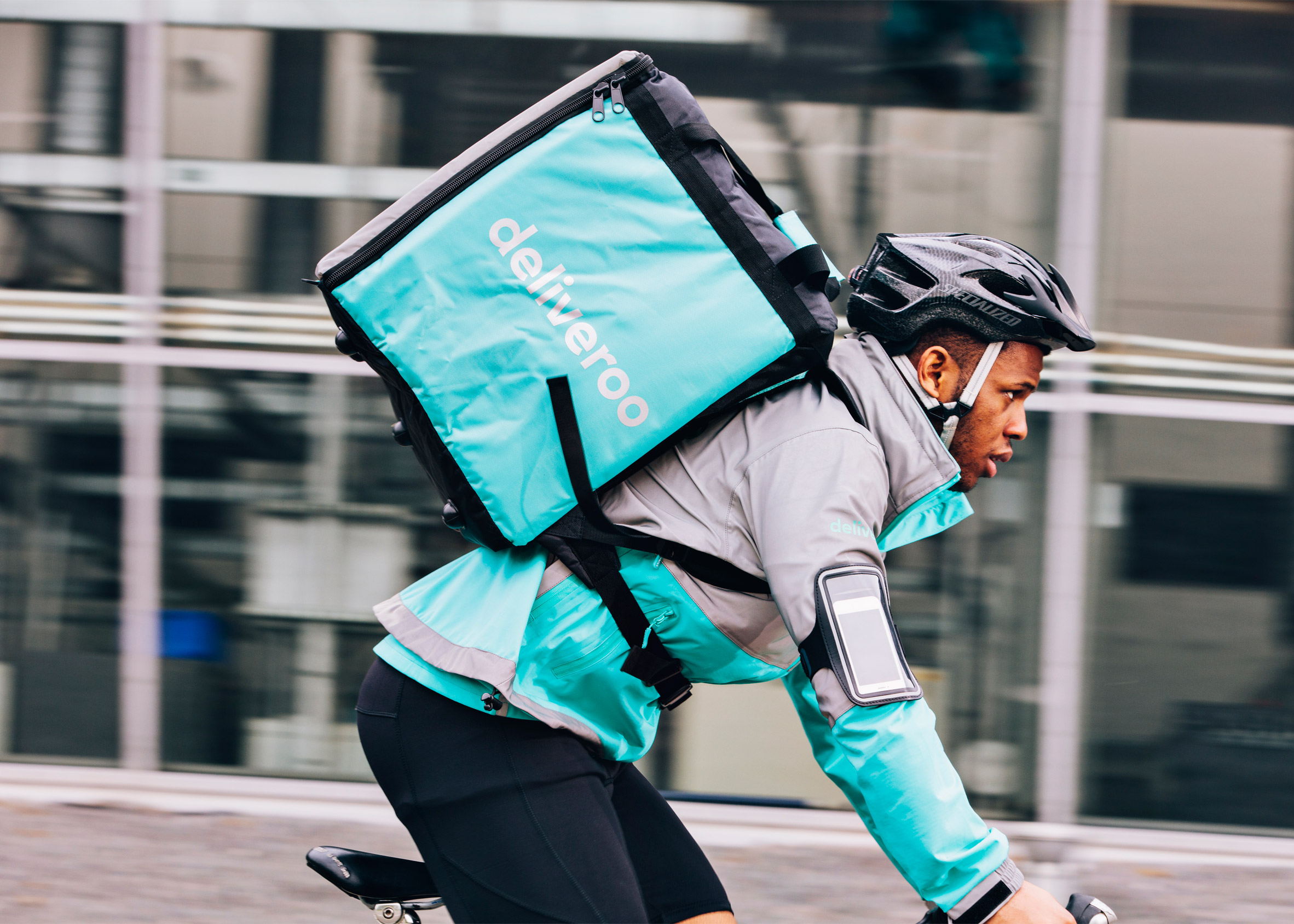
The new motif will be adapted across the company's branded products, from its website to new delivery riders' uniforms.
DesignStudio, which previously headed up the rebrands for England's Premier League and home-rental website Airbnb, worked alongside Deliveroo's in-house design team to develop a new kit for the riders.
Having consulted road safety organisation Brake, the design teams opted to add hyper-reflective material on the waist, shoulders and wrists of the jackets for night-time use, and increased the vividness of the day kit colours.
They spoke to riders in different countries, with those in warmer climates asking for jerseys that keep them cool, and those in colder places requesting a waterproof jacket to keep them dry.
Deliveroo's new logo continues the trend for flat design, which has been adopted by companies like Instagram and Uber. This has seen skeumorphic graphics – which aim to emulate real-world objects – replaced with more simple icons.


